Empathy mapping is the visual representation of users’ thoughts, feelings and actions. User Experience (UX) designers use empathy maps to organize user research data to gain a deeper, shared understanding of users’ needs and make decisions.
“Nobody cares how much you know, until they know how much you care.”—Theodore Roosevelt
Designers who choose an empathetic approach build stronger connections with their users. This gives their product a competitive advantage.
Empathy helps designers learn the underlying emotions and motivations that drive their users’ behavior. Designers can develop innovative solutions that meet users’ expectations when they understand what it is users truly want and need.
Let's look at some examples of good design and poor design in airports to understand why empathy is considered to be one of the most powerful tools in a designer’s toolbox.
Teams create empathy maps at the beginning of a project and use them throughout the design process. These maps shed light on hidden insights and keep the user front and center.
For example, a mobile productivity app team conducts user interviews and then creates empathy maps for different user segments, such as students, remote workers, and busy parents. Each empathy map includes details like user thoughts, feelings, needs and pain points related to task management.
As the team assembles the map, they notice students crave recognition and a sense of accomplishment. The team then works this need into their design ideation, testing ideas like leaderboards and productivity streaks.
Is Empathy Mapping Important?
Empathy mapping is an essential skill for designers:
Empathy is a powerful catalyst for ideation and creative problem-solving in Design Thinking. The deep understanding of the user gained through the empathy mapping process sparks ideas that go well beyond surface-level solutions.
Empathy maps reveal gaps in user research. For example, does the research reveal what users truly feel?
Teams develop a shared understanding of who the user is, and their needs and pain points. Empathy maps based on real quotes capture unfiltered perspectives and avoid the distortion of individual biases about the user.
Empathy maps help designers easily communicate their user research findings to stakeholders.
Empathy map canvases offer a quick visual summary of qualitative research data. This means that the team doesn’t have to go through all research data collected to understand their users.
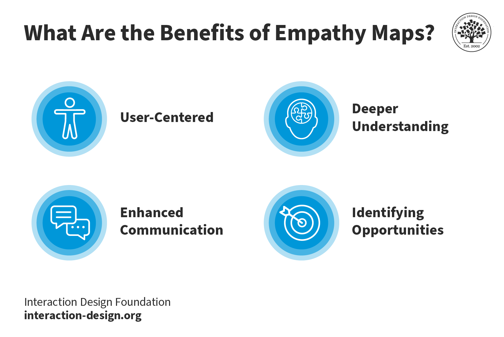
An empathy map is a simple tool that helps keep the design process user-focused. The empathy mapping process allows designers to gain a deep understanding of users’ wants and needs. The team can then further develop these insights to identify potential opportunities in the product.
Get started with Empathy Mapping today. Download and share this template with your team.
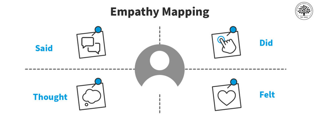
Empathy Map: What the User Said, Did, Thought, Felt
The four quadrants of an empathy map typically organize different aspects of a user's experience.
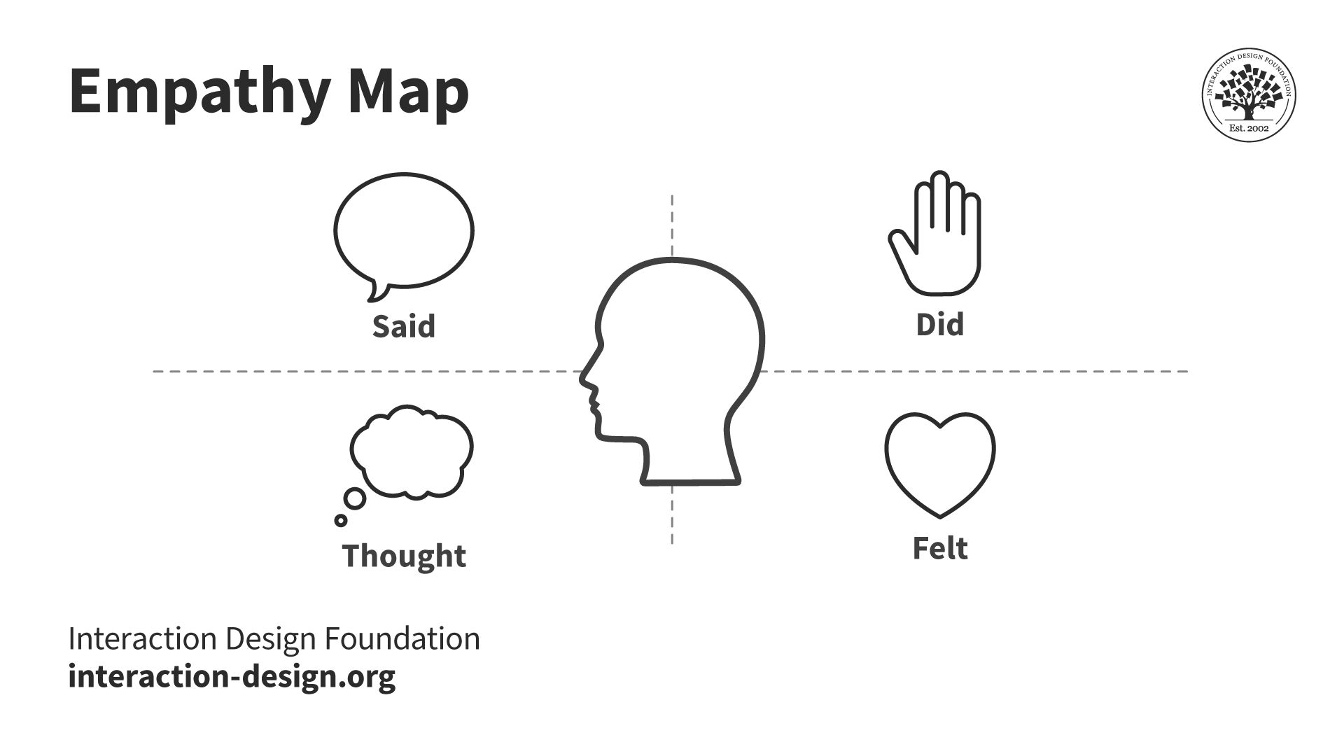
Most empathy maps help designers look at a user's experience through four lenses: what they say, think, do, and feel.
© Interaction Design Foundation, CC BY-SA 4.0
The four quadrants of an empathy map are:
1. Said/Says: This is usually the easiest section to complete. The “Said/Says” section is for what you hear your users say out loud. You gain valuable insights into their expectations, concerns, needs and preferences by listening to their words. Place direct quotes from users in this section.
For example, this section might include:
“Entering all the tasks’ due dates this way is stressing me out.”
“Is my profile public?”
“This page takes really long to load.”
2. Did/Does: The "Did/Does" section is for your users’ actions and behaviors. This will help you understand how users interact with your product. You can analyze the users’ actions to identify pain points and opportunities for improvement.
For example:
“The user spends the first 10 minutes customizing the app aesthetic.”
“The user screenshots motivational quotes and shares them on their Instagram story.”
“The user lists the different student societies they belong to in their bio.”
3. Thought/Thinks: The "Thought/Thinks" section is for your users’ thoughts, beliefs and assumptions. It looks at the underlying motivations that drive user behavior and this allows you to align your product with your users’ mental models.
For example, the “Thought/Thinks” section might include:
“The signup process is confusing.”
“I have so much on my plate. Will this app actually help me or is it just another thing that will take up precious time?”
“My tuition fees are overdue as it is. I hope this app has a free option. I’m on such a tight budget.”
4. Felt/Feels: This can be the hardest section to complete. The "Felt/Feels" section is for the users’ emotional state. Its purpose is to clearly articulate their fears, frustrations and desires. Watch how people move and listen to the tone of their voice to understand how they feel. You can create engaging experiences that connect with users in an unforgettable way once you master this skill.
For example, this section might include:
“Impatient with the amount of time it takes to complete an action in the app.”
“Overwhelmed by the amount of on-screen text.”
“Excited by the pop-up prompting them to connect with their friends on the app.”
The team will need to interpret all available data to fill out the “thinks” and “feels” sections. They may need to rely on more observational notes as people may not readily share what they think and feel.
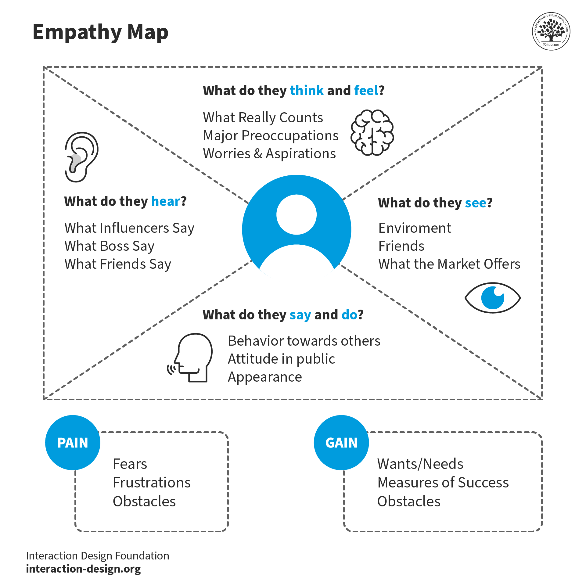
5. Additional sections: The latest variations of the canvas include extra sections for further analysis. These are Goals, Pains, Gains, Sees and Hears.
The “Goals” section details who the team empathizes with and what they need to do. The “Pains” section lists the user’s problems and pain points. The “Gains” section is where you’ll organize the users’ wants, needs and what they dream to achieve. The “Sees” section lists what the user sees in their immediate environment and relevant digital visual stimuli. The “Hears” section does the same for their auditory experience.
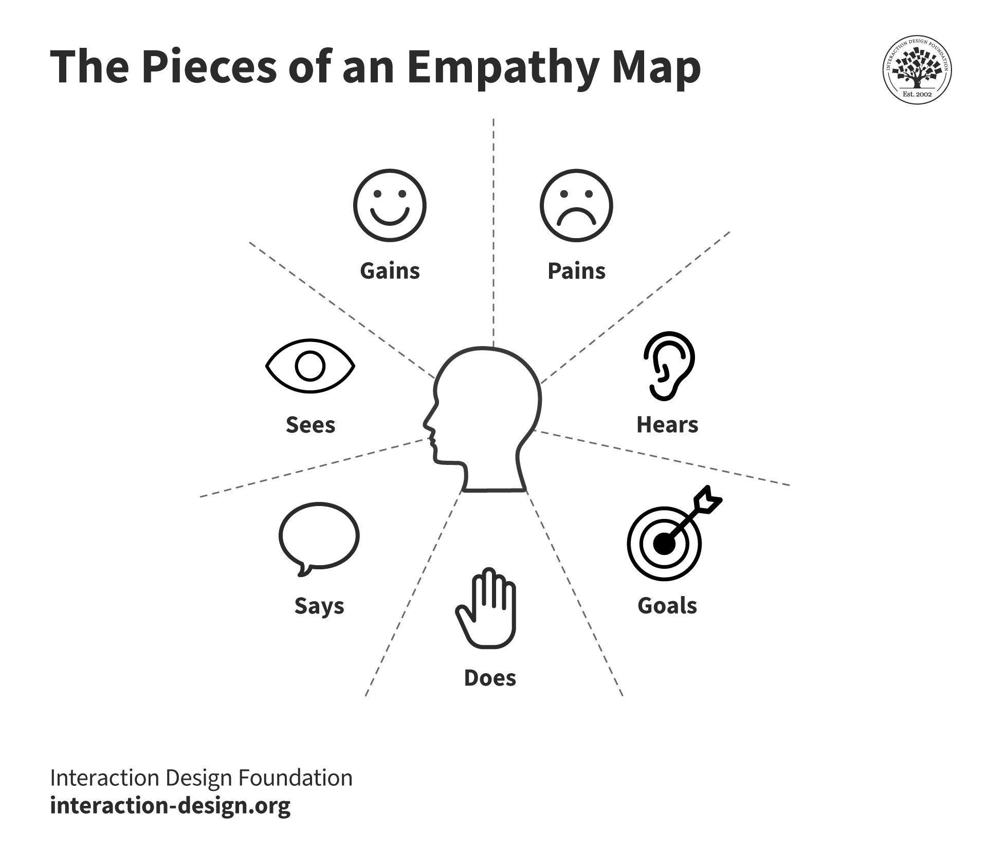
Dave Gray's updated empathy map canvas includes additional sections for the user's goals and what they see, hear, desire and struggle with.
© Interaction Design Foundation, CC BY-SA 4.0
How to Create an Empathy Map
Step-by-step breakdown of how to create an effective empathy map:
Step 1: Define Scope and Purpose
Clearly define the scope, purpose and target audience. This could be existing users, potential users or a specific segment of the target market.
Step 2: Gather and/or Conduct Research
Collect as much information as possible about your target audience. This can include customer surveys, interviews, observations and social media data.
Customer surveys are ideal for reaching a large audience quickly to gather general opinions and preferences.
Interviews let you dig deeper. You should choose this route when detailed, personal user experiences and stories are needed to understand specific aspects of user behavior.
Prof. Ann Blandford, Professor of Human-Computer Interaction at University College London, shares what’s the best way to approach the interview situation.
Sometimes, what people do reveals more than what they say. Observations will help you see the things they don't say. If you need to see how users naturally interact with a product in their own environment then this type of user research will be the best fit.
You can tap into live user feedback and trends with social media data. This approach is best when the team looks for real-time reactions and opinions about a product from a diverse user base.
More data will help you and your team to create a more accurate and reliable empathy map.
Step 3: Fill in the Empathy Map Quadrants
Choose a comfortable and collaborative environment to conduct an in-person empathy mapping session. Provide stakeholders with sticky notes, markers and a whiteboard or a large sheet of paper divided into four quadrants.
Create a Post-It (paper or digital) for each meaningful insight identified in the user research data. Next, add the Post-It to the relevant quadrant.
Start by filling in the "Says" quadrant with direct quotes from your users. These reflect your users’ needs, desires, and concerns. Then, move on to completing the "Does," "Thinks" and "Feels" quadrants. Remember to encourage your team to brainstorm and share their insights.
Stand back and identify any knowledge gaps once you’ve populated all four quadrants. Is there a specific quadrant that needs more user research data?
Step 4: Analyze
Encourage a discussion among your team. Open up the floor to team members to share their observations and identify patterns. The goal of this analysis is to look for opportunities to tackle pain points and help users.
You and your team should:
Identify patterns and trends: Look for commonalities and recurring themes in the empathy maps. These can help you understand your users’ behaviors, needs and desires.
Identify pain points and the opportunities they offer: Hone in on the pain points that have the biggest impact on the users’ experiences.
Identify user segments: Use the insights you and your team have collected during the empathy mapping process to segment your users further. The team will then be able to create more personalized experiences in the future.
Align with business goals: The insights collected from empathy mapping should be in alignment with the business objectives. Empathy maps help inform product development, user experience and marketing initiatives.
Step 5: Identify Your Users’ Needs
To identify your users' needs, go through the empathy map and look for:
verbs—i.e. activities and desires,
user traits,
contradictions and inconsistencies.
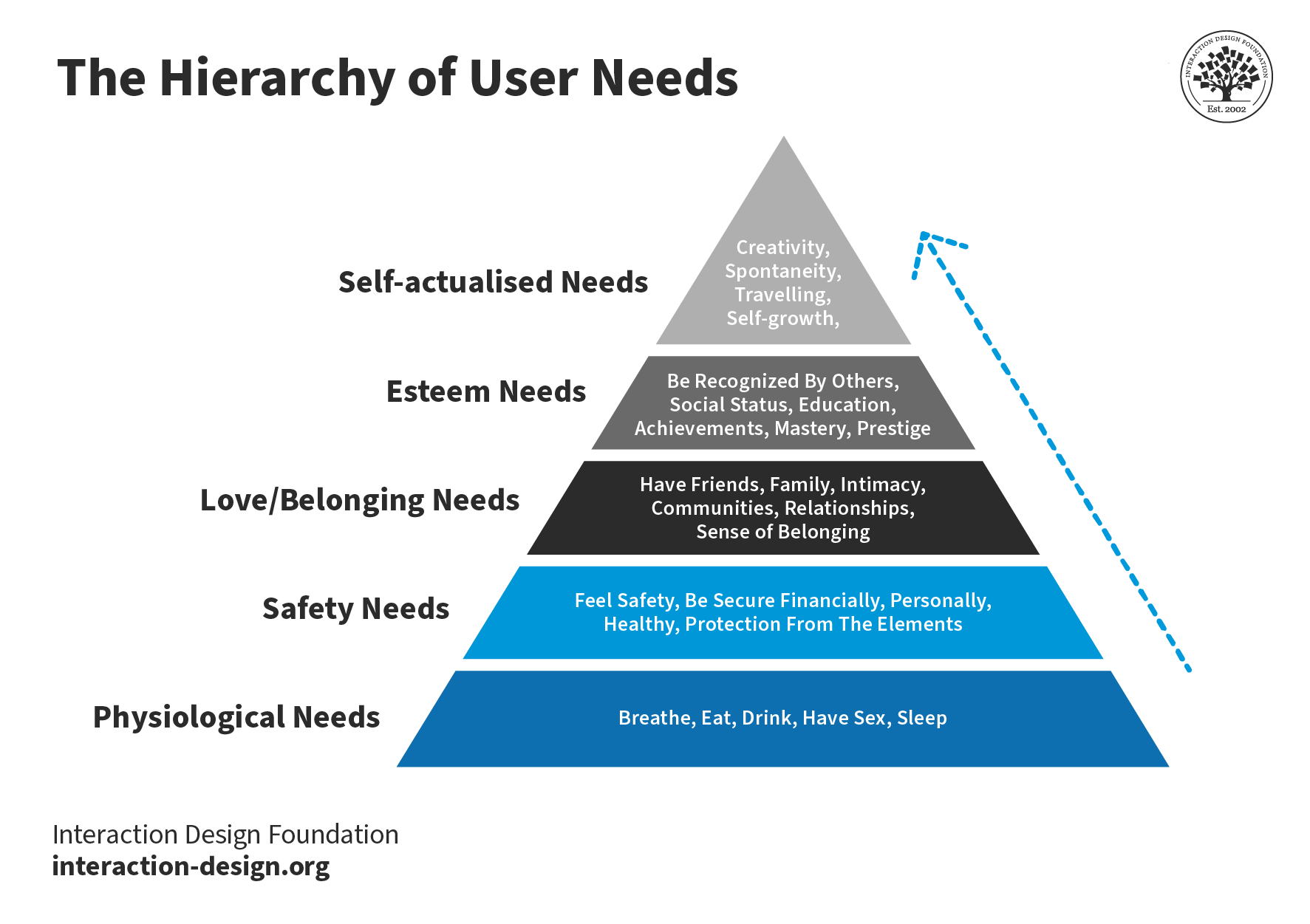
It also helps to refer to all five levels of Maslow's Hierarchy of Needs. This pyramid, developed by psychologist Abraham Maslow in 1943, can help your team pinpoint how your product can meet the needs of the user.
Maslow’s framework helps designers understand the basic, functional needs the product meets (like safety) as well as how it can fulfill higher-level emotional needs.
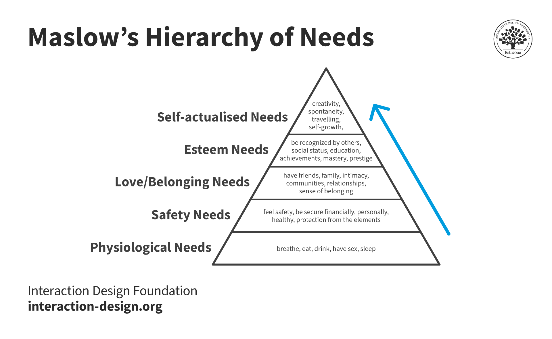
Designers use Maslow's hierarchy to define and prioritize user motivations and come up with user-centric solutions.
© Interaction Design Foundation, CC BY-SA 4.0
Empathy Maps vs Personas: What’s the Difference?
Empathy maps and personas are both valuable tools in user-centric design, but they serve different purposes. A persona is a detailed, semi-fictional character that represents different user types. Personas include demographic information, behaviors, goals, and provide a holistic understanding of the target user. Empathy maps are visualizations that focus on the users’ emotions, thoughts, actions, and words in a specific context.
User Experience (UX) Strategist William Hudson explains how personas help designers develop empathy.
Empathy mapping is exceptionally helpful when it comes to persona development. Empathy maps help shed light on the feelings and thoughts that personas might not fully show. It enriches personas with a deeper understanding of user motivations and pain points. Ultimately, empathy maps make personas more realistic which helps the design team to be more empathetic.
The decision of whether to create an empathy map or persona first depends on the project's goals. If you need quick insights into user experiences, which can then inform persona development, then start with an empathy map.
If the team has already created personas, you can use empathy mapping to add layers of emotional understanding to them.
Personas and empathy maps are symbiotic tools. Both contribute to a deeper understanding of users in the design process.
When to Use Empathy Maps
Design teams often create empathy maps at the beginning of the design process. However, once created, teams should continue to refer to the maps to keep users at the center of the design process.
The design process is not linear, and it’s likely the team will conduct interviews even after a product launch. Designers should always update these maps with new insights.
Empathy maps play several important roles during the design process:
Research Phase: Begin using empathy maps at the outset of a project, during the research and exploration phase.
Use empathy maps to collect and organize data from user interviews, observations, and surveys. This early understanding lays the groundwork for informed design decisions later.
For example, an empathy map created during the research phase may reveal that users feel frustrated with or intimidated by complex apps. This insight tells the design team to focus on simplifying the user experience.
Idea Generation: Use empathy maps during ideation and brainstorming as a springboard for creative thinking. UX designers can use the visual mapping process to identify solutions that hit the mark with users every time.
The idea generation phase is about turning empathetic insights into tangible design ideas that can improve user satisfaction. For example, if an empathy map shows that users are looking for quicker ways to complete tasks, designers might brainstorm features like shortcuts or predictive text.
Iterative Design and Prototyping: Continuously use empathy maps during the iterative design process. As prototypes evolve, empathy maps ensure the user’s emotional journey is consistently considered.
This phase is about bridging the gap between user needs and the product’s functionality. For example, if an updated empathy map indicates that users are annoyed by a lengthy signup process, the design team might prioritize a shorter signup flow in the next iteration of the app.
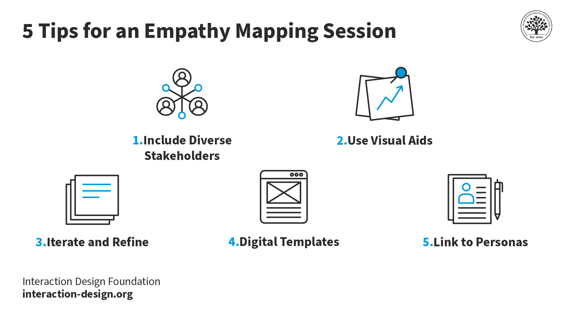
3 Common Challenges Designers Face when Empathy Mapping and How to Deal with Them
There are a few challenges to overcome when creating an empathy map:
Mistake 1: A Generic User Profile
Often, designers create empathy maps based on generic user profiles. There are many nuances and insights that can only be obtained through real user experiences. If you skip the research and rely on generic user profiles only, then you could end up with a one-size-fits-all design that doesn't really connect with anyone.
To avoid this, designers should create different empathy maps for insights from different groups.
For example, let’s consider an app for public transit users. If the team only looks at the perspective of a 9-to-5 office worker, they’ll miss the needs of night shift workers, students, or parents with school-age children. To remedy this, designers can make a different empathy map for each group to understand what each type of user wants. This will help the team tailor their product to meet specific user needs.
Mistake 2: Disregarding Users’ Emotions
Some designers rely only on what users do and say when they create empathy maps. Emotions drive behavior, and ignoring how users feel can likely lead to a superficial understanding of them.
How can designers avoid this misstep? They should pay close attention to emotional responses during user research.
Designers should ask questions about how users feel during certain tasks or experiences and observe their emotional cues. This is a skill that will take some practice but the more you observe and learn to interpret users’ emotional cues, the easier it will get. This deeper emotional understanding will lead to more intuitive and user-centered designs.
For example, a user of a fitness app might say they use it for exercise tracking. But engage with them a little more, and they might reveal they're also seeking motivation and community because they struggle with accountability. You can transform your product from simply tracking metrics to creating an engaging, supportive user experience when you learn to recognize and design for these emotional needs.
Mistake 3: Treat Empathy Mapping as a One-Off Task
Empathy mapping is not just a box to check at the beginning of a project, never to revisit. User needs and contexts change over time, and so should the designer’s understanding of them.
Designers should revisit and update their empathy maps regularly. As the project progresses, they should keep in touch with users. This ongoing conversation will keep the design relevant and user-focused.
For example, let’s look at a mobile streaming app’s empathy map. Initially, the insights gained might focus on entertainment and a user-friendly user interface (UI). As other streaming apps come to market, competition grows, and user preferences change. Revisiting the empathy mapping process could help the team identify untapped opportunities around unique content and personalized recommendations.
Mistake 4: Look to Prove Assumptions
Teams can make the mistake of only seeing what they expect while looking at data. This is called confirmation bias. They might pick out information that supports their ideas and stereotypes, which defeats the purpose of empathy maps.
Prof. Ann Blandford of University College London explains confirmation bias and other common analysis pitfalls.
Empathy mapping is more art than science. Only through practice will designers learn how to best manage the delicate balance of research, intuition, and user engagement needed.
If you keep these common mistakes in mind while empathy mapping then you'll be able to create designs that don't just look good on paper but actually hit the mark with the people they're meant for.
Remember, the heart of UX design is learning to understand the human experience—and there's no shortcut to that.