Visual Representation refers to the principles by which markings on a surface are made and interpreted. Designers use representations like typography and illustrations to communicate information, emotions and concepts. Color, imagery, typography and layout are crucial in this communication.
Alan Blackwell, cognition scientist and professor, gives a brief introduction to visual representation:
We can see visual representation throughout human history, from cave drawings to data visualization:
Art uses visual representation to express emotions and abstract ideas.
Financial forecasting graphs condense data and research into a more straightforward format.
Icons on user interfaces (UI) represent different actions users can take.
The color of a notification indicates its nature and meaning.
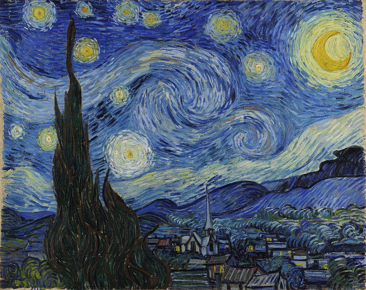
Van Gogh's "The Starry Night" uses visuals to evoke deep emotions, representing an abstract, dreamy night sky. It exemplifies how art can communicate complex feelings and ideas.
© Public domain
Importance of Visual Representation in Design
Designers use visual representation for internal and external use throughout the design process. For example:
Storyboards are illustrations that outline users’ actions and where they perform them.
Sitemaps are diagrams that show the hierarchy and navigation structure of a website.
Wireframes are sketches that bring together elements of a user interface's structure.
Usability reports use graphs and charts to communicate data gathered from usability testing.
User interfaces visually represent information contained in applications and computerized devices.
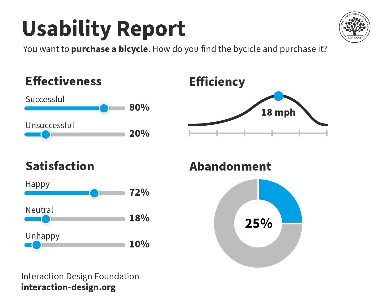
This usability report is straightforward to understand. Yet, the data behind the visualizations could come from thousands of answered surveys.
© Interaction Design Foundation, CC BY-SA 4.0
Visual representation simplifies complex ideas and data and makes them easy to understand. Without these visual aids, designers would struggle to communicate their ideas, findings and products. For example, it would be easier to create a mockup of an e-commerce website interface than to describe it with words.
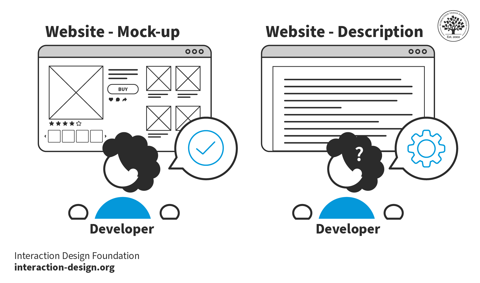
Visual representation simplifies the communication of designs. Without mockups, it would be difficult for developers to reproduce designs using words alone.
© Interaction Design Foundation, CC BY-SA 4.0
Types of Visual Representation
Below are some of the most common forms of visual representation designers use.
Text and Typography
Text represents language and ideas through written characters and symbols. Readers visually perceive and interpret these characters. Typography turns text into a visual form, influencing its perception and interpretation.
We have developed the conventions of typography over centuries, for example, in documents, newspapers and magazines. These conventions include:
Text arranged on a grid brings clarity and structure. Gridded text makes complex information easier to navigate and understand. Tables, columns and other formats help organize content logically and enhance readability.
Contrasting text sizes create a visual hierarchy and draw attention to critical areas. For example, headings use larger text while body copy uses smaller text. This contrast helps readers distinguish between primary and secondary information.
Adequate spacing and paragraphing improve the readability and appearance of the text. These conventions prevent the content from appearing cluttered. Spacing and paragraphing make it easier for the eye to follow and for the brain to process the information.
Balanced image-to-text ratios create engaging layouts. Images break the monotony of text, provide visual relief and illustrate or emphasize points made in the text. A well-planned ratio ensures neither text nor images overwhelm each other. Effective ratios make designs more effective and appealing.
Designers use these conventions because people are familiar with them and better understand text presented in this manner.
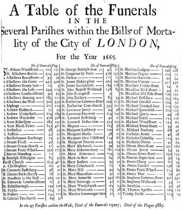
This table of funerals from the plague in London in 1665 uses typographic conventions still used today. For example, the author arranged the information in a table and used contrasting text styling to highlight information in the header.
© Public domain
Illustrations and Drawings
Designers use illustrations and drawings independently or alongside text. An example of illustration used to communicate information is the assembly instructions created by furniture retailer IKEA. If IKEA used text instead of illustrations in their instructions, people would find it harder to assemble the furniture.
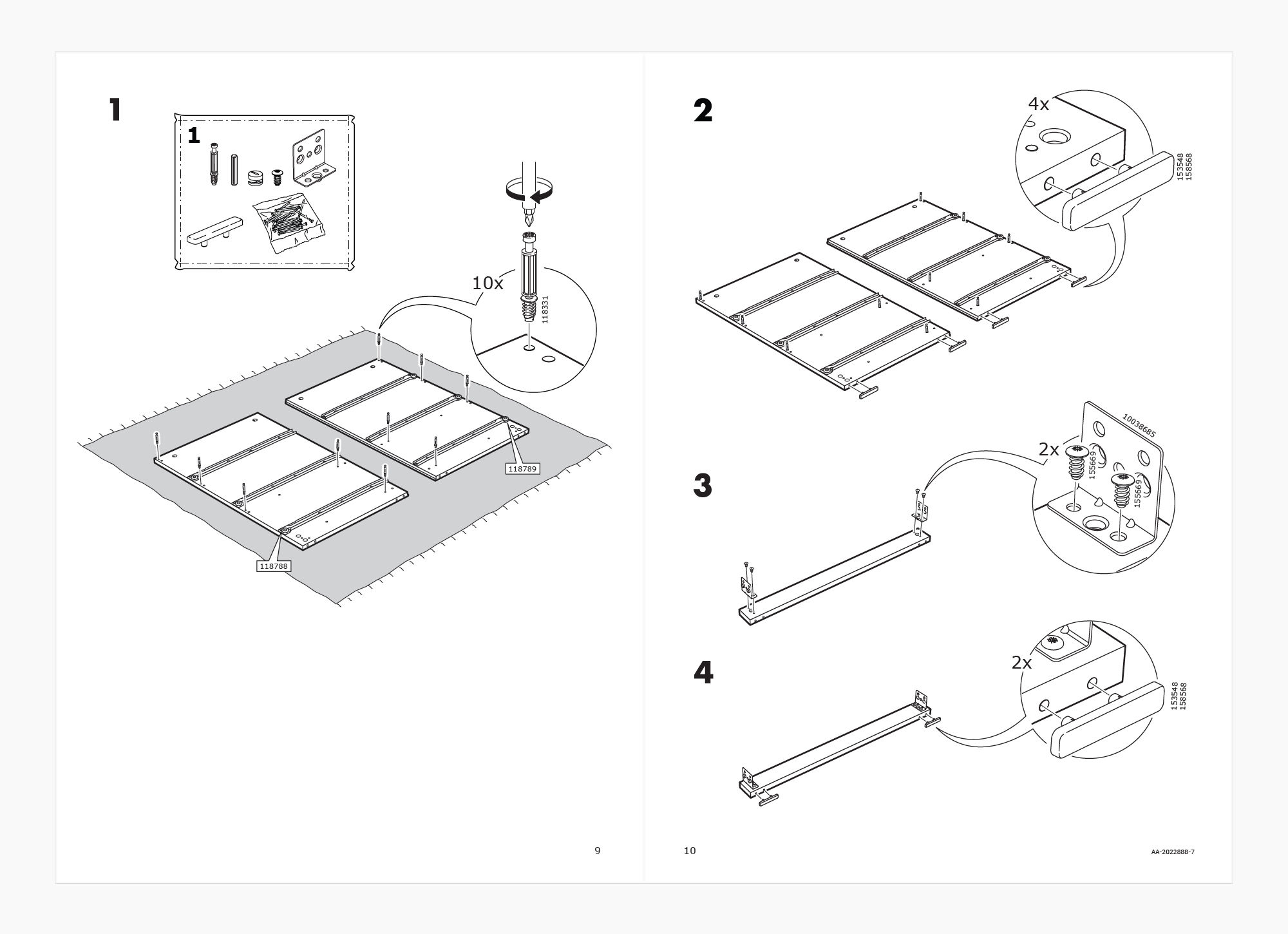
IKEA assembly instructions use illustrations to inform customers how to build their furniture. The only text used is numeric to denote step and part numbers. IKEA communicates this information visually to: 1. Enable simple communication, 2. Ensure their instructions are easy to follow, regardless of the customer’s language.
© IKEA, Fair use
Illustrations and drawings can often convey the core message of a visual representation more effectively than a photograph. They focus on the core message, while a photograph might distract a viewer with additional details (such as who this person is, where they are from, etc.)
For example, in IKEA’s case, photographing a person building a piece of furniture might be complicated. Further, photographs may not be easy to understand in a black-and-white print, leading to higher printing costs. To be useful, the pictures would also need to be larger and would occupy more space on a printed manual, further adding to the costs.
But imagine a girl winking—this is something we can easily photograph.
Ivan Sutherland, creator of the first graphical user interface, used his computer program Sketchpad to draw a winking girl. While not realistic, Sutherland's representation effectively portrays a winking girl. The drawing's abstract, generic elements contrast with the distinct winking eye. The graphical conventions of lines and shapes represent the eyes and mouth. The simplicity of the drawing does not draw attention away from the winking.
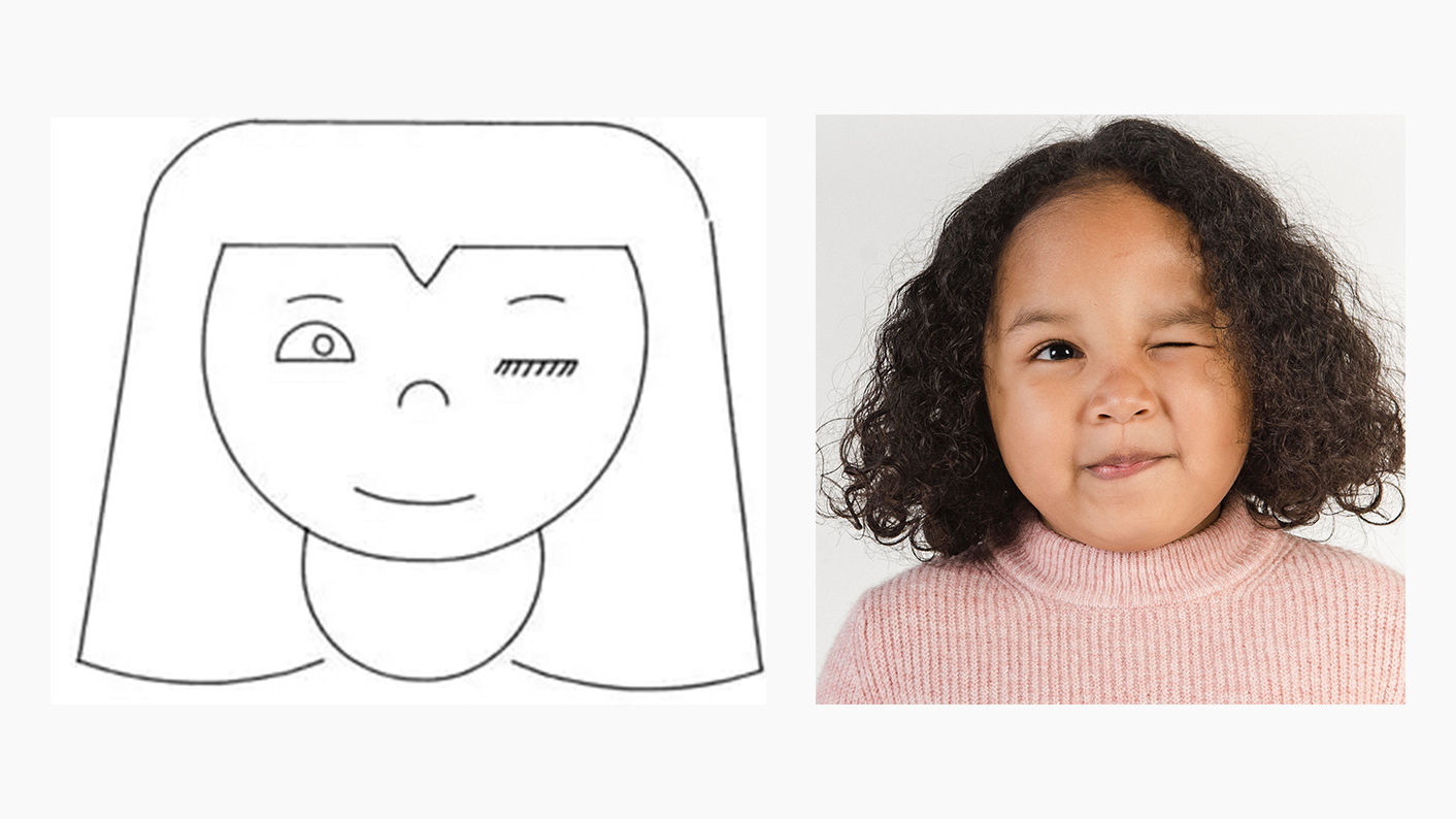
A photo might distract from the focused message compared to Sutherland's representation. In the photo, the other aspects of the image (i.e., the particular person) distract the viewer from this message.
© Ivan Sutherland, CC BY-SA 3.0 and Amina Filkins, Pexels License
Information and Data Visualization
Designers and other stakeholders use data and information visualization across many industries.
Data visualization uses charts and graphs to show raw data in a graphic form. Information visualization goes further, including more context and complex data sets. Information visualization often uses interactive elements to share a deeper understanding.
For example, most computerized devices have a battery level indicator. This is a type of data visualization. IV takes this further by allowing you to click on the battery indicator for further insights. These insights may include the apps that use the most battery and the last time you charged your device.
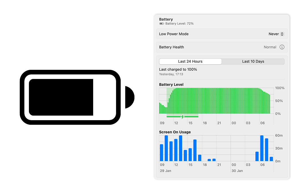
macOS displays a battery icon in the menu bar that visualizes your device’s battery level. This is an example of data visualization. Meanwhile, macOS’s settings tell you battery level over time, screen-on-usage and when you last charged your device. These insights are actionable; users may notice their battery drains at a specific time. This is an example of information visualization.
© Low Battery by Jemis Mali, CC BY-NC-ND 4.0, and Apple, Fair use
Information visualization is not exclusive to numeric data. It encompasses representations like diagrams and maps. For example, Google Maps collates various types of data and information into one interface:
Data Representation: Google Maps transforms complex geographical data into an easily understandable and navigable visual map.
Interactivity: Users can interactively customize views that show traffic, satellite imagery and more in real-time.
Layered Information: Google Maps layers multiple data types (e.g., traffic, weather) over geographical maps for comprehensive visualization.
User-Centered Design: The interface is intuitive and user-friendly, with symbols and colors for straightforward data interpretation.
The volume of data contained in one screenshot of Google Maps is massive. However, this information is presented clearly to the user. Google Maps highlights different terrains with colors and local places and businesses with icons and colors. The panel on the left lists the selected location’s profile, which includes an image, rating and contact information.
© Google, Fair use
Symbolic Correspondence
Symbolic correspondence uses universally recognized symbols and signs to convey specific meanings. This method employs widely recognized visual cues for immediate understanding. Symbolic correspondence removes the need for textual explanation.
For instance, a magnifying glass icon in UI design signifies the search function. Similarly, in environmental design, symbols for restrooms, parking and amenities guide visitors effectively.

The Interaction Design Foundation (IxDF) website uses the universal magnifying glass symbol to signify the search function. Similarly, the play icon draws attention to a link to watch a video.
© Interaction Design Foundation, CC BY-SA 4.0
How Designers Create Visual Representations
Visual Language
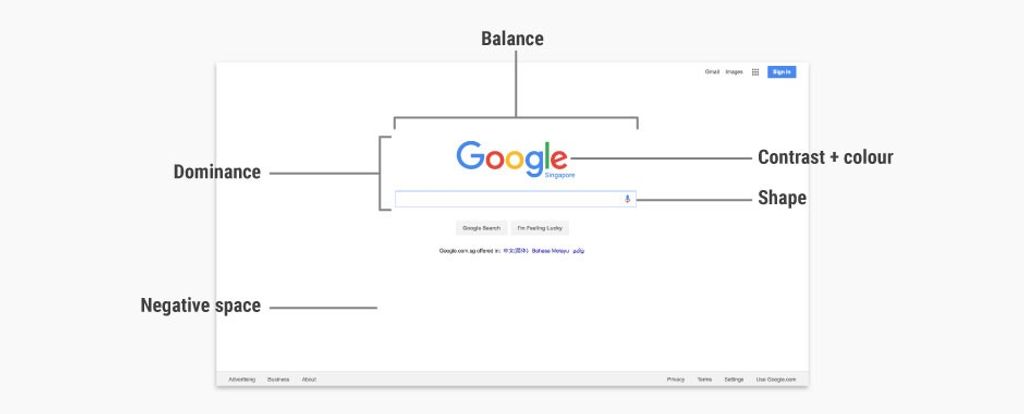
Designers use elements like color, shape and texture to create a communicative visual experience. Designers use these 8 principles:
Size – Larger elements tend to capture users' attention readily.
Color – Users are typically drawn to bright colors over muted shades.
Contrast – Colors with stark contrasts catch the eye more effectively.
Alignment – Unaligned elements are more noticeable than those aligned ones.
Repetition – Similar styles repeated imply a relationship in content.
Proximity – Elements placed near each other appear to be connected.
Whitespace – Elements surrounded by ample space attract the eye.
Texture and Style – Users often notice richer textures before flat designs.
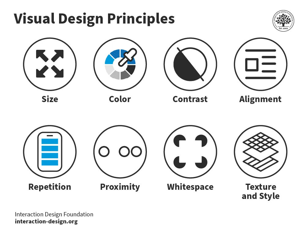
The 8 visual design principles.
© Interaction Design Foundation, CC BY-SA 4.0
In web design, visual hierarchy uses color and repetition to direct the user's attention. Color choice is crucial as it creates contrast between different elements. Repetition helps to organize the design—it uses recurring elements to establish consistency and familiarity.
In this video, Alan Dix, Professor and Expert in Human-Computer Interaction, explains how visual alignment affects how we read and absorb information:
Correspondence Techniques
Designers use correspondence techniques to align visual elements with their conceptual meanings. These techniques include color coding, spatial arrangement and specific imagery. In information visualization, different colors can represent various data sets. This correspondence aids users in quickly identifying trends and relationships.
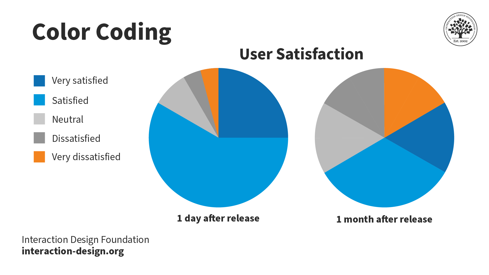
Color coding enables the stakeholder to see the relationship and trend between the two pie charts easily.
© Interaction Design Foundation, CC BY-SA 4.0
In user interface design, correspondence techniques link elements with meaning. An example is color-coding notifications to state their nature. For instance, red for warnings and green for confirmation. These techniques are informative and intuitive and enhance the user experience.

The IxDF website uses blue for call-to-actions (CTAs) and red for warnings. These colors inform the user of the nature of the action of buttons and other interactive elements.
© Interaction Design Foundation, CC BY-SA 4.0
Perception and Interpretation
If visual language is how designers create representations, then visual perception and interpretation are how users receive those representations. Consider a painting—the viewer’s eyes take in colors, shapes and lines, and the brain perceives these visual elements as a painting.
In this video, Alan Dix explains how the interplay of sensation, perception and culture is crucial to understanding visual experiences in design:
Perception
Visual perception principles are essential for creating compelling, engaging visual representations. For example, Gestalt principles explain how we perceive visual information. These rules describe how we group similar items, spot patterns and simplify complex images. Designers apply Gestalt principles to arrange content on websites and other interfaces. This application creates visually appealing and easily understood designs.
In this video, design expert and teacher Mia Cinelli discusses the significance of Gestalt principles in visual design. She introduces fundamental principles, like figure/ground relationships, similarity and proximity.
Interpretation
Everyone's experiences, culture and physical abilities dictate how they interpret visual representations. For this reason, designers carefully consider how users interpret their visual representations. They employ user research and testing to ensure their designs are attractive and functional.
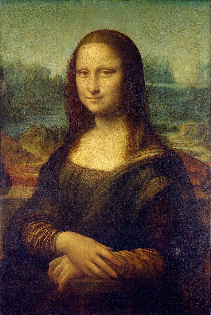
Leonardo da Vinci's "Mona Lisa", is one of the most famous paintings in the world. The piece is renowned for its subject's enigmatic expression. Some interpret her smile as content and serene, while others see it as sad or mischievous. Not everyone interprets this visual representation in the same way.
© Public domain
Color is an excellent example of how one person, compared to another, may interpret a visual element. Take the color red:
In Chinese culture, red symbolizes luck, while in some parts of Africa, it can mean death or illness.
A personal experience may mean a user has a negative or positive connotation with red.
People with protanopia and deuteranopia color blindness cannot distinguish between red and green.
In this video, Joann and Arielle Eckstut, leading color consultants and authors, explain how many factors influence how we perceive and interpret color:


 Teo Yu Siang and
  Teo Yu Siang and Interaction Design Foundation, CC BY-NC-SA 3.0
 Teo Yu Siang and Interaction Design Foundation, CC BY-NC-SA 3.0
 Teo Yu Siang and Interaction Design Foundation, CC BY-NC-SA 3.0
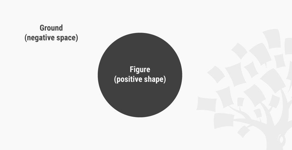 Teo Yu Siang and Interaction Design Foundation, CC BY-NC-SA 3.0
 World Wide Fund for Nature (WWF), Fair Use
 Teo Yu Siang and Interaction Design Foundation, CC BY-NC-SA 3.0
 Teo Yu Siang and Interaction Design Foundation, CC BY-NC-SA 3.0
 Teo Yu Siang and Interaction Design Foundation, CC BY-NC-SA 3.0
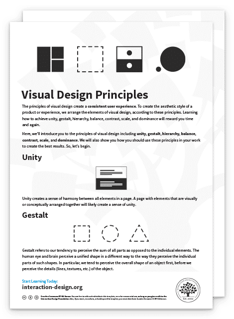
 Teo Yu Siang and Interaction Design Foundation, CC BY-NC-SA 3.0
 Teo Yu Siang and Interaction Design Foundation, CC BY-NC-SA 3.0
 Teo Yu Siang and Interaction Design Foundation, CC BY-NC-SA 3.0
 Teo Yu Siang and Interaction Design Foundation, CC BY-NC-SA 3.0
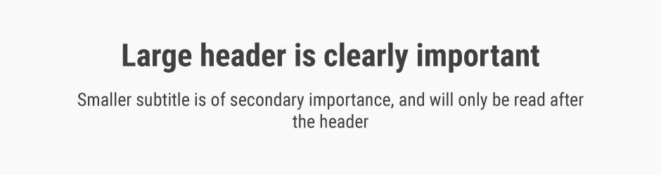 Teo Yu Siang and Interaction Design Foundation, CC BY-NC-SA 3.0
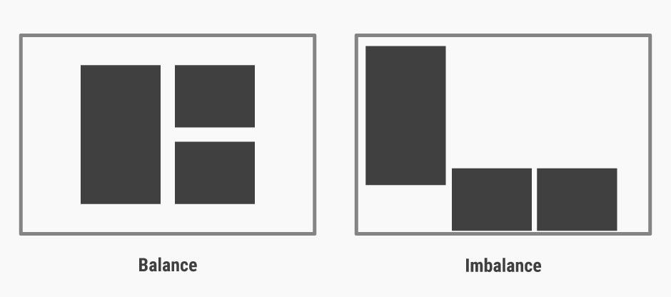 Teo Yu Siang and Interaction Design Foundation, CC BY-NC-SA 3.0
 Teo Yu Siang and Interaction Design Foundation, CC BY-NC-SA 3.0
 Teo Yu Siang and Interaction Design Foundation, CC BY-NC-SA 3.0
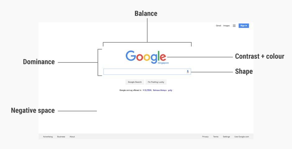 Google Inc., Fair Use.
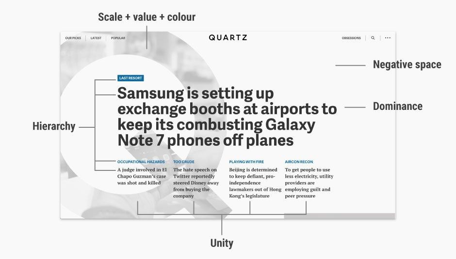 Quartz, Fair Use.