Color modes are the settings designers use to show colors consistently across devices and materials. Commonly used modes are LAB, RGB, CMYK, index, grayscale and bitmap, which differ in quality and file size. Designers pick modes to optimize images and ensure these appear identically across media for brand consistency.
“The main function of color should be to serve expression.”
— Henri Matisse
Learn about the intricate properties of color here.
How to Achieve Color Consistency and More in Screen and Print
© Interaction Design Foundation, CC BY-SA 4.0
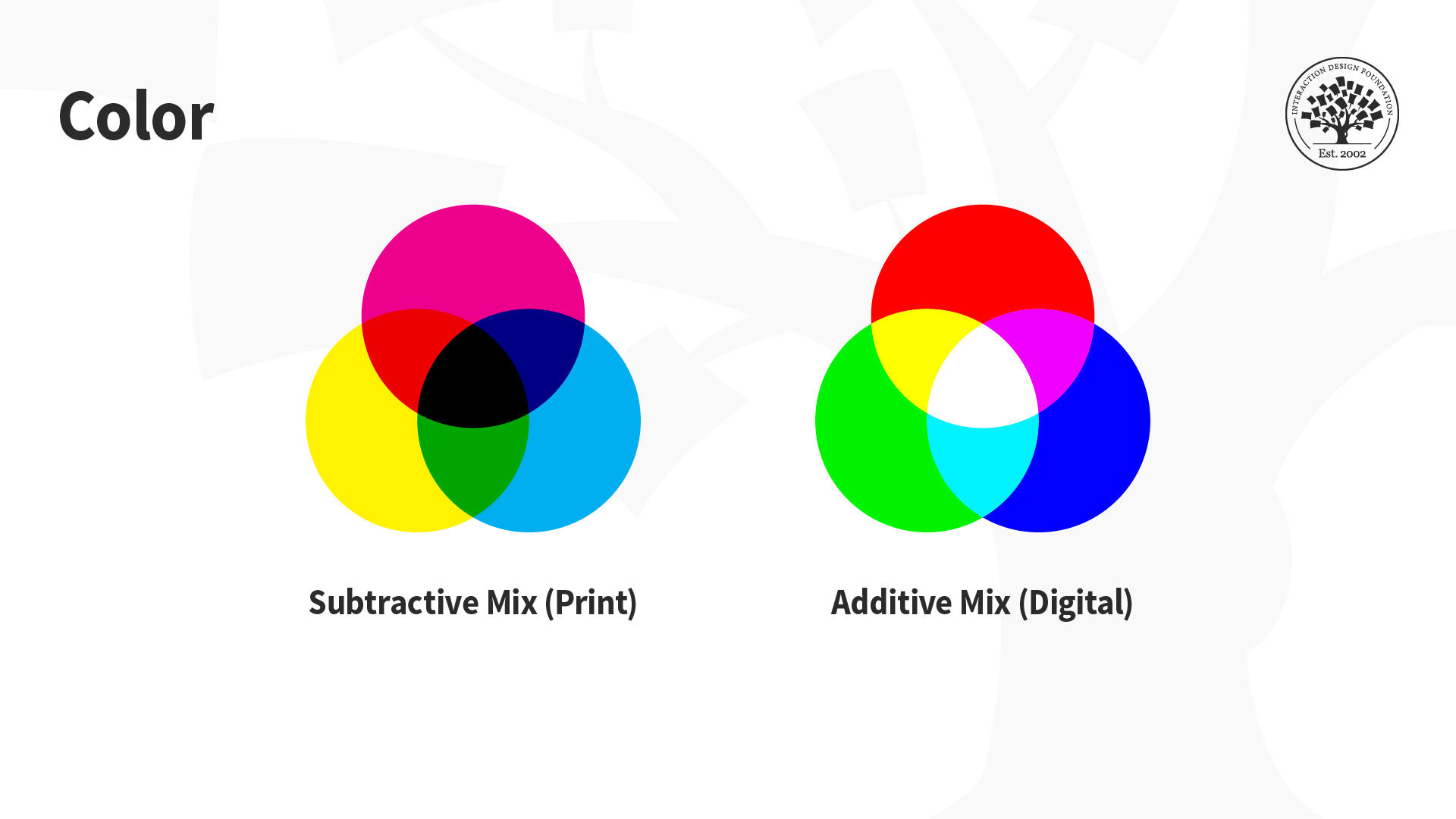
The designs we create appear on many devices and materials, and how we manipulate color greatly depends on the medium we use. This is due to differences in color spaces (i.e., the specific organization of colors), and the two processes for producing color, namely:
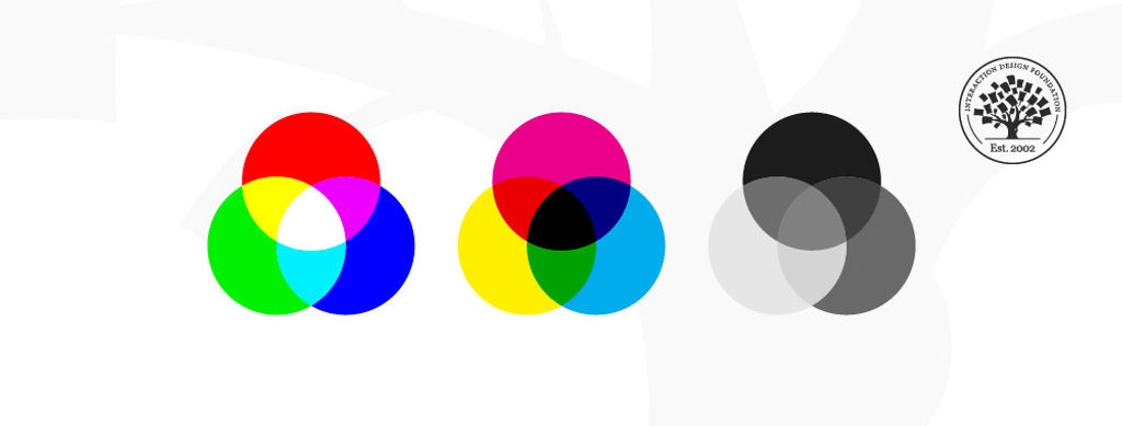
Additive: Involves the blending of light. We “create” white by mixing all the colors at full intensity; black is the total absence of color.
Subtractive: Involves mixing physical substances (e.g., ink, paint). Each dot/splotch covers the medium (e.g., paper). A classic example of mixing all paint colors is that curious dark grey-brown hue.
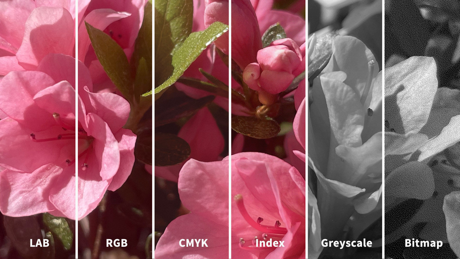
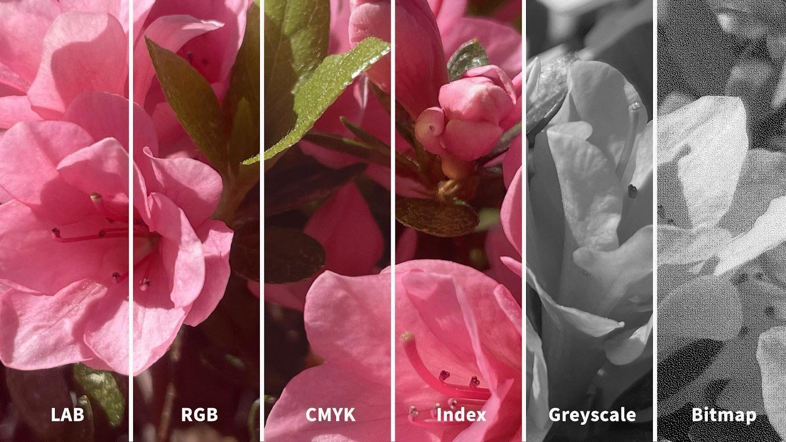
You may have seen how printed-out colors can look different from those on-screen. This phenomenon happens because the printer’s colors (using the subtractive process) didn’t replicate the screen’s (using the additive). Such inconsistencies can be easy to correct if you choose the suitable color mode. The illustration below depicts the difference between LAB, RGB, CMYK, Index, Greyscale and Bitmap color modes. You’ll notice how the quality from left (LAB) to right (Bitmap) decreases as the amount of color decreases.
© Daniel Skrok and Interaction Design Foundation, CC BY-SA 3.0
How to Pick the Right Mode for the Context
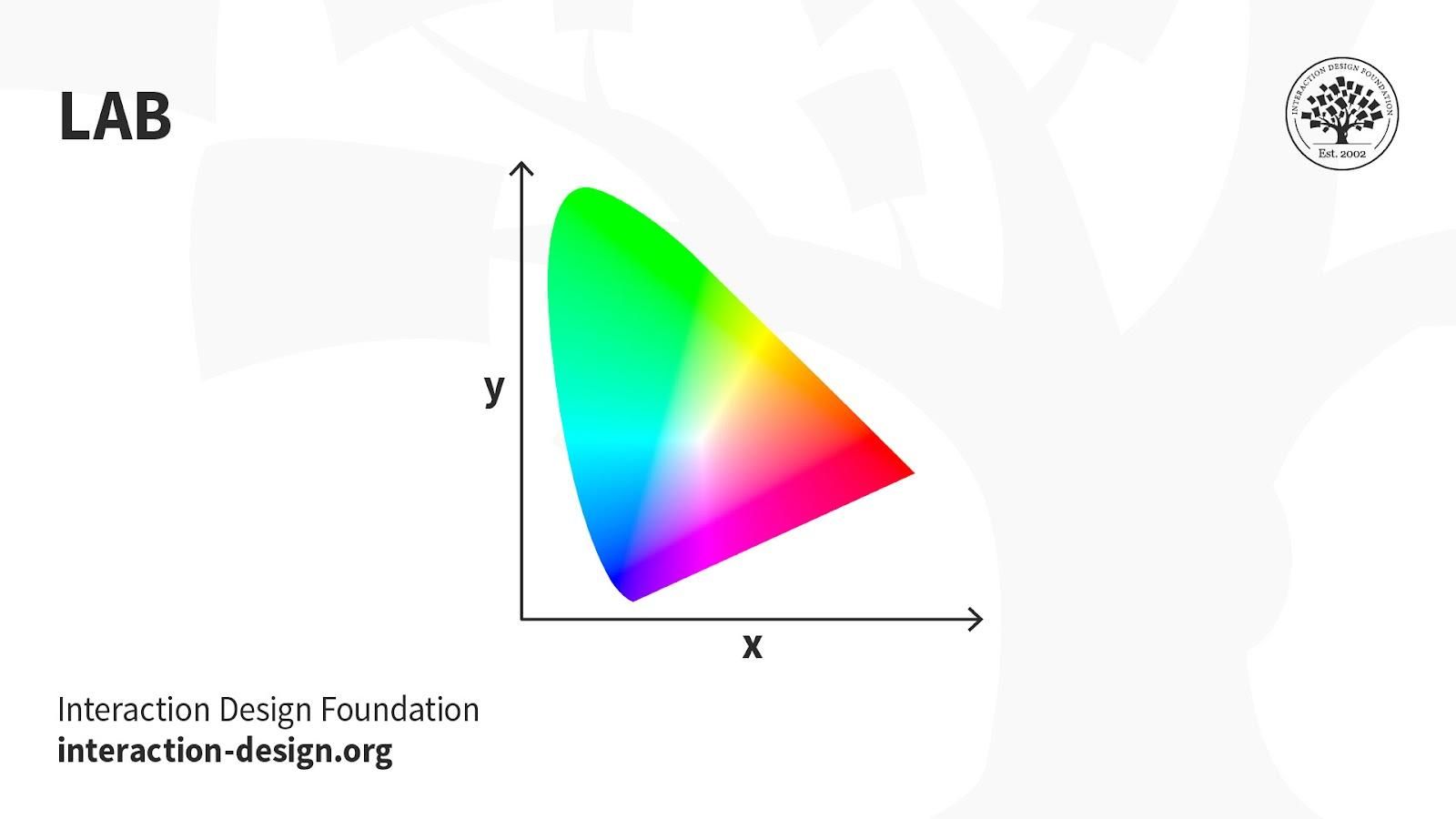
LAB: Also called CIELab, LAB is based on how humans perceive color. It comprises one channel for lightness (L, ranging from the values 0–100) and two for color (A—the Green-Red Axis channel—and B, the Blue-Yellow Axis channel, ranging from +127 to -128).
© Daniel Skrok and Interaction Design Foundation, CC BY-SA 3.0
LAB color is device-independent, making it easy to achieve precisely the same color across different types of media so your (e.g.) digital logo appears identically on a mug, banner, etc. However, LAB’s large file sizes can delay load times.
Uses:
Branded Products (e.g., T-shirts, banners).
Color Reference.
Photography.
Improving images with a natural and vibrant look.
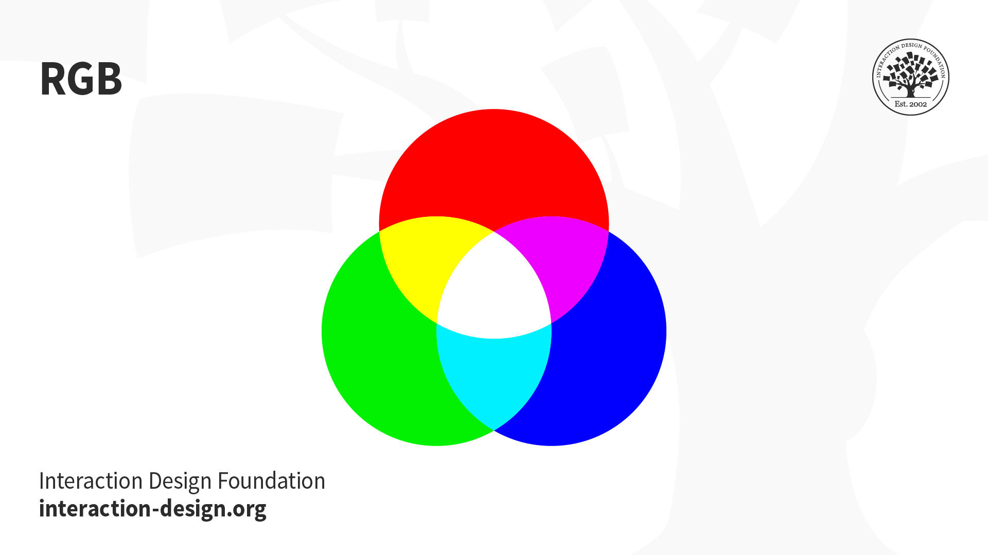
RGB: This color mode uses the additive process. It comprises Red, Green and Blue hues that combine to create extensive color variations.

© Daniel Skrok and Interaction Design Foundation, CC BY-SA 3.0
RGB exists exclusively in digital formats (e.g., mobile screens). Although RGB is present across most electronic devices, the color elements vary across systems and models. So, an image can display differently on-screen from brand to brand.
Uses:
Web & App Design.
Digital Design.
Online Advertisements.
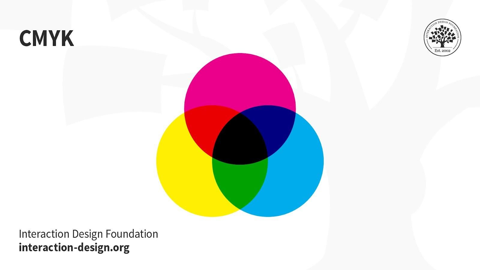
CMYK: This subtractive color mode comprises Cyan, Magenta, Yellow and Key (Black), which combine to produce a range of hues. This four-color process works for most printers.
© Daniel Skrok and Interaction Design Foundation, CC BY-SA 3.0
Printed images are a series of layered four-color dots (measured in dots per inch) that create different hues and gradations. Although CMYK is a standard color model, the exact range of colors represented can vary depending on the press and printing conditions.
Uses:
Stationery (e.g., business cards).
Advertising (e.g., posters, flyers, brochures).
Product Packaging.
Tip—Use CMYK mode when preparing an image to be printed with process colors, as image conversion from RGB to CMYK creates a color separation. If you start with an RGB image, it’s best to edit first in RGB and then convert to CMYK afterward.
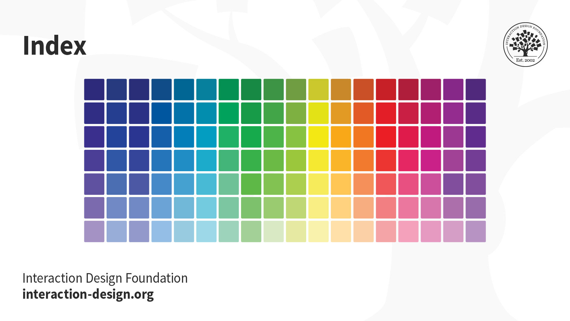
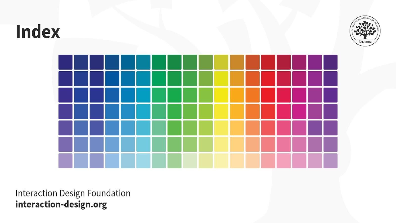
Index: This mode produces 8‑bit image files with up to 256 colors. Like RGB, this color mode is exclusively for digital formats, on-screen. When you convert an image to index color, a color table gets built to store and index the image’s colors.
© Daniel Skrok and Interaction Design Foundation, CC BY-SA 3.0
If a color in the original image doesn’t appear in the table, the software chooses the closest one or uses a dither effect to simulate the color.
Uses:
Websites.
Digital Presentations.
Mobile Applications.
While its color palette is limited, index color can reduce file size yet maintain the desired visual quality for digital presentations, websites and mobile applications. So, this mode is ideal for image optimization. For extensive editing, it’s best to convert temporarily to RGB mode.
Greyscale: This black-and-white-looking mode comprises various shades of grey within an image.

© Daniel Skrok and Interaction Design Foundation, CC BY-SA 3.0
You can use it in print and digital formats. In digital, each image pixel has a value ranging from 0 (black) to 255 (white). In print, the values range from 0% (white) to 100% (black), representing the amount of black ink used.
Uses:
Digital formats to express a specific tone in your designs.
Print formats to lower costs and minimize ink usage.
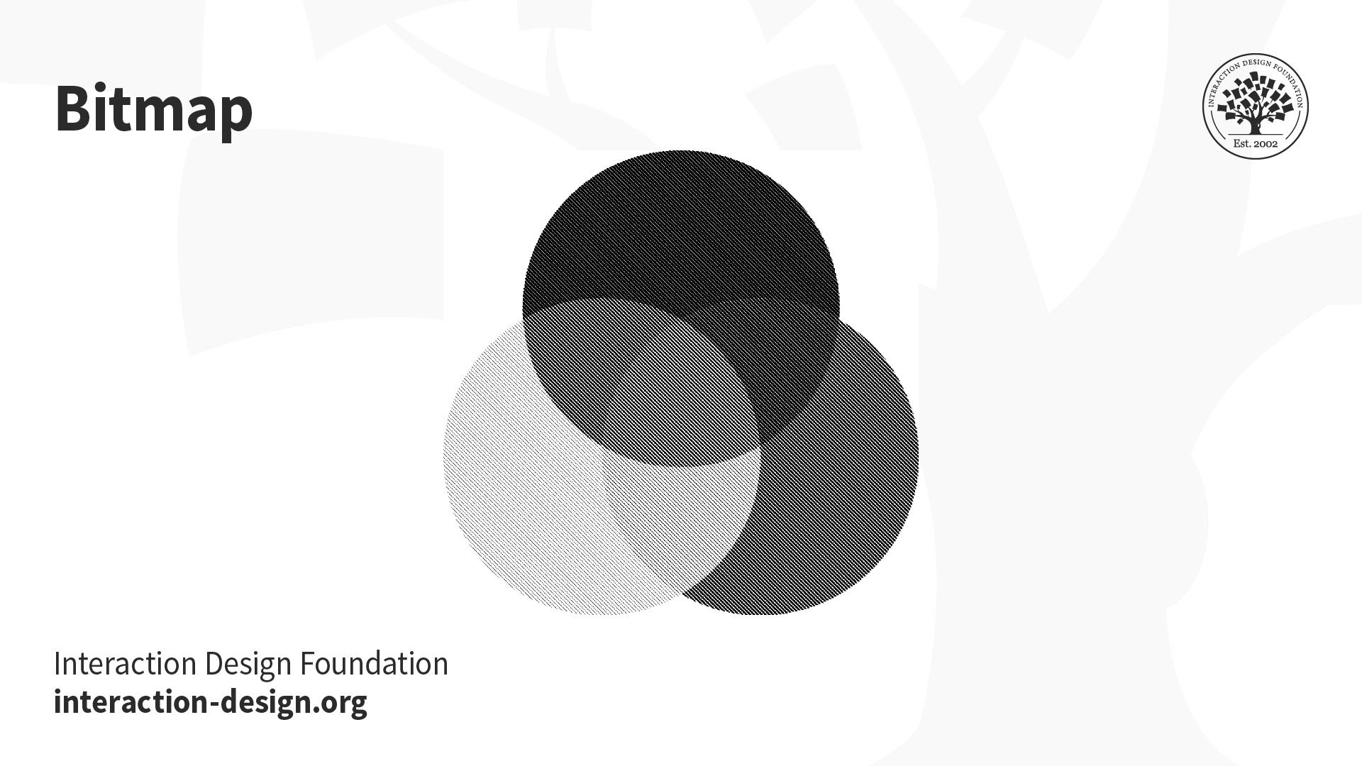
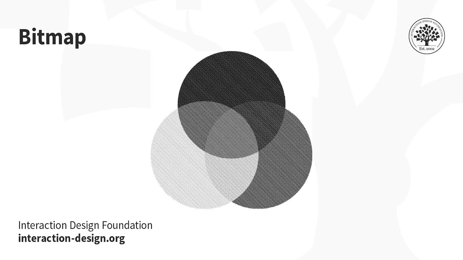
Bitmap (a.k.a. line art): This mode comprises black and white pixels, with no colors or shades of grey.
© Daniel Skrok and Interaction Design Foundation, CC BY-SA 3.0
In digital formats, black and white values represent an image’s pixels, while black ink dots and the white of the paper represent the overall image in print formats.
Uses:
Print and digital formats to create a line drawing or hand-drawn sketch or make vintage effects.
While jagged-edged on-screen, bitmap images usually print smoothly with high resolution.