
Part of the magic of how colors work together in impressive designs lies in the art of color selection. Designers often use complementary colors to craft visually appealing and efficient UX (User Experience). Complementary colors sit on the opposite ends of the color wheel, such as orange and blue, red and green, and yellow and purple, and play a key role in creating harmony while directing users' attention to key areas, such as calls-to-action. Read on to learn how to make the most of complementary colors in UX design.
© Interaction Design Foundation, CC BY-SA 4.0
Color Theory Fundamentals
First things first, visual arts and design use color theory as a conceptual framework; fundamental color theory explains how colors interact and how you can combine them to create different effects, which is why it’s important to know the fundamentals of color theory, and then you can make a design or artwork more effective and visually pleasing.
Discover the power of color and watch this video to see how color transforms perception and emotions.
The Science of Colors
Our perception of color stems from light waves that interact with our eyes and brain, and the color spectrum is made up of all colors that are visible to the human eye and ranges from red, with longer wavelengths, to violet, with shorter ones. The primary colors, red, blue, and yellow, are the building blocks for other hues, and mixing them gives secondary colors like green, orange, and purple, and the mix goes on to tertiary colors, and so broadens the designer's palette.
Color psychology is an important area, and it’s no mystery that colors influence mood and decisions. If we think about red, for example, it’s got a tendency to raise the heart rate and create a sense of urgency in many contexts (energy, passion, danger), while blue can instill a sense of calmness and serenity and actually boost productivity. What that means for you as a designer is that you can use these insights to shape effective and emotionally resonant designs that influence user behavior of your digital solution’s (and brand’s) target audience.
Color Harmony
Color harmony is essential in design, and what helps make this harmony a reality is a pleasing and balanced color palette. Harmonious colors enhance each other and create a sense of order that can help please (and direct) the eyes that see them, but without harmony, colors may clash to the point of visual chaos, or, in UX terms, frustrated users disliking and even abandoning a website or app.
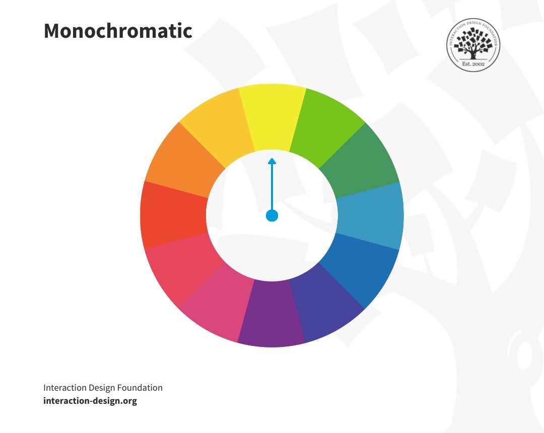
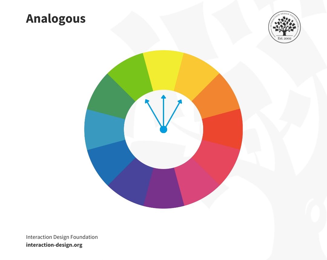
Simple harmonies include monochromatic schemes (variations in lightness and saturation of a single color) and analogous schemes (ones that use colors that sit next to each other on the color wheel) and these schemes are safe and guarantee visual coherence.
Color Context
Colors change in appearance and significance with their context, and the same color can look different when its surroundings have a contrast effect going on, and to pick the best color choices for your design solution calls for you to consider both individual colors and their relationship with other colors in the layout.
There’s another factor at play, too, and that’s cultural context, which plays a role because colors have different meanings in different cultures. For example, white indicates purity in many Western cultures, but it's a color of grief and mourning in some Eastern cultures and so you’ll need to be aware of these cultural connotations, especially in international settings.
Contrast and Accessibility
Contrast is a vital factor for visual clarity and accessibility, not least since high contrast between colors helps make for high readability, especially in text, and it's an essential thing for viewers with visual impairments like color blindness. Inclusive and accessible design is a big deal for digital designers, too, and it’s a legal requirement in many jurisdictions, making it critical for designers to comply with Web Content Accessibility Guidelines (WCAG) and have proper contrast feature as an important part of that.
Color Temperature
Color temperature refers to the warmth or coolness of a color, and warm colors like reds, oranges, and yellows evoke warmth and comfort and energize and capture attention. Then there are cool colors (like blues and greens) which convey calmness and professionalism and therefore create a sense of trust and stability. Use color temperature to set a mood or atmosphere in a space or design and you can shape how visitors to a website, for instance, register what they see as being aligned with, ideally, your brand message and the feelings you’re trying to evoke.
What Are Complementary Colors?
Complementary colors are opposite each other on the color wheel, and they create high contrast and vibrant looks when designers and artists use them together. Complementary colors include red and green, blue and orange, and yellow and purple, and artists and designers the world over often use these combinations to make elements stand out and grab their viewers.
Complementary colors also enhance visual appeal, and they balance each other, when one color often dominates and the other supports, and it’s a key concept in color theory as it impacts art, design, and even fashion.
Why Are Complementary Colors Important?
Complementary colors offer a vibrant look at full saturation, and they create a high level of contrast and make visual elements stand out, with benefits being in how you can use them to enliven your designs and to:
Create eye-catching visuals.
Give direct attention to critical design elements.
Keep viewers engaged.
Boost the clarity of text and make information more accessible.
Consider what Jeff Johnson, Assistant Professor, Computer Science Department, University of San Francisco, has to say on designing for older adults and enhance your skills for a more inclusive approach.
Evoke specific emotions from viewers.
Ensure there’s a visual equilibrium among design elements.
Use distinct color schemes to nurture brand identity.
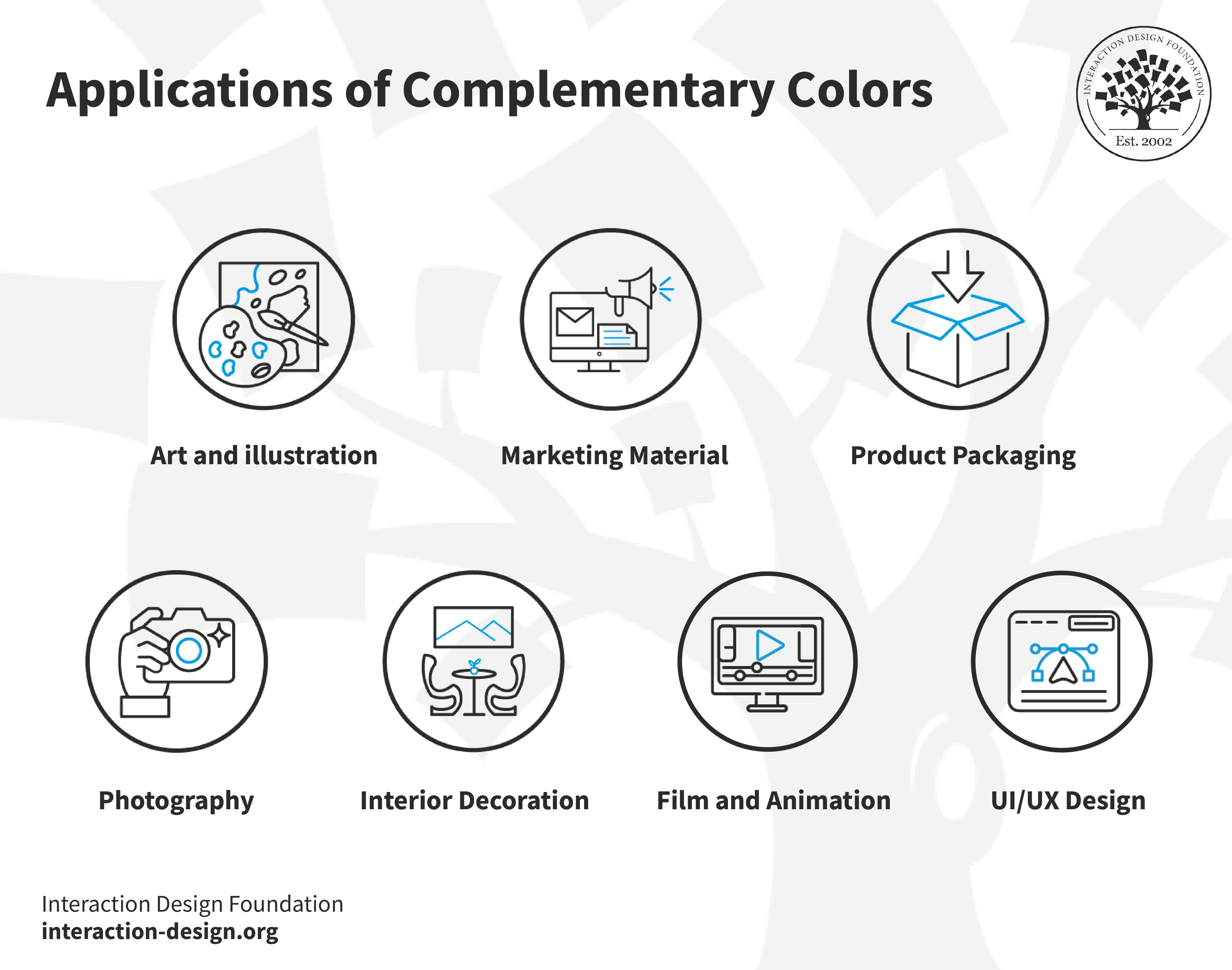
Applications of Complementary Colors
These dynamic color pairs don’t just improve functionality but establish a visual identity, too, and they appear a great deal in:
UX/UI design: Highlight buttons and links to improve navigation, for example, a "Buy Now" button in a complementary color from a UI color palette to the website's scheme will be nice and prominent.
Marketing material: Captivates viewers with vibrant ads and posters, and these materials use a list of complementary colors for effect.
Product packaging: Ensures that products stand out on the shelf to shoppers’ eyes.
Interior decorating: Creates inviting, balanced spaces with split complementary colors for a softer contrast.
Art and illustration: Adds depth and drama to artistic works.
Photography: Enhances the impact of images with strategic color contrasts.
Film and animation: Directs the viewer's gaze to help enhance the storytelling.
© Interaction Design Foundation, CC BY-SA 4.0
You have to understand when and how to use complementary and split-complementary colors. Split-complementary colors offer a twist on the traditional complementary scheme in that, instead of using opposite colors on the wheel, you pick one base color and use the two adjacent colors to complement it. This trio has a noticeable contrast, but it’s less intense than a direct complementary scheme and so it’s more flexible and gentle on the eyes.
What’s more, it’s important to recognize the difference between double-complementary color schemes, which use four colors arranged in two complementary pairs, and split-complementary schemes. Doing his helps you make effective design decisions and choose the right scheme to create impact and differentiation or guide the user’s attention where you want it to go.
Discover the science of sight: "Why Do We See Color?", a vivid journey into our world's hues.
The Basic Complementary Colors
In design, the right color combinations aren’t just about aesthetics, but are a language all on their own to communicate action, influence mood, and emphasize content. Here are foundational pairs of the color wheel:
Red and Green: A Vivid Contrast
Red paired with green offers a striking contrast in that red, often linked to urgency, finds a good balance with green's soothing qualities, and this duo often shows up in festive themes, for example, and in UX designs can be effective for attention-grabbing buttons or safety signs. With that said, it’s wise to avoid the combination of red and green for any significant amount of text, as it can be very taxing for users.
Blue and Orange: A Harmonious Balance
Blue and orange strike a harmonious balance that can conjure scenes like a sunset against a chilled sky, a favorite among designers because of how it can mix a sense of tranquility with vibrancy, and it’s a famous combination in movie palettes and website layouts.
Yellow and Purple: A Royal Pairing
Yellow and purple present a contrast that speaks of luxury and imagination in that the vividness of yellow set against the richness of purple can bring a regal touch to designs, and this pair is a handy go-to when you want to add sophistication to various creative projects.
Each pair uses stark contrast to capture attention and guide the viewer's eye, and you’ve got a powerful tool at hand when you use these fundamental complementary colors thoughtfully in that it can transform simple projects into works that are truly extraordinary and in line with what your brand wants to achieve when it helps users and customers.
See "Why Do Colors Change" and learn about the dynamic world of hues and their visual transformations.
What Is the Color Wheel and How to Use It?
The color wheel visually arranges colors so it shows their chromatic relationships, and it originates from Sir Isaac Newton's color circle. Renowned artists, designers, and educators use this tool to understand and apply harmonious color relationships to make the best use of aesthetically pleasing color effects and improve an impactful design’s overall look and feel with the right emotional responses.
How to Use the Color Wheel
Creating Color Harmony
Harmony is nothing short of vital in color theory and design, and the color wheel's complementary colors let you achieve through a balanced visual experience when you:
Use color wheel complementary colors for bold, vibrant contrasts.
Pick analogous colors for a serene and comfortable design.
Select triadic colors for a rich, dynamic feel.
Go for split-complementary colors for high contrast without the tension.
Go tetradic for a complex and nuanced palette.
Each approach serves a specific design purpose, and you’ll need to clearly understand color relationships if you’re going to create visually appealing and cohesive compositions that are right for your users (in intuitive and engaging interfaces) and right for your brand, when you align colors with the brand’s ethos.
Color Combinations
Color combinations are at the heart of captivating designs in that they create mood, guide attention, and shape experiences, and the most effective color schemes (used across various mediums and industries) include these ones below:

Monochromatic
A monochromatic color scheme uses variations in the lightness and saturation of a single color (just one color) and it’s an approach that makes for a cohesive, soothing aesthetic that often turns up in minimalist designs. It establishes mood and depth using shadow, tone, and highlight while it keeps color uniformity going strong.
© Interaction Design Foundation, CC BY-SA 4.0
Analogous
The adjacent colors on the color wheel form analogous color schemes, and they’re ones that provide a harmonious and visually pleasing effect because they’ve got more nuances while keeping the richness of the colors at play. Analogous colors can be an ideal pick if you want to create a serene and comfortable environment.
© Interaction Design Foundation, CC BY-SA 4.0
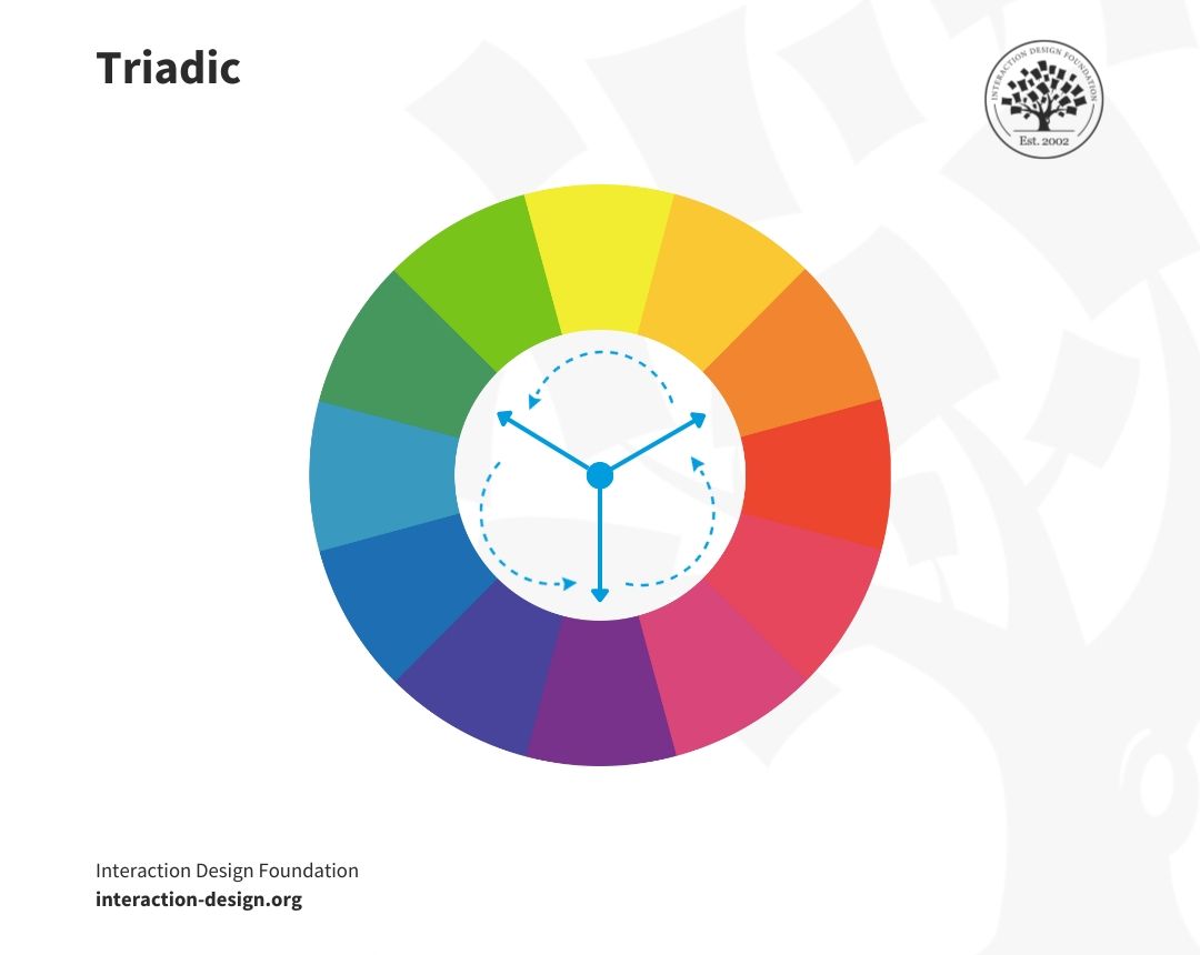
Triadic
Triadic color schemes are vibrant and dynamic, and for these you use three colors evenly spaced around the color wheel. A scheme that offers a high level of contrast along with balancing harmony, it’s ideal for making a lively and colorful design without overwhelming users.
© Interaction Design Foundation, CC BY-SA 4.0
Tetradic
The tetradic scheme, or double-complementary color scheme, involves four colors that get arranged into two complementary pairs. It’s a rich combination that gives plenty of variety and balances best with one dominant color, and tetradic often appears in bold and diverse palettes.
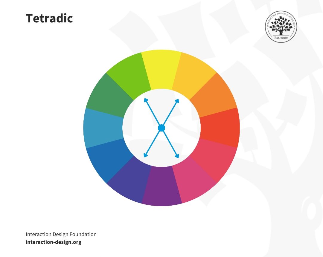
© Interaction Design Foundation, CC BY-SA 4.0
Beyond Basics
Designers often explore split-complementary color schemes so they can pick a base color and pair it with two colors next to its complement, and so give a softer contrast than a typical complementary scheme. One point about the results in designs that are eye-catching but less intense is how split-complementary avoids the sharp contrast of direct opposites like red and green, and that’s a nice touch to have.
It’s extremely helpful for you to understand the RYB (red, yellow, and blue) and RGB (red, green, and blue) color models, and you’ve got to know which colors complement each other, like the difference between magenta and cyan, so you can help yourself create designs that are both pleasing and balanced.
What’s more, you can also add images and illustrations for better explanation.
How to Use Cool and Warm Colors?
Cool and warm colors stir different emotions and can influence perception and behavior, so you’re going to have to know when and how to use them if you want to craft a truly effective user experience for your users and customers.
© Interaction Design Foundation, CC BY-SA 4.0
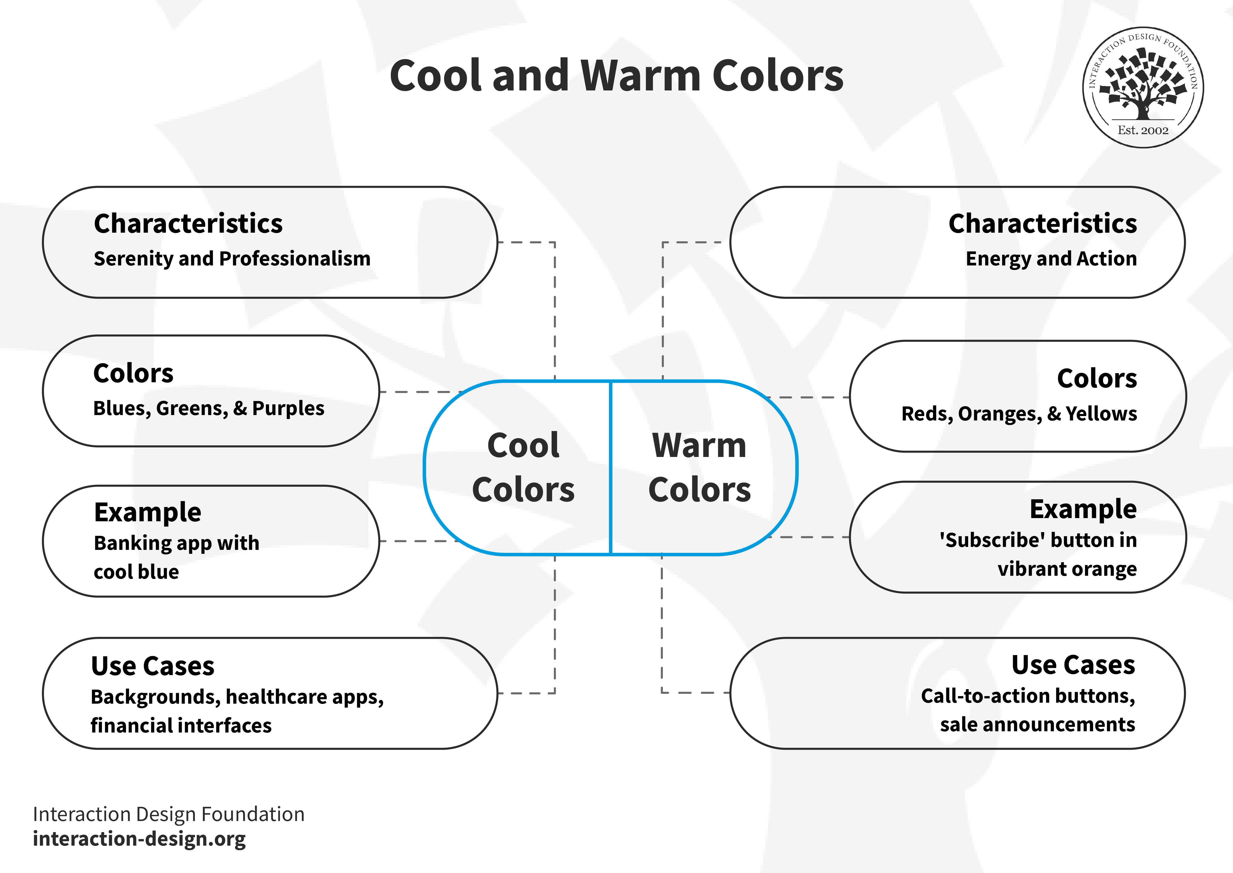
Cool Colors: Serenity and Professionalism
Cool colors like blues, greens, and purples evoke calmness and professionalism, and they work well in backgrounds, healthcare apps, and financial interfaces, where trust and tranquility are paramount. Think of a banking app, for example, which might feature a cool blue to promote security and stability.
Warm Colors: Energy and Action
Warm colors like reds, oranges, and yellows reflect energy and urgency. They’re excellent picks for call-to-action buttons, sale announcements, or anywhere you want to draw attention, like a vibrant orange for a "Subscribe" button, as it stands out and encourages users to take action.
Color Modes: The Backbone of Visual Design
You’ll need to understand color modes if you want to apply cool and warm hues well in digital design, and to make sure that the colors that appear on screens actually do achieve their intended emotional effect to resonate with the viewers, or users, and customers.
Balance for Harmony
A mix of cool and warm colors can make a user interface more attractive, and if you think of a fitness app, for example, cool colors can make for a calming background. Warm colors, on the other hand, can draw attention to critical features like workout challenges, and it’s a combination that doesn’t just look good but encourages and excites users, and can guide your target audience in the best way.
At any rate, you’ll need to pick the right colors to make your design both beautiful and functional, help keep users interested and engaged, stay in tune with their cultural expectations of color, and create designs that pass the tests of effectiveness, accessibility, and time.
Complementary Colors Generator
Get a complementary color generator working for you and have it in your toolkit to revolutionize your design process. This interactive feature can help you find the perfect color pairs for your projects, and with a click, the generator displays colors opposite the color wheel, a tool that can empower you to create appealing palettes with ease.
The Take Away
Complementary colors, with their high contrast and vibrant interaction, are fundamental parts of how you as a designer can create attractive and emotionally resonant designs. You’ll need to:
Understand the color wheel to identify complementary colors.
Use complementary colors to enhance readability and focus in design.
Appreciate how cool and warm complementary colors evoke different moods and responses.
Incorporate a complementary color generator to expedite the design process.
When you grasp these concepts, you can apply complementary colors in just the right ways in your projects and deliver maximum impact to your users and customers and for your brand.
References and Where To Learn More
See Cameron Chapman’s in-depth piece for insights, tips, and examples of color theory at work.
Read Tubik Studio’s guide for concepts associated with color theory and color scheme examples.
Learn color modes.
Understand in detail about color symbolism.


