Visual design is about creating and making the general aesthetics of a product consistent. To create the aesthetic style of a website or app, we work with fundamental elements of visual design, arranging them according to principles of design. These elements and principles together form the building blocks of visual design, and a firm understanding of them is crucial in creating a visual design of any product.
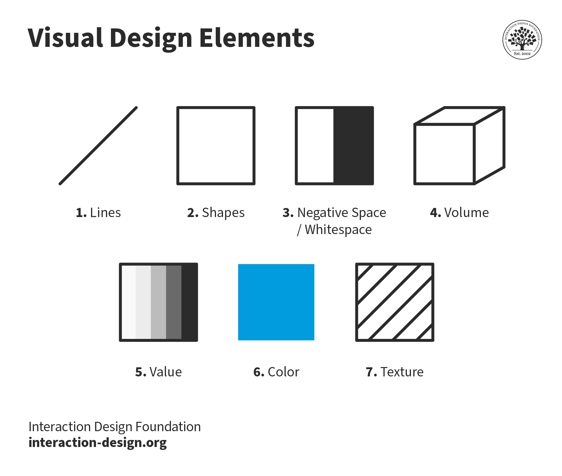
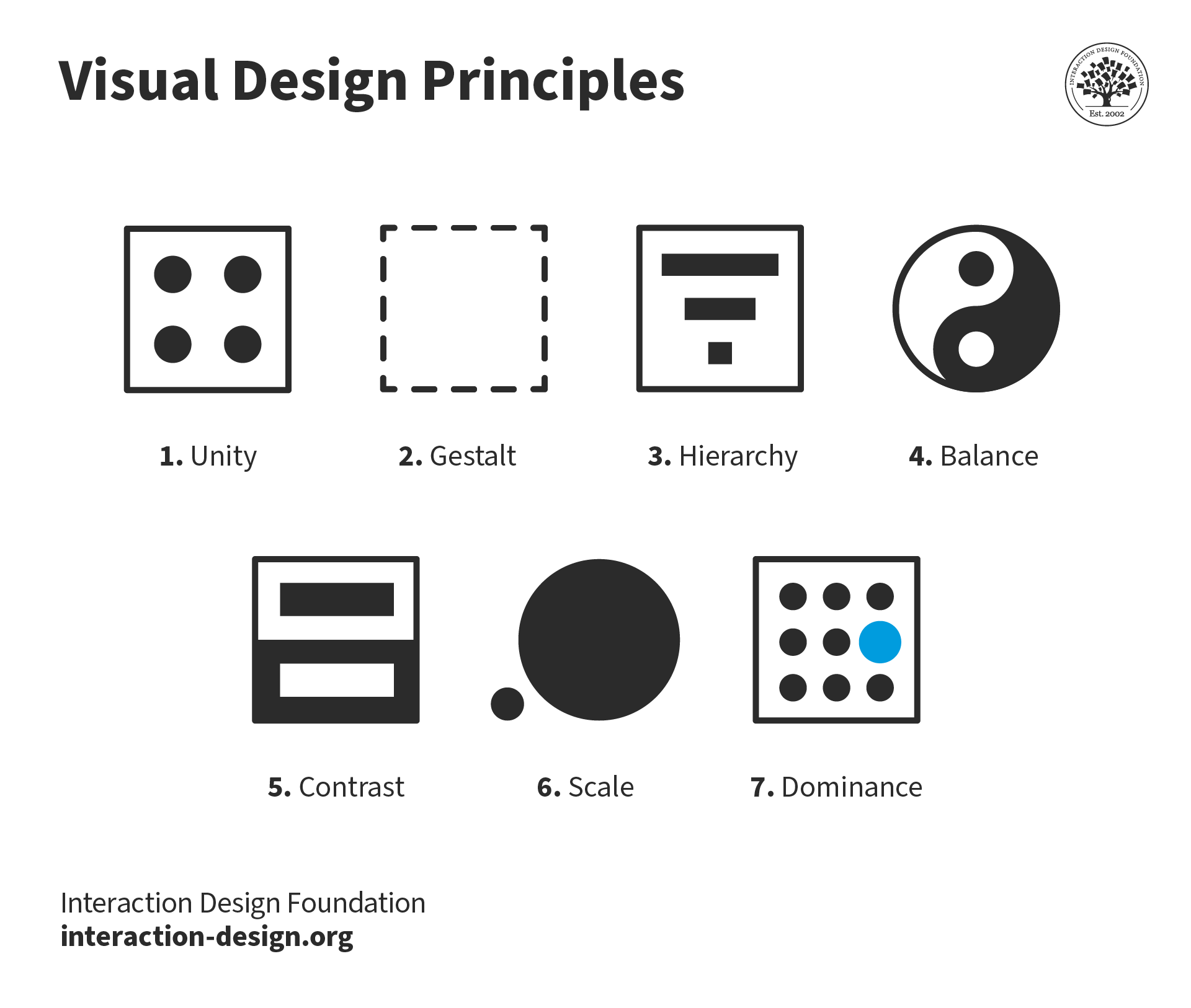
Here, we’ll introduce you to the elements of visual design: line, shape, negative/white space, volume, value, colour and texture. While a close examination of each element is usually not necessary in your daily work as a designer, the principles of design — how to place the elements together to build pages and app screens optimally — play a crucial part in your role. Learning how to achieve unity, gestalt, hierarchy, balance, contrast, scale, dominance, and similarity will reward you time and again. Here, we will also show you how you should consider placing these indispensable visual elements to make the maximum impact. So, let’s begin.
Elements of Visual Design
Any product — from software products such as websites and apps to hardware products such as toasters and hairdryers — can be broken down into fundamental elements of visual design, as described by Alan Hashimoto, associate professor of Graphic Design and Computer Art at Utah State University, and Mike Clayton, director and associate professor of Computer Graphic Arts at the University of the Incarnate Word, in their book, Visual Design Fundamentals: A Digital Approach. These elements are the basic tools that we visual designers use in our daily work, and having a basic understanding of them is definitely a prerequisite for the job.
Line
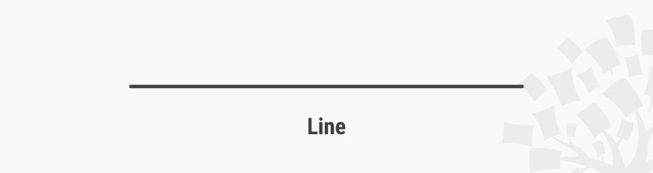
Lines are strokes connecting two points, and the most basic element of visual design. We can use them to create shapes, and when we repeat them, we can form patterns that create textures.
 Teo Yu Siang and Interaction Design Foundation, CC BY-NC-SA 3.0
A line connects two points and is the simplest element of design. Put it this way, you can’t strip down any lower than a one-dimensional object in the world of design. (In science, you can, but that’s another story.)
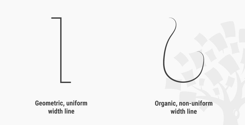
Although simple, lines can possess a large variety of properties that allow us to convey a range of expressions. For example, lines can be thick or thin, straight or curved, have uniform width or taper off, be geometric (i.e., look like they are drawn by a ruler or compass) or organic (i.e., look like they are drawn by hand).
 Teo Yu Siang and Interaction Design Foundation, CC BY-NC-SA 3.0
Lines are simple, but can convey different emotions by using different properties.
A line can also be implied: that is, suggested by forming an invisible connection between other elements. In the logo of the Interaction Design Foundation, for instance, the words “Interaction Design Foundation” around the tree connect to create a semicircular implied line.
 Teo Yu Siang and Interaction Design Foundation, CC BY-NC-SA 3.0
The words “Interaction Design Foundation” form an implied semicircular line in our logo.
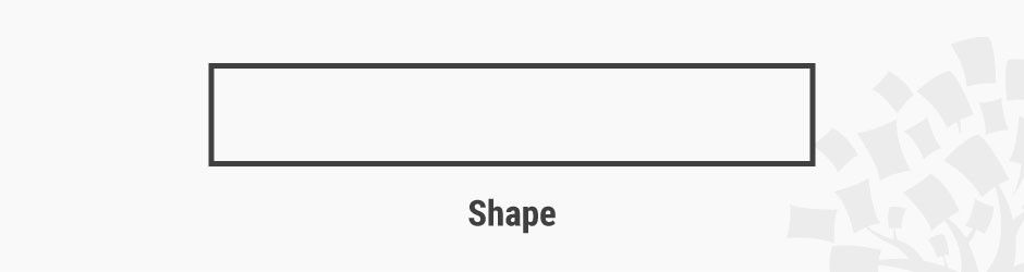
Shape
Shapes are self-contained areas, usually formed by lines (although they may also be formed by using a different colour, value or texture). A shape has two dimensions: length and width.
 Teo Yu Siang and Interaction Design Foundation, CC BY-NC-SA 3.0
We can form shapes using lines (as above), or by using differences in colour, texture or value.
We tend to identify objects by their basic shapes, and only focus on the details (such as lines, values, colours and textures) on closer inspection. For this reason, shapes are crucial elements that we designers use for quick and effective communication.
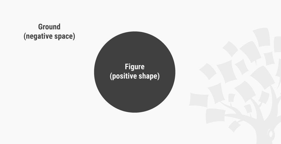
Negative/White Space
Negative space (also known as white space) is the empty area around a (positive) shape. The relation between the shape and the space is called figure/ground, where the shape is the figure and the area around the shape is the ground. We should be aware that when designing positive shapes, we are also designing negative spaces at the same time. Negative space is just as important as the positive shape itself — because it helps to define the boundaries of the positive space and brings balance to a composition.
 Teo Yu Siang and Interaction Design Foundation, CC BY-NC-SA 3.0
Negative space, also called white space, is the empty area around a positive shape. You can choose to see this as a blue ball set against a light blue rectangle — or, is it a light blue rectangle with a hole in it?
Some designs make use of negative space to create interesting visual effects. For example, the famous World Wide Fund for Nature (WWF) logo makes use of the confusion between positive shape and negative space to create the image of a panda.
 World Wide Fund for Nature (WWF), Fair Use
WWF’s logo doesn’t explicitly draw out the entire panda: it cleverly uses negative (white) space around the black shapes to suggest the rest of the panda.
Volume
Volume applies to visuals that are three-dimensional and have length, width and depth. We rarely use volume in visual design, because most digital products end up being viewed on a 2D screen, although some apps and websites do use 3D models and graphics. (Technically, though, 3D images viewed on a 2D screen are still 2D images.)
 Teo Yu Siang and Interaction Design Foundation, CC BY-NC-SA 3.0
Volume has 3 dimensions: length, width and depth. This image is a simulation of volume in 2D graphics.
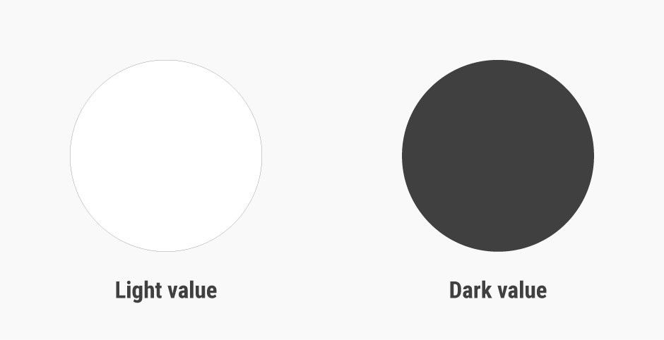
Value
Value, quite simply, describes light and dark.
 Teo Yu Siang and Interaction Design Foundation, CC BY-NC-SA 3.0
Light value vs. dark value: value describes lightness and darkness.
A design with a high contrast of values (i.e., one which makes use of light and dark values) creates a sense of clarity, while a design with similar values creates a sense of subtlety. We can also use value to simulate volume in 2D, for instance, by using lighter values where the light hits the object and darker values for shadows.
 Teo Yu Siang and Interaction Design Foundation, CC BY-NC-SA 3.0
Differences in values create clear designs, while designs using similar values tend to look subtle.
Advance Your Career With This Free Template
for “Visual Design Principles”
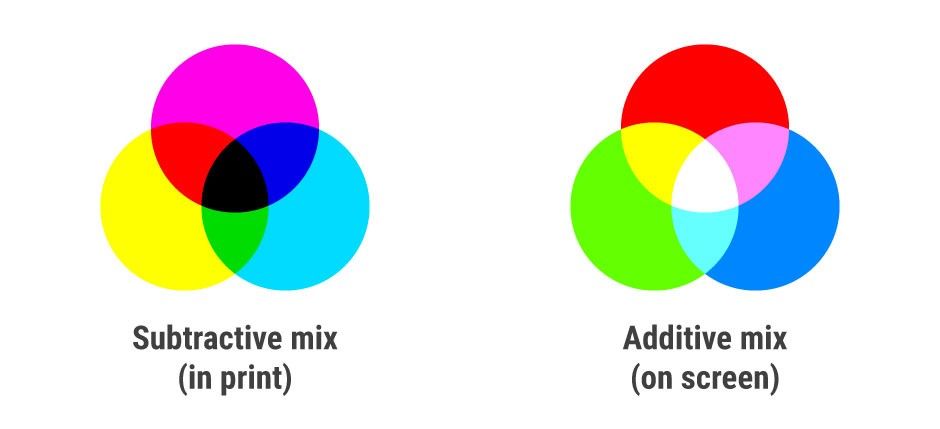
Colour
Colour is an element of light. Colour theory is a branch of design focused on the mixing and usage of different colours in design and art. In colour theory, an important distinction exists between colours that mix subtractively and colours that mix additively.
In paint, colours mix subtractively because the pigments in paints absorb light. When different pigments are mixed together, the mixture absorbs a wider range of light, resulting in a darker colour. A subtractive mix of cyan, magenta and yellow will result in a black colour. A subtractive mix of colours in paint and print produces the CMYK (i.e., Cyan, Magenta, Yellow and blacK) colour system.
In digital design, where the product shows up on a screen, colours mix additively, since the screen emits light and colours add to one another accordingly. When different colours are mixed together on a screen, the mixture emits a wider range of light, resulting in a lighter colour. An additive mix of red, blue and green colours on screens will produce white light. An additive mix of colours on digital screens produces the RGB (i.e., Red, Green, Blue) colour system.
 Teo Yu Siang and Interaction Design Foundation, CC BY-NC-SA 3.0
The subtractive mix of colours in paint and print produces the CMYK colour system. The additive mix of colours on digital screens produces the RGB colour system.
We use colours in visual design to convey emotions in and add variety and interest to our designs, separate distinct areas of a page, and differentiate our work from the competition.
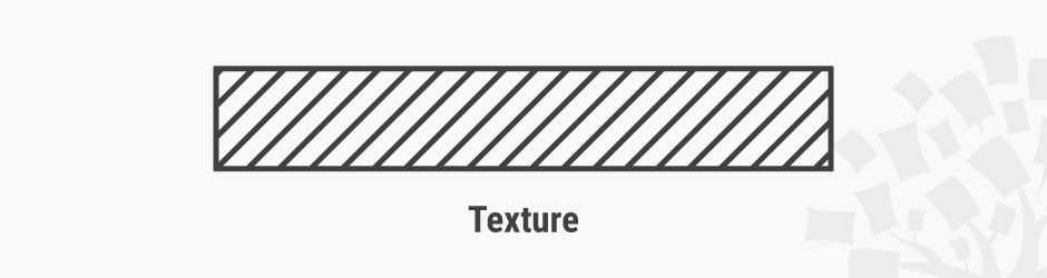
Texture
Texture is the surface quality of an object.
 Teo Yu Siang and Interaction Design Foundation, CC BY-NC-SA 3.0
Texture can be created by a repeated pattern of lines, or by using tiled images of textures. Above, the diagonal lines add a ‘grip’ effect to an otherwise ‘smooth’ rectangle.
As a designer, you can work with two types of textures: tactile textures, where you can feel the texture, and implied textures, where you can only see — i.e., not feel — the texture. Most visual designers will work with implied textures, since screens (at least as far as the state of the art had pushed them by the mid-2010s) are unable to produce tactile textures.
The app icon designs in iOS 6 and earlier mimic the glossy texture of glass to incite users to tap them. Later, Apple (in)famously introduced a linen fabric texture to much of its user interface. With the popularity of flat design (a minimalist style that features clean spaces and two-dimensional, flat illustrations), the use of textures in visual design would greatly decrease by the mid-2010s — although they can still be very useful.

Unknown, Fair Use
iOS 1-6 app icons feature a glossy texture so that they look like actual buttons.
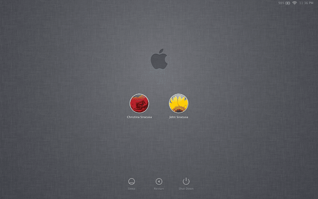
Unknown, Fair Use
Around 2011, Apple introduced a widespread use of linen texture (which first appeared on iOS) in all of its operating systems.
Visual Design Principles
The elements of visual design — line, shape, negative/white space, volume, value, colour and texture — describe the building blocks of a product’s aesthetics. On the other hand, the principles of design tell us how these elements can and should go together for the best results. Many of the principles below are closely related and complement one another.
Just how important are principles of design to a visual designer’s job? Partner and chief research and development officer at the Applied Management Sciences Institute William Lidwell, in his landmark and widely referenced book Universal Principles of Design, explains:
“The best designers sometimes disregard the principles of design. When they do so, however, there is usually some compensating merit attained at the cost of the violation. Unless you are certain of doing as well, it is best to abide by the principles.” – William Lidwell
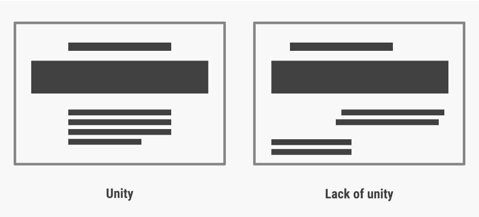
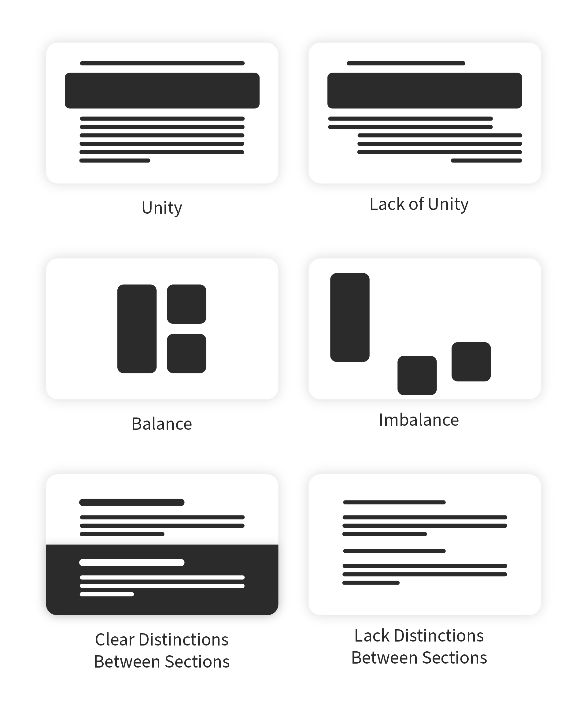
Unity
Unity has to do with creating a sense of harmony between all elements in a page. A page with elements that are visually or conceptually arranged together will likely create a sense of unity.
 Teo Yu Siang and Interaction Design Foundation, CC BY-NC-SA 3.0
A lack of unity in designs can create a sense of unease and chaos. Our eyes govern our judgements.
When we’re designing websites, we can make use of a grid for achieving a sense of unity, since elements organised in a grid will follow an orderly arrangement. We do need, however, to introduce some variety in our work in order to strike a balance between a boring and a chaotic design.
Gestalt
Gestalt refers to our tendency to perceive the sum of all parts as opposed to the individual elements. The human eye and brain perceive a unified shape in a different way to the way they perceive the individual parts of such shapes. In particular, we tend to perceive the overall shape of an object first, before perceiving the details (lines, textures, etc.) of the object.
 Teo Yu Siang and Interaction Design Foundation, CC BY-NC-SA 3.0
Gestalt is the reason that we can see a square, circle and triangle even though the lines are not complete. We see the whole formed by the dotted lines first, before perceiving the separate dotted lines in each of the images.
The WWF logo, shown earlier, is an example of making use of the principle of gestalt to create interesting designs. By placing the parts of a panda near one another and strategically, the design makes use of our tendency to view the whole of an image rather than its parts, thereby creating an illusion of a panda.
Gestalt is important, for instance, in making separate sections of a website distinct by increasing the white space between them. As designers, we should make sure that the parts of a website we group together by using gestalt principles — i.e., if they are close to one another, have the same shape, and/or are similarly sized — are indeed conceptually grouped together. “Accidentally” grouping elements which are not conceptually similar will result in confused users.
Teo Yu Siang and Interaction Design Foundation, CC BY-NC-SA 3.0
Designs with clear sections are easier to process and scan than those without clear distinctions between sections — especially if the sections are conceptually distinct.
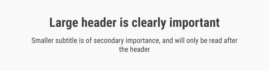
Hierarchy
Hierarchy shows the difference in importance of the elements in a design. Colour and size are the most common ways we can create hierarchy — for instance, by highlighting a primary button, or using larger fonts for headings. Items that appear at the top of a page or app also tend to be viewed as having a higher hierarchy than those appearing below.
 Teo Yu Siang and Interaction Design Foundation, CC BY-NC-SA 3.0
Font size and style is one of the ways to establish hierarchy.
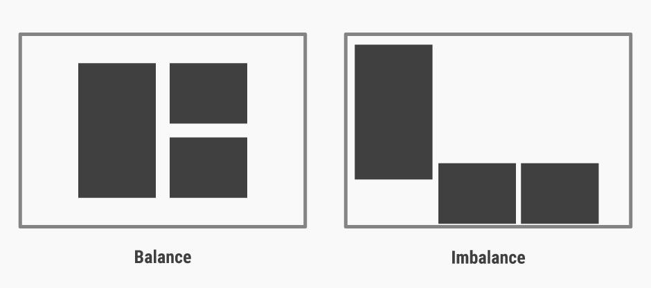
Balance
Balance is the principle governing how we distribute the elements of a design evenly. Balanced designs tend to appear calm, stable and natural, while imbalanced designs make us feel uneasy.
 Teo Yu Siang and Interaction Design Foundation, CC BY-NC-SA 3.0
Balanced designs appear stable, while imbalanced designs seem unsustainable and unnatural.
Balance can be achieved by having symmetry in the design (for instance, having a webpage with centralised text and images). However, you can also achieve balance without symmetry — perhaps unsurprisingly, this is known as asymmetrical balance. We achieve asymmetrical balance when we arrange differently sized elements in a way that results in unity. We can imagine a centre point of the design and distribute the elements in a way that creates balance.
Contrast
We use contrast to make an element stand out by manipulating differences in colour, value, size and other factors. For instance, as designers (be it in logo design, UI design, etc.), we often use the colour red to make certain elements stand out. In iOS, red often appears in the “Delete” action to signify that an (often) irreversible action is about to occur. On the other hand, green is often something we use (at least in Western design) in positive actions such as “Go” and “Accept” — thus highlighting that we cannot ignore the cultural meaning of colours when designing for contrast. If you’re designing for a client in a far-off land, learn about and adjust your work to conform to the cultural considerations. For instance, ask yourself, “Is their red lucky or angry?” or “Is their black businesslike or funerary?”
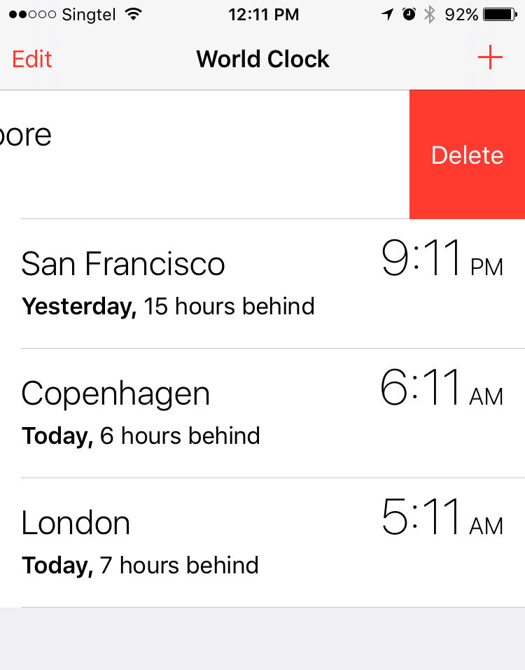
Teo Yu Siang and Interaction Design Foundation, CC BY-NC-SA 3.0
Red, a colour with high contrast, is used widely in iOS for the “Delete” function.
Scale
Scale describes the relative sizes of the elements in a design. By using scale to make an element larger than others appearing with it, you can emphasise that element. Not only can you make an element stand out this way—you can also use scale to create a sense of depth (since nearer objects appear larger to the human eye). Exaggerated scales of images also add a certain level of interest and drama to them.
 Teo Yu Siang and Interaction Design Foundation, CC BY-NC-SA 3.0
Scale can be used to create a hierarchy for and add emphasis to certain elements on a design.
Dominance
Dominance creates focus on a single element. We can use colour, shape, contrast, scale, and/or positioning to achieve this. For instance, most websites have a main “hero” image, which uses dominance to appeal to users, drawing them to it naturally.
 Teo Yu Siang and Interaction Design Foundation, CC BY-NC-SA 3.0
Dominance can be established by using positioning, shape and colour, among many other factors.
When working in visual design, we should ensure that we use dominance while still maintaining the unity and balance of websites — if not, the design would potentially produce a disorienting experience for users.
Examples of Visual Design Elements and Principles
With the elements of visual design and design principles in mind, we will analyse a few websites to see how they come together, and why the designs work.
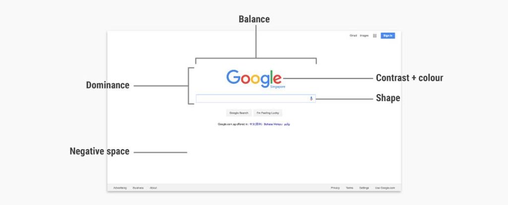
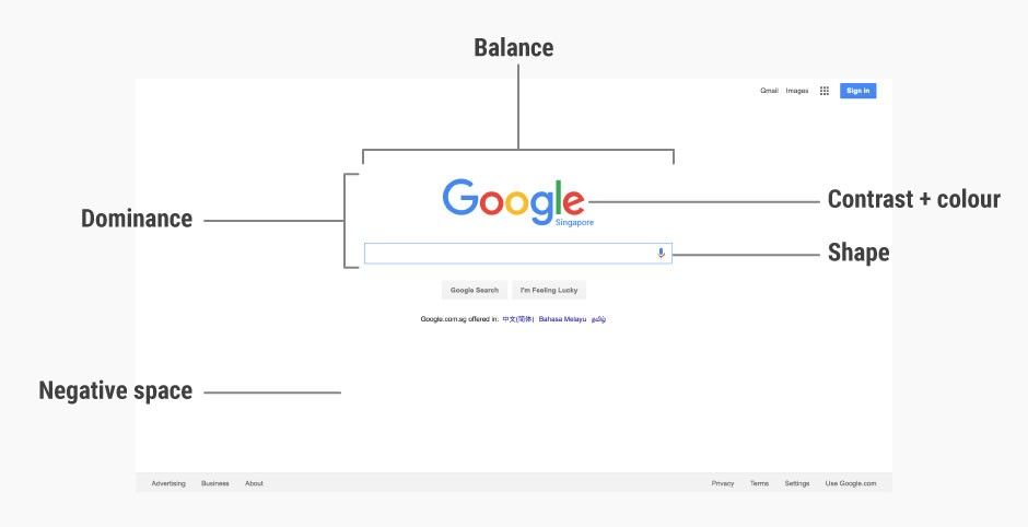
Google’s homepage
Google’s homepage is one of the most visited webpages in the world. The raw simplicity of the page is partly why it is so well designed, but here are other factors that make this page work superbly:
 Google Inc., Fair Use.
Dominance: The large Google logo and search box gives it dominance, making it the core (and to most, sole) focus of the entire page.
Contrast (and colour): Google’s logo uses bright (mostly primary) colours, and these mix well, forming a visually pleasing logo. The logo also has sufficient contrast against a white background, making it stand out on the page.
Shape: The search box uses a rectangular shape to delineate the search field, making it very usable.
Negative space: Google’s homepage is predominantly made out of negative space, which makes the search box (the main function of the page) the centre of attention. The negative space also works well for the page, as it acts like a blank sheet of paper before users type in their search terms.
Balance: The page is almost vertically symmetrical, resulting in a sense of balance that is very pleasing and calm to look at.
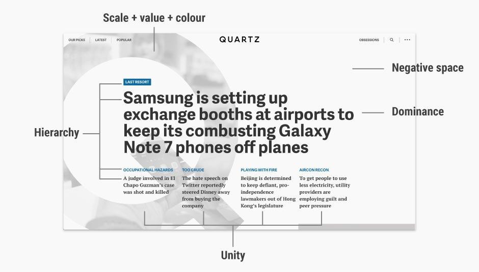
Quartz’s homepage
Quartz is a digital-first and mobile-first news agency with a global audience, launched in 2012 by Atlantic Media, which also publishes The Atlantic. It has a bold homepage that puts the featured news stories front and centre. Here’s how the principles of design and design elements come together:
 Quartz, Fair Use.
It’s easy to admire the effect as a whole without looking past it at the nuts and bolts—the elements that are set together so well and according to age-old principles so as to create that ‘wow’ effect.
Dominance: The main news story immediately catches your eyes because its large, bold font makes it dominant on the homepage.
Hierarchy: The homepage uses a clear hierarchy to establish the relative importance of various elements. The main story, with the largest text and bolded weight, has the highest hierarchy. The next four stories, positioned below the main story, have smaller fonts to show their subordinate hierarchy under the main story.
Scale, value and colour: Quartz’s homepage features a large (full page height) “Q”, which is a mask of the hero image for the main story. The large “Q” quickly establishes the identity of the website (since “Q” stands for “Quartz”) with the use of scale. However, the relative light value and greyscale colour of the “Q” makes it fade into the background, thus bringing the overall focus to the headline of the main story instead.
Negative space: Most of the homepage is negative space, which allows the content to shine through. When the mouse is brought over the main story headline, the “Q” mask disappears, filling the negative space with the featured image. This is an example of how a unique play of negative space can stimulate interest in a website’s design.
Unity: Quartz uses a grid system in its website to create a sense of unity. For instance, the four stories have equal width and are uniformly spaced, creating a sense of orderliness and structure.
Advance Your Career With This Free Template
for “Visual Design Elements”
The Take Away
The elements of visual design make up the fundamental building blocks of a product. While we as visual designers do not really need to examine each element closely in our daily work, the principles of design — how to place the elements together to build pages and app screens optimally — do play a crucial part in what we do. Learning how to achieve unity, gestalt, hierarchy, balance, contrast, scale, dominance, and similarity will be extremely useful as you work in visual design.
So, using your elements, namely:
Line
Shape
Negative space
Volume
Value
Colour
Texture
and gearing them around the principles, namely:
Unity
Gestalt
Hierarchy
Balance
Contrast
Scale
Dominance
—will enable you to produce winning results consistently.
References & Where to Learn More
Alan Hashimoto and Mike Clayton, Visual Design Fundamentals: A Digital Approach, 2004
William Lidwell, Universal Principles of Design, 2003
Digital Communications Division in the U.S. Department of Health and Human Services, Visual Design Basics.


