Mobile First

Your constantly-updated definition of Mobile First and collection of videos and articles.
Be a conversation starter: Share this page and inspire others!

295 Shares

What is Mobile First?

Mobile first design is an approach that embraces the constraints of smaller screens and focuses on what’s indispensable for users to improve the overall mobile User Experience (UX).

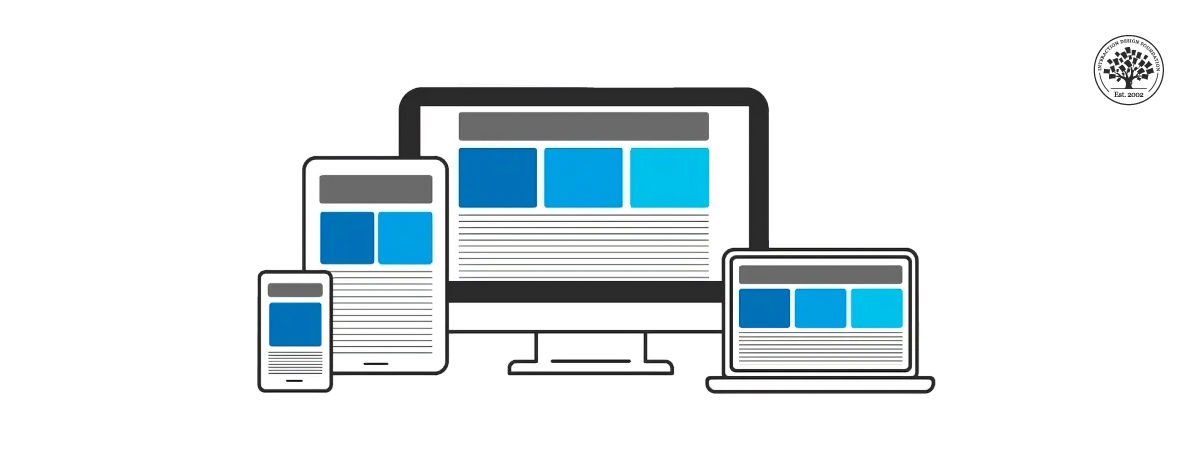
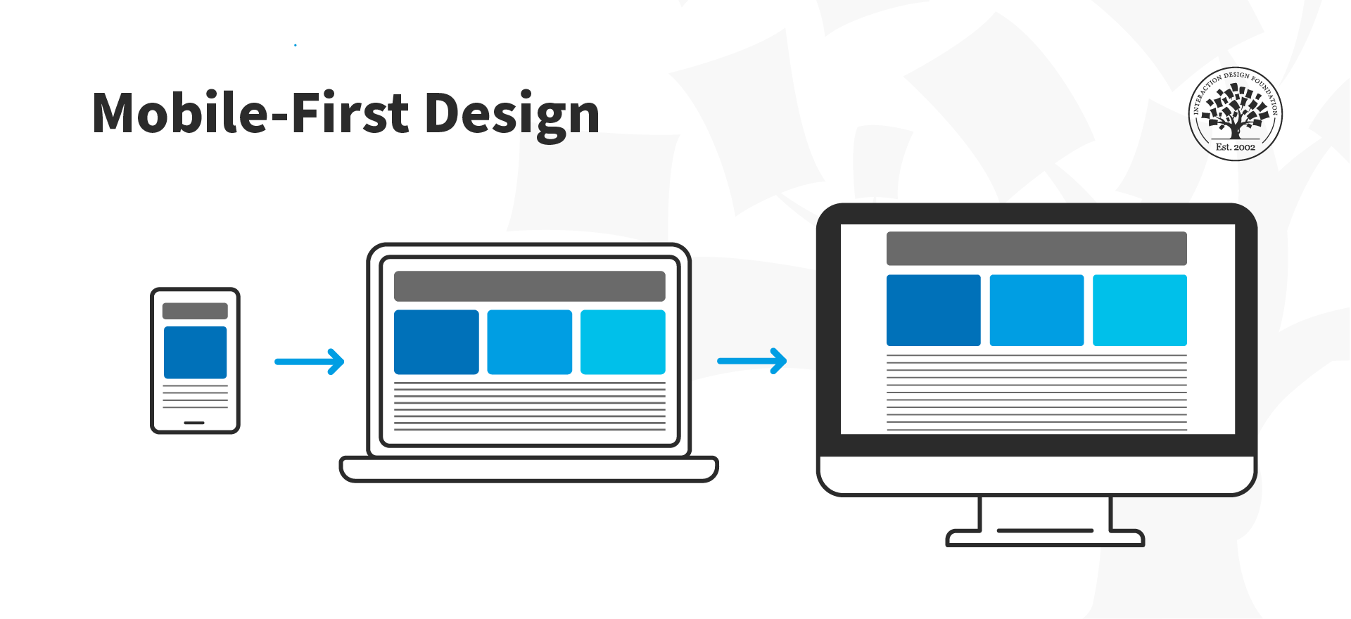
The mobile first design approach involves starting the product design process by designing for the smallest device first and progressively enhancing the design features for larger layouts—e.g., start designing for mobile and then move on to desktop. 

© Interaction Design Foundation, CC BY-SA 4.0

There are other approaches to mobile UX design, like content-first or task-oriented design. Mobile first was initially proposed in 2009 by Luke Wroblewski, Google's Product Director. In his book Mobile First, Wroblewski explains that designing web products, starting with the desktop version, is becoming a backward way of thinking about design. Instead, he suggests adopting the mobile-first approach, which forces the designer to focus and enables innovation.

Progressive Enhancement vs. Graceful Degradation

Mobile first supports itself in the concept of progressive enhancement. This web design strategy emphasizes web content first, providing universal access to essential content and allowing users with additional browser features or faster internet to receive an enhanced version of the same page.

Progressive enhancement shares some commonalities with another well-known web design concept, "graceful degradation." One of them is their goal of making content available for all and how it looks in different browsers. However, the difference is that graceful degradation focuses on designing for the most capable and up-to-date web browsers. At the same time, progressive enhancement is concerned solely with content availability, which is why it is preferred for modern web design.

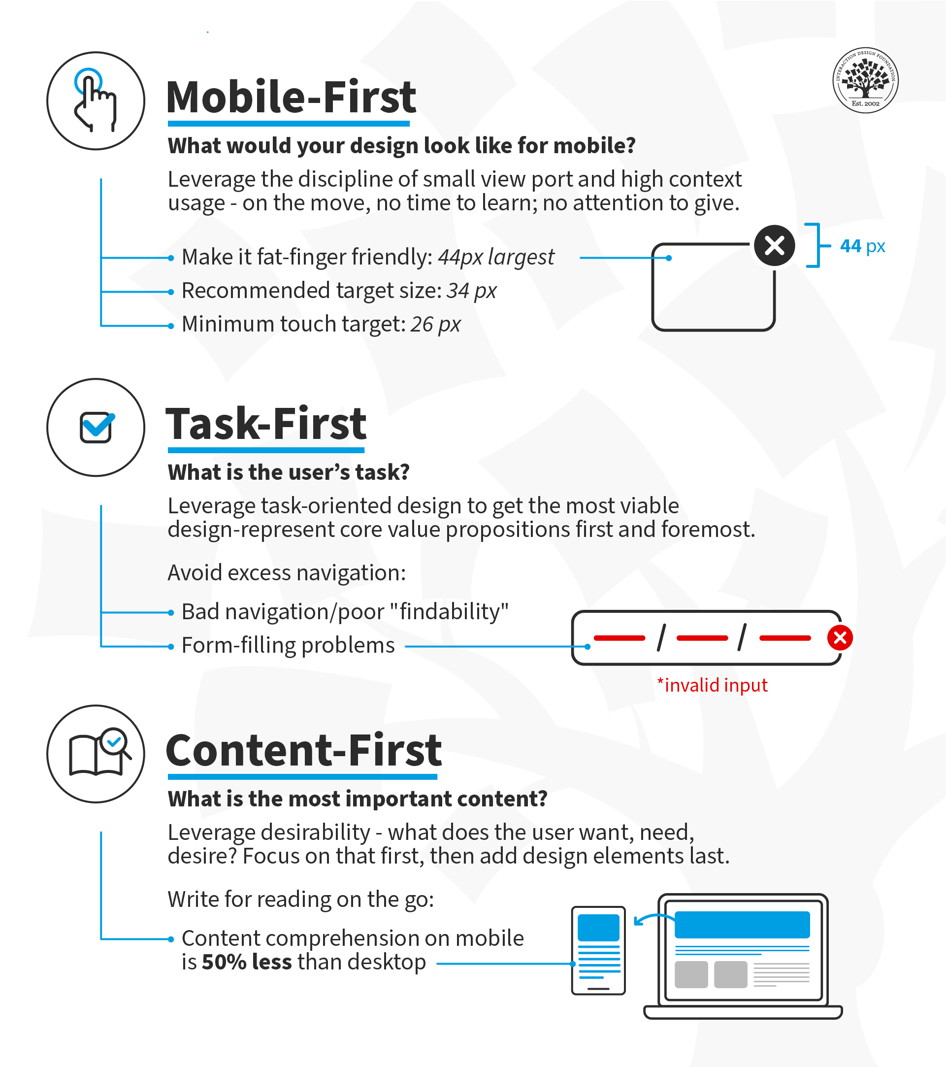
Mobile First Approach Core Principles

  1. Keep it simple: Consider white space as another design element you can use in your favor. White space enables you to maintain a clean, clutter-free layout that is free of distractions. Similarly, ensure your navigation contains only the most essential items, as human memory can only store between 5 and 9 items.

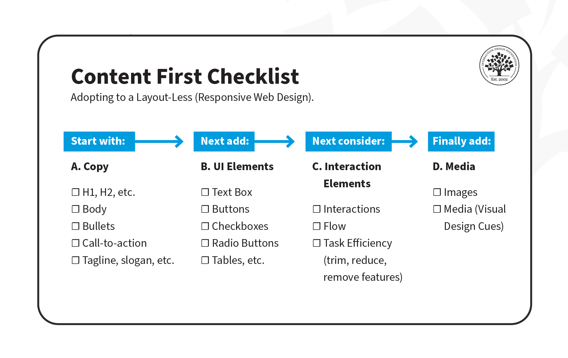
  2. Visual hierarchy: Mobile first is content-first, so focus on providing a clear and concise experience by prioritizing information. In other words, show your users what content is most important by using headings, paragraphs, captions, and other text styles to get your message across.

  3. Optimize text for visual scanning: Users do not read; they scan. People will look for patterns systematically to make sense of what is in front of them, such as from left to right or top to bottom. You can take advantage of that quirk and position your most important information following a known pattern. Also, add the most critical bits of information above the fold and use short paragraphs no longer than two or three sentences.

  4. Do not use hover effects on mobile, as they are impossible to implement. Instead, use touch or slide events. Furthermore, "think app" and utilize the gestures that users already know.

  5. Leave complex graphs and images for the desktop version: optimize your images so there are no awkward cuts on mobile.

  6. Make your design fat-finger-friendly: this means designing wide tap targets no smaller than 30px (Apple recommends at least 44px). When you create tap elements that are easy to find and click, you are also building a more accessible web environment.

  7. Consider the context of use.

    A mobile first approach is about keeping the user at the forefront of your design efforts and concentrating on delivering content clearly and concisely. This means the content should load before anything else, so ensure your images have appropriate alt-text descriptions, which also helps your website to improve its SEO rankings.

    Information architecture becomes critical when using the mobile first approach, as it helps weed out unnecessary details. You can also use a content inventory document to help you organize and visualize the elements you wish to include.

Questions About Mobile First?
We've Got Answers!

Why should designers use a mobile-first approach?

Designers should use a mobile-first approach because most people now access the internet on their phones. If a website or app works well on mobile, it will likely work well on larger screens too.

First, mobile-first design improves usability. Smaller screens force designers to focus on the most important content and features. This keeps the experience simple and clear for all users.

Second, Google ranks mobile-friendly sites higher in search results. A mobile-first approach helps businesses reach more people.

Third, faster load times improve user experience. Designing for mobile first ensures lightweight, efficient pages that perform well even on slow connections.

Last, but not least, mobile-first design increases accessibility. Many people rely on phones as their only device. Prioritizing mobile ensures they get a smooth, inclusive experience.

By designing for the smallest screen first, designers create products that work better for everyone.

Watch as CEO of Experience Dynamics, Frank Spillers explains important points about mobile-first design and more in this video:

Transcript

Take our course Mobile UX Strategy: How to Build Successful Products with Frank Spillers.

How is mobile-first different from responsive design?

Mobile-first and responsive design both ensure a good user experience across devices, but they take different approaches.

Mobile-first design starts with the smallest screen. Designers create a product for mobile devices first, then scale up for tablets and desktops. This approach keeps interfaces simple, improves performance, and ensures the most important features remain clear.

Responsive design adapts layouts to different screen sizes. Designers create a flexible grid that adjusts based on the user’s device. The design does not necessarily prioritize mobile but ensures everything looks good on all screens.

The key difference is starting point and priority. Mobile-first focuses on essential content and performance first—from the start. Responsive design ensures adaptability but may not optimize for mobile needs first.

From using a mobile-first approach within a responsive framework, designers create faster, more user-friendly experiences across all devices.

Watch our video about responsive design:

Transcript

Enjoy our Master Class How to Differentiate Your Mobile UX with Frank Spillers, CEO at Experience Dynamics.

What are the key principles of mobile-first design?

The key principles of mobile-first design ensure a smooth, efficient experience on smaller screens.

First, prioritize essential content. Start with the most important information and features, then add extras for larger screens.

Second, design for touch. Make buttons large enough to tap easily, avoid tiny links, and leave enough space between interactive elements.

Third, keep layouts simple. Use a clean, uncluttered design that helps users find what they need quickly.

Fourth, optimize performance. Minimize images, reduce code bloat, and ensure fast loading times, especially for slow connections.

Fifth, use scalable typography. Choose readable fonts and sizes that adjust well across different screen sizes.

Last, but not least, ensure accessibility. Accessible design is a vital consideration, so use high-contrast colors, clear labels, and alternative navigation options for all users.

Watch as CEO of Experience Dynamics, Frank Spillers explains important points about mobile-first design and more in this video:

Transcript

Take our course Mobile UX Strategy: How to Build Successful Products with Frank Spillers.

How do designers prioritize content in a mobile-first design?

Designers prioritize content in a mobile-first design by focusing on what users need most. Small screens require clear, essential information without distractions to help bring about mobile-first experiences that feel intuitive, load quickly, and provide real value.

First, identify core content. Determine what users must see first to complete tasks quickly. Remove anything unnecessary.

Second, use a clear visual hierarchy. Place the most important elements at the top and use bold headings, short paragraphs, and clear buttons to guide users.

Third, keep navigation simple. Limit menu items and avoid deep navigation structures that force users to tap too many times.

Fourth, place critical actions above the fold. Ensure users see key buttons or information without scrolling.

Last, but not least, design for scanning. Users do not read word for word. Use bullet points, whitespace, and clear sections to help them find information fast.

Watch as CEO of Experience Dynamics, Frank Spillers explains important points about mobile-first design and more in this video:

Transcript

Take our course Mobile UX Strategy: How to Build Successful Products with Frank Spillers.

What are common mistakes in mobile-first design?

Designers often make common mistakes in mobile-first design that hurt usability and performance.

First, they overload the screen with content. Mobile-first requires prioritizing essential information and removing clutter. Too much text or too many elements confuse users.

Second, they use small tap targets. Buttons and links must be at least 44px wide so users can tap them easily without frustration.

Third, they ignore performance. Large images, unoptimized code, and unnecessary animations slow down loading times, which drives users away (and might make the brand behind the design less popular with them).

Fourth, they forget about accessibility. Low contrast, tiny fonts, and difficult navigation exclude many users. Designers must ensure clear text, good color contrast, and multiple ways to navigate.

Last, but not least, they neglect real-world testing. Simulating mobile screens on a desktop isn’t enough and may be asking for trouble in this sense. Testing on actual devices helps identify usability problems and delivers an authentic mobile experience.

Watch as CEO of Experience Dynamics, Frank Spillers explains important points about mobile-first design and more in this video:

Transcript

Take our course Mobile UX Strategy: How to Build Successful Products with Frank Spillers.

How does mobile-first impact layout and navigation?

Mobile-first design impacts layout and navigation by simplifying structure and prioritizing ease of use on small screens.

First, it creates a clean, focused layout. Designers remove unnecessary elements and emphasize key content, ensuring users see the most important information first.

Second, it simplifies navigation. Instead of complex menus, designers use clear icons, collapsible menus, or bottom navigation bars that users can reach with one hand.

Third, it ensures responsive scaling. Designers build layouts that expand naturally for larger screens without losing usability. Starting small prevents bloated desktop designs.

Fourth, it prioritizes touch-friendly interactions. Buttons, links, and form fields must be large enough to tap easily, with enough space to avoid accidental clicks.

Last, but not least, it optimizes scrolling. Mobile-first layouts encourage vertical scrolling instead of forcing users to click through multiple pages.

Watch as Author and Human-Computer Interaction Expert, Professor Alan Dix explains important points about navigation:

Transcript

Take our course Mobile UX Strategy: How to Build Successful Products with Frank Spillers.

How do designers scale mobile-first designs to larger screens?

Designers scale mobile-first designs to larger screens by expanding layouts while keeping the experience clear and usable, so making for seamless experiences.

First, they add more space and structure. White space, larger margins, and multi-column layouts make content easier to read on bigger screens.

Second, they enhance navigation. A simple mobile menu can become a visible navigation bar on desktops, reducing the need for extra clicks.

Third, they introduce additional content. While mobile-first focuses on essentials, larger screens allow for supporting details, sidebars, or extra tools without overwhelming users.

Fourth, they adjust typography and images. Text can scale up for readability, and higher-resolution images ensure clarity on bigger displays.

Last, but not least, they maintain consistency. The core design remains the same, but interactions, spacing, and layout adapt smoothly to different screen sizes.

Take our course Mobile UX Strategy: How to Build Successful Products with Frank Spillers.

Read our piece What Comes First in Mobile Design: Tasks, Content, or Mobile Optimization? for additional insights into how mobile-first design is unique.

How does mobile-first design work with progressive enhancement?

Mobile-first design works with progressive enhancement by building a strong foundation for all users and then adding advanced features for larger screens. Combining mobile-first design and progressive enhancement means designers can create scalable, inclusive, and efficient digital experiences.

First, designers start with essential content and functions. They ensure the core experience works well on mobile devices with limited space and processing power.

Second, they enhance for larger screens. As screen size increases, designers introduce more layout options, additional content, and richer interactions without breaking the mobile experience.

Third, they improve interactions. Mobile-first ensures touch-friendly navigation, while progressive enhancement adds hover effects, keyboard shortcuts, and advanced animations for desktops.

Fourth, they optimize performance. Small-screen users get a fast, lightweight experience, while larger devices handle high-resolution images, videos, and complex layouts.

Last, but not least, they maintain accessibility. Every user gets a functional experience, regardless of device or connection speed.

Watch as CEO of Experience Dynamics, Frank Spillers explains important points about mobile-first design and more in this video:

Transcript

Take our course Mobile UX Strategy: How to Build Successful Products with Frank Spillers.

What are some successful examples of mobile-first design?

Several successful examples show how mobile-first design creates fast, user-friendly experiences.

First, Airbnb built its platform with mobile users in mind. The app uses large buttons, clear navigation, and simple booking steps to ensure a smooth experience.

Second, Instagram started as a mobile-first app. Its scrolling feed, touch-friendly interactions, and minimal design make it easy to use on small screens.

Third, Spotify designed its app to work smoothly on mobile before scaling to desktops. Large touch targets, intuitive navigation, and offline downloads improve usability.

Watch as CEO of Experience Dynamics, Frank Spillers explains important points about mobile-first design and more in this video:

Transcript

Take our course Mobile UX Strategy: How to Build Successful Products with Frank Spillers.

Wroblewski, L. (2011). Mobile first. A Book Apart.

Luke Wroblewski’s Mobile First is a pioneering book that emphasizes designing for mobile experiences before expanding to larger screens. He argues that starting with mobile constraints forces designers to prioritize essential content and interactions, resulting in cleaner, more effective designs. The book explores mobile growth, design constraints, capabilities, and best practices, guiding readers through creating user-centered mobile experiences. Wroblewski provides data-driven insights and practical techniques for leveraging mobile-friendly layouts, navigation, and touch-based interactions. This book has become a fundamental resource for UX designers and developers aiming to create responsive, user-friendly digital experiences in an increasingly mobile-centric world.

Earn a Gift Earn a Gift, Answer a Short Quiz!

1
2
3
4
1
2
3
4
Question 1
Question 2
Question 3
Get Your Gift
Interaction Design Foundation logo

Question 1

What is the main focus of mobile-first design?

1 point towards your gift

  • Design for desktop devices first and then scale down.
  • Ignore the desktop experience completely and only design for mobile users.
  • Prioritize mobile devices and progressively improve features for larger screens.
Interaction Design Foundation logo

Question 2

What design strategy does mobile-first rely on to make sure content is accessible?

1 point towards your gift

  • Fixed layouts
  • Graceful degradation
  • Progressive enhancement
Interaction Design Foundation logo

Question 3

Why is it important to design wide tap targets in mobile-first design?

1 point towards your gift

  • To increase the size of any CTA button on the screen
  • To make the interface look more professional
  • To support touch interactions and improve accessibility

Learn More About Mobile First

Make learning as easy as watching Netflix: Learn more about Mobile First by taking the online IxDF Course Mobile UI Design.

Why? Because design skills make you valuable. In any job. Any industry.

In This Course, You'll

  • Get excited about creating mobile apps that people love to use! If you've ever felt like you're not reaching your potential, this is your chance to fast-track your career. You'll build real confidence and shape your personal brand to stand out. With limited screen space and most of us constantly on the go, your mobile experience must be as effortless as possible. Did you know people delete 3 out of 10 apps within 30 days of downloading them? In this course, you'll get the skills to confidently design intuitive User Interfaces (UIs) that keep people coming back. It's easier than you think, even if design is completely new to you.

  • Make yourself invaluable with proven mobile UI design best practices that help your apps stand out in a crowded marketplace. Every swipe, tap, and scroll matters. People judge your app within seconds. If you want to discover the secret to easy-to-use mobile app designs that hook users from the start, this course is for you. As AI supports new mobile UI components and faster production, timeless human-centered design skills help you decide layout, hierarchy, and touch targets that work on small screens. That’s what turns AI from a superficial add-on into a real superpower for designing clear, usable mobile interfaces. The result? Mobile UIs that people can't put down. And more loyalty means more revenue.

  • Gain confidence and credibility with step-by-step templates that help you easily apply your new, impactful methods. Use them in your job or to build your portfolio. In the optional portfolio projects, you'll apply UI design patterns to make people feel at home as you redesign a mobile app feature and incorporate Augmented Reality (AR). You'll improve engagement and adoption as you learn how to avoid cognitive friction and design notifications for better mobile interactions. Fast-track your projects with ready-to-use templates like the Heuristic Evaluation Sheet and Mobile UI Design Checklist. This course will give you a high-demand skill set that'll future-proof your career across industries.

It's Easy to Fast-Track Your Career with the World's Best Experts

Master complex skills effortlessly with proven best practices and toolkits directly from the world's top design experts. Meet your experts for this course:

  • Frank Spillers: Service Designer and Founder and CEO of Experience Dynamics.

  • Mia Cinelli: Associate Professor of Art Studio and Digital Design at the University of Kentucky.

  • Joann Eckstut: Color Consultant, Founder of The Roomworks, and one of the 12 designers chosen by the Color Association of the USA to create the yearly forecast used by industries to keep up with color trends.

  • Arielle Eckstut: Author, Agent-at-large at the Levine Greenberg Rostan Literary Agency, and Co-Founder of The Book Doctors and LittleMissMatched.

  • Ellen Lupton: Award-winning Author, Designer, and Senior Curator of Contemporary Design at Cooper Hewitt, Smithsonian Design Museum, as well as Professor at the Maryland Institute College of Art (MICA).

Get an Industry-Recognized IxDF Course Certificate

Increase your credibility, salary potential and job opportunities by showing credible evidence of your skills.

IxDF Course Certificates set the industry gold standard. Add them to your LinkedIn profile, resumé, and job applications.

Course Certificate Example

Be in distinguished company, alongside industry leaders who train their teams with the IxDF and trust IxDF Course Certificates.

Our clients: IBM, HP, Adobe, GE, Accenture, Allianz, Phillips, Deezer, Capgemin, Mcafee, SAP, Telenor, Cigna, British Parliament, State of New York

All Free IxDF Articles on Mobile First

Read full article
What Comes First in Mobile Design: Tasks, Content, or Mobile Optimization? - Article hero image
Interaction Design Foundation logo

What Comes First in Mobile Design: Tasks, Content, or Mobile Optimization?

For many users worldwide, mobile was their first Internet experience and continues to be their primary way to access information. This is also true for people who don't need to use computer desktops, particularly since smartphone applications have dramatically changed how we live our lives. Here, we

Social shares
692
Published
Read Article
Read full article
How to Optimize Your Designs for Smartphones vs Tablets - Article hero image
Interaction Design Foundation logo

How to Optimize Your Designs for Smartphones vs Tablets

There are clear differences between smartphones and tablets and key differences in how users interact with them, which ultimately affects mobile user experience (UX) design. Here you’ll learn these differences so that your designs can satisfy both usage scenarios.It has become an industry standard t

Social shares
757
Published
Read Article
Read full article
How to Craft Effective Mobile Experiences: The Role of Content Strategy and UX Writing - Article hero image
Interaction Design Foundation logo

How to Craft Effective Mobile Experiences: The Role of Content Strategy and UX Writing

People use their devices in search of content: to solve problems, get information, consume entertainment, or do work. Therefore, content must be the primary consideration for UX design. Learn how to prioritize content to ensure the longevity of your mobile web content or app.In 1996, Bill Gates wrot

Social shares
530
Published
Read Article

What Comes First in Mobile Design: Tasks, Content, or Mobile Optimization?

What Comes First in Mobile Design: Tasks, Content, or Mobile Optimization?

For many users worldwide, mobile was their first Internet experience and continues to be their primary way to access information. This is also true for people who don't need to use computer desktops, particularly since smartphone applications have dramatically changed how we live our lives. Here, we'll look at three UX approaches to design for a world that relies heavily on mobile to solve problems for entertainment, health, wellness and more. 

© Frank Spillers and Interaction Design Foundation, CC BY-SA 4.0

Distractions surround mobile users. Hence, when you design for mobile, you must prioritize what is important for the user: give them what they need and do it efficiently within their changing environments and contexts.

We can consider three approaches to design interactions for mobile:

  1. Mobile-First: Design for small screen sizes first and then expand to larger device sizes. Users are on the move; they can spare neither time nor attention. Under these constraints (movement, time, attention), decide what makes sense on your screen(s). 

  2. Task-First: Design the core value proposition first. Focus on the users' primary task and support successful task completion.

  3. Content-First: Start with Desirability—what does the user want, need and desire? Design the content around that desire and add the other elements of user experience (interactions, interfaces and usability) afterward. 

What is Mobile-First?

In the mobile-first design approach, you start your design process with mobile users in mind first and then scale up to larger screen sizes. This means you prioritize the mobile experience and ensure all your content and features are accessible on smaller screens. Another way to approach mobile-first is to prioritize content from the outset so that even if you begin your design process on a larger screen, you still have the flexibility to show your content effectively in a mobile environment.

Luke Wroblewski, a Product Director at Google, proposed this concept in 2009 and offered three reasons for designing for mobile first. Here, we've updated Luke's arguments for going mobile first to reflect the new mobile landscape:

1. Mobile Has Exploded

It's undeniable that the use of smartphones has become ubiquitous in today's society. Ensure your app provides an exceptional user experience across different platforms and screen sizes to reach a global audience.

2.  Mobile Forces You to Focus

Regardless of device specifications, the one thing that's key to all mobile devices is portability. People use them on the move, which means that you must focus on the most important actions and tasks for your users.  

There's much more room on a desktop screen, and you can afford to add extraneous features, but smartphones don't give you that luxury. Remember that the user experience on smartphones is also determined by how they're used—on the move and in short, sharp bursts of activity, which is very different from sitting at a desk and browsing the internet for hours on end.

© Interaction Design Foundation, CC BY-SA 4.0

 3. Mobile Offers New Capabilities

On desktop, the web is the standard way to interact with most businesses, but on mobile, the preference has shifted to applications. This is due to smartphones' many sensors and features, such as GPS, accelerometers, pedometers, touchscreens, gesture controls, augmented reality, and eye tracking.

The mobile-first approach enables designers to leverage the full potential of mobile, rather than replicate the desktop experience on a smaller screen.

© Interaction Design Foundation, CC BY-SA 4.0

What Is Task-First?

This approach prioritizes user tasks over other design considerations, such as aesthetics or technical feasibility. This ensures the app is designed with the users’ needs in mind, resulting in a more efficient and practical experience. By focusing on user tasks, designers can also identify pain points in existing workflows and streamline them to improve overall user satisfaction.

For example, let's look at an application like Shazam, designed with a task-first approach. Its primary function is to assist users to identify songs playing in their vicinity. The app achieves this thanks to its clean layout and user-friendly interface that makes it easy for users to complete the main task without any extra distractions or complications.

The Shazam app features a clean interface that helps users accomplish the main task: to identify music playing nearby.

© Interaction Design Foundation, CC BY-SA 4.0

The Task-First approach prioritizes giving users what they want as quickly and easily as possible without requiring them to hunt, search, or think too much.

What Is Content-First?

The concept of a content-first approach has been around since the early days of web design, but it gained new relevance with the rise of responsive design. The basic idea is that content should be the primary focus of mobile UX design, as users come to apps and sites primarily for the content they offer rather than for the interface's design.

As UX designers, we often focus on interfaces and wireframes, but the content-first approach suggests that we should define the content structure first and then add UI and interaction elements later.

There are three stages to this approach:

  1. Copy: Create clear and concise copy that conveys the intended message to users. This may include defining typography, font sizes, and heading structure (H1, H2, H3, H4, H5), which is critical for accessibility. Properly defined headings make it easier for screen readers to parse a page.

  2. UI Elements: Once the copy is defined, it's time to add UI elements such as buttons, icons and graphics that support the content and help guide users through their tasks.

  3. Interaction Elements: Add animations and transitions to enhance the user experience.

© Experience Dynamics, Fair Use

Interested in adopting the content-first approach? Here's a helpful checklist to assist you on your transition. Download the template, and share it with your team!

Advance Your Career With This Free Template for “How to Use the Content-First Design Approach”
How to Use the Content-First Design Approach
We respect your privacy
Get 1 powerful email each week: Design a life you love!

Put It All Together: A Demonstration of Mobile-, Task- and Content-First Approach

Now that we've covered the three approaches, let's see them in action! In this video, Frank Spillers will show you how to create an interface for a health app that enables patients to chat with doctors. He'll use examples from each approach: mobile-first, task-first, and content-first.

Transcript

The Take Away

It's important to understand the unique challenges and opportunities of the mobile platform. Here are three powerful prioritization approaches to keep in mind:

Mobile-First: Mobile-First is a design strategy that puts mobile at the forefront of the design process. It recognizes the importance of the mobile web and emphasizes the need to create an experience tailored specifically to mobile devices. 

Task-First: Task-First prioritizes users' tasks. It helps them complete tasks quickly and efficiently and minimizes cognitive load. This approach is particularly well-suited for mobile devices since users are often on-the-go and need to complete tasks quickly.

Content-First: Content-First puts content at the center of the design process. Rather than starting with wireframes or UI elements, this approach begins by defining the content structure first. This allows designers to optimize experiences for different contexts, physical or otherwise.

References and Where to Learn More

Read Luke Wroblewski’s original proposition for Mobile First.

See Clayton Lewis and John Rieman’s original definition of task-centered design in Task-Centered User Interface Design: A Practical Introduction.

More about content first in these articles:

To know why the heading structure is crucial for accessibility, see this resource:
Accessibility at Penn State 

Read the forecast number of mobile users worldwide from 2020 to 2025, from Statista.

Hero Image: © Interaction Design Foundation, CC BY-SA 4.0

Feel Stuck?
Want Better Job Options?

AI is replacing jobs everywhere, yet design jobs are booming with a projected 45% job growth. With design skills, you can create products and services people love. More love means more impact and greater salary potential.

At IxDF, we help you from your first course to your next job, all in one place.

See How Design Skills Turn Into Job Options
Privacy Settings
By using this site, you accept our Cookie Policy and Terms of Use.
Customize
Accept all

Be the One Who Inspires

People remember who shares great ideas.

Share on:

Academic Credibility — On Autopilot

Don't waste time googling citation formats. Just copy, paste and look legit in seconds.