Negative space—also, white space or whitespace—is the unmarked areas between and within a design’s visual components. It may be any color, texture, pattern—or even a background image. Designers use it to create a balance between design elements and provide visual breathing room for content.
Why is Negative Space Important in Design?
“Less is more” is the short answer. In user experience (UX) design and particularly user interface (UI) design, a powerful element can greatly make a website or application more effective and usable. Still, it’s one that designers often overlook. This unmarked space between design elements really plays a critical role. That's because it helps create a user-friendly interface that’s visually appealing—and this space has a large part to play in working that “magic.”
The concept of positive and negative space really isn't anything new. Negative space in art has for a long time been known to give elements “room to breathe.” And it’s been a staple in graphic design for many decades. This space works well almost everywhere—it helps direct the viewer’s attention to important subject matter in a given piece. In that sense, that blank or “nothing” area works with the visual content—and it's just as important as it.
In spite of the name, negative space is a highly positive tool—and how well designers use it can make or break a design. Active negative space is what designers use to—in strategic ways—enhance a design’s structure and guide users through the content. There’s also passive negative space—something that's more for aesthetic appeal. Instead of contributing to the design’s structure, though, it enhances the user experience through visual relief—and by making the design that bit easier for users to understand.
“Whitespace is to be regarded as an active element, not a passive background”
— Jan Tschichold, calligrapher, typographer & book designer, influential in 20th Century graphic design
This idea of empty space is more than just an aesthetic element—it’s got a massive impact on the effectiveness of a user interface. Importantly, it’s not a matter of black and white elements. It can involve any color and having enough screen space left unmarked to calm things down. Some key reasons as to why white space is crucial in UX design are how it makes for:
1. Improved Comprehension
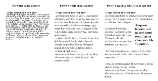
One of the main advantages of negative space is how it can make content so much more readable and legible. Whenever designers use appropriate spacing between lines of paragraphs and in the margins, users can read and understand the information far more easily. Research has shown an important point about this. That's namely that increasing space between paragraphs and in the left and right margins can improve comprehension—according to UX Planet editor-in-chief Nick Babich—by up to 20%.
See how the readability improves with the negative space between the paragraphs?
© Anastasia Diachenko, Fair Use
2. Focus and Attention
Negative space helps guide users' attention to and focus on specific elements or sections of a webpage or application. When designers put enough space around important content, they can direct users' eyes to the key information or call-to-action buttons—and doing this helps them make sure that users can quickly—and effortlessly—spot and engage with the most critical elements on the page. Since they're paying attention, the viewer’s eye can achieve a great deal more.
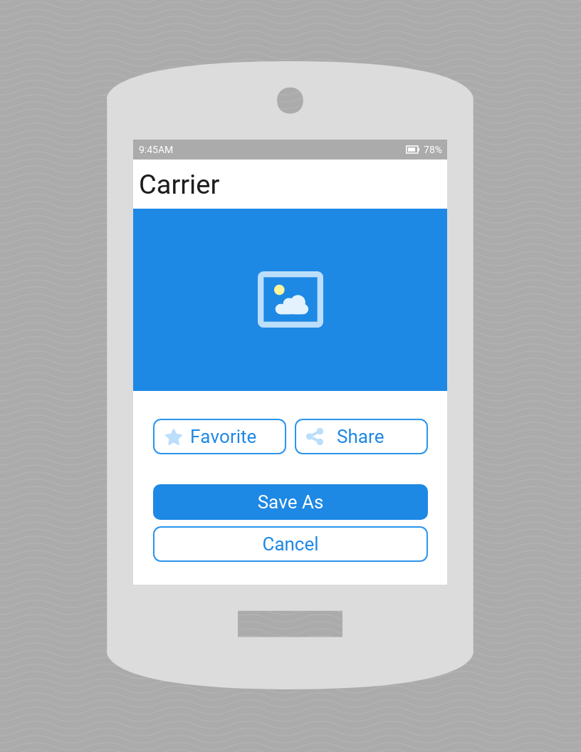
The negative space on this mobile app interface design helps users focus on the important parts.
© Joan Ang, Fair Use
3. Clarity and Organization
When designers include negative space in their designs, it really helps bring a sense of organization and clarity home to users. It lets designers separate different sections and elements in each work they make. And this makes the overall layout more visually appealing and easier to navigate for users.
So, it’s vital to avoid clutter and give sufficient space in an image, space between columns—and space between text and other elements. That way, users can easily find—and understand—the content they’re looking for.

The IxDF homepage incorporates negative space—including the main image—to add clarity in a crisp, uncluttered layout.
© Interaction Design Foundation, CC BY-SA 4.0
4. Visual Hierarchy
An important point is how negative space plays such a vital part to establish a visual hierarchy in a design—and designers can use the space strategically to make different levels of emphasis. What’s more, they can draw attention in ways that are appropriate. From doing that, they can guide users through the content and highlight important elements—such as bull’s-eyeing them with sufficient white space around. This helps users very quickly understand the structure of the page and navigate through it far more efficiently. Here, it’s helpful when designers know how users tend to scan screens. That’s typically in an F-pattern when reading content or a Z-pattern.

Notice how the negative space aids in the Z-pattern of this site’s layout. It helps guide users’ eyes as they scan from left to right at the top, diagonally down and then left to right again at the bottom.
© Aqua, Fair Use
5. Branding and Style
Another point is that negative space can contribute to the overall branding and style of a website or application. And when designers use white space intentionally, they can bring a real sense of elegance, sophistication and professionalism. Brands like Apple, Mercedes Benz, and IKEA are known for their minimalistic designs. They use negative space effectively and carry a sense of luxury and quality to viewers, users and customers.

Mercedes Benz’s website features negative space to help cast a luxury brand image.
© Mercedes Benz, Fair Use
How to Apply Negative Space in Web and App Design
Here are some practical tips to effectively apply negative space in interfaces:
1. Embrace Minimalism
It’s good for designers to embrace the concept of minimalism whenever they work to simplify a design and take out any unnecessary elements or clutter. When they do this, it lets negative space take center stage and create a clean and uncluttered interface. It might sound counterintuitive to make “nothing” so important—given that it seems to imply lack of design effort. Even so, it’s a vital skill—as well as an antidote to excessive design or horror vacui. One might think of Google’s crisp, calming homepage as a fine example of minimalist—and highly successful—design.
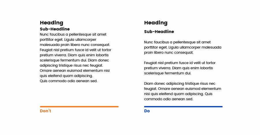
2. Use Consistent Spacing
Designers should keep the spacing consistent throughout their designs; they'll create a sense of harmony and balance when they do that. This includes the spacing between paragraphs, images and buttons—plus the spacing between other UI elements. Consistency in spacing like this helps users build up a mental model of the interface that's in front of them. And it’s something that makes it easier for them to navigate and interact with the content. What's more, that evenness really establishes a calming sense of order—one that helps them build a good sense of trust in the brand.
3. Prioritize Content with Negative Space
Designers should use negative space strategically—so they prioritize and highlight important content or elements. And when they put more space around crucial information or call-to-action buttons, they can draw users' attention. And then—moving on from there—designers can guide their brand's users towards desired actions.
Prioritize the content with the help of negative space. Here, you see where the party’s at and what to do to get to it, right away.
© Common Ninja, Fair Use
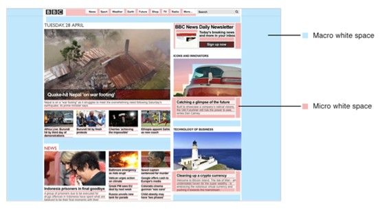
4. Experiment with Micro and Macro Negative Space
Understand the distinction between micro and macro negative space and experiment with both types in a design. Micro negative space is all about the small gaps within elements—like line spacing and margins. Macro negative space, though, refers to the larger space between major layout elements. When designers balance both types effectively, they can achieve something powerful—and make a visually appealing and organized layout.
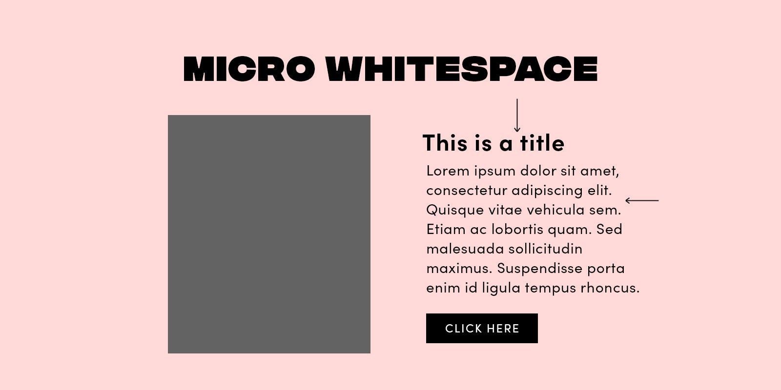
The micro part of negative space, here called 'whitespace'.
© Stephanie Corrigan, Fair Use

The macro part of negative space, here called 'whitespace'.
© Stephanie Corrigan, Fair Use
5. Maintain Balance
Negative space is essential, but one vital thing to do is strike the right balance with it. Too much of it may make the design feel extremely empty. Too little, though, and it can make things look cluttered and overwhelming—and so probably won’t speak so well for the brand, either. So, it's best to aim for a truly harmonious balance—and one that really lets the content breathe while keeping a visually pleasing composition.

Sometimes, it’s easier to spot when there’s too much negative space.
© Pineapple, Fair Use
6. Remember, Negative Space can Take Many Forms
Remember, negative space can even be an image that a designer works into their product design’s interface. It's important, then, to make sure it’s not “busy”-looking—and keep it in step with the brand message. That’s what designers want to resonate from their brand to their visitors, users, and—hopefully—customers after making that conversion.

In the famous Rubin vase, one can switch out the positive and negative space to see one of two scenes: a white vase on a (negative space) black background, or two faces on a (negative space) white background.
© Connor Turnbull, Fair Use
Another important point to understand is negative space’s role in the Gestalt design principles. These Gestalt principles—or laws—are vital parts of a designer’s toolbox. They include the principles of figure-ground, closure and common fate—to name just a few. They involve the role of negative space to make the “magic” truly work in web design and more.
7. Remember to Test
Ultimately, user tests will show how effective the negative space in one's designer work is. Such techniques as eye tracking can show a great deal about how negative space works to make an interface usable, desirable—and more.
Examples of Effective Use of Negative Space
Brands that effectively utilize negative space in their interfaces include:
1. Apple
Apple is famous for its clean and minimalist design aesthetic. Their use of ample negative space really delivers a sense of elegance and sophistication. And it emphasizes how important their products and brand really are. The space around their products on their website really lets the user focus just on the product—and it’s something that enhances the overall user experience.
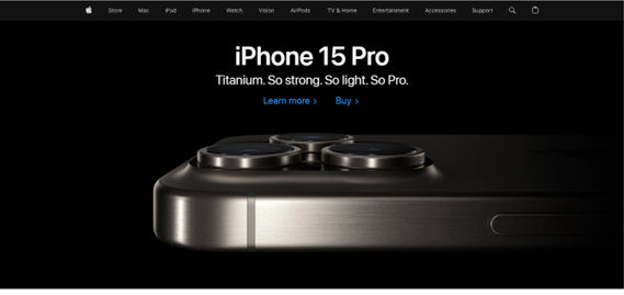
Apple’s homepage features generous amounts of negative space.
© Apple, Fair Use
2. Medium
Medium is a platform that prioritizes readability and user experience. And their use of negative space between paragraphs and around images makes a really visually appealing and easy-to-read layout. The generous spacing there lets users focus on the content and not feel overwhelmed at all.
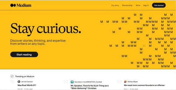
Medium’s use of negative space here is golden.
© Medium, Fair Use
3. Google
Google's homepage is a prime example of a really effective use of negative space—and the simplicity and minimalism of their design features ample white space that’s all around the search bar. It’s something that creates a calm and focused user experience. Users can—very—easily find the search bar and enter their query without any distractions.
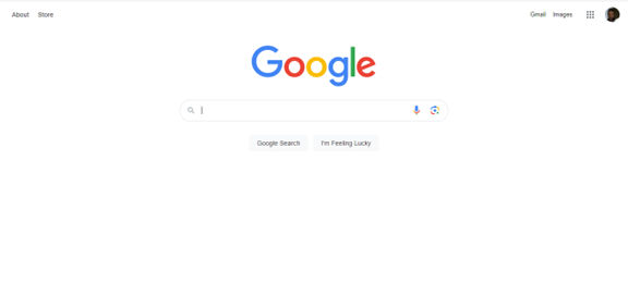
Google’s iconic homepage features perhaps the ultimate use of minimalist negative space design.
© Google, Fair Use
Overall, remember that negative space is one of the most powerful design tools that any designer can use. It’s there to complement the positive space they include as focal points—and strategically so. What's more, it’s a big part of the product experience—and it’s one that no designer should underestimate but—instead—use with care and an eye for strategy.