Gestalt Principles are principles/laws of human perception that describe how humans group similar elements, recognize patterns and simplify complex images when we perceive objects. Designers use the principles to organize content on websites and other interfaces so it is aesthetically pleasing and easy to understand.
In this video, designer and educator Mia Cinelli explains the importance of Gestalt principles in visual design and introduces a few principles, including figure/ground relationships, similarity, proximity and continuity.
Gestalt Principles – a Background
"Gestalt" is German for "unified whole". German psychologists Max Wertheimer, Kurt Koffka, and Wolfgang Kohler created the Gestalt Principles in the 1920s.
They wanted to understand how people make sense of the confusing things they see and hear. They identified a set of laws that address the natural compulsion to find order in disorder. According to this, the mind "informs" what the eye sees by perceiving a series of individual elements as a whole.
Graphic designers quickly embraced Gestalt Principles, using them to create eye-catching designs with well-placed elements.
The whole is other than the sum of the parts.
—Kurt Koffka
Gestaltism's philosophy is not the same as Aristotle's saying, "the whole is greater than the sum of the parts." In Gestaltism, the whole is different and may even be completely unrelated to its parts.
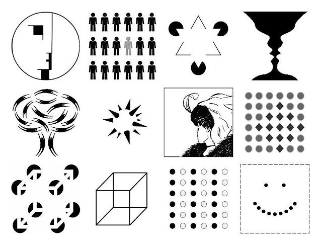
Gestalt Principles
Gestalt Principles are an essential part of visual design. There are more than ten overlapping principles. Here's a look at some of the more common ones.
1. Emergence
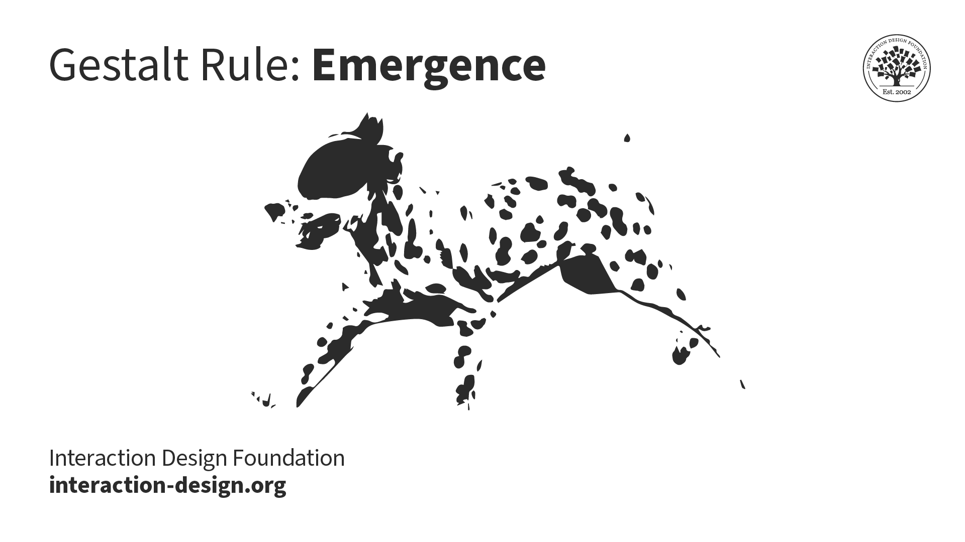
Instead of interpreting each blotch separately, we immediately identify a Dalmatian from a collection of oddly shaped black blotches. In other words, the Dalmatian emerges from the seemingly random scene.
© Interaction Design Foundation, CC BY-SA 4.0
The principle of emergence is central to Gestalt thinking. We perceive the world without thinking too much about understanding every small thing around us. This ability to quickly make sense of our environment is essential for survival. Imagine if we spent hours analyzing our world to understand what was going on; wild animals would have devoured our ancestors in no time!
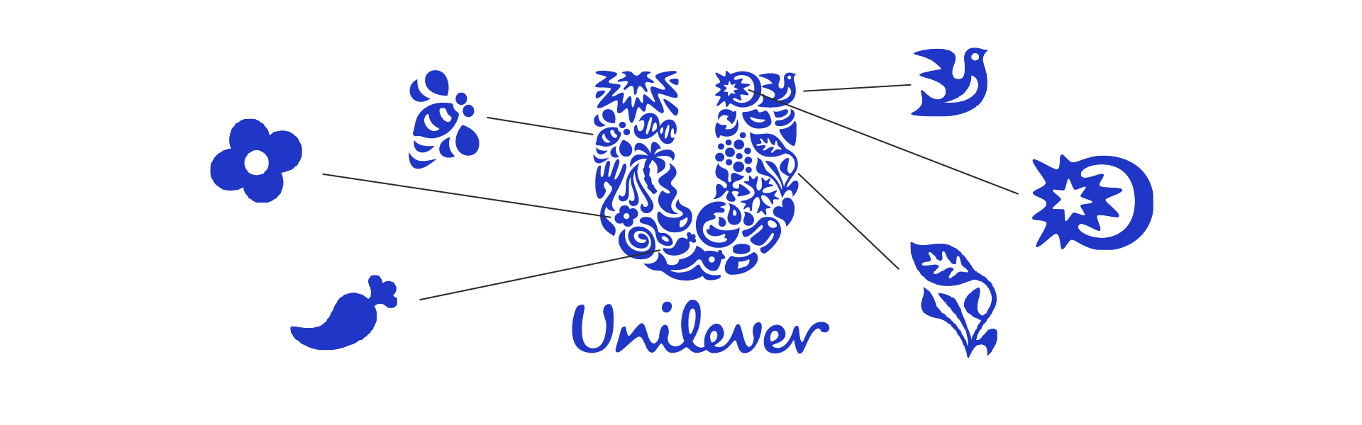
Unilever's logo is composed of several smaller shapes. But the letter "U" emerges from the combination of those smaller elements. Looking further, we see many smaller icons emerge from these abstract shapes.
© Unilever, Fair Use
2. Closure (Reification)
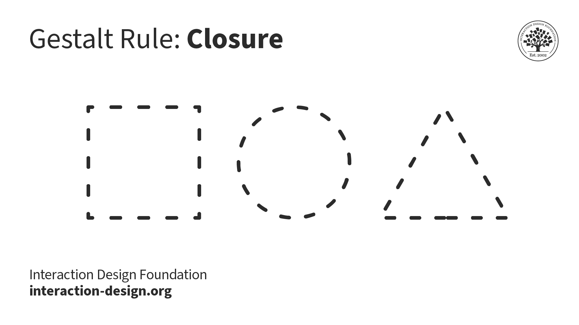
© Interaction Design Foundation, CC BY-SA 4.0
We prefer complete shapes, so we automatically fill the gaps between elements to perceive a complete image. That's how we can see the whole first. You can use closure creatively to gain users' trust and admiration. Users will appreciate it when they see pleasing "wholes" made from cleverly placed elements like lines, dots, or shapes.
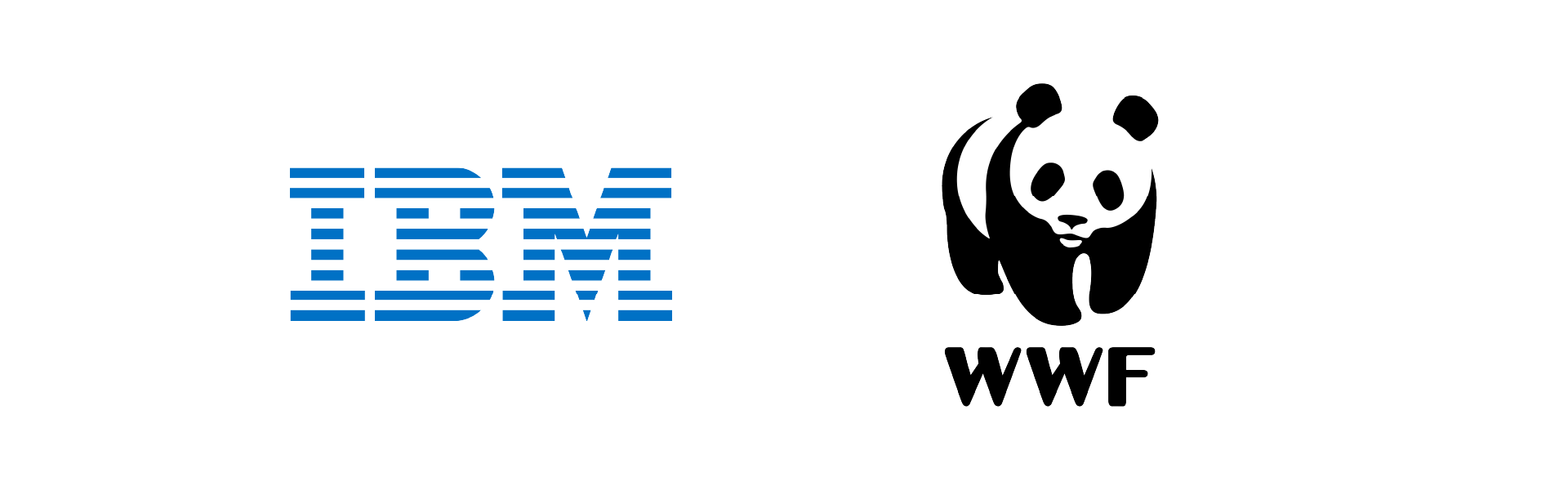
Iconic logos like IBM's and the World Wildlife Fund's are great examples of closure. IBM's logo has blue lines in three stacks. WWF's logo has black shapes on a white background that we interpret as the shape of a panda.
© IBM and WWF, Fair Use
3. Common Region
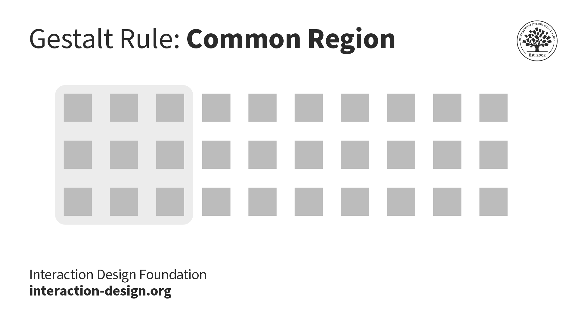
© Interaction Design Foundation, CC BY-SA 4.0
We perceive elements that are in the same closed region as one group. To apply this principle to your interfaces, group related objects together in a closed area to show they are separate from other groups.
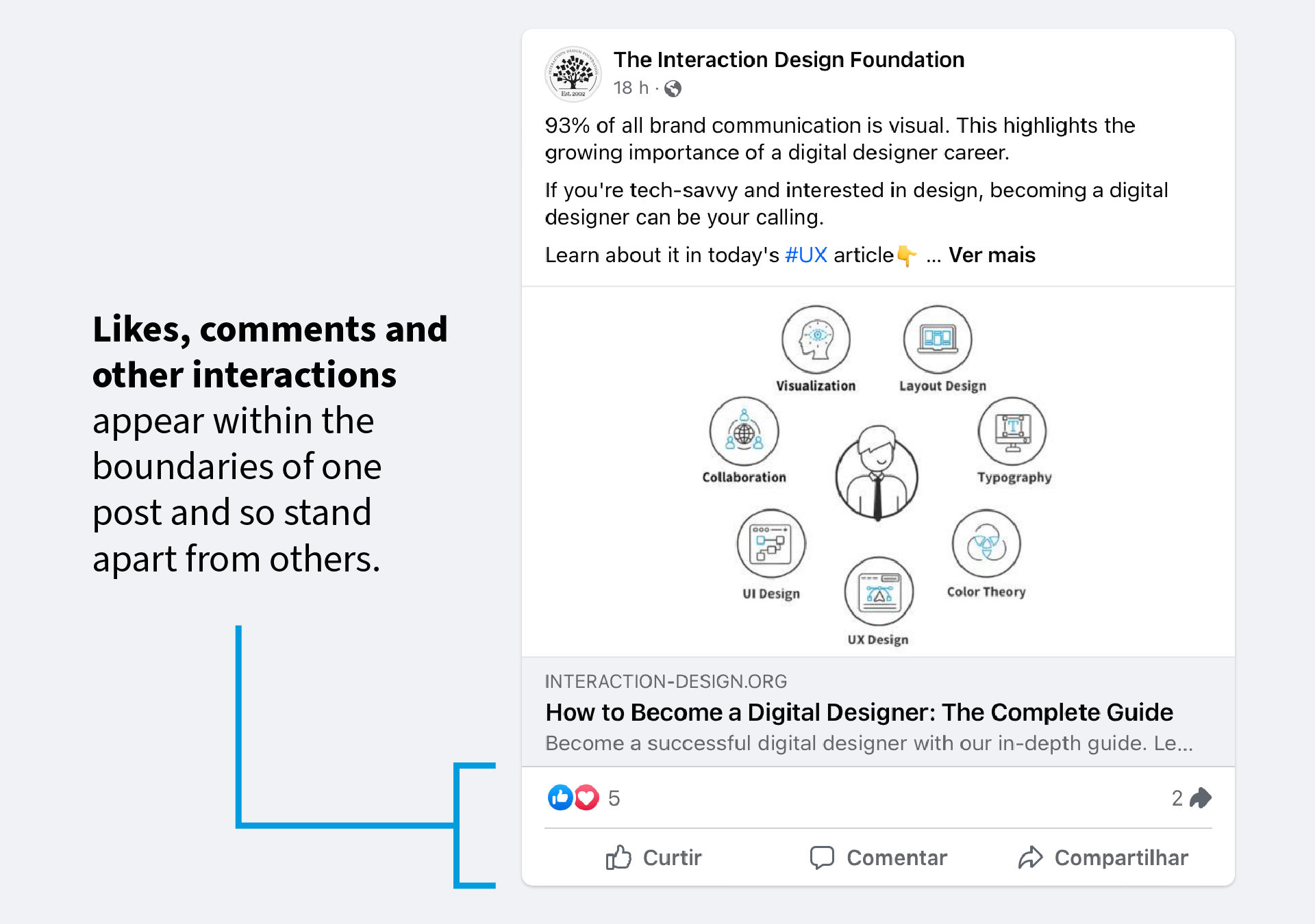
We can see the principle of common region applied in Facebook posts. Likes, comments and other interactions appear within the boundaries of one post and so stand apart from the other posts.
© Meta, Fair Use
4. Continuity or Continuation
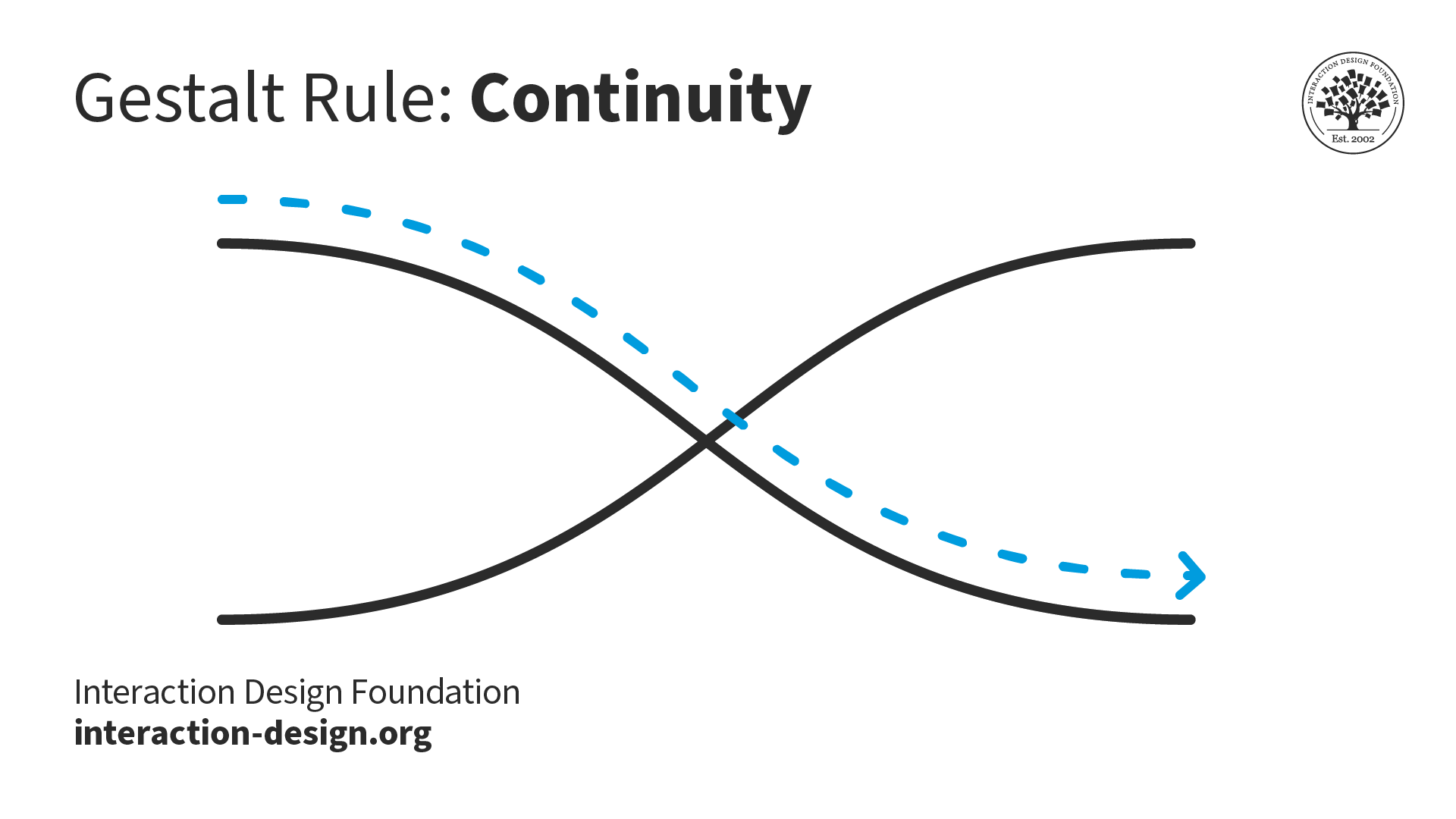
© Interaction Design Foundation, CC BY-SA 4.0
The continuity principle of Gestalt states that we group elements that seem to follow a continuous path in a particular direction. The human eye follows the paths, lines, and curves of a design and prefers to see a continuous flow of visual elements rather than separated objects. The human eye continues to follow the path even if an obstacle hides it or its flow is "broken" by interlinking or bisecting visual elements.
Mia Cinelli explains how the principle of continuity applies to typography and highlights a widespread mistake designers make.
5. Proximity
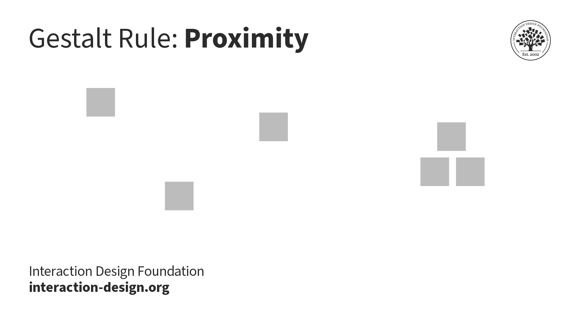
© Interaction Design Foundation, CC BY-SA 4.0
We group closer-together elements, separating them from those farther apart. When you group elements in your design, users will see it as one distinct entity on the screen.

An example of proximity in design is the Girl Scouts logo, with its three faces clustered in profile (two green, one white).
© Girl Scouts of the United States of America, Fair Use
6. Multistability
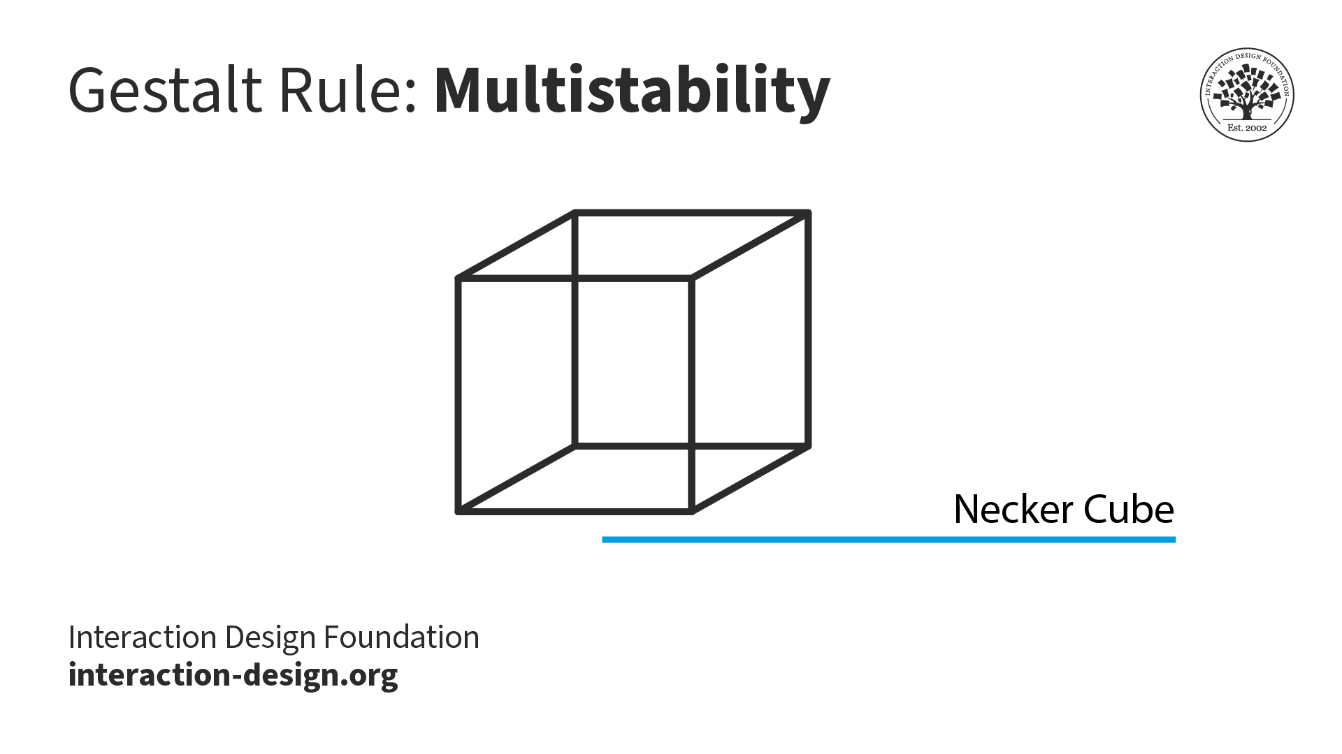
In the Necker cube optical illusion, you can interpret it as a three-dimensional cube with the "front" face either toward the lower left or the top right. A third interpretation is that intersecting lines create a diamond in the center. Often, when we interpret the image one way, we find it hard to see the other interpretations.
© Interaction Design Foundation, CC BY-SA 4.0
When images are ambiguous and present two or more meaningful interpretations, we experience the sensation of switching between them. We cannot see the multiple versions simultaneously. This switching sensation is called multistability.
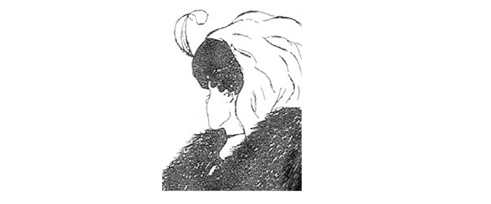
"My wife and my mother-in-law" is a famous optical illusion that demonstrates multistability. Depending on where you focus, you might see either a young lady looking away or an elderly one looking sideways.
© William Ely Hill, Public Domain
7. Figure/Ground
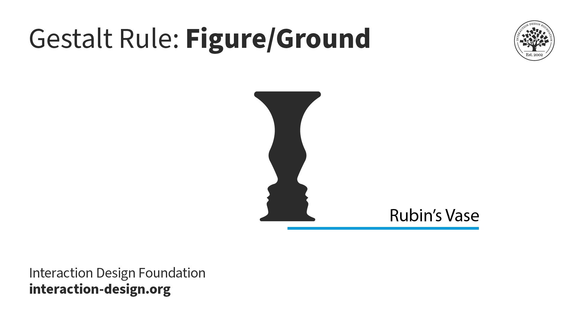
Rubin's Vase is a classic illustration that demonstrates the principles of figure/ground and multistability. If you consider a white background, you see a black vase in the foreground. And if you consider a black background color, you see two faces looking at each other.
© Interaction Design Foundation, CC BY-SA 4.0
We dislike uncertainty, so we look for solid, stable items. Unless an image is ambiguous—like Rubin's Vase above—we see its foreground first. You can apply figure/ground in many ways, but chiefly to contrast elements: for example, light text (i.e., figure) from a dark background (i.e., ground). When you use figure/ground well, alongside other considerations such as color theory, you'll help guide users in their tasks and lessen their cognitive load.
Figure/ground and multistability are sometimes confused to be the same. However, there is a slight difference. In most cases, background and foreground are stable, but in some cases, such as the optical illusion of Rubin's vase, it can contribute to multistability.

When an interface's color theme changes from light to dark, the previously black text becomes white, and the white background becomes black. Even though the colors have reversed, we have no trouble recognizing the interface. We automatically interpret the foreground and background colors.
© Google, Fair Use
8. Invariance
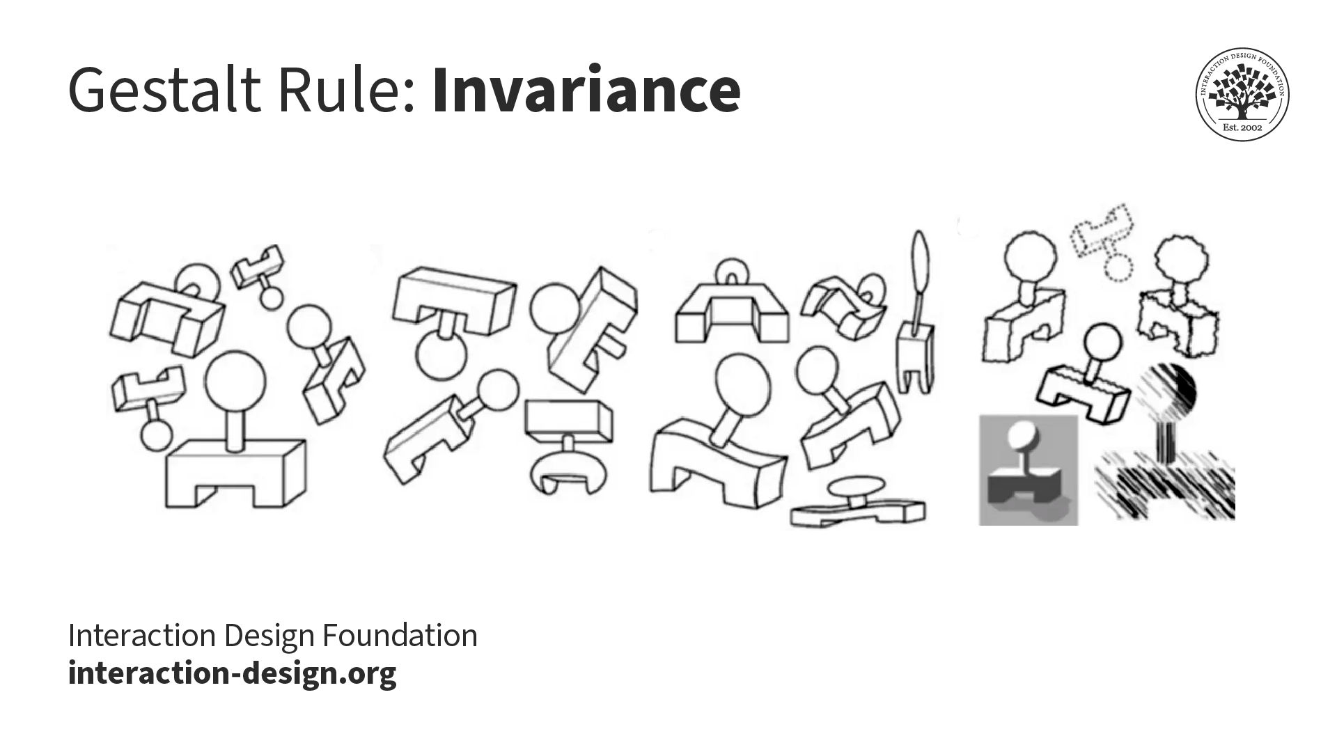
© Interaction Design Foundation, CC BY-SA 4.0
The Gestalt principle of invariance explains how we perceive basic shapes as identical despite various transformations. These transformations include rotation, movement, size alteration, stretching, different lighting conditions, and variations in parts. This principle is crucial for recognizing faces, for example. Thanks to invariance, we can recognize our friends and family members from afar or different angles or even when they make funny faces.

Captchas rely on the human ability to recognize shapes even if they are distorted.
© Interaction Design Foundation, CC BY-SA 4.0
9. Pragnanz
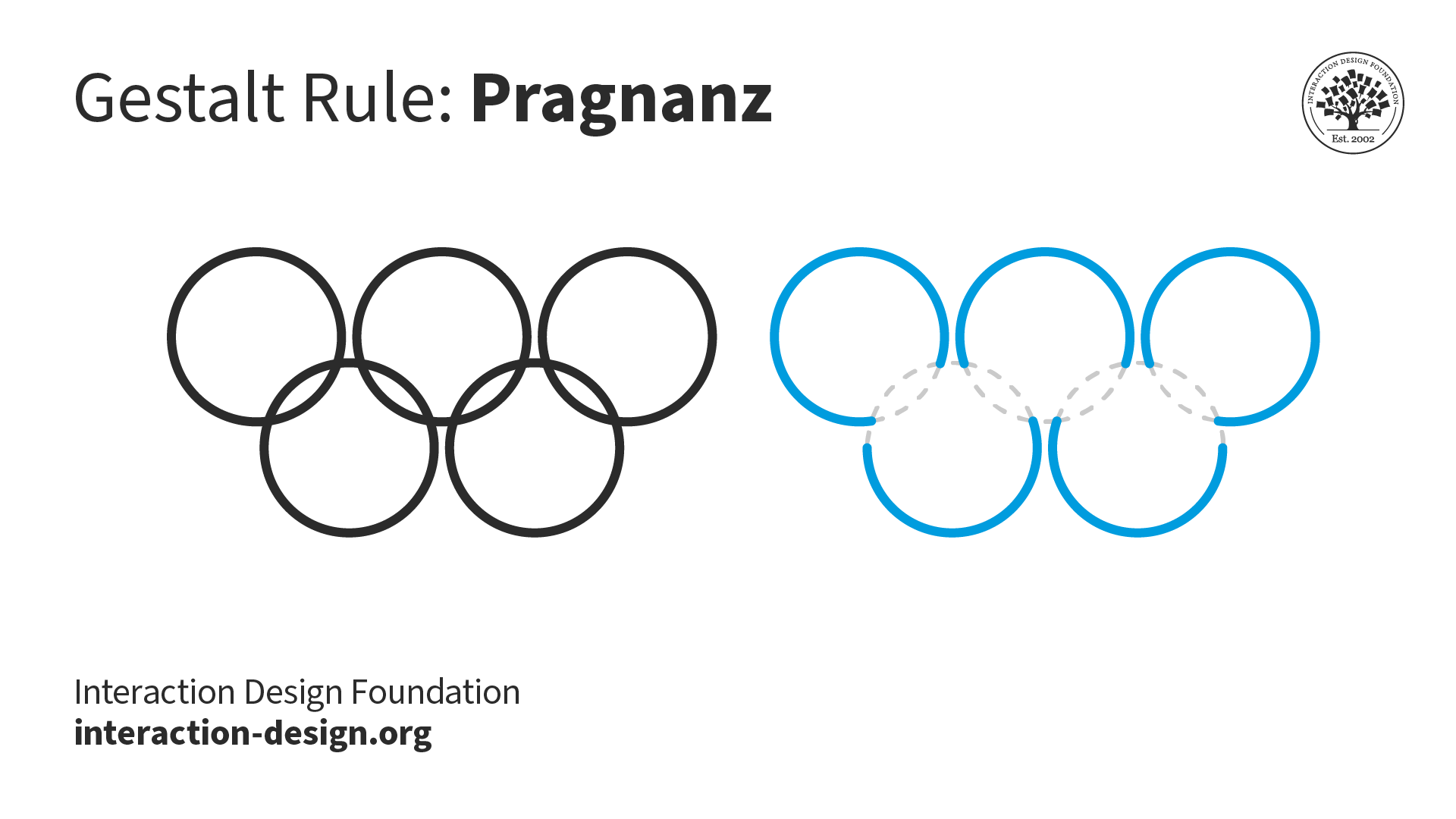
When we see the Olympic rings, we see five interlocked rings instead of "C" and lens shapes. The circles are simpler shapes to process than the C or lens shapes.
© Interaction Design Foundation, CC BY-SA 4.0
Pragnanz describes the human tendency to simplify complexity. Our environment constantly bombards our senses with stimuli, while we have limited attention and processing capacity to handle all the complexity. Pragnanz helps us see order and regularity in a world of visual competition.
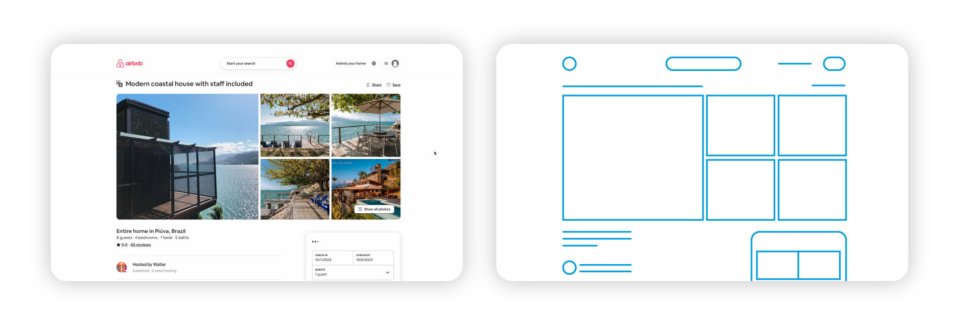
Pragnanz shows the importance of simplicity. It is no accident that interface elements across applications use simple shapes such as rectangles and circles instead of complex ones that are hard to recall or process.
© Airbnb, Fair Use
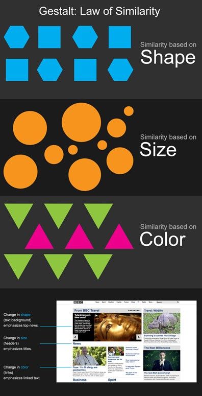
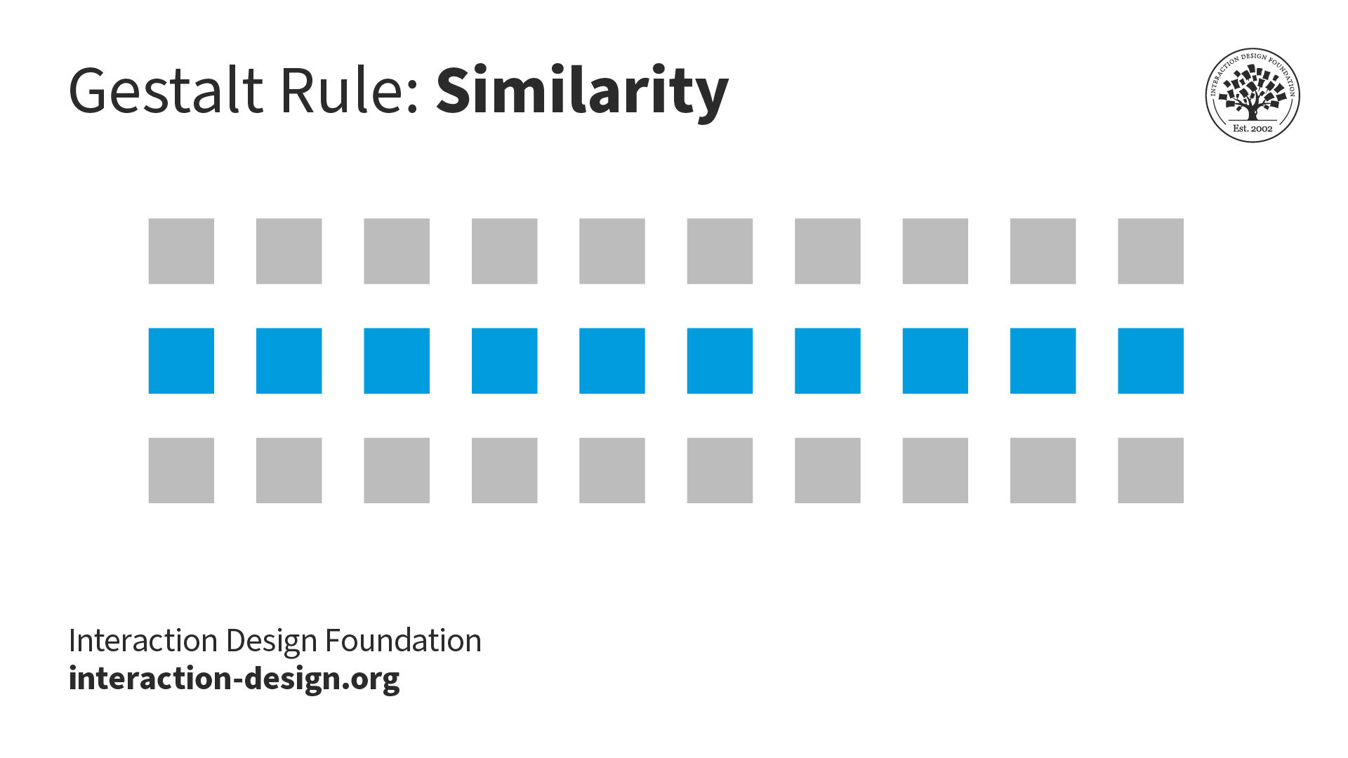
10. Similarity
© Interaction Design Foundation, CC BY-SA 4.0
When items, objects or elements share superficial characteristics, we perceive them as grouped. We can see the similarity principle in branding and design system guidelines.

Brands implement design systems to guide users. For example, on the IxDF homepage, all buttons are styled similarly to let the users know that clicking the button will lead to an action. All text elements that share a specific style will also be interpreted as being part of a group (say, links, headings, captions, etc.).
© Interaction Design Foundation, CC BY-SA 4.0
11. Symmetry and Order
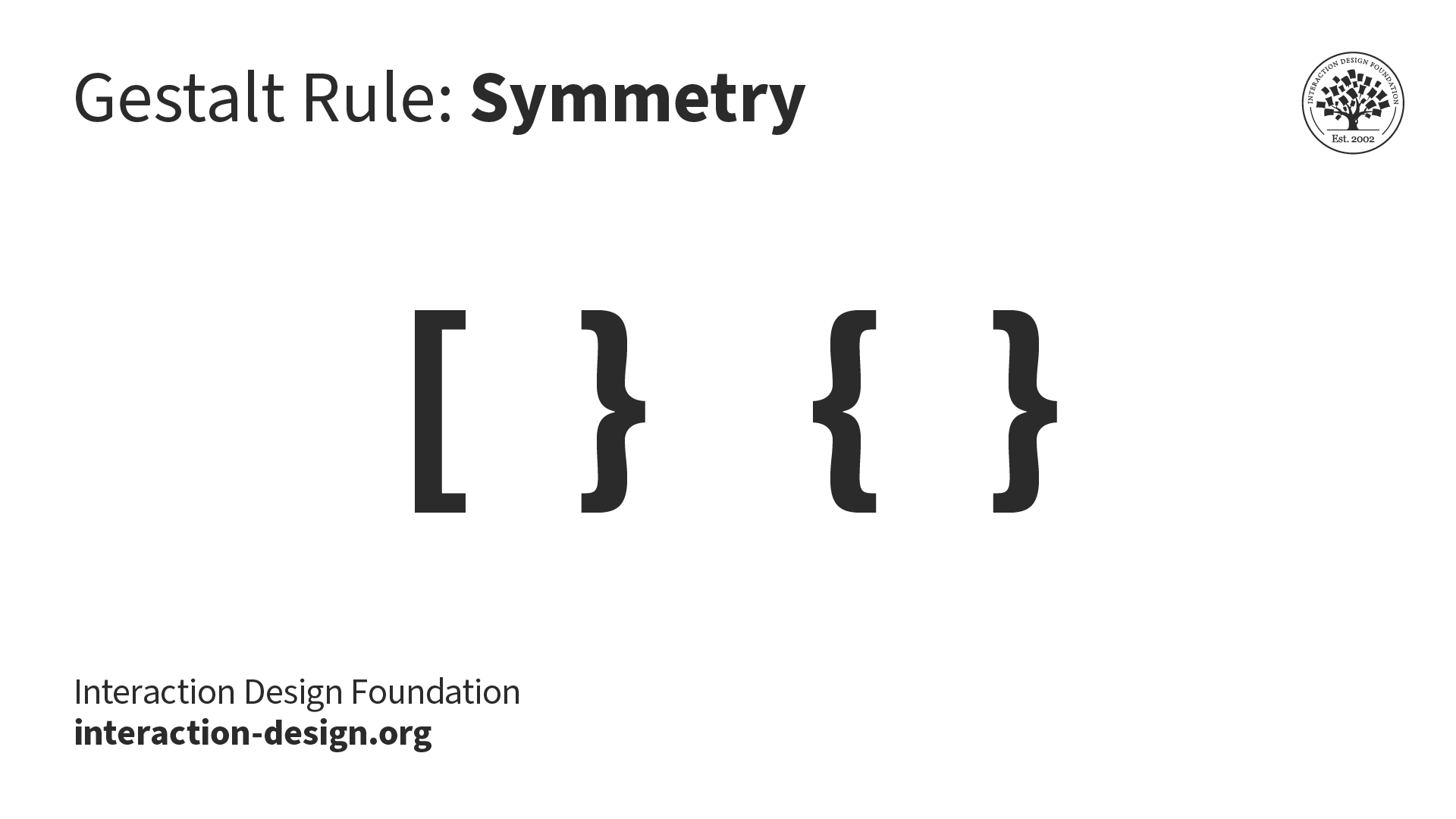
Which of these shapes would you group together? Chances are, you'll pick the matching curly brackets instead of the mismatched curly and square bracket combination.
© Interaction Design Foundation, CC BY-SA 4.0
Humans tend to see visual elements as grouped when they are arranged symmetrically. The natural world is filled with symmetry (or near symmetry), and our brains tend to favor symmetrical forms. Grid systems that evenly divide the space help designers implement symmetry and order in user interfaces.

Google's home page is symmetrical, with almost all major elements center-aligned and the two buttons, "Google Search" and "I'm Feeling Lucky," nearly mirroring each other.
© Google, Fair Use
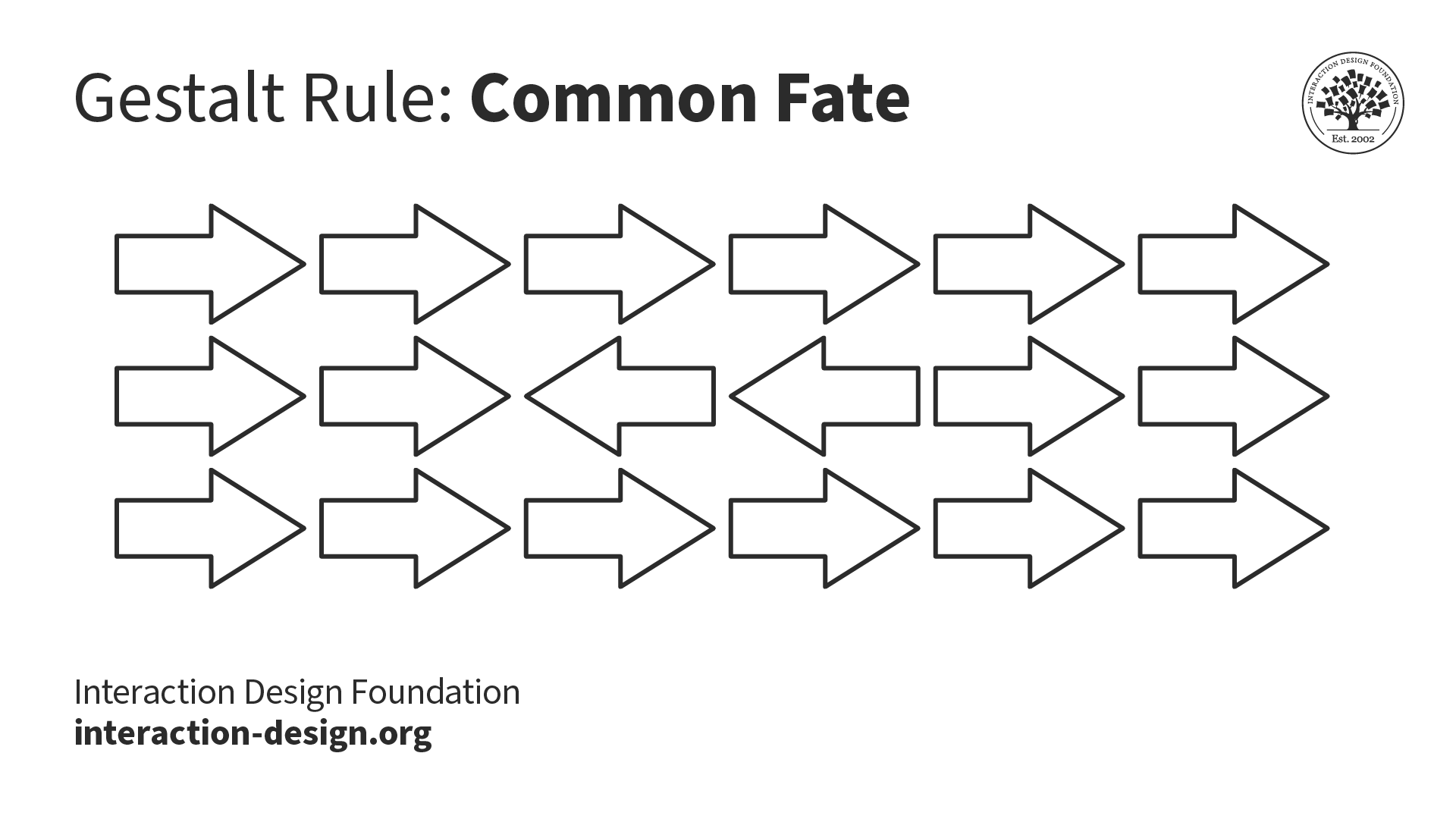
12. Common Fate
© Interaction Design Foundation, CC BY-SA 4.0
This principle refers to the human tendency to perceive visual elements moving in the same direction or in unison as grouped. Visuals need not be moving to convey motion. Cues such as arrows and the rotation angle can indicate the direction in which the elements are perceived to move.
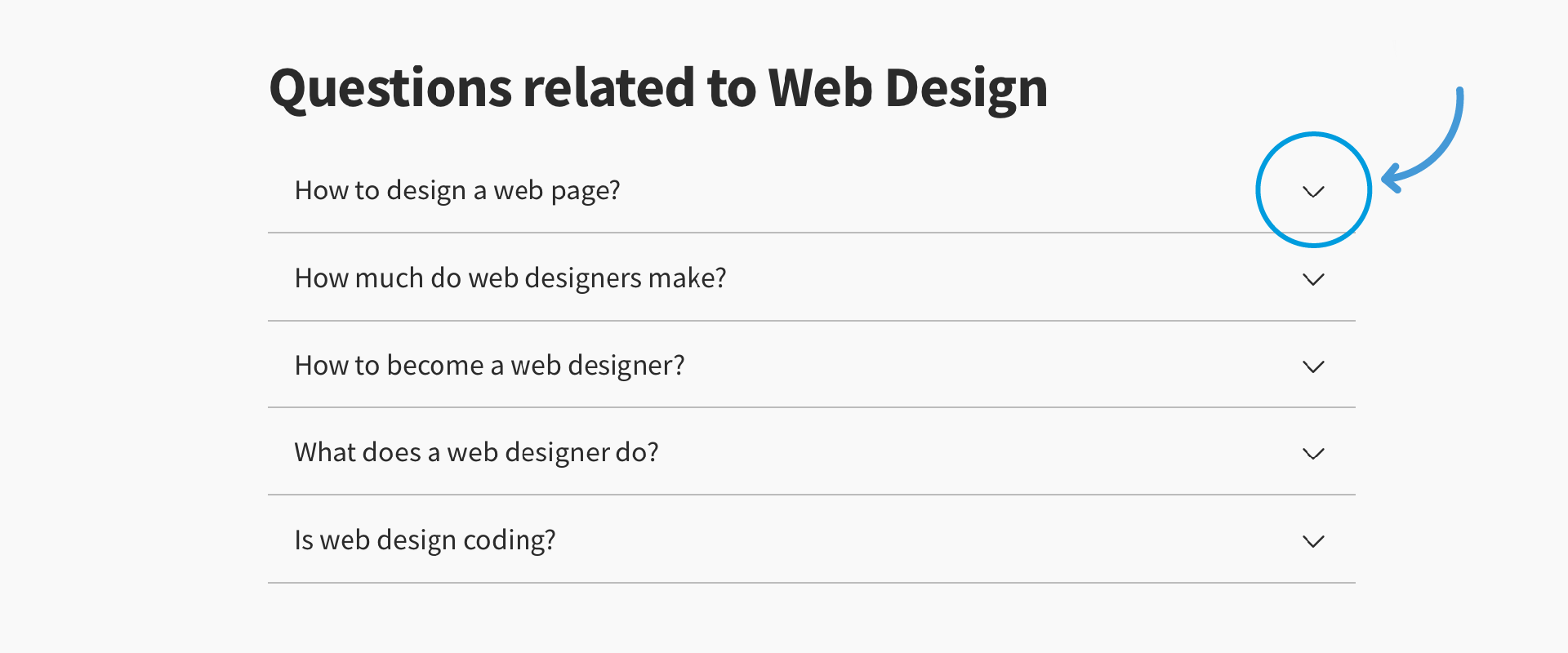
The "Frequently Asked Questions" section on websites is often an accordion. We interpret all the questions as part of a group "moving" in the same direction. In this case, the downward arrows point to the direction each of them will open.
© Interaction Design Foundation, CC BY-SA 4.0
Gestalt Principles are in the Mind, Not the Eye
The Gestalt Principles are vital in user experience (UX) design. When you design interfaces, users must be able to understand what they see—and find what they want—at a glance. Below are examples of the Gestalt principles from the IxDF landing page.
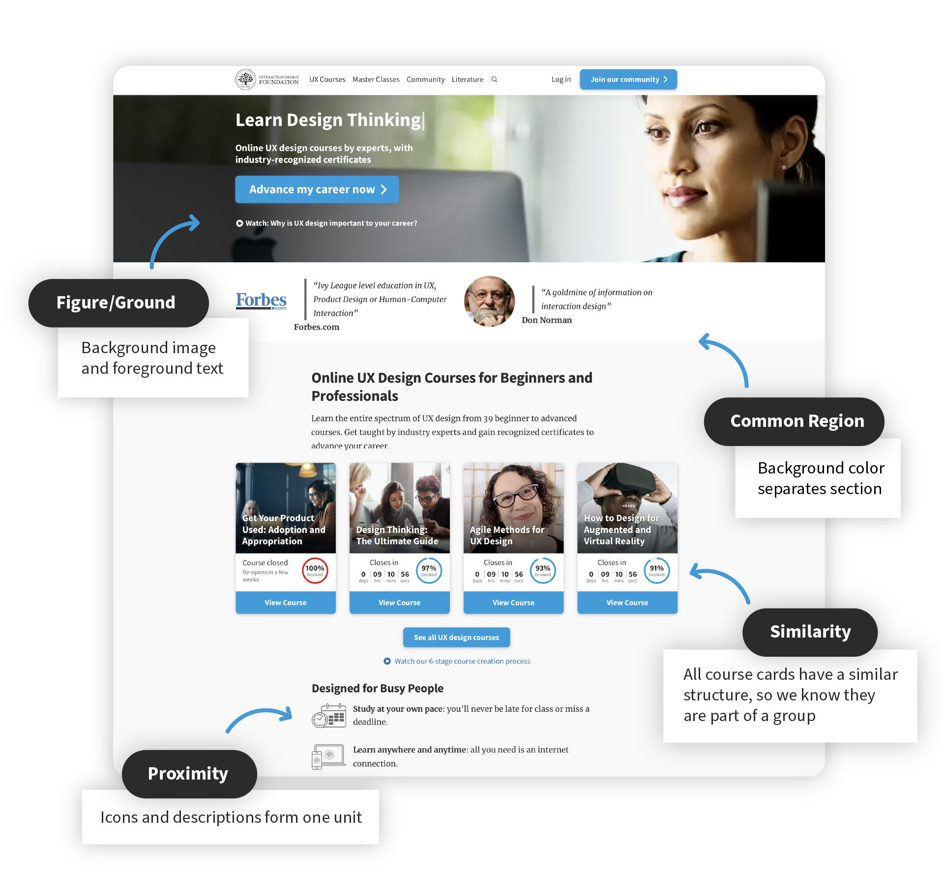
The background image and the text overlaid on it demonstrate the principle of figure/ground. The course cards have a similar structure, so users know they are part of a group. The icons and descriptions are placed in close proximity to indicate that they belong together. And finally, colors and graphics divide the page into separate regions. Without this, users would struggle to make associations between unrelated clustered-together items and leave the site.
© Interaction Design Foundation, CC BY-SA 4.0
In your designs, you should never confuse or delay users. Instead, guide them to their options so they can identify with organizations/brands rapidly.