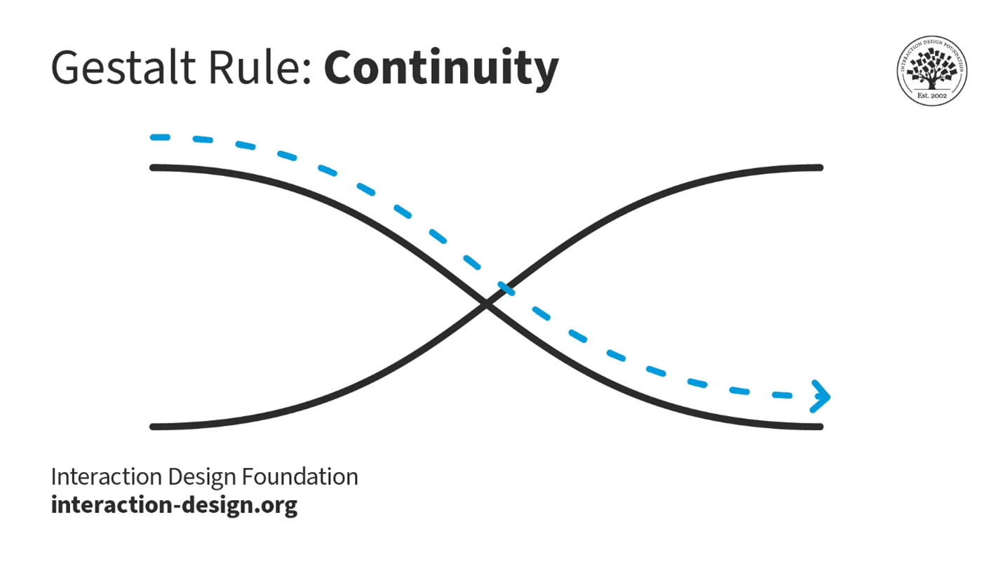
The Gestalt law of continuity—or continuation—refers to how the human mind naturally organizes visual elements into continuous and uninterrupted lines or patterns. It is a fundamental concept in visual perception and design. Designers apply it to create interfaces that guide users' attention and create a smooth flow of information.
In this video, author, designer and educator Mia Cinelli explains the importance of Gestalt principles in visual design and introduces a few of them, including continuity.
Why is Continuity Important in What Humans See?
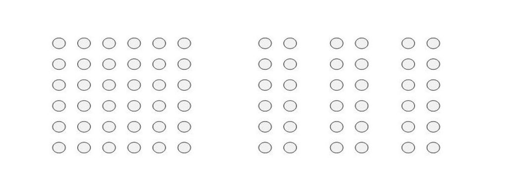
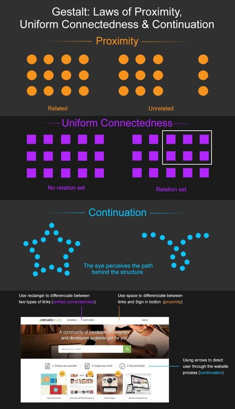
The Gestalt principle of continuity—also, the law of continuity, principle of continuation and law of continuation—comes from the idea that the human mind perceives and organizes visual stimuli in such a way to create a sense of continuity and flow. The theory behind the law of continuity is that people usually perceive objects so that a series of visual elements belong together—and form a continuous line or pattern. This is true even if some parts are missing or obscured, and this principle is closely related to the concept—or Gestalt law—of closure. In closure, the mind fills in missing information to make a complete and unified perception out of a figure.
The law of continuity has roots in the Gestalt psychology movement, which emerged in the early 20th century. “Gestalt” is a German word that describes the concept that an organized whole is more than the sum of its parts. For example, according to the principle of closure, figure-ground and the law of prägnanz, complex images become simplified because of the mind’s need to make sense of the object on show. To Gestalt psychologists, individual elements therefore take on a higher meaning than mere components.
© Interaction Design Foundation, CC BY-SA 4.0
German psychologists Max Wertheimer, Wolfgang Köhler and Kurt Koffka developed the Gestalt principles to understand how humans perceive the world around them. The law of continuity is observable in the real world in that the human eye follows the smoothest path when viewing lines. That’s true regardless of how the artist has actually drawn the lines.
When humans face a sequence of visual elements, they tend to see them as a continuous line or pattern. The human brain prefers to see a continuous flow of visual elements—as opposed to seeing separated objects. This natural inclination towards continuity is a key aspect of how humans make sense of their visual environment—an urge to extract meaning quickly from what was once a far, far more hazardous world. Because of its value, this law has seen a lot of use in a wide range of fields—including graphic design, advertising and product design.
Why Continuity Continues to be Vital in UX/UI Design
The Gestalt law of continuity can play an important part in user experience (UX) design and user interface (UI) design. When designers apply this law in their design work, it helps them create interfaces that are intuitive and easy to navigate. Reasons why this principle is important in UX/UI design include that it:
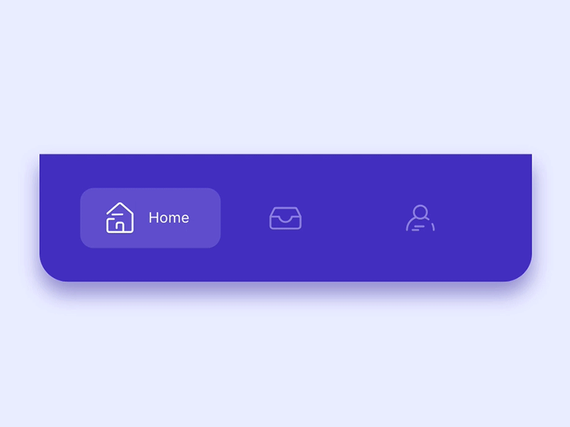
1. Simplifies Navigation
The continuity principle can guide users' eyes in a certain direction—a point that makes it easier for them to navigate the interface. It helps create a visual flow that guides users from one element to another—and so helps user interactions with a digital product or service.

Apple's macOS Dock is a strip of icons located at the bottom of the screen. When a user hovers over an icon, it magnifies and smoothly animates to indicate selection—giving a sense of continuity and connection between the user's action and the system's response.
© Apple, Fair Use
2. Enhances Readability
The law of continuity improves readability as it groups information in a continuous flow. It helps users easily understand—and process—the information they find on a website or app. For example, with primary and secondary navigation, designers can get continuity to work so it guides users without confusing them.
Readability is a huge factor when designers have to show text information in volume. Continuity is a factor in flowing conveniently from primary to secondary navigation.
© Kapil Moon, Fair Use
3. Creates Cohesion
The continuity principle can give a sense of cohesion and unity to design elements. This makes the interface appear well-organized and aesthetically pleasing. At the very least, it can help calm users’ pain points if they are distracted or in busy or potentially stressful environments.
Alamy makes use of continuity to direct users in a smooth flow.
© Alamy, Fair Use
4. Boosts User Engagement
A user interface design that follows the law of continuity is likely to be more engaging as it runs in line with the natural visual perception of humans. This element of visual design is important as—typically—users will respond better to information architecture and other parts of a design in a way that they expect to find. That is, they find what they see conforms naturally to expected principles such as continuity.

Credit Karma features the law of continuity to draw attention to their services.
© UserTesting, Fair Use
Examples of the Gestalt Law of Continuity in UX Design
Here are some chief examples of how designers use the Gestalt law of continuity in interfaces:
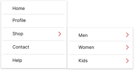
● Menus and Navigation Bars
In websites and applications, menus and navigation bars often follow a linear layout. This is something that lets users perceive them as a continuous group of elements.
● Progress Bars
Progress bars are another example where the continuity principle often turns up. The continuous line in progress bars gives users a visual cue about how much progress they’ve made and how much is left.
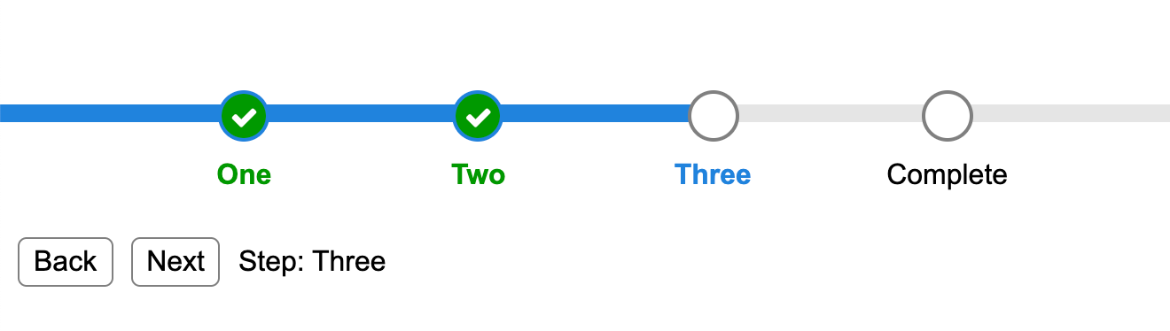
Progress bars help keep users on board and can represent a highly encouraging aspect of continuity in flow.
© Michael Xavier, Fair Use
● Typography and Text Layouts
The way designers arrange and present text also adheres to the law of continuity. In Western cultures, for example, users naturally read text in a continuous flow from left to right, top to bottom.
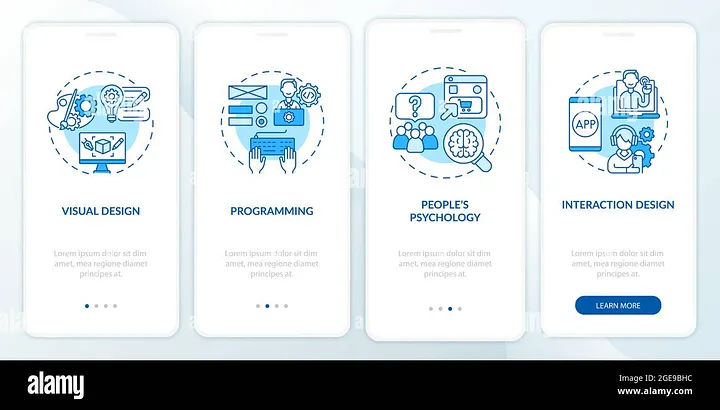
See typography expert, author, designer and educator Mia Cinelli explain the virtues of the law of continuation in typography:
Best Practices to Apply the Law of Continuity in UX Design
Some key ways that UX designers apply the Gestalt law of continuity in their designs are that they use it to:
1. Maintain a Logical Flow
Designers should ensure that design elements follow a logical and predictable flow. This could be from left to right, top to bottom or along a specific path that guides the user towards the desired action.

Sprig applies continuity to direct users conveniently to the steps to use their app.
© UserTesting, Fair Use
2. Group Related Elements
Use the principle of continuity to put related elements together—something that helps users perceive them as being a single entity. This improves the overall structure of an interface, and the readability of it.
3. Use Lines and Paths
Use lines, paths and similar visual cues to guide users' eyes in the direction that’s desired. This can be particularly useful in guiding users towards call-to-action buttons or important information.

Nike applies continuity to direct users’ eyes horizontally through the rows.
© Nike, Fair Use
4. Ensure Consistency
Consistency is key when it comes to making a continuous flow. So, be sure that elements like fonts, colors and button styles show up in a consistent way across the interface. Users find they can trust consistently crafted interfaces. A UI that improves the user experience will be one that matches their expectations while it distinguishes the brand message.
5. Design with Intention
For interface design, have a clear vision of the user flow and how to arrange elements to create continuity. Continuity comes best when designers arrange elements to lead the user’s gaze from one section to another. This creates a seamless experience—something that’s vital to keep users on board.
Good continuity keeps the users in flow—via smooth navigation, for example.
© Incharaprasad, Fair Use
6. Use Directional Cues
Directional cues like arrows or curved lines can help make a clear path that users can follow. They also create continuity within the design. This can be especially helpful when designers want to guide users through complex processes or interactions.

Google Maps keeps a good continuous flow to mirror the users’ needs.
© Google Maps, Fair Use
7. Incorporate Smooth Transitions & Animations
Smooth transitions and animations create a sense of connection between different states of an interface. They also provide continuity between different pages or sections. This helps make an uninterrupted experience for the user while they navigate different areas of the design.
8. Use Grid Systems & Layouts
Grid systems and layouts are vital for putting order in designs and a sense of continuity throughout interfaces. Consistent spacing, alignment and hierarchy will help ensure that all elements fit together harmoniously. They’ll also guide the user’s eye from one area to another without disruption.

A good, solid hierarchy goes a long way to aiding the users in flow.
© Incharaprasad, Fair Use
9. Create Good Flowcharts & User Journeys
Flowcharts are great tools for mapping out how users move through an application or website. They help designers spot potential disruptions or gaps in the flow—problems that could impact overall continuity within their designs. They’re also vital tools in terms of how they can communicate design ideas among team members.
10. Design Gestural Interfaces with Care
Gestures like swiping or pinching should always give a smooth and continuous experience for touchscreen users. So, designers need to beware of letting jarring disruptions happen at all costs. That way, they can help achieve true continuity within their designs.
Risks and Considerations
The law of continuity is a great benefit in UX/UI design—but it's important to be mindful of potential risks and considerations, and here are some:
Overuse of continuity: The overuse of the principle of continuity can make for an interface that’s cluttered and confusing. So, don’t overwhelm users with too many elements in a continuous flow. Strike a balance between continuity and simplicity—to make sure a pleasant user experience becomes a reality. For example, think about using ample negative space or white space; it’ll give valuable breathing room to a design.
Disruption of user expectations: If a design's continuity doesn't align with common UX patterns or user expectations, it can end up confusing users and even frustrating them. Always bear in mind the established conventions and user expectations in the design field—for example, include design patterns that work well.
Neglect of other design principles: Remember, the law of continuity is just one of many Gestalt principles. It's important, indeed—still, don't neglect other principles such as proximity, similarity and closure. Those are equally crucial when it comes to making a cohesive and user-friendly design.
The law of continuity—which plays a vital role in a seamless and enjoyable user experience—is a way to guide users' attention, establish logical flows and more. Ultimately, user testing will show fine points about how well the law of continuity actually works in a digital product or service. Overall, though, it’s an essential item in a designer’s tool kit—one that can help greatly in a site or app’s UX to keep a sure footing on the journey from user to customer.

Amazon's website uses the principle of continuity in their product listings, displaying in a continuous flow. This makes it easy for users to browse through items.
© Amazon, Fair Use