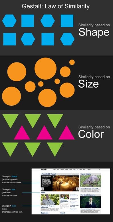
The law of similarity is a Gestalt psychology principle that refers to how our brains organize and perceive visual information. It states that people perceive elements that share similar visual characteristics (e.g., color, size, shape) to be related. This law is vital in web design—it helps designers create interfaces that users can easily navigate and understand.
There’s Something Familiar about Items Being Similar
The Gestalt similarity principle is a fundamental concept in both psychology and design. It comes from ideas about how the human brain naturally organizes information—and states that the mind perceives similar elements as part of a unified whole. Meanwhile, viewers typically view different-looking items as being separate from one another.
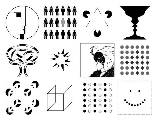
The Gestalt Laws encompass many aspects of how humans perceive images.
© Author/Copyright holder: Impronta. Copyright terms and licence: CC BY-SA 3.0
The Gestalt school of psychology emerged in the 1920s. It consisted of psychologists Max Wertheimer, Kurt Koffka and Wolfgang Köhler in Germany. The Gestalt approach developed theories that would become well-known to graphic designers. Visual perception theories such as the law of prägnanz (a German word for “good figure”), figure-ground and closed region soon became important graphic design principles. These guide designers on how to use lines or curves, shapes, focal points and backgrounds to powerful effect.
According to the Gestalt school of thought, humans typically perceive patterns using five main categories—summed up in the principle of proximity, principle of continuity, principle of closure, principle of connectedness (or uniform connectedness) and principle of similarity. Similarity is a simple principle that involves an innately human tendency. When people perceive a collection of objects, the brain automatically groups together those that have similar visual characteristics. These include the properties of shape, size, color, texture and orientation. This grouping helps people make sense of the visual information they encounter in the real world. It’s what allows people to perceive patterns, relationships and structures.
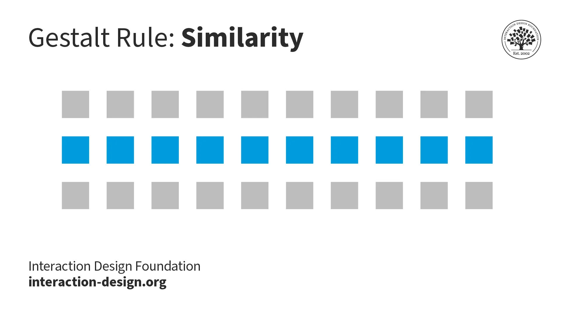
The law of similarity helps the mind associate groups of items with alike properties, including color and shape.
© Interaction Design Foundation, CC BY-SA 4.0
Why is the Gestalt Law of Similarity Vital in Design?
Similarity is crucial in design because it helps designers create visually cohesive and organized designs. It’s a vital ingredient in design works that are easy for users both to understand and to navigate. Here are the main reasons behind the success of similarity as a well-leveraged Gestalt principle:
Visual Coherence
When they group similar elements together, designers can create a good sense of visual coherence in their designs. Elements that share visual similarities—such as color or shape—let users easily identify relationships between them. So, users can perceive them as belonging to the same category or group.
Organized Information
The principle of similarity lets designers organize information in such a way that it’s visually intuitive and easy for users to understand. As they use similar visual characteristics for related elements, designers can guide users' attention. They can help users quickly understand the structure and hierarchy of the information presented.
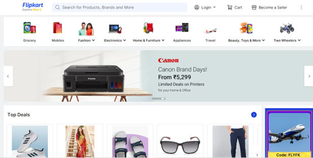
Flipkart’s website – divided neatly into categories and leveraging similarity so users can find top deals easily.
© Flipkart, Fair Use
Ease of Navigation
Similarity in design can also enhance the user's navigation experience. Designers provide consistent visual cues and group related elements together. That way—they can give their users clear visual cues. These guide the users through the user interface (UI) and also help them find the information or functionality they’re after.
User Engagement
When elements in a design have shared visual similarities, users will be more likely to engage with the content or interact with the interface. The principle of similarity can make a design more visually appealing and aesthetically pleasing, which, in turn, can raise the levels of user engagement and satisfaction.
In this video, Frank Spillers, Service Designer, and Founder and CEO of Experience Dynamics, explains how Google’s Material Design uses visual consistency, contrast, and clear affordances to create interfaces that are both beautiful and functional. These insights can help you boost user engagement through visual clarity and cohesion.
How Do Users Respond to the Law of Similarity?
Numerous studies and experiments have provided evidence that users respond to the Gestalt principle of similarity. Here are some key findings:
1. Visual attention: Studies have repeatedly demonstrated that users are more likely to direct their visual attention to elements that share visual similarities. For example, if a group of buttons that perform similar functions on a website has similar colors or shapes, users are more likely to notice and interact with them—as opposed to all the buttons being the same color.
2. Visual hierarchy: When they use the principle of similarity—and do it well—designers can establish a visual hierarchy that guides users' attention. This helps them navigate through the interface. Research has shown that users are more likely to focus on elements that stand out thanks to their similarity to other elements that are in the design.
3. Recognition and recall: The principle of similarity can help with users' recognition and their recall of information. When elements share visual similarities, users are more likely to recognize patterns. They can also remember information and make connections between related elements.
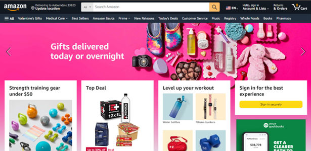
These iconic orange and gold buttons draw attention to some chief calls-to-action on Amazon.com’s home page.
© Amazon, Fair Use
How to Apply the Law of Similarity in Design
Designers apply the law or principle of similarity to make better designs in various ways. Here are some common techniques and strategies:
Make Visual Consistency
UI and UX designers ensure that elements that serve similar functions or belong to the same category share visual characteristics. These characteristics can include color, shape or typography. This consistency is something that helps users understand how different elements are related to one other. It also makes for easier navigation and comprehension.
Icons: Good iconography is a vital part of UI design. When they use similar shapes, styles or color schemes for related icons, designers facilitate users' understanding and improve the usability of the interface with icons that are consistent and recognizable.
Typography: is another area where designers apply the principle of similarity. By using consistent typefaces, font sizes or font styles for related elements, designers make a design that’s both cohesive and visually appealing. This consistency helps users recognize and associate different pieces of information, too.
Establish Groups and Categorization
When they use consistent visual cues, designers can indicate the grouping or categorization of different elements. This helps users quickly identify and understand relationships between elements and find the information they are looking for. Designers use:
Color: With similar colors for related elements, designers can create a visual hierarchy that guides users through the interface. For example, a website that uses blue buttons for primary actions could use green buttons for secondary actions. This helps users quickly understand the function of each button. Moreover, it quickly helps to show them how to interact with the interface.
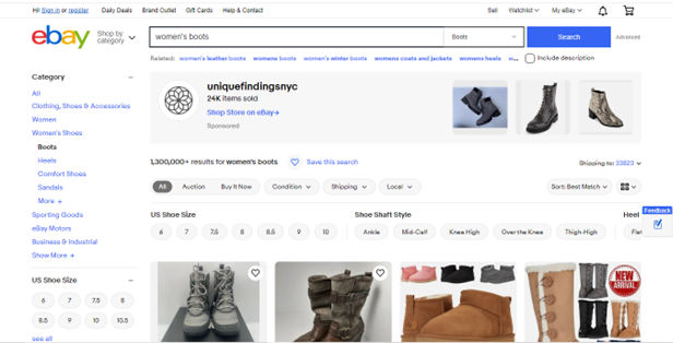
eBay offers similar buttons in the form of shoe size, etc., while the Search function stays clearly highlighted above.
© eBay, Fair Use
Shape: With similar shapes for related elements, designers can create a visual pattern that users can easily recognize. For example, a website that uses circular icons for social media links could use square icons for the contact information. This similarity is something that helps users quickly understand the function of each element and how to interact with the interface.
Size: With similar sizes for related elements, designers can create a visual pattern that guides users through the interface. For example, a website that uses large images for primary content could use smaller images for secondary content—and that helps users quickly understand the importance of each element, plus how to interact with the interface.

The circular icon indicates these two Site Design posts are related.
© John Moore Williams, Fair Use
Highlight Important Elements
Designers can use the principle of similarity to highlight elements that are important or calls to action. When they make elements that share visual similarities stand out, they create a clear hierarchy. And by making key elements visually distinct from others through color, size or shape, designers draw users' attention. They can also guide their focus to the most critical parts of the interface.
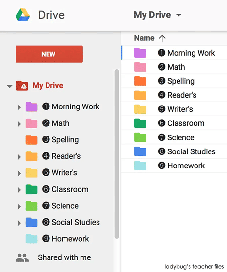
Google Drive leverages the principle of similarity through the use of consistent typography, icons and colors.
© Ladybug’s teacher files, Fair Use
Best Practices and Tips to Apply the Law of Similarity to User Interfaces
It takes careful consideration and attention to design UIs that make the most of the law of similarity. Here are some ways to leverage it to help create user interfaces that are visually cohesive and intuitive to use, and provide an enhanced user experience:
Use Consistent Visual Characteristics
Ensure that elements that belong to the same category or serve similar functions share consistent visual characteristics. Use similar colors, shapes, sizes or typography to establish visual relationships and help users understand more easily. Plus, use a style and color palette that are consistent across the entire interface.
Use Contrast Effectively
Use contrast strategically to highlight important elements or create visual hierarchy. By making key elements visually distinct through color, size or shape—designers draw users' attention and guide them through the interface, too.
Consider the Negative Space
Also known as white space, it’s a vital part of visual design. It gives a web page or app screen needed breathing space. What’s more, it helps “frame” sections for users to spot individual elements more easily.
Avoid Overusing Similarity
While similarity is essential for grouping related elements, avoid overusing it to prevent visual clutter or confusion. Strike a balance between similarity and diversity to make a design that’s both visually appealing and engaging.
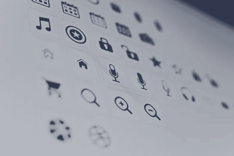
This selection shows a creative variety of icons leveraging similarity with a balance of diversity.
© Harpal Singh, Fair Use
Consider Cultural and Contextual Factors
Be mindful of cultural and contextual factors with the principle of similarity. Colors, shapes or symbols may carry different meanings or associations in different cultures or contexts. So, it’s vital to make sure that design choices are in line with the intended audience and context.
Test and Iterate
Test designs with users to see how effective the applied similarity principles are. Do usability tests and collect user feedback to find areas for improvement and refine the design iteratively.
Stay Updated with Design Trends
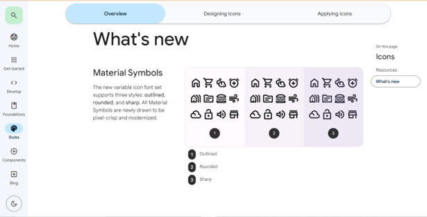
Designers should stay updated with the latest design trends and practices so they can make sure their grasp of similarity principles remains both relevant and effective. Embrace new techniques and approaches that are in line with users’ evolving needs and expectations. Another thing is to keep up with the success of new design languages that offer specific layouts, and more.
Google's design language—Material Design—relies heavily on the principle of similarity. Elements such as buttons, cards and icons share visual characteristics that are consistent. This is something that enables users to—quickly—recognize and interact with familiar patterns.
© Google, Fair Use
Potential Pitfalls with the Law of Similarity in UX design
To create interfaces that are visually coherent, intuitive to use and have an enhanced overall user experience, it’s important to be wary of several issues, including:
Visual hierarchy based on similarity alone: Be cautious not to rely just on similarity. Think about other Gestalt principles—such as proximity and closure—to create a comprehensive hierarchy that supports users’ understanding of things.
Watch this video to discover many of the visual design elements that influence visual hierarchy.
Lack of differentiation: Over-reliance on similarity may lead to a lack of differentiation between elements. It’s something that can make it challenging for users to distinguish between different categories or types of content.
Potential for confusion: If designers don’t apply similarity thoughtfully, it can lead to confusion or misinterpretation. Make sure that the similarities used are relevant and meaningful to the users and don’t create ambiguity. What’s more, too many different colors, shapes and sizes could be confusing for users. So, strike a balance between similarity and differentiation to keep things clear—and keep users on the right track, too.
Limited flexibility: If designers keep strictly to the principle of similarity, it may limit design flexibility. Designers need to find a balance between consistency and uniqueness to create visually appealing and engaging interfaces that stand out.
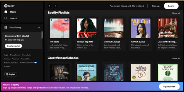
Spotify's user interface employs the principle of similarity to group content and create visual hierarchy. For example, playlists are visually distinguishable from individual songs thanks to consistent visual cues, such as color and typography.
© Spotify, Fair Use
Overall, the law of similarity is a crucial principle of Gestalt theory in web (and app) design. Good use of it helps create interfaces that are visually appealing and easy to understand. By using similar colors, shapes, or sizes to group related elements, designers can create a visual hierarchy that guides users through the interface.
However, it’s essential to strike a balance between similarity and differentiation—to prevent confusion or lack of distinction. Designers need to consider the context, cultural factors and user needs. When designers do it well, they can use similarity to help build interfaces that are both beautiful and functional. That goes a long way to creating designs that resonate with users and provide a seamless user experience.