Symmetry in user experience design (UX design) refers to a visual balance designers achieve by arranging elements to mirror each other or follow a consistent pattern. Designers align elements along a central axis to make interfaces more harmonious, intuitive and visually appealing. Symmetrical designs often give a sense of stability and organization, and help users navigate more effectively.

© Interaction Design Foundation, CC BY-SA 4.0
Why is Symmetry Important in UX Design?
Symmetry is important in design largely because it’s so close to the human experience. It certainly abounds in nature and the human world. For example, the human body and elements like tree leaves and butterfly wings exhibit natural symmetry. They provide a balance that’s aesthetically pleasing and structurally efficient. In architecture, too, symmetrical designs appear well-constructed and reliably strong—the Parthenon is a classic, and classical, example. Symmetry has reassuring qualities, and this fact translates to graphic design and UX design as well.
A key point about symmetry is how the human eye values order and seeks lines of symmetry to find balance in an image. The mind strives to make sense of what the viewer sees. People naturally tend to seek order in objects, and they typically understand that symmetrical elements are part of a unified group. This aspect comes from the Gestalt principles of psychology and design. In Gestalt terms, symmetry and order are sometimes known as the principle or law of Prägnanz (German for “good figure”)—the idea that individuals prefer simplicity and order in the forms they behold.
Author and Associate Professor of Art Studio and Digital Design, University of Kentucky, Mia Cinelli explains the Gestalt principles—watch this video to learn more about them:
Why are the Types of Symmetry?
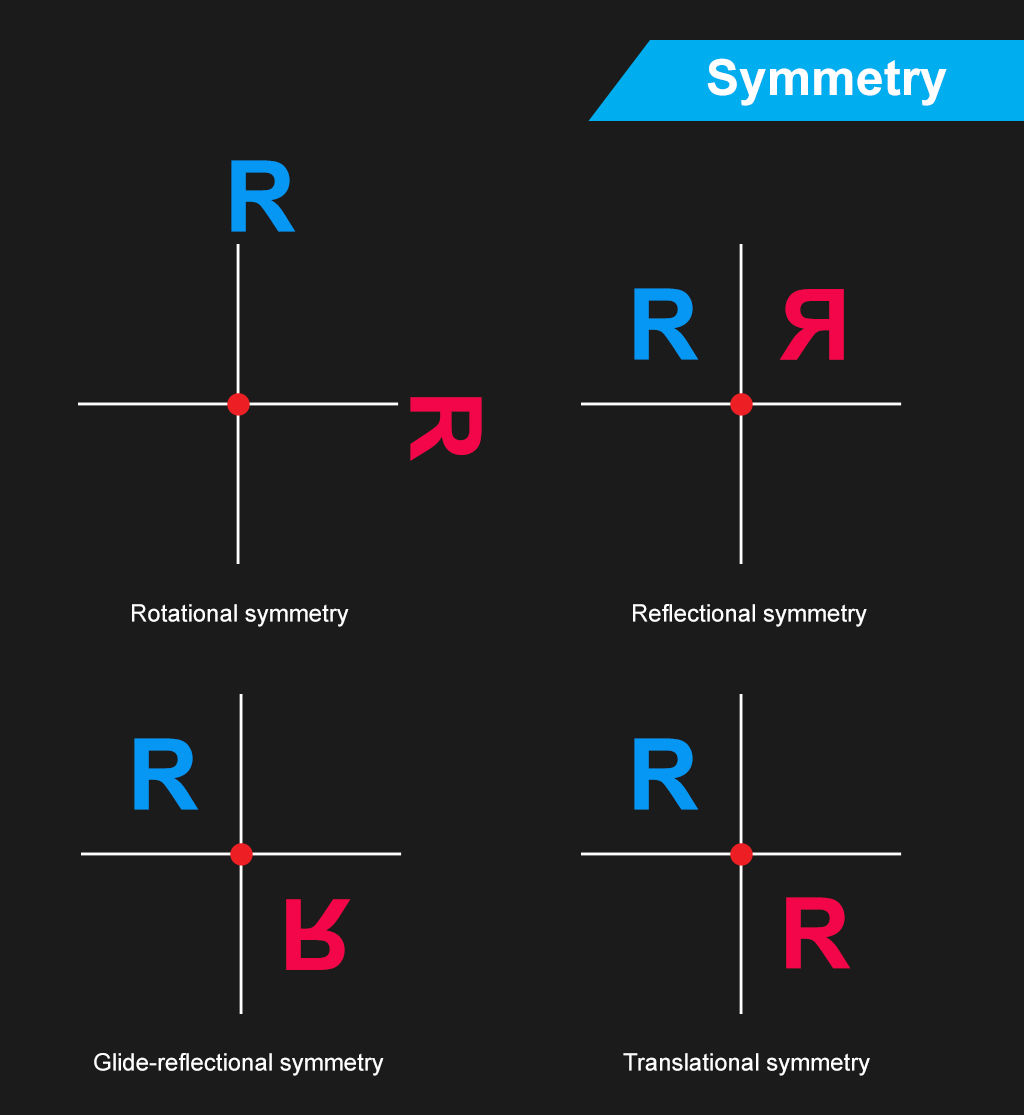
Symmetry as a design concept extends further than its Gestalt sense. In UX design, designers leverage symmetry to help users find websites and apps visually engaging and easy to navigate. Symmetry divides into several main types:
Reflectional symmetry, or bilateral symmetry: Designers achieve this when they reflect elements across a central axis, such as a website's header. This involves taking a single axis to make mirror images. This is typical in symmetrical logos.
Rotational symmetry, or radial symmetry: Designers arrange elements around a central point so that they keep their orientation when the user rotates them. What’s more, an object has axial symmetry if its appearance stays the same as the user rotates it. Circle symmetry designs such as circular logos are a good example of rotational symmetry.
Translational symmetry: Designers repeat elements at regular intervals. It’s common to find this in patterned backgrounds such as on-screen tiled arrangements.
Glide reflection symmetry: This combines reflection and translation. An example is footprints on the sand where each step mirrors and shifts from the last.
It’s important to note that when digital product designers leverage symmetry, they seldom make perfectly symmetrical designs. Instead, they tend to apply it measuredly in symmetric balance so users can find elements more readily. Sometimes, designers will apply pseudo-symmetry—where two elements or sections aren’t perfectly symmetric but “close enough” for users to see as being symmetric.
Full symmetric balance—or formal balance—is hard for designers to achieve in digital products. That’s because a perfect symmetry definition of elements in a design would constrain a designer to exceedingly simple and specific layouts. Google’s homepage, with its iconic, clean, lean and balanced look is pseudo-symmetric rather than symmetric. Users on Google’s main page tend to have one chief purpose—to look up keywords or subjects. Aside from the Doodles that celebrate and inform users on Google’s homepage, the latter offers a simple interface with much negative space so that users can get on with searching for the items and subjects they want.
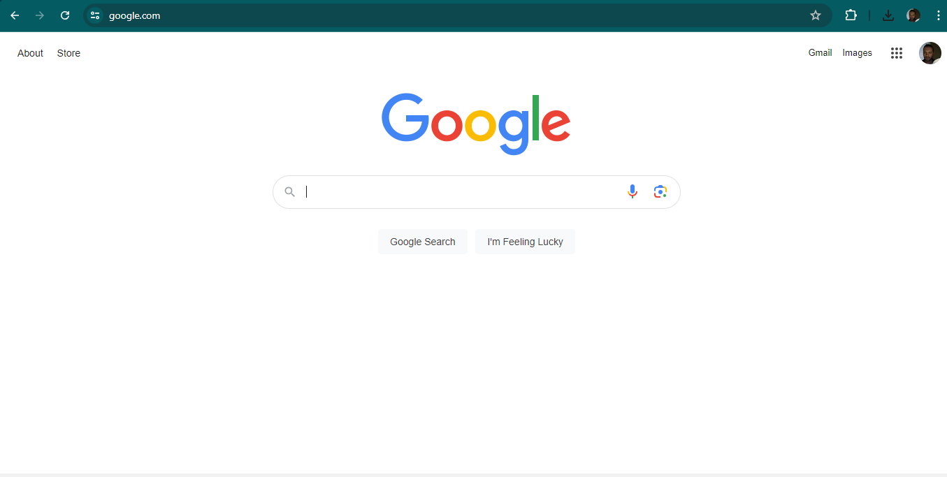
Google’s homepage has a degree of symmetry that helps set a calm, reassuring stage on which users can put their search requests and terms—in all their rich variety.
© Google, Fair Use
Another important point is that designers can make an interface like a webpage balanced with or without symmetry. With symmetry—or approximate symmetry—design, they can include elements such as centralized images and text. Without symmetry, however, designers can still make it balanced if they use an imaginary central point and arrange different-sized elements in a way that’s unified. As long as a design isn’t out of harmony or lop-sided, users can flow in seamless experiences without caring to search for symmetry and lines of symmetry. Depending on the nature of the brand and their own goals and desires, users will tend to tacitly enjoy the balance they sense.
What are the Benefits of Symmetry in UX Design?
When designers apply the balance that symmetry brings in their designs, they can:
1. Boost the Visual Appeal
Symmetry in UX design goes a long way to boosting the visual appeal of digital designs. The sense of order and balance it gives tends to come across to users as both attractive and professional. More symmetrically designed websites and apps can therefore be more engaging—in a gently guiding way. They can encourage users to explore and interact with the content.
2. Improve the User Experience
Symmetrical designs make for a better user experience as they make navigation simple, plus the content is easy to find and interact with. Symmetry is a tool to guide the user's eye in a natural flow across the interface. This will reduce the user’s cognitive load, so the interface feels more intuitive and user-friendly—important aspects especially in apps with users on the go. What’s more, a design with a symmetrical balance can draw users’ eyes to the middle of the screen—ideal to point them to the CTA and raise the likelihood that they’ll click on it. Design patterns can feature aspects of symmetry for such purposes.
Learn more about design patterns in our video:
.
3. Raise Readability and Accessibility
The balanced distribution of design elements in designs that have symmetry axes makes content more readable. Users can understand and absorb information more easily. That’s a major benefit for users with disabilities, who can more quickly recognize and interact with the interface elements than they would otherwise.
See why accessibility is such a vital concern in design:
4. Improve the Mobile Experience
Responsive design is an essential point to consider, especially in the mobile-first era where most users access digital products on handheld devices. Another main benefit of a more-or-less symmetrically designed website or app is that it can translate more easily across screen sizes with responsive design. Visual elements can appear on any screen as intended, which improves user interaction and the overall user experience.
CEO of Experience Dynamics, Frank Spillers explains responsive design:
5. Strengthen Brand Identity
A consistent symmetrical design across a brand’s digital platforms can help it establish a strong, recognizable brand identity. A high level of symmetry in visual design carries messages of stability and reliability. Plus, it fosters user trust and loyalty. These aspects are crucial for a brand to enjoy success.

Maersk’s application of symmetry helps their users and customers—and logistics and transportation tend to demand a high degree of trust in a brand.
© Maersk, Fair Use
Best Practices to Use Symmetry in UX/UI Design
Designers can leverage symmetry in their digital designs when they:
1. Leverage Rotational and Translational Symmetry
Designers apply rotational—or radial—symmetry when they rotate elements around a central point. They use it to create dynamic patterns that give a sense of movement and energy. Meanwhile, translational symmetry is what designers use when they repeat elements at regular intervals. That can create depth and a sense of continuous flow in a design. These types of balance and symmetry are helpful to make the most of the visual impact and user engagement in a digital product.
2. Balance Symmetry with Asymmetry
Symmetry brings order and familiarity—and, from that, a sense of stability and peace. Designers can add interest and focus to a design, though, with some calculated asymmetry. If they do it strategically, they can use some asymmetrical arrangements to guide users' attention to key areas, like calls to action. So, some degree of balance between symmetry and asymmetry can help designs be both beautiful and practical.
3. Use Symmetry to Guide User Attention
Symmetry isn’t just about aesthetics; it's a powerful tool to organize content and guide user attention. When designers align and distribute elements symmetrically, they can leverage the interplay of equal halves to create a natural flow and lead users’ eyes through the interface. For instance, to align text and images on a central axis or distribute icons evenly across a navigation bar can improve a website’s usability and make for a more cohesive experience overall.
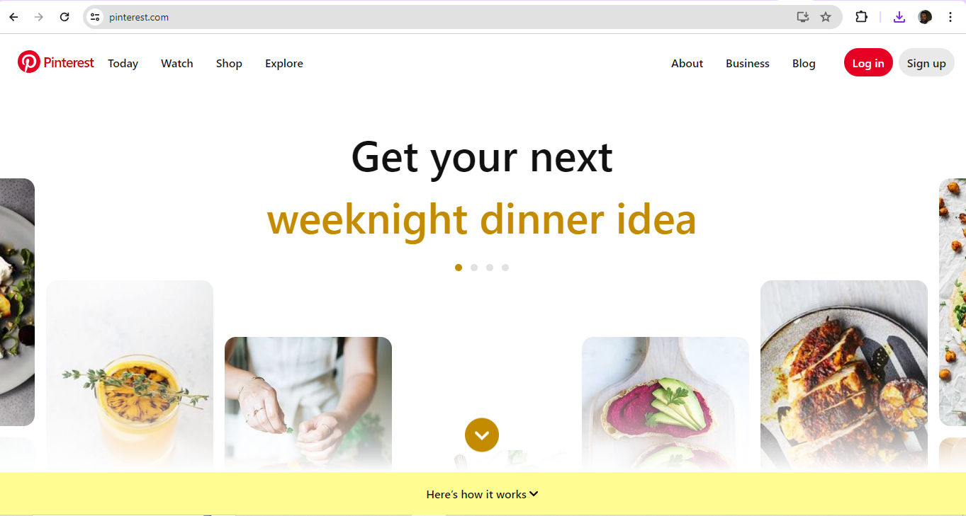
Pinterest’s use of symmetry naturally leads eyes to find what users’ want.
© Pinterest, Fair Use
4. Use Grids
One easy and popular technique that designers use to help with symmetry is to split a page into parts with a series of horizontal and vertical lines. Then, they put design elements in these sections to create a balanced and symmetrical layout. For instance, a 12-column grid for a web design layout can help designers place elements evenly across columns.
5. Use Patterns
Designers can use repeating shapes or colors to establish order and balance. They might split a webpage into sections and leverage symmetry that way. Alternatively, they might create a background to do this, and make a webpage more appealing with an alluring pattern.
6. Use Colors and Contrast
Designers can use a limited color palette to help create a sense of order and balance. This can help a website look more harmonious and professional. Plus, designers can use colors to highlight important information and form a visual hierarchy so users’ eyes follow a helpful flow. It’s essential to get color balance and contrast right to maintain balance and help users, especially users with visual impairments like color blindness. For instance, if a designer puts a dark-colored element on one side of a page, they should balance it with a similarly dark element on the opposite side to achieve good symmetry.
Watch as Arielle and Joann Eckstut, leading color consultants and authors—and among the most definitive authorities on color in the United States—give tips on how to choose colors:
7. Use Shapes
Simple shapes such as circles, squares and triangles are helpful tools for designers to leverage a sense of symmetry and balance. What’s more, they can use shapes to pique users’ interest and draw attention to important information. It’s important to use shapes—and sizes—of elements consistently. For example, an equilateral triangle can serve as a helpful Play or Proceed button element. Meanwhile, a button on either side with two triangles pointing to the right can serve as a Fast-forward button, and a button with two facing the other direction can indicate a Rewind button. This will also match users’ mental model for a media player.
8. Remember the Purpose
It’s vital to consider the brand’s nature and message as a deciding factor between symmetry and asymmetry in a digital product. This could feature in a brand’s guidelines, so designers should refer to their client’s design brief as well. For a bank’s app, for example, a symmetrical design is more likely to instill a sense of trust in users. Meanwhile, a more asymmetrical design would be more in step with a brand in the entertainment industry—to bring its energy and dynamism to users.
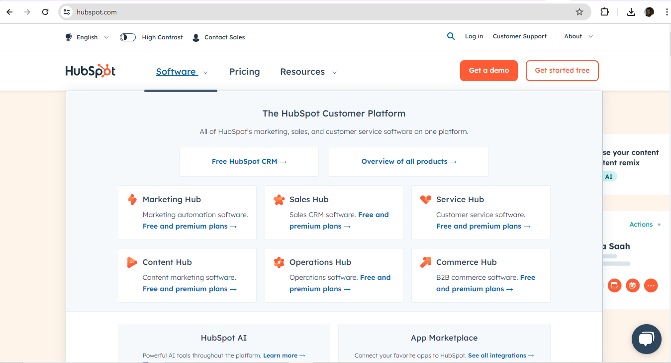
Cloud-based customer relationship management (CRM) platform, HubSpot show a neat grasp of symmetrical design that’s well-suited to their user base.
© HubSpot, Fair Use
9. Remember the Users
Aside from the brand—or maybe because of it as well—designers should always keep the users in mind when it comes to decisions about symmetry. Symmetrically designed digital products can convey a greater sense of sophistication and luxury. Meanwhile, less symmetry might appeal better to a younger audience, or one more interested in disruptive, unusual content.
It’s also vital to consider the users’ culture in this respect. As symmetry and asymmetry are bound up in design principles that different cultures will appreciate in different ways, designers should align with these expectations.
Author and Human-Computer Interaction Expert, Professor Alan Dix explains important points about how to design with culture in mind:
10. Consider the Other Gestalt Principles
Effective design doesn’t revolve entirely around how to find an axis of symmetry. The Gestalt principles of design are valuable allies for designers. Designers can consider how other Gestalt principles—such as the laws of proximity and figure-ground—might help achieve even more striking looks and helpful features in their design work.
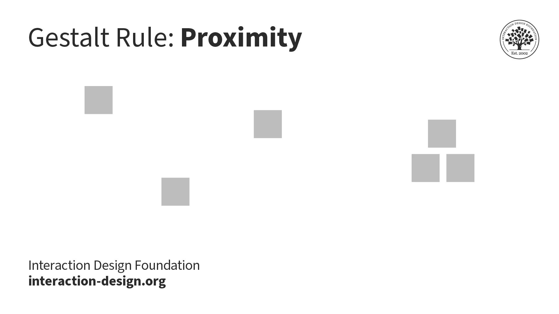
Proximity (above) is one particularly useful Gestalt principle, law or rule; figure-ground is another (below).
© Interaction Design Foundation, CC BY-SA 4.0
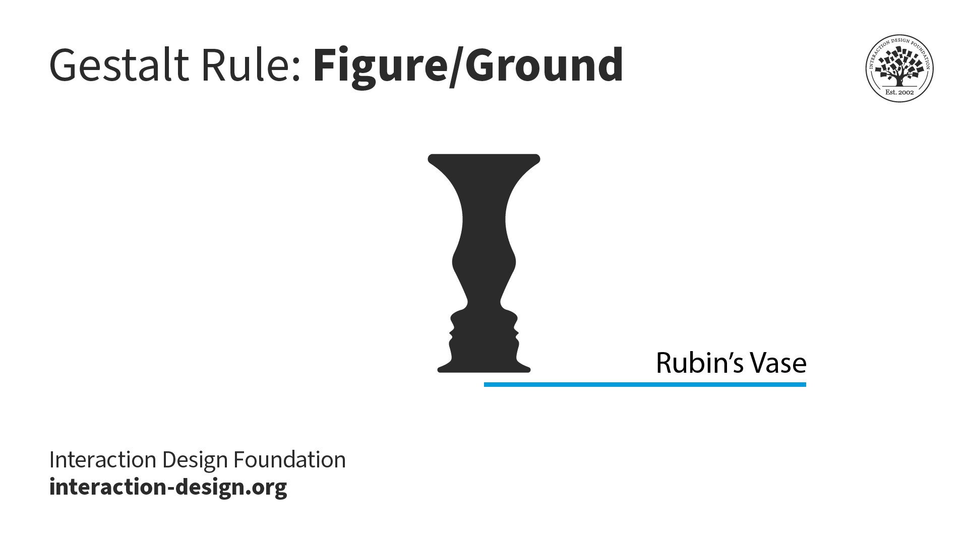
© Interaction Design Foundation, CC BY-SA 4.0
Risks and Considerations with Symmetry in Digital Designs
1. Potential for Monotony
Symmetry brings a sense of order and harmony to design, but too much of it can give a design a dull look and turn users off a brand. Perfect symmetry can come across as artificial. The predictable nature of symmetrical balance means there’s little room for flexibility. Compositions must be identical on both sides for that. If designers tie themselves to an axis of symmetry, the equation can result in designs that feel dry and unengaging.
2. Challenges with Complex Layouts
Perfect symmetry may promote stability and consistency, but it can sometimes stifle the creative expression a designer needs for more complex layouts. Strictly bilateral symmetry may dull the visual impact of a design. It can depend on the brand and the brand’s message, but if users arrive expecting some excitement, adventure and a visual feast, they’ll have little to excite them if a design is too symmetrical.
3. Balance Symmetry with Creativity
It’s more of an art than a science to achieve balance in design. That’s why designers are better off when they consider how much of a thoughtful blend of symmetrical and asymmetrical elements they can use. It’s that all-important balance between the order and predictability of symmetry—to guide users and make a design feel more familiar—and some degree of asymmetry—to insert some dynamism and focus in it.
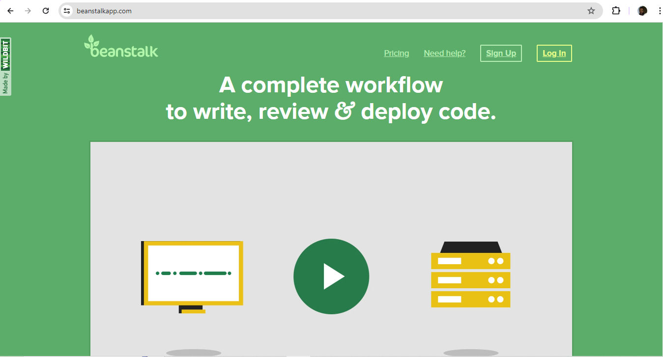
Beanstalk—from software company Wildbit—makes hosting code and managing deployments easier. Their use of symmetry helps to mirror this message in a highly user-friendly form, so teams can work on creating exceptional software instead.
© Wildbit, LLC., Fair Use
Overall, symmetry in the design of digital products is more about balance and order than perfect mirror-imaging. As with other design and art forms—like music—those who experience design work tend to have little patience for monotonous arrangements. It takes careful consideration to strike the perfect chord between predictability and engagement.
The designers who reflect their brands’ values and users’ needs, desires and expectations well in this sense are those who leverage just the right amount of symmetry. So, rather than a game of calculating the equation of an axis of symmetry to find out how much “disorder” or “playfulness” a designer can get away with, it’s a question of balance. It’s about mirroring both client-brand and user demand in good-looking, user-friendly interfaces.