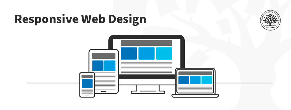
Responsive design is an approach to web design in which the interface adapts to the device's layout to facilitate usability, navigation and information seeking. Responsiveness is possible thanks to media queries, allowing the design to adjust automatically to the browser space to ensure content consistency across devices, and design elements being sized in relative units (%).
Responsive design has significant benefits, and it's a default for web design to support device switching.
With responsive design, you may:
Reach a larger audience: Nowadays, more users access the web through mobile devices, so ensure your mobile User Experience design is well-considered.
Save time and development efforts since designers and developers only focus on one design version.
Improve SEO, as search engines reward mobile-friendly websites with better search positions.
Ensure brand and design consistency across devices, as there is no chance to modify guidelines to fit different design boxes.
Why Responsive Design is so Popular
In the early 2010s, designers had to address a historical phenomenon. More users were starting to access web material on handheld devices than on desktops. There were two main design approaches to deal with designing across devices:
Designers could craft several versions of a design optimized for different devices and make each have fixed dimensions (adaptive design approach).
They could work on a single, flexible design that would stretch or shrink to fit the screen (responsive design approach).
Organizations and designers found the benefits of responsive design hard to ignore. Rather than work with absolute units (e.g., pixels) on separate versions, designers focused on just one design and let it flow like a liquid to fill all "containers."
How to Understand the Language of Responsive Design
Responsive design has three core principles:
Fluid Grid System
Grid systems are aids designers use to build, design, arrange information and make consistent user experiences. In interaction design, multi-column, hierarchical and modular are the most widely-used types of grids.
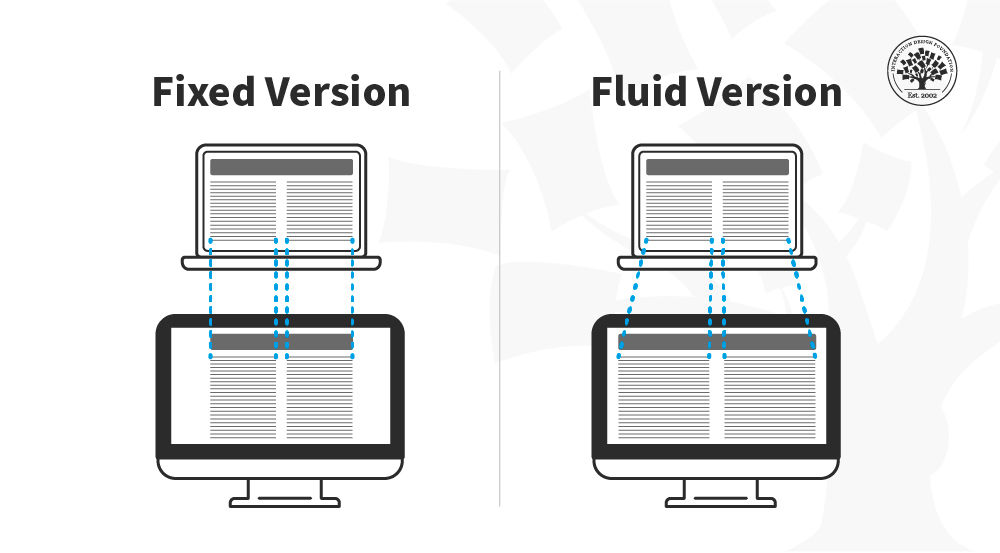
The principle of a grid is simple: every element occupies the same percentage of space, however large or small the screen becomes, which means that the components can be scaled up and down as the user switches devices.
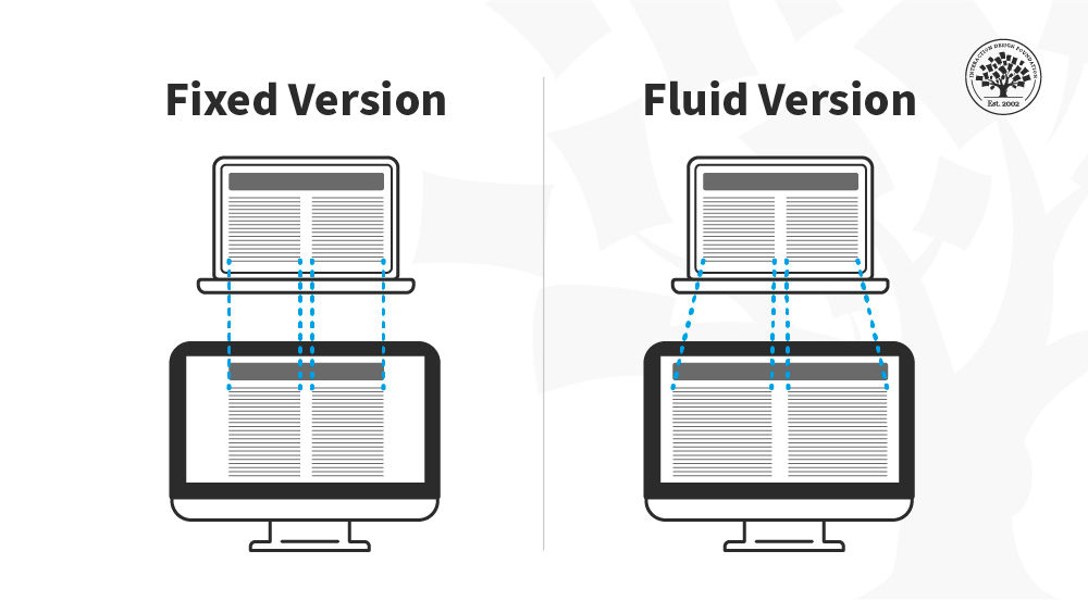
In this image, you can see that the fixed version of the content has the same width regardless of the device whereas in the fluid version the content fills the available space depending on the device size.
© Interaction Design Foundation, CC BY-SA 4.0
Fluid Images
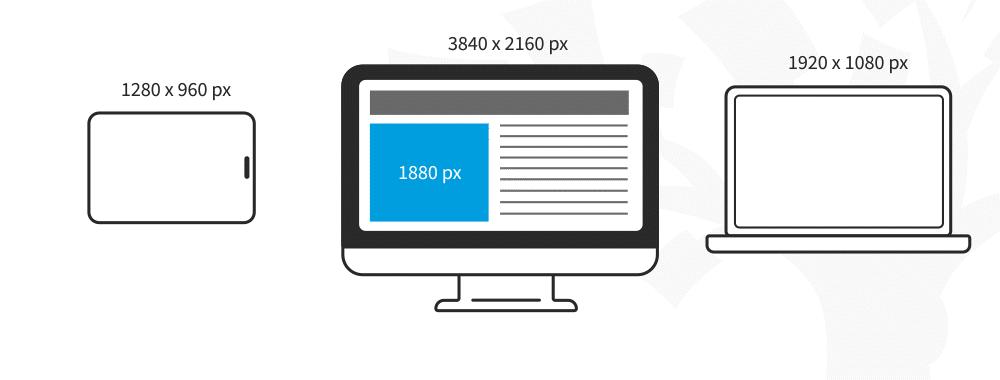
In responsive design, fluid images are images that scale to fit their container, meaning that when the browser reaches a breakpoint, the image will scale up or down to the current window size.
© Interaction Design Foundation, CC BY-SA 4.0
For non-photographic images, such as icons, you can use SVG files—these file formats are lightweight, and you can scale them to any resolution without losing quality.
Media Queries and Breakpoints
Media queries are filters that detect the browsing device's dimensions and make your design appear appropriate regardless of the screen size. To aid media queries, you have breakpoints: these are the values where the content of your website will be rearranged to provide the user with the best possible experience.
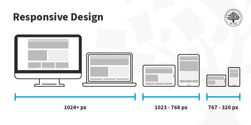
Media queries and breakpoints go hand in hand, and both can be defined in your CSS style sheets. For designers, a breakpoint is a boundary where the design will change to accommodate the features to the new size. Commonly, designers use three sizes when designing responsive websites: 1024 & upwards, 1023-768, and 767-320 px.
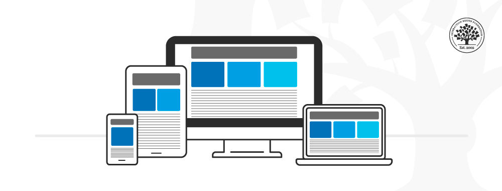
In this image, you can see how the placement of the columns is rearranged depending on the screen real estate available. The content is displayed in one column in the smartphone, two on the tablet and three on the desktop.
© Interaction Design Foundation, CC BY-SA 4.0
Media queries work best with a "mobile first" approach where you define what you want on mobile and then scale up from there. You’ll need to test content to see where breakpoints occur and plan them. Eventually, you may find you can predict breakpoints based on a device's screen resolution.
Best Practices & Considerations for Responsive Design
With responsive design, you design for flexibility in every aspect—images, text and layouts. So, you should:
Assume a "mobile-first" mentality: Whether you start to design from the smallest screen or the desktop version, assuming a mobile-first mentality helps you practice the mobile-first approach, a design principle with simplicity at its core. A mobile-first mentality means prioritizing content, leaving complex graphs and images for the desktop version, and creating fat-finger-friendly tap targets (30px minimum).
Use Scalable Vector Graphics (SVGs). These are an XML-based file format for 2D graphics, which supports interactivity and animations.
Include three or more breakpoints (i.e., design for 3+ devices).
Prioritize and hide content to suit users' contexts of use. Check your visual hierarchy and use progressive disclosure and navigation drawers to give users needed items first. Keep nonessential items (nice-to-haves) secondary.
Aim for minimalism.
Apply design patterns to maximize ease of use for users in their contexts and quicken their familiarity: e.g., the column drop pattern fits content to many screen types.
Aim for accessibility with font sizes/styles. Use contrast and background effectively. Consider learning about typographic scales to harmonize body copy and headlines. As some users rely on screen readers, make all your text "real" instead of text within images.
Responsive design is robust and economical, but its "easy" nature is deceptive. You can still run into difficulties if you use it without caution. For example, it can restrict your control over the design's screen sizes; consequently, if you do not set media queries upfront, the elements could shift independently. Also, it is typical to run into issues with advertisement formats, especially on mobile devices.
Still, responsive design aids great UX since, by default, it requires uniformity, seamlessness, and simplicity in your design efforts. It is SEO-friendly, and the multiple CMS and frameworks, such as WordPress and Bootstrap, make it very cheap to implement.


