Iconography in user experience (UX) design refers to a visual language geared to product identity, where designers craft or adapt icons—simplified illustrations that help users navigate across digital environments. Designers create clear, unambiguous icons and use them consistently to communicate effectively so users can instantly recognize their meaning and achieve goals faster.
CEO of Experience Dynamics, Frank Spillers explains important points about Google’s Material Design, a helpful resource in the design of icons and more.
Why is Iconography Important?
The definition of iconography—as well as the design and application of iconography sets—has evolved with computing and design over many years. Particularly with the advent of home computing in the early 1980s—and especially with the common use of the computer mouse—the need to represent interactive functionality on screens became profound. Icons are a vital component of any graphic user interface (GUI).
Icons are essentially a form of design language that encapsulate concepts in simple shapes. To a certain extent, they mirror pictograms in graphic design and infrastructure works—such as those inside buildings and on roadsides, like “for customers with disabilities” or “to airport”—for users to understand at a glance the function or content on their screens. Effective visual iconography is far more than a skill designers need to create visual elements to improve the user experience and interactive design of a digital product. Icons represent keys to accessing vast dimensions of usability in digital products. Without them—and unless voice-controlled user interfaces (VUIs) become the dominant form—users would encounter severe pain points and obstacles to their goals.
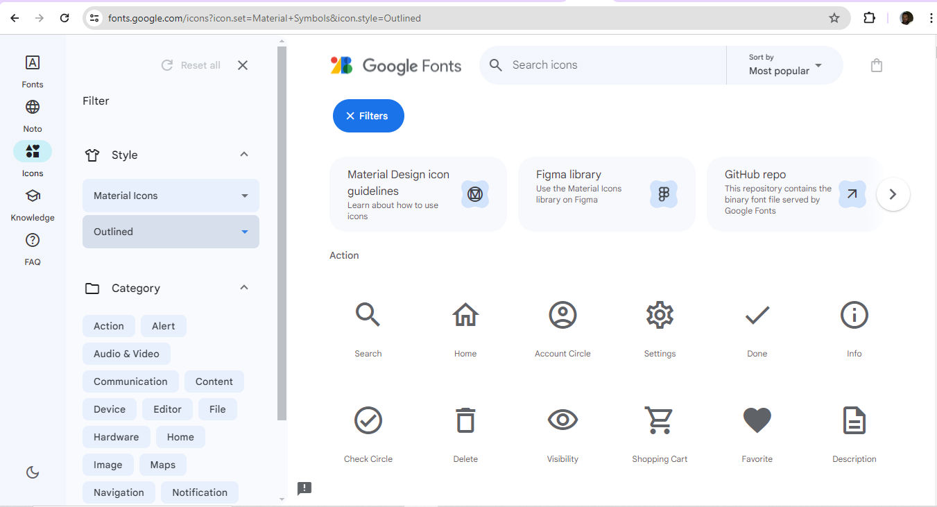
Google’s Material Design icons are customizable options.
© Google, Fair Use
In iconography for web design and apps, well-designed iconic symbols are vital cues for how a user interacts with a user interface (UI). The importance of icons for digital interfaces becomes even more apparent when one considers the relationship between a signifier and an affordance in the physical world. For instance, a door is an affordance. Meanwhile, the presence of a push plate—as opposed to a “Pull” handle—helps users realize what they must do to use the door in the right direction. If the plate also features the word “Push,” that’s the signifier that assures users of what to do. Other examples include the red “Exit” sign or a pictogram of a person running—set above a fire exit. Since icons on digital devices must offer more intricate functionalities—and more frequently on small screens—designers must leverage principles of iconography in UI design well to guide their target audience. They need to offer users the most effective types of icons to suit their needs for a multitude of tasks and goals.
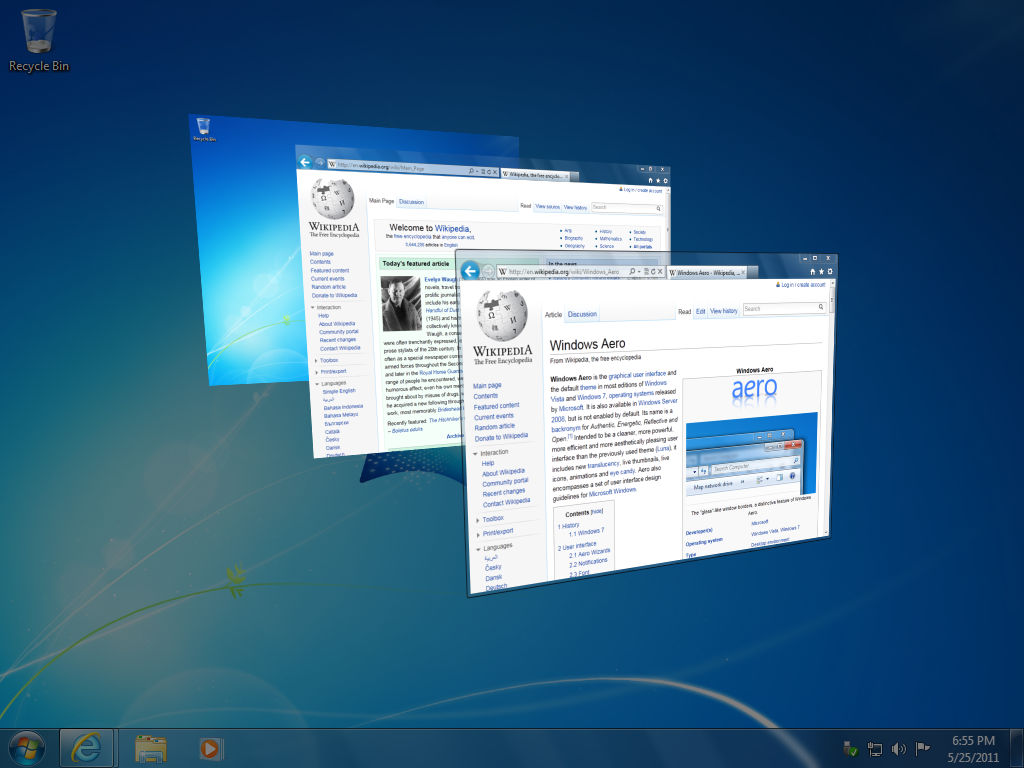
Some iconography examples have become firmly entrenched in the modern user experience. The trash can—later the recycle bin—was an early example of an icon in an interface. It’s a skeuomorphic design. This means the trash can mimics its real-world counterpart. Early computer users also came to associate the icon of the then-common floppy disk with the function of saving work such as a text file. These two physical items—the floppy having long since fallen out of everyday use—are examples of how iconography becomes established and then indelibly stamped in the public consciousness. Icons that succeed and become “household names” are like shorthand for the brain to respond to—like muscle memory.
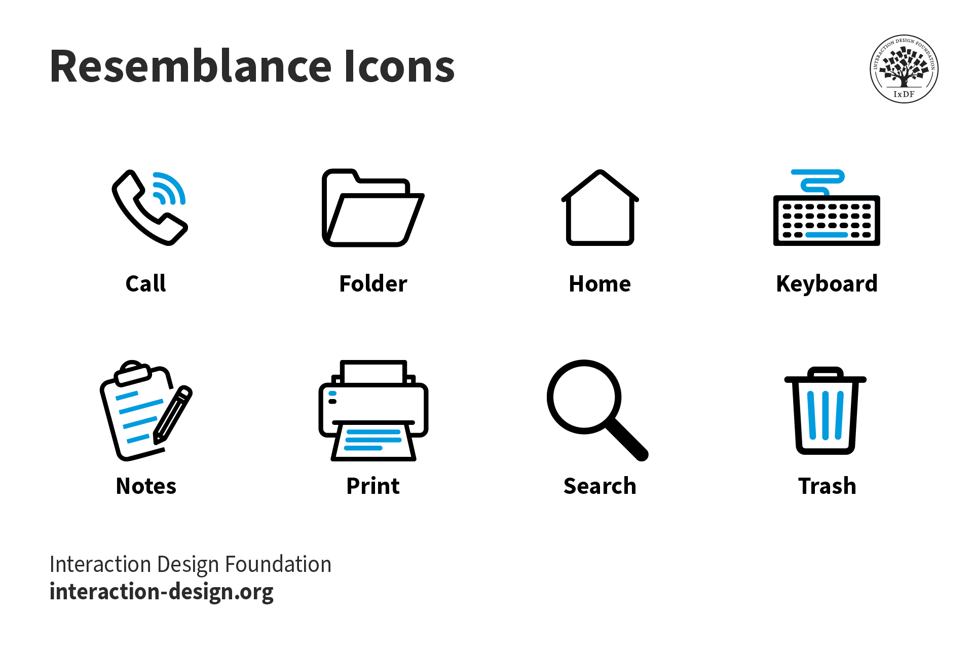
Some icons are mainstays of UI design, such as these ones that resemble their real-world counterparts.
© Interaction Design Foundation, CC BY-SA 4.0
What are the Benefits of Effective Iconography?
Designers continue to create, adapt and use icons to:
1. Make It Easy for Users to Recognize Function
One main purpose of icons is that they should be immediately recognizable—a quality that makes them effective for quick communication in user interfaces. Their ability to encapsulate information swiftly is especially valuable in environments where speed and clarity are vital. Especially in mobile contexts—the more common way users engage brands in the 21st century—this is a particularly important consideration for designers to accommodate in icons. When designers use a well-crafted icon style that users find familiar or can learn at a glance, it means users can navigate new interfaces more efficiently.
2. Save Space in Design
In digital design—especially on smartphone screens—space is a premium commodity. Icons are compact and allow a limited interface area to feature multiple functions. This space efficiency makes them indispensable in toolbars and menus where horizontal or vertical real estate is limited. So, designers can create clean and uncluttered user interfaces.
3. Leverage the Universal Appeal of Icons
Icons transcend linguistic barriers, so they’re a universal component of digital communication. They eliminate the need for translation in global applications—particularly helpful for international software. An envelope icon indicates email, for example. Icons can form part of a seamless user experience across different cultures and languages—slashing the potential for confusion while boosting accessibility.
Author and Human-Computer Interaction Expert, Professor Alan Dix explains important points about how to design with culture in mind:
4. Customize a Brand’s Presence Through Its Iconography
Designers tend to align the icon symbols they use on digital products like websites and mobile apps with the look and feel of their brand. It’s important to present users with iconography that’s familiar to them. However, if a designer can fine-tune this sense to match the personality of their brand—including a suitable color palette—they can welcome users and customers that much further into a seamless experience.

One of the keys to a seamless user experience is that users should not need to pause and think about the interface or its icons.
© Andrew Kucheriavy, Fair Use
Best Practices and Tips to Design Icons
Designers can utilize libraries like Google Material Design iconography or start working on their own from scratch. In any case, when designers embark on icon design, they should:
Establish a clear, consistent visual language: It should match the brand’s personality and the users’ expectations. So, it’s vital to conduct user research and follow the brand’s guidelines in a design brief. For example, a “traditional” bank website will call for a look that boosts trust, with a careful application of sedate colors and symmetry or visual balance. Meanwhile, an entertainment-oriented app can afford to embrace a certain degree of playfulness. In any case, designers should consider factors such as the following:
Line weight: For example, 2 pixels for a line weight is a common feature.
Fill style: Designers choose whether they want to stroke icons or fill them. If they stroke them, it’s important to have the same line thickness.
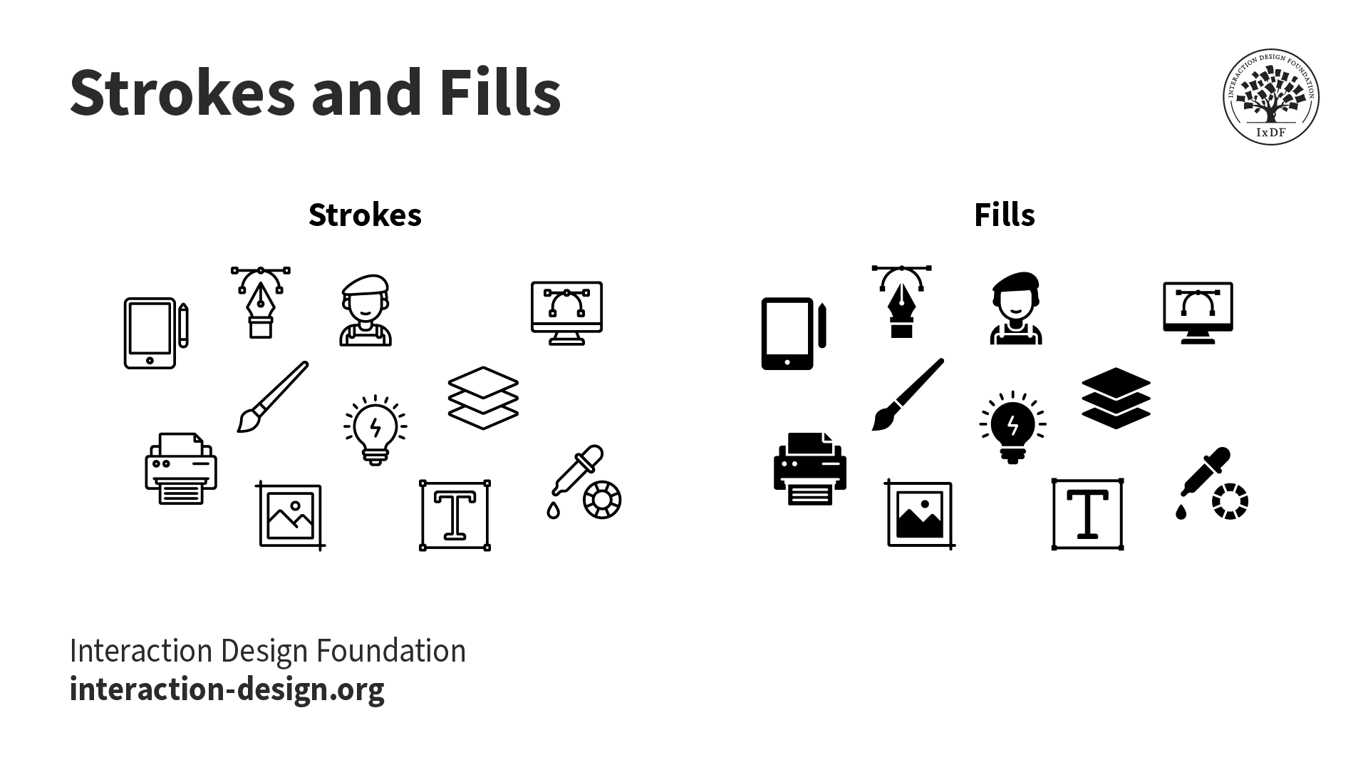
Strokes and fills—important considerations for a brand’s icon set.
© Interaction Design Foundation, CC BY-SA 4.0
Corner radius: This is the degree to which the icon has rounded corners.
This image marks the change when iOS app corners became distinctly more rounded.
© Appifier, Fair Use
Use a grid system to keep the alignment and balance effective: It’s vital to make sure that each icon is in harmony visually within the set.
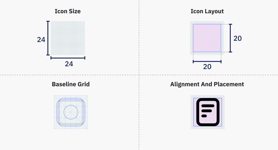
The icon’s live area is the part visible to users. An icon 24×24 dp (density-independent pixels) in overall size would have an effective live area of 20×20 dp—so, with 2-pixel padding.
© Shriya Pandey, Fair Use
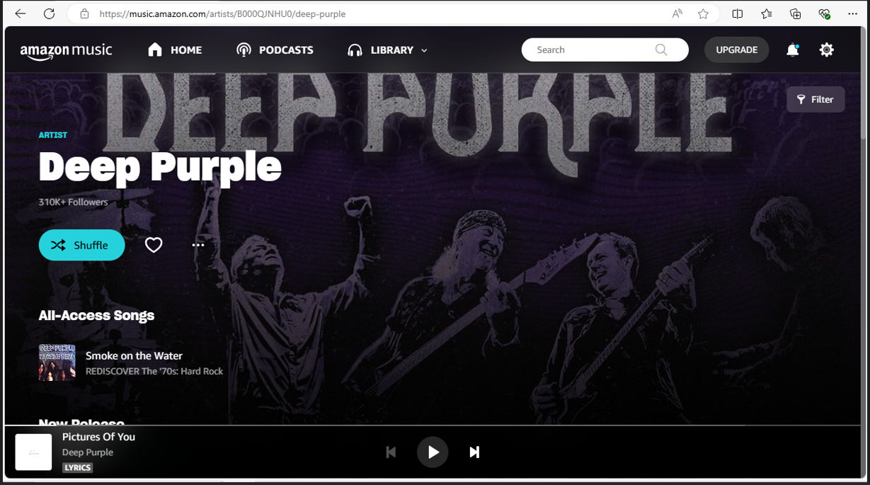
Make sure icons are ultra-quick for users to recognize: It’s best to use ones that users are used to. Familiar icons that have stood the test of time are there for consistent application. Designers can apply Home (house icon), Print (printer) and Search (magnifying glass) as reliable examples.
The Play button, along with next track and previous track symbols and others, are universal to recognize, on Amazon and Spotify, for example.
© Amazon, Fair Use
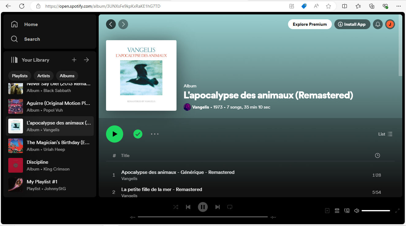
© Spotify, Fair Use
Use icons to save space but keep fat-finger friendly as a rule of thumb for mobile users: Users need to recognize icons in toolbars and elsewhere, so they shouldn’t be too detailed or hard to decipher. Plus, users need to be able to enjoy great accessibility, including with fat-finger friendly icon sizes (44 pixels).
Make icons describe function and purpose in visual terms: They’re not for decoration. Designers should consider if their product’s users could tell what an icon means without any help from labeling.
Always use a single icon set as per design and branding guidelines: In the same sense that microcopy needs to be consistent (e.g., “Remove item” or “Delete”), so do the icons on a site or app. One icon should have a single function, and there shouldn’t be multiple icons for the same function.
Label for clarity, as needed: On a toolbar, for example, be sure to label icons for clarity. Labels should go on the right of the icon or beneath it. Be sure to leave enough space between the icon and its label to maximize readability.
Beware of icons that might be ambiguous to users: Even if one thinks that sheer weight of usage over the decades should have indelibly stamped what some icons mean in the popular psyche, designers shouldn’t take the gamble if in doubt. For example, hamburger menus have historically proved problematic in this way—most interfaces implement hamburger icons to indicate the main navigation menu, but some don’t. Star and heart icons also run into grey areas in the sense that some users may not associate them with bookmarking and favorites, respectively.
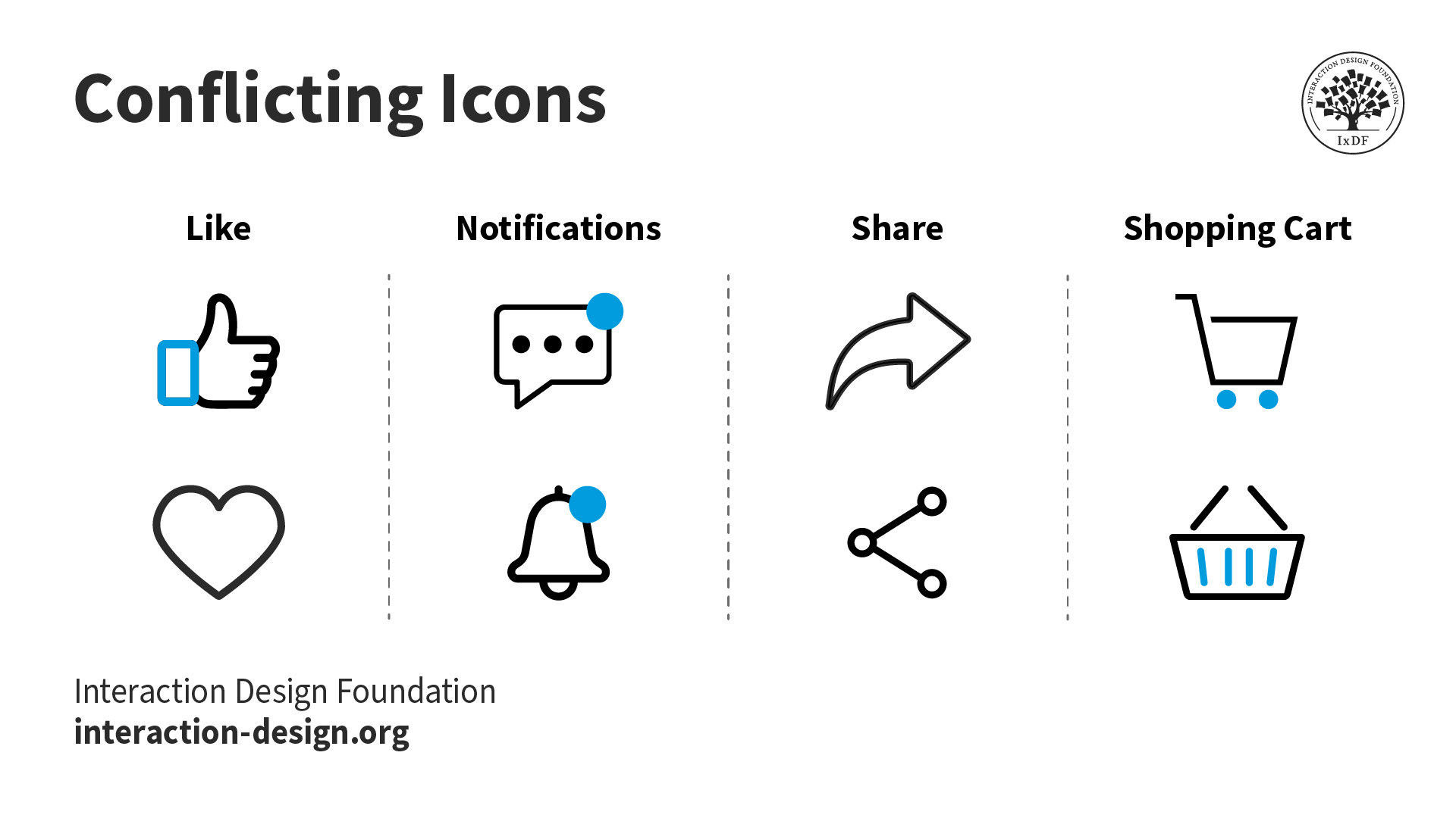
Two icons can mean the same thing.
© Interaction Design Foundation, CC BY-SA 4.0
Keep icons simple: Don’t insert too much graphic detail or make complex arrangements. Icons need to be schematic and recognizable at first glance.
Use distinct shapes and colors: If users can recognize shapes and colors that represent distinct functions, they’ll be able to act accordingly and without confusion.
Use text labels if the need arises: Sometimes, there can be doubt over how to encapsulate a function within—or indicate content using—an icon. Text labels can serve either to complement the icon or to serve as a button in its own right.
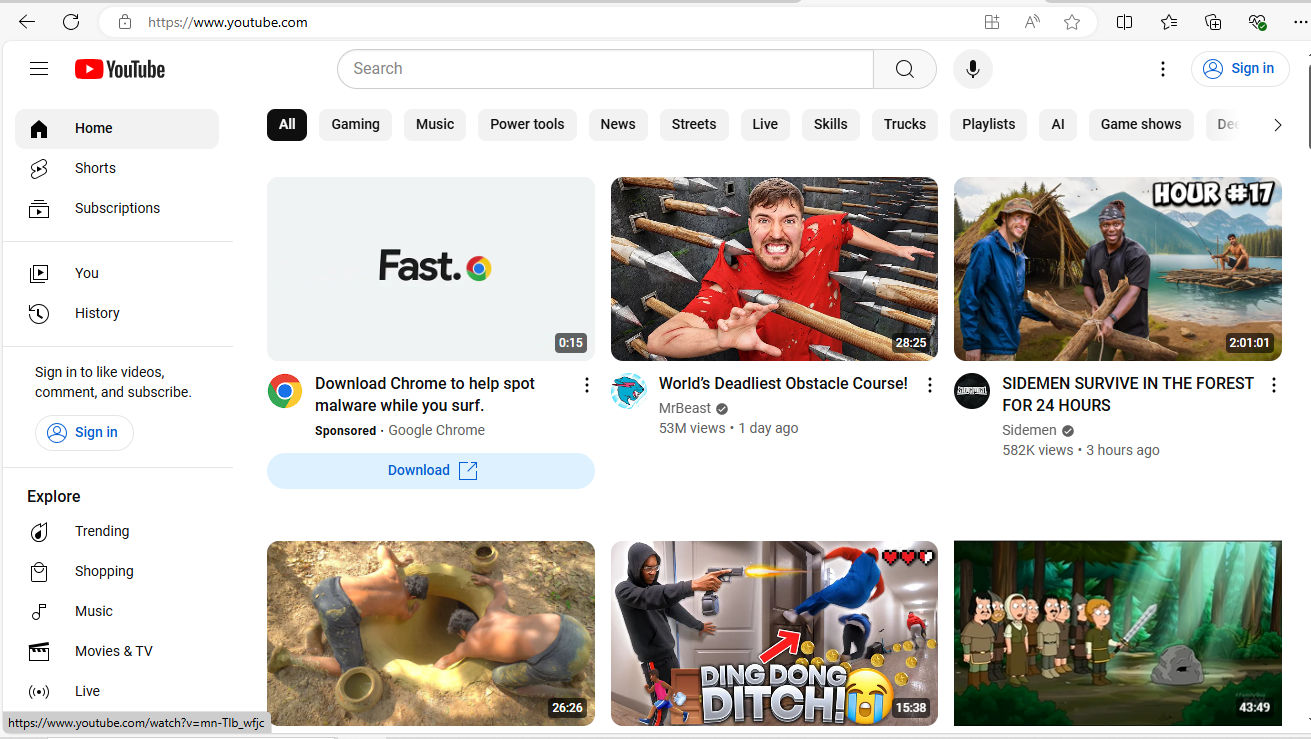
Some brands apply a combination of text labels and icons—as with YouTube (above)—and some utilize more text buttons, like Bank of America, below.
© YouTube, Fair Use
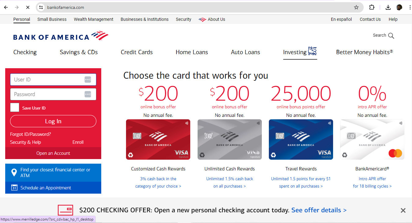
© Bank of America, Fair Use
Remember visual hierarchy: Consider how the icons work as a set on each screen. It’s vital to arrange them so they complement the interface and deliver the most intuitive experience to users.
Watch our video to understand more about visual hierarchy:
Test icons with real users: This is vital. As straightforward and intuitive as designers believe their icon creations may be, only through user testing can they get the feedback they may need to make refinement to icons—to ensure they’re intuitive and effective. Remember, simplicity in design aids user recognition and understanding. This is why effective icons remain an indispensable tool in UI design
UX Strategist and Consultant, William Hudson explains the importance of user testing:
What Tools are Helpful to Design Icons?
When it comes to choices in iconography, Google’s Material Design is an example of a popular resource to work with. Designers who want to create their own icons have many options, too. The following tools are among the most helpful with features like collaborative work facilitation and plugin libraries:
Adobe Illustrator: Vector-based, this tool is good for designing icons, logos and more.
Figma: This is a popular choice to make UI elements with—and that includes icon sets.
Sketch: This vector-based software is easy to learn.
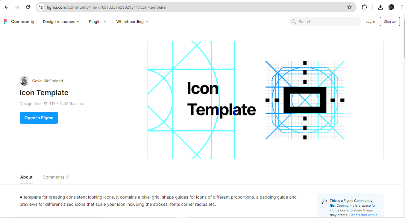
Designers can use icon templates as well.
© Gavin McFarland, Fair Use
Overall, a well-designed set of icons is a key part of product design. Users come to know—and love—the brands they choose to interact with through a journey of discovery. The best of these journeys invariably include those all-important seamless experiences. Like the logo, a brand’s iconography is a form of visual communication with its users and customers.
Many designers don’t venture out to create icons in a custom set for their client’s or brand’s digital products. However, the creations of designers who do stretch creatively to design system iconography, symbols and more intuitive ways to interact with a brand can be impressive. The most effective of these may prove to strengthen the links between users, customers and the brands they love in a more engaging and delightful UX. Some icons may join the core group of household symbols like the recycle bin, and through sheer frequency of use become iconic.


