Readability in UX/UI Design

Your constantly-updated definition of Readability in UX/UI Design and collection of videos and articles.
Be a conversation starter: Share this page and inspire others!

98 Shares

What is Readability in UX/UI Design?

Readability in user experience (UX) design refers to how easily users can read and understand textual content. It is crucial for a positive user experience as it directly impacts how effectively users can consume information on a website or application. Designers aim to enhance readability via appropriate presentation and language to make sure users can easily comprehend content.  

Why is Readability Vital in UX Design?

In user experience design and user interface (UI) design, readability’s an essential but often misunderstood concept. It refers to how easily users can not just perceive but understand the text they find on a digital platform, too. It’s different from legibility—which refers to how easy it is for someone to distinguish one letter from another in a particular typeface—and distinguish and recognize characters and words.  

As a concept, readability has a wider span than legibility. It covers how comfortably readers can decipher and process what a designer presents on a screen, and make sense of the intended message. So, readability in UX design isn’t just about making text legible for target users. It’s also about how designers present information to users and how users understand it. Like other aspects of user-centered design, it involves a delicate balance—in this case, of accessibility, legibility and comprehensibility.  

Even so, legibility is a vital part of readability. Users must first be able to clearly make out the text that they’re going to have to process. Typography primarily influences this aspect of design—and it’s helpful to know the anatomy of type to assist design choices. A good choice of typography and fonts is one of the most important design decisions behind a digital product. For the best legibility, designers should use a large default font size, make sure there’s high contrast between text and its background, and pick a clean typeface.  

Image showing the text Anatomoia De Um Tipo with various labels saying what the parts of the lettering are in typographical terms.

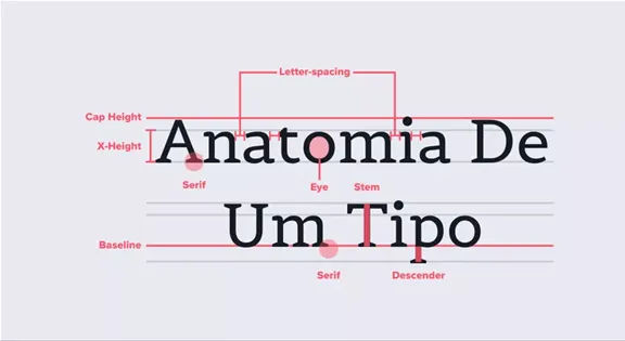
Spot all the little elements of type here.

© Aelaschool, Fair Use

The clarity of individual characters is crucial. Factors like x-height, kerning, weight and the presence of serifs or sans serif fonts are what typically determine how clear things are. These elements make up the design of the typeface and the shape of the glyphs—things that are essential for users to make out one letter from another. 

Author, Assistant Professor and Designer, Mia Cinelli explains crucial points about typography in this video: 

Transcript
 

In digital designs such as web pages, a web designer’s choice of typography, how they use space and the overall visual hierarchy to boost the content’s clarity and accessibility are vital. These are the ingredients of a user’s reading experience in terms of how the content actually looks. Designers also need to choose the best words and terms for their content. Both aspects are about how to create and present text such as website copy optimally. This includes correct spelling, punctuation and attention to detail with grammar. 

Image showing two distinct blocks of text, one with easy to read letters making up text and one with harder to read letters.

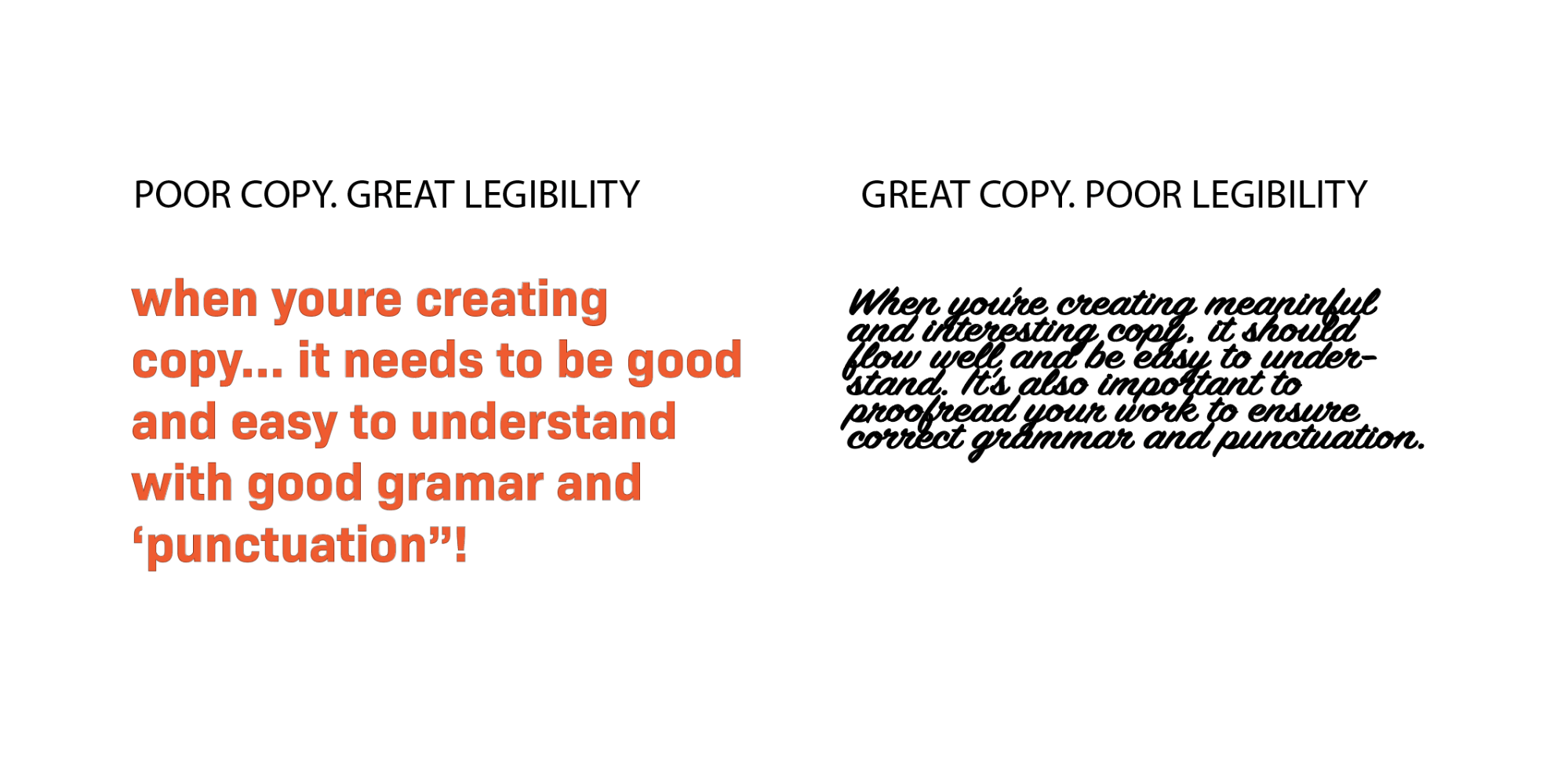
This example presents how text or copy can have great legibility, but be poor—or have poor legibility, and hide good copy from users.

© Anchor Digital, Fair Use

For good readability in design, it takes a solid understanding of users’ comprehension needs for designers to be sure their users can quickly digest written content. Since users’ satisfaction and engagement firmly depend on this, all users—including those with visual impairments—should be able to navigate and understand digital content—and do it efficiently. That’s why doing user research is a vital part of the design process. From solid research, designers can appreciate what users experience—and expect—in their user flows throughout their contact with a brand and its digital solution or service. 

UX Strategist and Consultant, William Hudson explains important aspects of user research in this video: 

Transcript
  

To make sure there’s a high degree of readability, designers must fine-tune the complexity of the words and sentence structures that appear on—and that describe—their products or services. The aim here is to make the content flow smoothly and be easy to understand. The interplay between legibility and readability is a critical factor behind creating user-friendly interfaces. Designers have to think about both aspects to make sure that all users—no matter their reading skills or visual abilities—can interact with the content comfortably and effectively.  

For mobile app and web design readability, it’s vital for designers to create and present content that’s both highly inclusive and accessible. They’ve got to make digital environments more welcoming and easier to navigate for a diverse audience. As far as inclusivity goes, good readability makes sure that digital content is accessible to people with disabilities and from many backgrounds. Consider users with visual impairments, as well as dyslexia and varying language abilities. When designers factor these aspects into their design work and use appropriate wording and terminology, they can help build an inclusive environment. From there, they can reach a wider audience as well as meet legal accessibility standards. What’s more, they can prove that their brands can identify better with a wide range of users’ needs. 

Watch this video to understand the need to design with accessibility in mind: 

Transcript
 

How Does Design Affect Readability?

In design work, here are some factors that affect readability: 

1. Vocabulary and User Comprehension

The choice of vocabulary is vital in UX design. When designers use words that resonate with the user's reading level, users understand the message better and it comes across much more effectively.  

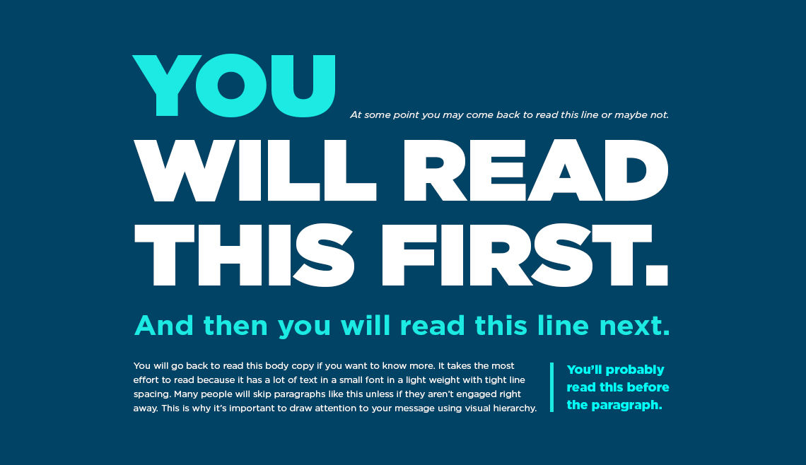
2. Inverted Pyramid Style

To adopt an inverted pyramid style to deliver content can greatly boost readability. Designers show the most crucial information first. They then follow it with important details—and end with background information. This structure helps users to get the essential points quickly. That’s particularly beneficial in digital environments—like mobile apps and websites—where attention spans run shorter.  

3. Text Layout and Scanning

The physical layout of text plays a critical role in readability, and when designers break up large blocks of text into smaller paragraphs of two to three sentences, and use left-aligned text rather than center-aligned, they make it easier for users to scan and read. This layout caters to how users typically consume digital content. They often just skim digital content rather than read it in depth.  

4. Consistency in Design Elements

When designers keep consistent across design elements such as images, headers, buttons and menus, it not only strengthens brand identity. It also raises the readability of content. A unified and cohesive look is something that helps to make a seamless user experience on digital products—and users have an easier time navigating and interacting with the content. 

An image of a Mindist webpage.

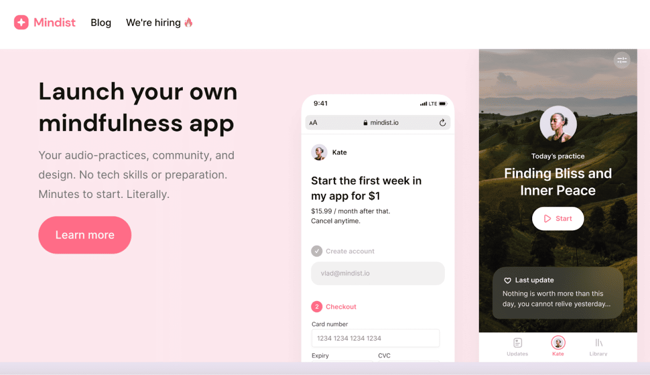
This application’s start page features—fittingly—a nature photo in the background; meanwhile, the picture’s subtle dimming effect and highly legible font in white give exceptional readability and deliver an effortless user experience.

© Mindist.io, Fair Use

What are the Benefits of High Readability in UX Design?

Like good readability in graphic design and document production, a high degree of readability in UX and UI design: 

1. Improves User Engagement and Comprehension

High readability greatly boosts user engagement and comprehension. When users can easily read and understand content, they’re more likely to stay engaged. This leads to a deeper understanding and retention of the information they encounter.  

2. Enhances Understandability of Content

Clear and concise content that users can easily read raises the overall understandability of that content. This lets users absorb and interpret information without any unnecessary complexity or confusion getting in the way.  

3. Facilitates Recognition of Characters and Words

Good readability is something that helps users smoothly recognize characters and words. That’s a vital factor for effective communication and interaction with digital content—especially so when many users scan what they find.  

4. Increases User Satisfaction

When users find content that they can easily read and navigate, their overall satisfaction with the digital experience goes up. This can lead to higher retention rates and positive user feedback—also including the trust they’ve got in the brand.  

5. Improves SEO

Search engines favor websites that offer content that’s clear and easy to read. High readability scores make for better SEO rankings. This makes the content more discoverable and accessible to a broader audience.  

6. Encourages Memorability Through Consistent Design Choices

Consistent design choices in typography, spacing and layout also make for high readability. This—in turn—helps make the content memorable. Users are more likely to recall information they’ve encountered in a format that’s easy for them to digest. 

7. Reduces Cognitive Load for Users

Well-structured content that users can easily read lightens the cognitive load on them. Users can navigate through information effortlessly and without feeling overwhelmed. 

8. Helps Users Perform Intended Actions After Reading the Text

High readability helps make sure users are clear about the actions they’ve got to take after they read the text. These could be to fill out a form, sign up for a newsletter or make a purchase. This clarity is something that can greatly improve conversion rates.

9. Impacts Users’ Decision Making

Good readability means users get to read and understand content—efficiently—and helps influence their decision-making process in a good way. Poor readability, though, might lead users to abandon the content—leading to higher bounce rates.  

Illustration showing three devices with their different screen sizes.

Consider the various screen sizes where users can encounter a site or app; note how users will make decisions in their various situations according to how—among other factors—easily they can read and process the content.

© Interaction Design Foundation, CC BY-SA 4.0

How to Create and Organize Content for the Best Readability

To make the most readable content in their visual designs, designers should adopt some strategies to make and present text best for their target audiences. This involves aspects of legibility. Here are some screen and document design techniques and tips to improve readability: 

1. Do Strong UX Research 

It might seem obvious, but it’s vital for a designer to know who they’re writing for. While their efforts to make content accessible have more general guidelines, designers really do need to pinpoint their target audience. That’s how they can assess the most suitable type of content—including the brand voice. For example, users with a particular industrial background may be familiar with terms that might confuse more general users who’re used to more informal content—like blog posts. In any case, it’s important to strive for good readability. So, it’s helpful to create user personas that accurately reflect the likely audience. 

Watch as Author and Human-Computer Interaction Expert, Alan Dix explains personas: 

Transcript
 

2. Choose the Best Typography and Fonts

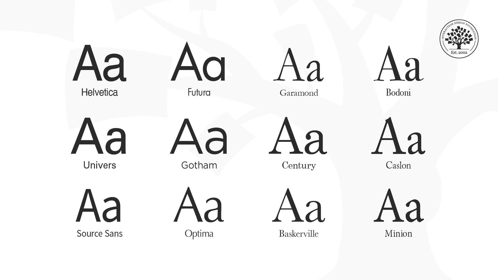
Typography is a cornerstone of readability in UX design. To choose the right fonts, it takes more than just aesthetics; it's about ensuring clarity and ease of reading, too. Key considerations include to pick fonts that are easy to read on various devices and screens. Simple fonts—with a mix of uppercase and lowercase letters—help keep a clear visual hierarchy and improve users’ ability to understand. For example, it can be a good idea to keep to a strong sans-serif font for headlines and a readable serif font for body content—for both desktop and mobile screens. 

3. Use Design Elements Consistently

Keeping things consistent is a crucial way to enhance readability. When designers organize all design elements—like fonts, colors and layout styles—in a way that’s unified, they can help make a seamless experience that helps users with recognition and navigation. This consistency also serves to reinforce brand identity, and make the interface more memorable to users. 

4. Make Effective Use of Space

It’s vital to put negative space around text blocks, and this spacing is one of the most helpful visual aids. It doesn’t just improve the overall aesthetic of the design. It plays a big role in readability, too. Such spacing helps to cut down on visual clutter, which makes the text more scannable and easier to digest. It’s a particularly important approach in digital environments where users are likely to skim rather than read in detail. In any case, well-designed documents give a boost to readability and comprehension, and white space—or negative space—is a handy tool for designers to remember. 

An image showing 5 mobile screens from The Nature Encyclopedia App.

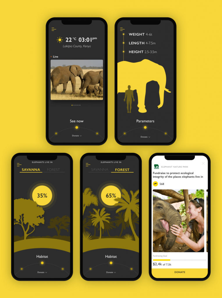
The Nature Encyclopedia App features a readable sans-serif font to make the text easily readable. What’s more, for the charity pages, which feature more text, the background lightens. The contrast boosts the readability level while marking the distinct nature and aims of the screens.

© Marina Yalanska, Fair Use

5. Use Color and Contrast Well

Proper use of color and contrast has a great bearing on readability. So, choose colors that stand out against the background but stay away from overly harsh contrasts that can strain the eyes. Ideal text-background combinations—like black text on a white background—look professional and they make sure that a wide range of users can access content. Designers should note that this includes users with visual impairments—like color blindness—who’ll find some color schemes hard to notice or read.  

Image of a green, orange and blue square with text on each to illustrate contrast.

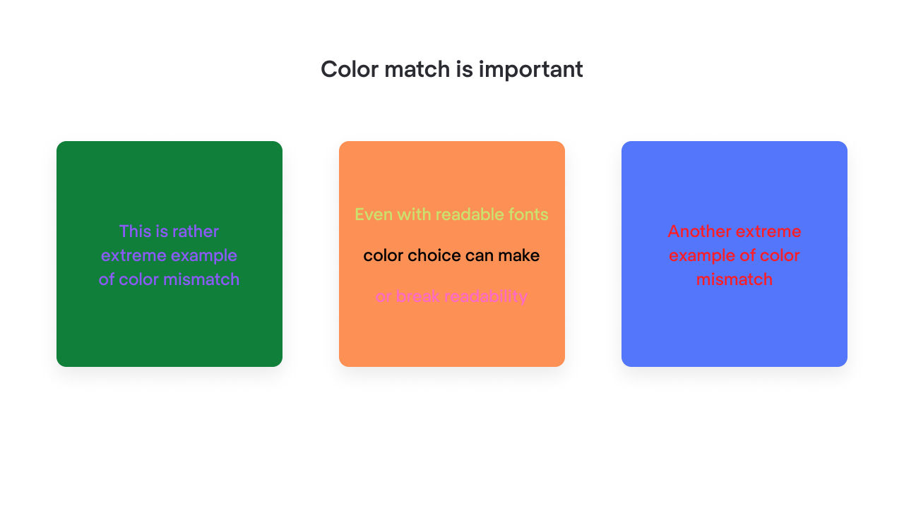
Color contrast is an important tool to help with readability—the right color choices make the difference.

© Mariia Kasym, Fair Use

6. Optimize Text Layout

The layout of the text should make for easy reading and scanning, and that includes the points that designers should: 

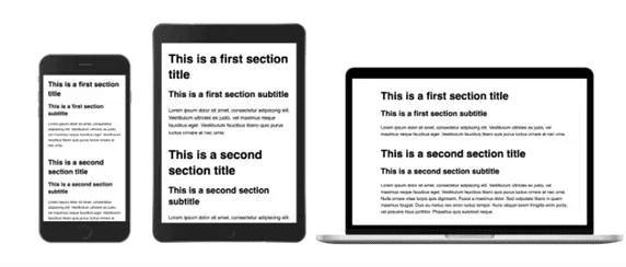
  1. Keep line lengths to—an optimal—45 to 72 characters and use shorter paragraphs. Such structuring helps to keep users’ attention and makes the content more readable overall. 

  1. Use headings and subheadings properly, with appropriate mixed-case bold, to help guide users through the content. 

  1. Keep to a sensible minimum for font size: about 12-16 pt, depending on context. 

  1. Space the line height to about 1.5, or as appropriate or comfortable for the content.  

An image showing two versions of the same text, set out in different spacing and font size.

Note how the more generous spacing of this particular font helps with readability, even with a smaller font size on the right.

© Ilene Strizver, Fair Use

  1. Align text to the left rather than justify it. A page of text that has a jagged right edge can make things more readable. That’s because the lines give a consistent starting point for the eye.  

  1. Avoid all caps—all caps can work against text’s readability. 

An image showing the same text in two versions, one in all caps and the other in normal case.

Notice the difference between all caps and the more readable text on the right.

© Ilene Strizver, Fair Use

7. Design for Accessibility and Inclusivity

When designers set out content with accessibility firmly in mind, they help make sure that that content’s readable for everyone—and this includes users with disabilities. For example, it’s good to use fonts that dyslexic users can read easily. It’s important to avoid italics and use bold text to add emphasis, too. What’s more, it’s good to create a printer-friendly version of the content. That’s so it can cater to those users who prefer reading on paper. 

8. Include User-Centric Writing

To compose the best content for readability, designers should use: 

  1. Straightforward language and avoid abbreviations and jargon as much as they can. 

  1. Short sentences, and avoid long, convoluted sentences. 

  1. Active voice, to identify who—or what—the actors are in a given piece of text. 

  1. An 8th-grade reading level as a target so they can cater to a broad audience. It’s also important to remember that many users won’t have English as their first language. So, plain English is best to access these readers with. Designers can use software such as Readable to help test, monitor and improve their readability score. 

Image from Readable's site.

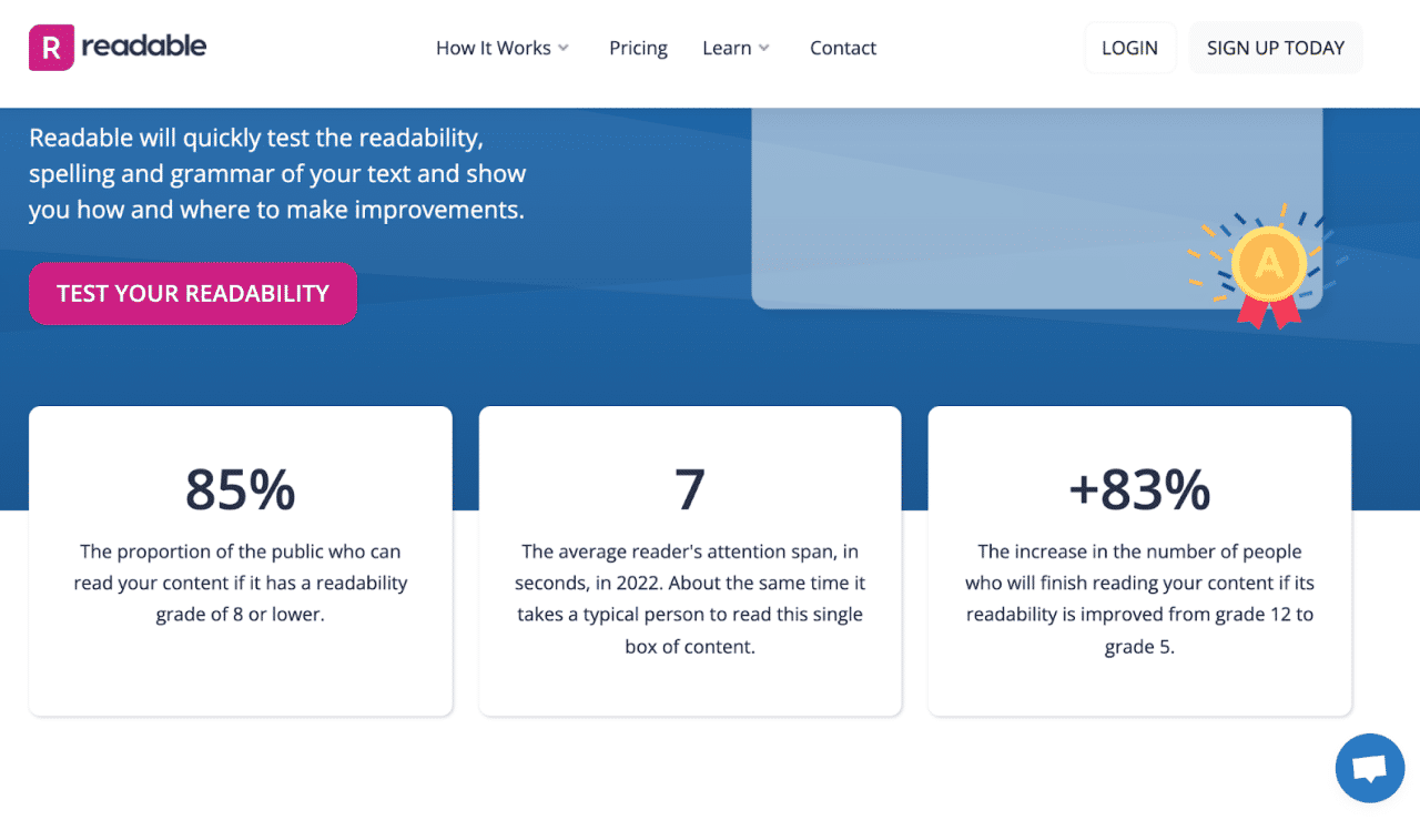
Readable is a highly useful online tool dedicated to readability testing. It features a flawless website design that prioritizes user comprehension and ease of use.

© Mariia Kasym, Fair Use

9. Place Important Content Above the Fold

It’s vital to make sure that important content is especially visible. One way to make sure of this is to place it above the fold so that users don’t have to scroll to find it. 

10. Conduct User Testing and Make Appropriate Adjustments

To make sure of both good legibility and readability, it’s crucial to do regular user testing. Designers can measure reading speed to see if users struggle with recognizing text. If test users do experience issues where they lean towards the screen or have difficulty discerning text, the design might want adjustments in typography. For readability, it’s a good idea to test how users interact with the content layout and organization. That can provide insights into whether the text’s comprehensible and engaging.

William Hudson explains the importance of usability testing: 

Transcript
 

11. Integrate with Visual Elements

Designers can enhance both readability and legibility when they work text in with other visual elements—likes images, charts and diagrams. These components don’t just break up text into manageable blocks. They help to clarify and emphasize information, too. This makes the content more accessible and appealing. Plus, it gives users contextual cues to help them understand the information in front of them better. 

Image from a design titled The Art of Hiring.

This design features serif font Domaine for the tagline, and reflects the illustration’s style. Meanwhile, the description copy block features a highly readable sans-serif font.

© Marina Yalanska, Fair Use

12. Avoid Common UX Mistakes

Several common UX mistakes stem from poor readability of text content. These sorts of things happen when designers ignore user research, overcomplicate navigation, neglect mobile optimization and fail to act on user feedback. Such errors can make the content hard to navigate and understand. What’s more, they can further alienate users and undermine how effective the digital product is. If users come away from an experience feeling confused and frustrated, it won’t matter how visually attractive the digital product is. It’ll cause the brand to suffer—and that includes from lack of user trust. 

Overall, it’s essential to remember the value of good readability in web design and other areas of UX design. Readability is a critical part of UX. It’s vital to appreciate how it extends from microcopy—such as button text—to larger content—such as landing page text. “How does document design improve readability?” is a good question for designers to bear in mind. When they consider it throughout the designer process, they can help make sure that their brand and its users stay on the same page time and again in great user experiences.  

Questions About Readability?
We've Got Answers!

How can you improve readability in UX design?

Focus on optimizing typography, layout and color schemes. With typography, pick fonts that are easy to read and vary font sizes and weights to enhance the hierarchical structure. For instance, a sans-serif font for body text makes legibility better on digital screens. 

Layout also plays a crucial role here. Organize content into a structure that users can easily navigate. This effort includes using a grid system to get elements aligned consistently and enough whitespace to minimize visual clutter—which helps users concentrate on content that’s important. 

Color contrast serves as a factor that’s essential, too. High contrast between text and background colors greatly boosts the text legibility. Tools such as the Web Content Accessibility Guidelines (WCAG) offer guidelines on optimal contrast ratios to make sure of text readability for users with visual impairments. 

What’s more, incorporating text-to-background contrast doesn’t just boost accessibility—it boosts overall user engagement, too.  

Take our course, The Ultimate Guide to Visual Design


How does line spacing affect readability in UX design?

It greatly affects readability, and designers increase line spacing to make text clearer and more legible. Adequate line spacing prevents text from looking cramped—and it lets the eye comfortably transition from one line to the next. That’s vital for keeping users engaged and making sure the content is easy to understand for them. 

Optimal line spacing typically falls between 120% and 150% of the font size. So—and as an example—with a font size of 16 pixels, line spacing should be around 19 to 24 pixels. This spacing gives enough vertical space between lines. Plus, it lowers the chances that users will lose their place while they’re reading. 

What’s more, proper line spacing improves the design’s overall aesthetic. That’s something that makes the text both functional and visually pleasing. Plus, it helps establish hierarchy and organize content into sections that users can digest more easily. 

Take our Masterclass How to Communicate with Typography How To Communicate With Typography with Ellen Lupton, Writer, Designer, Curator and Educator. 

Transcript
 

What are the best fonts to use for readability in digital products?

Pick fonts that are clear and easy on the eyes. Sans-serif fonts are the best choice for digital screens—that’s because they lack the small projecting features called "serifs" at the ends of strokes. So, they’re cleaner and more straightforward to read on various devices. Some of the most recommended sans-serif fonts for digital readability include Arial, Helvetica and Verdana. They’re popular as they offer excellent legibility and simplicity.  

Arial is known for its rounded characters and simple form. Helvetica’s favored for its neutral design that works well in many text densities and design layouts. Verdana—with its wide spacing and large x-height—is a particularly good pick for small texts on screens. Designers like Calibri and Roboto, too, since these fonts give a modern and lightweight look. Calibri often appears in web and office environments for its warm and soft character, while Roboto offers a geometric precision that’s readable at various sizes and on different screen types.   

In this video, Mia Cinelli, Associate Professor of Art Studio and Digital Design, University of Kentucky, explains how the Gestalt principle of continuation helps you arrange sans-serif fonts like Arial or Helvetica along consistent baselines, improving both legibility and the visual rhythm of your text designs.

Transcript

How does color contrast affect readability in UX design?

Contrast plays a crucial role there. Designers use high contrast between text and background colors to make sure that users can easily read content on digital screens. High contrast makes text stand out—making for quick and efficient reading, which is particularly important for users with visual impairments. The most effective color combinations often involve dark text on a light background or light text on a dark background.   

Designers stick to standards such as the Web Content Accessibility Guidelines (WCAG), which recommend a minimum contrast ratio of 4.5:1 for normal text and 3:1 for large text. The right color contrast doesn’t just improve readability. It raises the overall user experience by making interfaces user-friendly and easy to navigate, too. Designers constantly test color schemes to find the best contrasts that meet accessibility standards and that support a seamless user experience. Doing so, they help users engage with the content more effectively—and reduce eye strain. 

Understand the need to design with accessibility in mind: 

Transcript
 

Designers recommend specific font sizes to make sure readability and usability figure well. On websites, the standard minimum font size for body text is 16 pixels. 

For mobile interfaces, the approach is slightly different due to the smaller screen sizes. Designers generally suggest a minimum body text size of 16 pixels as well. However, they often adjust this based on the device's resolution and screen size. A crucial point is that the text remains legible whenever users hold their devices at a typical viewing distance. 

Headings and titles on both web and mobile should be larger—to make a visual hierarchy and draw attention to key sections. Typically, designers use sizes ranging from 24 to 32 pixels for headings; it depends on the design's overall layout and the weight of the font. 

There’s also line height and letter spacing to consider. A good rule of thumb for line height is 120% to 150% of the font size—it helps keep text from looking too cramped. 

Take our Master Class The Tone Of Typography: A Visual Communication Guide with Mia Cinelli, Associate Professor of Art Studio and Digital Design, University of Kentucky. 

What role does white space play in improving readability?

In design, white space—also, negative space—plays a vital part there, and for the overall user experience. Designers strategically use white space to create a visual buffer between different elements on a page—like text, buttons and images. This space helps to prevent the design from appearing too cluttered, allowing users to easily focus on the content without feeling overwhelmed. White space around text increases legibility by reducing visual noise and directing the user’s attention to the content that matters. By incorporating adequate margins and padding, designers ensure that text is not too cramped, which makes reading more comfortable and less strenuous on the eyes.  

White space contributes to a design’s visual hierarchy, too. It helps users distinguish between elements of varying importance, so they can be guided through the content in a logical and intuitive way. For example, more white space around a call-to-action button makes it stand out more, prompting users to click.  

Read our Topic Definition about White Space, or Negative Space for more details.  

Take our course, The Ultimate Guide to Visual Design


How does text alignment influence user readability?

Text alignment has a great impact on a user interface’s readability. Designers pick specific alignments—based on the content and context—to optimize user experience. 

Left-aligned text is the most common choice for readability. It gives a consistent starting point for the eye—and makes it easier for users to move from one line to the next and keep their place. It’s particularly effective for languages that read from left to right—like English. 

Right-aligned text is less common. It typically turns up for aesthetic reasons or for languages that read from right to left. But it can disrupt the natural reading flow for left-to-right readers—potentially slowing down their reading speed and bumping up their cognitive load. 

Center alignment places text equally distant from both margins. Designers might use this for short pieces of text like headings or captions—where it can add visual interest and balance. For longer texts, though, center alignment can make it difficult to find the start of each new line. 

Justified text, which aligns text evenly along both the left and right margins, can create a neat and formal appearance. Even so, it often leads to uneven spacing between words. This irregular spacing can disrupt reading flow—and make text blocks harder to read. 

Author and Expert in Human-Computer Interaction, Professor Alan Dix explains important points about alignment: 

Transcript
 

Take our course, The Ultimate Guide to Visual Design


What are some common readability issues in UX design?

Here are some of them: 

  1. Small font size: If text is too small, users struggle to read it—especially on mobile devices. A minimum font size of 16 pixels is advisable for body text to keep clear readability across devices.  

  2. Poor color contrast between text and background: This can make it hard for users to distinguish text—particularly users with visual impairments. When designers follow accessibility guidelines—such as the Web Content Accessibility Guidelines (WCAG)—they aim for a contrast ratio that supports all users.  

  3. Overcrowded text blocks: When text is too dense or doesn’t have adequate spacing, it becomes challenging for users to focus and track lines of text. So, get enough line spacing and paragraph breaks.  

  4. Inconsistent typography: Too many fonts or styles disrupts the visual hierarchy and can confuse users.   

Master readability in our course, The Ultimate Guide to Visual Design


What tools can designers use to check the readability of text?

Designers have several tools at their disposal to check the readability of text. Here are some in no particular order:  

  1. The Hemingway Editor stands out by highlighting complex sentences and suggesting simpler alternatives.  

  2. The Readable website, which provides readability scores based on various established indexes.  

  1. Grammarly also offers readability checks by analyzing sentence length and complexity.  

Take our course, The Ultimate Guide to Visual Design


How can bullet points and lists improve readability in UX design?

Bullet points and lists greatly boost the readability in UX design—breaking down information into manageable pieces. This format lets users scan content quickly. That’s crucial in digital environments where attention spans are often limited. Lists organize data effectively, and make it easier for users to identify key points or actions without having to navigate through dense paragraphs. 

To use bullet points also improves the visual hierarchy of a page. Designers can use them to emphasize important features or benefits—and help guide the user's eye through the content in a logical manner. This method of presentation lightens the cognitive load as users don’t need to work as hard to understand the information. 

Watch our video about visual hierarchy for more information: 

Transcript
 

Take our course, The Ultimate Guide to Visual Design


How can the use of icons and symbols enhance readability?

Icons and symbols give visual shortcuts for information. Good icons can help users navigate content more quickly and easily. They can understand information at a glance, which is particularly useful in interfaces where space is limited or where users need to make quick decisions. 

Icons can also cut down on the amount of text on a page—and lighten the cognitive load and make the content more accessible. By replacing common actions or ideas with universally recognized symbols, designers can create a cleaner and more user-friendly interface. For example, a trash bin icon universally communicates the action of deleting, and a magnifying glass suggests searching. 

What’s more, the strategic use of icons can direct user attention to important features and controls—boosting the overall user experience by making interactions intuitive. Well-designed icons are immediate and effective, eliminating language barriers and making the interface more inclusive. 

Watch our video about visual hierarchy for more information: 

Transcript
 

Take our course, The Ultimate Guide to Visual Design


How does user age affect readability preferences and requirements?

Younger users often prefer dynamic content with interactive elements—like videos and animations—which engage them better. They also tend to be comfortable with smaller fonts and denser information presentations. 

Older adults—meanwhile—need clearer and larger text, usually because of visual impairments that often come with age, such as presbyopia. They benefit from high-contrast color schemes and straightforward layouts that simplify navigation and lighten the cognitive load. Older users can also appreciate content that avoids jargon or complex language. 

Designers really do need to think about these factors whenever they work to create content for specific age groups. For instance, educational platforms aimed at older adults might use larger text sizes, good white space and more important navigational cues to make sure the users understand what’s going on and stay on board. 

Take our course, The Ultimate Guide to Visual Design


What are some highly cited scientific articles about readability in UX design?
  1. Rello, L., Kanvinde, G., & Baeza-Yates, R. (2012). Layout guidelines for web text and a web service to improve accessibility. Proceedings of the International Cross-Disciplinary Conference on Web Accessibility (W4A), 1-9.  

This paper provided empirically-validated guidelines for improving the readability of web content through optimal layout and typography choices. The authors also introduced a web service that automatically analyzes and suggests improvements to web page layouts, making it a highly influential resource for UX designers focused on enhancing digital readability. 

  1. Boyarski, D., Neuwirth, C., Forlizzi, J., & Regli, S. H. (1998). A study of fonts designed for screen display. In Proceedings of the SIGCHI conference on Human factors in computing systems (pp. 87-94).  

This early study on screen font readability compared four different fonts (Georgia, Verdana, Verdana Italic, and Times New Roman) and found that Verdana and Georgia were more readable on screen than the other fonts tested. This work laid the groundwork for understanding how font choice impacts readability in digital interfaces and has been highly influential in guiding font selection for web and software design. 

Earn a Gift Earn a Gift, Answer a Short Quiz!

1
2
3
4
1
2
3
4
Question 1
Question 2
Question 3
Get Your Gift
Interaction Design Foundation logo

Question 1

What is the goal of readability in UX design?

1 point towards your gift

  • To ensure content is accessible and easy to understand for the target audience
  • To increase a design's aesthetic appeal and reduce textual content
  • To limit the amount of text on a page to avoid information overload
Interaction Design Foundation logo

Question 2

Which typographic feature plays an important role in readability in digital design?

1 point towards your gift

  • The adjustment of the line height for clear separation between text lines.
  • The implementation of complex ligatures for every letter pair.
  • The use of decorative fonts for all headings.
Interaction Design Foundation logo

Question 3

Which design technique enhances readability as it breaks text into smaller, more digestible sections?

1 point towards your gift

  • The incorporation of subheadings, bullet points and short paragraphs.
  • The justification of text alignment.
  • The use of long paragraphs without subheadings.

Learn More About Readability in UX/UI Design

Make learning as easy as watching Netflix: Learn more about Readability by taking the online IxDF Course Visual Design: The Ultimate Guide.

Why? Because design skills make you valuable. In any job. Any industry.

In This Course, You'll

  • Get excited when you use visual design principles to create impressive visuals people love! Great visual design makes the message clear, memorable, and persuasive—whether it's an app, a logo, or a presentation slide. You'll learn what makes a design excellent and how science and culture influence what works and what doesn't. You'll create designs that truly connect with people. Visual design isn't just about beauty—it's about shaping ideas that inspire action, build trust, and give meaning to your work. As AI makes visual production faster and cheaper, you stay in demand when you can turn rough or AI-generated visuals into successful designs that get approved, adopted, and used. If you want to stand out with timeless human-centered design skills, this course is for you.

  • Make yourself invaluable with practical design skills that amplify your impact in any industry! Did you know that you only have 50 milliseconds to make a good first impression? Great visual design ensures you pass the test every time. You'll learn to use visual elements to guide emotions, influence purchasing decisions, and optimize User Experience (UX) and User Interface (UI) design. You'll master color theory, typography, and grid systems to improve usability, build credibility, and create designs that stop the scroll.

  • Gain confidence and credibility as you fast-track results with step-by-step exercises and downloadable templates! Complete optional tasks to walk away with portfolio-ready case studies that will help you land your dream job and advance your career. You'll get hands-on and design a low-fidelity wireframe, apply a monochromatic, complementary, or triadic color scheme, choose typefaces, and select a grid system. It's easier than you think! No matter your background, you can master Visual Design. With clear guidance and real-world examples, you'll apply your skills right away. This course will give you the visual design skills you need to solve design challenges, collaborate smarter, and make it easy for decision-makers to say yes to your vision.

It's Easy to Fast-Track Your Career with the World's Best Experts

Master complex skills effortlessly with proven best practices and toolkits directly from the world's top design experts. Meet your experts for this course:

  • Mia Cinelli: Associate Professor of Art Studio and Digital Design at the University of Kentucky.

  • Joann Eckstut: Color Consultant, Founder of The Roomworks, and one of the 12 designers chosen by the Color Association of the USA to create the yearly forecast used by industries to keep up with color trends.

  • Arielle Eckstut: Author, Agent-at-large at the Levine Greenberg Rostan Literary Agency, and Co-Founder of The Book Doctors and LittleMissMatched.

Get an Industry-Recognized IxDF Course Certificate

Increase your credibility, salary potential and job opportunities by showing credible evidence of your skills.

IxDF Course Certificates set the industry gold standard. Add them to your LinkedIn profile, resumé, and job applications.

Course Certificate Example

Be in distinguished company, alongside industry leaders who train their teams with the IxDF and trust IxDF Course Certificates.

Our clients: IBM, HP, Adobe, GE, Accenture, Allianz, Phillips, Deezer, Capgemin, Mcafee, SAP, Telenor, Cigna, British Parliament, State of New York

All Free IxDF Articles on Readability in UX/UI Design

Read full article
The UX Designer’s Guide to Typography - Article hero image
Interaction Design Foundation logo

The UX Designer’s Guide to Typography

Typography can make or break the success of a site or app. It’s a cornerstone of UX design; more than 90% of online information is in text form. But the design discipline of typography is so much more than choosing an attractive font for your website or app. There are a number of elements to conside

Social shares
937
Published
Read Article

The UX Designer’s Guide to Typography

The UX Designer’s Guide to Typography

Typography can make or break the success of a site or app. It’s a cornerstone of UX design; more than 90% of online information is in text form. But the design discipline of typography is so much more than choosing an attractive font for your website or app. There are a number of elements to consider when practicing typography. Here is a list of terms and a set of typography principles that will help you to become more proficient in this discipline so that you can create user-friendly designs. 

But first, what exactly is Typography? 

Typography is a design discipline that involves the use of typefaces and the organization of those typefaces to create readable, usable and ideally, user-friendly interfaces or experiences. Effective typography enhances UX, optimizes usability, catches users’ attention and has the potential to increase conversion rates.  

There is some confusion around typographic terminology, so we’ve compiled the following list of terms to provide some clarity. This is not an exhaustive list, but this specific collection of terms is particularly relevant to you, as a UX designer.

Typography Terms

Typeface: Also known as a font family, the word “typeface” comes from physical print and refers to the faces of physical letter blocks. A typeface is composed of fonts—much like an album is composed of tracks or a book is composed of chapters. A typeface includes multiple font weights, and its style is shared across all characters, numbers and symbols. Arial, Times New Roman and, yes, even Comic Sans are all typefaces. 

Illustration of widely used typefaces
Typefaces of Helvetica, Futura, Garamond, Bodoni, Univers, Gotham, Century, Caslon, Source Sans, Optima, Baskerville and Minion.

© Daniel Skrok and Interaction Design Foundation, CC BY-SA 3.0


Font: Fonts are specific weights within a typeface. You choose a typeface; you use a font. If you were to select Georgia as your typeface, then Georgia bold, italic and regular would be your fonts. In other words, a font is the distinct, stylized characteristics found within a typeface. You’ll likely use 2-3 fonts per project, and they’ll be the foundation of your typography and a key element of your overall design. 

Character: an individual element, most commonly a single letter, number or punctuation mark. 

Baseline: the invisible line on which all letters rest. You can create a grid using the baseline of your chosen type to create a harmonious layout. Find out more about grid systems here

x-height: the distance between the baseline and the height of the lowercase letter “x”. If you are working with a font that has an unusually large (or small) x-height, it could impact the entire interface—sometimes even breaking the layout. 

Stroke: a straight or curved line that creates the principal part of a letter.

Serif: the stroke, or foot-like element, connected to the end of some typefaces’ main strokes. Serif fonts are often more readable, as the tiny “feet” guide the readers’ eyes to the next character. However, due to their tiny size, they may not always render well on screens. 

Sans serif: a typeface without strokes or any extra elements at the bottom of a letter. Owing to the lower resolution of screens, sans serifs are often preferred for digital interfaces. As technology improves and screens come equipped with better resolutions, this may no longer be a deciding factor in choosing a font.

Illustration depicting the difference between a serif and sans serif typeface

Comparison of a serif and sans serif typeface.

© Daniel Skrok and Interaction Design Foundation, CC BY-SA 3.0


Weight, height, and size: This refers to the thickness, length and overall size of a typeface. You can experiment with different weights and sizes and use the variations judiciously on your interface to break the monotony on long passages of text, or to direct attention to specific elements.

Ascender and descender: the vertical stroke that extends upward beyond the x-height and downward beyond the baseline, respectively. 

Letter spacing (or tracking): the distance between the widest point of each character. Tracking specifically refers to the uniform increase or decrease in the horizontal space between characters. 

White space: also known as negative space, is the area between elements in a design composition. If the white space is not balanced, copy will be hard to read. 

Alignment: refers to how text is positioned. There are 4 main alignments: left, right, centered and justified. Alignment helps designers to create a coherent composition. 

Hierarchy: the principle of arranging elements according to importance. Creating a strong hierarchy is paramount to helping users identify where to look first. No matter the screen size, if an interface has multiple elements, it is important to guide the user towards the most important elements of the screen. Your choice of font, its weight, size, letter spacing, alignment and surrounding white space, along with other visual design elements, work together to create this hierarchy.  

Illustration depicting hierarchy in typography
Hierarchy in typography.

© Daniel Skrok and Interaction Design Foundation, CC BY-SA 3.0


Typography Principles 

Here are some typography guidelines to keep in mind when designing your website or app for optimal user-friendliness. It’s by no means an exhaustive list, but it provides a good starting point in your burgeoning typography practice. 

1. Too many typefaces hinder good user experience

Keep it simple! Too many typefaces can look sloppy and lead to confusion. It’s best to stick to between two and three typefaces in design. Using multiple typefaces also adds to the size and loading time of applications. For optimizing the experience, use fonts that are likely to be available/installed at the users’ end. 

2. Choose typefaces that compliment and contrast with one another

Your typefaces shouldn’t be too similar; otherwise, their nuances will be lost. Create contrast by choosing one serif and one sans serif font.

Examples of bad and good pairing in typography. The example on the left shows a good pairing of a sans serif and serif typeface. The one on the right shows a bad pairing of two sans serif typefaces.
Examples of bad and good pairing in typography.

© Daniel Skrok and Interaction Design Foundation, CC BY-SA 3.0


3. Keep readability, legibility, and accessibility top of mind

The text your typography creates needs to be understandable; otherwise, it defeats the purpose of communicating information through text. Consider your user, their environment and the medium with which they’re engaging with your product. Color and contrast can make or break accessibility; pale yellow text placed on an orange background is going to be more difficult to read than the same yellow text on a navy-blue background. 

The prevalence of “dark mode” is a good example with which to illustrate the importance of accessibility—it reduces the discomfort of looking at a bright screen and improves overall legibility (the characters and words of your text are recognizable and easy to comprehend) and readability (your text is easy to follow, overly-complex words and overwrought sentence structures are avoided). Some studies suggest that serifs are not as accessible as sans-serifs, particularly for dyslexic users. The research, however, is inconclusive. To make sure your designs are accessible, always test them with real users.  

4. Great visual hierarchy improves UX

Type hierarchy for your app/site is crucial as it allows your users to quickly scan through information. Organize your content according to priority; the most important must be the most prominent and the least important should be smaller and unobtrusive. Size, weight and color are effective ways of creating visual hierarchy

When you’re designing a page, you should begin with an, and each type style that follows should be beneath, from and beyond. As an added bonus, an effective hierarchy also improves SEO.

Image showing visual hierarchy with text of different colors, sizes and weights.
Create visual hierarchy through typography. © Chaosamran_Studio, Fair Use

5. Make your typography scalable 

In your design work, you will be asked to create a website or app that works on both desktop and mobile. So, it’s important to design your typography in a way that considers the user’s experience on both platforms. You want your typography to scale well, no matter the screen size. Define a scale for your font and typefaces at the beginning of the design process. Remember, your scale guidelines should include different operating systems, as well as different platforms. 

6. Enrich UX with typography 

Typography is part of the overall visual language you use to communicate with your users. Just like the visual elements of color, form and pattern, typography can set a mood, set a tone and present a product the way you want it perceived

Image showing The New York Times' website homepage.
The New York Times uses calligraphy for its logo and a serif font for its headlines, evoking a classic, hard copy newspaper.© New York Times


Image showing website homepage of Texas band, Khruangbin.
Khruangbin is a unique band, crossing genres of classic rock, funk, soul and psychedelia. Their website’s design, the colors, typography and illustrations all add to their retro, funky and unique style.  © Khruangbin

Image showing Netflix's series, Stranger Things, typography or logo.
Successful typography can make a statement and set a mood. © Netflix, Fair Use

7. Test and learn

As with any stage of the design process, it’s vital to test and learn. Try out different typefaces and fonts, see how they work with one another and scale from one platform to the next. A nifty trick to test out a typeface is with the phrase “the quick brown fox jumps over the lazy dog” as it contains all the letters from the English alphabet. It’s possible that your app or website may be translated into another language, so it’s important to test for that outcome. You want to ensure that your typography design still works with diacritics (the accents or marks above, below or next to letters that indicate a particular pronunciation or emphasis) or different scripts. Through testing and learning, you can make the experience seamless for everyone!  

The Take Away

Typography can seem an obscure part of design, but it’s fundamental to creating a positive user experience. By familiarizing yourself with basic terms and principles of typography, you can transform the success of your designs. Simplicity is your friend; don’t overcomplicate your life (or design) by trying to do too much with type. Ultimately, you want your typography to be readable, accessible and understandable. Words are important, and so is how they look. So, the better your typography, the better your user experience. 

References & Where To Learn More 

Learn more about typography and other elements of visual design from our course Visual Design: The Ultimate Guide.

Discover more typography terminology and learn about the anatomy of type.

Dig deeper into typography in UI design with some free online resources by Adobe XD, Shopify, and Protoypr

Explore more best practices of typography with Mockplus

Hero Image

© Mika Baumeister, UnSplash, Fair Use

Feel Stuck?
Want Better Job Options?

AI is replacing jobs everywhere, yet design jobs are booming with a projected 45% job growth. With design skills, you can create products and services people love. More love means more impact and greater salary potential.

At IxDF, we help you from your first course to your next job, all in one place.

See How Design Skills Turn Into Job Options
Privacy Settings
By using this site, you accept our Cookie Policy and Terms of Use.
Customize
Accept all

Be the One Who Inspires

People remember who shares great ideas.

Share on:

Academic Credibility — On Autopilot

Don't waste time googling citation formats. Just copy, paste and look legit in seconds.