Presentations are structured ways to share your ideas or information with an audience, whether in person, online, or asynchronously (not “live”). They are often supported by visuals like slides, charts, images, or videos.
Explore what presenting effective messages to audiences who want to hear from you helps you achieve, as feedback and iterations help you shape the best possible product, in this video with Morgane Peng, Managing Director, Global Head of Product Design and AI Transformation.
In UX (user experience) design, you’ll use presentations to explain research findings, showcase design solutions, and align stakeholders around a shared goal. When done right, presentations turn complex design work into clear, actionable insights. They help you build trust, earn buy-in, and move projects forward.
Your Work Doesn’t Speak for Itself. You Do.
You might think your work speaks for itself. It doesn’t. It’s your job to frame it, explain it, and champion it, whether you’re kicking off a project, walking through usability findings, or just sending a status update.
Presentations are golden opportunities to build bridges, between designers and developers, between teams and stakeholders, between user needs and business priorities. Without strong presentation skills, even the best design work risks being misunderstood, sidelined, or forgotten. And the team’s “hands” can become disconnected not just from the “mind” but the “heart” of the brand, too, a recipe for disaster. The same is true for any job.
When and Where UX Designers Present
Each type of presentation comes with different goals and formats:
1. Interview Presentations
These are typically one-way presentations where you showcase your portfolio; they’re often followed up with a two-way discussion.
Discover valuable tips about how to maximize your chances with a good UX portfolio and avoid pitfalls, in this video with Morgane Peng.
2. Design Presentations
You share research insights, prototypes, or usability findings with your audience, including stakeholders from various departments and clients. These often start one-way and evolve into dialogue and active discussion of important points to address in a current or proposed design solution.
3. Workshops
You facilitate or participate in interactive, two-way sessions for brainstorming or problem-solving. Workshops can pull teams together in live collaborative efforts that land on precious design insights.
4. Career Presentations
You report achievements to managers or human resources (HR) personnel, like a “highlight reel” to encapsulate your value to the brand.
5. Email Presentations
You deliver asynchronous updates you write with clarity and structure, so these “speak for” you without the need for a meeting.
Each type of design presentation requires different preparation; however, the core goal is the same: you must make the message easy to understand, relevant, and actionable.
How to Deliver an Effective UX Design Presentation, Step by Step
1. Plan to Avoid “Death by PowerPoint”
One of the biggest risks in presentations is what’s known as “Death by PowerPoint.” This happens when you overload your slides with text, charts, and detail, leaving your audience disengaged and “punch drunk” by what’s on the screen. Begin with your audience, not your slides.
Why it fails:
Slides compete with you. People read faster than you speak, so if your slides are text-heavy, they’ll stop listening to you and go right to the source.
Cognitive overload occurs. Too much information makes your audience tune out, their heads exploding with facts, figures, even relatable stories that would otherwise sound good coming from you at the right time (not jammed into a paragraph on the screen).
Monotony. Repetitive slide decks without story or variation drain energy; your listeners may lose the will to even care why they should be there, let alone remember what the meeting is about.
The cure is simple: let slides support, not replace you. Keep slides visual, scannable, and aligned with your message, and in step with an “alive” pace that makes the subject matter matter to the people who have taken the time from their schedules to sit in a room listening to you.
Discover other potential pitfalls to avoid before you plan to present for success, in this video with Morgane Peng.
2. Follow Key Frameworks for Presentations
Now that you know what to avoid, think about how a framework can help you add structure to what you’ll present. Great presentations don’t happen by chance; they follow proven structures and delivery styles that help your message stick, and here are two key ones to consider:
Freytag’s Pyramid: Tell a Design Story
Freytag’s Pyramid has five stages to help you land a first-class design story in the minds of eager listeners: exposition, rising action, climax, falling action, and resolution.
Exposition: Show the reality of the initial situation: for example, “Our team designed a mobile banking app for Gen Z, but onboarding had huge drop-offs.”
Rising action: This is where you shed light on the “emergency” and figures that demonstrate a problem to address, such as: “In usability tests, 7 out of 10 participants quit halfway, calling the flow confusing.”
Climax: Now you come in with a solution to stop and reverse the crisis, like: “We debated patching but chose a full redesign: shorter steps, optional fields, clearer progress.”
Falling action: It’s time to show the symptoms easing from the cure and the hopefully powerful signs that what you did was effective, such as: “In testing, completion jumped 40%, and users described the flow as ‘smooth.’”
Resolution: Close out the story with a happy ending to confirm the effectiveness of the cure; in this case: “Support tickets dropped by half, and conversions doubled.”
This story arc makes your audience feel the tension of the problem and the relief of resolution. They’ll remember their initial shock and suspense of the emergency you addressed with a solution that alleviated it. Compare this with what would happen if you were to just feed them data; the percentages and figures might still be alarming, but the arc of a story frames the facts and lifts the crisis and cure from a flat, “academic” account into a tangible tale with real-world impact.
STAR Method: Explain Your Role Clearly
STAR (Situation, Task, Action, Result) is a direct approach that can neatly emphasize your personal contribution to turn negative situations around and make the person behind shine. An example that presents an overview of this could be:
Situation: “Our e-commerce site had a high cart abandonment rate.”
Task: “As the lead UX designer, I was responsible for reducing friction.”
Action: “I ran usability tests, analyzed heatmaps, identified the problem, which was a complicated form, and simplified it.”
Result: “Checkout completion rose 30% and bounce rates dropped.”
STAR is especially effective in portfolio reviews and interviews, where clarity about your role matters most.
3. Pick a Presenter Style: Choose How You Deliver
Along with an effective framework, your delivery style shapes how your presentation lands. Choose from these main styles:
The Storyteller makes an emotional and narrative-driven approach, such as telling the story of “Emily,” a customer who struggled to buy groceries online, before showing how your redesign changed her life.
The Demonstrator makes for a hands-on approach, such as where you conduct a live demo of a prototype where one-click reordering replaces a clunky flow. It’s a helpful way to deliver information when the audience is already familiar with the project.
The Instructor teaches in a step-by-step explainer approach. It’s particularly helpful for enlightening stakeholders who don’t have design backgrounds, such as teaching non-design colleagues how to run a guerrilla usability test in several clear steps.
The Collaborator brings things around for an interactive and co-creative experience. You still present in this approach, but it’s more leading collaborative design activities, such as sketching wireframes together in a workshop with product managers and engineers.
Note that you don’t have to stick to one role; you can also blend them, perhaps starting with a Storyteller intro, then moving into a Demonstrator demo, and ending with a Collaborator-style discussion, for example.
4. Design Slides That Work and Support Your Presentation
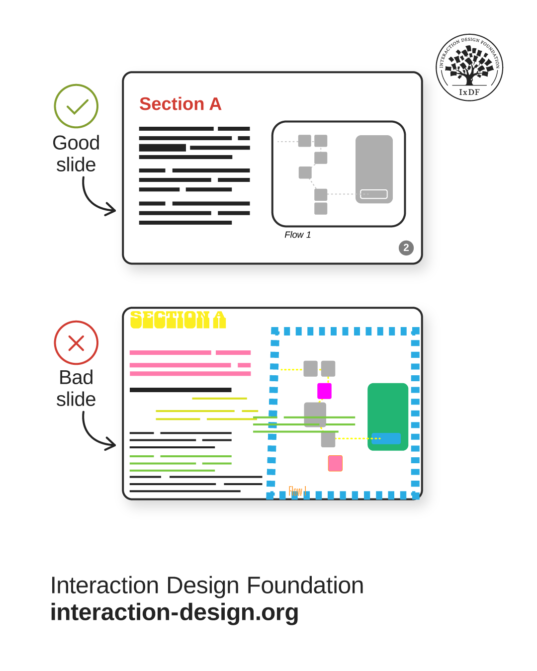
© Interaction Design Foundation, CC BY-SA 4.0
Slides should amplify your story, not compete with it, so:
Keep it simple with minimal text, consistent fonts, strong visuals that speak volumes, much like a good picture can tell a “thousand words.”
Write meaningful headlines. “56% of users struggled in checkout,” not “Usability findings.”
Use progressive disclosure, where you reveal content gradually to match your pace and ease the audience into more complex or intricate concepts thoughtfully.
Discover how to use progressive disclosure to keep target users, including meeting room audience members, engaged and eager to know more, in our video.
Adapt for sharing, especially important when you’re not there to present “live”; for emailed decks, use full sentences and highlight key takeaways.
As with any design solution that has users, think of slides as interfaces: make them clear, scannable, and audience-centered.
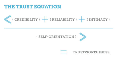
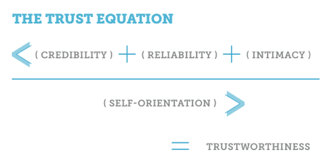
5. Build Trust Through Presentations
Presentations succeed only if your audience trusts you. The good news is two trust frameworks can help you establish and build that all-important ingredient and rapport with your audience.
Discover how to win your audience’s trust so your presentation can resonate with them, in this video with Morgane Peng.
Trust Framework 1: Competence & Warmth
Two core questions any audience will ask are: “Are you skilled?” and “Do you care?” High competence without warmth feels cold; consider a knowledgeable designer who delivers first-class but hates people and is rude. On the flip side, warmth without competence feels weak; consider a friendly designer who bungles most of the design jobs they work on, a pitiful, if nice professional. People won’t trust either of them, but for different reasons. You need both high competency levels and high empathy levels to tick both boxes, a competent professional and a decent human being.
An Example of How to Use the Competence and Warmth Framework:
Competence: Share usability data: “70% abandoned checkout; here’s the heatmap to show it.”
Warmth: Use empathy: “Imagine being asked for a credit card before browsing. That’s where users’ frustration began. Also, what about older or vulnerable users? It’s scary, almost like a trap.”
This balance ensures stakeholders respect your expertise as a designer and see you as an approachable, caring professional: if you care about users, you care about people, and you care about people in the brand.
Trust Framework 2: Giver vs Taker
Psychologist and bestselling author Adam Grant’s framework describes Givers (who share value, information, and other benefits, not expecting anything in return), Takers (who extract value and, wanting to get more for themselves, will give back as little as possible), and Matchers (who balance giving and taking on a reciprocal basis).
In presentations, a designer who appears as a Giver builds trust; Matchers also can, but it’s better to be a Giver to win audiences over.
Example of a Giver stance: “This new flow reduces support calls and saves your team time.”
Example of a Taker mistake: “We need more budget.” (They do not show any shared benefits.)
Framing designs as contributions to others’ success makes stakeholders more willing to support your work. If you have a generous personality and want only the best for people, you’ll come across as someone who is kind and worth supporting, and certainly worth listening to.
6. Set the Stage for Success
You have you presentation plan in place, and ideally have rehearsed what you’ll present, at least once; now it’s time to arrange the stage for success to happen upon. Apart from anything else, your setup shapes first impressions; so:
In-person: Arrive early, declutter the room, sit at eye level and not so that you are alone on one side of the table, and greet people warmly.
Online: Clear your desktop, hide bookmarks, and use chat tools to engage.
Begin with context and credibility, a pleasant “preamble” that sets the stage relevantly before you dive into content.
These choices signal professionalism and readiness, that you’re confident, know your material and why it’s important to your audience, and respect everyone’s time out of their busy schedules.
7. Delivery: How to Present with Confidence
Be sure to rehearse your presentation. On the day, manage any stress safely with the 4-7-8 breathing method (4 seconds to inhale, 7 seconds to hold, 8 seconds to exhale) and try striking a power pose (don’t slouch, open your posture in your chest, and ground your posture with your abdomen). You have your slides and frameworks for cultivating trust and framing information into relatable stories that will resonate with the audience. Now, you want to make the most effective delivery: blend voice, body language, and presence:
Pitch, pace, tone: vary them to avoid monotony and highlight insights and empathy.
Articulation: especially when mentioning technical terms, speak clearly.
Silence: may be golden, but it’s also like “white space,” so use pauses to frame key ideas. It can also make people take notice, in the right measures at the right times. Too little silence might make your presentation jammed and even sound stressed, like you’re trying to finish as fast as possible. Too much silence can make you sound like you’ve lost your train of thought.
SOLER framework: Sit squarely, Open posture, Lean forward, Eye contact, Relax, and this balance of confidence and openness can make audiences far more receptive. However, note that in some cultures, sustained eye contact can be especially off-putting, so tailor your approach to the locale.
Get a greater grasp of how to position yourself for success in a presentation, in this video with Morgane Peng.
8. Use Active Listening
Throughout your presentation, keep your “radar” on to note how your target audience is responding to you. It can be difficult to maintain an active listening approach when you’re proceeding through a rehearsed presentation, but be sure to keep your eyes and ears open, and receptive, to how others are receiving what you’re saying and showing them.
Discover how to use active listening to make your presentation even more successful, in this video with Morgane Peng.
9. Handle Questions and Feedback
Presentations often evolve into discussions and feedback sessions. How you handle feedback shapes trust and proves your level of professionalism, so:
Acknowledge concerns by offering acknowledgements such as “That’s a good point.”
Seek clarity for questions that need it, such as “Can you share what makes you think this might confuse users?”
Detach ego: remember that critique of a design isn’t a critique of you. Unless there are preexisting problems between yourself and an audience member, nobody will have an axe to grind. Distance yourself from what may seem like an “unfair critique” and keep your professional and emotionally mature stance.
Reframe criticism, and treat feedback as collaboration, not opposition. It will also show your emotional maturity and prove your professionalism in a credibility-building moment as a trustable team member, and leader.

Sound advice, and so much better than the other way around.
© Interaction Design Foundation, CC BY-SA 4.0
10. Remember the Role of Presentations in Career Growth
Every presentation you give influences how others see you: not just your work. For all you plan, prepare, deliver, take as feedback, and prove to roomful after roomful of people that you are a caring professional who knows the craft, others will take notice and rewards will come. Designers who present clearly and confidently:
Win faster project approval.
Earn trust with executives and peers.
Build reputations as leaders.
Stand out in interviews and reviews.
Good presenters advance faster than those who rely just on their craft.
Overall, presentation and speaking before an audience to get effective messages across are an art, not a natural-born talent. Presentations are far more than slide decks, but the human element of framing, lifting, and making points relevant to other human beings is more than worth the effort for even the shiest designers. Far from being hindrances, presentations are vehicles for clarity, trust, and influence, capable of catapulting designers who present well into promotions and higher levels of influence.
There might seem much to remember, but designers who avoid “Death by PowerPoint,” structure with Freytag’s Pyramid or STAR, adapt delivery styles, apply trust frameworks, and design slides that support their story can tap a skill and cultivate a talent they might never notice otherwise. They can become accustomed to turning presentations into powerful tools of collaboration and leadership, advocating for users, aligning teams, and accelerating their career. Every presentation is a chance to lead, inspire, and make design matter to people who, if they don’t already know why design must matter, will know what’s important and what to do by the end of a successful session.


