Progressive Disclosure

Your constantly-updated definition of Progressive Disclosure and collection of videos and articles.
Be a conversation starter: Share this page and inspire others!

492 Shares

What is Progressive Disclosure?

Progressive disclosure is a user experience (UX) technique that defers advanced features and information to secondary user interface (UI) components. Designers keep essential content in the primary UI, while advanced content is available to users upon request. Progressive disclosure’s goal is to improve usability for novice and experienced users.

Vitaly Friedman, senior UX consultant, European Parliament, gives an example of how to use progressive disclosure in complex interfaces, and explains why it’s important:

Transcript

Progressive disclosure aims to show users what they need when they need it. Designers use UI patterns like modal windows and accordions to hide advanced features and information. This approach keeps the primary UI straightforward and inviting.

Designers use progressive disclosure to:

  • Ensure new users achieve success from the beginning.

  • Support users of varying experience levels, from beginners to experts.

  • Make infrequent tasks less noticeable.

  • Keep the UI clear and uncluttered.

UX designers primarily apply progressive disclosure in digital applications and websites to improve usability. An example of progressive disclosure is Google Search’s advanced search feature.

The Google homepage next to the Google Advanced Search page. The homepage is simple with one search box while the advanced search has many options and text boxes for refining searches.

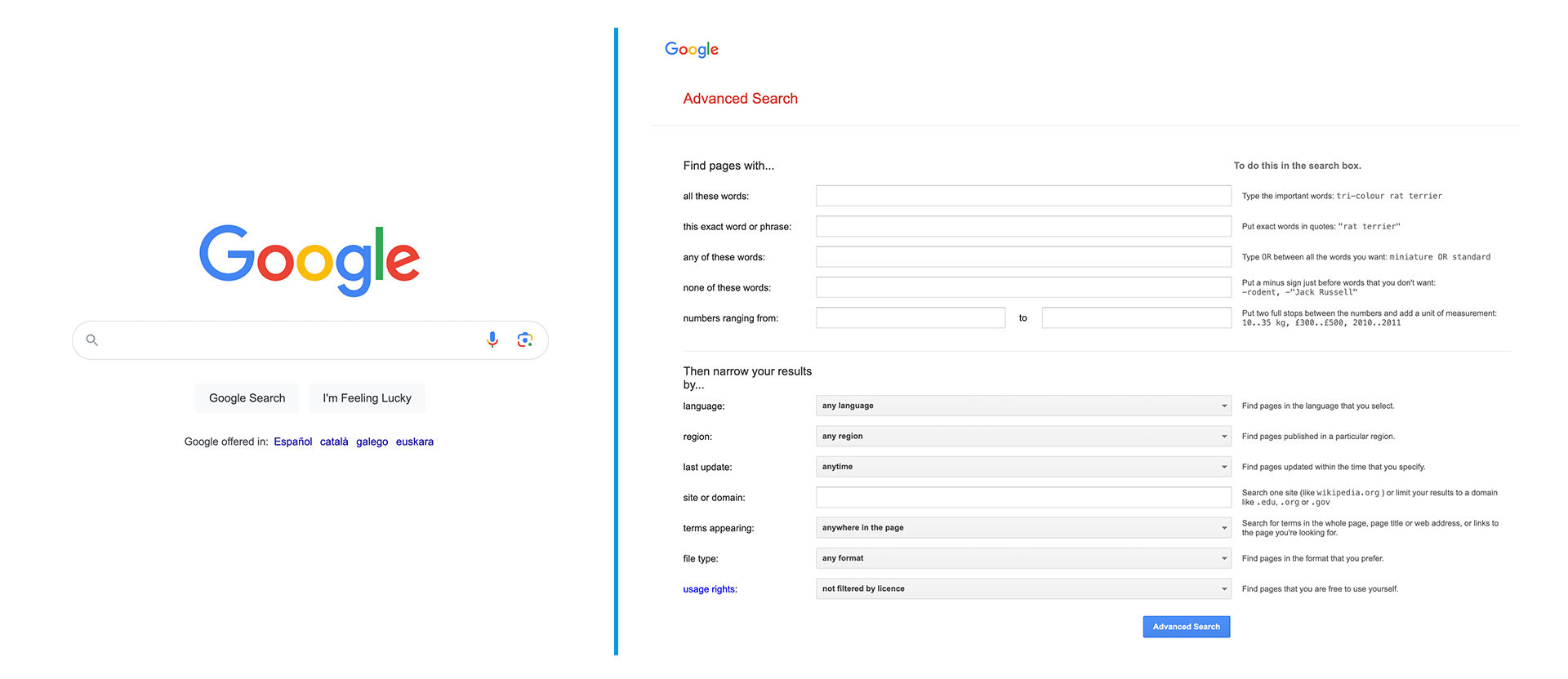
Google Search (left) presents a simple UI. For most users, this is enough. They do not need to see any advanced features. The Advanced Search (right) is available to users who need additional search functionality. If Google presented these advanced features to every user, they may overwhelm them with options.

© Google, Fair use

How Does Progressive Disclosure Improve User Experience?

Progressive disclosure declutters the UI to prevent confusion and cognitive overload. For instance, a social media app might initially display a simple feed and posting features to new users. Extra features, like user activity or detailed analytics, are available upon exploration or demand. This approach ensures designers do not overwhelm users with options they do not need yet.

Three screens from the Instagram mobile application. Screen one shows the home screen, screen two shows the user's profile page and screen three shows the additional features menu.

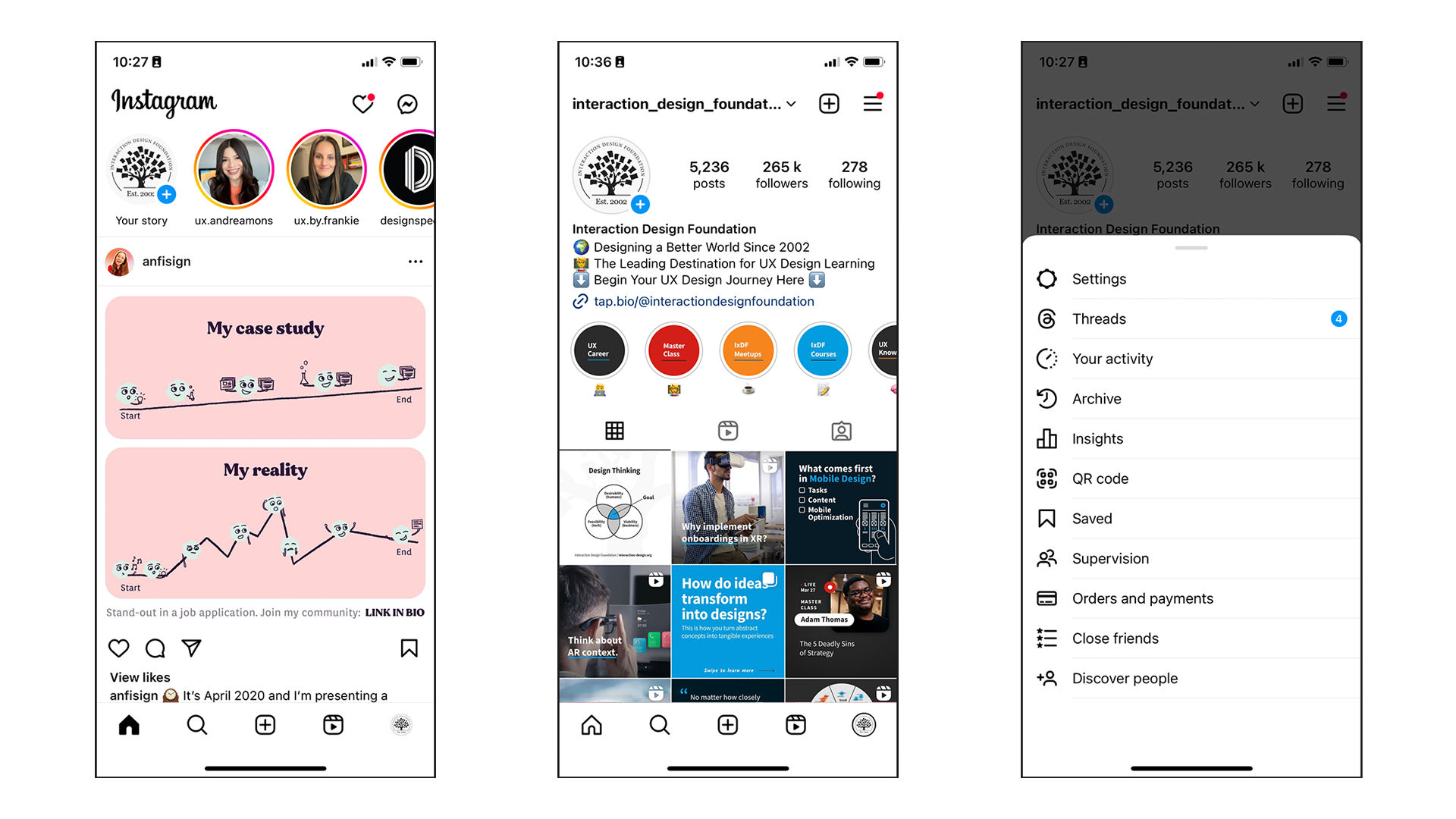
The social media app Instagram uses progressive disclosure. Many users do not need more than what Instagram presents on the home screen (left). Users who need settings and advanced features must navigate to their profile (middle) and then select the hamburger menu (right). If the home screen presented all these features simultaneously, it would likely appear cluttered. UI clutter can confuse users as they navigate through the app.

© Meta, Fair use

Designers hide complex functionalities to improve the user’s learning curve. For example, a sophisticated graphic design tool might only show basic editing options on the main interface. As users become more comfortable, they can choose to access more complex features, like layer management or custom brushes. This method:

  • Prevents users from feeling overwhelmed.

  • Encourages a more engaging learning experience.

The main interface in Adobe Photoshop.

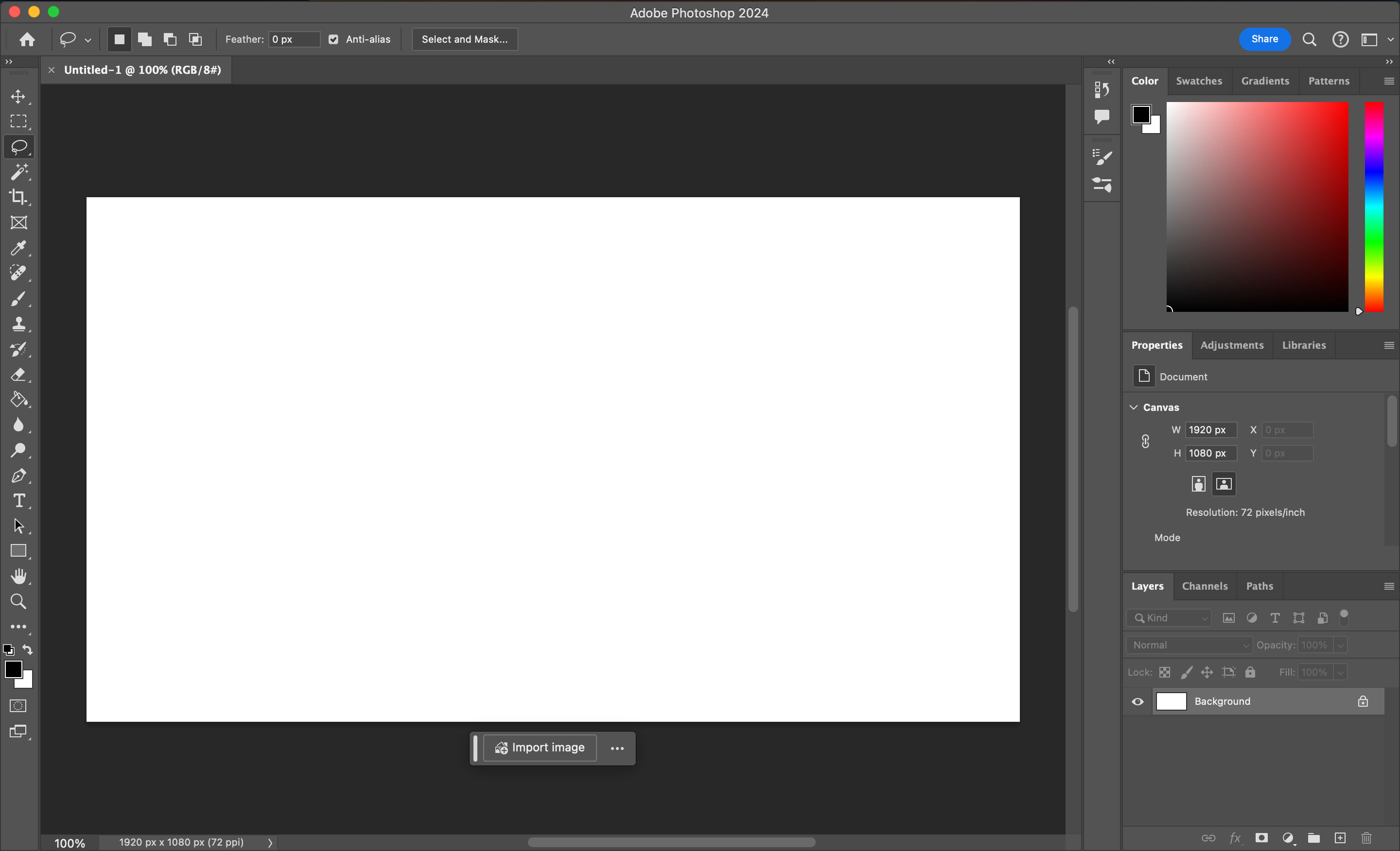
Adobe Photoshop is a deep and complex photo editing application. However, its initial UI focuses on its basic functionality. Photoshop displays the primary tools on the left, selection controls at the top and the main control panel on the right. Users can find advanced features in secondary menus and windows. This deference manages the complexity of Photoshop and allows new users to get an easier grasp of its functionality.

© Adobe, Fair use

Progressive disclosure helps basic and advanced users find what they need faster. When designers simplify the main interface, new users do not need to look at or read through content they do not yet need.

Meanwhile, experienced or knowledgeable users can bypass this basic content. They can directly access advanced content through shortcuts or secondary menus. For example, a product page might present customers with core information and hide detailed specifications from view.

A product page for a jacket on the Patagonia website. On the left are the product photos, and on the right is the product description and a series of accordions with extra information.

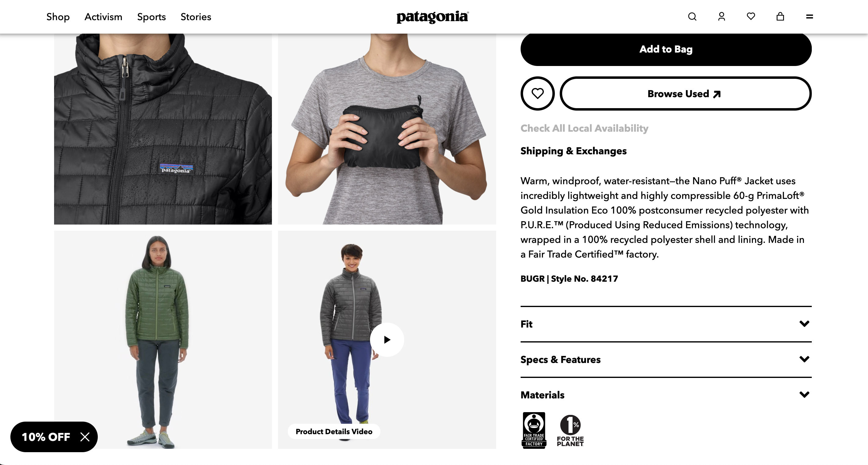
This product page on the Patagonia website provides customers with a brief product overview. Patagonia contains advanced information within an accordion, like specifications and materials. New customers can find the overview quickly since it’s the only body of text initially shown. Customers who need further information can quickly locate and expand the necessary accordion.

© Patagonia, Fair use

Designers limit the immediate set of actions available to cut the chance of mistakes. When users face an interface packed with functionalities, the likelihood of errors increases.

Consider an online banking application. For new users, it might prominently feature key actions like viewing balances and making transfers. The app may then introduce complex operations as the user navigates deeper into the app. These operations could include setting up recurring payments or applying for loans. This progressive disclosure ensures users are less likely to make incorrect transactions because of an overwhelming array of options.

Three screens from the Monzo banking app. Screen one is the home screen, screen two is the transfers screen set to showing payment options, screen three is the transfers screen showing scheduling options.

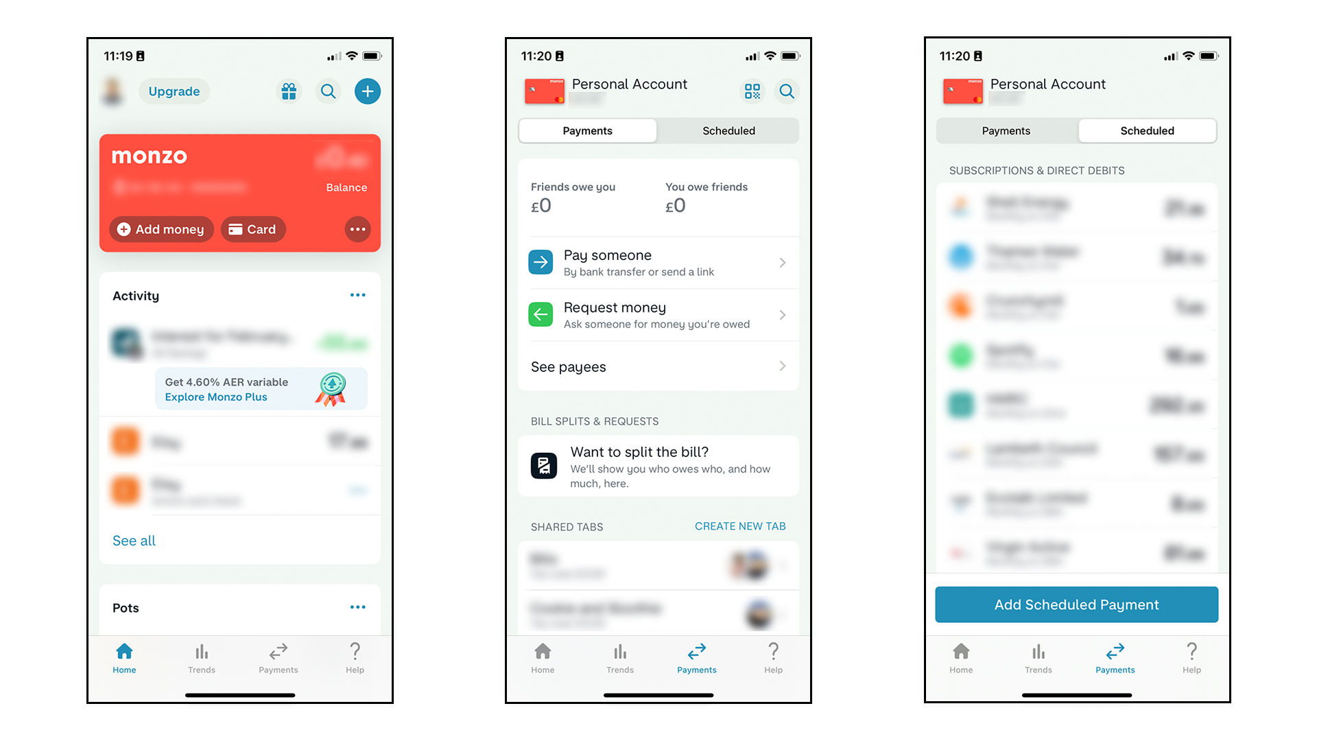
Monzo’s banking app uses progressive disclosure for transfer functionality. Users must press the transfer tab and navigate to scheduled payments before setting up a payment. If Monzo presented all transfer options on the main screen, users may accidentally access this while trying to complete a different task.

© Monzo, Fair use

How to Implement Progressive Disclosure in the Design Process?

Design thinking is a 5 stage process where designers empathize, define, ideate, prototype and test. The design thinking process is non-linear and cyclical. For example, designers may return to the prototyping stage to implement feedback from the testing stage. Watch this video to learn about the five stages of design thinking:

Transcript

Designers implement progressive disclosure during this design process:

  1. Empathize. Designers talk to users to determine which information and actions are most important to them. A typical user research method for progressive disclosure is card sorting. In card sorting, users arrange information into groups. These groups could include basic, intermediate and advanced functions. Designers watch and listen while users arrange the information. Observation helps designers understand user preferences and reasoning.

    Design Consultant and author Donna Spencer provides some best practices for card sorting:

    Transcript

  1. Ideate. Based on their research, designers refine the primary and secondary content. They may use techniques like brainstorming to find solutions to user issues. If the designers ran multiple card sorting sessions with basic and advanced users, they might combine the results to find a happy medium.

  1. Prototype and test. Designers create interactive versions of their designs that include progressive disclosure. They then do usability testing with users to ensure the design helps them; not confuse them.

Progressive Disclosure UI Patterns

Designers use many different UI patterns to implement progressive disclosure in their products. Examples include:

  • Modal and pop-up windows open in front of the main UI to provide extra functions.

    Microsoft Word uses a modal window for advanced paragraphing options.

    © Microsoft, Fair use

  • Accordions expand and collapse content sections to optimize space and reduce clutter. Each section has a header that users can click or touch to reveal or hide the information beneath. Designers commonly use accordions for FAQs, forms and navigation menus.

    The Interaction Design Foundation website uses accordions for its FAQ sections.

    © Interaction Design Foundation, CC BY-SA 4.0

  • Tabs divide content into multiple panels or sections but display only one panel at a time. Users can click on the tabs to switch between panels.

    Avid Pro Tools uses tabs to move between different categories in its preferences menu.

    © Avid, Fair use

  • Scrolling unveils content gradually as users move through a page. While simple, scrolling is an effective tool for progressive disclosure. Many product pages place simple information at the top and complex information at the bottom. Users can reveal further details by scrolling.

    The Carphone Warehouse uses scrolling for progressive disclosure on its product pages. The product's essential specifications appear higher on the page. Customers can access detailed specifications by scrolling further down.

    © Carphone Warehouse, Fair use

  • Carousels showcase multiple items or features in a single space, allowing users to browse them horizontally.

    Netflix uses carousels to show personalized recommendations to users. Users can view top recommendations immediately and access lower entries via the carousel.

    © Netflix, Fair use

  • Collapsible menus and sidebars reveal advanced features within the primary UI. Some applications allow users to add and remove multiple menus and sidebars within the UI for advanced customization.

    Asana uses a collapsible sidebar to navigate between different views. The user can hide this sidebar to simplify the UI.

    © Asana, Fair use

  • Tooltips and popovers reveal extra information or tips for an element when hovered over. This pattern provides context without overwhelming the primary content.

    Adobe Photoshop uses tooltips to give the user information about a specific tool.

    © Adobe, Fair use

  • Toggles reveal or hide advanced settings or information. They allow users to control the complexity of their interface.

    Apple’s Safari browser uses a toggle to show and hide developer preferences.

    © Apple, Fair use

Designers use many UI patterns to implement progressive disclosure. They often combine the patterns for optimal UX. Vitaly Friedman, senior UX consultant, European Parliament, shows an example of how to progressively disclose complex menus with multiple UI patterns: 

Transcript

What Are the Best Practices for Progressive Disclosure?

Designers must consider the following when applying progressive disclosure.

  • Keep important information visible. Define essential and advanced content through user research. Use methods like card sorting and task analysis. In task analysis, pinpoint the user's issues while watching them perform a task. Then craft a task flow that shows the steps from facing a problem to finding a solution. These insights can reveal the primary content the user needs.
     
    Frank Spillers, CEO of Experience Dynamics, gives an introduction to task analysis:
     

    Transcript

  • Limit layers of information. A single secondary screen is typically sufficient for each instance of progressive disclosure. Multiple layers can confuse users and make finding “buried” functionality hard. Simpler designs are often better solutions than numerous levels of progressive disclosure. If simplification isn't possible, use combinations of UI patterns. For example, many settings menus use a combination of tabs or menus with modal windows to organize settings.

    Two screens from the MacOS System Settings app.

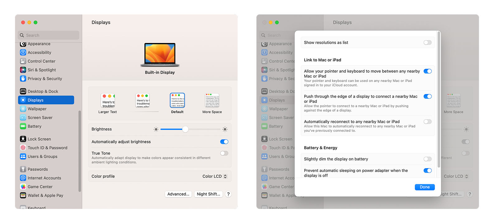
    Modern operating systems have many features and are deeply customizable. The MacOS settings application uses combinations of UI patterns to facilitate progressive disclosure. Apple uses the left-hand menu to organize settings into groups. They defer advanced settings to modal windows. If, for example, a user accesses the display settings, they see the primary settings first. Buttons allow them to access “Advanced” and “Night Shift” settings via secondary windows. The app also features a search bar and help icon to assist the user.

    © Apple, Fair use

  • Avoid multiple access paths. Users can become confused if they can reach the same information or feature in several ways. A single straightforward path is better for usability. Tree diagrams help designers visualize the content of their products and ensure one path to each piece of information or setting.

Guide the User

Progressive disclosure helps to keep the main interface simple and ease new users into an application. To keep advanced content discoverable, designers help the user in the following ways:

  • Make it clear where advanced functions are available. To achieve clarity, use icons, labels, and other signifiers. These signifiers suggest there’s more information available. Examples include arrows, buttons, ellipses and text (e.g., more options).

  • Use onboarding tutorials. Explain key hidden features and how to access them through tutorials. Tutorials should include a skip option so as not to frustrate advanced users.

  • Provide contextual help. Tooltips, pop-ups and other contextual help patterns guide users as they learn. These patterns can inform users advanced features are available.

  • Implement feedback mechanisms. Use prompts and feedback to guide users in discovering and using hidden features. For example, a user completes a task for the first time in an application. A prompt might appear to congratulate them and suggest a related advanced feature they have yet to try.

The Adobe Photoshop main interface. A modal window presents tutorials, while a tooltip reveals more information about a specific tool.

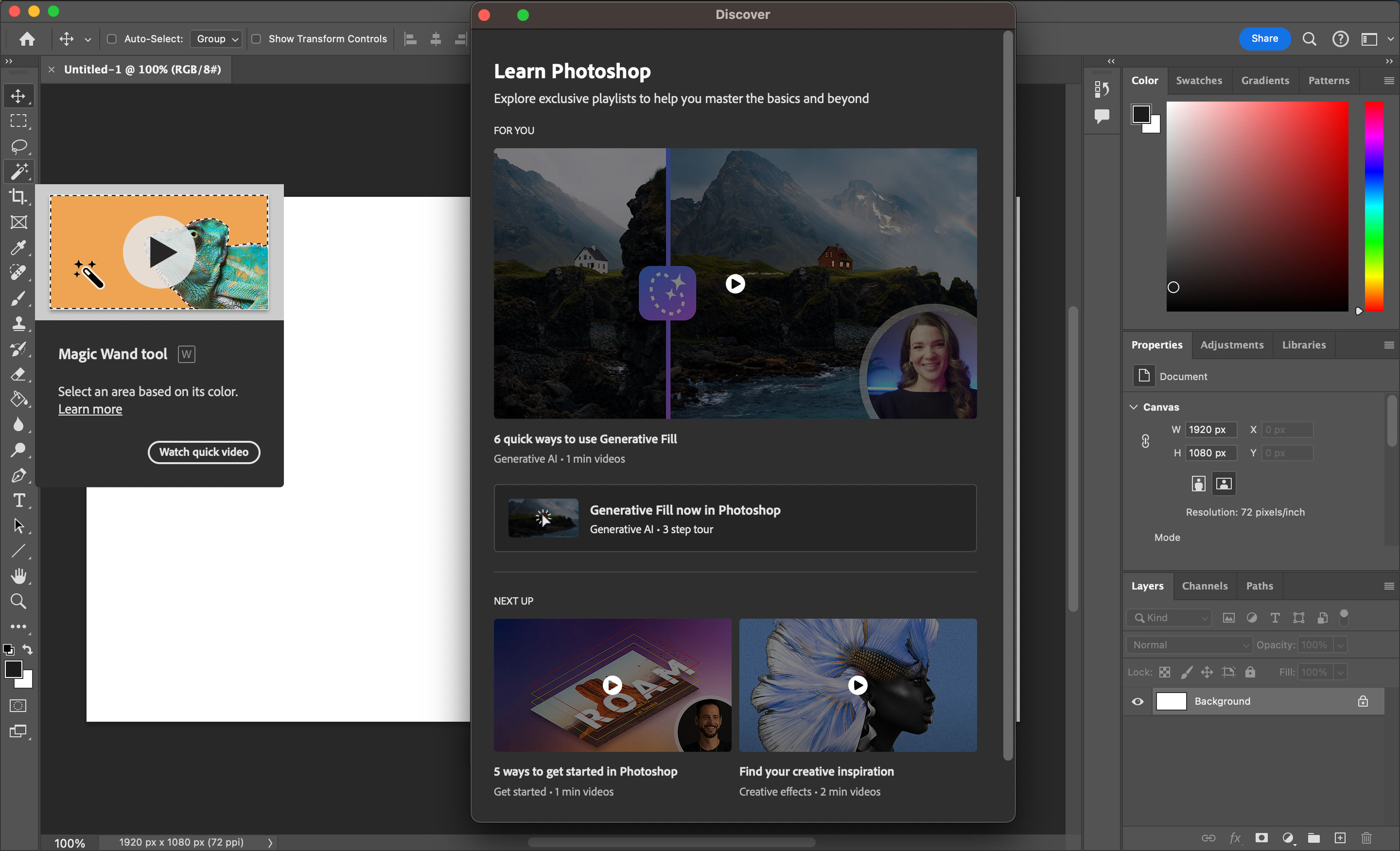
Adobe Photoshop offers several ways to help the user with basic and advanced functionalities. Tooltips provide contextual help and the option to watch a video tutorial. The Discover panel (accessed via the question mark icon) offers tutorials for many features and tasks.

© Adobe, Fair use

Progressive Disclosure Challenges

While progressive disclosure is often highly beneficial, it has risks and challenges. Designers must be mindful of the following as they implement progressive disclosure:

  • Broad audiences. Defining essential and advanced content becomes challenging when your have a broad audience. Consider a website like Amazon. Amazon’s customers include both computer scientists and people who rarely use technology. In this scenario, designers must test their solution to ensure it meets the needs of their entire audience.

  • When “advanced” features become everyday tasks. For tasks users perform frequently, the benefits of progressive disclosure can diminish. If users need to go menu diving to access familiar tools, this can become a hindrance and not a help. An email client, for example, may hide the reply, delete and mark actions behind additional clicks. These extra clicks could frustrate users who perform these actions multiple times daily. In this scenario, designers can use research to redefine primary actions. Alternatively, designers can implement UI customization for advanced users.

  • Dumbed-down content. A risk of progressive disclosure is that it can oversimplify the product and limit what users can achieve. Oversimplification affects the usability of the application or website for advanced users. A dumbed-down interface can also give the impression that the software lacks depth or capability. For example, a photo editing application’s UI may be easy to understand,  but the software's full range of features and tools are challenging to find. Designers must find the balance between usability and discoverability.
     
    In this video, Morgane Peng, Design Director at Societe Generale, explains the “UX Efficient Frontier.” This concept is a way for designers to understand how to approach the balance of simplicity and complexity: 
     

    Transcript

Alternatives to Progressive Disclosure: Staged Disclosure and Responsive Enabling

In addition to progressive disclosure, designers employ similar methods to reveal information progressively. Methods include "staged disclosure" and "responsive enabling."

Designers decide which method to use based on research and context. These methods are also not mutually exclusive. Designers may combine all three to improve their product’s usability.

Staged Disclosure

Staged disclosure unfolds the user's journey in a straightforward, step-by-step manner. Progressive disclosure makes advanced features or information available to the user on request. Staged disclosure reveals all information one step at a time.

A typical example of staged disclosure is a step-by-step e-commerce checkout process. Some processes use multiple pages; others use accordions that expand and contract as the user completes each step. Here’s an example flow:

  1. Page 1: Name, email address, shipping address and phone number.

  2. Page 2: Shipping method and discount codes.

  3. Page 3: Card details and billing information.

  4. Page 4: Confirm details and pay.

  5. Page 5: Card check and authorization.

  6. Page 6. Order confirmation.

Four screens from the Interaction Design Foundation's sign-up flow. On screen one the user chooses a membership, on screen two they enter their name and email, on screen three they enter their payment details, and on screen four they enter their address and phone number.

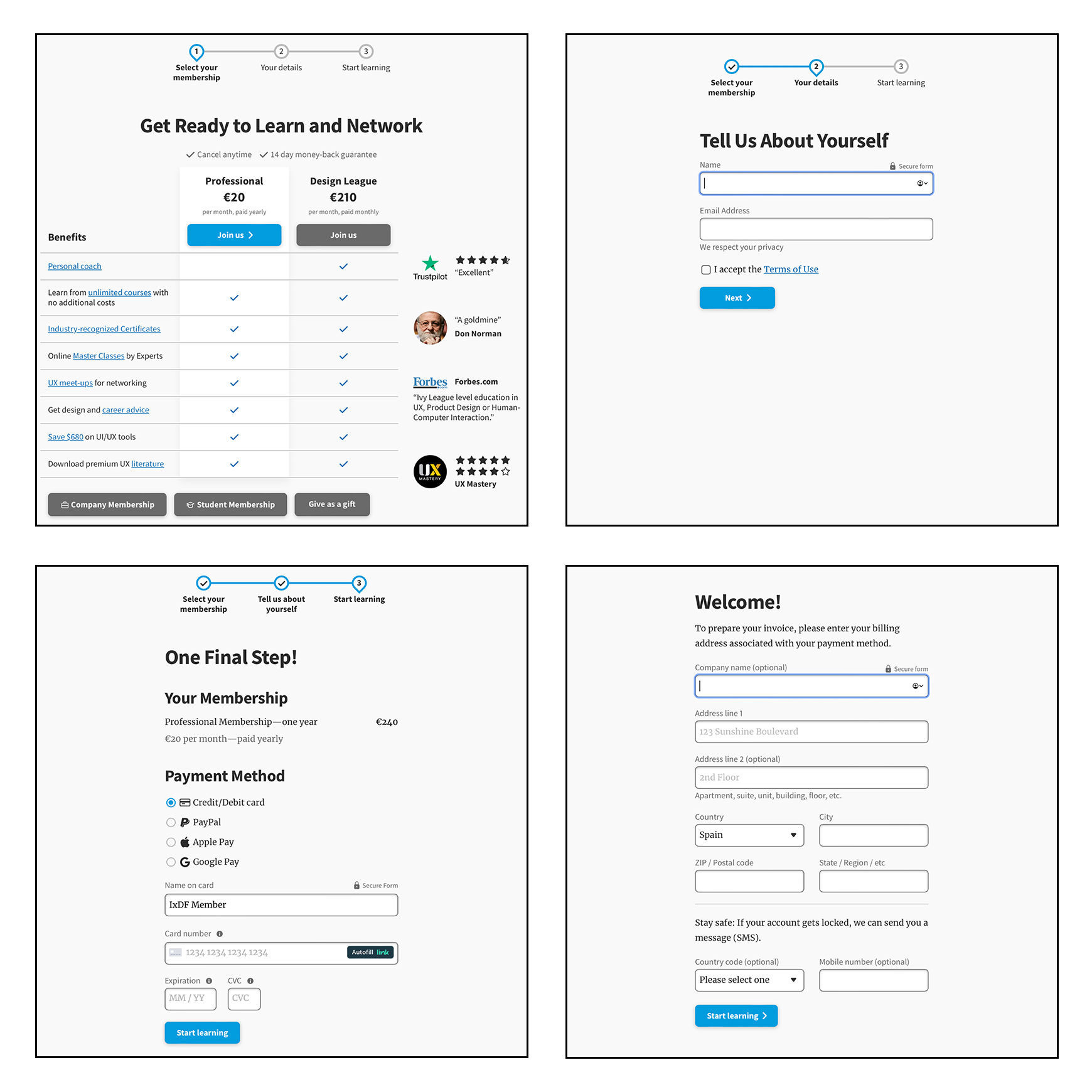
The Interaction Design Foundation’s sign-up flow features 16 text fields, drop-down menus, and checkboxes. If IxDF presented all this information on a single page, it may overwhelm and confuse the user. The IxDF uses staged disclosure to simplify this process and reduce the user’s cognitive load.

© Interaction Design Foundation, CC BY-SA 4.0

Other examples of staged disclosure include:

  • Software installation wizards present software setup in stages. Wizards make complex installations manageable and user-friendly through guided choices.

  • Educational course modules progressively unlock content. This progression facilitates learning and keeps students engaged without overwhelming them.

  • Product configuration flows present customizable product options in a sequence. Choices in early steps determine the options available in later steps. For example, an online car configurator starts with model selection, followed by color and then interior options.

Responsive Enabling

Responsive enabling displays only relevant information and controls for a specific immediate task. As the user interacts, the interface enables relevant options and disables unnecessary ones.

A typical example of responsive enabling is in application menus. Users see a full menu based on the active window, item or task. However, unavailable actions appear grayed out.

This approach indicates to the user the functionality available in the current context. Designers use responsive enabling in partnership with progressive disclosure to inform users of their possible actions.

The Adobe Photoshop main interface. A drop-down menu reveals many functions and options. Some options are in black text while others are in gray.

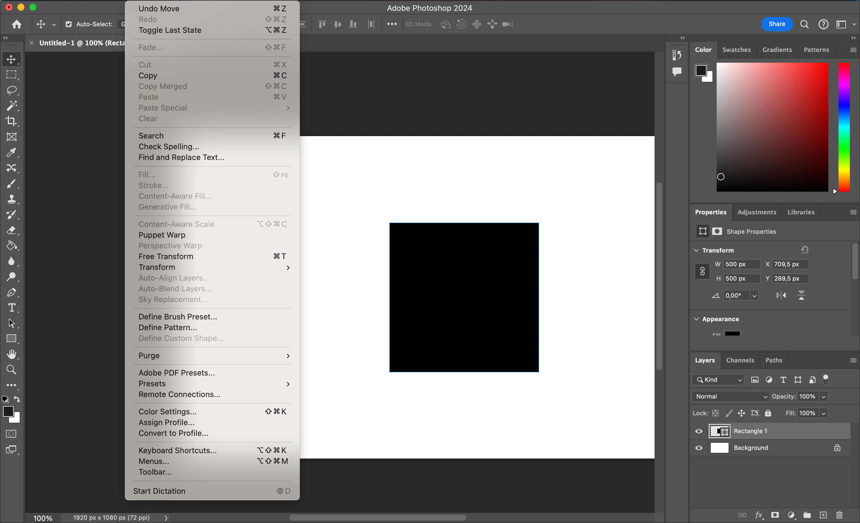
Adobe Photoshop uses responsive enabling in its menus. Certain edit menu functions are unavailable when the user selects a single shape. Responsive enabling reduces the risk of user errors and confusion since users cannot choose actions without effect.

© Adobe, Fair use

Other examples of responsive enabling include:

  • E-commerce product configurators. Size and accessory options activate when the user selects a product color.

  • Document editing tools. Formatting options (e.g., bold, italic) activate only when the user selects text.

  • Survey forms. Specific questions unlock depending on the user’s answers. For example, the user unlocks pet care questions when they answer "Yes" to owning a pet.

  • Payment method input. Users do not see the credit card input form if they choose an alternative payment method like Apple Pay.

  • Video game tutorials. Tutorials guide users through game controls one at a time. Once the user completes one action (e.g., jump), they unlock the next (e.g., punch).

Questions About Progressive Disclosure?
We've Got Answers!

What is a physical example of progressive disclosure?

Many books, fiction and non-fiction, defer advanced information to their appendices. This is a form of progressive disclosure. For example, the science fiction book Dune includes extra information about the world and characters in its appendices. Readers who want this information can navigate to the appendices, while those who don’t can read the story without it.

Another physical example of progressive disclosure is in museums. Museums often show visitors essential information in the main displays. Further information is available to visitors through guidebooks, interactive displays and video installations. Museums use progressive disclosure not to overwhelm visitors and let them decide when they want to see advanced information.

Watch our Master Class, Complex UI Design: Practical Techniques, with Vitaly Friedman, Senior UX consultant, European Parliament, to learn how to implement progressive disclosure in UI design.

What role does progressive disclosure play in mobile versus desktop app design?

In mobile app design, designers have limited screen space. Given this, they often make the main interface as simple as possible and focus on the main actions. Users can access additional content through UI patterns like tabs and modal windows. This approach improves usability and engagement as users interact more easily and quickly.

In desktop app design, designers have more space to work with, yet the same principles apply. Given the additional space, designers can include more content in the main UI. Designers must handle this freedom with care, as too much content overwhelms users, while too little can make an app appear too simple.

Regardless of the platform, designers use progressive disclosure to:

  • Present content and interactions that meet users’ immediate needs. 

  • Encourage exploration in a manageable way.

  • Offer information and options in an easy-to-understand format.

Designers use adaptive design techniques to optimize for mobile and desktop devices. Frank Spillers, CEO of Experience Dynamics, explains adaptive design:

Transcript

What are some examples of good progressive disclosure in popular applications?

Examples of successful progressive disclosure exist across many popular applications. A few notable examples are: 

  • Google Maps displays vast amounts of data (locations, traffic, points of interest) in a layered manner. The initial UI is simple and presents a general view of the map. More detailed information becomes available as users zoom in or search for specific locations. This information includes reviews, live traffic updates and street views. This approach ensures users aren't overwhelmed by information irrelevant to their immediate needs. 

  • Instagram uses progressive disclosure for a simple interface with rich functionality. The main feed is clean, focusing on photo and video content. Users only see additional options and features, like filters and editing tools, as they navigate through the app. Progressive disclosure makes the experience more engaging without cluttering the initial view. 

  • Slack carefully balances simplicity with the complexity of team communication. It shows an organized view of channels and direct messages in the main UI. Users can request detailed functionalities like workflows and app integration via secondary screens. Progressive disclosure makes Slack manageable for new users while still powerful for advanced users. 

Many modern applications are feature-rich. Designers must ensure their user interfaces remain accessible and intuitive. Watch our Master Class, Complex UI Design: Practical Techniques, with Vitaly Friedman, Senior UX consultant, European Parliament, to learn some best practices. 

Transcript

What should designers consider to make progressive disclosure inclusive for all users?

Designers must ensure their designs are accessible, understandable and usable to people with diverse abilities and needs. This includes the implementation of progressive disclosure. Some essential factors to keep in mind are:

  • Clarity and simplicity. Designers ensure they present essential and advanced information and options clearly and simply. They use language and visuals that are easy to understand and avoid technical jargon or complex symbols that could confuse users.

  • Predictability. Designers create interactions for users to anticipate what will happen next. This anticipation helps users feel in control and reduces anxiety and frustration. This point is essential for designing for those with cognitive or learning disabilities.

  • Accessibility features. Designers incorporate accessibility features like keyboard navigation and screen reader compatibility. These inclusions ensure everyone, including those with visual, motor, or cognitive impairments, can navigate through the content.

  • User testing. Designers involve a diverse group of users in testing, including people with disabilities. This approach helps identify and address potential barriers in their progressive disclosure implementation. This feedback is invaluable in creating an inclusive experience.

  • Feedback mechanisms. Designers provide clear feedback when users take an action that triggers progressive disclosure. Cues like animations and haptic feedback help users understand new content or options are available.

  • Flexibility in interaction. Designers allow users to control the pace at which they access information. For example, automatically loaded content can overwhelm or confuse users. Instead, a "More Information" button lets users decide when to view additional details.

  • Reversibility. Designers allow users to quickly revert their actions or return to previous states. This option supports users who unintentionally trigger new content and want to return to a more familiar state.

Katrin Suetterlin, UX Content Strategist, explains universal and inclusive design:

Transcript

Can progressive disclosure improve the usability of dashboards and data visualization?

Designers use progressive disclosure to present information in a layered and interactive manner. This approach helps users navigate complex data sets without feeling overwhelmed. It also enhances the user’s ability to understand and analyze the data effectively. Some key ways progressive disclosure benefits dashboards and data visualization are:

  • Layered information presentation. Designers restrict the initial UI to high-level summaries or overviews of the data. This restriction lets users grasp the general trends or insights at a glance.

  • Customizable views. Designers implement customizable views that allow users to select the data points or metrics most relevant to them. This approach enables users to access information based on their specific needs or interests as requested.

  • Interactive elements. Designers incorporate interactive elements like sliders and filters to refine the data displayed. Progressive disclosure lets users control the amount and type of information presented.

  • Conditional visualization. The user’s actions or preferences adjust the complexity of the presented data. For example, designers can reveal more detailed visualizations as users zoom in on a specific area of a graph.

  • Guided exploration. Designers implement guided exploration features, like tutorials, tips or prompts. These elements gradually introduce users to more advanced features or deeper data insights. This approach helps manage the learning curve associated with complex data analysis.

Learn how to apply a range of basic and complex information visualization techniques in our course, Information Visualization.

How do I test the effectiveness of progressive disclosure in my design?

Designers use the following techniques to evaluate the usability, user engagement, and overall user experience of their designs:

  • Set clear objectives. Define what you aim to achieve with progressive disclosure in your design. Objectives may include:

  • Reducing cognitive load.

  • Increasing task completion rates.

  • Improving user satisfaction.

  • User testing. Conduct user testing sessions to see how real users interact with your designs. Utilize tasks that make users navigate through progressively disclosed information. Measure how easily and quickly users can complete these tasks, noting any points of confusion or frustration.

  • A/B testing. Test two or more versions of your design with different implementations of progressive disclosure. Split users equally by the designs and measure which one performs best.

  • Heatmaps and click tracking. Use heatmaps and click-tracking tools to analyze user interactions. Look for patterns that indicate engagement. Patterns include:

  • Which areas do users focus on or ignore?

  • How do users navigate advanced content?

  • Feedback collection. Gather direct feedback from users about their experiences with the progressive disclosure elements in your designs. Surveys, interviews and feedback forms can be effective tools. These methods collect qualitative insights into user perceptions and define areas for improvement.

  • Analytics review. Review analytics to measure changes in user engagement and behavior resulting from progressive disclosure. Consider metrics like page views, time spent on page, bounce rates and conversion rates.

  • Accessibility evaluation. Use accessibility testing tools and guidelines (like WCAG) to evaluate whether all users can effectively access and interact with progressively disclosed content.

Designers refine their designs based on their findings. Sometimes, they iterate on their designs several times and retest after each iteration.

Learn how to conduct effective usability testing with our course, Conducting Usability Testing.

Transcript

What metrics measure the success of progressive disclosure strategies?

Quantitative and qualitative metrics help designers measure the success of their progressive disclosure strategies. Some key metrics to consider are:

  • Task completion rate measures the percentage of users who complete a given task. A higher rate may indicate progressive disclosure helps users to find the information they need.

  • Time on task tracks the time users spend completing specific tasks. A reduction in time may indicate progressive disclosure helps efficient navigation.

  • Error rate counts the number of errors or missteps users make. A lower error rate can mean the progressive disclosure is intuitive and reduces confusion.

  • User satisfaction can indicate how easy it is for users to find the information they need. Designers gather this metric through surveys, feedback forms and interviews.

  • Conversion rates measure the percentage of users who complete a desired action, like purchasing an item. Higher conversion rates can signal that progressive disclosure helps users make decisions.

  • Bounce rate is the percentage of users who leave a site after viewing only one page. A lower bounce rate may suggest users want to explore further because of effective progressive disclosure.

  • Accessibility metrics ensure all users, including those with disabilities, can benefit from progressive disclosure. Metrics include the success rate of users using assistive technologies.

Designers combine these metrics to understand the performance of their progressive disclosure strategy. Metrics help designers make data-driven decisions. Designers continuously monitor these metrics and iterate based on insights.

Designers often acquire quantitative data, like conversion rates and bounce rates, through analytics. William Hudson, CEO of Syntagm, UX Expert and Author, explains how analytics fit into UX:

Copyright
Transcript

Learn more from William in our course, Data-Driven Design: Quantitative Research for UX.

How can user feedback refine progressive disclosure elements?

Here's how designers effectively integrate user insights into their design process:

  • User testing observations. Conduct user testing sessions to focus on how users interact with progressive disclosure elements. Observe how users navigate these elements and note any confusion or hesitation. Use these observations to identify areas to make the progressive disclosure more intuitive or informative.

  • Surveys and interviews. After testing or upon release, gather user feedback through surveys and interviews. Ask specific questions about users' experiences with navigation, information comprehension, and overall satisfaction. Use this feedback to pinpoint areas for improvement.

  • Analytics data. Review analytics data to gain insights into how users interact with your designs. Metrics like click-through and conversion rates can indicate how well a progressive disclosure strategy works. High dropout rates or low interaction with progressively disclosed elements may suggest a need for refinement.

  • A/B testing. Implement A/B testing by creating variations of your progressive disclosure approach. This method helps identify the most effective strategies for engaging users and encouraging deeper content exploration.

  • Accessibility feedback. Ensure your design is accessible by talking to users with disabilities in testing and feedback processes. Their insights help designers understand the impact of progressive disclosure on assistive technologies.

  • Iterative design process. Use the collected feedback to improve your designs iteratively. Improvement may involve simplifying information, redefining advanced information or enhancing navigational cues. Test these changes with users to assess their impact and refine them based on new feedback.

  • Community forums and social media. Monitor feedback on broader community forums and social media platforms. Users often share their experiences and challenges in these settings. This approach provided additional insights that can inform design improvements.

Designers incorporate user feedback continuously to create more user-friendly designs. Learn from Ditte Hvas Mortensen, design psychologist and researcher, when to incorporate user research into your design process:

Copyright
Transcript

How does progressive disclosure relate to information architecture?

Progressive disclosure directly supports information architecture (IA) by structuring and organizing content optimally. Here's how progressive disclosure complements and enhances information architecture:

  • Enhances usability. Progressive disclosure presents content to users when they need it. This approach makes digital products more straightforward to use. Strong usability is a core goal of effective information architecture.

  • Supports hierarchical organization. IA often involves creating a hierarchical information structure, from general to specific. Progressive disclosure aligns with this. For example, scrolling gradually reveals more detailed information as users request.

  • Improves findability. Progressive disclosure prevents information overload, helping users find information more efficiently. It guides users through the IA in a controlled manner.

  • Facilitates user-centered design. Both progressive disclosure and information architecture are elements of user-centered design. They require designers to understand the information most relevant at different stages of the user journey.

  • Adapts to user skill levels. Designers can tailor progressive disclosure to accommodate varying levels of expertise. Users can request more complex features or detailed information as needed. This adaptability is crucial to information architecture, aiming to meet diverse user needs.

Earn a Gift Earn a Gift, Answer a Short Quiz!

1
2
3
4
1
2
3
4
Question 1
Question 2
Question 3
Get Your Gift
Interaction Design Foundation logo

Question 1

What is one of the main purposes of progressive disclosure in user interface design?

1 point towards your gift

  • To keep the primary user interface minimal and decluttered.
  • To make all features immediately visible to users.
  • To prevent users from using advanced features when they want to.
Interaction Design Foundation logo

Question 2

Which UI pattern do designers commonly use for progressive disclosure to present extra features?

1 point towards your gift

  • Full-screen navigation.
  • Modal windows.
  • Search function.
Interaction Design Foundation logo

Question 3

How does progressive disclosure help users when interacting with complex interfaces?

1 point towards your gift

  • It gradually introduces advanced features to prevent cognitive overload.
  • It presents a mandatory advanced features tutorial.
  • It shows all functions at once to make sure no information is missed.

Learn More About Progressive Disclosure

Make learning as easy as watching Netflix: Learn more about Progressive Disclosure by taking the online IxDF Course UI Design Patterns for Successful Software.

Why? Because design skills make you valuable. In any job. Any industry.

In This Course, You'll

  • Get excited as you discover the design patterns brands like Nike and Apple use to create interfaces users love. You know that feeling when you use a website that's so intuitive it feels almost like magic? Or the frustration when you can't find the items you just added to your cart? The difference lies in the User Interface (UI) design. Skills in UI Design equip you to create intuitive user experiences and amazing customer interactions. It's easy because you already have transferable skills like analytical thinking, creativity, clear communication, and problem-solving. In this course, you'll build on them to deliver exceptional customer interactions, even if interface design is new to you.

  • Make yourself invaluable with the in-demand design skills you need to create successful software. UI design patterns offer standardized ways to organize visual elements like hamburger menus and breadcrumbs. These repeatable design frameworks deliver predictable success. How? Your user-friendly software interfaces make your users' lives easier. Navigation, forms, data visualization, and feedback patterns reduce your users' cognitive load. Less cognitive load means happier customers. Happier customers mean greater loyalty, increased conversions, and higher earning potential. As AI speeds up production, you stay in demand by applying timeless human-centered design skills that keep simplicity, clarity, and usability front and center. This is how AI becomes a real advantage in your career, not just another tool.

  • Gain confidence and credibility with hands-on experience. No matter your background, you'll quickly master UI Design Patterns. With clear guidance and real-world examples, you'll apply your skills immediately. Master frameworks that simplify data entry, improve website usability, and engage your users. Fast-track your UI design portfolio and career with 20+ downloadable templates for sitemaps, user input forms, leaderboards, and more. If you'd like, you can also complete an optional portfolio project to showcase your new skills. This course gives you practical skills to delight your users, excel professionally, and confidently advance your career.

Get an Industry-Recognized IxDF Course Certificate

Increase your credibility, salary potential and job opportunities by showing credible evidence of your skills.

IxDF Course Certificates set the industry gold standard. Add them to your LinkedIn profile, resumé, and job applications.

Course Certificate Example

Be in distinguished company, alongside industry leaders who train their teams with the IxDF and trust IxDF Course Certificates.

Our clients: IBM, HP, Adobe, GE, Accenture, Allianz, Phillips, Deezer, Capgemin, Mcafee, SAP, Telenor, Cigna, British Parliament, State of New York

All Free IxDF Articles on Progressive Disclosure

Read full article
Make it Easy on the User: Designing for Discoverability within Mobile Apps - Article hero image
Interaction Design Foundation logo

Make it Easy on the User: Designing for Discoverability within Mobile Apps

Discoverability sometimes also referred to as “learnability” is the ease at which users can find new features or functions with an app and learn to use the things that they find. While this has always been an important part of user experience design – it becomes even more important in the mobile des

Social shares
787
Published
Read Article
Read full article
Display Contents the Classic Way with Dropdown Menus - Article hero image
Interaction Design Foundation logo

Display Contents the Classic Way with Dropdown Menus

The dropdown menu goes all the way back to the Start menu of the most classic Microsoft Windows versions. Now, you can find it nearly everywhere: from newspaper websites to online shops, and from graphic design applications to text-editing software. It has helped users time and time again to access

Social shares
700
Published
Read Article
Read full article
Embrace the Mental Models of Users by Implementing Tabs - Article hero image
Interaction Design Foundation logo

Embrace the Mental Models of Users by Implementing Tabs

Users of all ages will still remember the tabbed file folders people used to bring order into a vast amount of information and make it super simple to find what they were looking for. If you’re trying to design a good way to prevent your users from having to search for a needle in a haystack every t

Social shares
710
Published
Read Article
Read full article
Your Guide to Hamburger Menus - Article hero image
Interaction Design Foundation logo

Your Guide to Hamburger Menus

The hamburger menu—with its three horizontal lines—simplifies website navigation. Not every interface benefits from its use, but it can help in certain scenarios. That’s why it’s vital to understand when it shines and when alternatives might serve users better. So, learn the pros and cons of using t

Social shares
841
Published
Read Article

Make it Easy on the User: Designing for Discoverability within Mobile Apps

Make it Easy on the User: Designing for Discoverability within Mobile Apps

Discoverability sometimes also referred to as “learnability” is the ease at which users can find new features or functions with an app and learn to use the things that they find. While this has always been an important part of user experience design – it becomes even more important in the mobile design environment where limitations on screen real estate make discoverability a more significant challenge.

The easier your mobile application is to learn to use and the easier it is for your users to find the functionality to learn it – the more useful that application is likely to be to the user. The user experience is also likely to greater.

Discoverability and Learnability

Discoverability refers to the ease with which users can discover features within an application. Learnability refers to how easy it is for the user to learn to use the application and its features. Whilst not identical concepts they are closely related enough that you can treat them together in your designs.

A Little about Learnability

There are several factors that affect the implementation of learnability in apps:

  • Learnability must be easier the less important an app is in a user’s daily life. People will put more effort into learning when they use something regularly than they will if something will only be used once a month or once a year.

  • Learnability is easier the more frequently an app is used – familiarity with an interface, conversely to the point above, makes it easier to use.

  • Learnability might want to be delivered in proportion to cost. If someone spends $100 on an app – they’re more likely to spend more time learning to use it than they will with a $1 app.

  • Learnability can be affected by competing offerings – the more complex your competitor’s products are the more likely those users will tolerate complex learning curves in your products.

  • Learnability, to some extent, must reflect complexity. If your app only has 2 functions it really should be very easy to learn to use and execute those functions; it is clearly going to be harder to pick up 200 functions in the same time.

It is also worth noting that evidence suggests that steeper learning curves may, in direct opposition to standard UX experience practice, create more loyal users with greater capacity. (In those who persist with the application rather than giving up on it).

© Kartik Shradha, Fair Use

Areas of UI that Help with Discoverability and Learnability

When making applications (and especially mobile applications) discoverable and learnable you’ll want to focus on UI to facilitate that and in particular:

  • Action Bars – these provide the opportunity for the user to “bank” their most commonly taken actions. This is in contrast to the navigation bar more traditionally used in web applications. They remove the clutter from the screen and focus on what a user is most likely to want to do in any given circumstance.

  • Social logins – it’s a good idea to first consider whether users will want to link their social profiles to your app. However, if they are going to be OK with that – logging in with a social network can save time, save account creation and still provide you with useful data for your app design team.

  • Big Buttons – the bigger the button, the clearer it should be that the user needs to take an action. Think Badoo and its’ tick/cross approach to dating, for example. Of course, big buttons are best in apps that are going to offer a limited number of options to a user at any point in time. Otherwise they’re likely to become very annoying and require a ton of scrolling to handle properly.

  • Notifications – when something changes for the user, let them know. Notifications don’t have to be dramatic and highly intrusive either. The simple digit count on message apps so that users are aware there are new messages available to them, for example, is a great way to update someone without intruding into their day.

  • Discoverable controls – mobiles offer a whole new set of interactions with a device. Touch-sensitive screens, accelerometers, GPS readings, swipe controls, gesture controls, image controls, etc. it can be incredibly useful to make these controls make themselves known as users experiment with their devices.

© bluemuppet, CC BY-SA 3.0

The good news is, of course, that many of these discoverable approaches are already available as UI patterns. You don’t always have to reinvent the wheel in order to assist your users via UI design.

Testing for Learnability and Discoverability

It can be hard to test for both of these concepts prior to implementing a design. They are a consequence of usage and as such even prototyping may not lead you to the answers that you seek when it comes to these concepts.

It may be best to agree that you need to iterate a product from an alpha or beta version to a launch version to test learnability and discoverability. They should also be revisited at a later date once your user base has become more familiar with the product and you can gain a better understanding of how these concepts played out in “real life”.

The Take Away

Discoverability and learnability are not quite the same thing – however, they both complement each other. The need for users to be able to discover functionality becomes critical on a mobile interface where limited screen real estate requires different approaches compared to the desktop. Learnability, as we have seen, should reflect the user’s needs and investment in the application – the more it is used and the more it costs – the more likely the user is to tolerate a steeper learning curve.

References

See some great examples of discoverable controls in UI Design patterns here.

UX Booth looks at learnability with an example drawn on Google Maps here.

Hero Image: © ScotXW, CC BY-SA 3.0

Feel Stuck?
Want Better Job Options?

AI is replacing jobs everywhere, yet design jobs are booming with a projected 45% job growth. With design skills, you can create products and services people love. More love means more impact and greater salary potential.

At IxDF, we help you from your first course to your next job, all in one place.

See How Design Skills Turn Into Job Options
Privacy Settings
By using this site, you accept our Cookie Policy and Terms of Use.
Customize
Accept all

Be the One Who Inspires

People remember who shares great ideas.

Share on:

Academic Credibility — On Autopilot

Don't waste time googling citation formats. Just copy, paste and look legit in seconds.