Your constantly-updated definition of Mobile User Experience (UX) Design and collection of videos and articles. Be a conversation starter: Share this page and inspire others!
4,437 Shares
What is Mobile User Experience (UX) Design?
Mobile UX designs are interfaces for hand-held and wearable devices. Designers focus on accessibility and efficiency to optimize these on-the-go interactions.
Transcript
Transcript loading ...
Mobile design has different limitations and requirements than computer interfaces. Many companies have mobile and computer-based designs for identical products. Designers learn to distill essential elements for smaller screen sizes and to optimize their designs for users on the move.
Cater for Users on the Go
The importance of mobile user experience design grew dramatically in 2014 when mobile users suddenly became the online majority. Designers quickly learned they couldn’t simply miniaturize a desktop interface. They needed to reevaluate the needs and limitations of the growing audience of mobile users.
Since then, mobile design has evolved to find the best use of smaller screens.
Experiences are now tailored specifically for mobile environments and specific contexts of use.
Attention spans are shorter in mobile UX. Users want results fast, with minimal effort and zero friction. They’re often distracted. Signal and power loss are frequent worries. These users often walk and use devices at the same time.
Typically, mobile users find themselves in three scenarios:
Micro tasking: they use devices in short, intense spurt—e.g., to buy tickets.
Local: they use devices to see what’s happening around them.
Bored: e.g., they surf news feed links while waiting.
Tips for Mobile UX
Here are some practical guidelines to design for mobile interfaces and a mobile-first approach:
1. Minimize Content
Smaller screens mean essential elements need to be legible on a smaller resolution. You must make a clean, legible layout to cater to mobile users.
Design for minimal page-loading times. Less than 3 seconds is ideal.
Users might not complete a task all at once. Make sure they don't get lost easily. Also, most users use one hand, and some fingertips are larger than others.
Questions About Mobile User Experience (UX) Design? We've Got Answers!
What makes a good mobile user experience?
A top-notch mobile user experience follows a structured five-step process, as explained by Frank Spillers, CEO of Experience Dynamics. Firstly, assess your internal priorities and business goals.
Transcript
Transcript loading ...
Dive deep into understanding users by recognizing their needs, contexts, and objectives in step two. The third step is defining the app's value proposition, emphasizing emotional value. With insights from user needs and the specified value, step four involves crafting a distinct UX strategy. Lastly, you sketch, review, and refine the design. Ultimately, understanding and integrating the user's context with the design results in an app that resonates, delights, and ensures strong user adoption.
What is UX in mobile?
Mobile UX (User Experience) pertains to a user's overall experience while interacting with a mobile device, predominantly smartphones and tablets. It encompasses the design, usability, and functionality tailored for smaller screens and different user behaviors compared to desktops. Effective mobile UX ensures seamless navigation, intuitive design, and rapid load times, catering to on-the-go usage. As highlighted in our Mobile UX Design guidelines, it's crucial to consider factors like touch screen interaction, limited screen real estate, and varied device capabilities to create a satisfactory user experience.
What is the most important way to optimize a mobile user experience?
The cornerstone of enhancing mobile UX is task analysis. As Frank Spillers, CEO of Experience Dynamics, explains, task analysis involves observing users performing their tasks without emphasizing the technology they use.
Transcript
Transcript loading ...
By having users show their current routines, you can identify workarounds, patterns, and individual adjustments. The goal is to comprehend their problem-solving process step by step. This method reveals invaluable insights, especially with ethnography, which delves into cultural cues and user behavior. Using the observations from task analysis, designers can map and flow chart user activities, ensuring the design supports these sequences seamlessly. The ultimate aim is to create an intuitive user journey that feels natural and logical.
What is an example of good user experience?
A prime example of good user experience can be observed in the Apple Watch, which functions not just as a standalone device but as part of a broader product-service system. This biofeedback device, when paired with services like Fitness Plus, seamlessly integrates with the user's lifestyle. Its cohesive design complements the mobile app and other devices, creating a harmonious ecosystem. Frank Spillers, CEO of Experience Dynamics, emphasized the importance of examining the entire ecosystem, from service to mobile app, to truly grasp how products like the Apple Watch provide an unparalleled user experience.
Transcript
Transcript loading ...
What are the 7 aspects of user experience?
User experience (UX) encompasses more than just usability.
Transcript
Transcript loading ...
As described by UX pioneer Peter Morville, the seven critical aspects of UX are:
Useful: Products must serve a purpose, fulfilling specific needs or desires.
Usable: It's essential for users to achieve their goals effectively and efficiently.
Findable: Products should support easy navigation, ensuring users can find desired objects or content.
Credible: Trustworthiness is crucial; users should believe in the product's legitimacy.
Desirable: Driven by emotions, this aspect pertains to design, imagery, and brand identity.
Accessible: Products should cater to users of all abilities, including those with disabilities.
Valuable: Ensuring both business and user derive value is vital for sustained success.
How To Build a Mobile App?
Transcript
Transcript loading ...
To construct a mobile app tailored for patient-doctor chats:
Employ a mobile-first, task-first, and content-first strategy.
Begin with a sketch emphasizing large buttons suitable for mobile interfaces.
Prioritize content, focusing on security, and protective measures for health information (HIPPA).
Allow users to see incoming messages from their doctor, specifying the date and time of the message. The app should support a chat format but with provisions for longer, descriptive messages.
Enable a full-screen mode for typing, and add features like attachments for photos or health records and emotion icons to indicate the patient's feelings.
Consider features like video calls, but ensure privacy with a video request system.
Enable searching and editing of messages while emphasizing security for sensitive content.
What is Tappability in mobile UX?
Tappability in mobile UX refers to the efficiency and clarity of tap-based interactions on mobile devices. It minimizes unnecessary taps, ensuring users know what's tappable without confusion.
Transcript
Transcript loading ...
Tappability is closely related to affordances, UI elements that invite the expected interaction. Think of a button that looks pressable or a slider that looks slideable. Enhancing tappability means offering clear visual cues (or signifiers), such as a pulsating button, to indicate interactive elements. Clean design is vital, but it shouldn't maintain clarity. Proper tappability reduces user frustration, uncertainty, and errors, ensuring a smoother mobile experience. Dive deeper into mobile UX best practices in our course Mobile UX Design: The Beginner's Guide.
What’s the difference between a Smartphone and a Tablet?
Smartphones and tablets differ mainly in size, purpose, and user behavior. A smaller resolution characterizes a smartphone and is not always the primary access device. Users of smartphones often multitask, face more distractions, and interact in a profound social and emotional context, which includes environmental factors like low lighting. They require clear tapability on objects. On the other hand, a tablet offers a larger screen area and is easier to design for due to its size. It's often a multi-user device used more by consumers at home, with less business usage than smartphones. When designing for tablets, one should maximize the available real estate while ensuring objects remain easily tappable.
Transcript
Transcript loading ...
Where to learn more about mobile UX?
Dive deep into mobile UX on the Interaction Design Foundation. Start with Mobile UX Design: The Beginner’s Guide for foundational knowledge. To refine interface skills, explore the Mobile UI Design Course. Enroll in the Mobile UX Strategy Course: Building Successful Products for a strategic perspective on creating successful mobile products. Each course offers expert-led content, ensuring a comprehensive mobile user experience design grasp. Enhance your skills and stay updated with the latest in mobile UX.
Transcript
Transcript loading ...
Earn a Gift! Answer a Short Quiz at the End of This Page
Earn a Gift, Answer a Short Quiz!
1
2
3
4
1
2
3
4
Question 1
Question 2
Question 3
Get Your Gift
2
3
4
2
3
4
Question 1
Question 2
Question 3
Get Your Gift
3
4
3
4
Question 1
Question 2
Question 3
Get Your Gift
4
4
Question 1
Question 2
Question 3
Get Your Gift
Try Again! IxDF Cheers for You!
0 out of 3 questions answered correctly
Remember, the more you learn about design, the more you make yourself valuable.
Improve your UX / UI Design skills and grow your career!
Join IxDF now!
Congratulations! You Did Amazing
3 out of 3 questions answered correctly
You earned your gift with a perfect score! Let us send it to you.
1
Check Your Inbox
We've emailed your gift to name@email.com.
Improve your UX / UI Design skills and grow your career! Join IxDF now!
Learn More About Mobile User Experience (UX) Design
Make learning as easy as watching Netflix: Learn more about Mobile User Experience (UX) Design by taking the
online IxDF Course Mobile UX Design: The Beginner's Guide.
Why? Because design skills make you valuable. In any job. Any industry.
In This Course, You'll
Get excited as you design world-class mobile apps and interfaces that make a real difference in people's lives. Mobile UX Design doesn't just offer a skill, it gives you freedom. Freedom to work from anywhere, switch industries, and build a career on your own terms. With mobile-first design in high demand across the world, your skills can take you wherever you want to go. Almost 90% of the world's population owns a smartphone, and more than half of all online traffic comes from mobile devices, so your work has the power to reach billions. Whether you're designing for healthcare, finance, gaming, or education, you'll create intuitive, accessible solutions that make people's lives easier, faster, and better.
Make yourself invaluable by learning how to use your human strengths such as empathy, creativity, and problem-solving to build experiences people love and keep coming back to. As AI accelerates how fast we build and iterate, your timeless human-centered skills become even more powerful. You'll direct AI with deep human insight, and ensure outcomes remain meaningful, ethical, and genuinely resonate with people. This is how you stay in demand: Human-centered design skills transform AI from a tool into your new superpower. You'll create experiences that meet people where they are: On the go, at home, or at work. Well-designed mobile UX design leads to happier customers, retention, and revenue. This course will give you the skills to launch successful apps and interfaces that deliver results on the App Store, Google Play, or within your organization. No matter your background, you can master mobile UX design. With clear guidance and real-world examples, you'll apply your skills straight away!
Gain confidence and credibility with optional practical exercises. You'll develop an app feature for mobile, tablet, and desktop, then adapt the design for different contexts like lighting conditions and user movement. You'll get comfortable with human-centered mobile design best practices and the mobile UX design lifecycle. Use our downloadable templates such as the Customer Journey Map and Usable, Satisfying, and Easy (USE) Scorecard to fast-track results and help you excel in any role, in any industry.
It's Easy to Fast-Track Your Career with the World's Best Experts
Master complex skills effortlessly with proven best practices and toolkits directly from the world's top design experts. Meet your experts for this course:
Frank Spillers: Service Designer and Founder and CEO of Experience Dynamics.
Alan Dix: Author of the bestselling book “Human-Computer Interaction” and Director of the Computational Foundry at Swansea University.
Mike Rohde: Experience and Interface Designer, author of the bestselling “The Sketchnote Handbook.”
Get an Industry-Recognized IxDF Course Certificate
Increase your credibility, salary potential and job opportunities by showing credible evidence of your skills.
IxDF Course Certificates set the industry gold standard. Add them to your LinkedIn profile, resumé, and job applications.
Be in distinguished company, alongside industry leaders who train their teams with the IxDF and trust IxDF Course Certificates.
All Free IxDF Articles on Mobile User Experience (UX) Design
Application design is the biggest field of endeavour in technology at the moment. It seems that ever since Apple launched the iPhone that clever people are coming together to try and make our lives ever more interesting via the various app stores. Yet, there are some simple things that these wonderf
There are many rules for navigation UX; some of them complex and only used in very specific circumstances. Yet, there are some rules which will apply to nearly every situation. We’ve come up with six simple rules that may help you get your navigation UX closer to perfection:
Rule 1: Be ClearAuthor/
I have a confession to make. I bought a $700 smartphone and have now permanently disconnected it from being online during the day. Why? The notifications are driving me berserk. Ding! You have a Facebook message. Ding! It’s 1 degree colder outside than it was yesterday. Ding! Your phone company has
The differences between responsive and adaptive design approaches spotlight important options for us as web and app designers. Choosing with insight can empower you to plan and execute your designs with better aim, purpose and results.With the pervasiveness and diversity of mobile devices, as design
Functionality and Mobile Design – Don’t Shrink the Screen, Focus on the Tasks
Designing for mobile devices is not the same as designing for laptops or desktops. It's about creating a unique user experience that focuses on what matters to mobile users. To achieve this, it's important to focus on the tasks that users want to accomplish and ensure they can be executed efficientl
Many businesses start with the end-point in mind; “We need a mobile app or a mobile website!” They do not consider why their users would want it. Having a mobile website or app isn’t the key to success—you must provide value to your users. When you take a user- and task-centered approach to mobile (
Social shares
899
Published
Read Article
Simple Guidelines When You Design for Mobile
In mobile user experience (UX) design, it’s important that we respect a user’s task and mindset, as well as the device’s limitations. Here you’ll learn about the general principles that can help you get started with your design.
Josh Clark, the author of Tapworthy: Designing Great iPhone Apps, describes three types of mobile mindsets:
“I’m Microtasking”: When the user interacts with their device for brief but frenzied periods of activity. Think about how you can accommodate users who are in a hurry. Make frequent, recurring tasks as efficient as possible.
“I’m Local”: When the user wants to know what’s going on around them. Take advantage of mobile devices’ sensors such as location, device orientation, and ambient light to personalize the experience where appropriate (and with permission, of course!).
“I’m Bored”: When the user is looking to be entertained, think beyond the task-focused features. What can you offer users when they leisurely browse?
We might add a few more categories that have emerged since Josh wrote that book early on in the smartphone era:
Extended engagement: When the user fully engages with the content for a long time, scrolling, tapping or swiping endlessly.
Interrupted attention: When notifications pull users back to check up on activity, status updates, or anything else. Note this is not always good, as notifications notoriously pull users back for no urgent reason other than for the company’s app engagement monetization needs.
In that last category, Microsoft offers a set of guidelines called “Respecting Focus.” They fall into five main areas:
Understand urgency and medium: Technology communicates in many ways: pop-ups, blinking lights, sounds, and vibrations. Are they all needed? Match the urgency of a notification with the urgency of the communication.
Adapt to the customer’s behavior: How a customer interacts with each feature or part of your experience will change over time.
Adapt to context: We all focus, filter, and consume information in unique ways. We filter out different information. These preferences and capabilities can rapidly change based on the contexts of use. context. Because of that, how a person interacts with each feature or part of an experience will change. Can your system learn from how people interact to modify the way it communicates?
Enable the customer to adapt: Personal experiences should suit each individual. Customizable features help customers feel empowered and in control of their devices. Many alerts on computers today are difficult to tune out or turn off. It can get overwhelming if multiple applications all send alerts simultaneously. Better systems have ways for users to control the type and timing of notifications.
Reduce mental cost: Experiences move beyond screens to engage and immerse human senses. Each of these new interactions presents new potential points of friction.
Basic Design Considerations for the Mobile Web
Small Screens
You don’t have as much screen real estate for mobile devices as you do for PCs and laptops. That means, normally, you’ll design for multiple screen sizes. Remember, you want to focus on a “mobile first” approach, which means you’ll design for the smallest mobile platforms and increase complexity from there.
A good process to follow would be:
Group device types based on similar screen sizes and try to keep these groups to a manageable size.
Define content and design adaption rules that enable you to make a clean layout on each group of devices.
Adhere as closely to web standards (W3, Material Design, etc.) as possible.
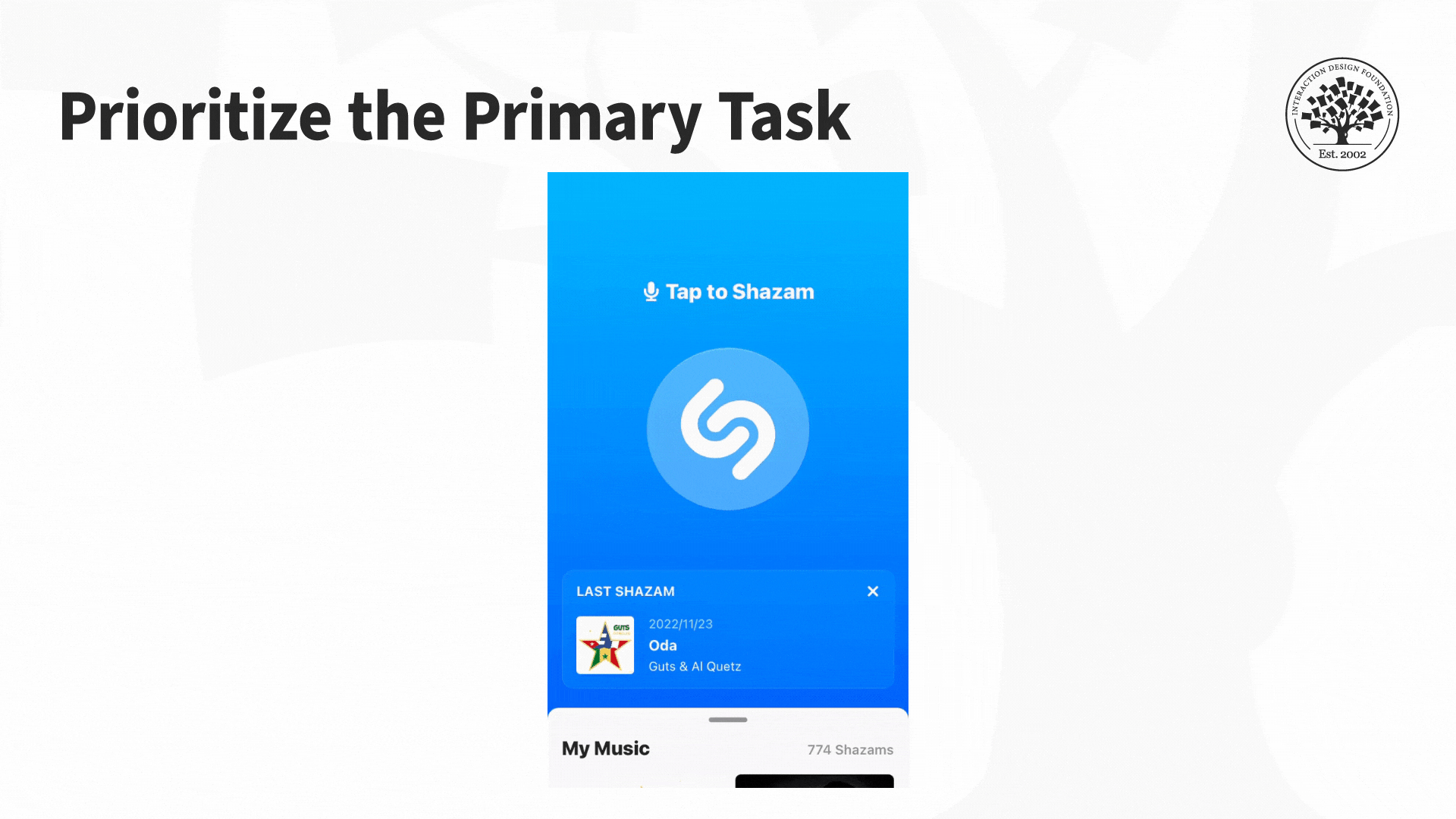
Prioritize the Primary Task
If we use a task-first approach, we can guarantee that you've got the main task upfront. Think of it as a measure of urgency for the task.
The app Shazam is an excellent example of how you prioritize the main task. Shazam identifies the music playing around you. It helps solve a problem that we can all relate to: how many times have you heard a great song on the radio, at a shop or bar but couldn't identify it? Often, you don't have much time to Shazam a song, and the app caters to this issue. The interface is pared back, with just one large button on the screen. The button is animated to show the user that it needs to be pressed, with a line of text saying, "Tap to Shazam." The app's main task is immediately apparent to anyone who uses it.
So, what’s your Shazam button in terms of task urgency and priority?
Ensure that links are visually distinct and make it clear when users have activated them.
Make it easy to “hand off” or swap between the mobile and desktop sites and keep task continuity between devices if possible.
Offer navigation links in the footer of a page (if a mobile website) as well as a “back-to-top” function. This feature helps reduce scrolling fatigue, so users don’t have to scroll all the way back to the top. Also, screen readers (for blind users) need repeat footer links, so they have a forward motion path.
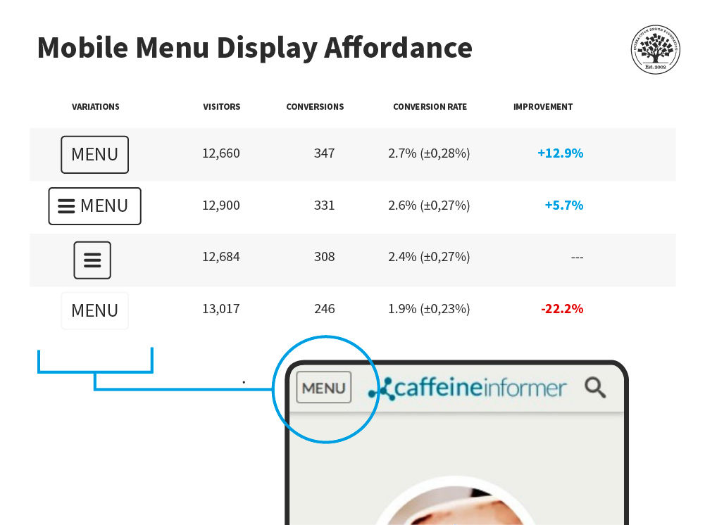
Make sure “hamburger menus” (a menu icon with three horizontal lines) are visually distinct (don’t assume users know what they are). Use appropriate ARIA attributes to identify the hamburger menu for accessibility.
Various studies have been done on the mobile Menu (hamburger) display affordance. This study by developer James Foster found a word menu with a border had a much higher conversion rate than a menu without a border—and no hamburger was involved!
This isn't to say that you should never use a hamburger menu. Mobile gaming especially finds good uses for hamburger menus, but be aware of their strengths and weaknesses.
As always, test with your users to make sure your mobile menu is accessible.
Keep Content to a Minimum
Don’t overwhelm your users—respect the small screen space. Keep content to a minimum.
Ensure content is universally supported on all devices, or avoid it.
Make page descriptions and microcopy short, verb-oriented and concise.
Reduce the Inputs Required from Users
The less the user has to fiddle with their phone, the more they’ll enjoy your mobile web or app. Consider how to:
Offer alternative input mechanisms (video, voice, etc.).
Minimize inputs in forms (you can always ask for more data when the user logs on to the desktop).
Allow permanent sign-in (most smartphones are password- or fingerprint-protected, so this poses less risk than on the desktop).
Keep scrolling to a minimum and ensure users only have to scroll in one direction.
Remember That Mobile Connections Are Not Stable
Mobile connections can be a colossal pain in areas with patchy service. Don’t make things difficult for your users. Try to:
Retain data, so you don’t lose it in a connection break.
Minimize page size for rapid loading.
Kill off ad networks and pop-ups on mobile sites which consume huge amounts of bandwidth and data.
Keep images to a minimum and reduce the size of those images.
Reduce the number of embedded images to a minimum (speeding up load times).
Continuous Integrated Experiences
As users move between mobile and desktop, they will expect similar experiences. Remember to:
Maintain continuity. If they log into your web store on mobile, they should be able to track orders and make purchases just like they would on the desktop.
Maintain consistency. Offer the option to switch between mobile and desktop at will.
Maintain brand. The look and feel of each version should be similar.
The Take Away
Mobile is different from the traditional desktop environment. While standard UX and usability considerations apply to a mobile context, the mobile environment brings new design considerations. We must respect a user’s attention and minimize interruptions. Overall, we must pay attention to the particular details of mobile experiences to deliver the best possible UX.
AI is replacing jobs everywhere, yet design jobs are booming with a projected 45% job growth.
With design skills, you can create products and services people love. More love means more impact and greater salary potential.
At IxDF, we help you from your first course to your next job, all in one place.


