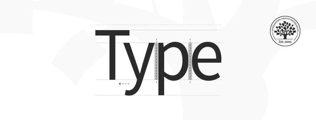
Type is the appearance or style of printed text. It also refers to the process of working with text to create a legible, readable and visually appealing experience. Designers choose appropriate typefaces and use elements of design including hierarchy, alignment, spacing and more to convey their message.
“Typography exists to honor content.”
— Robert Bringhurst, author of “Elements of Typographic Style”
Learn about the intricate details of type here.
Types of Type
As designers, we select typefaces (a grouping of fonts including bold, regular and light) to match the context and make easy-to-read and pleasing text for users. We choose fonts that accentuate and match the spirit of our messages. For example, the Chiller font helps cast an atmosphere for the users of a horror-themed movie poster. The multitude of available fonts are variations of weights within typefaces, and the vast array of styles we can select have a long heritage.
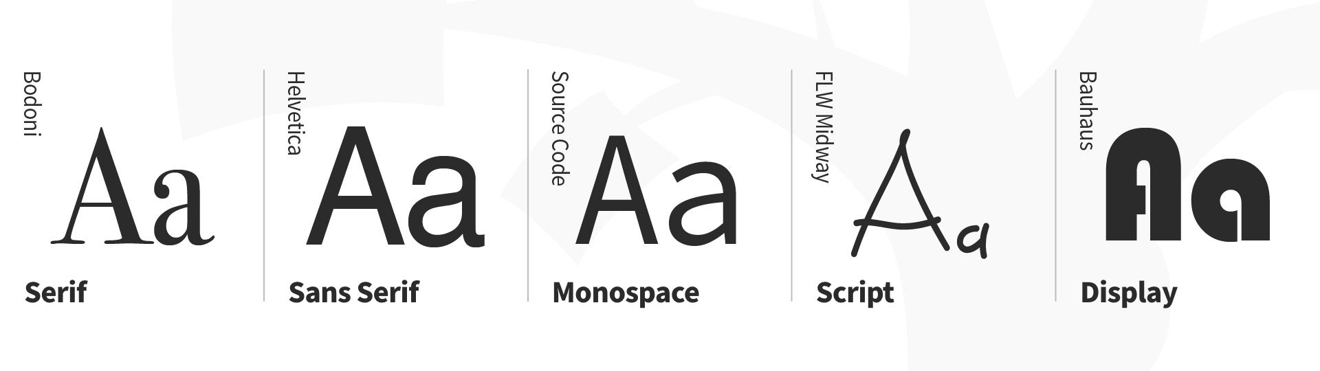
Type classifications are a basic system for classifying typefaces devised in the 19th century. Humanist letterforms are closely related to calligraphy and hand movement, while transitional and modern typefaces are less organic. These three main groups correspond roughly to the Renaissance, Baroque and Enlightenment periods in art and literature, and modern designers have progressed with new styles based on historic characteristics. There are five basic type classifications, each showing unique forms in the anatomy of type. (Some notable characteristics appear below each subsection.)
Serif
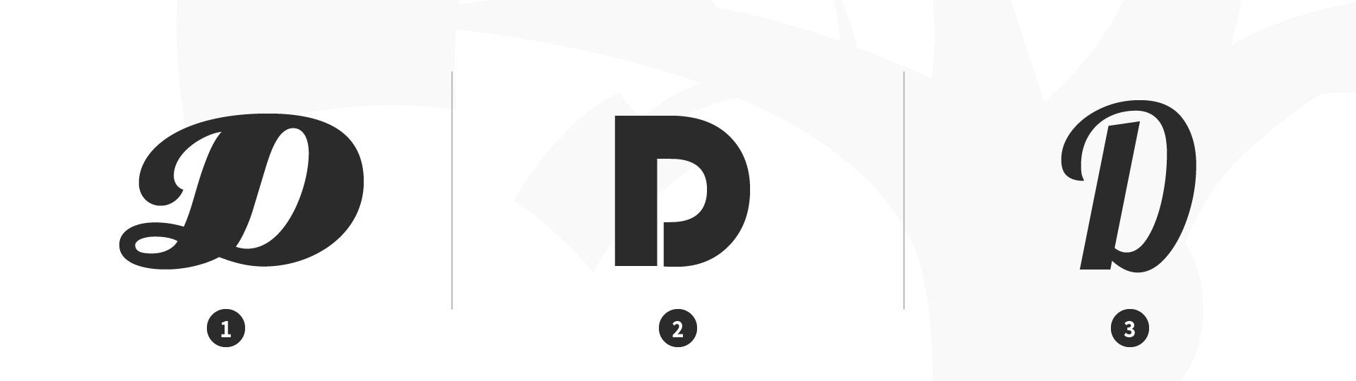
A serif is a stroke added to the beginning or end of one of the main strokes of a letter. A typeface with serifs is called a serif typeface. Serifs can be classified as Old-Style, Transitional, Modern and Slab.
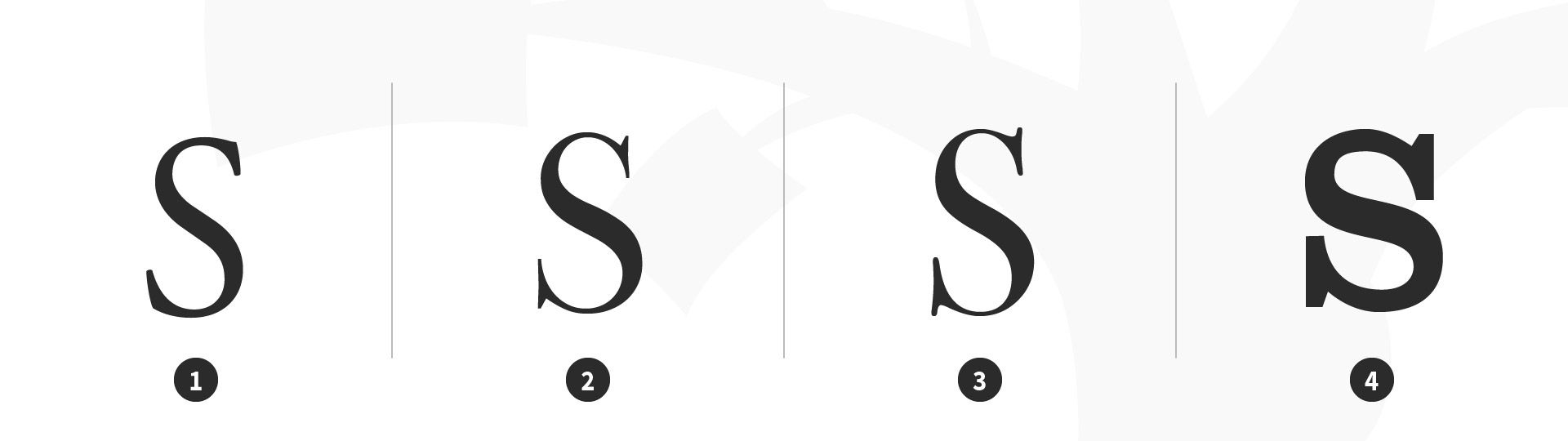
Serif type classifications. 1 Old-Style: Garamond, 2 Transitional: Baskerville, 3 Modern: Bodoni, 4 Slab: Clarendon.
© Daniel Skrok and Interaction Design Foundation, CC BY-SA 3.0
Characteristics of Serif Typefaces:
Old-Style
Have a low contrast between thick and thin strokes
Have a diagonal stress in the strokes
Have slanted serifs on lower-case ascenders
Transitional
Have a high contrast between thick and thin strokes
Have a medium-high x-height
Have vertical stress in the strokes
Have bracketed serifs
Modern (Didone, Neoclassical)
Have a high contrast between thick and thin strokes
Have a medium-high x-height
Have vertical stress in the strokes
Have bracketed serifs
Slab
Are heavy serifs with subtle differences between the stroke weight
Usually have minimal or no bracketing
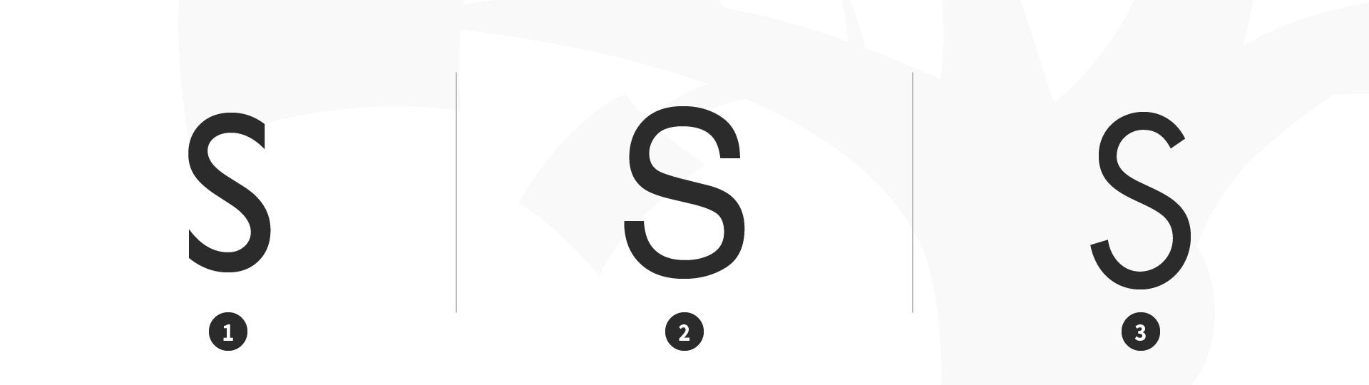
Sans Serif
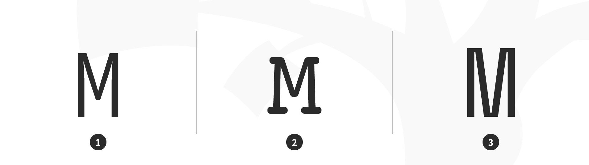
A typeface without serifs is called a sans serif typeface, from the French word “sans” that means "without." Sans serifs can be classified as Transitional, Humanist and Geometric.

Sans serif type classifications. 1 Transitional: Gill Sans, 2 Humanist: Helvetica, 3 Geometric: Futura.
© Daniel Skrok and Interaction Design Foundation, CC BY-SA 3.0
Characteristics of Sans Serif Typefaces:
Transitional
Have a low contrast between thick and thin strokes
Have vertical or no observable stress
Humanist
Have a medium contrast between thick and thin strokes
Have a slanted stress
Geometric
Have a low contrast between thick and thin strokes
Have vertical stress and circular round forms
Monospace
A typeface that displays all characters with the same width is known as Monospace.
Monospace type classification. 1 Monospace: Source Code Mono, 2 Monospace: Courier, 3 Monospace: Space Mono.
© Daniel Skrok and Interaction Design Foundation, CC BY-SA 3.0
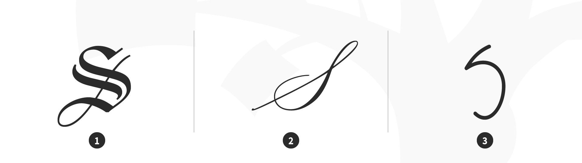
Script
Script typefaces have a natural, handwritten feel. Scripts can be classified as Black Letter, Calligraphic and Handwriting.

Script type classification. 1 Black Letter: Linotext, 2 Calligraphic: Mackinac 1895, 3 Handwriting: P22 FLW Midway.
© Daniel Skrok and Interaction Design Foundation, CC BY-SA 3.0
Characteristics of Sans Serif Typefaces:
Black Letter
Have a high contrast between thick and thin strokes
Are narrow with straight lines and angular curves
Calligraphic
Are replications of calligraphic styles of writing (formal)
Handwriting
Are replications of handwriting (casual)
Display (Decorative)
Display typefaces, also known as decorative, are a broad category of typefaces that do not fit into the preceding classifications. They are typically suited for large point sizes and primarily used for display.

Display (decorative) type classification. 1 Display: Eclat, 2 Display: Bauhaus, 3 Display: Lobster.
© Daniel Skrok and Interaction Design Foundation, CC BY-SA 3.0
Characteristics of Display Typefaces:
Decorative
Are distinctive, eye-catching and original
Type Families and Superfamilies
In the 16th century, printers began organizing roman and italic typefaces into matched type families. The concept was formalized in the early 20th century to include styles such as bold, semibold and small caps. A traditional roman book face typically has a small family, an intimate group that comprises roman, italic, small caps, and possibly bold and semibold (each with an italic variant) styles. Sans-serif families often feature many more weights and sizes (e.g., thin, light, black, compressed and condensed).
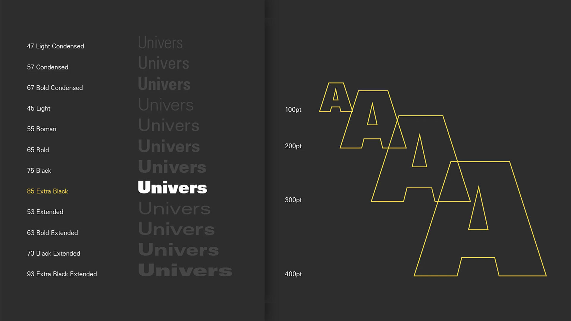
A superfamily comprises dozens of related fonts in multiple weights and/or widths, often with both sans-serif and serif versions. Small capitals and non-lining numerals (formerly only in serif fonts) appear in the sans-serif versions of Thesis, Scala Pro and other contemporary superfamilies. Some type families evolve over time. An exception is Univers, designed by Swiss typographer Adrian Frutiger, in 1957. Frutiger designed 21 versions of Univers, thereby conceiving an entire system of it.
Choose Your Type Wisely
Here are some helpful tips and best practices for designing with type (the art of arranging type). While these best practices are appropriate in most situations, it’s important that you always consider the cultural context of your user.
Keep it simple; stick to two typefaces, preferably different-enough-looking ones. Try pairing a serif typeface with a sans serif.
Ensure it’s appropriate for the application/occasion. If in doubt, choose from Baskerville, Bodoni, Caslon, Century, Futura, Garamond, Gotham, Helvetica, Minion, Optima, Source Sans and Univers.
Left align your type to create a strong vertical threshold and reduce eye fatigue for users.
Limit your word count to 10–12 words per line of text, to further minimize eye fatigue.
Align groupings of text (e.g., headlines and body copy) with design elements (e.g., images and logos).
Skip a weight; use multiple font weights within a typeface to differentiate text, so adding contrast between your headlines, body copy and call-to-actions.


