A design system is a set of standards to manage and scale design. It includes reusable components, design principles and guidelines to achieve consistency and efficiency across a company's digital products.
Design systems streamline workflow, enhance collaboration and maintain brand identity. Design teams create them for scalable and cohesive digital experiences.
Design systems provide consistent styling and interaction guidelines for teams. For example, a design system might have:
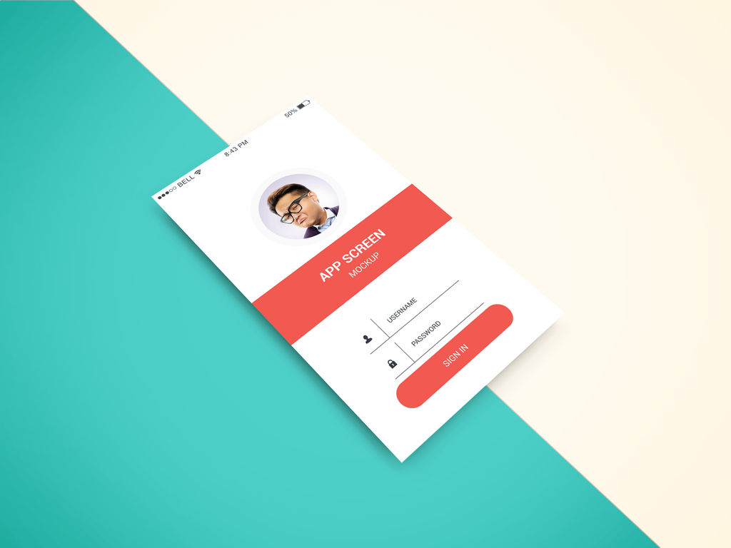
Standard elements to use in interfaces. It includes input boxes, dropdown lists, and menu structures.
A list of approved brand colors and fonts. It also guides us on when to use them.
Standard buttons and other interactive affordances.
Interaction guidelines. The system includes decisions like using a slide-out panel. It also determines if expanding or pinching should resize images.
A flexible grid system lays out screens consistently. It comprises things like the styling of cards or content separators.
Rules about the placement of particular objects. For example, always keep the login/log out and profile icons in the top-right corner of the desktop.
Lists of icons and what they mean.
Content guidelines that specify how and when to use content. For example, decide if all menu items should be verbs or nouns. Or determine if the company refers to the user in the first or second person.
Rules about when to use icons and when to use text as labels.
Visual guidelines for where certain types of call-to-action buttons should be.
Rules about using things like auto-save vs explicit save/cancel buttons.
There are many other guidelines that a design system might have. Google's Material Design is an example of a consistent design system. It consists of different types of elements and guidance on when and how to use each element.
Design systems extend beyond visually driven tools; they apply to voice-controlled systems, too. These systems focus on content and behavior. They provide different but equally valuable features. Effective design systems evolve with time. They adapt as the needs of a product or product suite change.
Ideally, elements of a design system are code pieces developers can use in interfaces. This helps build features quicker or prototype faster. In other cases, they are design elements in prototyping tools for designers to reuse.
Advantages of Design Systems
Design systems are foundational tools in digital product design. They provide a unified approach to create user interfaces. These systems bring several advantages to the design and development process.
Improved consistency: Ensures uniformity in typography, spacing, and UI elements. This consistency extends across all platforms and devices.
Enhanced efficiency: Streamlines the design process. Reusable components from the UI kit cut down design time. They also speed up front-end development.
Facilitate collaboration: Facilitates better communication between designers and developers. A shared language simplifies the design and development process.
Scalability: Makes scaling design efforts more manageable. As a project grows, the design system helps maintain design integrity.
Quality Control: Maintains high quality in design. Regular updates and maintenance keep the system relevant.
Inclusivity: Promotes inclusive design practices. A design system that includes accessibility and inclusive design guidelines will ensure everyone implements it in the final product. It creates inclusivity so that everyone can use the products.
Brand Reinforcement: Strengthens brand identity. Consistent use of design elements reinforces brand recognition.
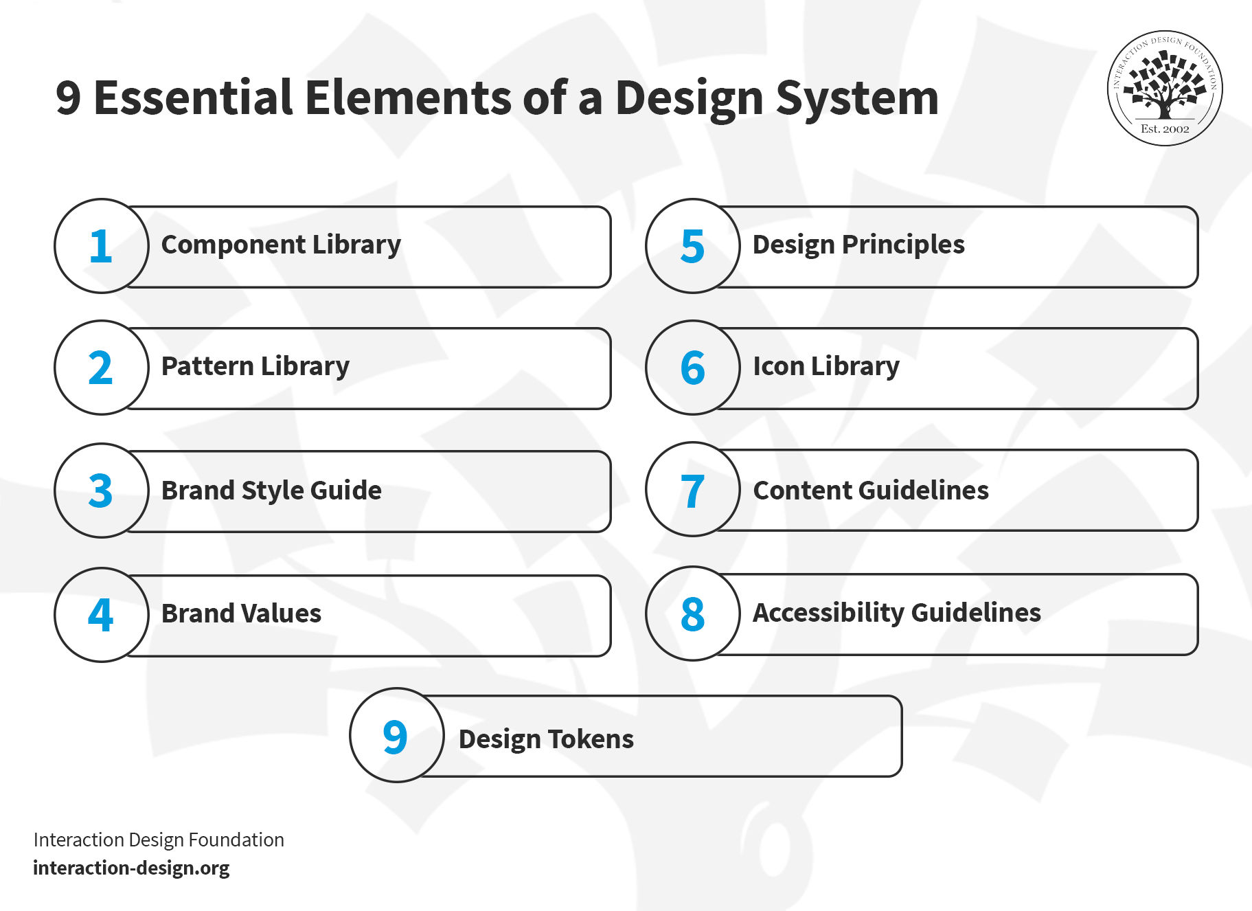
Essential Elements of a Design System
A design system guides the creation of digital products. It ensures consistency and efficiency across design and development.
A design system includes a blend of standards, tools and best practices. It shapes the way teams build and maintain their digital presence.
© Interaction Design Foundation, CC BY-SA 4.0
1.Component Library
The component library includes UI elements like buttons, menus and input fields. Designers can reuse each element whenever they need it. The purpose of the component library is to ensure a consistent user interface. Tools like Figma aid in creating these libraries. A well-designed component library:
Streamlines front-end development
Enhances user experience
Maintains design consistency across products
Explore the essentials of user experience with this video. Ideal for anyone stepping into the world of UX design.
2. Pattern Library
A pattern library comprises specific design patterns or standard solutions to common design problems. Patterns help to create intuitive and consistent user experiences. For example, a pattern library might contain a contact form or a login flow (which, in turn, may include components, such as buttons and input fields). Front-end developers use these libraries to ensure that different parts of a website or app work well together and are easy to navigate.
3. Brand Style Guide
This guide outlines the visual representation of a brand. It includes typography, color schemes and logo usage. It's essential to maintain brand identity across various mediums. The guide also covers tone and voice for written content. It serves as a reference for designers and content creators. This ensures that all materials align with the brand's identity.
4. Brand Values
Brand values include the core principles that dictate a brand's identity and culture. They influence all design decisions. Brand values align each product or service with the brand's culture. Brand values create a coherent user experience and maintain brand integrity.
5.Design Principles
Design principles act as the foundational ideas that guide the design process. They ensure that all design decisions contribute to a functional, aesthetically pleasing and user-friendly product.
Principles like accessibility and typography are crucial to create attractive, easy-to-use designs.
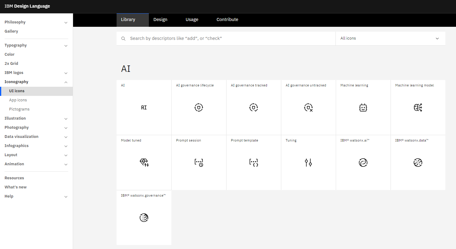
6.Icon Library
This library contains visual symbols used in design systems. Icons communicate actions and ideas efficiently. They guide users and enhance usability and interface navigation.
IBM's icon library, for example, includes detailed usage guidelines. These icons are integral to front-end design. They ensure a consistent visual language across platforms.
© IBM, Fair Use
7. Content Guidelines
Content guidelines dictate the tone, style, and language of textual content. They maintain consistency and clarity in communication. These rules cover grammar, vocabulary, and style. They help keep a uniform brand voice.
8. Accessibility Guidelines
Accessibility guidelines ensure that everyone can use the products, including people with disabilities. They cover aspects like color contrast, typography and spacing. Accessibility guidelines are a core part of front-end development. They help to create user-friendly and accessible interfaces.
9. Design Tokens
Design tokens represent specific design elements like colors, typography and dimensions. Instead of hard-coded values (such as hex codes, font styles or pixel values), the team uses design tokens.
For example, the design team might define a token named “primary-color” and give it the value of an indigo color, #4B0082. Whenever the developers need to use that color, they use “primary-color” instead of the hex value. If the design team decides to change the underlying specifications of the token—say, in this case, to a slightly different shade, with the hex code #2e5090—then the team only needs to change the value once, at the definition of the design token. Once the definition of “primary-color” changes, the design automatically gets updated.
As we see in this example, design tokens provide consistency, scalability and flexibility. These tokens maintain uniformity in a design system. They keep coherent applications across different media.
Each element contributes to a robust design system. They work together to create a unified and efficient design process.
When Not to Use a Design System? And Why?
A design system may not suit every project. Consider avoiding it in small, one-off projects. Here, a full-fledged system might slow down progress. For such projects, simple style guides or a pattern library may suffice.
A strict design system may limit creativity in unique and unconventional projects. In artistic or experimental websites, innovation takes priority over consistency. Designers often notice this difference in such scenarios. Here, the focus shifts to exploring new ideas rather than adhering to set standards.
While design systems provide structure and consistency, they also require maintenance. A small team may not have the capacity—time, budget and people—to maintain a design system. They will prefer to focus on crucial tasks, such as product development and customer engagement, without diverting resources.
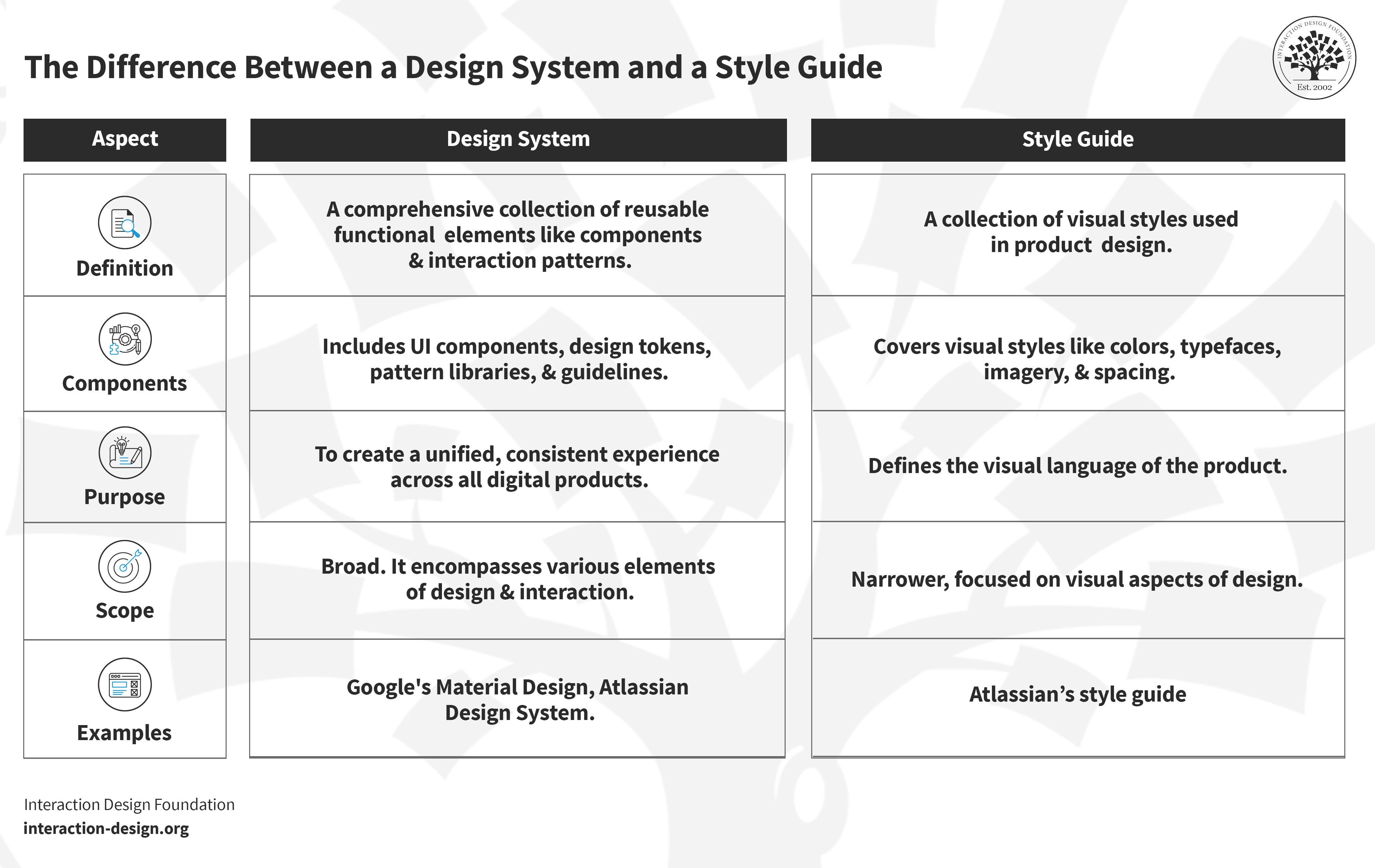
The Difference Between a Design System and a Style Guide
A design system and a style guide serve different purposes in design. A design system comprehensively covers various design aspects. It includes a style guide as one of its components. Think of it as a master plan for creating a cohesive product experience.
On the other hand, a style guide focuses more narrowly. It outlines the visual design and brand elements like typography, color and logo usage. They are more about maintaining brand consistency. A style guide is a subset of a design system.
© Interaction Design Foundation, CC BY-SA 4.0
Aspect
Design System
Style Guide
Definition
A comprehensive collection of reusable functional elements like components and interaction patterns.
A collection of visual styles used in product design.
Components
Includes UI components, design tokens, pattern libraries, and guidelines.
Covers visual styles like colors, typefaces, imagery, and spacing.
Purpose
To create a unified, consistent experience across all digital products.
Defines the visual language of the product.
Scope
Broad. It encompasses various elements of design and interaction
Narrower. Focused on visual aspects of design.
Examples
Google's Material Design, Atlassian Design System
Atlassian’s style guide


