Inclusive design is an approach to create accessible products and experiences that are usable and understandable by as many people as possible. It goes beyond accessibility to consider users’ diverse needs, backgrounds and experiences.
Why Do We Need Inclusive Design?
Inclusive design ensures that every person—regardless of their gender, location, native language and physical abilities—can enjoy and use products or services.
To understand inclusive design, we as user experience (UX) designers must understand the sections of our users who have historically been excluded from product designs:
Women
People of color
People with non-binary identities (LGBTQ+)
People who do not speak English natively
People with restricted mobility
People with different cognitive abilities.
These exclusions are sometimes obvious. In most cases, they’re subconscious. For example, you may find websites that use gender stereotypical images such as suit-clad Caucasian men in a boardroom or young female service professionals.
Conversely, inclusive experiences are those that reach beyond assumptions about demographics to embrace the full range of human diversity. They bring out the best in human-centered design to grant equal access across the board. Making your design work accessible to people from all backgrounds, ability levels, and other imaginable categories ensures a strong brand identity as well. When design focuses on inclusivity, it proves it hasn’t let the biases of a bygone era make it visually impaired.
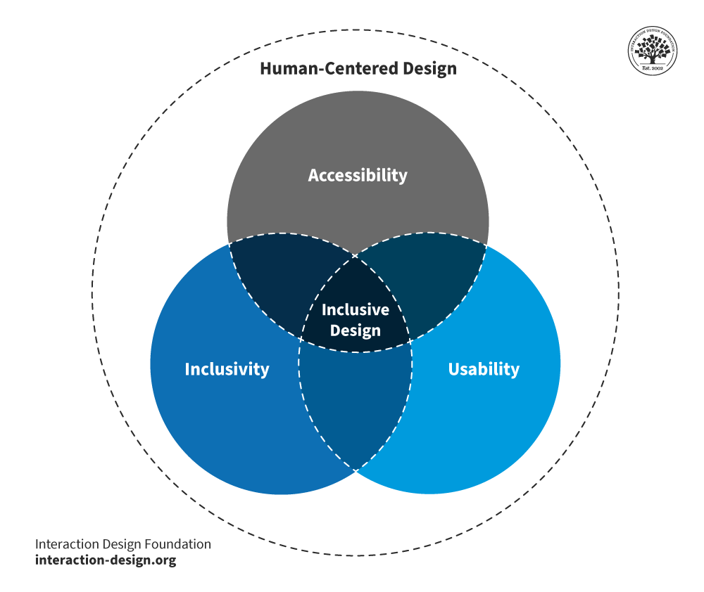
Inclusive design is the meeting place of several key design factors.
© Interaction Design Foundation, CC BY-SA 4.0
Inclusive design has its roots in the disability rights movement, which began in the 1950s. The goal of this movement was for people with disabilities to have access to the same rights, opportunities, and resources as non-disabled people. One example of a powerful design benefit that came from this is the curb cut. Curb cuts help wheelchair users, but they also act as ramps for cyclists and many others.

Sidewalk granite curb cut for wheelchair users, or anyone with tired or aching knees.
© Nick-philly, CC BY-SA 4.0
Inclusive design practices take this spirit of accessible design a step further in user interfaces. For example, it’s not just about images that have high contrast and alt text for screen readers. It’s also about how you design these images. For example, you practice inclusive design through clear and unambiguous messages that depict a diverse group of people. You also do it through thoughtful use of pronouns in the caption. You make your target users feel welcome because you include them from your designer’s research right through to user testing. In the process, you learn to recognize exclusion in web design and far beyond.
© Interaction Design Foundation, CC BY-SA 4.0
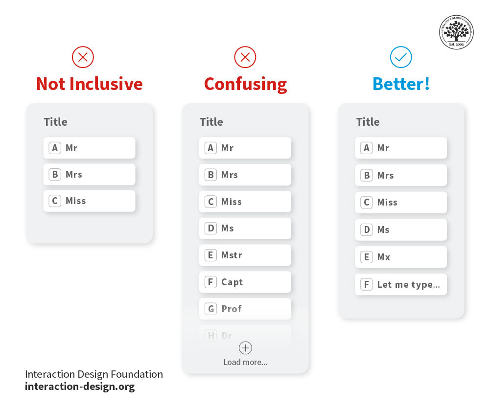
To practice inclusive design, don’t design for an "ideal user" or make assumptions about user behavior or their needs for functionality. Instead, ask critical questions during the early stages of your design process. In your UX research, you can uncover potential barriers that may affect your users. You should consider the accessibility of content for individuals who may have disabilities, limited vision, or use assistive technologies. Many aspects of disability are in the realm of neurodiversity. For instance, think about how users on the autism spectrum might not recognize features in your design because of how you set out the elements.
It’s also important to challenge assumptions about users and understand how their experiences may differ. For example, is design practice geared solely toward users in the United States? In the early phases of design and development, it’s vital to get to grips with questions like this.
Such questions could involve age, gender identity, ethnicity, language, culture, location, religion, and socio-economic status. For example, “What is the impact of language on users’ understanding and use of the product?” When you have the answer, you as a UX designer can create products that you tailor to the needs of a diverse range of users. Consequently, all users will benefit because you will have designed to address a vast range of pain points. When you build inclusive products, you infuse them with a sense of belonging to a huge span of user groups .

Something as “small” as images can be a huge step towards inclusive design. Shopify’s homepage has a rotating cast of diverse users. Its prominent headline “Making Commerce Better for Everyone” and the subtitle, “...supporting the next generation of entrepreneurs, the world’s biggest bands, and everyone in between.” reinforce this ideology.
© Shopify, Fair Use
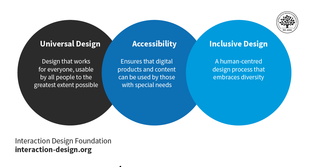
Inclusive Design vs Universal Design vs Design For All vs Accessibility: Related but Distinct Concepts
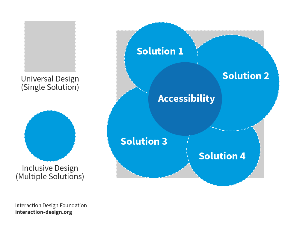
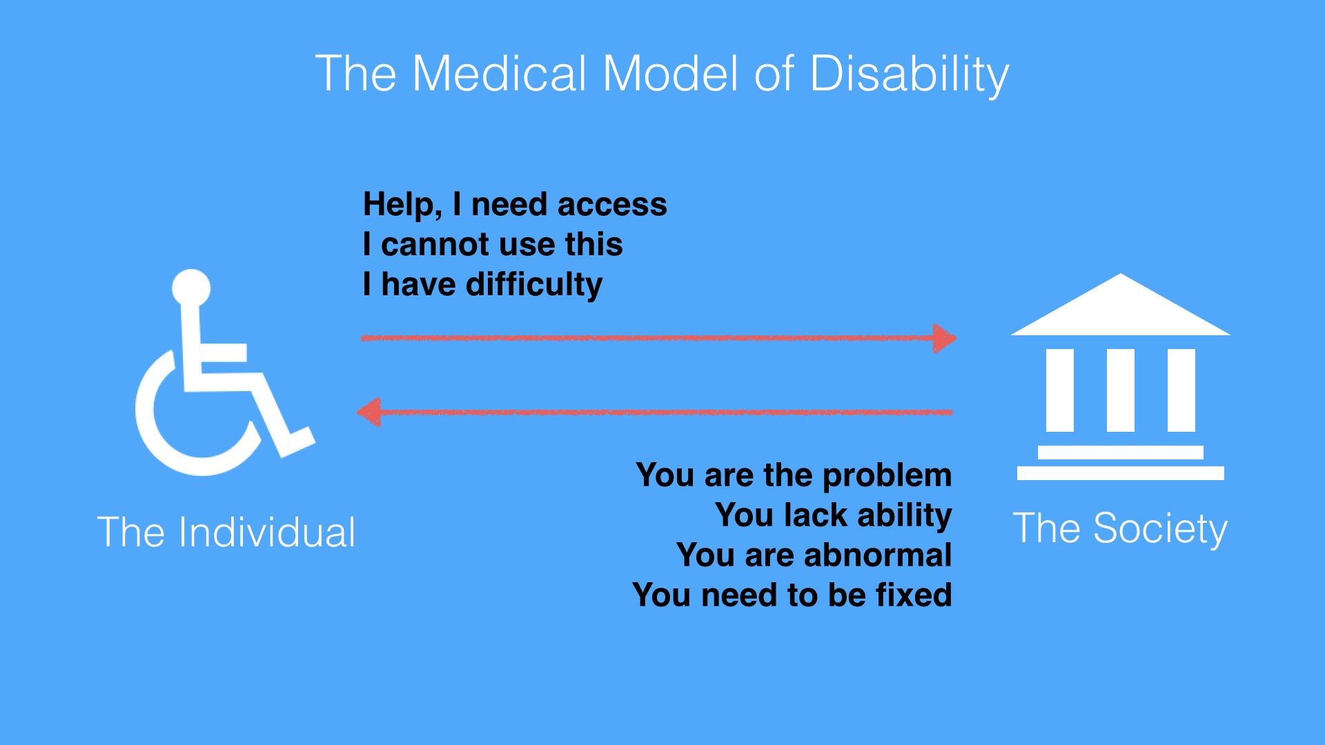
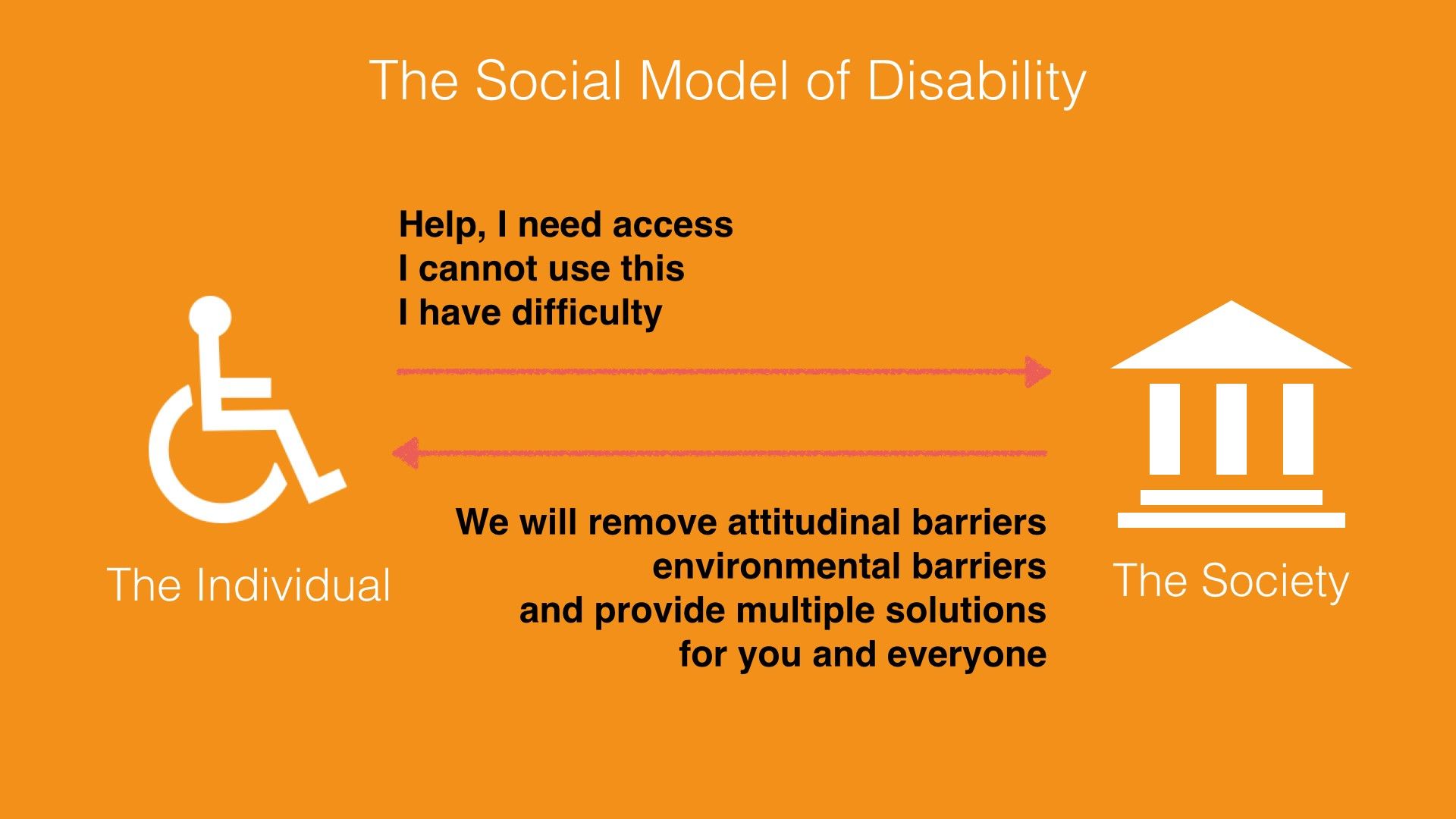
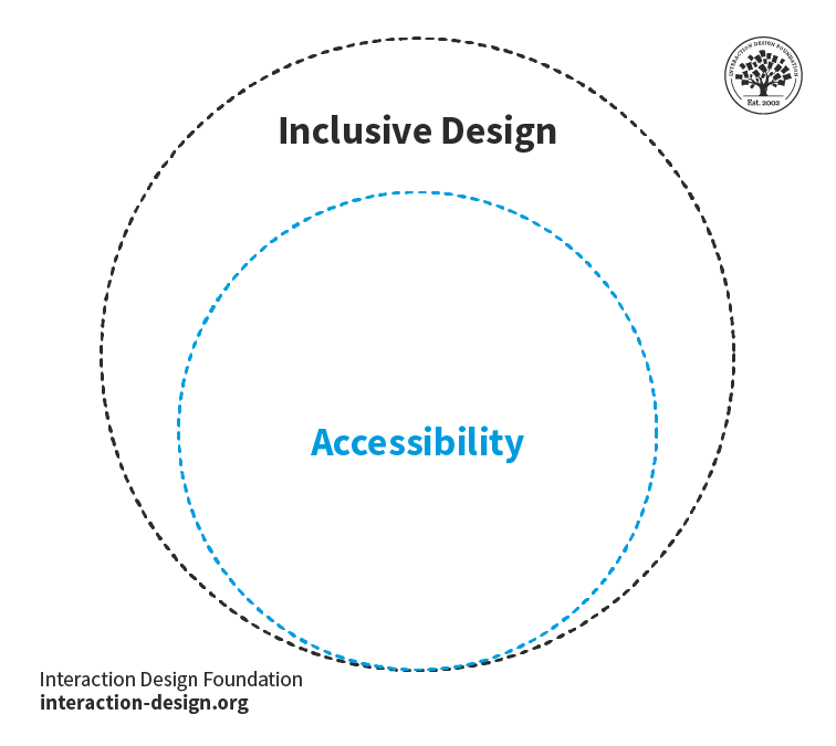
Accessibility is the lowest common denominator and is an integral part of inclusive and universal design. While inclusive design and universal design both cater to the widest range of users, universal design strives for a single solution to cater to everyone, while inclusive design tries to achieve the goal through multiple adaptations.
© Interaction Design Foundation, CC BY-SA 4.0
Inclusive design is related to three other concepts in the spirit of removing barriers: Accessibility, Universal Design and Design for All. Accessibility is narrower in scope and involves designing products so that people with disabilities can use and enjoy the products just as well as people without disabilities. Accessibility is the bare minimum with respect to Inclusive Design and Universal Design.
Both inclusive design and universal design aim to ensure that a design is usable and understandable for the maximum number of people. The difference lies in how designers implement the design. Universal design opts for a one-size-fits-all answer to design. All users use the same product, without any specialization. For example, in a digital design, subtitles cover accessibility in the sense that hard-of-hearing viewers have them. Also, they satisfy this universal design principle of equitable use. Viewers who aren’t hard-of-hearing but who aren’t native speakers of the language either can understand the content better with the closed captioning. The feature also benefits people who are in loud environments.
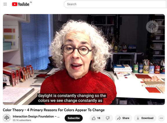
YouTube offers subtitling options for users who are hard of hearing but also for any user who needs them at the time (e.g., in a loud environment or for non-native speakers).
© YouTube, Fair Use
Inclusive design doesn’t require designers to stick to a single design. Designers can implement multiple variations of the design to cater to different user segments.
Design for all is most closely related to inclusive design. It focuses on including accessible features in digital interfaces from early on in design—as opposed to retrofitting a “mainstream” design with options for users with disabilities later. However, its scope is not quite as explicit regarding how it involves users in the design process who have been traditionally underrepresented.
In general, universal design is used for physical products, where customization or multiple variations become expensive to develop. Inclusive design works well with digital products as they are relatively inexpensive to mass-customize. Dark mode options, text-size selectors, options to select age, and ways of identifying the user’s full name (i.e., some cultures term and place “first” and “last name” in different ways) are some examples of inclusive design.
Always research current best practices to make the most inclusive and optimal decision for your products.
© Interaction Design Foundation, CC BY-SA 4.0
The Principles of Inclusive Design
Microsoft defines 3 main guiding principles of inclusive design:
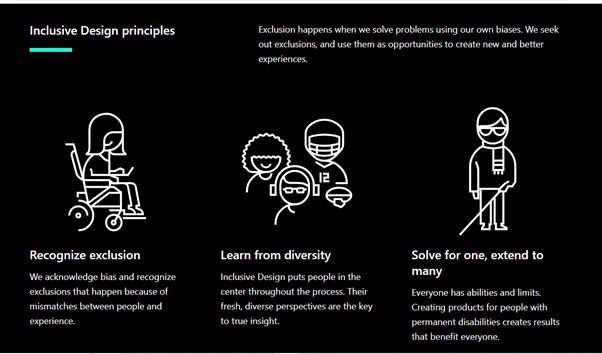
Microsoft’s three fundamental principles of Inclusive Design: Recognize exclusion; Learn from diversity; Solve for one, extend to many.
© Microsoft, Fair Use
Recognize Exclusion: We may not realize it, but all of us have biases—it is human nature. If we design solutions for user problems without recognizing these biases, we will end up excluding certain groups of people. Note that this is not limited to physical disabilities. It can apply to other forms of exclusion, such as social participation or temporary impairments. For example, if your app won’t work well on older phones (e.g., for users who can only afford those), it will exclude them. It is only after we recognize and acknowledge exclusion, that we can begin to design inclusive experiences. User research can provide powerful insights for you to design more inclusively. User testing can also reveal points of exclusion.

Nonprofit Girls Who Code’s mission steps from historical exclusion. Despite the name, their target audience includes non-binary people.
© Girls Who Code, Fair Use
Learn from Diversity: Inclusive Design puts people in the center throughout the process. Involving people from different communities throughout the design process will help you gain fresh, diverse perspectives. So, include people from different age groups, cultures, ability levels, socioeconomic backgrounds, education levels and more in your design team.
Solve for One, Extend to Many: When you design a feature with one group in mind, you can expand the scope to help others who can benefit. For example, if you offer users an option to listen to content rather than read it, you’ll help users who have limited sight as well as those who may just want to rest their eyes.
Medium offers the feature to listen to a story on its platform that is helpful for people who might find it hard to read long passages either due to vision difficulties or simply to rest their eyes after a long day staring at the screen!
© Medium, Fair Use
Additional Inclusive Design Principles
In 2017, accessibility experts Henny Swan, Ian Pouncey, Heydon Pickering, Léonie Watson developed a set of seven principles for inclusive design:
Provide a Comparable Experience: Build your UI so everyone can perform tasks and achieve goals in a way that suits them without compromising on your content. Different users will have different ways of using your interface, and tools to do so. For instance, you help users of all types with content for alternative means such as screen readers and transcripts. Or you might give users options to change the font size, color, etc. of their subtitles to suit them.
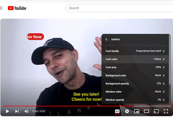
YouTube offers the feature to adapt how your subtitles appear, including the color.
© YouTube, Fair Use
Consider situation: Consider the situation, or rather the context of your user and design accordingly. For example, Google Maps automatically switches to dark mode when you enter a tunnel or at sundown.
Be Consistent: Use well-established patterns to make an interface that users will find familiar. So, use design patterns to achieve that consistency in information architecture and more, and maximize users’ understanding. Another example of consistency is to write the same things in the same way (e.g., micro copy, instructions) and in plain language to make text easy to understand.
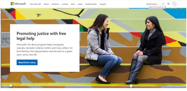
Microsoft’s homepage shows a highly familiar layout. The logo is in the top left and the search is the magnifying functionality in the top right.
© Microsoft, Fair Use
Give Users Control: Provide several ways for users to appreciate content and complete tasks. For example, if you have a long list of content for users, consider letting them choose to have a grid or a list. Another form of control might be to let users delete items by swiping left and also have the option to select them from another screen so they can delete more at once.
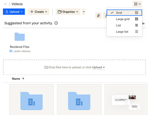
Dropbox offers a variety of views.
© Dropbox, Fair Use
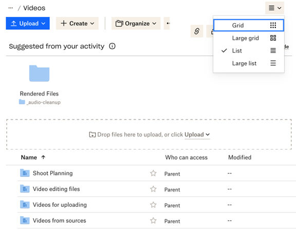
Dropbox offers a variety of views.
© Dropbox, Fair Use
Offer Choice: Give your users several ways to achieve the same goal. For example, three ways to delete an email on an email client: Swipe, hit the delete key on the keyboard, or right-click and select delete.
Prioritize Content: Help users focus on one thing at a time. For example, for each page of a website, present users with the core task, feature or information they need and expect to find. So, be clear what the purpose of each page is and highlight that to them. Use progressive disclosure to reveal the prioritized content to them. If it’s a button, for example, what is the most frequent action users will take on a virus-scanning app? It will be “Scan Device” rather than secondary actions such as “See Scan History.”

Avast prioritizes the function of running a smart scan here.
© Avast, Fair Use
Add Value: Focus on adding value to your interface with features that are not only efficient but also versatile in how they let users interact with content in diverse ways. You can do this in several ways—for example, integrating with connected devices, such as voice commands to control a TV. Or you might add some bonus functionality, such as a “show password” feature.
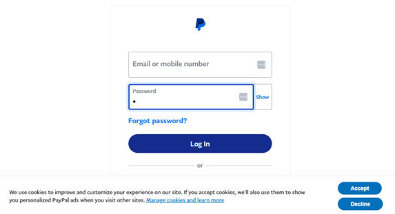
PayPal offers a “Show” feature for users to see their password as they enter it.
© PayPal, Fair Use
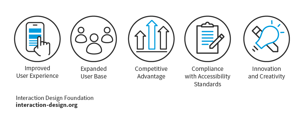
The Benefits of Inclusive Design
Inclusive design offers numerous benefits, both for users and businesses. Here are some key advantages:
© Interaction Design Foundation, CC BY-SA 4.0
Improved User Experience
Inclusive design enhances the overall user experience. It ensures that everyone—irrespective of physical or cognitive abilities, age, culture, educational background, gender, and language can access and navigate digital products effectively. This results in a more inclusive and satisfying experience for all users.
Expanded User Base
Inclusive design enables products to reach a broader audience. As they accommodate diverse needs and preferences, inclusive designs attract users who may have been excluded in the past. This expands the potential user base and increases the market reach of the product.
Competitive Advantage
Inclusive design has become a standard practice for many businesses. By embracing inclusive design principles, brands can differentiate themselves from competitors and position themselves as leaders in accessibility and inclusivity. This can enhance brand reputation and attract loyal customers.
Compliance with Accessibility Standards
Inclusive design ensures compliance with accessibility standards and legal requirements. Many countries have laws mandating digital accessibility, and failure to comply can result in legal consequences. By prioritizing inclusive design, businesses can avoid legal issues and demonstrate their commitment to accessibility.
Innovation and Creativity
Inclusive design promotes innovation and creativity by encouraging designers to think outside the box. From there, they can develop solutions that cater to diverse user needs. When you consider a wide range of perspectives, you can uncover new ideas and create unique user experiences in products or services that take the extra step beyond user-centered design and universal design.
Inclusive Design in Practice: Examples and Case Studies
Many well-known brands have embraced inclusive design principles and have created products that cater to a diverse range of users. Here are some examples:
Google has prioritized inclusive design in its products. The Google Camera features the technology to capture accurate and fine-tuned tones of people’s skin color. Previously, cameras had overlooked this tendency for the imaging of people with darker skin colors to come out inaccurately, Google embraced inclusive testing to accommodate everyone.

Google’s camera fine-tunes how it captures some skin tones to ensure accuracy.
© Google, Fair use
Microsoft
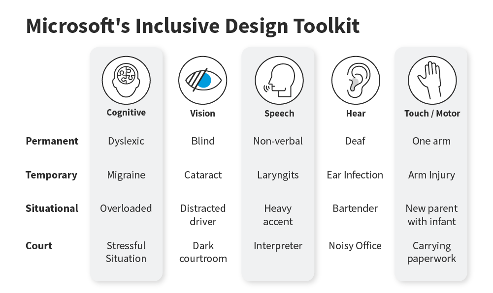
Microsoft has made significant efforts to promote inclusive design. Their inclusive design toolkit provides resources and guidelines for designers to create products that are accessible to a wide range of users. Microsoft's Xbox Adaptive Controller is a notable example of inclusive design. It was specifically designed to meet the needs of gamers with limited mobility.
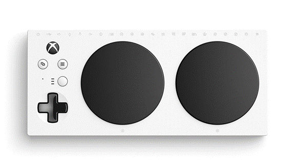
The Microsoft Xbox Adaptive Controller offers exceptional control.
© Microsoft, Fair Use
These examples demonstrate how inclusive design can be integrated into various digital products to improve accessibility and enhance user experiences.
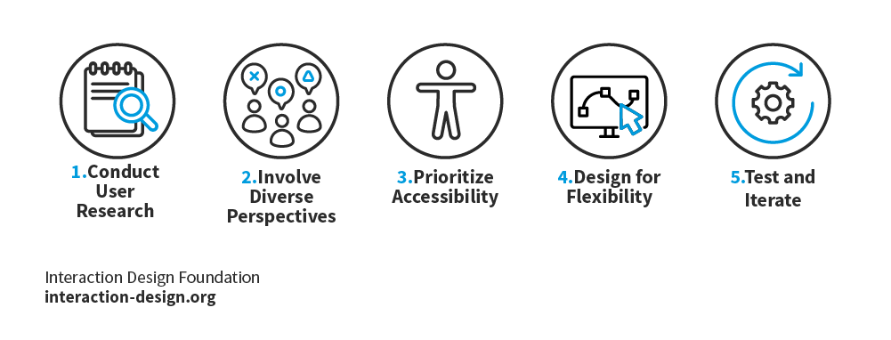
Best Practices for Inclusive Design
© Interaction Design Foundation, CC BY-SA 4.0
1. Conduct User Research
User research is a crucial step to understand the diverse needs and experiences of your target audience. Conduct interviews, surveys, and usability tests with individuals from different backgrounds and abilities to gain insights into their specific requirements.
2. Involve Diverse Perspectives
Build a diverse design team that includes individuals from different backgrounds, abilities, and experiences. This diversity will help uncover different viewpoints and ensure that design decisions are not biased or based on assumptions. Also ensure that stakeholders appreciate these differences and how different people use interfaces and technology.
3. Prioritize Accessibility
Consider accessibility throughout the design process. Start by following WCAG guidelines to ensure that your digital products are accessible to individuals with disabilities. Test your designs using both automated tools and manual testing involving individuals with disabilities.
4. Design for Flexibility
Create flexible and customizable interfaces that allow users to adapt the product to their specific needs. Provide options for adjusting font sizes, color contrast, and other visual elements. Consider offering alternative input methods for users with limited mobility.
5. Test and Iterate
Regularly test your designs with users, including those with diverse abilities and backgrounds. Use their feedback to improve the accessibility and inclusivity of your product. Iterate and refine your designs based on user insights and evolving accessibility standards.
When you follow these best practices, you can foster inclusivity and create digital products that all users find accessible and enjoyable. Remember, too, to watch out for elements of exclusion that may remain. For example, if your design includes pictures or illustrations, do they reflect a truly diverse scenario that you would be proud to represent your product?
Overall, inclusive design is a goal well worth aiming for. To achieve it, you need to understand user experience research, accessibility, user flow, and interactive design principles. When you recognize how different factors like information organization, visual design, and product qualities affect the user experience, you can consistently create inclusive designs.
© Interaction Design Foundation, CC BY-SA 4.0