Your constantly-updated definition of Design Guidelines and collection of videos and articles. Be a conversation starter: Share this page and inspire others!
986 Shares
What are Design Guidelines?
Design guidelines are sets of recommendations on how to apply design principles to provide a positive user experience. Designers use such guidelines to judge how to adopt principles such as intuitiveness, learnability, efficiency and consistency so they can create compelling designs and meet and exceed user needs.
Transcript
Transcript loading ...
Find out how design guidelines help us craft successful designs, and how to adapt them to suit the content in creative ways.
Design Guidelines – An Essential Bridge between Principle and Judgment
Over many years, cognitive psychologists provided the foundations of many design guidelines through findings from their studies. Still other design guidelines exist thanks simply to common sense. For example, users can tell when a webpage looks too busy the moment they see it. So, designers should also be able to tell, and understand why. Design guidelines fall into several groups, including these:
Design guidelines are rules of thumb for you to create work which never frustrates users. Likewise, you should also cater to users who have a wide range of disabilities. How you apply design guidelines also depends on the contexts of use, your design’s platform and the type of interaction users will have with it (e.g., voice-controlled).
Industry pioneers such as Don Norman and Jakob Nielsen identified areas which designers and developers should consider to design products that offer the best user experience. Here’s an example of how a designer might realize one of Jakob Nielsen’s ten design principles.
Design principle: Provide plain-language error messages to pinpoint problems and likely solutions.
Design Guideline: Write large-lettered, jargon-free text in web-safe font. Use short sentences and draw users’ attention to causes and remedies.
Design rule: Use 20-pt, black Georgia on lavender background (#e6e6fa Hex). Put instructions in bold.
Note the differences. The principles represent general points of direction. The guidelines reveal how to approach these. The rules are direct instructions. So, the designer approaches the design principles and then uses design guidelines to determine the design rules. Designers often apply design guidelines subjectively when they design products. One designer might interpret a guideline differently from another.
At the Interaction Design Foundation, we follow the design principle that we use recognition rather than recall. So, we have a design guideline to always show you where you are inside a course -so you don’t have to remember.
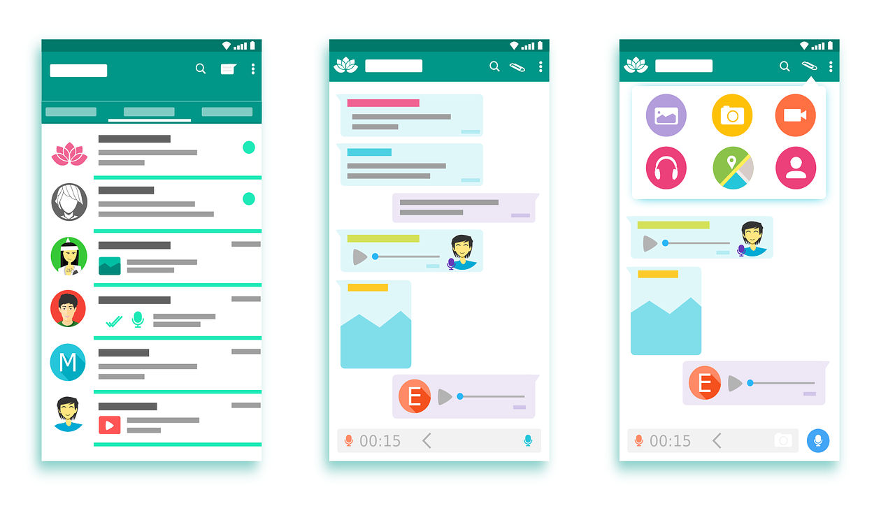
It’s vital to give users what’s most fit for purpose. Brands have various guidelines for designers to tailor dashboards to minimize cognitive load and maximize readability. Microsoft, Apple and Google are examples of companies that have exemplary standards (e.g., Google’s Material Design) for use in customization. Designers also have to accommodate users’ cultural considerations (e.g., color use and text direction). Moreover, when you design for mobile devices, you have to balance between brand consistency and maximal use of limited screen space. That’s why designers often use pictures or icons to represent information on mobile designs.
Author/Copyright holder: 200 Degrees. Copyright terms and licence: CCO.
Google’s Material Design is a good example of company specific design guidelines that relates both to branding and user experience.
In all cases, it’s best to apply design guidelines with care, where you balance user data and insights with brand directives to create designs that users find intuitive and pleasurable.
“Learn the rules like a pro, so you can break them like an artist.”
― Pablo Picasso
Questions About Design Guidelines? We've Got Answers!
What is the rule of layout?
The rule of layout is a set of principles that guide the arrangement of visual elements in a design. These principles help designers create works that are visually appealing and easy to understand. There are several rules of layout, but some of the most common ones include:
The grid: Grids give order to graphic design. They speed up the design process by helping designers decide where content should be placed rather than where it could be placed.
Emphasis and scale: The eye generally needs a place to rest or something of interest to hold it. Otherwise, people will look at your design and quickly move on. You want to use scale and emphasis to communicate to the viewer.
Balance: Balance refers to the distribution of visual weight in a design. A well-balanced design feels stable and harmonious.
Rule of thirds: The rule of thirds divides an image into thirds both horizontally and vertically and then places the most critical elements of the image along those lines or at their intersections.
Rule of odds: The rule of odds suggests that an odd number of elements in a design is more visually appealing than an even number of elements.
These rules are not hard and fast, but they can be helpful starting points for designers looking to create effective layouts.
What is the difference between design principles and guidelines?
Design principles provide general direction, while guidelines offer specific recommendations for implementing those principles. For instance, a principle may focus on legibility and readability. However, a guideline would specify using large, jargon-free text with short sentences and drawing attention to causes and solutions for effective communication. Combining these elements ensures that design decisions align with overall principles while offering actionable steps for implementation, fostering a cohesive and practical design approach. Principles serve as the guiding philosophy, outlining broad objectives, while guidelines provide a practical roadmap for achieving those objectives. The relationship between these elements is pivotal for every designer to understand and implement them.
Transcript
Transcript loading ...
Refer to this video to understand more about design principles.
Where to learn more about good design?
In online education, there are many ways to educate yourself about design. You can explore courses like IxDFs' visual design course to learn more about good design. Witness the designs in action and delve into code-level examples. Additionally, broaden your knowledge by reading firsthand accounts from seasoned designers. This will help gain insights into how they apply and leverage good design principles in their projects. Engage with design communities and forums, where discussions and shared experiences contribute to a rich learning environment. Staying updated on industry trends through design blogs and podcasts and attending design conferences further fuels your understanding of good design. This will foster a continuous learning journey in the dynamic and evolving field of UX design.
Where to learn more about design guidelines?
You can enhance your understanding of design guidelines with courses from the Interaction Design Foundation. Explore design guidelines from industry experts like Don Norman and more on multiple topics. Discover various brand guidelines to deepen your knowledge and apply these principles effectively in your designs. Continuous interaction with online design communities, participating in design challenges, and seeking mentorship from experienced designers further enrich your understanding of design guidelines. This will also provide practical insights and networking opportunities. A culmination of the above will contribute to your growth as a skilled and informed designer. One of the popular courses offered by IxDF is UI Design Patterns for Successful Software. Besides these courses, you can also check Amazon's guidelines on UX design and a big repository of user interface platform guidelines.
What are the 7 rules of UX design?
1. Visibility: The design should make it easy to see possible actions and how to perform them.
2. Feedback: The design should provide feedback to the user about what actions have been performed, what results have been accomplished, and what state the system is in.
3. Constraints: The design should use constraints to prevent users from taking actions that are not allowed or that would lead to errors.
4. Mapping: The design should use natural mappings between the controls and their actions, the system state, and the user's expectations.
5. Consistency: The design should be consistent with user expectations and other products in the same category.
6. Affordance: The design should clarify possible actions and how to perform them.
7. Simplicity: The design should be simple and easy to understand, with unnecessary complexity removed.
(From Don Norman's Design of Everyday Things)
Transcript
Transcript loading ...
Watch this video to learn more about UX design.
What is the format of a design statement?
A design statement is a comprehensive guide for crafting consistent, user-focused, visually appealing designs. It typically outlines design principles, associated guidelines, and rules for implementation. This structure of design rationale provides a framework for designers to curate products that align with user needs and aesthetic considerations. In UX, you need to understand the UX problem statement before working on the design statement. Incorporating case studies and user feedback into design statements enhances their effectiveness. The design statement also provides a robust framework for designers to articulate the intent and impact of their designs. Incorporating the design statement will include mapping out the users' pain points, highlighting the design's core issues, and suggesting probable solutions. This gives designers a basis to work and formulate their UX design.
How do you document design guidelines?
Design guidelines are documented by outlining principles, providing specific guidelines for their application, and detailing rules for implementation. This comprehensive documentation ensures that designers share a common understanding. This process also promotes consistency in design decisions, fostering team communication and collaboration. In addition to documentation, collaborative tools and real-world examples can also be used. This further enriches the understanding of design guidelines, providing practical insights for designers. These insights can then be effectively applied to their projects to deliver excellent, coherent, human-centric designs. Every budding designer is encouraged to adapt to the process of documenting design guidelines. This ensures a structure in their design process and will help highlight anomalies.
What are the key usability principles?
1. Simplicity: The design should be simple and intuitive.
2. Efficiency: After learning the design, users should be able to perform tasks quickly.
3. Satisfaction: The design should be pleasant, satisfying to use and meet users' expectations
4. Learnability: It should be easy for new users to navigate and use the interface.
5. Memorability: The design should be easy to remember, helping users to perform tasks with ease when they return.
6. Error Prevention: The design should prevent errors, and when they occur, provide clear ways to correct them.
7. Flexibility: The design needs to accommodate different user skills and preferences.
8. Visibility: The design should ensure all relevant options and functionality are easily accessible.
Transcript
Transcript loading ...
To understand the three crucial issues of usability, review this video.
What are examples of design criteria?
The key criteria or principles in interaction design include:
1. Goal-driven Design: Designing interfaces that help users achieve their goals efficiently and effectively.
2. Usability: The interface should be easy to use, understand, and learn.
3. Affordances & Signifiers: Affordances are the potential actions the user can take, and signifiers indicate where those actions should occur.
4. Learnability: Users should be able to quickly and intuitively learn how to use the interface.
5. Feedback & Response Time: The design should provide feedback so users know if an action was successful, and response time should be quick.
6. Consistency: Components and operations should be consistent to help users understand and learn the interface.
7. Errors: The design should anticipate potential errors, prevent them, and provide helpful guidance when mistakes occur.
8. Accessibility: The design should be usable by people of all abilities in different contexts.
Remember, good interaction design isn't just about creating a usable interface; it's about creating a user experience that is pleasant, efficient, and satisfying.
Earn a Gift! Answer a Short Quiz at the End of This Page
Earn a Gift, Answer a Short Quiz!
1
2
3
4
1
2
3
4
Question 1
Question 2
Question 3
Get Your Gift
2
3
4
2
3
4
Question 1
Question 2
Question 3
Get Your Gift
3
4
3
4
Question 1
Question 2
Question 3
Get Your Gift
4
4
Question 1
Question 2
Question 3
Get Your Gift
Try Again! IxDF Cheers for You!
0 out of 3 questions answered correctly
Remember, the more you learn about design, the more you make yourself valuable.
Improve your UX / UI Design skills and grow your career!
Join IxDF now!
Congratulations! You Did Amazing
3 out of 3 questions answered correctly
You earned your gift with a perfect score! Let us send it to you.
1
Check Your Inbox
We've emailed your gift to name@email.com.
Improve your UX / UI Design skills and grow your career! Join IxDF now!
Learn More About Design Guidelines
Make learning as easy as watching Netflix: Learn more about Design Guidelines by taking the
online IxDF Course User Experience: The Beginner's Guide.
Why? Because design skills make you valuable. In any job. Any industry.
In This Course, You'll
Get excited when you experience how easy it is to transition into tech and land your dream job with User Experience (UX) design skills. No design background? No problem. You already have transferable skills, so it's easy to fast-track your career!
Learn to combine logical thinking with creativity. Do you enjoy creativity and structure? Do you communicate ideas clearly? UX designers turn ideas into services, experiences, and products. This course helps you structure your existing skills and apply them in an innovative, creative context. You'll use hands-on methods that empower you to continuously test and optimize your products and services from idea to delivery.
Make yourself invaluable when you use the very fabric of being human, such as empathy and intuition, to make users and customers smile. More smiles, more impact, greater salary potential. You'll find out what your users need and want, and you'll build products, experiences, and services that help them succeed. You can benefit from UX design in any job, any industry. As AI becomes part of everyday work, timeless human-centered UX design skills help you decide what problems are worth solving and how solutions should actually work for people. This approach turns AI from a tool into your new superpower, keeping your work useful, relevant, and centered around peoples’ needs, even as technologies change.
Gain confidence and credibility when you master a range of powerful, real-world UX design skills such as user research, user interviews, personas, customer journey maps, sketching, task analysis, low-fidelity paper prototyping, and usability testing. It's easy with downloadable templates.
Craft your personal portfolio with step-by-step guidance. It's completely optional. Your portfolio is your gateway to transition into a career in tech or design. You'll be able to apply your new skills immediately in your current job. If you're new to UX design, this course is the best place to start. Your path to tech starts here. UX design is your way in.
It's Easy to Fast-Track Your Career with the World's Best Experts
Master complex skills effortlessly with proven best practices and toolkits directly from the world's top design experts. Meet your experts for this course:
Don Norman: Father of User Experience (UX) design, author of the legendary book “The Design of Everyday Things,” and co-founder of the Nielsen Norman Group.
Rikke Friis Dam and Mads Soegaard: Co-Founders and Co-CEOs of IxDF.
Mike Rohde: Experience and Interface Designer, author of the bestselling “The Sketchnote Handbook.”
Stephen Gay: User Experience leader with 20+ years of experience in digital innovation and coaching teams across five continents.
Alan Dix: Author of the bestselling book “Human-Computer Interaction” and Director of the Computational Foundry at Swansea University.
Ann Blandford: Professor of Human-Computer Interaction at University College London.
Cory Lebson: Principal User Experience Researcher with 20+ years of experience and author of “The UX Careers Handbook.”
Get an Industry-Recognized IxDF Course Certificate
Increase your credibility, salary potential and job opportunities by showing credible evidence of your skills.
IxDF Course Certificates set the industry gold standard. Add them to your LinkedIn profile, resumé, and job applications.
Be in distinguished company, alongside industry leaders who train their teams with the IxDF and trust IxDF Course Certificates.
In mobile user experience (UX) design, it’s important that we respect a user’s task and mindset, as well as the device’s limitations. Here you’ll learn about the general principles that can help you get started with your design.Josh Clark, the author of Tapworthy: Designing Great iPhone Apps, descri
Best Practices for Mobile App Usability from Google
In today's world, mobile apps are an essential aspect of our daily routines, so the demand for user-friendly and intuitive mobile applications has skyrocketed. In response to this need, Google has released a set of best practices for mobile app usability to increase user satisfaction and retention r
Guidelines for Good Visual Information Representations
Information visualization is not as easy as it might first appear, particularly when you are examining complex data sets. How do you deliver a “good” representation of the information that you bring out of the data that you are working with?While this may be a subjective area of information visualiz
User Interface Design Guidelines: 10 Rules of Thumb
Learn to design with your user’s needs and expectations in mind by applying Jakob Nielsen and Rolf Molich’s Ten User Interface Guidelines. These heuristics have been reflected in many of the products designed by some of the most successful companies in the world such as Apple, Google, and Adobe. Fur
Appropriation occurs when a user takes a design and puts it to use in a way that wasn’t anticipated by the designer. This can have real benefits for a product; it enables the product to become more useful and can increase the product’s appeal to different audiences and increase its market life too.
How to Develop an Empathic Approach in Design Thinking
Empathy requires us to put aside our learning, culture, knowledge, opinions, and worldview purposefully in order to understand other peoples’ experiences of things deeply and meaningfully. It requires a strong sense of imagination for us to be able to see through another person’s eyes. It requires h
Social shares
1k
Published
Read Article
User Interface Design Guidelines: 10 Rules of Thumb
Learn to design with your user’s needs and expectations in mind by applying Jakob Nielsen and Rolf Molich’s Ten User Interface Guidelines. These heuristics have been reflected in many of the products designed by some of the most successful companies in the world such as Apple, Google, and Adobe. Further evidence of how their design teams incorporate these rules into their design process is reflected in the user interface guidelines published and shared by these companies. This article will teach you how to follow the ten rules of thumb in your design work so you can further improve the usability, utility, and desirability of your designs.
Nielsen and Molich's 10 User Interface Design Guidelines
Jakob Nielsen, a renowned web usability consultant and partner in the Nielsen Norman Group, and Rolf Molich, another prominent usability expert, established a list of ten user interface design guidelines in the 1990s. Note that there is considerable overlap between Nielsen and Molich's heuristics and Ben Shneiderman’s 'eight golden rules'. These 10 rules of thumb further iterate upon Shneiderman’s eight golden rules 4 years after Shneiderman’s initial publication.
Visibility of system status. Users should always be informed of system operations with easy to understand and highly visible status displayed on the screen within a reasonable amount of time.
Match between system and the real world. Designers should endeavor to mirror the language and concepts users would find in the real world based on who their target users are. Presenting information in logical order and piggybacking on user’s expectations derived from their real-world experiences will reduce cognitive strain and make systems easier to use.
User control and freedom. Offer users a digital space where backward steps are possible, including undoing and redoing previous actions.
Consistency and standards. Interface designers should ensure that both the graphic elements and terminology are maintained across similar platforms. For example, an icon that represents one category or concept should not represent a different concept when used on a different screen.
Error prevention. Whenever possible, design systems so that potential errors are kept to a minimum. Users do not like being called upon to detect and remedy problems, which may on occasion be beyond their level of expertise. Eliminating or flagging actions that may result in errors are two possible means of achieving error prevention.
Recognition rather than recall. Minimize cognitive load by maintaining task-relevant information within the display while users explore the interface. Human attention is limited and we are only capable of maintaining around five items in our short-term memory at one time. Due to the limitations of short-term memory, designers should ensure users can simply employ recognition instead of recalling information across parts of the dialogue. Recognizing something is always easier than recall because recognition involves perceiving cues that help us reach into our vast memory and allowing relevant information to surface. For example, we often find the format of multiple choice questions easier than short answer questions on a test because it only requires us to recognize the answer rather than recall it from our memory.
Flexibility and efficiency of use. With increased use comes the demand for less interactions that allow faster navigation. This can be achieved by using abbreviations, function keys, hidden commands and macro facilities. Users should be able to customize or tailor the interface to suit their needs so that frequent actions can be achieved through more convenient means.
Aesthetic and minimalist design. Keep clutter to a minimum. All unnecessary information competes for the user's limited attentional resources, which could inhibit user’s memory retrieval of relevant information. Therefore, the display must be reduced to only the necessary components for the current tasks, whilst providing clearly visible and unambiguous means of navigating to other content.
Help users recognize, diagnose and recover from errors. Designers should assume users are unable to understand technical terminology, therefore, error messages should almost always be expressed in plain language to ensure nothing gets lost in translation.
Help and documentation. Ideally, we want users to navigate the system without having to resort to documentation. However, depending on the type of solution, documentation may be necessary. When users require help, ensure it is easily located, specific to the task at hand and worded in a way that will guide them through the necessary steps towards a solution to the issue they are facing.
Google Inc., the multibillion-dollar technology company, certainly produces designs that reflect the above heuristics. Jon Wiley, the head designer of Google Search in 2012 once said:
“When I think of design and creating great user experiences, I generally think of it in terms of three things: usability, utility and desirability.”
Nielsen and Molich’s 10 user interface guidelines cover these three key components of user experience quite nicely, which means you can likely improve the user experience of your designs by following these guidelines!
Learn How Adobe Integrates Nielsen and Molich's Ten User Interface Design Guidelines
Adobe Systems Incorporated, the large North American computer software company, is a great example of how designs reflecting Nielsen and Molich’s ten user interface guidelines can lead to success for a company. One of their most popular products, Adobe Photoshop, which is a raster graphics editor exhibits the characteristics of a well designed user interface that reflects these guidelines.
We will take a closer look at how Adobe Photoshop reflects each of these guidelines in order to inspire you to improve the usability, utility, and desirability of your own designs by incorporating the 10 rules of thumb into your own work.
1. Visibility of System Status
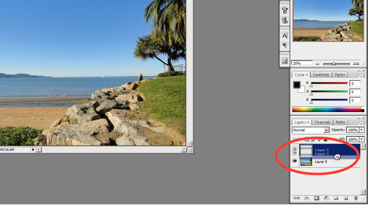
Photoshop does a great job of letting the user know what’s happening with the program by visually showing the user what their actions have led to whenever possible. For example, when users move layers around in the Layers palette, they can visually see the layer being represented as physically dragged within the space.
The cursor graphic goes from representing an open-hand to a gripped hand when the user drags a layer around within the Layers palette. This makes it easier to instantly understand the system status. Additionally, Adobe’s choice of using a ‘hand’ is a great example of the second guideline where the system matches the real world.
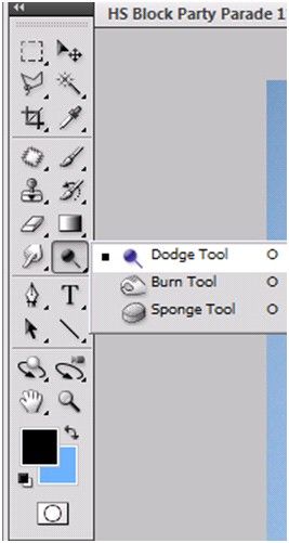
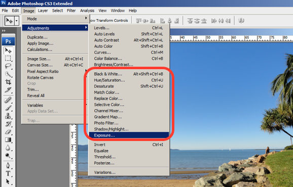
An example of Photoshop mimicking the real world in terms and representations that their target users would understand, is where they design the information structure and terminology to mirror the same wording we would use in the world of photography or print media. Familiar concepts and terms like RGB, Hue/Saturation/Brightness and CMYK are used to represent color, while various tools like the dodge tool and the burn tool mimics a traditional darkroom technique for photographs.
Photoshop’s Dodge Tool and Burn Tool mimics a traditional darkroom technique for photographs
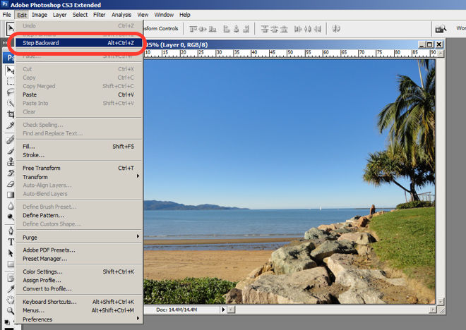
Photoshop is very good at providing users with control every step of the way. As the user makes changes to an image or adds various artistic effects, they are able to quickly and easily take a step backwards if they make an error, for instance.
The users are in control as they can take a Step Backward or Step Forward under the Edit menu, or alternatively they can use Photoshop’s keyboard shortcuts like Alt+Ctrl+Z, for example.
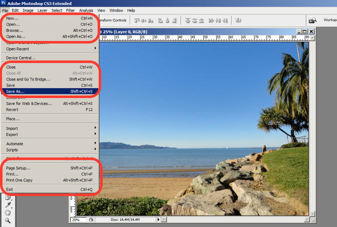
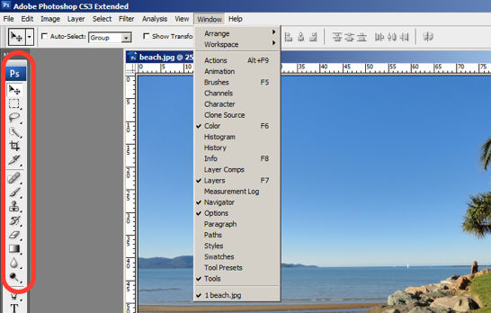
Photoshop maintains a standard layout and look and feel when it comes to the menu bar. They also utilize commonly known terminology such as “New…”, “Open…”, “Save As…”, etc.
The File menu in Photoshop displays a variety of highly familiar options.
To prevent users from making errors, Photoshop provides a brief description or label of the tools when a user hovers over it to help make sure users are using the proper tool for the task at hand.
The user hovers over the eraser icon and Photoshop displays the “Eraser Tool” label.
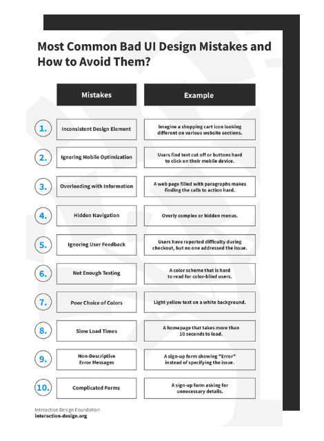
Advance Your Career With This Free Template
for “Bad UI Design Mistakes and How to Avoid Them”
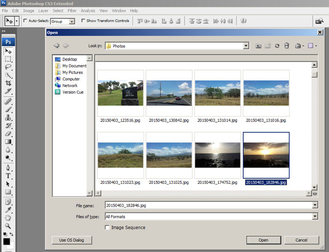
6. Recognition rather than Recall
Whether it be making a selection from the artistic filters menu, or opening a new image file, Photoshop provides a sample view for users to make the right choice. This allows for the user to visually recognize what they’re looking for instead of having to recall the name or typing it in to search for it. Perhaps you have encountered other photo editing programs which ask you to recall and type the name of the file you want to work on. This can indeed be really difficult to recall as it is often something to the effect of: 29412_09342.JPG.
The user is able to visually recognize the sunset image by its thumbnail and select it.
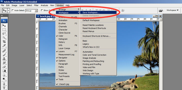
One of the many reasons for frequent users to love Photoshop is for its flexibility and efficiency. Users are able to utilize its flexibility by organizing and adding to their Workspace, as well as making things more efficient by saving it for future use.
Photoshop gives frequent users the ability to save their preferred workspace-setup.
The toolbar in Photoshop only displays the icons and is neatly tucked to the side to help keep clutter to a minimum, and maintain a minimalist aesthetic.
The Photoshop toolbar is minimalist and avoids clutter by representing the tools with icons only.
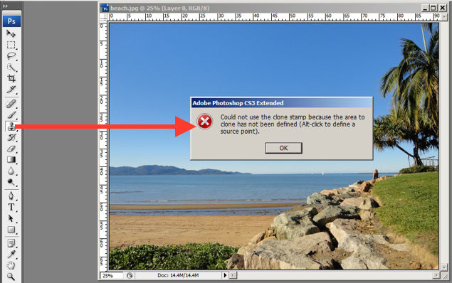
9. Help Users Recognize, Diagnose and Recover from Errors
Whenever there is an error, Photoshop provides dialogue that lets the user know what went wrong and how to fix it.
In this error message for the user’s misuse of the clone stamp, Photoshop explains what went wrong, the reason why and how the user should proceed from there.
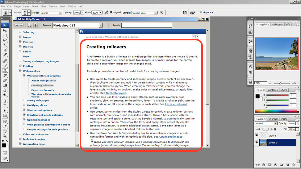
Help and documentation can be accessed easily via the main menu bar. From there, you can find a wide variety of help topics and tutorials on how to make full use of the program.
The window displays information on how to create rollovers in the context of web graphics. The user is also able to see a list of topics on the side menu.
10 Steps to Improve Usability, Utility, and Desirability by Implementing Nielsen and Molich’s User Interface Design Guidelines
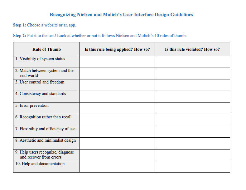
As a designer, you should have the ability to critique the designs of your own as well as the work of others with well supported reasoning. Applying Nielsen and Molich’s 10 rules of thumb in evaluating interface design will help you recognize any potential issues as well as guide you and your team in creating better experiences for your users. Here’s a worksheet for you to practice with as you learn the skill of recognizing whether or not these rules have been applied and when these rules have been violated. Finally, it’s time to improve the website or app by further implementing the 10 guidelines.
When you follow Nielsen and Molich’s 10 user interface guidelines you will design with usability, utility and desirability in mind. Just as the designers of successful companies like Apple, Google, and Adobe, you’ll be able to support your design decisions with well researched heuristics and be confident in creating designs that are both usable and beautiful. To practice recognizing these 10 rules of thumb, go ahead and work through the exercise outlined in the attached file from the above section.
References and Where to Learn More
To find more information on Jakob Nielsen’s ‘Enhancing the Explanatory Power of Usability Heuristics’ please see
AI is replacing jobs everywhere, yet design jobs are booming with a projected 45% job growth.
With design skills, you can create products and services people love. More love means more impact and greater salary potential.
At IxDF, we help you from your first course to your next job, all in one place.


