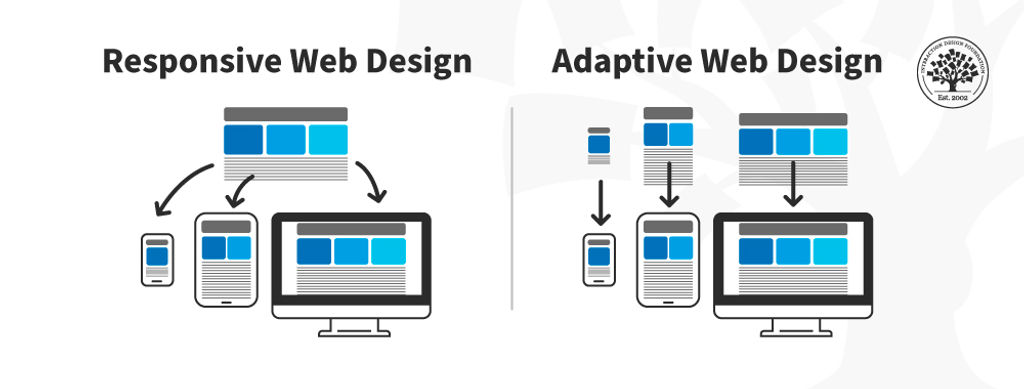
Adaptive designs are a range of pre-made layouts that fit different screen sizes. The device's browser selects the best-fitting design from those options.
Adaptive design is one method of ensuring webpages function on different-sized devices, which makes it a good option for mobile User Experience (UX) design. Designers might make differently-sized graphical user interfaces (GUIs) ranging from smartwatches to TVs.
Adaptive design for websites uses multiple fixed layout sizes. The system detects the browser size and selects the most appropriate layout.
Adaptive designs usually include six designs for the six most common screen widths—320, 480, 760, 960, 1200, and 1600 pixels.
Adaptive and Responsive Design
Adaptive design is like responsive design, which also adapts to different screen sizes. However, responsive designs use a single layout that adjusts in response to screen size. Adaptive design content chooses the best configuration from a selection of fixed layouts.
In this image, you can see a comparison between the responsive design approach and the adaptive design approach.
© Interaction Design Foundation, CC BY-SA 4.0
The advantage of adaptive design is that it is a tailor-made solution. The GUI will appear exactly as intended on different screen sizes. The disadvantage is that adaptive design is expensive. The designer creates up to six versions of a webpage to match the screen specifications a user needs. An adaptive design might leave users with non-standard-sized screens with an unoptimized solution.
Responsive design is the "default" for accessing web content on any device. Adaptive design is a related technique that allows for UX to be optimized. Which approach you take depends on several factors, the most important of which is your users’ needs and contexts of use. The trade-off between responsive and adaptive design ultimately comes down to consistency and flexibility. Responsive affords less control over your design on each screen size.
Adaptive and responsive design are different approaches to deliver device-specific experiences for users. While responsive design focuses on just the device, adaptive design takes both device and the user’s context into account. Sometimes, a hybrid approach is best.


