
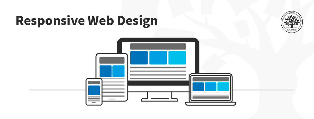
Responsive Design allows people to access content across multiple device resolutions. As more people interact with websites through mobile devices, users now expect websites to be responsive. Here we’ll look at the main principles of responsive design and how it supports accessibility and device-switching.
"Responsive Design" was first coined by the web designer and developer Ethan Marcotte in his book, Responsive Web Design. It is the default to support device-switching. Users may start interacting with your product or service on a desktop, switch to a phone or a tablet and then switch back. It’s essential to bear this in mind for mobile user experience (UX) design Let's look closely at the key elements of responsive design. Moreover, The Web Content Accessibility Guidelines (WCAG) lay down web responsiveness (called Reflow) as one of the success criteria for accessible content. A responsive site also ranks better in search results and is crucial for Search Engine Optimization (SEO).
What is Responsive Design?
Responsive Web Design (a.k.a. "Responsive" or "Responsive Design") is an approach to design web content that appears regardless of the resolution governed by the device. It’s typically accomplished with viewport breakpoints (resolution cut-offs for when content scales to that view). The viewports should adjust logically on tablets, phones, and desktops of any resolution.
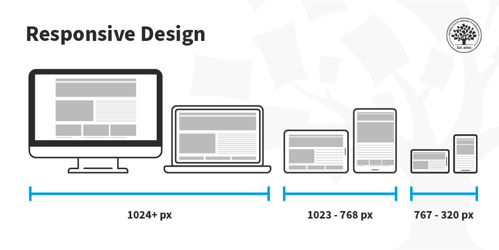
In responsive design, you can define rules for how the content flows and how the layout changes based on the size range of the screen.
© Interaction Design Foundation, CC BY-SA 4.0
Responsive designs respond to changes in browser width by adjusting the placement of design elements to fit in the available space. If you open a responsive site on the desktop and change the browser window's size, the content will dynamically rearrange itself to fit the browser window. On mobile phones, the site checks for the available space and then presents itself in the ideal arrangement.
© Stéphanie Walter, CC BY-SA 3.0
The 3 Major Principles of Responsive Design
Three main principles drive responsive design. Other principles may come into play for certain designs, but these three bind all responsive sites:
Fluid Grid Systems
Fluid Image Use
Media Queries
Fluid Grid System
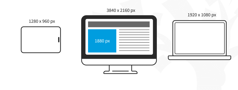
In print, publishers determine the size of what is displayed (and where) in absolute measures. When the internet arrived, this trend continued, and designers defined websites in pixel sizes.
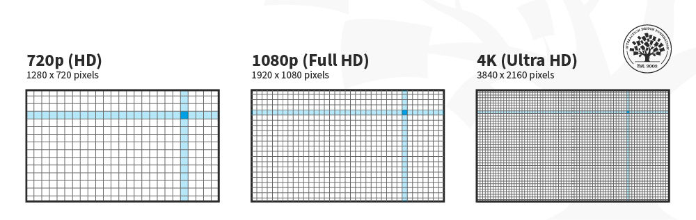
The "p" in “720p” and “1080p” stands for “progressive scan,” and the number refers to the height dimensions of the image in pixels.
© Interaction Design Foundation, CC BY-SA 4.0
For responsive design, the absolute size method doesn't work because devices vary in size. Therefore, responsive design uses relative sizes.
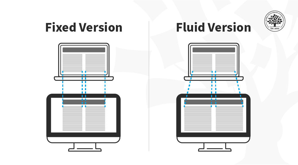
In this image, you can see that the fixed version of the content has the same width regardless of the device, whereas in the fluid version, the content fills the available screen space of the device.
© Interaction Design Foundation, CC BY-SA 4.0
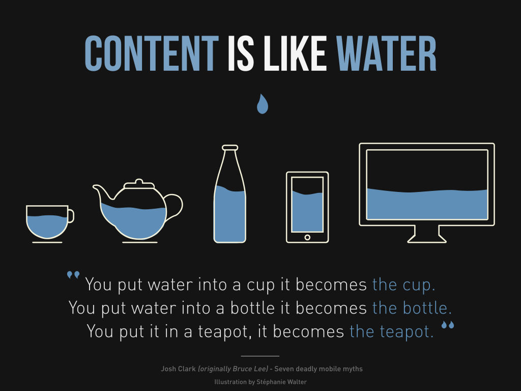
Fluid Images
When you use fluid grids to define a layout using relative values (such as percentages), nothing on a layout will have a constant size across all devices. This means that images in your layout will need to be resized for each screen real estate. That's where fluid images enter the picture! Much like water, fluid images take on the size of their container. So, you can create a single image and instruct the browser to scale the image according to the size of the container.
© Interaction Design Foundation, CC BY-SA 4.0
For non-photographic images, such as icons, you can use SVG files. These file formats are lightweight, and you can scale them to any resolution without quality loss.
Media Queries
Media queries are instructions to alter the site's layout based on certain conditions. For example, a two-column approach might not be practical in the screen real estate of a smartphone.
You can use a media query to instruct the browser to rearrange the screen real estate if the screen size is smaller than a particular size. This specific size at which the layout breaks is called a “breakpoint.”
In this image, you can see how the placement of the columns is rearranged depending on the screen real estate available. The content is displayed in one column on the smartphone, two on the tablet and three on the desktop.
© Interaction Design Foundation, CC BY-SA 4.0
Media queries work best with a "mobile first" approach where you define what you want on mobile and then scale up from there. You’ll need to test content to see where breakpoints occur and plan them. Eventually, you may find you can predict breakpoints based on a device's screen resolution.
Best Practices and Considerations for Responsive Design
With responsive design, you design for flexibility in every aspect—images, text and layouts. So, you should:
Take the mobile-first approach—start the product design process for mobile devices first instead of desktop devices.
Create fluid grids and images.
Prioritize the use of Scalable Vector Graphics (SVGs). These are an XML-based file format for 2D graphics, which supports interactivity and animations.
Include three or more breakpoints (layouts for three or more devices).
Prioritize and hide content to suit users’ contexts of use. Check your visual hierarchy and use progressive disclosure and navigation drawers to give users needed items first. Keep nonessential items (nice-to-haves) secondary.
Aim for minimalism.
Apply design patterns to maximize ease of use for users in their contexts and quicken their familiarity: e.g., the column drop pattern fits content to many screen types.
Aim for accessibility.
The Take Away
Responsive design is the default approach in web design. It is crucial for accessible and search-engine-optimized experiences. To create responsive designs, UX designers work with fluid grids and images. You must work closely with developers to specify breakpoints and test if they render correctly.
Best practices for responsive design include the use of a mobile-first approach, with three or more breakpoints, prioritizing or hiding content, minimalism, accessibility and the use of design patterns to enhance the ease of use.
References and Where to Learn More
To learn more about why responsive web design is important for accessibility, read the WCAG’s success criterion guideline.
Learn more about the mobile-first approach proposed by Luke Wroblewski.
Hero image: © Interaction Design Foundation, CC BY-SA 4.0


