Graphic of the acronym, KISS.

KISS (Keep it Simple, Stupid) - A Design Principle

• 8 min read

1,289 Shares

It was Albert Einstein who said; “If you can’t explain it, you don’t understand it well enough.” Though it is often mis-reported as being; “If you can’t explain it to a six year old, you don’t understand it well enough.” What Einstein was driving at was a particular application of “keep it simple, stupid”.

From scientific concepts to products the end-user doesn’t care how clever the creator or designer of something is. They care about being able to take that person’s output and make it useful to their own lives. The simpler the explanation and the simpler the product, the more likely it is that the output will be useful to others.

The phrase; “keep it simple, stupid” is thought to have been coined by the late Kelly Johnson, who was the lead engineer at the Lockheed Skunk Works (a place responsible for the S-71 Blackbird spy plane amongst many other notable achievements). It is worth noting that Kelly’s version of the phrase had no comma and was written “keep it simple stupid”.

Author/Copyright holder: Terretta. Copyright terms and licence: CC BY-NC-ND 2.0

There’s really not much more to say here is there? Keep it simple stupid.

Kelly explained the idea to others with a simple story. He told the designers at Lockheed that whatever they made had to be something that could be repaired by a man in a field with some basic mechanic’s training and simple tools. The theater of war (for which Lockheed’s products were designed) would not allow for more than that. If their products weren’t simple and easy to understand – they would quickly become obsolete in combat conditions and thus worthless.

Today the KISS principle is celebrated in many engineering professions (including software engineering) and is often brought to bear by managers in many professions as well as by trainers and educators.

The First Usability Principle?

KISS may have been the first usability principle for product design – though it was never formally presented as a usability principle. It focuses on the idea that if we can’t understand a product, we can’t use it properly and that the widest possible audience must be able to understand it, if the product is to gain maximum market share. This is as true for mobile applications as it is for fighter planes.


Author/Copyright holder: United States Navy. Copyright terms and licence: Public Domain.

The Lockheed F-35 will have been built to the KISS principle and so should your products if you want them to succeed.

Variants of KISS

The KISS principle is also offered in two other forms (for those who feel delicate about the inclusion of the word “stupid”):

  • Keep it short and simple

  • Keep it simple and straightforward

Though both phrases technically introduce an “a” into the acronym – they both deliver the same message as “keep it simple, stupid”. The objective of any process is to deliver the simplest possible outcome.

Alternatives to KISS

KISS is related to a fair number of other famous quotes, phrases and principles. Among them:

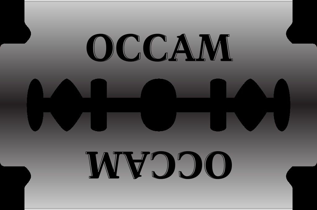
  • Occam’s Razor - “Among competing hypotheses, the one with the fewest assumptions should be selected” (but often restated as “The simplest solution is most likely the correct solution” which is not quite the same thing).

  • Albert Einstein’s – “Make everything as simple as possible but not simpler” (it is possible that Einstein never actually said this and it was actually a paraphrase of something he said during a lecture but the principle remains sound).

  • Leonardo Da Vinci’s – Simplicity is the ultimate sophistication” (when, perhaps, the greatest designer in history offers this advice, it’s almost certainly good advice).

  • Ludwig Mies Van Der Rohe’s – “Less is more” (Mies was a highly respected architect and peer of the better known Frank Lloyd Wright)

  • Bjarne Stroustrup’s “Make Simple Tasks Simple!” (Stroustrup is a Danish computer scientist and highly regarded academic).

  • Antoin Marie Jean-Baptiste Roger, comte de Saint-Exupery’s “It seems that perfection is not reached when there is nothing left to add but when there is nothing left to take away.”


Author/Copyright holder: Fred the Oyster. Copyright terms and licence: CC BY-SA 3.0

Occam’s razor is a metaphorical rather than literal razor and it’s often misquoted too. It is possible for something to be too simple and this diagram, rather ably, demonstrates.

A Note of Caution When Applying KISS to Design

Whilst simplicity is an admirable goal and can lead to enhanced user experiences, it is important not to let simplicity interfere with the design objective. The user must still be able to carry out their task requirements with the finished products or the design process has failed – no matter how simple the final design.

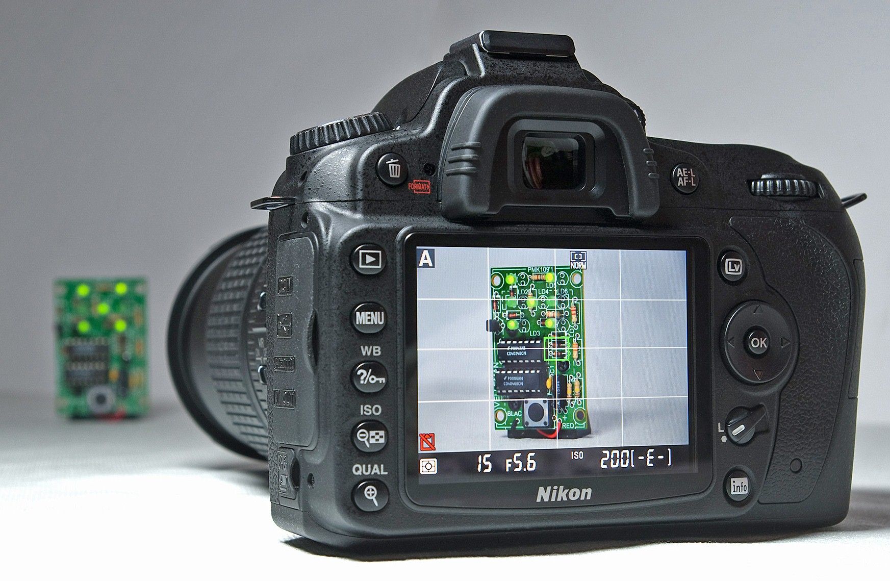
Products such as DSLR Cameras are by nature more complex than the cameras found on the latest generations of smartphones. Complexity is to be resisted when it exists for its own sake and not when complexity can enhance the design for the user.


Author/Copyright holder: Bill Bertram. Copyright terms and licence: CC BY-SA 3.0

The DSLR is as simple as it can be without reducing its utility. It’s not as simple as a mobile phone camera but it offers more options to the photographer. KISS has not been abandoned here but rather kept in line with user expectations.

The Take Away

Simplicity is a key design principle. The easier something is to understand and use – the more likely it is to be adopted and engaged with. KISS, “keep it simple, stupid” is thus a great rule of thumb to be applied when considering your design work in a larger context of usage. However, it is also important not to make things so simple that they compromise the functionality of the final design – users will live with a little complexity if it enhances their overall experience.

References

Forbes Magazine explores why using KISS doesn’t make you any stupider. See here.

Lifehacker offers tips into implementing the KISS principle in your life in general here.

Hero Image: Author/Copyright holder: Kristian Bjornard. Copyright terms and licence: CC BY-SA 2.0

Learn More in This Course:

User Experience: The Beginner's Guide

Course Closed
100 % booked
View Course

What You Should Read Next

  • Read full article
    Bad Design vs. Good Design: 5 Examples We Can Learn From - Article hero image
    Interaction Design Foundation logo

    Bad Design vs. Good Design: 5 Examples We Can Learn From

    Looking at examples of bad design alongside counter-examples of good design is not only fun but also draws important lessons for designers. They highlight pitfalls for designers to avoid and let us understand how to translate design theories into solutions that work in the real world. Jared Spool, t

    Social shares
    1.5k
    Published
    Read Article
  • Read full article
    User Interface Design Guidelines: 10 Rules of Thumb - Article hero image
    Interaction Design Foundation logo

    User Interface Design Guidelines: 10 Rules of Thumb

    Learn to design with your user’s needs and expectations in mind by applying Jakob Nielsen and Rolf Molich’s Ten User Interface Guidelines. These heuristics have been reflected in many of the products designed by some of the most successful companies in the world such as Apple, Google, and Adobe. Fur

    Social shares
    1.4k
    Published
    Read Article
  • Read full article
    The Key Elements & Principles of Visual Design - Article hero image
    Interaction Design Foundation logo

    The Key Elements & Principles of Visual Design

    Visual design is about creating and making the general aesthetics of a product consistent. To create the aesthetic style of a website or app, we work with fundamental elements of visual design, arranging them according to principles of design. These elements and principles together form the building

    Social shares
    1.4k
    Published
    Read Article
  • Read full article
    The Principles of Service Design Thinking - Building Better Services - Article hero image
    Interaction Design Foundation logo

    The Principles of Service Design Thinking - Building Better Services

    Service design is all about taking a service and making it meet the user’s and customer’s needs for that service. It can be used to improve an existing service or to create a new service from scratch. In order to adapt to service design, a UX designer will need to understand the basic principles of

    Social shares
    1.4k
    Published
    Read Article
  • Read full article
    The 7 Factors that Influence User Experience - Article hero image
    Interaction Design Foundation logo

    The 7 Factors that Influence User Experience

    User Experience (UX) is critical to the success or failure of a product in the market but what do we mean by UX? All too often UX is confused with usability which describes to some extent how easy a product is to use and it is true that UX as a discipline began with usability – however, UX has grown

    Social shares
    1.3k
    Published
    Read Article
  • Read full article
    Principle of Consistency and Standards in User Interface Design - Article hero image
    Interaction Design Foundation logo

    Principle of Consistency and Standards in User Interface Design

    Learn to design with consistency and standards in mind and understand the reasons why they’re important to incorporate them into your work. Derived from Jakob Nielsen and Rolf Molich’s Ten User Interface (UI) Guidelines, ‘Consistency and Standards’ are evident in many of the widely-used produc

    Social shares
    1.3k
    Published
    Read Article
  • Read full article
    Hick’s Law: Making the choice easier for users - Article hero image
    Interaction Design Foundation logo

    Hick’s Law: Making the choice easier for users

    Now let’s see a topic about keeping our users’ lives easy. “Isn’t that the theme of most articles here?” you may ask. Well, this one is especially geared towards users. Understanding Hick’s law means you can design so that more users will visit and stay on your website.Delivering a good user experie

    Social shares
    1.3k
    Published
    Read Article
  • Read full article
    Visual Hierarchy: Organizing content to follow natural eye movement patterns - Article hero image
    Interaction Design Foundation logo

    Visual Hierarchy: Organizing content to follow natural eye movement patterns

    Let’s look at a topic that deals with, oddly enough, how we look at designs. Once you understand how the human eye processes these, you’ll find yourself better able to arrange your elements more effectively.Content in any digital page layout will follow a specific hierarchy. Headers appear above bod

    Social shares
    1.3k
    Published
    Read Article
  • Read full article
    Usability: A part of the User Experience - Article hero image
    Interaction Design Foundation logo

    Usability: A part of the User Experience

    This subject may seem incredibly “big” for a single article, but it’s about the specific nature of usability that we often overlook or confuse. With this appreciation, you’ll be able to design more effectively, and your website’s users will be able to grow, too.Usability replaced the outmoded label

    Social shares
    1.2k
    Published
    Read Article
  • Read full article
    Responsive Design: Best Practices - Article hero image
    Interaction Design Foundation logo

    Responsive Design: Best Practices

    Responsive Design allows people to access content across multiple device resolutions. As more people interact with websites through mobile devices, users now expect websites to be responsive. Here we’ll look at the main principles of responsive design and how it supports accessibility and device-swi

    Social shares
    1.1k
    Published
    Read Article

Top Articles

Top Topic Definitions

Feel Stuck?
Want Better Job Options?

AI is replacing jobs everywhere, yet design jobs are booming with a projected 45% job growth. With design skills, you can create products and services people love. More love means more impact and greater salary potential.

At IxDF, we help you from your first course to your next job, all in one place.

See How Design Skills Turn Into Job Options
Privacy Settings
By using this site, you accept our Cookie Policy and Terms of Use.
Customize
Accept all

Be the One Who Inspires

People remember who shares great ideas.

Share on:

Academic Credibility — On Autopilot

Don't waste time googling citation formats. Just copy, paste and look legit in seconds.

Feel Stuck? Want Freedom?

Join 326,013+ designers who get one powerful email each week. Learn to design a life you love.

Next email in
1
day
17
hrs
24
mins
33
secs

Free forever. No spam. Unsubscribe anytime.