Occam’s Razor

Your constantly-updated definition of Occam’s Razor and collection of videos and articles.
Be a conversation starter: Share this page and inspire others!

197 Shares

What is Occam’s Razor?

Occam's Razor is a problem-solving principle. It suggests the simplest explanation or solution—with the fewest assumptions—is often most likely the right one. It encourages designers to take out unnecessary complexity and focus on a design’s essential elements. Designers apply it to make intuitive and efficient user interfaces. 

Image of stained glass picture of William of Ockham

Occam's Razor takes its name from the 14th-century philosopher William of Ockham.

© Chris Simms, Fair Use

Occam's Razor Helps Cut to the Chase

The 14th-century philosopher William of Ockham suggested that the simplest explanation or solution is often the one that’s most accurate. Because of its focus on direct simplicity and minimal assumptions, it’s been a driving force among a wide range of problem-solvers for centuries. 

More precisely, this philosophical principle advises decision-makers to select the simplest explanation or solution when they face multiple options. An essential point behind the approach to choose the most straightforward solution is that thinkers should avoid making unnecessary assumptions. William of Ockham never explicitly formulated this principle. Even so, he frequently used a similar idea in his philosophical and theological work. The real essence of Occam's Razor goes back to the concept of "Pluralitas non est ponenda sine necessitate." That Latin sentence means "Plurality should not be posited without necessity." 

Image of Apple screen showing

Occam’s Razor—clean simplicity in the modern age.

© Craig Barber, Fair Use

How to Apply Occam's Razor: UX Design

Occam's Razor plays a crucial role in user experience (UX) design and—more visibly—in user interface (UI) design. Because it’s about promoting user-friendliness and simplification, it’s a powerful asset in any UX design process—and the digital design of products or services. When designers work to create products such as web pages and mobile apps, they strive to stick to the principle of “sufficient to explain.” That means they ensure that their designs are intuitive, efficient and user-centric. From web design to app creation, Occam's Razor therefore helps prevent—or eliminate—unnecessary features. In its approach to ensure a well-solved problem, it enables designers to minimize cognitive overload and enhance the overall user experience.  

Occam's Razor is a particularly powerful principle—and one that designers leverage to produce the following: 

1.  Streamlined Navigation

One of the key areas where Occam's Razor comes into play is for designers to create streamlined navigation systems. So, designers should avoid cluttered menus and convoluted navigation paths. Then, they can help to create interfaces that let users find what they need to effortlessly. Some well-known brands—such as Google and Airbnb—truly excel in this aspect. These brands use clean and straightforward interfaces that make ease of navigation a real priority.   

Screenshot of Google Home page

Google’s iconic clean and minimalist look embodies the principle of streamlining.

© Google, Fair Use

2. Minimalist Visuals

Occam's Razor extends beyond navigation—it has a direct influence on the aesthetic aspects of visual design in digital products. When UX designers take minimalist design principles close to heart, they can focus on truly essential elements. Meanwhile, they reduce unnecessary visual noise. Brands like Apple are renowned for their minimalist approach. Apple creates elegant and user-friendly experiences—ones that prioritize core features and functionalities. 

Screenshot of Apple web page.

Apple’s iconic look is geared around minimalism and classy user-friendliness.

© Apple, Fair Use

3.  Clear and Concise Messaging

Effective communication is vital if a designer wants to make a seamless user experience. One central part of Occam's Razor in design is how it puts an emphasis on clear and concise messaging. When designers apply it—and do it well—they make sure that users understand the purpose and functionality of an interface effortlessly. Designers should use straightforward language, not use jargon and give concise instructions—this makes sure that users understand and interact with their products seamlessly.   

Screenshot of Airbnb web page.

Airbnb gets the point across concisely in its highly intuitive design.

© Airbnb, Fair Use

4.  Streamlined Forms and Inputs

Online forms are an integral part of many digital experiences. Occam's Razor can guide designers to create streamlined and user-friendly forms. Designers minimize the number of form fields, pre-fill information when possible and give helpful input validation. When they do this, they can lessen the amount of friction. They can also make completion rates rise.  

The principle of Occam's Razor highlights how important it is to make communication straightforward and succinct. If designers prevent or remove cluttered menus and complex navigation routes—they can develop interfaces that empower users to easily locate the information they need. Typeform and similar platforms have streamlined intricate forms that provide seamless and user-friendly interfaces.   

Illustration of a screen showing form fields.

Simple forms enable users to get information across fast and with minimum work.

© Paul Capcan, Fair Use

5.  Reduction of Cognitive Load

​​​​​​​​​​​​​​​​​​​​A core part of the advice in Occam's Razor is that designers minimize their users’ cognitive load. So, designers should be sure they take out unneeded complex things and organize content and features in a logical and efficient way.  This they can do if they apply thoughtful organization, make the information architecture efficient, create a clear hierarchy and include intuitive interaction patterns. Designers can tap into users' existing mental models, lessen the learning curve and give usability a boost if they use familiar icons and standard conventions.        

6.  Consistent Design Elements

An Occam’s Razor design generally features a uniformity in colors, fonts and icons throughout the interface. This helps keep things coherent. It also helps in the user flow and overall user and customer experience. What’s more, when designers apply consistent design patterns and standards across an interface, they line up with Occam’s Razor in terms of how it promotes familiarity and predictability.   

7.  Progressive Disclosure

The Occam’s Razor principle recommends that information in interfaces should just be revealed when users need it. For example, when users access one section of an onboarding screen, they only encounter the information necessary for that part of it. This doesn’t just reduce clutter and cognitive load—it also matches users’ expectations as they move forward.   

8.  Error Prevention and Handling

Designers can stay one step ahead of and prevent errors through clear and concise instructions with this design principle. This reduces the need for troubleshooting—and it can take the form of—for example—a calendar date picker for booking tickets.   

Image of a calendar widget on a computer screen.

Calendar widget for selecting travel dates.

© UXPlanet.org, Fair Use

9.  Clear Calls To Action

Designers ​should ​use clear and concise calls to action (CTAs) that guide users toward their intended actions without ambiguity. This is something that supports Occam's Razor—as it streamlines the user's decision-making process on the way to the goals they want to achieve. 

Illustration of three mobile phone screens during a transaction.

PayPal’s simple and straightforward look helps users check out with a clear sense of trust and security.

© Radiant Digital, Fair Use

Tips to Successfully Use Occam's Razor in UX Design

Designers should incorporate these tips into the design process so that they apply Occam's Razor effectively. When they use it as one of their centermost design tools, they can help create exceptional user experiences, ones that prioritize simplicity and effectiveness. 

1.  Know the users: Designers should do their user research thoroughly so they can understand the target audience's needs, goals—and pain points. This knowledge will help them design with simplicity and relevance in mind. 

2. Prioritize clarity: They need to make sure that messaging and instructions are clear, concise and easily understandable. It’s best to use plain language and avoid any unneeded technical jargon. Clear communication lightens the cognitive load. Plus, it lets users navigate the interface more efficiently. 

3.  Prioritize essential elements: Spot the core features and functionalities that run in line with the users' goals. Focus on these elements and eliminate any extraneous features that could distract or confuse users. 

4.  Embrace minimalism: Strive for simplicity in visual design, typography and color schemes. Use white space strategically and take out any unnecessary visual elements to create a clean and uncluttered interface. 

5.  Simplify navigation: Streamline menus and group similar items for easy navigation. Cut down the number of steps users need to follow to complete tasks. What’s more, guide users through a clear and intuitive information architecture. 

6.  Test and iterate: Continuously test designs with real users. Get the feedback collected and find areas for improvement. Usability testing is a vital ingredient in the design process to see how users interact with a prototype or product. So, use insights from user testing to iterate with design team members, refine and simplify designs further. 

Screenshot of a 62 Management web page showing models.

The best designs speak clearly to users.

© 62 Management, Fair Use

Occam's Razor: Risks and Considerations

While Occam's Razor is a valuable principle in UX design, it's important to consider potential risks and limitations: 

●  Oversimplification

If a designer over-simplifies an interface, it can lead to a lack of necessary functionality or usability issues. It's crucial to strike a balance between simplicity and meeting user needs. Continuously collect that all-important user feedback and iterate on designs—to make sure there’s the right level of simplicity without sacrificing functionality. 

●  Context Matters

Keep in mind that how best to work Occam's Razor into a design project is something that may vary depending on the context and specific user requirements. What works for one user group mightn’t work for another. So, understand the user journey, cultural considerations and other fine-tuned aspects of the people to design for. Tailor the design decisions to the unique needs of that target audience. 

●  Complexity is Sometimes Necessary

Occam's Razor serves as a guiding principle to prioritize simplicity and elegance in designs and deliver seamless, streamlined, user-centric experiences. Don’t apply it blindly, though. In certain cases, designers may need more complex solutions to address specific user needs or intricate tasks. Carefully evaluate the trade-offs between simplicity and functionality to make sure that the design effectively does meet user requirements. 

Overall, Occam's Razor serves as—and remains—an invaluable principle in UX design. It guides designers to prioritize simplicity and minimal assumptions. Still, it’s only a guide to create intuitive and efficient user interfaces that give the overall user experience a boost. Discretion and judgment are vital to consider potential risks and make sure that design decisions strike the right balance between simplicity and functionality. Ultimately, it’s a valuable part of a designer’s toolbox and a good form of insurance against user uncertainty and lack of trust. 

Screenshot from the Zara website.

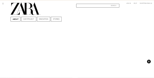
Zara’s simple and clean look speaks to fashion lovers in no uncertain terms.

© Zara, Fair Use

Questions About Occam’s Razor?
We've Got Answers!

How is Occam's Razor like Keep It Simple Stupid (KISS)?

Occam's Razor and the "Keep It Simple Stupid" principle are similar in these areas: 

  1. Simplicity as a guiding principle 

  • Both Occam's Razor and the "Keep It Simple Stupid" principle emphasize how important simplicity is in problem-solving and decision-making. 

  • Occam's Razor suggests that among competing hypotheses, the one with the fewest assumptions is the one to pick. 

  • "Keep It Simple Stupid" encourages simplicity in design and problem-solving to steer clear of unnecessary complexity. 

  1. Preferential treatment of simpler explanations or solutions 

  • Occam's Razor advises that when multiple competing hypotheses are equal in other respects, the simplest one is the one to select. 

  • Similarly, the "Keep It Simple Stupid" principle urges the preference for simple solutions over complicated ones—as long as they really do effectively address the problem at hand. 

  1. Focus on minimizing unnecessary complexity 

  • Both concepts advocate for the cutting down of unnecessary complexity in favor of straightforward, elegant solutions. 

  • Occam's Razor is all about the need to minimize unneeded things or assumptions in explanations. 

  • "Keep It Simple Stupid" promotes the avoidance of unnecessary features, processes or design elements that can complicate a solution without adding significant value. 

  1. Application in various fields 

  • Occam's Razor sees commons use in scientific and philosophical reasoning to guide hypothesis selection and problem-solving. 

  • The "Keep It Simple Stupid" principle finds application in diverse fields such as engineering, design, management and communication. It puts emphasis on the benefits of simplicity in these domains. 

Take our course Human-Computer Interaction: The Foundations of UX Design to take a deep-dive into this and other principles geared around design for users. 

Does Occam's Razor have any similarities to Hick's Law?

Occam's Razor and Hick's Law are two distinct principles from different fields—even so, they share some similarities in their underlying concepts. Occam's Razor is a principle from the field of philosophy and science that states that when there are competing hypotheses to explain a phenomenon, the simplest explanation is often the best. 

Hick's Law, though, is a principle in psychology and ergonomics that describes the time it takes for a person to make a decision as a result of the possible choices they have. It states that raising the number of choices will drive up the decision time logarithmically. 

Similarities 

  • Both Occam's Razor and Hick's Law emphasize simplicity and efficiency. 

  • Occam's Razor advocates for the simplest explanation—meanwhile, Hick's Law highlights the advantage of reducing the number of choices to make decisions more efficiently. 

Occam's Razor and Hick's Law are different in their specific applications—still, they both promote the idea that simplicity and the reduction of unnecessary elements can lead to outcomes that are more effective. 

Take our course Psychology of Commerce: How to Sell Online for insights into how to design successfully for users. 

What role does Occam's Razor play in usability testing?

When designers work Occam's Razor into usability testing, they observe users as the users interact with a product. Designers note where these users encounter difficulties. When they look for the simplest solutions to these issues, designers can make incremental improvements, ones that will greatly boost usability. For instance, if users tend to struggle with a complex navigation menu, a designer could take Occam's Razor and give it a “shave”—or simplify that menu to a more intuitive structure. 

This principle also is something that supports a user-centered design approach—it puts an emphasis on the need to take out any non-essential elements that don’t add value to the user's experience. When they focus on simplicity, designers can create more efficient and accessible products that meet users' needs more effectively. 

Take our course Conducting Usability Testing for essential and in-depth insights into how to design successfully for users with testing. 

In what ways can Occam's Razor influence information architecture?

Occam's Razor can greatly influence information architecture through how it encourages simplicity and clarity. In information architecture, for designers to go about applying Occam's Razor, it means they design websites and digital products in a way that’s easy for users to understand and navigate. The principle encourages designers to minimize complexity in how they structure information, lessen unnecessary content and focus on essential elements that improve user experience. 

When they streamline navigation and organize content clearly, designers can create more intuitive and user-friendly interfaces. This approach helps users find information faster—and with less effort. So, it gives a real boost to the overall effectiveness of the digital product.  

Watch CEO of Experience Dynamics, Frank Spillers explain how to use UI design patterns to make exceptional user interfaces. 

Transcript
 

How can designers use Occam's Razor to evaluate existing user interfaces?

Designers can use Occam's Razor to look at and analyze existing user interfaces—by choosing the simplest designs that meet the users’ needs. This means they take out unnecessary elements that don't add value—which makes the interface cleaner and easier to use. Designers compare different design options and pick the one that makes the least assumptions. That’s something that leads to a straightforward and efficient user experience.  

This approach helps designers find and take out complicated features—which makes navigation intuitive. When designers use Occam's Razor, they focus on essential functions that boost the usability—and so ensure the interface is accessible and user-friendly. 

Watch our topic video on accessibility to appreciate the need ​to​​​ design​ ​with accessibility in mind. 

Transcript
 

How can designers apply Occam's Razor and Fitts's Law together in UX design?

Designers can apply Occam's Razor and Fitts's Law together in UX design if they simplify interfaces and optimize the placement of elements for easy interaction. Occam's Razor encourages reducing unnecessary components to make the design as simple as possible.  

Fitts's Law—meanwhile—suggests that designers put important interactive elements in easy-to-reach areas—which makes them larger for quicker access. When they combine these principles, designers can create user-friendly interfaces that are both simple and efficient. This enhances the overall user experience—it makes navigation intuitive and actions effortless. 

Take our course UI Design Patterns for Successful Software for vital and in-depth insights into how to design successfully for users and factor in their needs properly. 

How does Occam's Razor aid in creating more effective user personas and scenarios?

Occam's Razor helps designers make more effective user personas and scenarios through its encouragement of the focus on essential, realistic details that accurately reflect target users. It simplifies personas—by taking out unnecessary assumptions and complexities. That leads to clearer, more actionable insights. Designers can concentrate on key attributes and behaviors that truly matter. Especially when designers are using design thinking, they can make personas and scenarios more relatable and useful for guiding design decisions. This streamlined approach makes sure that design efforts align closely with user needs and preferences—something that enhances the effectiveness of the UX design process. 

Watch Author and Expert in Human-Computer Interaction Professor Alan Dix explain personas and their value in design. 

Transcript

How does Occam's Razor affect content strategy and UX writing?

Occam's Razor affects content strategy and UX writing through how it promotes simplicity and clarity. The razor guides UX writers in such way that they create concise, straightforward content that directly addresses user needs. Designers avoid unnecessary jargon and don’t get into complex explanations. This approach makes sure that the content is easily understandable for users by making information accessible and actionable. As it focuses on essential information and takes out superfluous details, content strategy becomes more effective. It helps users achieve their goals with minimal effort.  

Watch our Master Class with Author, Speaker and UX Writer at Google, Torrey Podmajersky for in-depth insights into UX writing. 

How can UX designers avoid oversimplification while they apply Occam's Razor?

UX designers can manage to do this if they carefully evaluate user needs and make sure that all the essential functionalities are present and accessible. They balance simplicity with usability—and they recognize that if they take too much out, it can harm the user experience. Designers focus on the core user tasks and give clear pathways to complete them—without stripping away helpful context or guidance. This approach ensures that while designs are streamlined, they still fully support user goals and preferences.  

Take our course UI Design Patterns for Successful Software for essential and in-depth insights into how to design successfully for users, as well as factor in their needs properly. 

How do designers prioritize features using Occam's Razor during product development?

Designers prioritize these at that time when they focus on simplicity and user needs. They evaluate each feature's impact on the overall user experience—and prefer those that offer large benefits without adding any unneeded complexity. This process means that designers critically assess the value each feature adds—and pick just those that are essential for achieving the product's goals. When they do that, designers make sure the final product is streamlined and user-friendly—and that it meets the users' core requirements efficiently. 

Take our course Emotional Design—How to Make Products People Will Love for essential and in-depth insights into how to design products that users will truly enjoy. 

What are highly cited scientific articles on the subject of Occam’s Razor?

Sudjatmoko, A. A., Susanto, A. A., Jayaseputra, J. A., Purwanto, E. S., & Sari, A. C. (2022). The Influence of Consumer Interest on the Use of UI and UX in the E-Commerce Application. In 2022 4th International Conference on Cybernetics and Intelligent System (ICORIS). IEEE.  

This publication delves into the critical role of User Interface (UI) and User Experience (UX) in e-commerce applications—with a particular focus on their impact on consumer interest. The authors argue that well-implemented UI and UX don’t just facilitate smoother interactions between users and applications but greatly enhance user satisfaction and engagement too. Conversely, inadequacies in UI and UX design can obstruct information interaction and foster user frustration. Occam’s Razor receives attention in this piece. 

What are some highly regarded books about Occam’s Razor?

Epic Love Books. (2019). Occam's Razor Scientific Principle Journal: Scientist | Science Experiments Notebook.  

The journal encourages users to apply this principle in their work—promoting clear thinking and effective problem-solving. Its design is particularly useful for chemistry or biology teachers tracking experiment notes—and so embodying the principle of simplicity in scientific exploration. 

Earn a Gift Earn a Gift, Answer a Short Quiz!

1
2
3
4
1
2
3
4
Question 1
Question 2
Question 3
Get Your Gift
Interaction Design Foundation logo

Question 1

What does Occam's Razor primarily suggest in problem-solving?

1 point towards your gift

  • Solutions need verification through extensive testing.
  • The most complex solution is usually the correct one.
  • The simplest solution is often most likely the correct one.
Interaction Design Foundation logo

Question 2

How does Occam's Razor benefit UX design?

1 point towards your gift

  • It encourages the use of multiple functions for simplicity.
  • It promotes highly detailed interfaces.
  • It simplifies user interfaces to enhance user-friendliness.
Interaction Design Foundation logo

Question 3

What is a direct result of the application of Occam's Razor to navigation design?

1 point towards your gift

  • Increased number of navigation options
  • More complex navigation paths
  • Streamlined and clear navigation paths

Learn More About Occam’s Razor

Make learning as easy as watching Netflix: Learn more about Occam’s Razor by taking the online IxDF Course Affordances: Designing Intuitive User Interfaces.

Why? Because design skills make you valuable. In any job. Any industry.

In This Course, You'll

  • Get excited when you use affordances to design intuitive user interfaces that help people achieve their goals effortlessly. Affordances are one of the key secrets behind products that are easy and intuitive to use. You'll empower people by making their lives easier, safer, and more enjoyable. If your designs frustrate people, you'll likely lose them. From websites to everyday objects, affordances instantly clarify how people should use products. In physical products, a handle says, "grab me." In tech, affordances guide interactions through recognizable elements like buttons that look clickable or a scissor icon that clearly means "cut" selected content. When people know what to do without thinking, they'll love your interface and keep coming back.

  • Make yourself invaluable with a deep understanding of how affordances make products feel effortless. An intuitive User Interface (UI) isn't just user-friendly; it's business-friendly. Studies show that when people feel confident using your product, they're more likely to choose it over competitors. People will make fewer mistakes when they naturally understand what to do. In industries like healthcare, transportation, or construction, good affordance design can even save lives.

  • Gain confidence and credibility as you use affordances to create products people love and recommend. You already understand affordances intuitively, like knowing that a door with a push plate opens inward. Your existing skills, combined with step-by-step guidance, make mastering affordances easy, regardless of your background. Clear affordances build trust in your design. You'll tap into familiar patterns and reduce cognitive load with proven frameworks that ethically influence behavior. You'll apply concepts such as visibility, findability, constraints, mapping, feedback, and conceptual models. Affordances are grounded in timeless human behaviors. These timeless human-centered design skills keep you in demand and ensure your interfaces work for people, whether you're sketching, prototyping, or working with AI.

Get an Industry-Recognized IxDF Course Certificate

Increase your credibility, salary potential and job opportunities by showing credible evidence of your skills.

IxDF Course Certificates set the industry gold standard. Add them to your LinkedIn profile, resumé, and job applications.

Course Certificate Example

Be in distinguished company, alongside industry leaders who train their teams with the IxDF and trust IxDF Course Certificates.

Our clients: IBM, HP, Adobe, GE, Accenture, Allianz, Phillips, Deezer, Capgemin, Mcafee, SAP, Telenor, Cigna, British Parliament, State of New York

All Free IxDF Articles on Occam’s Razor

Read full article
Occam’s Razor: The simplest solution is always the best - Article hero image
Interaction Design Foundation logo

Occam’s Razor: The simplest solution is always the best

You may have heard of Occam’s Razor; did you know that you can apply it to web design? When you’ve got it in your “toolbox”, you’ll have an edge in the marketplace.Occam’s Razor, put simply, states: “the simplest solution is almost always the best.” It’s a problem-solving principle arguing that simp

Social shares
1.1k
Published
Read Article
Read full article
KISS (Keep it Simple, Stupid) - A Design Principle - Article hero image
Interaction Design Foundation logo

KISS (Keep it Simple, Stupid) - A Design Principle

It was Albert Einstein who said; “If you can’t explain it, you don’t understand it well enough.” Though it is often mis-reported as being; “If you can’t explain it to a six year old, you don’t understand it well enough.” What Einstein was driving at was a particular application of “keep it simple, s

Social shares
1.3k
Published
Read Article

Occam’s Razor: The simplest solution is always the best

Occam’s Razor: The simplest solution is always the best

You may have heard of Occam’s Razor; did you know that you can apply it to web design? When you’ve got it in your “toolbox”, you’ll have an edge in the marketplace.

Occam’s Razor, put simply, states: “the simplest solution is almost always the best.” It’s a problem-solving principle arguing that simplicity is better than complexity. Named after 14th-century logician and theologian William of Ockham, this theory has been helping many great thinkers for centuries. Many industries swear by it.

How to Use in Design

In design, Occam’s Razor encourages us to eliminate unnecessary elements that would decrease a design’s efficiency. So, when two products or designs have the same function, Occam’s Razor recomends selecting the simpler. Therefore, when evaluating your designs, analyze each element and remove as many as possible, without compromising the overall function. This should ensure that you remain with elements you have minimized as much as possible but which still work perfectly


With the flexibility and power of the web and our design tools, it’s easy to get carried away. Designers can end up making very complicated sites or designs that may have a lot of functionality and information, but are difficult to use, build and maintain. One might think the site can do more, but it actually accomplishes less.

This is commonly an issue where companies feel the need to put everything they possibly could up on the website in the rare case that someone wants the information. In an increasingly competitive market, the pressure is on to get the message “out there”. What companies often ignore is that the overwhelming majority of the users will access about 20% of the content on the site (see the article on the Pareto principle; you’ll find the link at the bottom). Being ruthless about the value that a page or piece of content provides and removing anything unnecessary will make significantly stronger, more effective designs. It may be hard to weed out those unnecessary parts — you may say your business has no unnecessary parts; look harder.

For designers, using Occam’s Razor is all about careful thinking. It easier than you might fear. For instance, an editor-author who has a fiction career, but who also ghostwrites for clients, calls us. She tells us what she wants in her design:

  • Big handwritten font — autograph

  • Her photograph

  • Large-font mission statement

  • Contact information

  • Picture of the ranch where she works

  • Daily writing tip box.

Right away, we see we’ve got much to work into her design. Our author insists on an elaborate, decorative landing page. She loves her ranch and believes other writers will love it, too, so she wants a large photo of it.

We have to decide how to prioritize these elements. So, let’s see what’s necessary:

  • Author’s photograph

  • Signature/autograph—her branding

  • Mission statement.

These three parts embody her service. We want to present a famous author who can help other writers. However, we can move the unnecessary components to other pages using link buttons:

  • Daily writing tips

  • Contact Information

  • Picture of ranch.

We can show the ranch with her contact information, and we can perhaps design a daily writing tip as a pop-up.

The phone goes; our author loves what we’ve done with the design. However, she wants her ranch to feature on the landing page. We say: “We’ll see what we can do.”

Using Occam’s Razor, we see that we can fade the ranch into the background so that the images are there, but don’t distract. We want to cut out “noise”, which would distract/confuse users. So, we remove everything that would have got in the way. Our author friend is an enthusiastic person, but her enthusiasm gets the better of her. She’s scared of writers not contacting her. That’s the problem: she’s trying to push all her goodies onto the landing page, not appreciating that the flood of information will make user’s go: “What?” Instead of showing her good name and service in the best way, she got desperate and tried to squeeze ideas in, making a maze — walls, pictures, text, and spaces sprawling everywhere. Users coming to her site want help; they don’t want to have to work out how she can help them. Worse, it would tell them that this person can’t get ideas across properly. Why should they want her to write for them?

Occam’s Razor cuts down the walls that keep a message from getting through. Also, this rule speaks to the age-old saying that “A design isn’t finished when there is nothing more to add, but when there is nothing left to take away.” Design simplicity is elegant, sophisticated and much more effective than the complex decorative style that is so prevalent on the web these days.

Simplicity shows care, understanding and effort

Author/Copyright holder: 62 Models. Copyright terms and licence: Fair Use

It’s easy to think that the words “simple” and “easy” might show a lack of sophistication, or that working to produce simple designs means you don’t have to work very much. You might worry that a client will think that it took you 10 minutes to design something that he/she could have made.

Let’s do a reality check. Our author-ghostwriter has noticed the high number of hits her site is getting. She certainly doesn’t think that we’ve been lazy; she knows that we worked magic for her. The proof is in the number of page views — users have found it easy to navigate. Instead of shutting off on the landing page after squinting in confusion, many went on to learn more. The design’s simplicity, showing images and text in the best way (remember the other design principles here, such as the golden ratio), puts them at ease. They have a good user experience; most see her site’s simple, comprehensive design reflecting her skill as a no-nonsense writer who’ll work the same magic for them.

With this in mind, we can pat ourselves on the back for having done it for her. However, let’s look at what we did. We:

  • Asked how many elements the landing page needed, including choices or decisions our friend wanted users to make. She wanted them to click on her daily writing tip box so they could see previous days’ tips. We linked this elsewhere.

  • Asked what she wanted her users to do the most. She wanted people contacting her for help writing books. So, we highlighted the contact box, but we added one that took users to another page, where they could read all about her services first. This information was far more detailed than the simple description we put on her landing page: “Making manuscripts move into book and movie deals.”

  • Asked if a user, regardless of background, could get confused/frustrated. Her initial concept was confusing. We imagined approaching the design as ordinary people. Our friend wants to help other writers; well, if an 88 year-old author is looking for someone to clean up his manuscript, he might have had trouble with her design.

In summary, we translated what the writer wanted into a website that was easy to understand and use for the target users. Keeping in mind Occam’s razor, we focused on the key elements and keeping the interface simple.

The Internet is saturated with intricate and exquisitely complex designs. Many flash at us, offering all sorts of benefits, their designers not aware that it’s distracting, commonplace, and cheap-looking, Simplicity is refreshing.

Keeping Accessibility in Mind

Keeping our designs simple means that the websites we build are accessible. Creating a simple layout, with carefully placed images (remember the Rule of Thirds?) and simple, to-the-point, pithy text will keep users on the page.


Author/Copyright holder: Polar Gold. Copyright terms and licence: Fair Use

What gets them navigating to the call for action, such as the shopping cart depends on how you guide them. Did you:

  • Shave off the unnecessary bits?

  • Tone down anything loud or distracting?

  • Use plain language?

  • Would my 80 year-old neighbor understand what the website is about?

  • Would my grandmother be able to buy what I offer through my site and feel good?

Or, you can always make a “reality check”:

And above all, will my users understand the website’s added value and how it targets their needs and desires?

The Take Away

Occam’s Razor is a problem-solving principle devised in the 14th Century that states that simplicity is better than complexity. It has many applications, running from detective work to deductive reasoning about the cosmos.

We UX designers find that it empowers us to aim past the tendency to over-think our designs. It’s easy to focus on a cool idea, without standing back and asking if it’s essential to what we want to achieve. Occam’s Razor lets us approach and plan a design carefully. Our tendency is to keep adding what seem like great elements, sometimes worrying that if we don’t get all we want in one place, we’ll fail by a) weakening the message, or b) looking lazy.

Think of Apple. Steve Jobs’ philosophy embraced Occam’s Razor. His iPad and iPhone, for example, are the proof: one button on the front of a seamless, self-contained device.

By asking ourselves a few questions about our design and our users’ expectations, and reacting accordingly, shaving off the clutter or moving less important bits to other pages, we’ll serve our users and ourselves best. Remember, your design isn’t ready until you’ve found that you can’t take anything else out. This isn’t like repacking a suitcase to match a weight limit; it’s about deconstructing your design. When you’ve got your piece down to its bare essentials, that economy will pay dividends. By getting in ahead of your user’s eye, you can judge. Their page views and clicks will tell you if you’ve made the right choices.

Okay, so you’ve made it all the way here but you’re thinking: “I live by the principle of the simplest solution is always the best”. Where’s my take away? Now that you have a name for this principle, it is yet another advocacy tool to user with your client, boss, colleague. Whenever they insist about adding more functionalities, more elements, more and more, remind them of the Occam’s Razor.

References & Where to Learn More

Duvall, A. (2015). “Taking the Occam Razor Approach to Design.Speckyboy Design Magazine.

McConnell, C. (2010). “Occam’s Razor: A Great Principle For Designers.Web Designer Depot.

Lant, M. (2010). “Occam’s Razor and the Art of Software Design”. Private Blog.

Read more about The Pareto Principle and Your User Experience Work

Feel Stuck?
Want Better Job Options?

AI is replacing jobs everywhere, yet design jobs are booming with a projected 45% job growth. With design skills, you can create products and services people love. More love means more impact and greater salary potential.

At IxDF, we help you from your first course to your next job, all in one place.

See How Design Skills Turn Into Job Options
Privacy Settings
By using this site, you accept our Cookie Policy and Terms of Use.
Customize
Accept all

Be the One Who Inspires

People remember who shares great ideas.

Share on:

Academic Credibility — On Autopilot

Don't waste time googling citation formats. Just copy, paste and look legit in seconds.