The golden ratio—often symbolized as the Greek letter Phi (Φ)—is a mathematical constant approximately equal to 1.618033987. It exists in nature, architecture, art and design. It is a factor in producing aesthetically pleasing and balanced forms. Designers apply it to create harmonious screen compositions that draw users’ attention and evoke positive emotions.
Why is The Golden Ratio so Important?
The golden ratio is also known as the “golden mean” and “golden rectangle.” It's an irrational number—and it comes from the Fibonacci sequence of numbers. There, each number after the first two is the sum of the two preceding ones (0, 1, 1, 2, 3, 5, 8, 13, 21, 34—and so on). The golden ratio reflects the ratio of two consecutive Fibonacci numbers calculated as the sequence progresses on and on towards infinity. So, 34 + 55 = 89 and 89/55 = 1.618, and 1.61798 is the result for 144/89 (the next in line in the sequence of 34, 55, 89, 144).
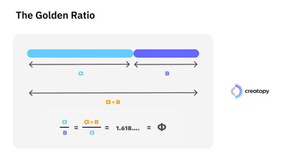
The golden ratio comes from a unique formula.
© Creatopy, Fair Use
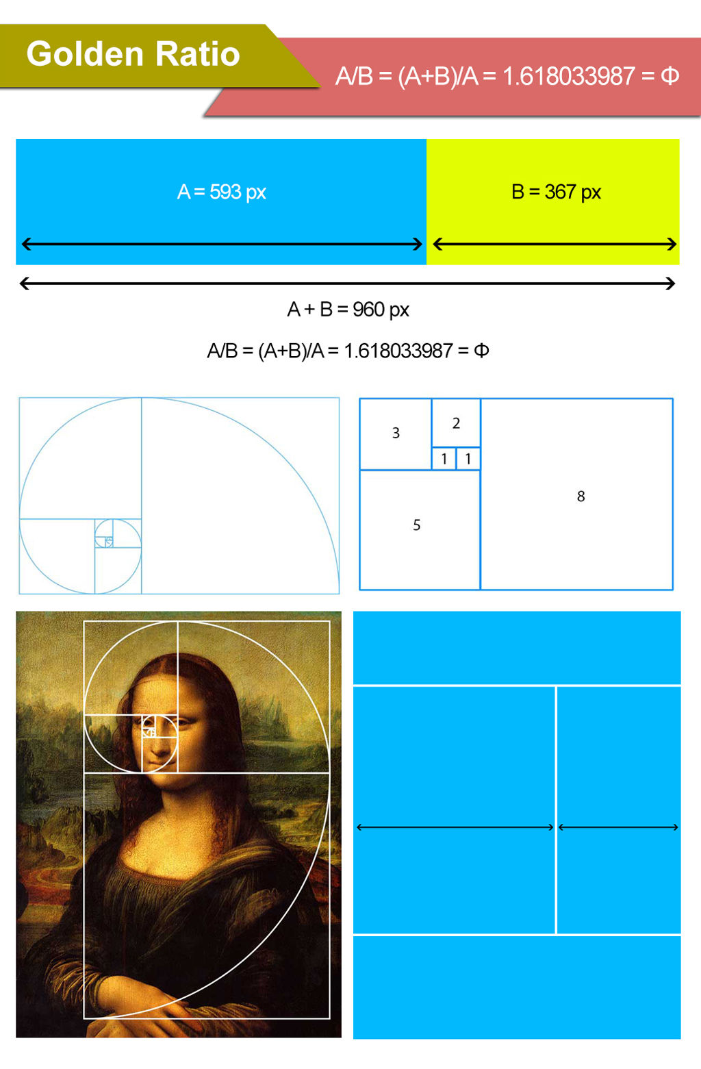
However, the golden ratio has another unique characteristic. The ratio of the sum of the quantities to the larger quantity is the same as the ratio of the larger quantity to the smaller one. This simple—yet fascinating—relationship creates a unique sense of balance and proportion. It’s also aesthetically pleasing to the human eye. This visual phenomenon comes from the “golden” proportions of 1.618 to 1, or 1 to 0.618 (approximately). So, a screen with these respective lengths makes a “golden rectangle.”

The Golden Ratio's classic proportions.
© Nielsen Norman Group, Fair Use
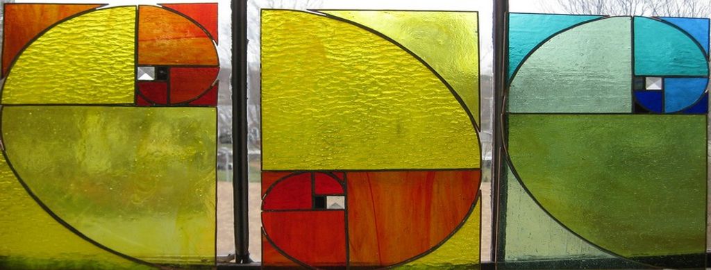
Another quirk of this unique visual relationship is that designers also apply it in slightly more complex ways. A common technique is to use it as a logarithmic spiral—or “golden spiral.” For instance, designers can take a length of 55 units as a starting point. Then, they can draw inwards to reach a length of 34 units when they pass that starting point. As they continue inwards and inwards with lengths of 21, 13, 8, 5, 3, 2 and then 1, a “golden spiral” is what appears. Such a spiral is more interesting to look at than one that's equally spaced. Yet, the phenomenon includes something else. Research has shown that the human eye also processes images constructed with the ratio more quickly.

Golden ratio rectangles, showing the properties of the golden proportions, including the golden spiral (bottom right).
© Company Folders, Fair use
The Golden Ratio in Nature, History, Art and Culture
Examples of the golden ratio exist in nature, and they turn up in many other parts of the physical or real world. Living things that exhibit it include pine cones—with their patterns—and nautilus shells’ spirals. Proportions of the human body can also show the ratio, and these idealized forms often appear in art.

Signs of the golden ratio abound in nature. In this flower example, the golden spiral is evident.
© Amalia Madalina Pop, Fair Use
The golden ratio has been featuring in design and design elements for millennia. The Great Pyramids of Giza are among the earliest structures with proportions that reflect the golden ratio. Certainly, the ancient Greeks recognized its aesthetic appeal and showed their appreciation of it. They called it the "divine proportion"—and applied it in classical structures such as the Parthenon. As a principle, the ratio was familiar to philosophers and mathematicians—Pythagoras and Euclid, for example. Around 300 BCE, Euclid mentioned this principle in his Elements.
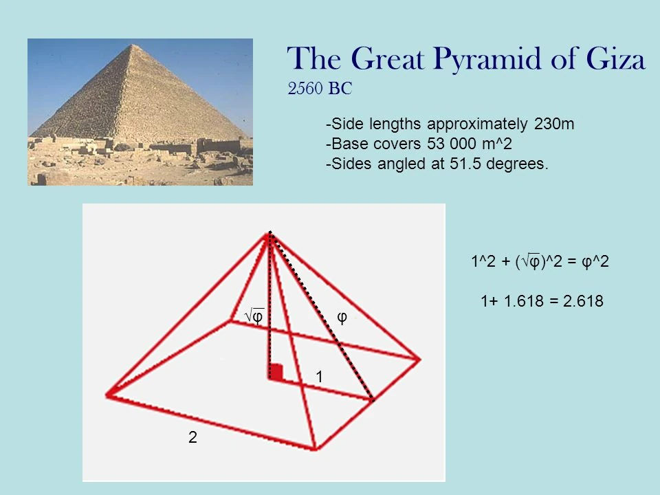
In the case of the Great Pyramid, the ratio of the slant height to half the base length is 1.6804, very close to the golden ratio.
© Prof. L. Kaliambos, Fair Use
The Renaissance saw a resurgence in the use of the golden ratio—mathematician Luca Pacioli was at the forefront. Perhaps most notably, Leonardo da Vinci employed it to create balanced and harmonious works of art. This is evident in the Mona Lisa, for instance. Da Vinci referred to the golden ratio as the "sectio aurea" or the “golden section.”
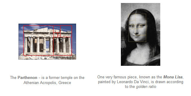
The Parthenon and Mona Lisa – two very different expressions of art and culture emerging from different civilizations and eras, but both make use of the golden ratio.
© Cubet, Fair Use
The golden ratio remains one of the most fundamental principles of art. Vincent van Gogh and Salvador Dali were among the legions of artists to put it to use since da Vinci. Nonetheless, it has a proven track record in creating a sense of visual harmony for all types of viewers far beyond art galleries. What's more, it continues to influence a wide range of fields outside of painting and sculpture. These include architecture, photography—and, indeed, design. The golden ratio is synonymous with good design and the design industry in general. Among the many design areas where the ratio does feature (including gardening) are graphic design and user interface (UI) design.
How The Golden Ratio Features in User Interface Design
The field of user experience (UX) design reflects the world around the human viewers who live in it. For users to enjoy intuitive experiences with digital products, designers must mirror the patterns and dynamics which the people who use their products find familiar. That's to say, they must match the users’ mental models. Among the design principles they apply, the golden ratio stands out with its inherent sense of balance and harmony. Indeed, for web design and other user experience design aspects, it offers a time-tested formula. Designers apply it to help them create interfaces that are intuitive and engaging—and visually appealing.
However, these designs are more than technically well-formed with their well-proportioned, balanced compositions that maximize usability. When designers and web developers use the ratio well, they can draw viewers’ attention and instill positive, warm emotions in them. So, brands that feature such harmonious designs can cause these to resonate deeply with their users. This can happen on a uniquely subconscious level—one that earns trust while it pleases and helps users achieve their goals.
As a vital part of visual design, the golden ratio is a particularly helpful design aid in the “mobile first” era. More users access digital products on mobile devices than on desktops—and the trend continues. Especially when the screen real estate is small, the ratio provides a needed framework for guidance. With it, design professionals can create balanced and harmonious layouts, typography and images even on the smallest screens. Together, these visual elements work to enhance the overall user experience and keep users on board. On top of that, a layout with such “pleasant” proportions can go a long way to keeping users calm when they’re distracted. Even when they’re in potentially stressful conditions, users can appreciate the sense of order such designs give them.
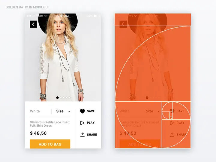
The golden ratio at work in a mobile design; note the application of the golden spiral.
© Mariya Tereshkova, Fair Use
Designers can make the best of their designs particularly when they strive to:
Achieve Balance and Harmony
One of the key principles of the golden ratio is balance. When they follow the ratio's proportions, designers can ensure that their designs are indeed visually balanced. They set elements out in a way that feels natural and harmonious. This balance creates a sense of order and coherence for users. It makes it easier for them to navigate and understand the interface—even at a glance.
Create Visual Hierarchy
Visual hierarchy is an essential part of guiding users' attention and helping them prioritize information. A design can stand—or fall—on its information architecture. Designers use the golden ratio to help them establish visual hierarchies within the web pages and app screens they create. They do it from determining the relative sizes and positions of different elements. For instance, for typography, designers use the ratio to create a clear distinction between headers, subheadings and body text. This makes it easier for users to scan and understand the content.
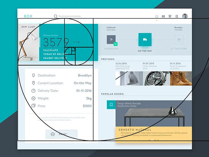
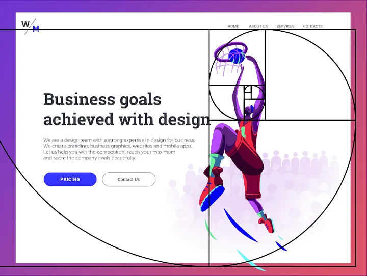
This web template shows the golden spiral at work.
© Tubik UX, Fair Use
Enhance Aesthetic Appeal
Aesthetics play a crucial role in user experience—by nature. Users are more likely to engage with a visually appealing interface. This phenomenon refers to the aesthetic usability effect. The effect states that users will typically perceive visuals that are well-structured as being more usable—no matter what. People like pretty things, which the golden ratio can help achieve. As they apply the ratio to the layout, typography and imagery, designers can cast a certain “magic.” This aesthetic appeal doesn't just attract users; it enhances their overall experience with the product or service as well. Plus, it can be a lasting part of their pleasurable memory of it—something that prompts them to return time and again to a clean, alluring digital product.
Foster a Sense of Familiarity
The golden ratio is a part of the human experience that goes back through many centuries. As a result, it's become an ingrained part of how people perceive beauty and harmony. As they incorporate the golden ratio into their design work, UX designers tap into this sense of familiarity. They can make an interface feel more natural and intuitive to their users. So, users can feel more comfortable and confident when they're interacting with it. That speaks to trust on a level that's deep-rooted. It serves as a strong foundation for design teams to build towards compelling calls-to-action, easier conversions and—vitally—long-term customer loyalty.
Google’s familiar look is a golden one, even if it is multicolored.
© Golden Number, Fair Use
Optimize Logo and Icon Design
Logos and icons are integral parts of a brand's identity, and their design often involves the golden ratio. When they design logos or icons, designers should consider using the golden ratio to establish the proportions and shapes. If they make sure that elements of the logo or icon are in harmony, they can create winning, memorable designs. This can help welcome and maximize user interactivity—and promote iconic status.
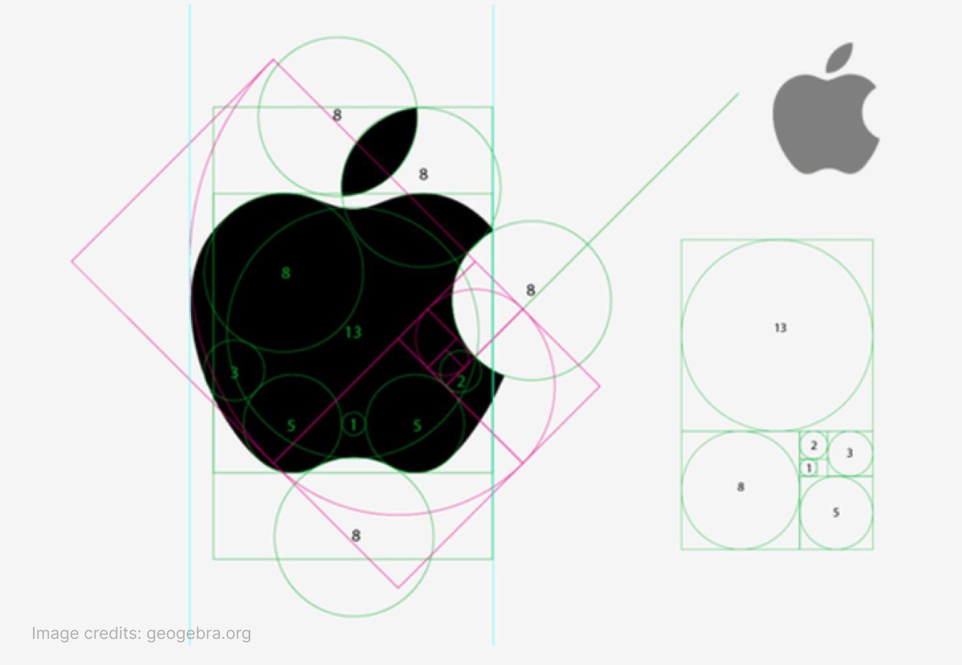
Famous brand images often show the golden ratio at work in their iconic simplicity.
Geogebra.org, Fair Use
How to Apply the Golden Ratio in Design
Key parts of using the golden ratio to enhance the overall user experience include:
Layout design
This determines an interface’s overall structure and organization. The golden ratio helps make better compositions overall and interfaces that are pleasant, calming and easy for users to navigate.
One common approach is to divide the layout into sections using the ratio. For example, a designer can divide a web page layout into a main content area and a sidebar. The main content area will be 1.618 times larger than the sidebar. This proportion creates a visually pleasing and balanced layout that guides users' attention to the most important content.
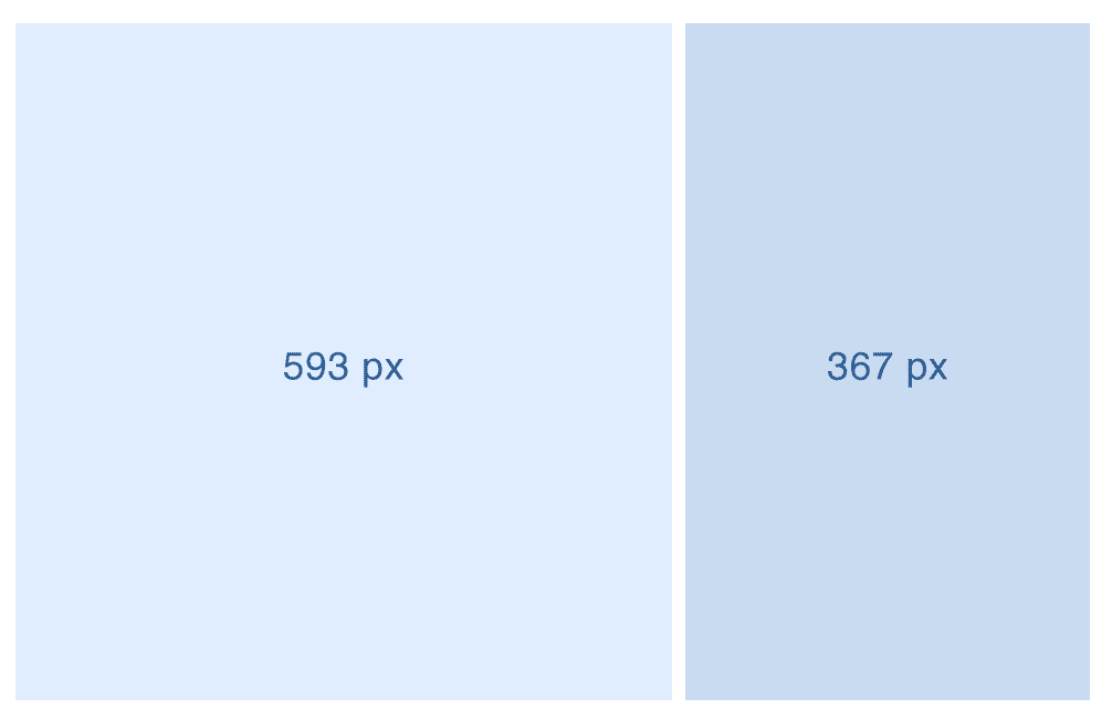
A simple approach to applying the golden ratio: to divide a layout width of 960 pixels by 1.168, gives 593 pixels – note the square (left section) making up the main part of the screen as a result.
© Cubet, Fair Use
Brands tend to establish their signature use of design principles. For example, National Geographic’s web designs incorporate unique applications of the golden ratio.
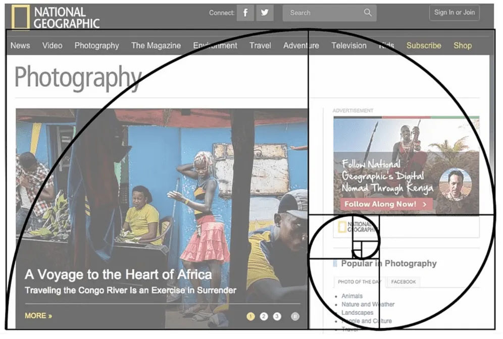
Another example of National Geographic’s use of the principle.
© Apiumhub, Fair Use
Typography
Good typography plays a crucial role in UX design. Wise choices help create visual hierarchy and improve readability. Designers can establish harmonious proportions between different typographic elements when they use this ratio. They can create a typographic hierarchy that’s balanced and pleasing to the eye. This hierarchy lets users easily distinguish different levels of information and notice important copy more easily.
For instance, imagine the body text has a setting of 10pt. Then, to apply the golden ratio (i.e., to multiply by 1.618), a designer would have a header text size of approximately 16pt. This creates a visually pleasant contrast and hierarchy between the header and body text.
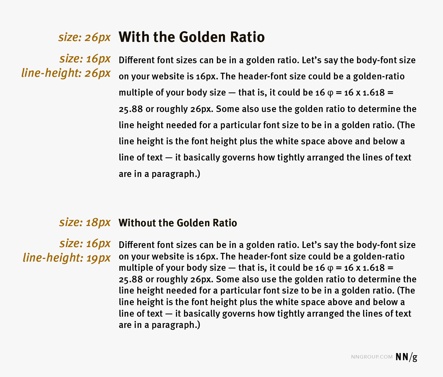
The differences between text according to the principle and text without. Note the improved readability in the former.
© Nielsen Norman Group, Fair Use
Image Resizing and Cropping
The golden ratio can help maintain the balance and focus of the composition whenever designers crop an image. As they use the ratio to determine the proportions of the cropped image, they can ensure that the result works best as an image.
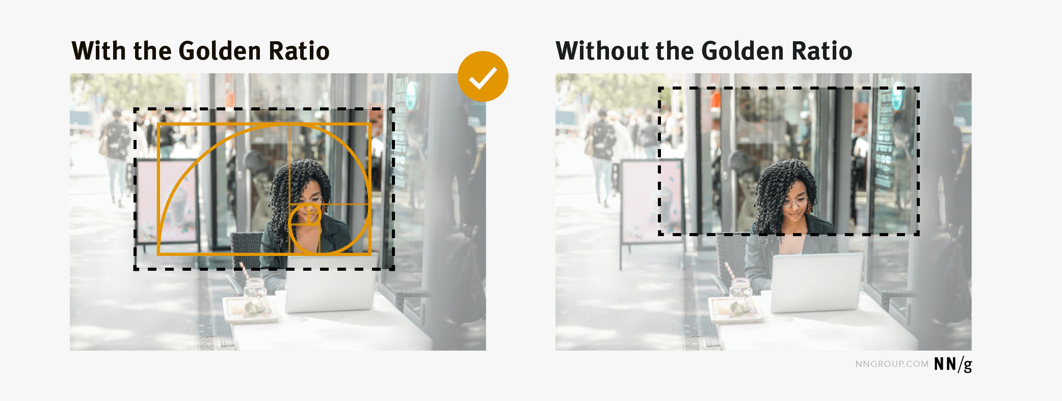
How to crop according to the golden ratio.
© Nielsen Norman Group, Fair Use
To create visually appealing and balanced compositions, designers can overlay the golden spiral on an image. They can then determine the most effective cropping strategy to keep balance and focus on the image's key elements. The goal is to align the focal point or main subject of the image with the spiral's center. Designers can then make a composition that feels balanced—and grabs the viewer.
White Space
This is a vital part of any design. It helps to create balance and harmony between different elements on a page. It also gives much-needed “breathing space.” When a designer applies the golden ratio, it makes it easier to determine the ideal white space proportions for a design. For example, if one element is 8px (pixels), then the white space around it should be 13px (8 x 1.618). This ensures that there’s enough space between elements. The result is a strong sense of balance and unity in the overall design.
White space, another essential UI design ingredient, at work in this Digital Agency landing page.
© Tubik, Fair Use
Tools to Apply the Golden Ratio
Many online tools are available. These programs and services can help calculate the proportions and generate templates. They can also provide visual feedback to ensure that designers apply the golden ratio quickly and in the best way for them. What's more, they permit the input of measurements for elements like fonts, images and white space. As well as this, they'll tell the exact proportions needed for each element to ensure the design looks balanced and pleasant.
The following software examples are among popular choices that help designers achieve good-looking designs that can win their products' users over time and again:
PhiMatrix: This software provides customizable grids and templates that designers can overlay on designs to make sure they apply the golden ratio accurately.
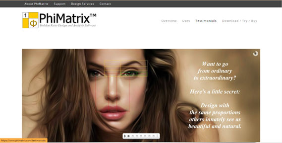
PhiMatrix is a popular and effective choice for applying the golden ratio.
© PhiMatrix, Fair Use
Adobe Illustrator: A popular vector graphics editor—it lets users create designs and illustrations while it provides tools to calculate and apply the golden ratio.
Sketch: This digital design tool provides plugins and features that enable designers to leverage the golden ratio in their design work. It provides a free Sketch file that includes the golden spiral to use as a guide for image and layout composition.
Figma: This collaborative interface design tool offers plugins and features that let designers calculate and apply the golden ratio in their design projects.
Golden Ratio Typography Calculator: This tool helps designers to determine the ideal typography sizes based on the golden ratio.
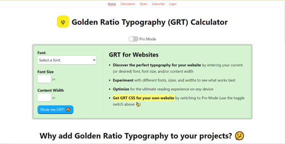
Golden Ratio Typography Calculator is another popular solution for applying the principle.
© Golden Ratio Typography Calculator, Fair Use
Overall, the golden ratio resonates with the human eye since it’s such an integral and time-tested principle. Designers who apply it accurately can help themselves and their brands to enjoy success with user interfaces that look great and work well—whatever the user scenario may be. The key part is that these designs are engaging and resonate with users on a subconscious level—one that builds trust and helps secure conversions. In any case, it’s essential for designers to treat the golden ratio wisely—as a tool in their design process, not a set-in-stone rule to follow regardless.