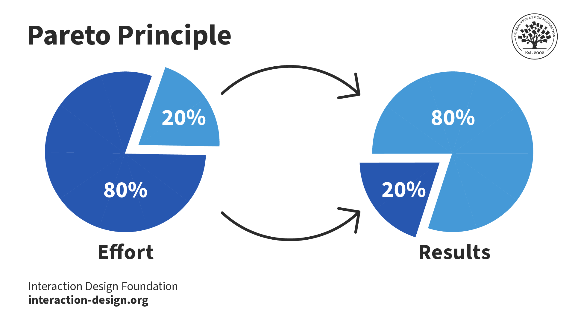
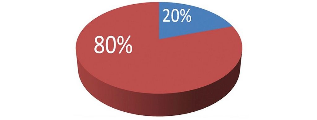
The Pareto principle—or the 80/20 rule—is a concept that states roughly 80% of the effects come from 20% of the causes. This proven principle is invaluable in various fields—including user experience (UX) design. When designers understand and apply the Pareto principle, they can optimize their designs, prioritize their efforts and boost the user experience overall.
© Interaction Design Foundation, CC BY-SA 4.0
Why is the Pareto Principle Important in UX Design?
The Pareto principle’s origins came from the observations of Italian economist Vilfredo Pareto in the late 19th century. Pareto had noticed that approximately 80% of the land in Italy lay in the hands of just 20% of the population. This pattern of uneven distribution later was something that became applicable to a wide range of many other scenarios—including UX design—hence the name the Pareto principle for this valuable design tool.
In the context of UX design, the Pareto principle suggests that a small percentage of features or elements in a product or website contribute to the majority of its impact. When UX designers find and focus on these key elements, they can place their resources effectively and improve the overall user experience.
In a fast-paced digital landscape, users enjoy an abundance of choices. So, it’s become crucial for designers to provide not just a good user experience—but an exceptional one for their users and customers. The success of any product or service firmly depends on how well designers can accommodate what users expect—and how well they can gear their design offerings around how users feel.
The Pareto principle helps designers and design teams prioritize their efforts and resources. That way, they can deliver the most impactful user experience in the final product. These are key areas:
Efficiency: When designers see that a small number of key elements are instrumental to achieve a great portion of the desired outcomes, they can optimize their workflows and use their time and resources more efficiently.
User satisfaction: When designers focus on those essential features that give users the most value, they can create a seamless and intuitive experience—and one that meets users' needs and expectations. This targeted approach mirrors an accurate envisionment of how users engage in product experiences. So, it helps to enhance user satisfaction and raises how likely it is that a brand will retain users.
Simplicity: The Pareto principle encourages designers to streamline their designs and eliminate elements or features they don’t need. This leads to a cleaner and more focused user interface. It lightens cognitive load and makes it easier for users to navigate and interact with the product—key aspects of user-centered design.
Prioritization: The Pareto principle helps designers prioritize their design decisions based on what impact they’ll have on the user experience. As designers focus on the vital few elements, they can make sure their efforts stay in line with the most vital user needs and goals.
Usability testing: When designers engage in usability testing, they often observe that a small number of usability issues or pain points have a large impact on the overall user experience. When designers address these key issues, they can make their designs more usable and make most users feel more satisfied.

It’s important to isolate which 20% of functions users use 80% of the time.
© Anjana Ramesh, Fair Use
How do UX Designers use the Pareto Principle?
UX designers can leverage the Pareto principle throughout the design process on the way to creating more effective and user-centric experiences. The overall strategy is to:
1. Identify
Designers should find the vital few features or elements that have a profound impact on the user experience. They can do this through user research or UX research, data analysis and user feedback. If designers understand the core needs and preferences of their target audience, they can work out which aspects of the product or service are most important to them.
2. Optimize
Once a designer has identified the vital few elements, it’s time to optimize them so they can make the maximum impact. This calls for the designer to refine the design, improve usability and make the overall user experience the best it can be. If designers focus their efforts on these key areas, they’ll be better placed to deliver a far more satisfying and engaging user experience. What’s more, they can do that without getting overwhelmed by trying to improve every aspect of the product or service—such as through every single visual element.
3. Streamline
Another way to work the Pareto Principle into UX design is to streamline and simplify the product or service. When designers take out the features they don’t need, lessen complexity and emphasize the most important functionalities, they can make a more intuitive and user-friendly experience for their users. This improves usability—plus, it lightens the cognitive load. So, it makes it easier for users to do what they want.

Hotel reservations website LateRooms took data analytics and user testing to find that 98.6% of users didn’t use the menu, with 98.9% ignoring their prominent popular destinations content.
© Keep It Usable, Fair Use

LateRooms redesigned the home page to concentrate on the function users performed most when coming to the website: to search. They accentuated the search feature and removed distractions to produce a clean look that proved popular with users, and that embodies the Pareto principle.
© Keep It Usable, Fair Use
Tips and Best Practices to Use the Pareto Principle
To make the most of the Pareto principle in UX design, designers should consider some points:
1. Conduct Solid User Research and Analysis
It’s vital to understand the key aspects that influence the user experience; that’s why designers should conduct thorough research and analysis. Designers need to look at user behavior, feedback and data. From there, they can find that vital handful of elements that have the greatest impact on user satisfaction and engagement.
There are techniques such as user interviews, surveys and usability testing. Through these, designers can gain valuable insights into user preferences, pain points and behaviors. This information helps them prioritize those design elements that will have the deepest impact on the majority of users.
2. Prioritize Information Architecture and Content Strategy
The Pareto principle works as a guide for designers to organize and structure information effectively. Designers work to find those key bits of content and features that users rely on the most. Then, they can make sure that these elements are easily accessible and show up prominently for users.
Designers can use techniques such as card sorting and tree testing to work out which information architecture works best. With this approach, it means that users can quickly find the information they need. So, it lowers their frustration levels—while boosting their overall user experience.
UX Strategist and Consultant, William Hudson explains tree testing in this video:
3. Optimize Visual Hierarchy and Interface Design
In visual design, the Pareto principle is something that can help designers prioritize how they put—and emphasize—key elements on the interface. When designers give a sense of prominence to those vital few elements, they can guide users' attention—and make sure that they focus on the information or actions that are the most critical ones.
Designers can use techniques like color contrast and attention to color schemes, size variation and visual cues to highlight which elements are important—and create a clear visual hierarchy. This approach will make users more able to scan and navigate their interface efficiently.
4. Embrace Iterative Design and Continuous Improvement
The Pareto principle isn’t a one-time application—it’s an ongoing process of refinement and optimization instead. Designers should continuously check on the user experience and iterate on the design from the user feedback and data analysis they gain and do.
As designers make a priority of the most impactful changes or improvements, they can make sure that their efforts have the maximum effect on the user experience. It’s an iterative approach that permits continuous improvement. It also acts as a kind of insurance that the design remains aligned with user needs and expectations.
5. Take a User-Centric Approach
Designers should prioritize their target users’ needs and goals—every time. It’s vital to spot the key elements that are in line with what the users expect and optimize those elements—a key to delivering a truly seamless and satisfying user experience.
6. Use Data-Driven Decision-Making
Designers should base their design decisions on rock-solid user research, data analysis and feedback. It’s vital to leverage quantitative and qualitative data to spot the vital few elements. These are the elements that have the largest impact on user satisfaction and engagement.
7. Collaborate and Communicate Well
It’s crucial to nurture a productive collaboration between UX designers, stakeholders and development teams. That’s how to make a shared understanding of the vital few elements and their importance a reality. Effective communication and collaboration—especially between how design and development team members gel together—are a large part of how to align efforts and make for a cohesive user experience overall.
8. Make the Most Used Features Most Accessible
Users should be able to find and use the most used features in a digital product—and easily so. For example, in a mobile app, designers can cluster or group the most commonly used features at the bottom navigation tab.
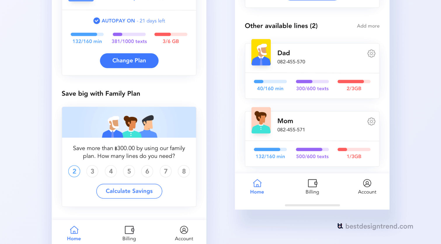
The three features that users use the most for this Mobile Operator app appear at the bottom navigation, for ultra-easy access.
© Shirish Shikhrakar, Fair Use
Risks and Considerations about the Pareto Principle in UX Design
The Pareto principle indeed has a great deal to offer as a tool in UX design—still, it’s essential to think about some potential risks and limitations that may come with it:
Contextual variations: The distribution of the vital few elements may vary; it depends on the specific context, target audience and industry. So, it’s vital that designers become—and stay—mindful of these variations and tweak how they apply the Pareto principle accordingly.
User diversity: If designers design for the majority of users, they may end up neglecting the needs and preferences of minority user groups—by accident. That’s why it’s important to strive for inclusivity and consider different user segments. This is one way to make sure a comprehensive and equitable user experience happens.
Oversimplification: If designers focus just on the vital few elements, it may work against the overall user experience—and make it too simple. Designers should be cautious about this; they shouldn’t sacrifice important secondary elements that contribute to the overall richness and depth of the user experience.
Evolution of user needs: User needs and expectations do evolve over time. So, it’s critical to regularly reassess the vital few elements so designers can be sure that these remain in line with changing user behaviors and preferences.
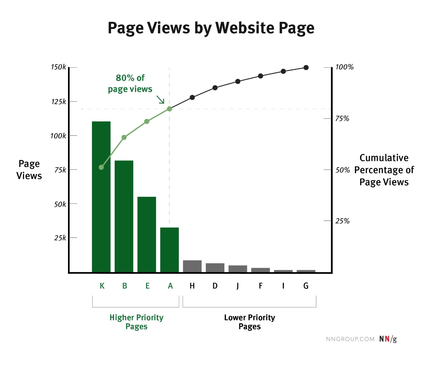
In quantitative research, for example, the Pareto principle is useful, as it charts the metric by category (the page views per page). A line plot graphs the cumulative percentage of the metric by category (the percentage of the page views due to the current page and to all the pages with larger page-view counts).
© Evan Sunwall, Fair Use
Overall, the Pareto principle is a valuable concept—and tool—and one that can greatly benefit designers as they seek to optimize the user experience. Even so, it’s crucial to consider the contextual variations, user diversity and the evolving nature of user needs. That’s a key part of how designers make sure of a comprehensive and inclusive user experience. When designers leverage the Pareto principle and apply it thoughtfully, they can create exceptional experiences—experiences that drive true user satisfaction and business success.


 Author/Copyright holder: Pixabay. Copyright terms and licence: CC0
 Author/Copyright holder: Corinna Duron. Copyright terms and licence: Public Domain.