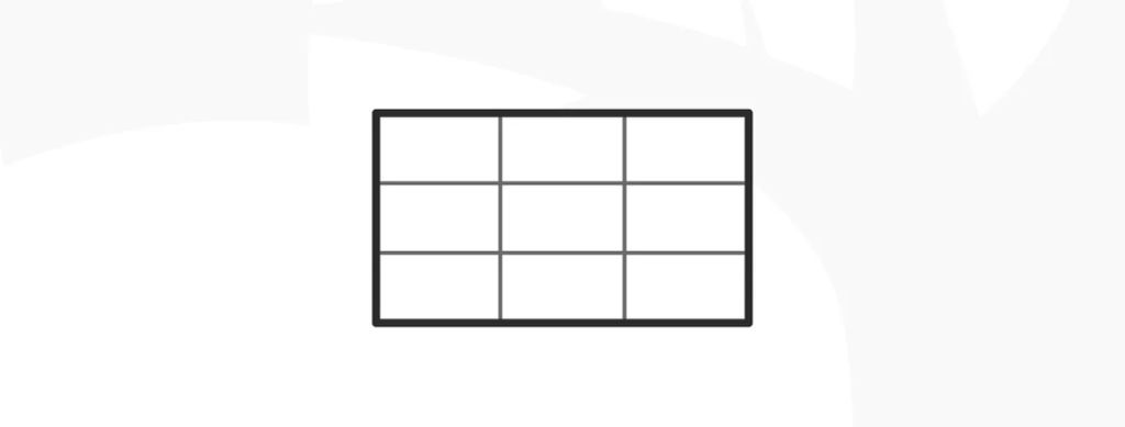
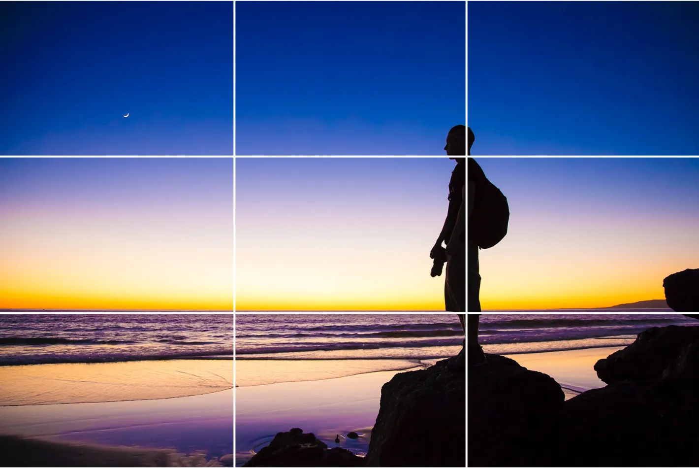
The rule of thirds is a design technique where designers divide a layout into nine equal parts through two equally spaced horizontal lines and two equally spaced vertical lines. This technique makes sures key elements—like images, text or calls to action—appear along these lines or at their intersections, and so boost user engagement and make a balanced, visually appealing interface.
© Interaction Design Foundation, CC BY-SA 4.0
Why is The Rule of Thirds Important in Design?
The rule of thirds has deep roots in the theory of proportions. That theory emphasizes the relationship between individual components—micro—and the overall structure—macro—in design. The rule of thirds comes from Painter and Engraver, John Thomas Smith's 1797 insights in Remarks on Rural Scenery, and it’s evolved to become a cornerstone of design alongside the golden ratio and the rule of proportions.
Designers, photographers and others who work in the visual arts have applied the rule of thirds design principle in works that are both captivating and effective—to create a sense of harmony, intrigue and more. These compositions feature strategically placed elements along the grid lines or their intersections—or the “sweet spots”—to whet visual interest and create balance. For example, the rule of thirds in graphic design is a staple technique of visual communication, one that can access viewers in a storytelling manner—or arouse their interest in other compelling ways.
The rule of thirds is a design staple that speaks volumes through the compositions it frames.
Unsurprisingly, the rule of thirds is an essential visual design technique that features greatly in UX (user experience) design. Designers particularly value it as a way to help optimize the user experience in digital products such as web pages. When designers work on user interfaces (UIs), they use the rule of thirds to guide the eyes of their target audience naturally to the most crucial parts of a site or mobile app. They can therefore improve usability and aesthetic appeal as they help users establish a sense of order, intrigue and trust in their design works.
When designers get the rule of thirds working in their designs, they align key interface elements—such as navigation bars, call-to-action buttons and key information—along these strategic points. Here are the main benefits of the rule of thirds in UI design:
1. Visual Hierarchy, Harmony and Balance
Designers use the rule of thirds to establish a clear visual hierarchy in their web design work and elsewhere. This arrangement helps them highlight the most crucial elements there, like call-to-action buttons or key information. It makes them easily accessible and noticeable for users.
The rule of thirds helps make a balanced composition, too. When designers distribute elements evenly across the grid, they can stop themselves from overcrowding a design—and make sure that each component receives adequate space to “breathe.” This technique enhances how clear and readable the interface is overall. What’s more, when designers apply the rule of thirds across websites they design, it can give a really consistent and professional look to their work.
2. Enhanced User Interaction and Conversion
When designers put elements strategically around a screen with the rule of thirds, it doesn’t just capture user attention. It guides users’ interactions across the interface, too. This guidance is something that can greatly improve both the navigation and usability. And it can lead to better user engagement—as well as potentially higher conversion rates. For example, if designers place a primary call-to-action at an intersection point within the grid, it can draw users’ eyes towards it—and naturally so. So, users will be much more likely to interact with the call-to-action.
The rule of thirds can really help improve the user experience whenever users encounter static elements like information architecture on a webpage. Still, it also applies to dynamic elements in interactive designs, where user focus is absolutely critical.
© lovish verma, Fair Use
3. Adaptability Across Devices
Another great advantage of the rule of thirds lies in its flexibility and effectiveness across different screen sizes and orientations. This adaptability is something that’s crucial in responsive design—where user interfaces have to function seamlessly across a range of devices from desktops to smartphones. With the rule of thirds, designers can create layouts that keep a high level of visual appeal and functionality, whatever the device. This makes sure users can have a consistent user experience—everywhere.
4. Enhanced Visual Interest
The rule of thirds also encourages designers to experiment with asymmetry so they can make layouts that are more dynamic and visually interesting. For instance, designers can place an image near two-thirds of one side rather than center it. That way, they can break the monotony of a symmetrical design. This adds an element of surprise and visual interest, and the technique’s particularly effective to draw the user's eye to specific areas of the screen. It gives a boost to both the design's aesthetic quality and its functional efficiency, too.
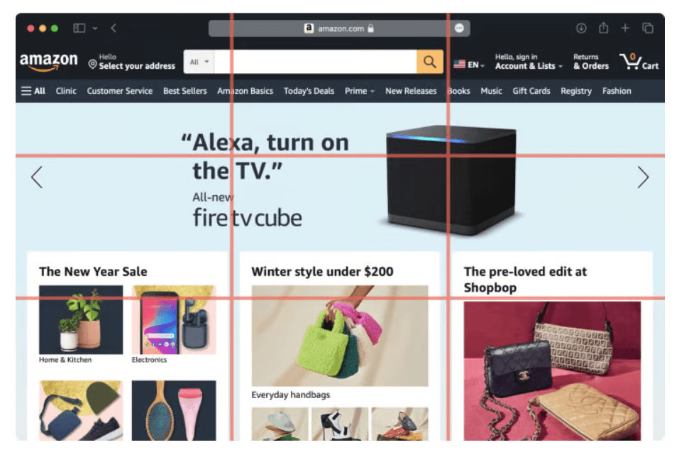
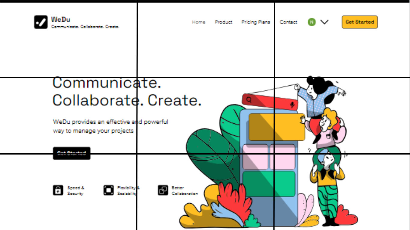
Amazon structures its homepage around a grid that’s divided into nine equal parts—leveraging the rule of thirds to make the best visual flow and user engagement.
© Angela Fabunan, Fair Use
How Do Designers Apply the Rule of Thirds in Website Design?
UI designers use the rule of thirds in website design to organize and position elements effectively, and here's how they do it:
1. Layout Composition
Designers put key elements like logos, navigation menus and call-to-action buttons at the intersection points—or along the lines. This makes for a layout that’s more balanced and visually engaging.
2. Content Placement
Designers often place images, text blocks and other content in a way that goes in line with the rule of thirds grid. They draw users’ attention to the important content and make a natural flow for their eyes to go with.
3. Visual Hierarchy
When designers align important content or interactive elements with the intersecting points or lines, they can establish a visual hierarchy that’s clear—and guide the user's focus to specific areas of the website.
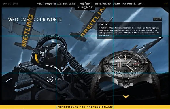
Breitling watch’s design balances many elements well on one screen.
© Camren Browne, Fair Use
4. Balance Negative Space
Designers use the rule of thirds to make sure there’s an optimal distribution of negative space or white space. This can boost the readability—and overall user experience—of the design.
5. Responsive Design
When designers create content for different screen sizes, the rule of thirds helps them keep a balanced composition and adapt the layout effectively across various devices.
CEO of Experience Dynamics, Frank Spillers explains responsive design:
Advanced Techniques and Examples
For more sophisticated applications, designers might choose to use variations like focusing on just the columns or rows of the grid. This can help them put emphasis on specific aspects of the content more strongly.
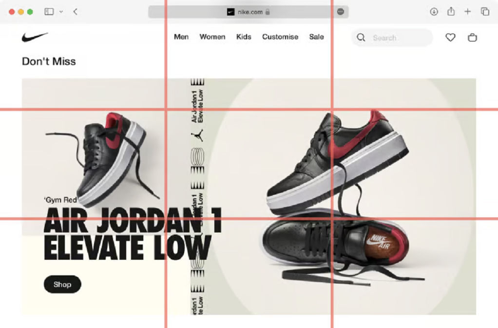
Nike utilizes the rule of thirds by making sure that these focal points really grab the viewer's attention.
© Angela Fabunan, Fair Use
Step-by-Step Guide to Implement the Rule of Thirds
To design rule of thirds compositions well, designers can follow these steps:
1. Establish the Grid
Designers should set up a basic grid on their design canvas—one that divides the space into nine equal sections. That grid will serve as the foundation for them to strategically place the design elements. It’s important to make sure that the grid lines are even in spacing both horizontally and vertically so they create a balanced layout.
2. Place Key Elements
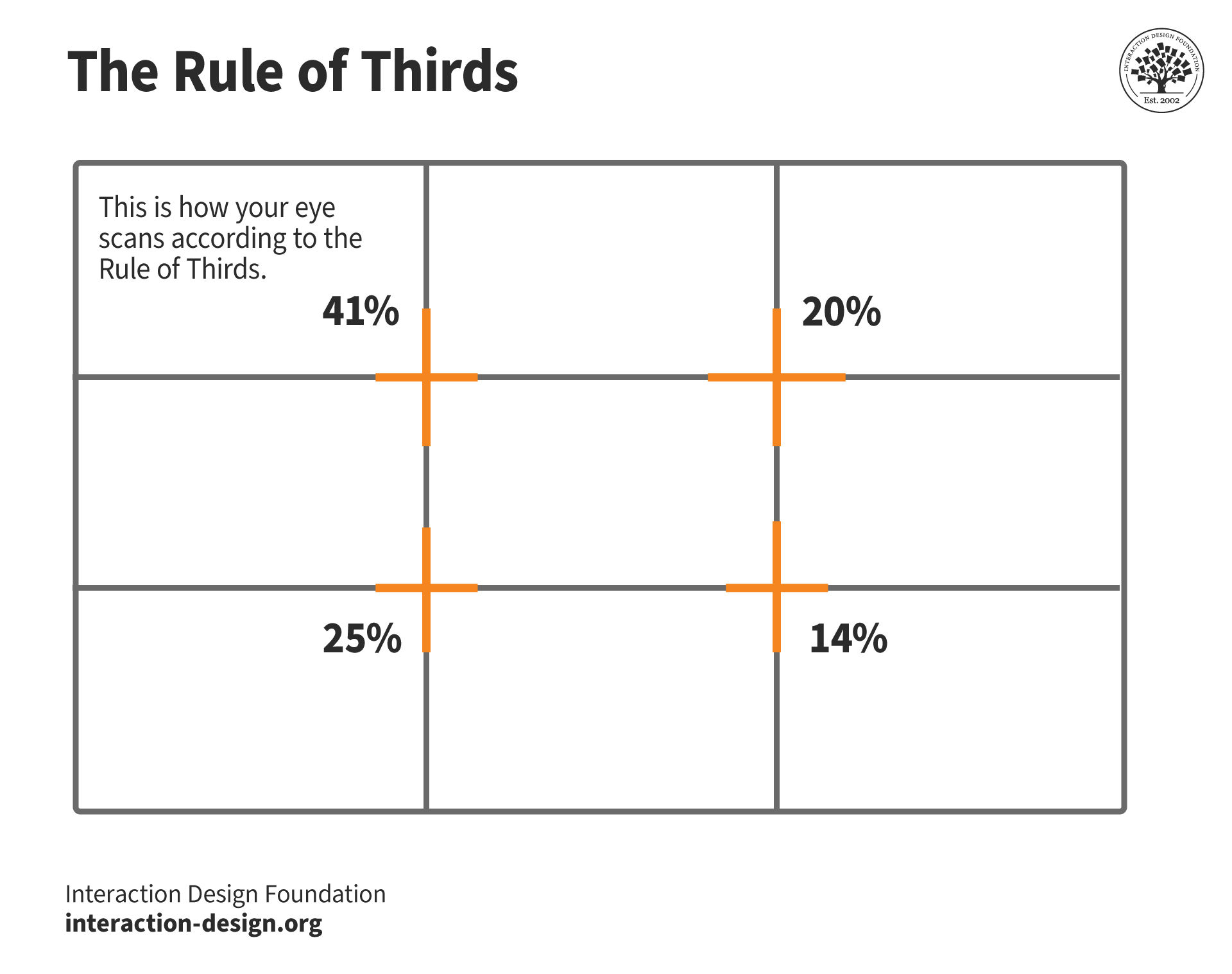
Designers should focus on positioning important elements—like logos, navigation menus, call-to-action buttons and key content—at the intersections of these grid lines. These points typically attract the most viewer attention, and they can give a great boost to the design’s visual impact. The top-left intersection—for example—gets the highest visual attention at over 40%. That makes it an ideal spot for the most important information or interactive elements to go.
3. Use Visual Weight and Balance
Designers should distribute elements across the grid to keep a visual balance. Avoid overcrowding any one part of the grid, especially the intersections. The rule of thirds encourages not just the placement of elements at the intersections but along the lines themselves, too. That can help them achieve a well-proportioned and aesthetically pleasing design.
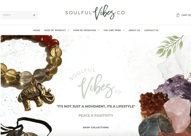
This design’s main focus—on the crystal rocks and the beaded bracelet with an elephant—is on the left and right thirds sections, and that makes sure the visitor focuses on the center text itself: "It's not just a movement, it's a lifestyle."
© Caroline Forsey, Fair Use
4. Apply the Rule in Photography and Graphics
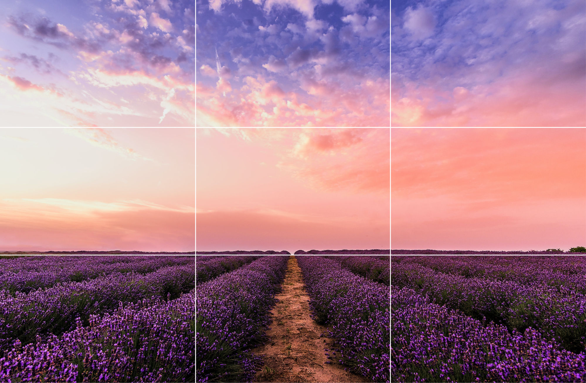
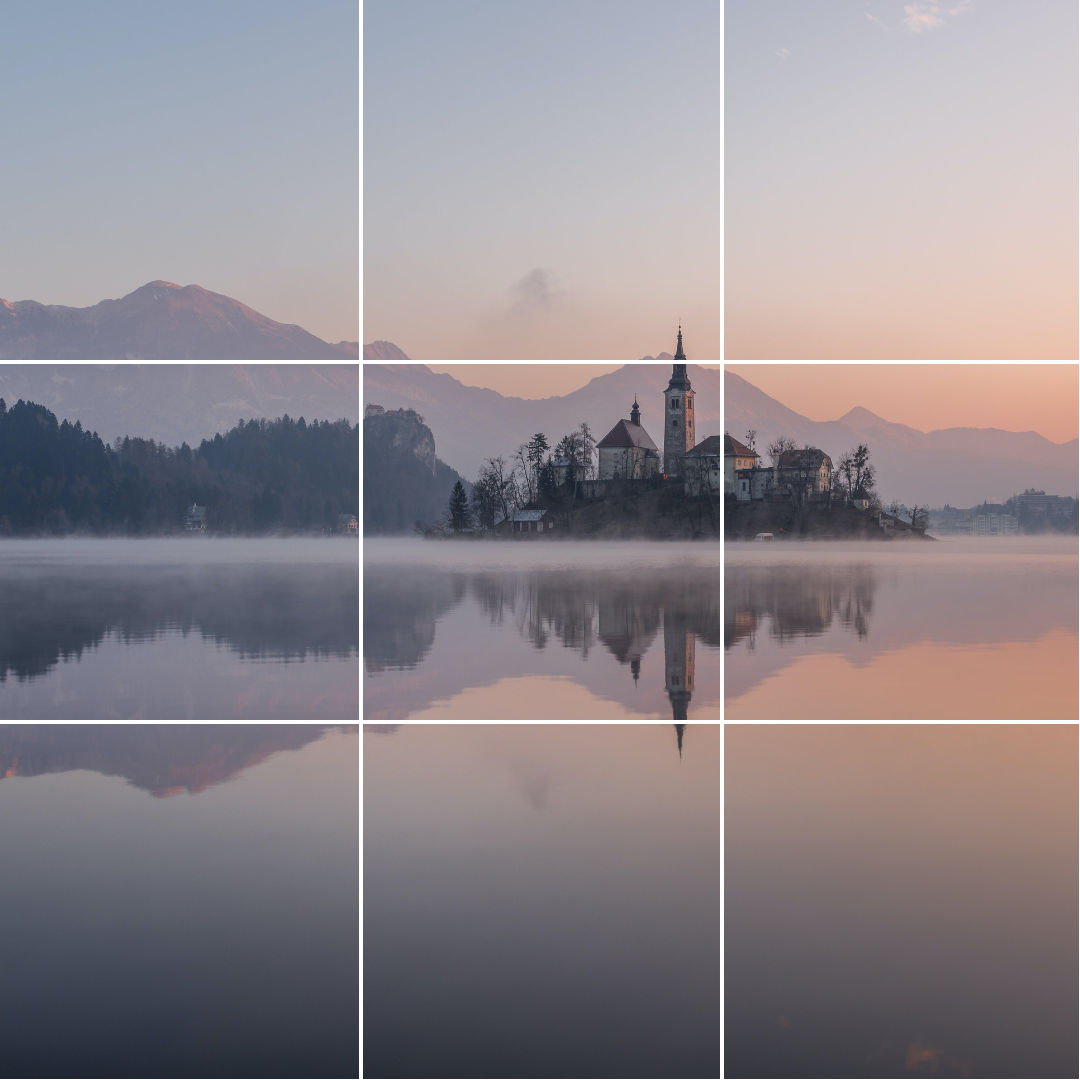
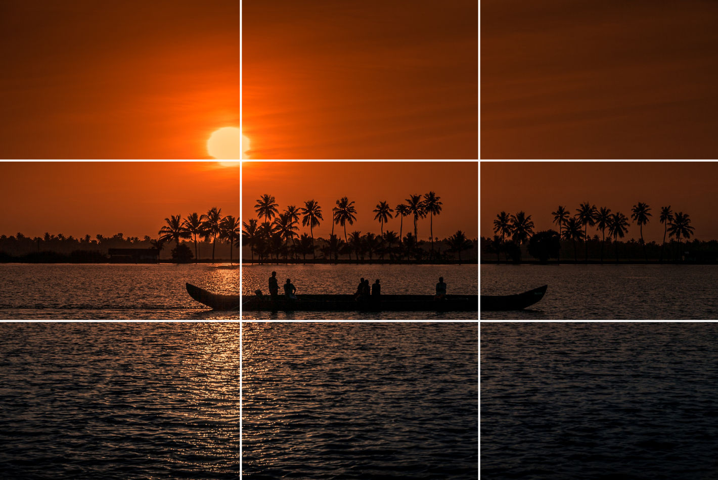
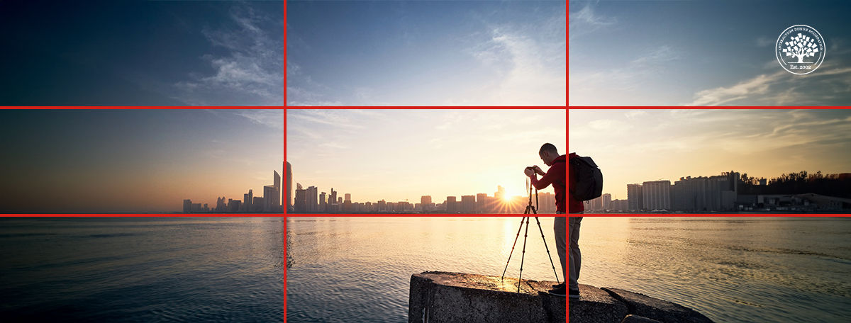
When designers work images or graphical elements into their designs, they should line the subject or focal point up with the grid intersections or along the lines. This technique is crucial not just in UI/UX design but in photography, too, where the rule of thirds is a foundational skill. For example, in a landscape photo, to run the horizon line along the top or bottom horizontal grid line—and not the center—can make for a more captivating composition.
5. Practice Continuously and Make Adjustments
The best way to master the rule of thirds is to keep at it with continuous practice—and experimentation. Designers should apply this rule in different projects and see how it changes their design’s visual appeal as well as user interaction. They should use tools like cropping and re-aligning in post-production so they refine how they put elements according to the rule of thirds. What’s more, this can help them train their designer’s eye to naturally recognize these balance points in future projects.
6. Conduct Usability Testing
Designers can make sure how effective their rule-of-thirds web designs and other visual designs are when they do their user testing well. Regular feedback mechanisms—like A/B testing and heatmaps—can further refine how they apply the rule of thirds. These can help designers understand how users interact with their creations—and where they may need to make adjustments. When designers regularly revisit these principles and adapt them based on specific project needs and user feedback, it can lead to more refined and successful design outcomes.
UX Strategist and Consultant, William Hudson explains A/B testing in this video:
Software and Tools to Implement the Rule of Thirds
Designers can choose from numerous tools to implement the rule of thirds, including the following:
1. Grid Systems in Design Software
Design software like Adobe Photoshop, Illustrator or Sketch often include grid systems that allow designers to overlay a rule of thirds grid on their designs. This helps designers align and position elements according to the rule.
2. Grid Plugins and Extensions
Many design softwares offer plugins and extensions specifically for grid systems and composition, such as "GuideGuide" for Photoshop and "Grid Guide" for Sketch, which enable designers to create and align designs based on the rule of thirds.
3. Grid Generators
Online grid generators such as "Gridulator" and "Gridpak" let designers generate custom grid systems, including the rule of thirds—and download them to use in their design projects.
4. Grid Paper and Templates
Physical grid paper and printable templates with the rule of thirds grid are ideal for sketching and initial wireframing before designers move on to digital design software.
5. Mobile Apps
There are mobile apps specifically for applying the rule of thirds to photographs that smartphone users take. These apps overlay the grid on the camera viewfinder, helping photographers align their shots according to the rule.
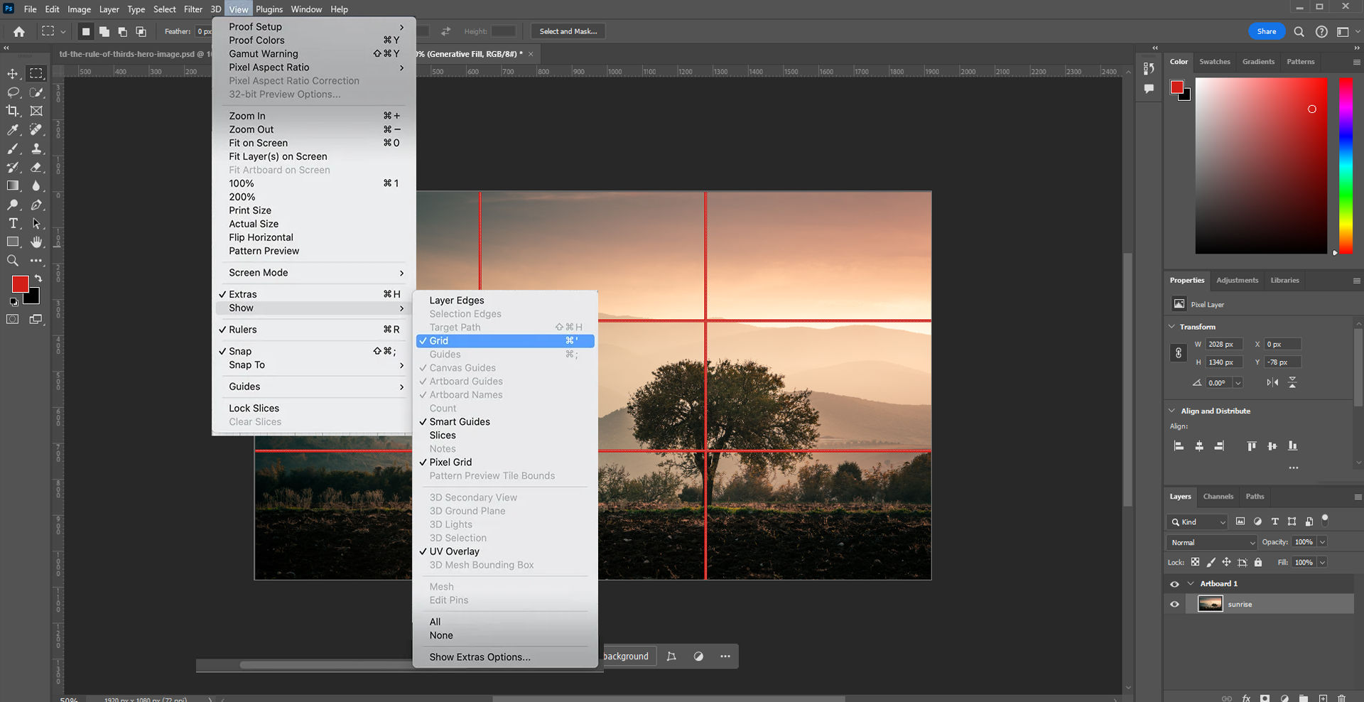
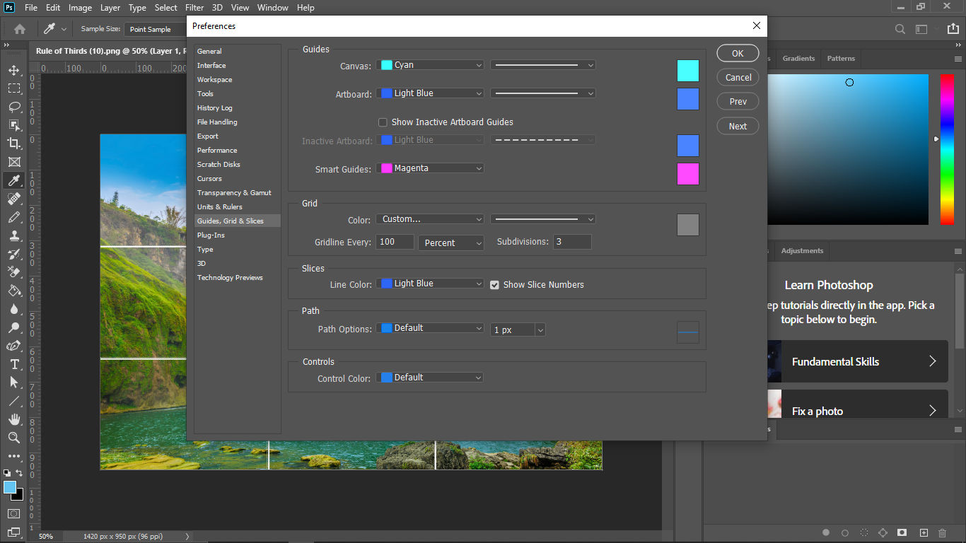
Photoshop features a handy way to apply the rule of thirds: click "View" → "Show" → "Grid".
Considerations and Risks about the Rule of Thirds
The rule of thirds is certainly a fundamental design principle in UX and UI design. Still, it’s crucial to be aware of potential limitations and risks that may affect just how effective a design ends up being. When designers understand these considerations, it can help them make decisions that are more informed—and potentially avoid common pitfalls.
1. Limitations in Creative Freedom
To rely too heavily on the rule of thirds may accidentally get in the way of a designer’s creativity. It might lead to designs that lack a unique feel and a personal touch. This overreliance can end up making interfaces feel standardized, monotonous—and uninspiring. Users will be less likely to take to experiences that don’t have the engaging effects they’re after.
2. Suitability for Various Design Approaches
The rule of thirds mightn’t always be the best choice for every design scenario. For instance, minimalistic interfaces—which thrive on simplicity and ample white space—or data-heavy interfaces—which call for a different approach to information hierarchy and layout—mightn’t benefit from strictly sticking to this rule.
3. Risks of Overcrowding and Clutter
Designers might feel tempted to put too many elements at the intersections of the grid—in the belief that doing so will capture users’ attention better. However, this can lead to a cluttered and overwhelming interface—one where the user finds it difficult to focus or find important information.
4. Balance and Composition Challenges
If designers use the rule of thirds incorrectly, it can result in compositions that are unbalanced and visually confusing. If designers fail to thoughtfully align elements—or if they misuse the grid—the overall aesthetic and functional quality of the design may suffer and harm the user experience.
5. Overemphasis on Aesthetics Over Usability
Indeed, it’s important to create designs that are very visually appealing. Even so, designers who overemphasize aesthetics at the cost of usability can end up making interfaces that are utterly beautiful—yet hard to navigate and understand. This misalignment often results in users who are frustrated and who may not engage deeply with the product.
6. Inflexibility Across Different Devices
The rigidity of the rule of thirds can sometimes work against its application across various screen sizes and resolutions. Designs that look perfect on a desktop might not translate well to smaller mobile screens. This can lead to issues in visual coherence and user interaction.
7. Content-Design Disconnect
If designers stick too strictly to the rule of thirds, they might make designs that don’t adequately consider the content they should display. This can make for a disconnect between what the design emphasizes and the actual information or functionality that needs to come across to users—which can potentially mislead users.
8. Accessibility Concerns
Designs that focus too heavily on aligning elements strictly according to the rule of thirds might overlook important accessibility considerations—like readable text sizes and easily clickable buttons. This oversight can make the interface less accessible to users with disabilities—and that’s a great risk in user-centered design.
This video explains why accessibility is such a vital concern in design:
Designers should note that to break away from the rule of thirds can work well, too. It might lead to unique and captivating designs. Depending on the project's requirements and creative direction, designers might deviate and arrive at fresh perspectives and innovative solutions—solutions that really stand out in the digital landscape.
Overall, the rule of thirds is a time-tested tool that can help improve user experience—and boost engagement and conversion. It can cast compelling imagery and build trust with a brand, too. As with other design principles, it’s important to apply it mindfully and create good-looking designs that users find useful, helpful and more.


