Ease of Use

Your constantly-updated definition of Ease of Use and collection of videos and articles.
Be a conversation starter: Share this page and inspire others!

295 Shares

What is Ease of Use?

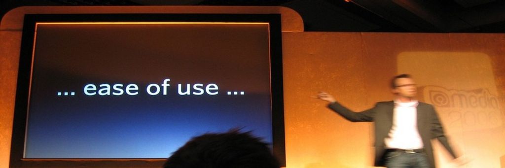
Ease of use is a basic concept that describes how easily users can use a product. Design teams define specific metrics per project—e.g., “Users must be able to tap Find within 3 seconds of accessing the interface.”—and aim to optimize ease of use while offering maximum functionality and respecting business limitations.

“Ease of use may be invisible, but its absence sure isn’t.”

- IBM

See why ease of use is a fundamental part of user experience.

Transcript

Designing for Ease of Use can be Complicated

Ease of use is a central usability concept. Usability comprises all user experience (UX) elements relating to the ease with which users can learn, discover content and do more with a design/product. In UX design, usability is a minimum requirement for any successful product, but good usability alone is no guarantee of market success. If you create an easy-to-use interface, though, you can partly tap into emotional design and help users fall in love with it, your brand and the service represented.

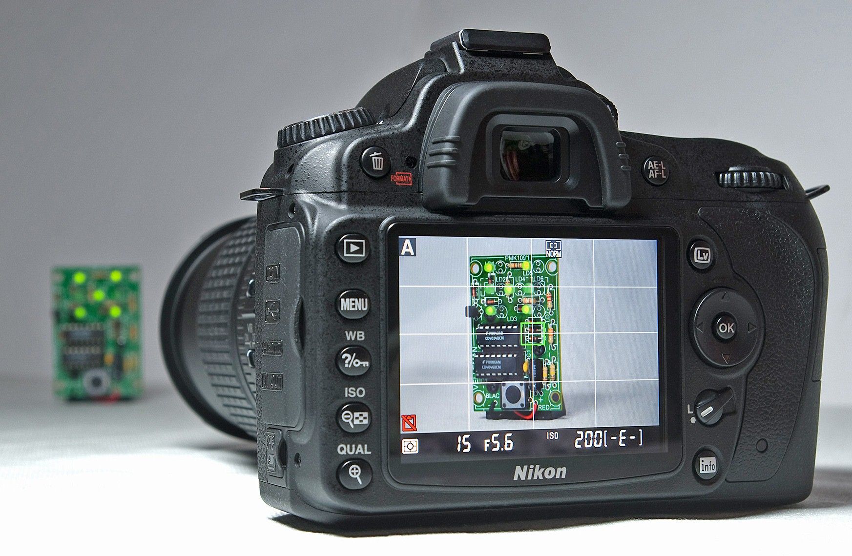
Ease of use is frequently at odds with functionality – a balance where functionality sometimes wins. For example, a DSLR camera gives users immense control. The “price”, however, is that users need some photographic expertise – unlike with point-and-shoot smartphones. A vital dynamic in user interface (UI) design is users’ ability to achieve goals without having to consider they’re using a website or app. So, ease of use is an integral part of seamless experiences. Designers typically strive to answer “Can users interact easily enough with the interface to complete their tasks/goals effortlessly?” with “How might we minimize the complexity of what users must do?”.

Author/Copyright holder: Bill Bertram. Copyright terms and licence: CC BY-SA 3.0

DSLR cameras are usually as simple as possible, for target users.

How to Maximize Ease of Use

Easy-to-use designs are ones which users find so familiar that they’re intuitive. It’s best to start with user research so you can understand your users and the contexts in which they’ll encounter and use your design. When your research helps you gain empathy with users through contextual interviews, observations, etc., you can see what “ease of use” would mean for them. Then, you’ll be able to determine how to map the best functions to their needs. First, you’ll want to consider your users’ goals:

  1. Overall goals –What your users want to achieve ultimately – E.g., healthier blood pressure levels.

  2. Completion goals –What they expect to have happened after using your product – E.g., lower blood pressure.

  3. Behavioral goals –What they would do to achieve the goal without your product – E.g., manually record their daily salt intake if they didn’t have your app.

A key part of maximizing ease of use is to understand the fine details of how users see their own needs, problems, etc. Helpful questions include:

  • What are users prepared to do to reach those goals and any subtasks on the way? – Specifically, what must they do as they progress and why must they do action A before action B, etc.? What expectations do they have at each touchpoint?

  • Where would they use this product? – e.g., at home

  • How would they use it? – e.g., on a smartphone

  • What would prompt them to use it? – e.g., needing to book travel tickets

  • What would they expect to find as they move through a process? – e.g., a shopping cart

  • What’s going on around them while they use it?– e.g., are they moving around, possibly stressed?

  • What obstacles might keep them from using it? – e.g., signal strength issues, other parties must act first.

  • What could motivate them to pick your product over a competitor’s? – E.g., they can wear your fitness app and scan food product barcodes with a smartphone.

When you answer these, you can work towards project-specific metrics, such as: “Train users must be able to find travel information within 15 seconds.”

Our homepage features affordances (blue buttons), whitespace and more to optimize ease of use.

Special Ease-of-use Considerations

Here are some helpful things to consider for easy-to-use designs:

  • Imagine a “perfect scenario” – When you address questions such as “What if this process magically occurred?” or “What if users had an incredibly knowledgeable helper?” as you begin the design process, you might just discover the easiest path for users to take on their task flows.

  • Affordances and natural mapping – Use design principles to make (e.g.) pushbuttons and match users’ expectations for how real-world items work. Instantly recognizable controls should work predictably (e.g., sliders offer smooth adjustment).

  • Mobile UX design – When users work on smaller screens and in hectic/uncomfortable environments, they’ll become frustrated far faster than when sitting with their desktops. So, try to discover their expectations, pain points, etc. from using tools such as customer journey maps.

  • UI design patterns – Patterns such as wizards, to prepare forms, help reduce stress and hard

  • Accessibility – When you maximize ease of use with features that include users of all abilities, your product will likely be more successful among all types of users.

Overall, reality rules – and sometimes you’ll need to make trade-offs for your product to be viable (e.g., avoiding expensive technology to run it on).

Questions About Ease of Use?
We've Got Answers!

How do you measure ease of use in a digital product?

To measure ease of use in a digital product, you as a designer—or UX researcher—need to observe how quickly and effortlessly users complete tasks.

One key metric is task completion time—if users can finish tasks quickly without hesitation, the design is intuitive. Error rates are important, too, and frequent mistakes suggest confused users.

Another useful measure is the first-time success rate, which tracks how many users complete a task correctly on their first try. This shows how easy the interface is to understand. User feedback—which you can gather through surveys like the System Usability Scale (SUS)—helps gauge how simple or frustrating the experience feels.

When you watch real users interact with the product through usability testing, it reveals pain points, while heatmaps and click tracking show where they struggle. From analyzing these insights, you can fine-tune the interface to make interactions smoother and more intuitive.

For many insights and tips on ease of use and more, enjoy our Master Class, Micro-Usability: How to Design for Frictionless UX with William Hudson, Consultant Editor and Author.

Watch our video on usability testing:

Transcript

What factors contribute to a product’s ease of use?

A product’s ease of use depends on several key factors that make interactions smooth and intuitive. Clear navigation is a major one—and it helps users find what they need quickly. Menus, buttons, and links should be easy to locate and understand for them. Simple, consistent design reduces confusion—users shouldn’t have to guess what different elements do.

Minimal cognitive load ensures that people don’t feel overwhelmed. Too many choices or complex workflows slow users down—or might even make them leave. Responsive design makes interactions feel natural, whether users are on desktop or mobile.

Effective signifiers, like clear buttons and intuitive icons, guide users effortlessly. Fast load times and smooth performance prevent frustration. Helpful feedback, such as confirmations or error messages, reassures users that their actions are working as expected.

Watch our video about how to make effective signifiers:

Transcript

For many insights and tips on ease of use and more, enjoy our Master Class, Micro-Usability: How to Design for Frictionless UX with William Hudson, Consultant Editor and Author.

How can I improve the ease of use of my website or app?

To improve the ease of use of your website or app, focus on making navigation simple, interactions intuitive, and performance smooth.

First, simplify navigation—use clear menus, logical layouts, and recognizable icons. Ensure users can find what they need to with minimal effort. Reduce cognitive load by eliminating unnecessary steps, clutter, or excessive choices.

Use clear signifiers like buttons that look clickable, links that stand out, and form fields with helpful labels. Be sure to optimize for speed—fast load times and smooth performance prevent frustration and keep seamless experiences going.

Provide feedback when users take actions. Buttons should change when users click them, error messages should be clear, and confirmations should reassure users.

Last—but not least—test with real users; watch how they interact with your site or app, identify pain points, and make improvements based on the feedback you get from them. An easy-to-use design is a user-friendly design, and it keeps visitors engaged and maximizes satisfaction.

Watch our video about information architecture (IA) for important points about what makes an interface easy to use:

Transcript

For many insights and tips on ease of use and more, enjoy our Master Class, Micro-Usability: How to Design for Frictionless UX with William Hudson, Consultant Editor and Author.

How do I make complex features easier to use?

To make complex features easier to use, focus on simplicity, clarity, and guidance.

Break tasks into smaller, manageable steps using progressive disclosure—only show advanced options when they’re needed. Use clear labels, tooltips, and inline hints to explain features to users without overwhelming them.

Ensure the interface is intuitive—group related functions logically and keep navigation straightforward. Use icons and visual cues to guide users, but pair them with text for clarity.

Provide helpful defaults and presets so users can get started without adjusting too many settings. Offer undo options to reassure users that they’ve got a safeguard against making mistakes.

Test your design with real users to identify pain points and refine interactions. A complex feature doesn’t have to feel complicated—good UX simplifies interactions, and so makes even advanced tools accessible and user-friendly.

Watch our video on progressive disclosure:

Transcript

For many insights and tips on ease of use and more, enjoy our Master Class, Micro-Usability: How to Design for Frictionless UX with William Hudson, Consultant Editor and Author.

What UX research methods help assess ease of use?

You’ve got several UX research methods to help assess ease of use—by identifying friction points and measuring user interactions.

Usability testing is one of the best ways to see how real users navigate your digital product. From observing their behavior, you can spot confusing elements and areas for improvement.

Tree testing allows you to quickly assess the effectiveness of navigation. Users are given a set of tasks and asked to navigate to an appropriate page. Tree testing records the journeys taken, both right and wrong, while keeping track of success rates.

First-click testing reveals whether users instinctively know where to go to complete a task.

Surveys and feedback forms like the System Usability Scale (SUS) provide direct insights into user satisfaction.

Heatmaps and click tracking show where users struggle or hesitate—and highlight potential usability issues.

A/B testing compares different versions of a design to determine which one has better ease of use.

Task success rates and error tracking measure how efficiently users complete tasks.

From combining these research methods, you can get valuable data to refine your design, remove obstacles, and create a smoother, much more intuitive user experience.

Watch our video on first-click testing for valuable insights:

Transcript

For many insights and tips on ease of use and more, enjoy our Master Class, Micro-Usability: How to Design for Frictionless UX with William Hudson, Consultant Editor and Author.

What are common design mistakes that hurt ease of use?

Several common design mistakes can hurt ease of use and frustrate users, even to the point they abandon the site or app (and the brand responsible for it). So, it’s vital to avoid making these errors or fix them after usability testing.

Cluttered layouts overwhelm users with too much information coming at them at once. A clean, well-organized interface makes navigation easier and gives users “breathing” space to do what they want to do intuitively. Unclear navigation—like hidden menus or confusing labels—forces users to hunt for what they need. If things aren’t clear, it can get stressful if users are in high-pressure situations like needing to buy tickets at the last minute.

Poor signifiers make it hard to tell what’s clickable or interactive. Buttons should look like buttons, and links should stand out as clickable links. Inconsistent design—such as different styles for similar elements—creates confusion. Users expect consistency in colors, icons, and interactions.

Slow load times frustrate users and will make them abandon a site or app quickly. Lack of feedback is another issue—users need visual cues like button animations, error messages, or success confirmations to understand their actions and feel confident about proceeding.

Ignoring mobile usability is another significant issue that leads to frustrating experiences. Mobile UX design is vital, especially when over half of users access digital products on mobile devices. Responsive design ensures smooth interactions across devices.

Watch our video about information architecture (IA) for important points about what makes an interface easy to use:

Transcript

For many insights and tips on ease of use and more, enjoy our Master Class, Micro-Usability: How to Design for Frictionless UX with William Hudson, Consultant Editor and Author.

Can a product be too simple and lose functionality?

Yes, a product can be too simple and lose important functionality, making it less useful for users. While simplicity improves ease of use, oversimplifying an interface can remove essential features and force users to look elsewhere for solutions.

For example, a photo editing app that removes advanced tools favoring a minimalist design may frustrate professionals who need precise controls. Likewise, an e-commerce site that hides filtering options to keep the interface clean may make product searches harder.

Good UX design balances simplicity with functionality. Instead of removing features when there’s a lot of functionality to offer, designers should use progressive disclosure and show advanced options only when needed. Clear navigation, intuitive icons, and tooltips can keep a product user-friendly without sacrificing power.

The goal isn’t just to make a product simple—it’s to make it efficient and effective for both beginners and experienced users. Smart design keeps complexity hidden but available when needed.

Watch our video on progressive disclosure:

Transcript

For many insights and tips on ease of use and more, enjoy our Master Class, Micro-Usability: How to Design for Frictionless UX with William Hudson, Consultant Editor and Author.

How do I balance aesthetics and ease of use?

It’s important to focus on creating a design that looks great without sacrificing functionality—as a beautiful interface should still be intuitive and easy to navigate.

Start with clear visual hierarchy—use size, color, and spacing to guide users naturally. Don’t have overly decorative elements that clutter the screen or distract from essential actions. Whitespace improves readability and makes content easier to scan.

Ensure buttons, links, and navigation menus are easy to find and interact with. A sleek, minimal design shouldn't hide important functions or make users guess where to click. Maintain contrast between text and background for readability, and ensure fonts are legible.

Test your design with real users to see if beauty is hindering usability. A well-balanced UI is visually appealing and effortless, creating a seamless and engaging user experience.

For many insights and tips on ease of use and more, enjoy our Master Class, Micro-Usability: How to Design for Frictionless UX with William Hudson, Consultant Editor and Author.

Watch our video on usability testing:

Transcript

What are some well-cited scientific articles about ease of use?

Lewis, J. R., & Sauro, J. (2023). Effect of perceived ease of use and usefulness on UX and behavioral outcomes. International Journal of Human–Computer Interaction. Advance online publication.

In this study, Lewis and Sauro replicate and extend previous research to examine how perceived ease of use (PEoU) and perceived usefulness (PU) influence user experience (UX) and behavioral intentions. Utilizing structural equation modeling, they assess the impact of varying measures of PEoU and PU on overall experience, likelihood to recommend, intention to use, and actual usage after three months. Findings indicate that both PEoU and PU significantly affect experiential and intentional outcomes, with PU having a slightly greater influence. The study also validates the two-item UX-Lite questionnaire as an efficient tool for measuring these perceptions, and offers valuable insights for UX practitioners who aim to enhance product design and user engagement.​

Krug, S. (2014). Don't Make Me Think, Revisited: A Common Sense Approach to Web Usability. New Riders.

Steve Krug's classic guide emphasizes the importance of intuitive web design, advocating for clear layouts and straightforward navigation to enhance user experience. This updated edition includes insights on mobile usability and responsive design.

Norman, D. A. (2013). The Design of Everyday Things: Revised and Expanded Edition. Basic Books.

In this update to his seminal work, UX Pioneer Don Norman introduces the concept of signifiers, referring to perceivable cues that indicate how users can interact with a design. The book emphasizes the importance of intuitive design and has been instrumental in shaping user-centered design principles.

How is ease of use different from usability?

Ease of use and usability are closely related, but they’re not the same. Ease of use refers to how simple and effortless an interface feels during first-time interactions. A product with good ease of use requires little to no learning curve—users can quickly understand how to navigate on and complete tasks with it.

Usability, on the other hand, is a broader concept that includes ease of use but also considers efficiency, effectiveness, and user satisfaction of specified users in specified contexts of use over time. Also, the term “usability” is defined in international standards. A product may be easy to use at first but lack long-term usability if it becomes frustrating or inefficient with repeated use.

For example, a simple mobile app with large buttons and clear labels might be easy to use at first. However, if it lacks advanced features or becomes cumbersome for frequent users, its overall usability suffers.

Great UX design balances both—ensuring an interface is intuitive for beginners while remaining functional and efficient for experienced users.

Watch our video about usability:

Transcript

For many insights and tips on ease of use and more, enjoy our Master Class, Micro-Usability: How to Design for Frictionless UX with William Hudson, Consultant Editor and Author.

Earn a Gift Earn a Gift, Answer a Short Quiz!

1
2
3
4
1
2
3
4
Question 1
Question 2
Question 3
Get Your Gift
Interaction Design Foundation logo

Question 1

What is the primary focus of ease of use?

1 point towards your gift

  • To improve visual complexity
  • To make sure users can complete tasks effortlessly
  • To reduce the number of features and increase conversions
Interaction Design Foundation logo

Question 2

How does ease of use typically interact with functionality in design?

1 point towards your gift

  • Ease of use always reduces functionality.
  • Functionality is more important than ease of use.
  • They must be balanced to meet user needs.
Interaction Design Foundation logo

Question 3

What is a common method to measure ease of use in a product?

1 point towards your gift

  • Conduct aesthetic evaluations.
  • Count the number of features.
  • Set project-specific usability metrics.

Learn More About Ease of Use

Make learning as easy as watching Netflix: Learn more about Ease of Use by taking the online IxDF Course The Practical Guide to Usability.

Why? Because design skills make you valuable. In any job. Any industry.

In This Course, You'll

  • Get excited as you master usability to create products and services people love. Users don't notice good usability, but they never forget bad design. If you had to choose between a product requiring a manual and one that's intuitive from the start, you'd choose intuitive usability every time. This course helps you turn complexity into simplicity and frustration into love. Studies show that 79% of people abandon websites due to poor usability. Think of the advantage you gain when you identify problems early and design solutions users genuinely love. As AI becomes part of design workflows, your timeless human-centered design skills help you decide which usability problems are worth solving and how solutions should actually work for people. This is how you stay in demand: Human-centered design skills transform AI from a tool into your new superpower.

  • Make yourself invaluable by learning how to think like your users. A well-designed user interface can boost a website's conversion rate by up to 200%. This course equips you to observe user behavior, uncover hidden pain points, and make data-backed decisions that increase loyalty, efficiency, and profits. Usability ensures your designs connect with people on a human level, whether you create software, marketing campaigns, or operational processes. All industries and roles benefit from great usability. You already practice usability intuitively when you arrange apps for easy access or label folders clearly—professional usability naturally builds on these skills.

  • Gain confidence and credibility with ready-to-use templates, real-world examples, and clear guidance you can immediately apply. No matter your background, you'll be guided to easily master heuristic evaluations, cognitive walkthroughs, and user testing to transform “good enough” designs into firm favorites. You'll apply best practices directly to your work, designing products and services that are not only functional but loved. This course empowers you to create meaningful experiences, enhance your career, and make a lasting impact on people's lives.

It's Easy to Fast-Track Your Career with the World's Best Experts

Master complex skills effortlessly with proven best practices and toolkits directly from the world's top design experts. Meet your experts for this course:

  • Marc Hassenzahl: Professor of Ubiquitous Design/Experience & Interaction in the Department of Business Computing at the University of Siegen.

  • William Hudson: User Experience Strategist and Founder of Syntagm.

Get an Industry-Recognized IxDF Course Certificate

Increase your credibility, salary potential and job opportunities by showing credible evidence of your skills.

IxDF Course Certificates set the industry gold standard. Add them to your LinkedIn profile, resumé, and job applications.

Course Certificate Example

Be in distinguished company, alongside industry leaders who train their teams with the IxDF and trust IxDF Course Certificates.

Our clients: IBM, HP, Adobe, GE, Accenture, Allianz, Phillips, Deezer, Capgemin, Mcafee, SAP, Telenor, Cigna, British Parliament, State of New York

All Free IxDF Articles on Ease of Use

Read full article
How to Design for Ease of Use - Article hero image
Interaction Design Foundation logo

How to Design for Ease of Use

Ease of use is something that designers strive for but how can you design for ease-of-use? It’s a common question at the start of projects; “If we’re going to do this well, it will need to satisfy ease-of-use for our customers. What kind of universal metrics can we apply to ensure that the product d

Social shares
776
Published
Read Article
Read full article
An Introduction to Usability - Article hero image
Interaction Design Foundation logo

An Introduction to Usability

Usability and user experience (UX) are not the same thing: the usability of a product is a crucial part that shapes its UX, and hence falls under the umbrella of UX. While many might think that usability is solely about the “ease of use” of a product, it actually involves a great deal more than that

Social shares
1.1k
Published
Read Article

How to Design for Ease of Use

How to Design for Ease of Use

Ease of use is something that designers strive for but how can you design for ease-of-use? It’s a common question at the start of projects; “If we’re going to do this well, it will need to satisfy ease-of-use for our customers. What kind of universal metrics can we apply to ensure that the product does just that?”

Someone at IBM said: “Ease of use may be invisible but its absence sure isn’t.”

Universal Metrics for Ease of Use?

Unfortunately for designers there are no universal metrics for ease of use. Each product and project is different. What will define “ease of use” for a spoon is likely to fail to define “ease of use” for a digital camera.

You can define project specific metrics for ease of use. For example, if you were building an MP3 player you might have a target of “The user must be able to find and play their chosen song within 3 seconds of accessing the interface.” Or you could decide; “A user must be able to pause play by any interaction with the interface so that they can deal with any interruption without having to find a pause button.”

How do you Reach These Project Specific Metrics?

That’s a great question and one which you probably, deep down, already know the answer to. We reach project specific metrics for ease of use by conducting user research. We need to know what the user’s objectives are and what they think is reasonable to reach those objectives to define ease of use metrics.

For example; you might want to think about different types of goals for your product and interact, observe, etc. users to see what their goals are in those spheres:

  • Life goals – what does the user aspire to in their life? How might your product get them to that goal? What would motivate a user to choose your product over a competing product that achieves this objective?

  • Completion goals – what do users expect to happen at the end of using your product? What can you measure when this takes place?

  • Behavioral goals – when users undertake achieving the goal without using your product, how do they do it? How can your product mimic that process so that the product is familiar to them? (E.g. it mimics their mental models).

Note: Mental models are the models we all have of things we do all the time. We know that we push buttons, for example, and that’s why so many computer applications have buttons that look like “real life” buttons; they fit the mental model.

Author/Copyright holder: Jurgen Appelo. Copyright terms and licence: CC BY 2.0

Understanding Ease of Use from a User’s Perspective

If you want to know what ease-of-use looks like from a user’s perspective, without user research, there are a couple of questions you can try to get there through visualization but it’s worth remembering – it is always best to carry out user research on the models you develop through this process; user feedback is essential to product design.

  • What if this process took place by magic? If your user could complete their chosen task via the use of magic and no work whatsoever what would the experience feel like? This gives you a “perfect scenario” as a starting point. You can then add the fewest possible additional steps to create the product with the greatest degree of “ease of use” without delivering something from J K Rowling’s imagination.

  • What if the user had an incredibly knowledgeable helper to carry out the process? If you imagine that your product is that helper (who is say a very, very smart human being with a lot of experience in reaching that objective) – what would the experience feel like then? Again you can use this to deliver a starting point which you can then add the fewest possible steps to in order to deliver something tangible.

Author/Copyright holder: Pixabay. Copyright terms and licence: Free to Use.

Ease of Use and Commercial Reality

It is important to remember that when designing for ease of use; you may not be able to deliver the perfect experience from a user’s perspective. It’s important to remember the commercial realities of the design process too. If something requires cutting edge technology (e.g. expensive to buy, own and implement) but is only going to deliver marginal returns; it’s unlikely that the business is going to support your efforts to include this technology in your design.

Ease of use cuts both ways and ease of use includes the impact that your work has on the business as a whole. Your designs must be easy to use from a commercial viability perspective to deliver true “ease of use”. This may mean compromises on the way through the design process to balance the demands of your user and your business.

Ease of Use and Functionality

It is also worth remembering that while it sometimes worth sacrificing functionality to provide ease of use that many products sacrifice ease of use for functionality. The most common example of this is the smartphone camera vs. the DSLR camera.

Smartphone cameras are incredibly simple to use and the mass market loves them. Push the camera icon, point the phone (perhaps pinch to zoom) and then push the camera icon again to take the photo. There may be some other basic controls but not very many.

In contrast a DSLR such as those made by Canon, Nikon, Fuji, etc. offers a huge amount of control over the camera experience but it comes at the price of ease of use. You need to learn about lenses, about flash, about controlling aperture, shot speed, ISO, etc. And while there’s no denying that smartphones have many more users than DSLRs – there is still a very healthy market for DSLR cameras. Some people will always prioritize functionality over ease of use while others will always prioritize ease of use over functionality (this assumes that the functionality being offered is useful in some way – useless functionality will never be preferred by users).

Author/Copyright holder: Bill Bertram. Copyright terms and licence: CC BY-SA 3.0

The Take Away

Design for ease of use requires talking to users and discovering what they mean by “ease of use”; there is no “one size fits all” checklist that you can use on projects to determine ease of use in advance. You can put yourself in the user’s shoes when you design for ease of use by asking some simple questions. It’s also important to remember that ease of use must not conflict with business goals and that it may be necessary to sacrifice a certain amount of ease of use to deliver more complex functionality.

References

Alan Cooper’s - The Inmates Are Running the Asylum: Why High Tech Products Drive Us Crazy and How to Restore the Sanity

WQ Usability - Looking Beyond Ease of Use

Hero Image: Author/Copyright holder: Sindre Wimberger. Copyright terms and licence: CC BY-SA 2.0

Feel Stuck?
Want Better Job Options?

AI is replacing jobs everywhere, yet design jobs are booming with a projected 45% job growth. With design skills, you can create products and services people love. More love means more impact and greater salary potential.

At IxDF, we help you from your first course to your next job, all in one place.

See How Design Skills Turn Into Job Options
Privacy Settings
By using this site, you accept our Cookie Policy and Terms of Use.
Customize
Accept all

Be the One Who Inspires

People remember who shares great ideas.

Share on:

Academic Credibility — On Autopilot

Don't waste time googling citation formats. Just copy, paste and look legit in seconds.