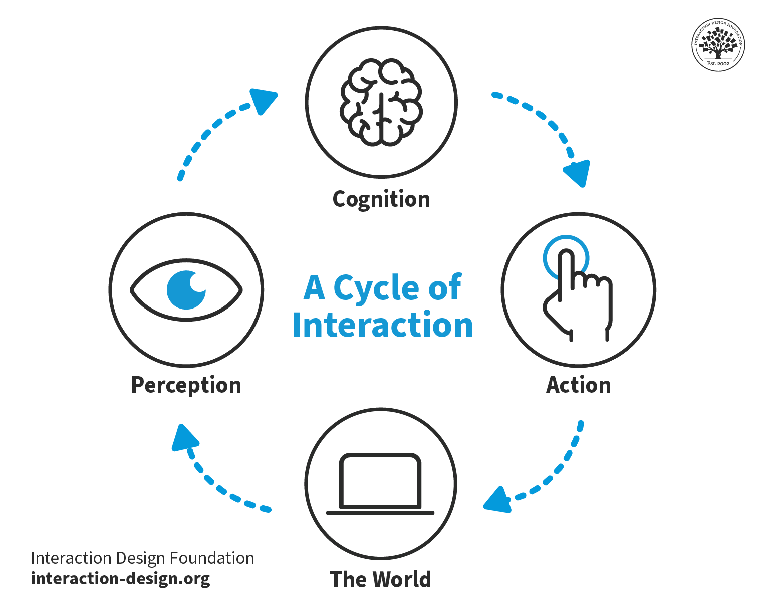
Visual perception refers to the ability to interpret and make sense of visual information from the environment through the process of sight. This complex process involves several steps, beginning with the detection of light by the eyes and ending with the interpretation of visual stimuli by the brain. Visual perception allows individuals to understand and interact with their surroundings by recognizing, organizing, and interpreting shapes, colors, spatial relationships, movement, and other visual attributes.
In this video, HCI Expert and Author, Alan Dix discusses the difference between sensation and perception:
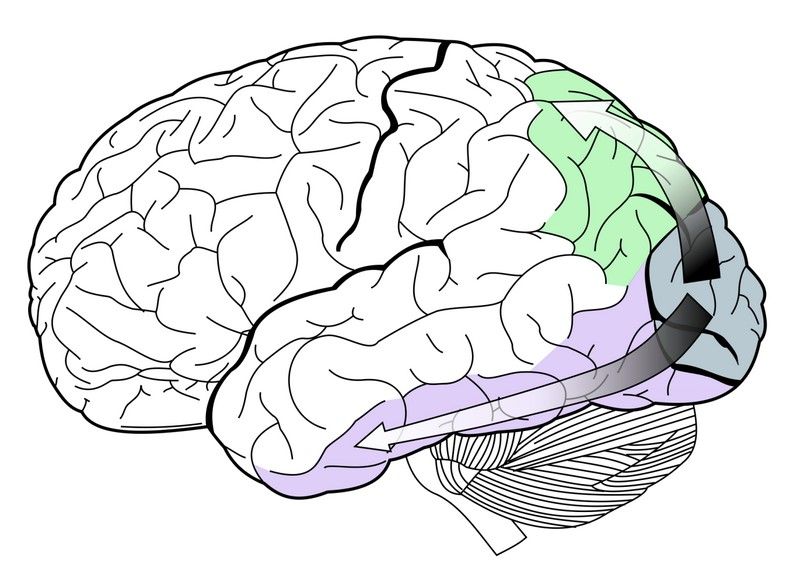
Physiologically, visual perception happens when the eye focuses light on the retina. Within the retina, there is a layer of photoreceptor (light-receiving) cells which are designed to change light into a series of electrochemical signals to be transmitted to the brain. Visual perception occurs in the brain’s cerebral cortex; the electrochemical signals get there by traveling through the optic nerve and the thalamus. The process can take a mere 13 milliseconds, according to a 2017 study at MIT in the United States.
The visual perception of colors, patterns, and structures has been of particular interest in relation to graphical user interfaces (GUIs) because these are perceived exclusively through vision. An understanding of visual perception therefore enables designers to create more effective user interfaces.
© Interaction Design Foundation, CC BY-SA 4.0
How Does Visual Perception Affect UX Design
Visual perception plays a crucial role in user experience (UX) design as it fundamentally influences how users understand and interact with digital products. It encompasses the way our brain interprets visual information from the environment, which impacts decision-making, usability, and overall satisfaction with a product. Here's how visual perception impacts UX design:
1. First Impressions and Aesthetics
Visual perception shapes the first impressions users have of a product. Attractive designs are perceived as more usable and trustworthy. This aesthetic-usability effect means that visually appealing interfaces can positively influence user satisfaction and loyalty from the moment they encounter the product.
Since its launch in 2007, The Apple iPhone's sleek design, intuitive interface, and overall aesthetic appeal significantly influenced its market success. Consumers perceived it as not only a symbol of innovation but also as a highly usable and trustworthy device, which contributed to strong user satisfaction and brand loyalty. This demonstrates how first impressions based on visual perception can have a lasting impact on product success.

Steve Jobs with the first Apple iPhone.
© Paul Sakuma, CC BY-SA 4.0
2. Hierarchy and Structure
Through the use of visual hierarchy, designers can guide users' attention to important elements first. Size, color, contrast, and placement all play roles in how users perceive the importance of various elements on a page. This helps to create a structure that aligns with users’ natural scanning patterns, such as the F-pattern or Z-pattern, improving the effectiveness of information presentation and navigation.
Google’s search engine uses size, color, contrast, and placement strategically to differentiate between types of results (e.g., ads, organic results, featured snippets) and to highlight key information. The design ensures users quickly see the most relevant results and additional helpful features like questions related to their search. This structure aligns with natural scanning patterns, which enhances the user's ability to find information efficiently and navigate the page effectively.

© Google, Fair Use
3. Simplicity and Clarity
Visual perception underlines the importance of simplicity in design. Overly complex or cluttered interfaces can overwhelm users, which leads to confusion and frustration. Designers can create clear and concise interfaces that communicate more with less when they leverage users' visual perception which enhances usability and reduces cognitive load.
WhatsApp's design avoids clutter by using a clean layout, straightforward navigation, and intuitive icons, which makes it easy for users of all ages and tech-savviness to communicate effectively. This simplicity ensures users can focus on their primary task—messaging—without unnecessary distractions or complications. This demonstrates how leveraging visual perception to create clear and concise interfaces can significantly enhance usability and user satisfaction.
4. Consistency and Familiarity
Consistent visual elements across a product, such as color schemes, typography, and iconography, leverage users' visual memory and perception, making interfaces more intuitive and learnable. Familiar design patterns and conventions, like the placement of a logo at the top left corner or navigation menus at the top of a webpage, play into users' pre-existing visual perceptions, facilitating smoother interactions.
Google's suite of products, including Gmail, Google Drive, and Google Docs are consistent and familiar. Google maintains a consistent color scheme, typography, and iconography across these services, which leverages users' visual memory to make navigation and interaction more intuitive. Additionally, the familiar placement of key elements, such as the app launcher icon in the top right corner and the search bar prominently displayed at the top, aligns with users' expectations based on prior web experiences, facilitating smoother and more efficient interactions across different Google products.

Several of Google’s product icons—the consistency of their visual design help make them recognizable.
© Google, Fair Use
5. Color Psychology and Accessibility
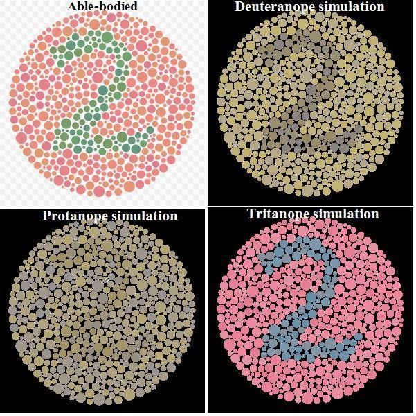
Colors have psychological effects that can influence how users feel and behave. For example, blue can convey trust and security, while orange might be used for calls to action due to its high visibility and association with action. Additionally, understanding visual perception is crucial for designing accessible interfaces, ensuring that color choices and contrasts accommodate users with visual impairments, such as color blindness.
Bank of America’s online platform predominantly uses blue hues throughout its interface, leveraging the color's association with trust, security, and stability, which are crucial in the context of financial transactions. For calls to action, such as submitting forms or proceeding to the next step in a transaction, the platform often employs colors like green or orange, which are visible and convey a sense of progress or action. Furthermore, Bank of America's online platform is designed with accessibility in mind, offering high contrast options and color schemes that are considerate of users with color vision deficiencies to ensure that all users can navigate and use the services effectively, regardless of their visual abilities.
6. Motion and Interaction
Visual perception influences how users perceive and react to motion within an interface. Well-designed animations can direct attention, indicate actions, and provide feedback, enhancing the interactive experience. However, it's important to use motion thoughtfully to avoid distracting or disorienting users.
Slack incorporates thoughtful animations and transitions for activities such as switching between different chat channels, sending messages, and receiving notifications. For instance, when a message is sent, users see a smooth transition that visually confirms the message's delivery, and notification animations are designed to catch the user's attention without being intrusive. These subtle motions help in making the digital workspace feel more dynamic and responsive, fostering a more engaging and intuitive user experience.
How Does Visual Perception Relate to the Gestalt Principles?
Different attributes of visual perception are widely used in GUI design. Visual perception is deeply intertwined with the Gestalt principles, a set of theories that describe how people tend to organize visual elements into groups or unified wholes when certain principles are applied.
In this video, Mia Cinelli, Associate Professor of Art Studio and Digital Design at the University of Kentucky explains what the Gestalt principles are and how they relate to visual perception.
Gestalt principles emerged from the Gestalt psychology movement in the early 20th century and are fundamental in understanding how users perceive and make sense of visual information in design in general and UX design. Here’s how visual perception relates to the Gestalt principles:
1. Proximity
The Law of Proximity states that objects that are close to each other tend to be perceived as a group. In UX design, designers use proximity to indicate relationships between items, grouping related elements together to simplify information processing and navigation for the user.
2. Similarity
According to the Law of Similarity, elements that are similar in appearance (color, shape, size, etc.) are perceived to be more related than elements that are dissimilar. Designers leverage this to create visual hierarchies and categorizations within interfaces to guide users' attention to important features or grouping similar items.
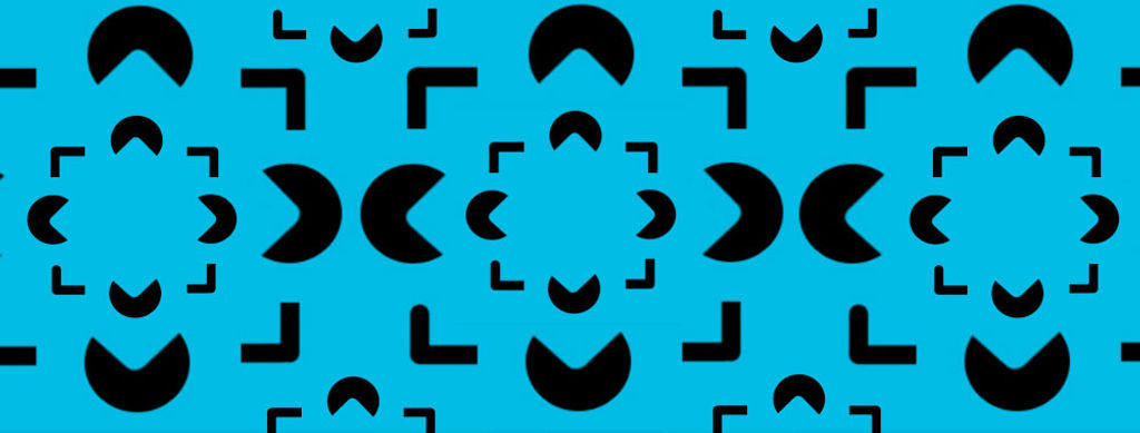
3. Closure
The Law of Closure suggests that people tend to see complete figures even when part of the information is missing. In UX design, this can be used to create icons or interactive elements that are not fully drawn out but that users can still recognize and understand, which reduces visual clutter while maintaining usability.
4. Figure-Ground
The Law of Figure or Figure-ground involves the perception of objects (the figure) as being distinct from the background (the ground). Effective UX design uses this principle to direct focus to actionable items or important information by making them stand out against their background which enhances user interface clarity and navigability.
5. Continuity
The Law of Continuity posits that elements arranged on a line or curve are perceived to be more related than elements not on the line or curve. Designers apply this principle to guide the user's eye through a flow of information or actions to create a visual narrative that is easy to follow.
6. Common Fate
The Law of Common Fate states that elements that move in the same direction are perceived as part of a single group. In interactive design, animations or elements that change in response to user interaction can reinforce the perception of relatedness or guide the user through a series of steps or actions.