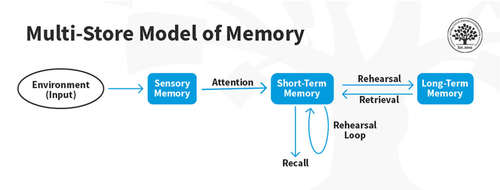
Recognition and recall are two terms used in UX design to describe how users retrieve information. Recognition is the ability to recognize something you have seen before, while recall is the ability to remember something without being prompted. In other words, recognition is less cognitive effort.
"Recognition rather than recall" is the sixth heuristic guideline established by Jakob Nielsen in his General Principles for Interaction Design. It promotes the design of interfaces with items people can quickly identify instead of recalling them from scratch.
"Minimize the user's memory load by making visible objects, actions, and options. The user should not have to remember information from one part of the dialogue to another. Instructions for using the system should be visible or easily retrievable whenever appropriate."
— Jakob Nielsen
Minimize the Need for Recall in UX Design
Recall requires more effort and can be more prone to errors. When users rely on their memory to find what they are looking for, they are more likely to become frustrated and abandon the task altogether.
There are several strategies that UX designers can use to minimize the need for recall in interfaces:
Use familiar icons and labels: One effective strategy is to use standard icons and labels that users can quickly recognize. For example, a magnifying glass icon for search or a home icon for the homepage can help users find what they are looking for more easily.
Provide visual cues: Visual cues such as color, contrast, and typography can help guide users to important information. Use different colors or font sizes for headings, subheadings, and body text to help users scan content more easily.
Follow common patterns: Design interfaces that follow common patterns to reduce the need for recall. For example, users expect to find a logo in the top-left corner of a website.
Group related information together: This can help users find what they are looking for without the need to remember where it is located. For example, grouping all account settings under one tab or menu item can make navigation easier for users.
Examples of Good Interface Design That Minimize the Need for Recall
Most interfaces follow the "recognition rather than recall" principle and provide a seamless user experience. Here are some examples:
Google Maps
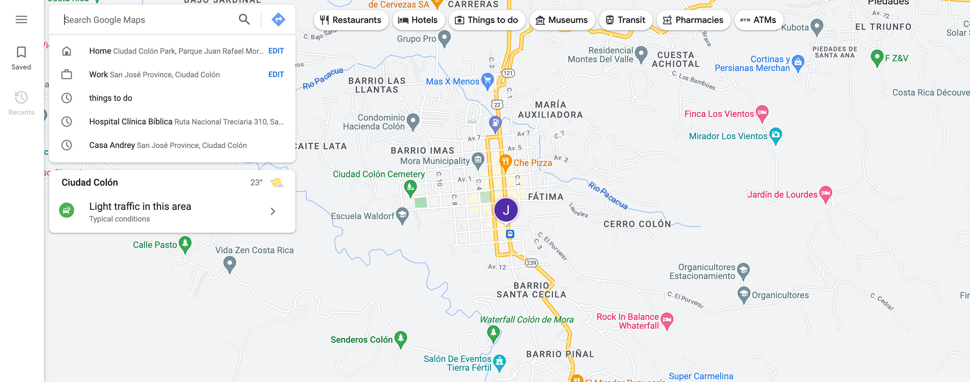
© Google Maps Website, Fair Use
The Google Maps interface is easy to navigate, with a prominent search bar at the top. Visual cues like colors and icons help users identify points of interest.
Amazon
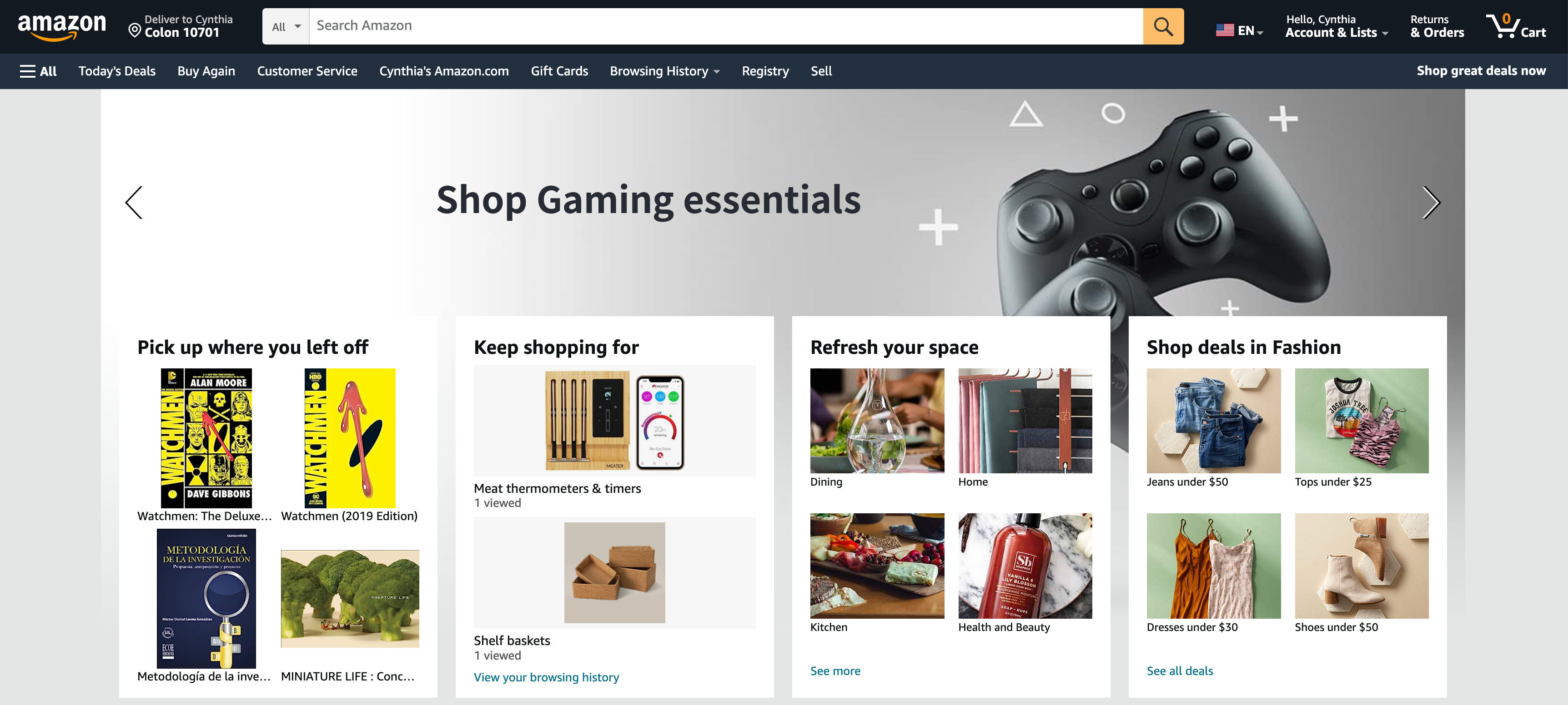
© Amazon Website, Fair Use
Amazon's interface simplifies online shopping. It also includes a prominent search bar but provides numerous product suggestions based on items being viewed. This approach addresses the “I don’t know what to call it, but I’ll know it when I see it” problem often faced by customers.
Spotify
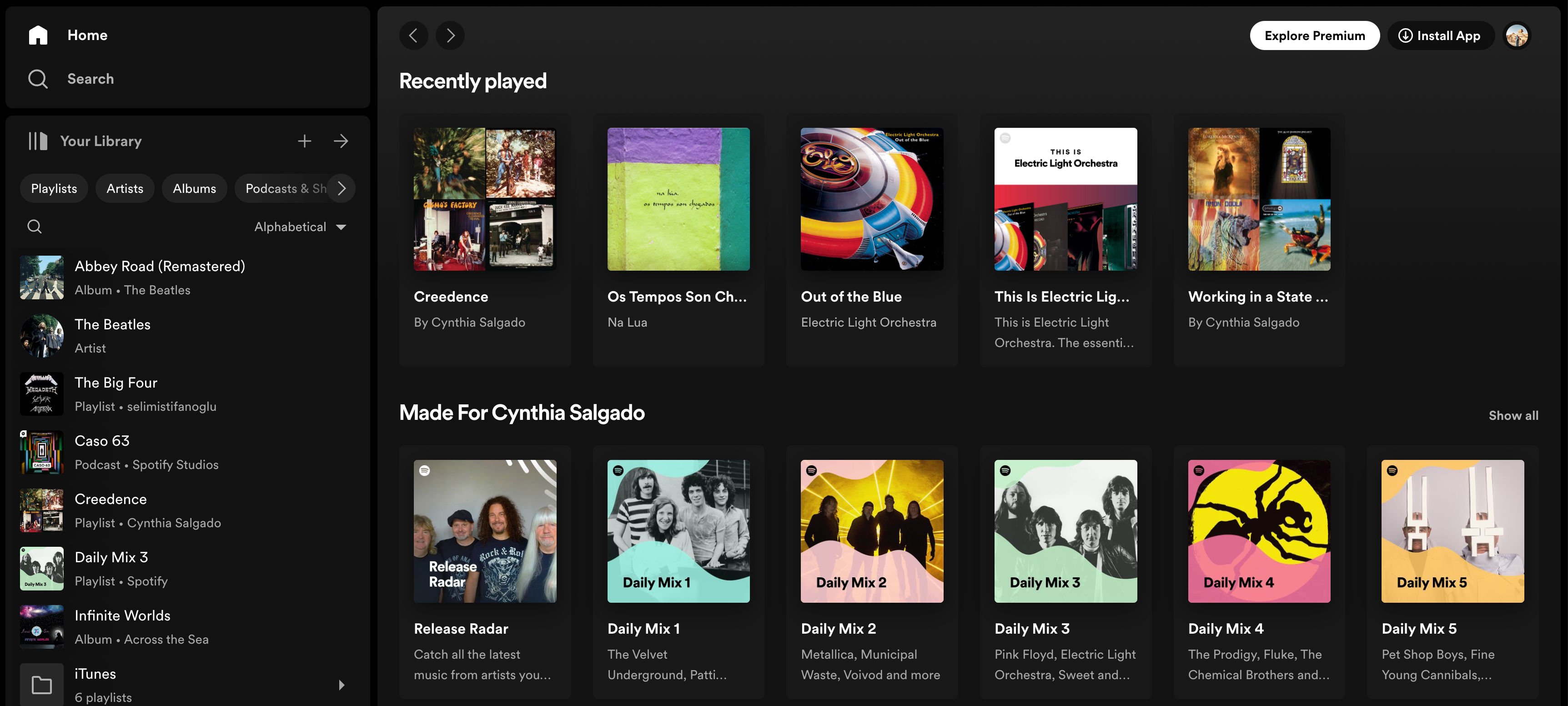
© Spotify Website, Fair Use
Spotify's music streaming provides personalized recommendations based on listening history to help users discover new music without remembering specific artists or genres.