Logo design is the art of creating a visual symbol that captures a brand’s identity and differentiates it. Designers create successful logos when they carefully mix typography, color theory and graphic elements to communicate each brand’s essence, values and personality to the marketplace and establish a strong visual presence that customers trust.
The Interaction Design Foundation’s logo—a tree with pages as leaves—embodies the brand’s mission that knowledge wants to be free.
© Interaction Design Foundation, CC BY-SA 4.0
Why is Logo Design Important in UX Design?
It might be more appropriate to reverse the order of the terms in the question above to examine why user experience (UX) design is an important factor in a brand’s logo design. Like graphic design, logo design existed long before UX design. Logo creators have included design elements in graphic representations of what a business or artisan does or makes for centuries. The history of custom logo design extends back through graphic design and the industrialization of marketing in the 1800s to—arguably—primitive designs that represented the makers of products or services in the ancient world.
Amazon’s logo evolved to become the iconic arrow-like smile the world associates with quality, convenience and much more.
© Oliver, Fair Use
UX and user interface (UI) designers concern themselves with the creation and optimization of digital products such as websites and apps. A company logo may be a single or one-time creation—in comparison to a series of web pages, for example. However, it still calls for designers to approach it as a product to delight users with. As its purpose is to represent the brand across the many channels where users and potential customers will find it, it’s especially vital for designers to get the logo just right. The global market and popular psyche tend to embrace those brands with logos that are the most meaningful and relevant to the users and consumers who love them.
Logos are often combinations of a wordmark—such as the company’s name—with a graphic symbol or mark. So, a logo is a kind of trademark. Some company logo designs also bear symbols such as the trademark—™—or registered trademark, ®. A brand’s graphic logo design will typically feature their distinguishing mark, such as Apple’s apple with the bite mark. The other features to consider in the logo design of a company are typography and color choices. How the letters of the company name appear and the associated colors are essential ingredients to convey a brand’s message. To make logo design further relevant is to establish a context with the target audience. When designers gear their logo design ideas around a context or theme, they can access users and potential customers in a way that links the product to the setting. For example, a tree or leaf design in an app for gardening can deliver real-life authenticity to the users who will engage with it.
When they work for brands, designers apply design principles to create good logos. Design principles are fundamental pieces of advice that come from researchers and practitioners in design and related fields. When a design shows these principles at work within it, the proof is in its accessibility, usability and more.
CEO of Experience Dynamics, Frank Spillers explains design principles, in this case as they apply to mobile UX design:
Since a logo is far more than an image, it’s a fundamental tool in branding. For instance, in the space of so many pixels on a smartphone screen, the best logo designs offer a vital point of perception for their target audiences. Casual users and more avid, loyal customers can instantly identify and draw associations with the brand.
The logo also stays in their memories as a key identifier of the brand. That’s why designers need to add visual elements that are appropriately captivating. Users will make snap judgments and decide within seconds if a brand can serve their needs best. So, logos need to speak to users and establish an emotional connection at lightning speed.
Author and Human-Computer Interaction Expert, Professor Alan Dix explains why emotion is a vital part of design:
What are the Benefits of Good Logo Design?
As with good branding in UX design, an effective logo can bring numerous positive benefits to the organization it represents because it:
1. Boosts Brand Recognition
A well-designed logo is a visual cornerstone. Like a flag for a nation or organization, it carries symbolism that a brand wants the global marketplace to acknowledge, recognize, respect—and love. As a good logo is visually “catchy,” it will instantly tell users what they can expect from the brand, and how. For example, a learning app for children is likely to feature vibrant colors and elements as an appropriate way to distinguish its brand in the market.
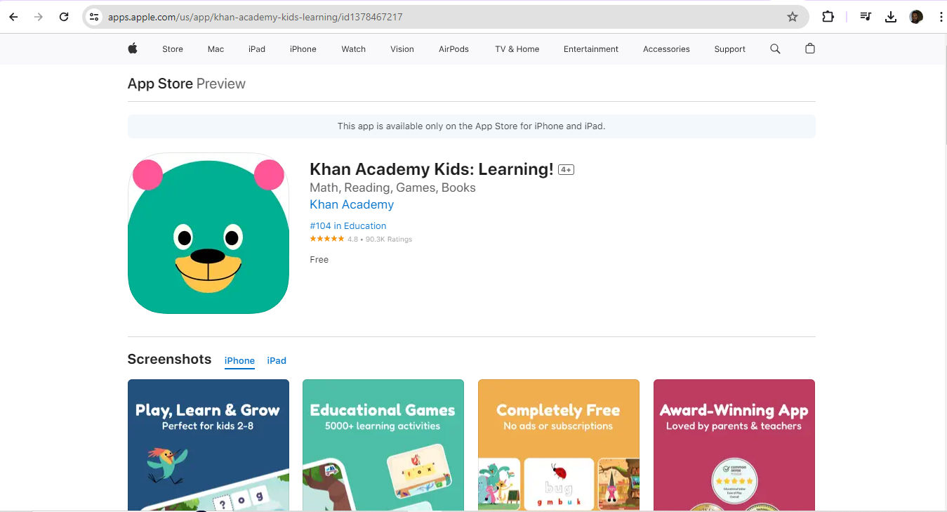
Khan Academy Kids: Learning! App features a highly appropriate and recognizable icon.
© Khan Academy, Fair Use
2. Builds Trust and Credibility
Logos are far more than symbols. They’re also vital ways to validate how professional a brand is. A consistent and professional logo gives consumers reassurance about the quality and reliability of the brand. That’s crucial for long-term business relationships. For example, a bank’s logo will need to instill a sense of security in users—that they can entrust their money to that brand. The challenge to create the perfect logo therefore demands design skills and logo ideas that thoroughly understand the expectations, needs, desires and concerns of users. When they design a logo, UX designers must show they have a firm grasp of these points—plus an eye for standard industry practices.
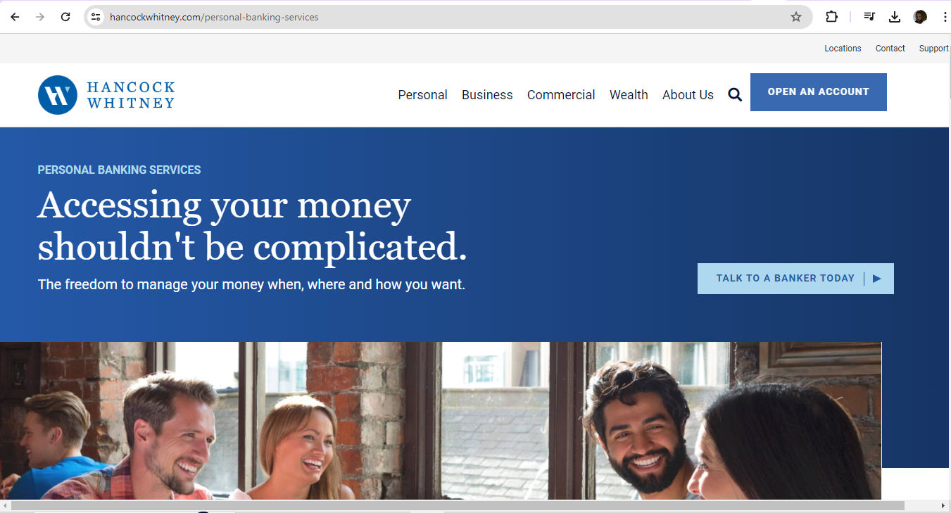
Hancock Whitney bank’s logo (top left) features blue and white, a color scheme that casts consistently across its website and fosters trust.
© Hancock Whitney, Fair Use
3. Encourages Customer Loyalty
A memorable logo can bring out good feelings and trigger positive memories between users or customers and the brand. This emotional connection goes a long way to keeping customers on board with a brand. They’ll keep coming back to a brand that they find represented consistently across all platforms. For example, Coca-Cola—one of the world’s most visible brands—shows up across the globe with its iconic logo. For instance, a unique font overlying a distinct background in an instantly recognizable interplay of red and white signifies good times with the beverage for many, and good memories associated with it. When customers see this logo—appearing exactly as the brand intended—it’s a touchstone of their experience with the company.
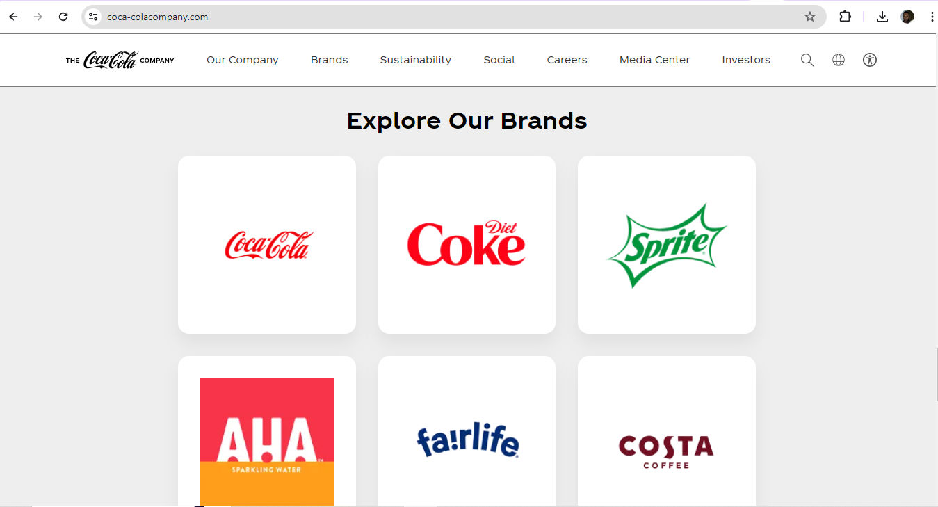
Coca-Cola’s brands feature iconic looks, including typography and colors.
© The Coca-Cola Company, Fair Use
4. Has a Positive Impact on User Experience
In UI and UX design, a logo is more than an aesthetic feature; it's a tool that aligns with the user's needs and improves how they interact with the brand. A well-crafted logo reflects the brand’s personality and makes it relevant and appealing. Users recognize the logo as a signifier of a good user experience. For example, brands that promote, measure and gamify health and fitness in their hardware—such as fitness trackers—and apps tend to echo the elements of well-being, motion and personal improvement in their logos.
Amazfit captures the essence of “Up your game” and promoting fitness in both of its logos.
© 1000logos.net, Fair Use
What are Best Practices and Tips to Design Logos Well?
Anytime designers approach design work that involves a brand’s logo, they should:
1. Follow the Brief
If the client is an established brand and wants to revamp their logo, they’ll typically include all the necessary details in a document. In the industry, this is a brief. The brief should contain relevant features of their brand guidelines, including company colors. Some fresh startups may also have a clear idea of the symbolism they want to convey in a logo and will include this information in their web design and logo files. Design briefs tend to carry all—or nearly most—of the information designers will need to design a logo.
2. Conduct Thorough Research
In any case, before designers dive in, they must fully understand the brand's values, target audience and industry. This is foundational. The whole course of the logo’s design needs to lift from the best-laid “runway”—if the logo is to both resonate with the intended audience and reflect the company's identity precisely. So, a solid grasp of a brand’s message, vision, values, along with its customers’ and users’ needs, is a vital place to begin.
UX Strategist and Consultant, William Hudson explains the importance of user research:
3. Keep It Simple and Memorable
Simplicity is vital. Users need to understand what a brand encapsulates in its logo right away—and recognize it for that and remember it as well. They should have a visceral reaction to it. So, when designers sketch and then color a prospective logo, every line, curve, dot and shade must add up to something meaningful that users and customers would expect. As a bonus, simpler designs are easier to reproduce across various mediums, too—an important advantage when it comes to the many channels which brands access their target users through.
Frank Spillers explains the importance of channels—particularly omnichannel—in this video related to service design:
4. Make It Versatile and Scalable
It’s best to design logos that are highly versatile and scalable. These tend to keep their impact and clarity across different sizes and media. This adaptability is valuable as it prevents visual distortion. It also makes sure a brand appears consistently across digital platforms—including social media posts—as well as physical advertising and merchandise.
5. Pay Attention to Typography and Colors
Designers must select typography and colors that optimize readability and capture the brand's essence and personality. Consistency is a watchword here also. Designers must follow their brand guidelines and use a specific color palette and legible typography for all branding materials. A crucial point is that the colors and typography must appear consistently everywhere. A cohesive brand identity depends on exact reproduction. For example, the shade of blue that appears in the logo on the website must match the logo color on paper. This demands particular care and attention since colors on-screen and in ink have a different make-up and process.
6. Test on Different Platforms and Sizes
It’s vital to regularly test the logo across various platforms and sizes. Designers must check that their design work stays effective and visually appealing, whatever the device users may access their product with. So, designers should assess how the logo performs on different screens and contexts. For example, does the logo on the brand’s website translate well to social media contexts, when users scroll through their news feed on a smartphone?
Google’s iconic logo has seen some changes through the years but remains true in its expression of brand values.
© Sean Mackay, Fair Use
What are Potential Risks and Concerns with Logo Design?
Designers can make mistakes especially when they design for startups that lack or have not had time to build up strong brand guidelines. Here are some of the main hazards that designers should understand, especially if they lack an extensive design brief from the client:
Trends: Designers should aim for a timeless look rather than keep up with fashions. For example, bevels and corporate swooshes can date a logo and lock it in the past—making it stale for users who demand freshness and relevance.
Color psychology: Colors echo feelings and can work against the brand’s message. For example, blue is a common one for banking as users connote trust with blue. Red is less common in banking, as it can signify excitement or even danger. Even so, some successful banks do have red in their logo. What’s more, designers must consider the target audience’s culture—for instance, red in Eastern cultures can symbolize good fortune.
Professor Alan Dix explains the importance of cultural considerations in design:
Typography: It’s best to pick a font that reflects the brand essence and is visually appealing and legible. Clean fonts that translate across multiple mediums are solid choices. Some large, successful brands have been able to encapsulate themselves in a single letter, as a kind of progression from their wordmark logo.
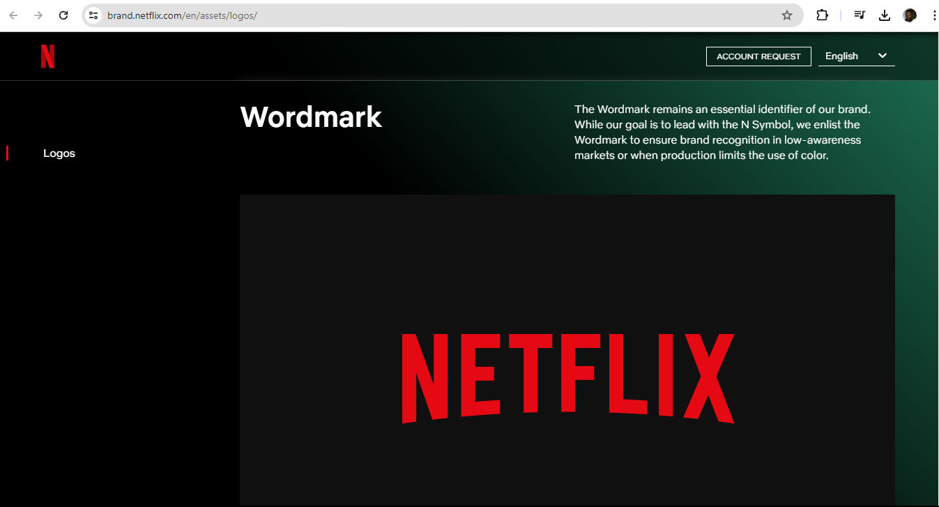
The Netflix wordmark logo—featuring the name of the brand in its signature red—conveys the popular and exciting nature of the brand.
© Netflix, Fair Use
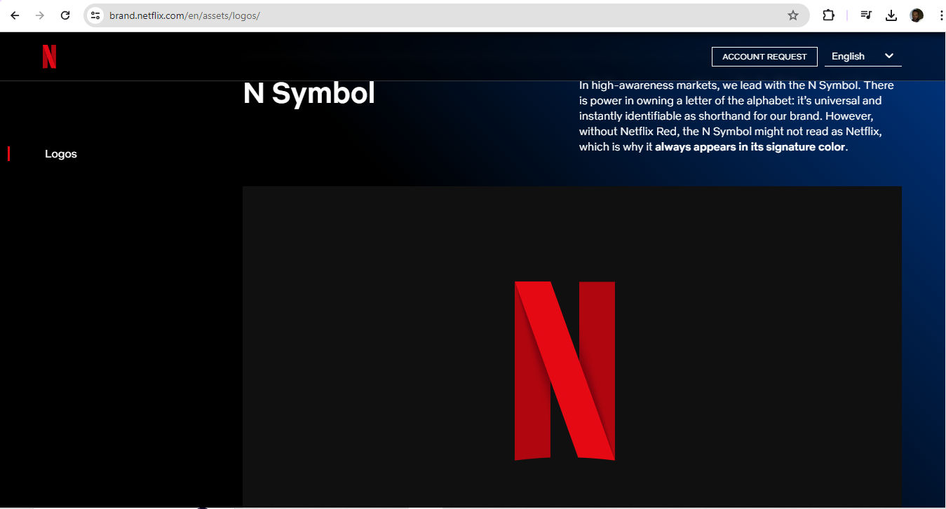
Netflix’s N Symbol—in red with curves as shown, as the brand stipulates—is an instantly identifiable brand shorthand, and leads in high-awareness markets.
© Netflix, Fair Use
Overcomplicated designs: Logos that are too highly detailed can confuse users and give them a negative experience.
Raster images: Vector images are better because raster ones may cause pixelation at larger sizes.
Stock images: Designers can get into trouble over copyright if the stock images they rely on for a logo are another brand’s design work.
Accessibility: Accessibility is a watchword in UX design overall, and logo design isn’t exempt. It’s vital to consider color contrast choices—for example, red-and-green combinations can cause problems for users.
Watch our video to understand why accessibility is vitally important in design:
User testing: Apart from the point that the brand must see how its users and customers like the logo, it’s essential to test the logo regularly across multiple platforms and sizes.
William Hudson explains important points about user testing:
Overall, logo design is an easy-to-misunderstand part of UX design. Because logos should carry the brand’s vision, essence and more, it can take a sharp eye and creative mindset to create one that will succeed and endure in the marketplace. Brands need to carefully consider the angles and options available to them. This includes when it comes to writing a brief, choosing from designers’ portfolios or considering AI logo design, logo design apps, logo templates and more.
Remember, logo design transcends mere aesthetics—it's about forging a connection with the audience. The global marketplace is a large arena for users and customers to have first-impressions and draw mental associations. That’s an extra reason for designers to get their clients’ brand logos right the first time. If they prove popular, many of these logos can evolve as the brand enjoys continuing success long into the future.
“We ended up with the primary colors, but instead of having the pattern go in order, we put a secondary color on the L, which brought back the idea that Google doesn’t follow the rules.”
—Ruth Kedar, Logo Designer