An affinity diagram or map, is a tool that helps designers, researchers and project managers organize ideas, information, and observations to identify patterns and, ultimately, insights.
Also known as the KJ method, after Professor Jiro Kawakita, affinity diagrams are most useful for sorting large amounts of unstructured, qualitative data. Stakeholders cluster data based on natural relationships or similarities into more manageable groups to determine related patterns and draw informed conclusions.
“With masses of data spread about on my desk, I had been racking my brains to find some way to integrate them when I suddenly realised that depending on the spatial arrangement of the cards, you can see new meaning in them and find ways to systemise the data. That was the first realisation that led to the creation of the KJ Method.” - Professor Jiro Kawakita, Anthropologist.
The Oxford English Dictionary defines “affinity” as “a similarity of characteristics suggesting a relationship, especially a resemblance in structure between animals, plants, or languages.” In an affinity diagramming session, participants group similar ideas, items, statements, or data with a “liking” or “similarity” to each other together. You can do this physically with cards or post-it notes or with diagramming and brainstorming software.
Anyone can create an affinity map—whether on a team or individually. Through an affinity diagram you can identify patterns and turn those patterns into valuable insights to apply in your work. Due to its simplicity and effectiveness, UX researchers often use affinity diagrams in their work.
The Importance of Affinity Diagrams in UX Design and User Research
In UX design and user research, we use affinity diagrams to organize and make sense of qualitative data from research activities such as user interviews, observations, and questionnaires.
Affinity diagrams can help you go from a state of complete chaos with no overview of your information to a serene state of organized groups of information, which you have named and sorted into hierarchies that make sense and provide insight.
© Interaction Design Foundation, CC BY-SA 4.0
Affinity diagrams help UX designers in the following ways:
Organize User Insights: After conducting user interviews, usability testing, or other research methods, UX researchers often amass a wealth of qualitative data, including user quotes, pain points, and suggestions. Affinity diagrams help teams make sense of the data and get a broad idea of the types of user insights in a single view.
Identify Patterns and Themes: UX designers and researchers use affinity diagrams to identify patterns, themes, and trends within research data. By grouping similar user comments or issues together, designers can easily identify the most common or critical issues to work on.
Promote Cross-Functional Collaboration: Affinity mapping provides a visual and collaborative platform for different team members to contribute their perspectives and insights, fostering a shared understanding of user needs.
Persona Development: Affinity diagrams can help teams create and refine user personas. When you group user characteristics, behaviors, and preferences, you can create more comprehensive and representative personas, ensuring user-centered design decisions.
Prioritize Features: Designers and product teams use affinity diagrams to prioritize features based on user needs and pain points. This helps the team focus on the most crucial aspects which contribute to a positive user experience.
Idea Generation and Brainstorming: Affinity diagrams help organize existing data and generate new ideas. During brainstorming sessions, teams can use the affinity diagram process to group and categorize emerging ideas, which leads to more structured and focused discussions.
In the context of UX design and user research, affinity diagrams are a powerful tool to synthesize and visualize qualitative data, foster collaboration, and inform design decisions based on a deeper understanding of user needs and behaviors.
How to Create an Affinity Diagram
Step 1: Gather Inputs
Affinity diagrams are useful when a team works with a large amount of qualitative data, whether for research or during ideation. The following affinity diagram example focuses on organizing user research findings, but a team can easily apply the same process for a brainstorming session.
Imagine your UX design team creates an affinity diagram after a round of user interviews for a mobile application for a popular gym in your city.
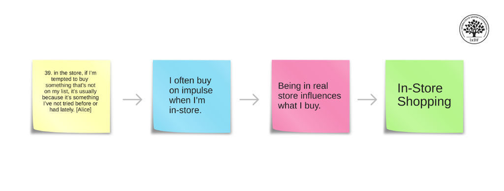
Start the session where participants write down user quotes, observations, or issues from their user research on notecards or sticky-notes. Write only one idea on each card. Include direct quotes, for example:
“I didn’t understand how I could book a recurring class.”
“I struggled to find the ‘Contact Us’ page.”
“It was difficult to book the class I wanted to attend.”
“I was stuck and I couldn't figure out where to ask for help.”
“This is practically impossible to use offline.”
In this video, William Hudson, User Experience Strategist and Founder of Syntagm Ltd, explains how to turn user research into affinity notes.
Whether for a brainstorming session or for organizing user data as above, make sure you add only one piece of data or one quote per sticky note or card.
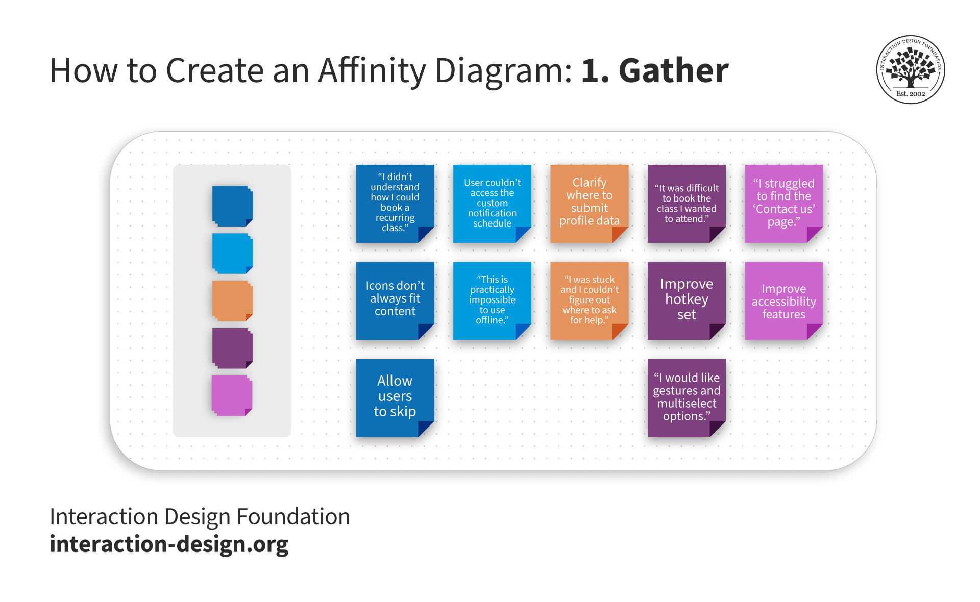
In this example, the designer represents each participant with color-coded sticky notes. The designer includes only one quote on each post-it note. You can gather these observations directly from your user research notes, spreadsheets, recordings, etc.
© Interaction Design Foundation, CC BY-SA 4.0
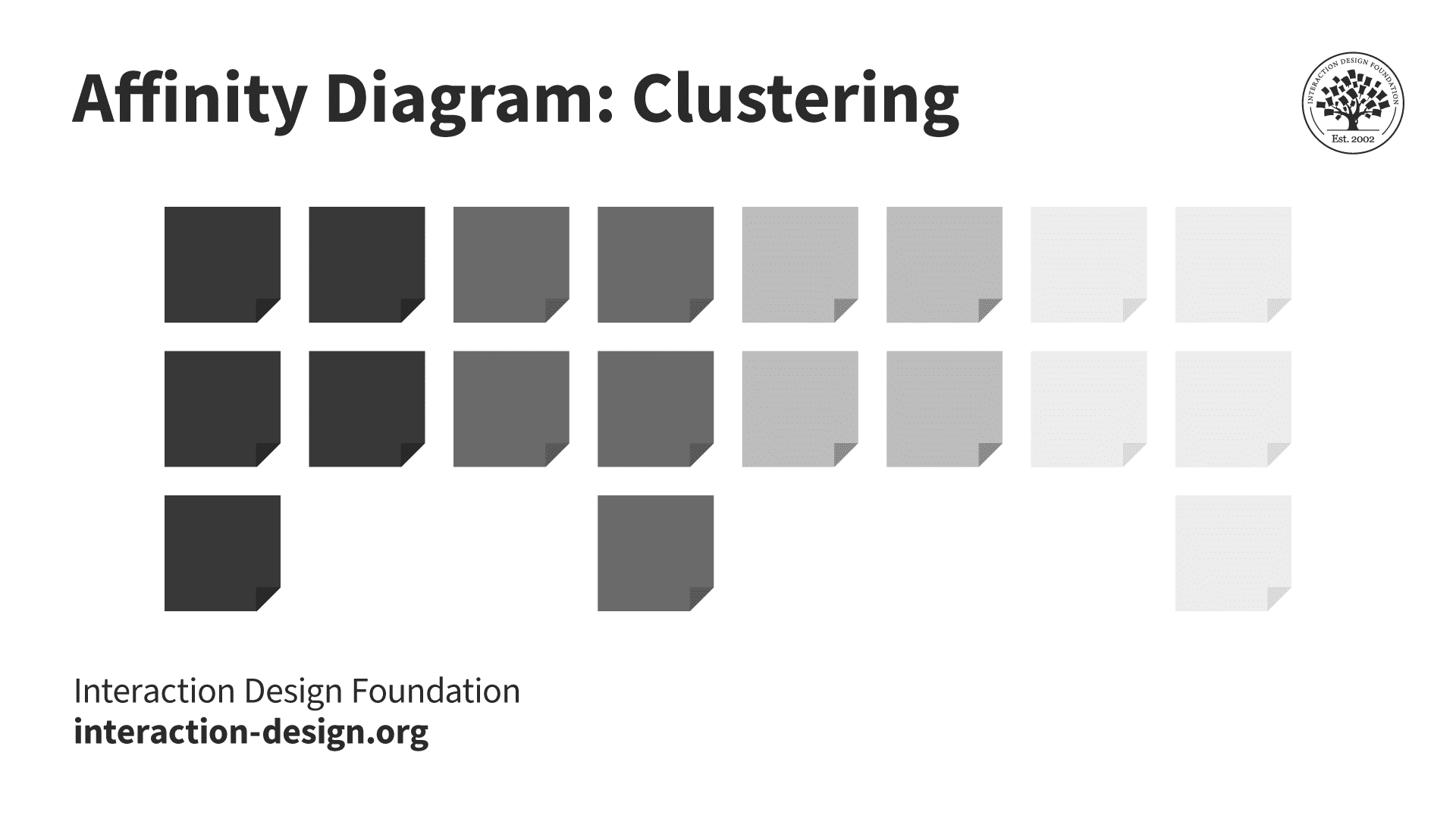
Step 2: Sort and Group
Once you have all data in front of you, discuss, sort, and group them based on their similarities or relationships.
Following the example above, you might group the following ideas together:
Group 1:
“I didn’t understand how I could book a recurring class.”
“It was difficult to book the class I wanted to attend.”
Group 2:
“I struggled to find the ‘Contact Us’ page.”
“I was stuck and I couldn't figure out where to ask for help.”
Some oddballs might not or do not group well with anything else or even some post-it notes could belong to multiple groups. It’s okay! You can add them to an “Other” group or keep them as individual observations to be dealt with separately.
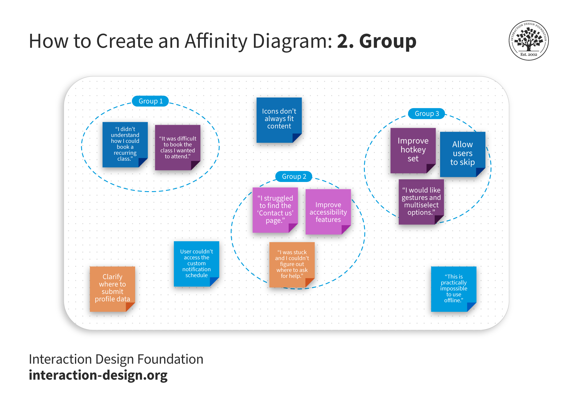
As you group similar items or those with an affinity for each other, don’t worry about the ones that don’t group well with anything else. You can attend to them individually later in the design thinking process.
© Interaction Design Foundation, CC BY-SA 4.0
Step 3: Label Groups
Assign a label or category to each group of related ideas. This label should capture the common theme or connection among the ideas in the specific group.
For example, “Booking Issues,” “Class Booking,” or “Class Booking Flow Problems” are category names you could apply to your newly formed Group 1. You might name the second group “Accessibility.”
You can still label the single observations with a theme, too. “Improve offline mode,” for instance.
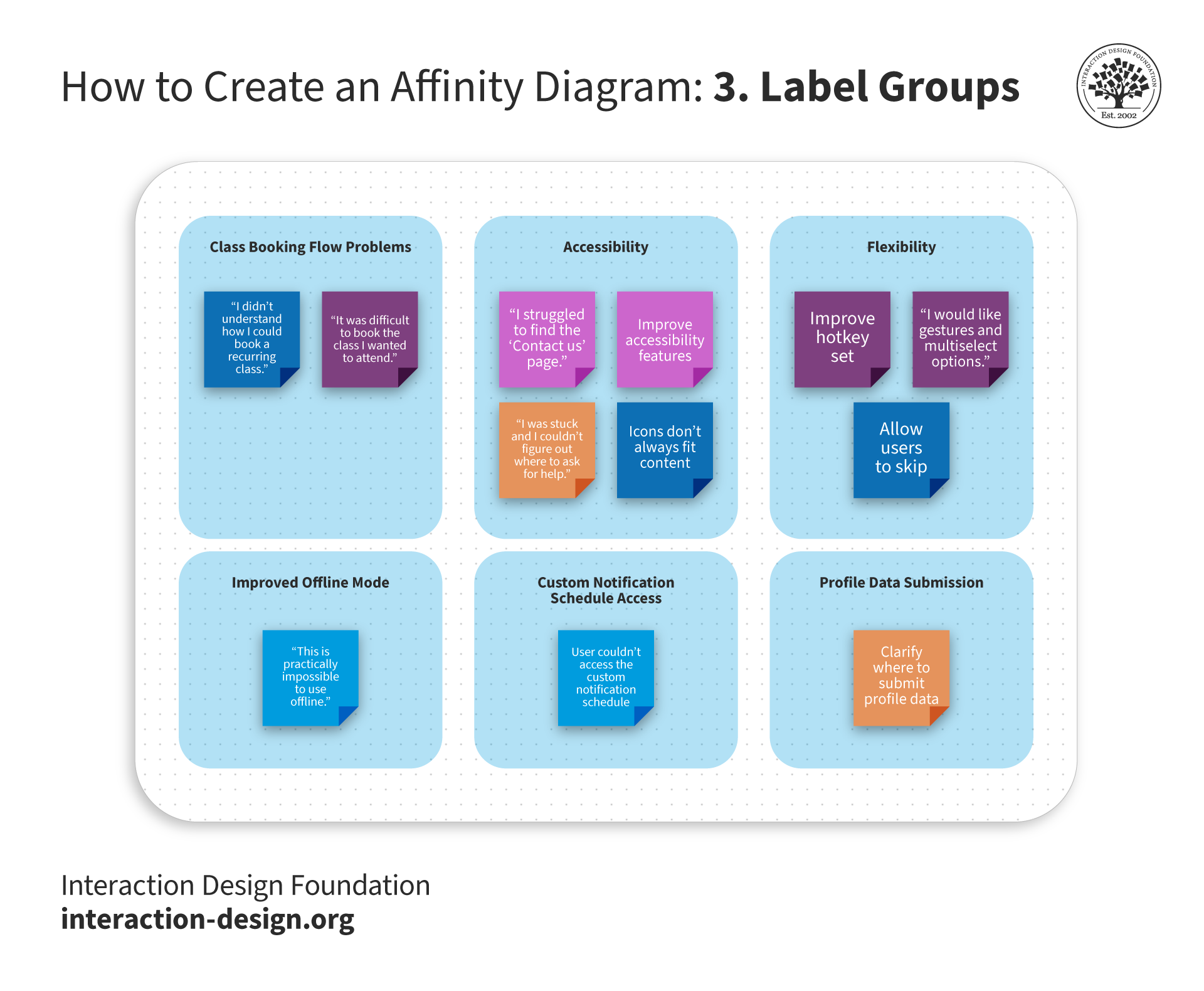
When you determine the common themes, it’s essential to label them clearly so everyone on the team can quickly understand what each note pertains to. Be sure to accommodate anyone on the team who might encounter accessibility issues, i.e., take visual or hearing impairments into consideration during the session for a truly inclusive environment.
© Interaction Design Foundation, CC BY-SA 4.0
Step 4: Create Hierarchy
Depending on your data's complexity, you may create a hierarchy by organizing groups into further categories or themes or even merging more narrow categories together.
In the example group, “Class Booking Flow Problems,” you could create a hierarchy where the idea, “It was difficult to book the class I wanted to attend.”, breaks further down into a sub-theme called “Single Booking Difficulty” and the other user comment, “I didn’t understand how I could book a recurring class.”, nests under “Recurring Booking Difficulty.”
Additionally, you could add the quote, “This is practically impossible to use offline.” to the theme, “Flexibility,” under the sub-group, “Improved Offline Mode.”
It would look something like this:
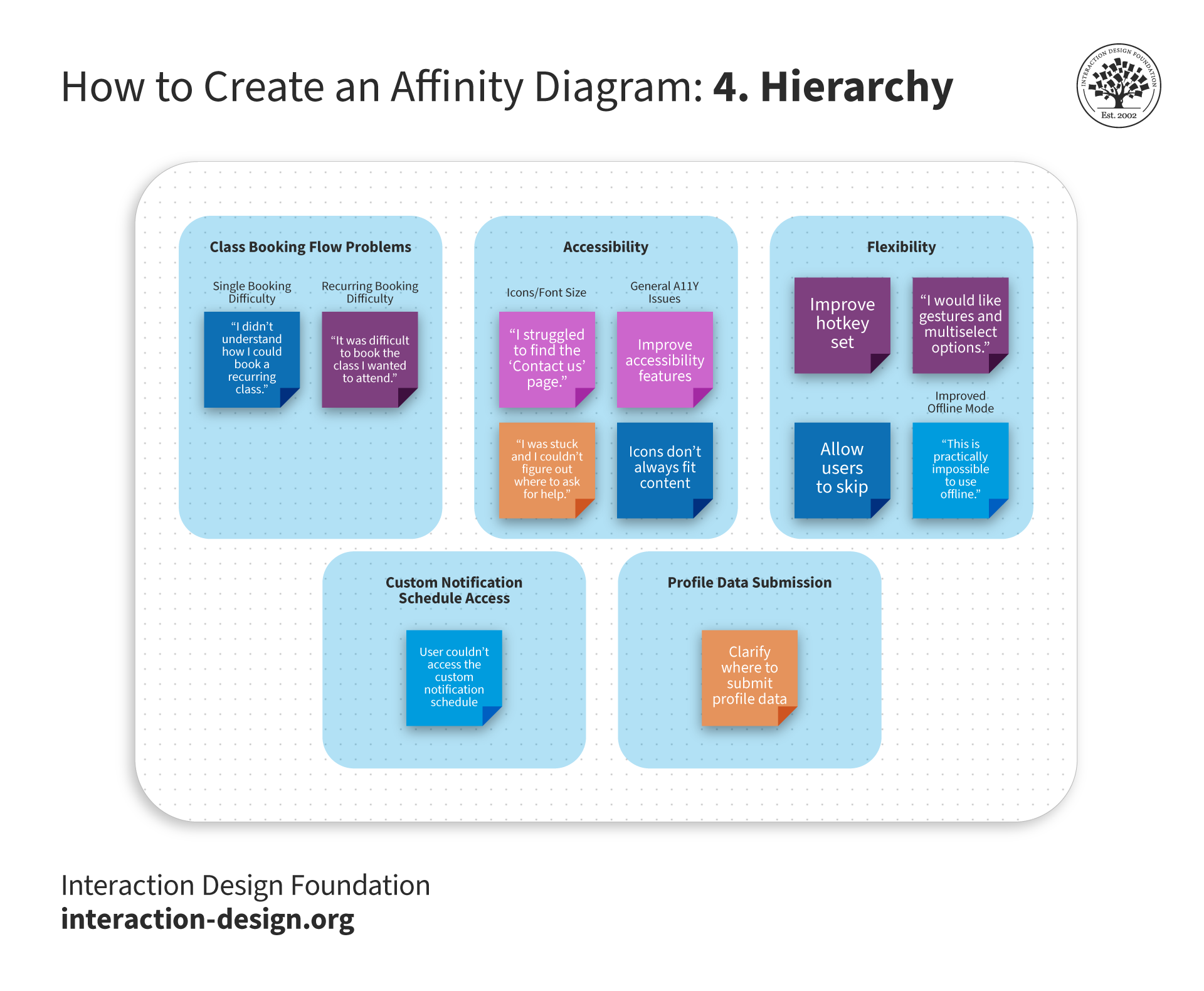
In this optional step, you can create hierarchy within the groups themselves. For example, you can nest the sub-groups, “Icons/Font Size” and “General A11Y Issues,” in the main group labeled “Accessibility”. Hierarchy formation helps when you start to identify insights in the next step.
© Interaction Design Foundation, CC BY-SA 4.0
Step 5: Review, Refine, and Share Your Insights
Now you can review the overall structure of the affinity diagram. Make sure the groups make sense and accurately represent the relationships among the ideas. Refine and adjust the diagram as needed. As with everything in UX design, affinity mapping is also an iterative process.
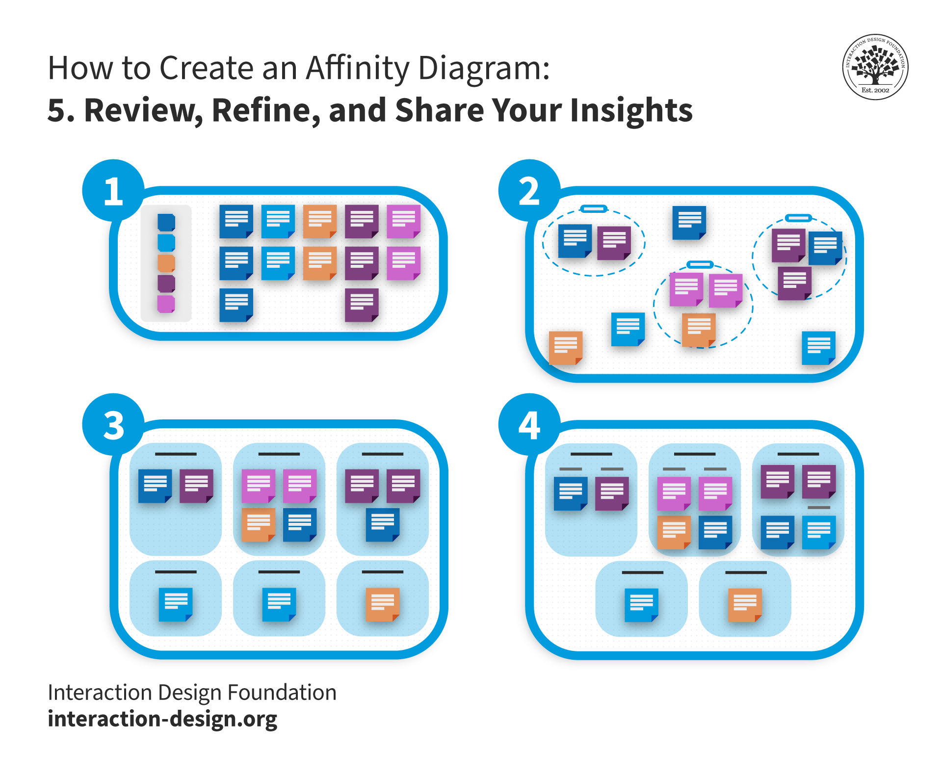
The affinity diagram process requires iteration. Take a step back, review the results of your efforts, and don’t be afraid to make edits, additions, and appropriate changes based on your user research and data. Create the affinity map as a team to take advantage of different perspectives.
© Interaction Design Foundation, CC BY-SA 4.0
You’ve now identified the patterns, you can create insights to share with your team and relevant stakeholders.
For example, you might notice that a majority of your users faced one particular problem… You could present them as follows:
“Participants struggled to book a class using the gym app; this means the booking flow needs improvement for singular and recurring booking. To accomplish this we could add a recurring booking feature to the app and dedicate resources to improve the current design for the single-class booking experience.”
“Participants couldn’t easily find the ‘Contact Us’ page while others had trouble with the icons and related copy; this means the ‘Contact Us’ button and other icons are perhaps not obvious enough on each screen. The team can improve this by testing alternate layouts.
The affinity diagram helps teams make sense of complex information and facilitates a more organized and structured approach to problem-solving or idea generation. You can use it in different fields, including business, design, and project management, to clarify large amounts of data and encourage collaboration among your team members.
Potential Challenges of Affinity Mapping
Affinity diagrams bring incredible value to the design table, but they are not without potential downsides. As a UX designer, it’s always a good idea to remember:
Affinity diagrams require time-intensive collaboration. Similar to a design sprint, they necessitate time-intensive collaboration among team members. The process of sorting, grouping, and categorizing information demands active participation and discussion, whether physically or via a design tool. This is a potential drawback in fast-paced projects or when team members have limited availability. However, many virtual whiteboard tools use artificial intelligence (AI) and can automatically identify themes from raw data which saves time by pre-populating the board for the team to then validate and iterate.
Affinity diagrams may introduce subjectivity and bias. Individuals or teams interpret and categorize information based on their perspectives, potentially leading to bias in the final diagram.
Affinity diagramming may present challenges in accessibility. The visual nature of affinity diagrams, which often relies on physical cards or visual representations, may pose difficulties for individuals with visual impairments or other accessibility needs. You should ensure the information is accessible to all team members and keep in mind those who require additional considerations or alternative approaches in the representation of data.
Affinity diagramming involves multiple stakeholders. The more team members participating in the session can mean more insights but also more time needed for discussion and consensus-building. It's important to involve only those absolutely necessary to the process.
Tools for Affinity Diagramming: Beyond Post-it Notes
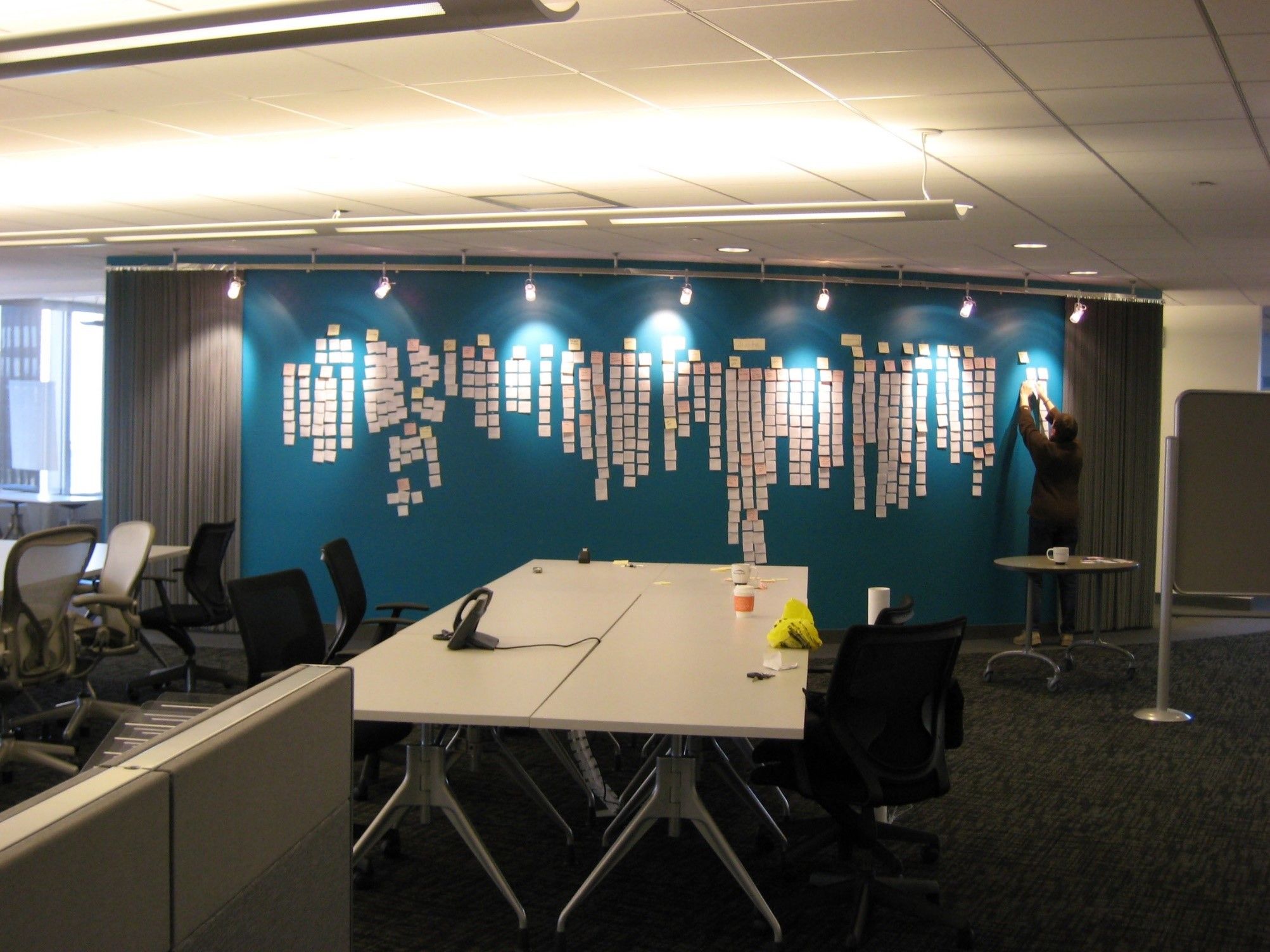
Since its inception in the 1950s-60s, people have completed affinity diagramming with paper notecards or post-it notes. They are “tried and true” supplies, always on hand or readily available in offices and homes around the world. However, writing down each input on a physical post-it note is a time-consuming task that teams may not want to invest in.
With the rise of design software tools, many include affinity map templates and built-in artificial intelligence (AI) which give teams a head start on their ideation journey. These digital programs have revolutionized how long-distance or remote teams implement affinity diagrams within their research, as multiple users can log in and participate simultaneously from even thousands of miles away.
The virtual canvas’ use goes beyond affinity diagramming and teams can continue to use the same tools for journey mapping, project planning, design collaboration, and more.
 The affinity diagram process is great when you want to make sense of insights gathered during research, as well as when you want to organize ideas generated during ideation sessions.
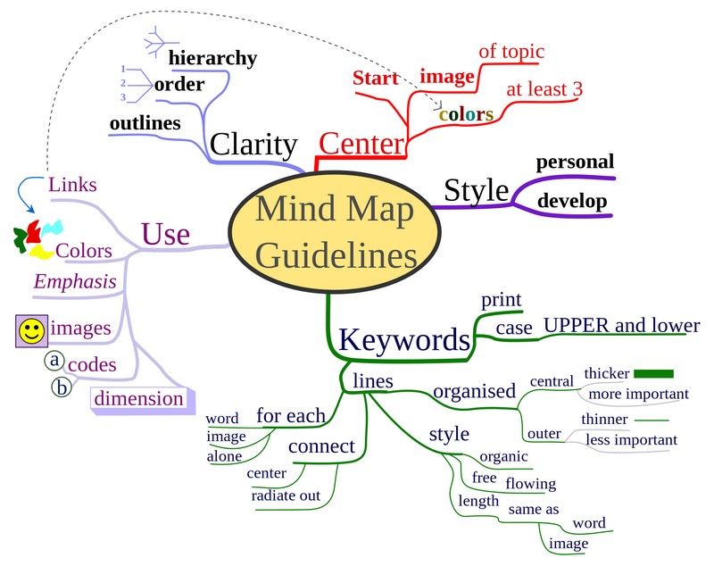 A mind map depicts mind map guidelines. You're able to break abstract ideas down into their sub-ideas and show connections between them. You can easily use this brainstorming technique on your own.