When thinking about visualization of research results, many people will automatically have an image of a graph in mind. Do you have that image, too? You would be right in thinking that many research results benefit from a graph-like visualization, showing trends and anomalies. But this is mainly true for results from quantitative user research. Graphs are often not the best way to communicate the results from qualitative user research methods such as interviews or observations. Frequently, the number of participants in these types of studies is too low to create meaningful graphs. Moreover, the insights you will want to communicate sometimes don’t translate to a clean number. Let’s show you how to visualize more subjective and fuzzy data from qualitative user research methods, in a way that communicates the essential insights to other stakeholders, so they don’t have to plow through voluminous research reports.
“The purpose of visualization is insight, not pictures.”
— Ben Shneiderman, Distinguished university professor in computer science
When you’re sharing results from qualitative user research efforts, you’re most likely focusing on creating an understanding for the lives people lead, the tasks that they need to fulfill, and the interactions they must effect so as to achieve what they need or want to do. This holds true whether you’re using the research in the beginning phases of a design process (getting to know what to design), or using it in the final stages (understanding how well a design is meeting its targets). Depending on the people you’re communicating with (such as your design team or a client) and the type of understanding you need them to have (in other words, a deep empathy for the user needs or a global feeling for the context in which a product will be used), you need to determine what type of visualization suits your results best.
Imagine that you’ve conducted several interviews with people from your target group: overworked and worried informal caregivers of seniors with early signs of dementia. They have shared some essential information with you, regarding the fears they have about a new product that’s supposed to help them be more independent in the care they provide to their loved ones. You used a thematic analysis technique with lots of Post-it notes to make sense of the data, and you found four categories of fears that are relevant to consider when designing the new product: changes in the relationship, a constant feeling of worrying, lack of competencies, and lack of personal time. You need to share your insights with your design team—so that everyone is on the same page and continues the design process with the same level of empathy for this fragile target group. Also, you need to communicate these insights to your clients: the management team of a healthcare organization. They are hoping to engage informal caregivers more into the care process, since they need to reorganize their budgets and unburden their employees. How would you go about communicating the results that you found? Would you simply give them that short list of four fears? Would you give them a pie diagram, showing how often a certain category of fears was mentioned in the interviews? We would argue that this does not lead to the deep understanding you’re aiming for. A list is not immersive enough to trigger any type of empathy. Here, we’ll show you three ways of visualizing your results that are much more effective.
Affinity Diagram
By using Post-it notes for the thematic analysis technique to come to your conclusions on the four main fears that your target group struggles with, you’ve already used a visualization method that we would recommend: an affinity diagram. You have taken quotes and notes from the interviews and have written each of them on a separate Post-it. Then, you started to reorganize them according to similarities, creating themes as you went along. There’s a tremendous amount of information present in the diagram you’ve created as an analysis tool. However, you will need to clean up this diagram so that it better reflects the insights you want to communicate.
You can quickly decide that the categories should reflect the four main fears that you discovered. You then need to ask yourself what pieces of information will help your fellow designers and your client understand what these fears entail. What impact do they have on your users’ lives? When is this fear most prominent? What triggers this fear? Do you have some insight into what can reduce this fear? All this information will already be present in the Post-it notes you collected within a theme. Now you simply have to filter out the most important ones, and present them in a clear and visually appealing way to accommodate the people you’re communicating this to. You can use quotes or keywords, and—if you happen to have made some observations as well—illustrate them with pictures or drawings. The image below shows what an affinity diagram for this purpose could look like.
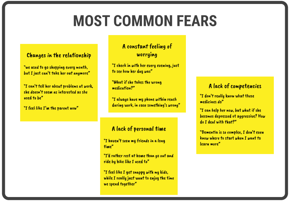
© Teo Yu Siang and Interaction Design Foundation, CC BY-NC-SA 3.0
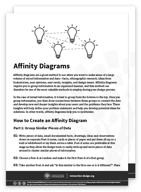
Want to learn more about how to create an affinity diagram? Read our article “Affinity Diagrams – Learn How to Cluster and Bundle Ideas and Facts”, or download our affinity diagram template below:
Empathy Map
An empathy map is a great way to create a clear overview of four major areas that we as designers should focus on so as to gain empathy for our target group: what people said, did, thought, and felt. This is also very relevant for our client in the case of informal caregivers—the management team of a healthcare organization—as they might have some preconceptions based on the usual interactions they have with the target group. The empathy map has the potential to trigger discussion within that management team, and force them to admit that they often have to adjust their perspective. In healthcare (but this holds true for many other contexts as well), professionals feel that they can speak for the patient or their family, as their main job is to take care of them. They tend to forget that they only have a limited view on their lives, and therefore might not understand all their needs as well as they would need for a design process.
To create an empathy map based on the findings from your interviews, you go through the notes and other materials that you have from your qualitative user research. For each quadrant—or each focus area—you select the relevant quotes and images, or you synthesize the appropriate insights based on them. As you can see in the image below, the resulting empathy map draws on the same data as the affinity diagram we created before, but communicates different insights. Both visualizations can be relevant in our design case.
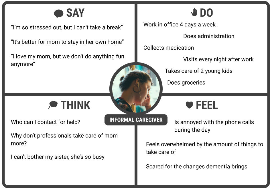
© Teo Yu Siang and Interaction Design Foundation, CC BY-NC-SA 3.0
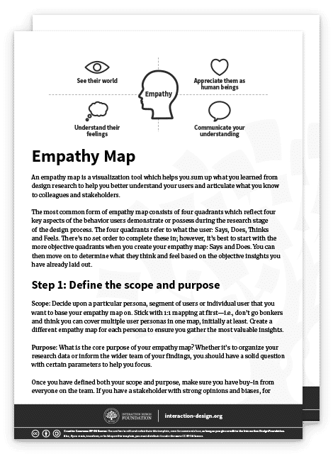
Want to learn more about how to create an empathy map? Read our article “Empathy Map – Why and How to Use It”, or download our empathy map template below:
User Journey Map
Let’s revisit the design case we used to illustrate how to visualize your qualitative user research results. You’re creating a new product to help informal caregivers of seniors with mild dementia symptoms to be more independent in the care that they provide. Your client is the management team of the healthcare organization involved with these seniors. One of the subjects that you are likely to have focused on during your user research is the context in which informal caregivers provide their care. You might have asked yourself questions like: Which tasks do they perform? When do they perform these tasks? What other activities do they have before and after performing these tasks? How do they feel while providing care to their loved ones? What is relevant in your results is not only the straightforward answers to these questions but also the flow that they create throughout the lives of these informal caregivers. For example, it’s important to know whether the care they provide can be planned well in advance, or if people are often disrupted by other activities. A very powerful way to communicate this flow over time involves making a user journey map.
The user journey map you see in the image below shows a period of one day. You can choose this period according to what makes sense in your project; sometimes a week or a month would be more appropriate. You can map out the steps involved in taking care of a senior throughout a typical day, by creating separate paths for the doing, thinking, and feeling elements that you also used in your empathy map. Furthermore, you should indicate any touchpoints with the current service provided by the healthcare organization, or any other entity involved. Focus on showing the motion of a user through the different touchpoints across the day, and how the user feels about each interaction on that journey. Ultimately, you should be able to communicate to your team and the client which interactions should change, disappear, or be introduced.
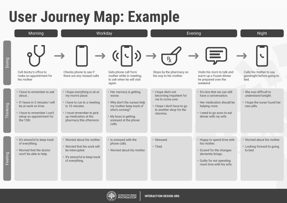
© Teo Yu Siang and Interaction Design Foundation, CC BY-NC-SA 3.0
Want to learn more about how to create a user journey map? Read our article “Customer Journey Maps – Walking a Mile in Your Customer’s Shoes” here.
The Take Away
Information visualization is a powerful technique to communicate the results from qualitative user research to your fellow designers or the client. There are three types of visualizations you could use. Affinity diagrams resemble your data analysis outcomes most, but you must rework them to provide more clarity to the people who need to understand the insights. Empathy maps give your audience a great overview of four relevant areas of user understanding: what people say, do, think, and feel. Finally, user journey maps introduce user flow over time. You can use these three visualizations side by side to elicit the deep feeling of empathy that will bring your design project to the next level.
References & Where to Learn More
Read this insightful article on how to use affinity diagrams to collaboratively clarify fuzzy data here.
Learn more about empathy maps here.
For more on journey mapping and how it is done in the industry, refer to this research here.
Image
Hero Image: © Pexels, CC0