KPIs (Key Performance Indicators) are metrics that brands collect and evaluate to measure how successful their user experience (UX) activities are. UX KPIs show how close a company is to meeting its UX goals and they help UX designers turn the more abstract user experience into measurable data. When designers track UX KPIs, they can monitor user interactions with a product and gauge how the experience makes users feel.
CEO of Experience Dynamics, Frank Spillers explains important points about UX KPIs:
Why Are User Experience Key Performance Indicators Vital to Measure?
User experience designers value user experience KPIs as vital signs of how they can guide their design work towards the most desired outcomes both for their brands’ users and to meet their brands’ business goals, too. It’s crucial to measure UX KPIs, and for several reasons—namely to:
1. Track Success
UX KPIs help brands keep a finger on the pulse of their UX activities in real-world areas such as product development. When they monitor how successful efforts and iterations have been, they can make informed decisions or test hypotheses about how to improve the user experience as needs be.
2. Maximize Visibility
KPIs make UX contributions to the company's success both traceable and visible over extended periods of time.
3. Apportion Budget
UX KPIs that show signs of success can be a useful argument for design teams to bring up if their management think about allocating budgets away from their UX activities to, say, marketing campaigns.
4. Boost The Sense of Achievement
UX KPIs help bring a rewarding sense of accomplishment for teams as they make visible progress towards their set UX goals. Plus, success breeds success—and they can be nice morale boosters to give team members the lift they need to see that they’re on the right track with design efforts.
© Emily Stevens, Fair Use
What Are Types of KPIs in UX Design?
KPIs can comfortably split into three large branches or general types:
Behavioral KPIs
Behavioral UX KPIs help designers measure what users actually do when they’re interacting with a product. These are critical metrics because they yield invaluable insights into user behavior in the moment and in the field. Another important point is that they can clearly highlight areas where improvements need making. Key behavioral UX KPIs include:
1. Task Success Rate
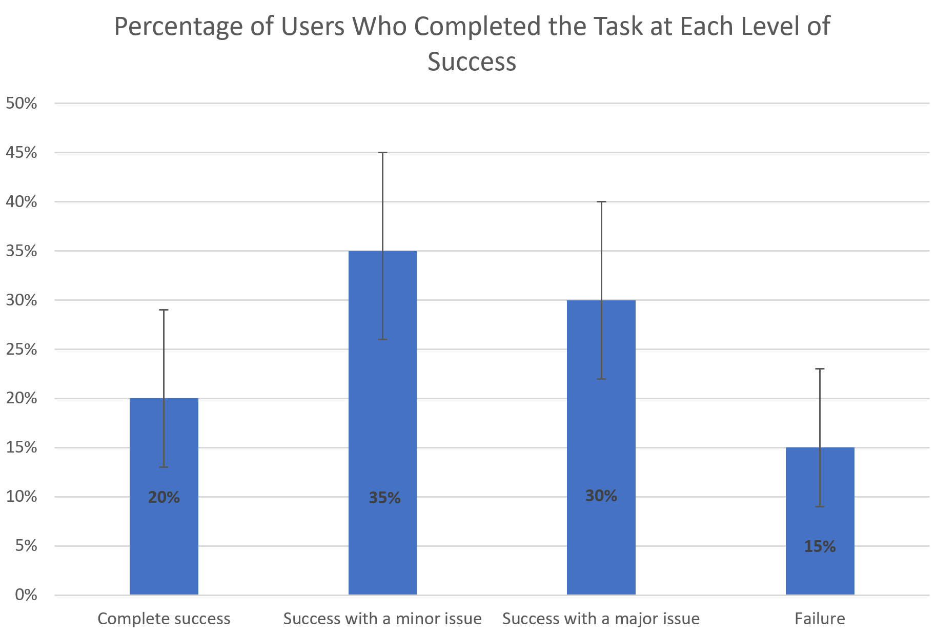
The task success rate UX metric sees wide use, and—true to its name—it shows what percentage of users successfully complete a specific task. It's a simple—yet powerful—way to see how well users can actually achieve their goals when they use a product. In the main—and regarding KPI UX design efforts—a good task success rate to aim for is around 78%.
To measure their task success rate, designers typically run usability studies with multiple users and then they calculate the percentage of them who manage to finish the assigned task. It's important to consider partial successes, too, however—and in varying degrees. For example, if 35 out of 100 users complete a task with just a minor issue, then it’s important to record that 35% of users were able to complete the task with just that small kink—something that designers can iron out in the next iteration from the data collected.
© Jakob Nielsen and Raluca Budiu, Fair Use
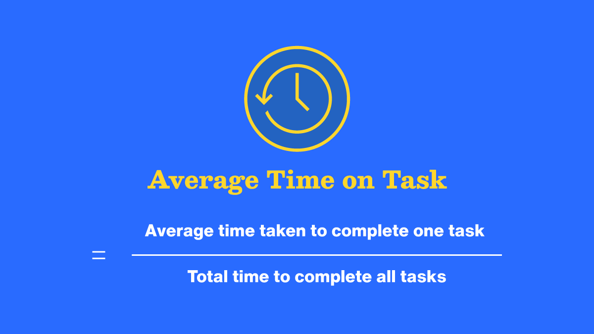
2. Time-On-Task
Just as it sounds, time-on-task measures how long it takes a user to get through and finish a specific task. The time spent usually gets reported as an average, and so it can give valuable insights into a user interface’s (UI’s) efficiency. Naturally, it can vary according to the individual user—and numerous factors might be at play, including external distractions and other factors such as their mood. Generally, though, shorter task times directly indicate high levels of usability. KPIs that reflect these can be a strong indicator of a decently crafted UI, therefore, if tasks that take just a small amount of time chart as a distinct majority.
At the other end of the scale, longer times might well suggest that users are really struggling to understand the product or find the information they need to use it. If there’s a sizeable amount of longer time-on-task KPIs showing up, then it’s almost certainly going to call for a revisit to the design. It’s a particularly helpful KPI for UI-UX designers, since it’ll also provide a chance for design teams to take a closer look at how they can make the content a better fit for the users’ contexts:
Watch Frank Spillers explain important points about context, content and what users need.
To measure time-on-task accurately, it's best to track time per screen—or activity—as well as how long it takes users to get through the overall task; that means as a sequence of actions or screens. This helps to pinpoint which steps are taking them the most time to get through or which might be adding unnecessary seconds. Every split-second counts in this KPI for UX designers—a vital opportunity for them to deliver great customer service through seamless experiences that respect individual users’ time. To calculate average task time, it’s wise to use the geometric mean for sample sizes smaller than 25, and the median for larger samples.
© Aparna Subhash, Fair Use
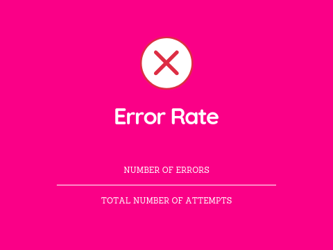
3. User Error Rate & User Error Occurrence Rate
These two KPIs are in the same “bucket,” but they’ve got minor differences which are important to understand to maximize the benefit designers can get when they use them.
To measure the user error rate is to find the percentage of mistakes that users make while they’re trying to complete a task. Take the number of user errors and divide it by the total number of task attempts and then multiply that result by 100. A high error rate is a pretty sure sign that usability issues are lurking in digital solutions and designers need to address these as soon as possible.
© Sandro Meyer, Fair Use
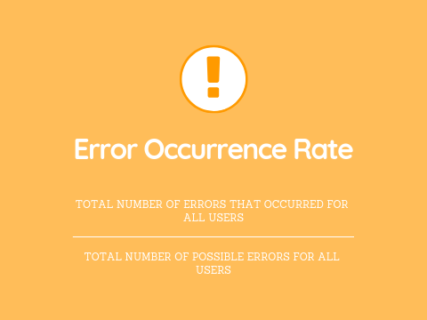
Then, there’s the error occurrence rate or average error occurrence rate. Designers can use that whenever the task they want to measure has just one potential chance for error—for example, if users click the wrong button—or if designers, or UX researchers, just want to track one error among several different ones that a user could make. To calculate the average error occurrence rate, divide the total number of user errors which happened—for all users—by the total number of possible errors that all users could have made.
© Sandro Meyer, Fair Use
Naturally, the error rate is a huge factor—and potential worry—for designers, design teams and the brands they work for. It doesn’t mean the other KPIs are any less important; it’s just that error rates tend to flag—in clear terms—what designers may need to do to improve UIs as a matter of urgency. Tasks might be too complex for users; the system itself might demand too much familiarity for them to use straight away—and so not be as intuitive as needed—or there might be environmental factors, like distractions, or user characteristics, like cognitive abilities to account for. The latter point highlights precisely why accessibility is so vital a matter in UX design.
Watch this video to understand key points about the need for accessible designs:
4. Navigation Versus Search
With this KPI, digital designs’ essential quality of navigation vs search is a metric to compare the effectiveness and usage of a website or application's navigation system against its search functionality. This KPI helps designers and developers understand how users prefer to find information or complete tasks within a digital product like a website or mobile app. Navigation refers to the menu structure, links and hierarchical organization of content that lets users browse through a website or app. Meanwhile, search is the functionality that enables users to directly query for specific information or content using keywords or phrases.
This KPI compares these two methods of information retrieval so researchers or designers can tell which one’s more effective and preferable to users. For example, a large e-commerce website might have thousands of products with users being able to find the products they want in two primary ways, if they:
Navigate through categories and subcategories: for example, Electronics > Smartphones > iPhones.
Use the search bar to type in specific product names or features: for example, "iPhone 13 Pro Max."
The KPI of navigation vs search would measure and compare how often users successfully find products using each method and how efficiently they do so. For example, designers and UX researchers measure this KPI with analytics tracking—such as Google Analytics to track user behavior—and navigation path analysis, click tracking and heat maps. The insights they get from collecting data like this can show them many things about which way is better. For instance, a check in the search log analysis could reveal what search terms users enter to look for what they’re after.
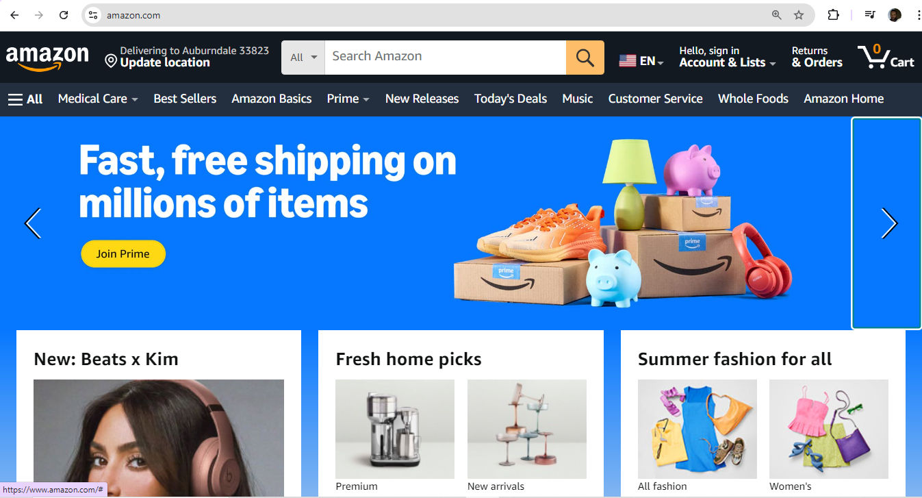
Amazon offers a wealth of possibilities for users to find what they want—how they get to the item page might be a matter of interest with key insights into this part of their user and customer experience.
© Amazon, Fair Use
5. Page Views
For this KPI—the number of views of a page—designs can involve anything from blog posts to the most particular type of item a brand might offer—like a tiny accessory or hard-to-find car part—and be a more intricate matter for interactive design.
Still, page views alone don't tell the whole story. To really understand how people use a website, it's smart to look at other factors as well. For example, with mobile apps, it’s advisable to keep a count of items like taps, clicks or how many screens a user goes through. When researchers or designers combine these details with page views, they’ll likely get a much clearer picture of how users use a site or app.
6. Bounce Rate
Bounce rate is a key user engagement metric—and even a UX designer KPI in the sense that a high bounce rate can show up a designer’s errors in judgment and other elements of work performance. It measures the percentage of visitors who leave a webpage without further interaction—potentially a major drawback for product designers, especially. To track bounce rates and other behavioral metrics, brands can use web analytics tools or app-specific platforms—with features like session tracking, heat maps and bug identification, among alternative methods like A/B testing.
UX Strategist and Consultant, William Hudson explains important points about A/B testing:
Attitudinal KPIs
These KPIs measure what users say, with these key examples:
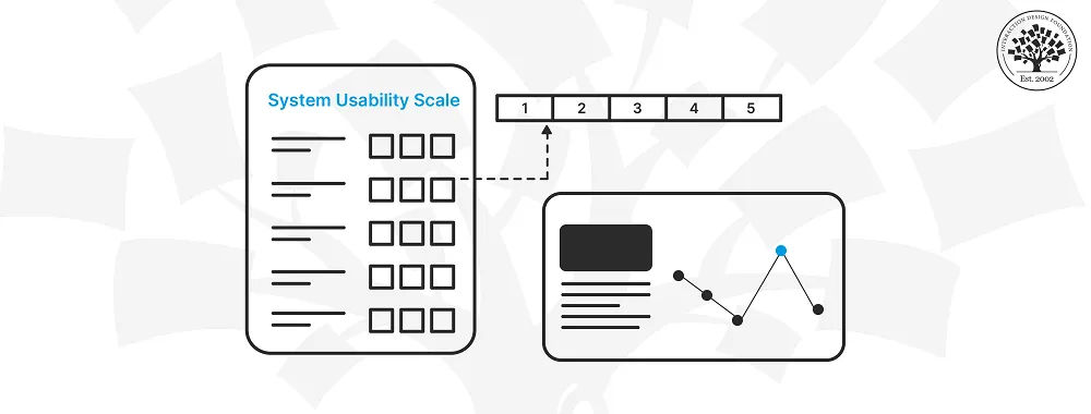
1. System Usability Scale (SUS)
The System Usability Scale (SUS) is a widely used tool for evaluating how usable software, websites and other interactive systems are. John Brooke of Digital Equipment Corporation created the SUS in 1986, and it’s become a standard method for assessing the overall user-friendliness of a product. It consists of a 10-question survey that users complete after they’ve interacted with a system, and it provides quick and unfiltered feedback.
The SUS uses a 5-point Likert scale—ranging from strongly disagree to strongly agree. The final score is something to calculate on a scale of 0 to 100, with higher scores indicating better usability. It’s important to point out that the average SUS score is 68%—roughly translating to “C” grade, with 51% being the threshold for a system not to fail.
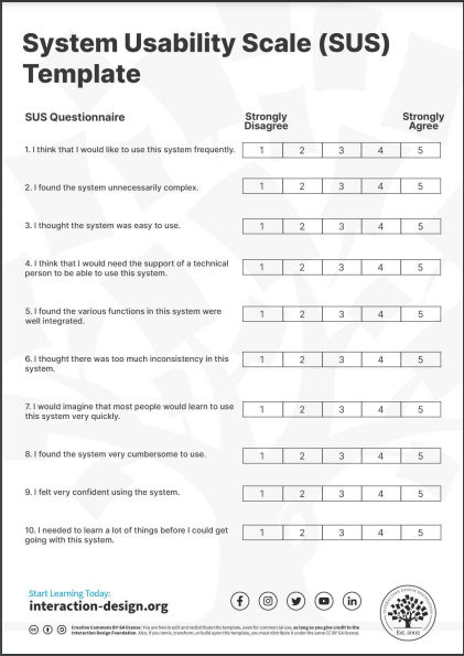
© Interaction Design Foundation, CC BY-SA 4.0
2. Net Promoter Score (NPS)
The Net Promoter Score (NPS) is a customer loyalty metric—one that Fred Reicheld at Bain & Company introduced in 2003. It asks users a simple question: "On a scale of 1-10, how likely are you to recommend this product to a friend?" Based on their responses, users are categorizable as Promoters (9-10), Passives (7-8) or Detractors (0-6).
To calculate NPS, subtract the percentage of Detractors from the percentage of Promoters. The score can range from -100 to +100. A positive score indicates that Promoters outnumber Detractors, which suggests there’s considerable customer loyalty at work.
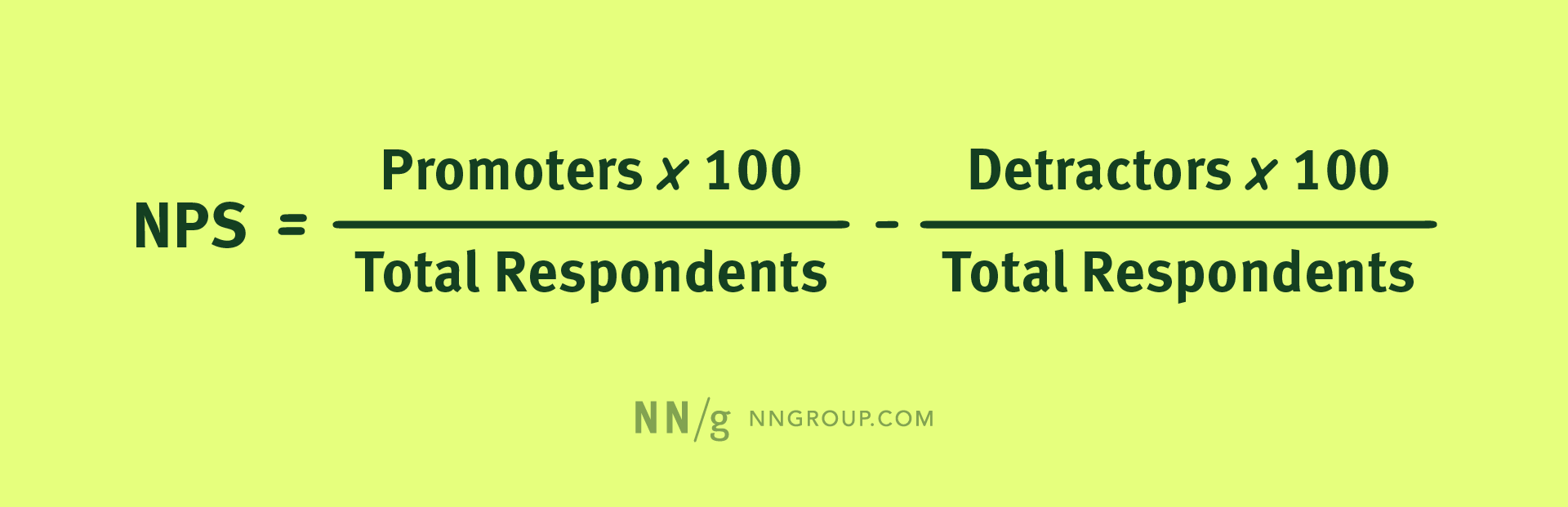
© NN/g, Fair Use
3. Customer Satisfaction (CSAT)
Customer Satisfaction (CSAT) is a metric that measures how satisfied customers are with a company's products or services. Researchers measure CSAT when they ask for customer feedback, and often use variations of the question: "How would you rate your overall satisfaction with the [goods/service] you received?" To calculate CSAT, use the responses of 4 (satisfied) and 5 (very satisfied) on a 5-point scale, though some Likert scales can vary.

Hubspot’s 7-point scale, for fine-tuned CSAT feedback.
© Hubspot, Fair Use
Other Important Business KPIs
Here are some other major KPIs for designers to consider:
1. Conversion Rate
One of the most telling indicators of how effective a product is is its ability to transform casual browsers into active participants—or visitors into customers. This transformation is something to quantify through the conversion rate, and it’s a percentage that reflects how many users complete a desired action, like to finalize a purchase or subscribe to a newsletter. To calculate this rate means to divide the number of successful conversions by the total visitor count.
2. Retention Rate
The retention rate is the percentage of users who continue to engage with a product—or a service—over time. To determine it, divide the number of customers retained by the total number of customers at the start of the measurement period.
CEO of Experience Dynamics, Frank Spillers explains vital points about KPIs in a business and UX context:
3. Average Order Value
For e-commerce businesses, the Average Order Value (AOV) is critical for them to understand actual customer spending, and it’s the typical amount a customer spends in each transaction over a specific time frame. To calculate AOV, divide the total revenue by the number of orders that users placed during the chosen period.
It’s helpful to keep an eye on UX design KPI examples in context and in combination with other UX metrics.
© Interaction Design Foundation, CC BY-SA 4.0
How to Implement UX KPIs in An Organization?
This typically applies more to startups—since established or bigger brands will likely already have a concrete grasp of what KPIs they should follow. It's critical to note that UX teams need to make sure they have their KPIs based on specific UX goals that support general corporate goals. The selection of UX KPIs should include business-centered, marketing-centered and user-centered metrics—that way, they can be in line with various corporate goals and avoid disconnects between what designers see as success and what the high management might deem success to look like and expect from a production team under them.
Set Up A Measurement Framework
To set up a solid measurement framework, start by identifying relevant KPIs. Google's HEART framework is a helpful tool for this. It covers Happiness, Engagement, Adoption, Retention and Task success. These metrics are applicable at both product and feature levels.
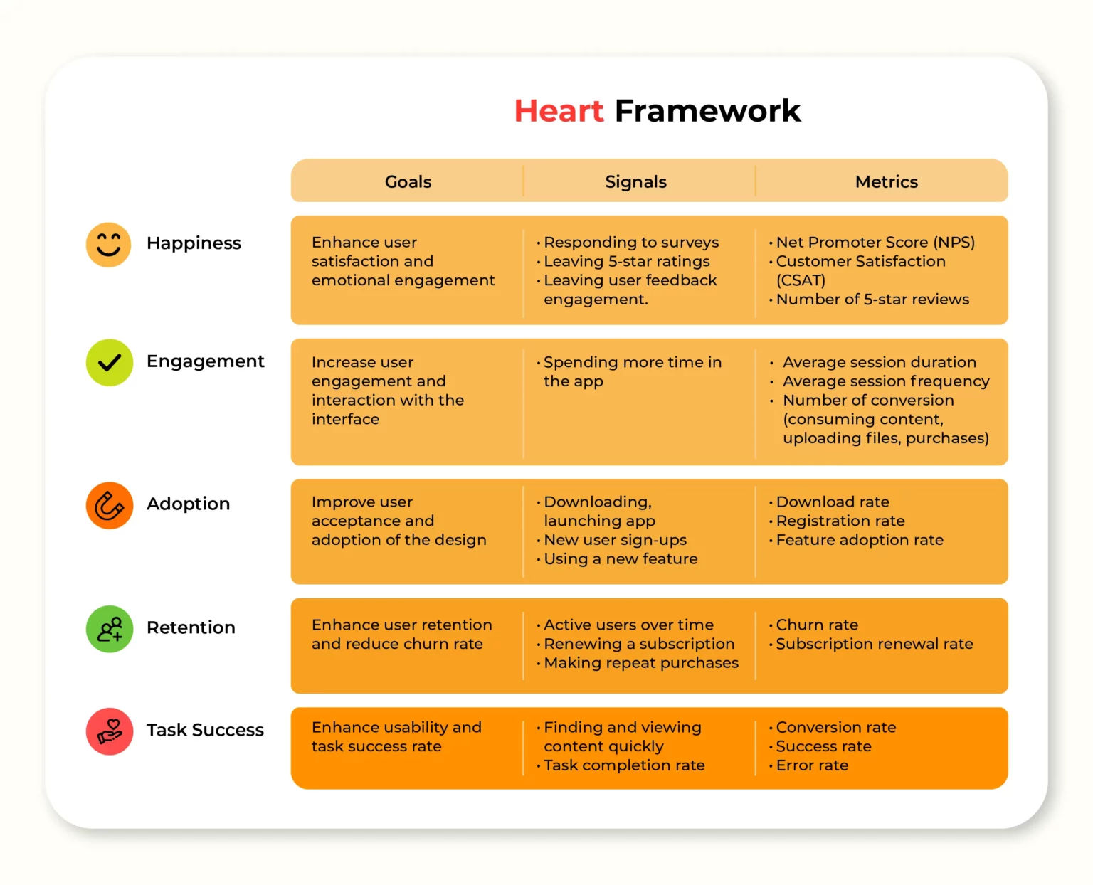
© Long Le, Fair Use
Next, it’s important to align the chosen metrics with business goals to make sure they really do support key objectives. So, set clear benchmarks and goals for each KPI to track progress effectively, and use tools such as heatmaps and session recordings—important ways to bring qualitative and quantitative data into the picture. To implement UX KPIs effectively, it’s essential to combine quantitative and qualitative data—and so reveal both the “what” and the “why” behind user behaviors.
Watch as Author and Human-Computer Interaction Expert, Professor Alan Dix explains important points about the difference between qualitative and quantitative research:
What Are Best Practices to Improve UX KPIs?
Designers can boost their essential KPIs in many ways, and here are some important ones:
Conduct thorough user research to understand their target audience’s needs.
UX Strategist and Consultant, William Hudson explains important points about UX research:
Provide clear and concise instructions for complex tasks.
Design with a mobile-first approach for responsiveness.
Frank Spillers explains important points about responsive design:
Use progressive disclosure to lessen cognitive load.
William Hudson explains vital aspects of progressive disclosure:
Optimize page load times and overall performance.
Use descriptive, action-oriented button labels.
Use consistent and familiar UI patterns.
Watch this video on UI patterns to understand more about how useful they are:
Incorporate visual cues and micro-interactions for feedback.
Work effective error handling and recovery into the UI.
Leverage A/B testing to refine design choices.
Create clear, intuitive navigation structures.
Include a clear and logical information architecture.
Watch William Hudson explain important points about information architecture:
Make sure of an accessible design for all users—including those with disabilities.
Simplify forms and minimize unnecessary fields.
Provide search functionality with relevant results.
Use clear and legible typography.
Implement user onboarding for new features.
Regularly analyze user behavior data and make iterative improvements.
Create designs that evoke positive emotions and align with users' values and expectations.
Author and Human-Computer Interaction Expert, Professor Alan Dix explains vital aspects of emotions and usability:
Make sure there’s a cohesive visual identity and tone of voice across all touchpoints.
Be upfront about product features, limitations and any potential issues.
Tailor the user experience with individual personalized preferences and needs whenever possible.
Add little, engaging elements—micro-interactions that surprise and please users.
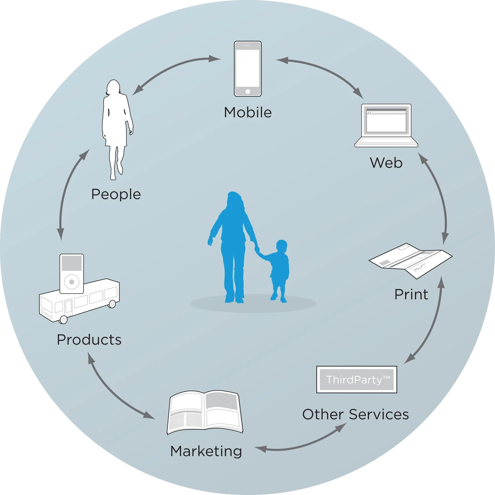
Some important touchpoints to keep in mind.
© Rosenfeld Media, Fair Use
Why Are KPIs Important to Feature in UX Portfolios?
It's crucial for designers to demonstrate their ability to work with KPIs in their UX portfolios for several reasons—namely since designers can:
Demonstrate business acumen: To show how proficient they are in handling KPIs indicates that a designer understands how important it is to align design decisions with business goals and objectives.
Prove a data-driven approach: It showcases how well the designer can make informed decisions—as in, ones based on measurable metrics and hard analytics—rather than just aesthetics or personal preferences.
William Hudson explains key points about analytics:
Highlight problem-solving skills: To address KPIs in design work shows how ably a designer can spot and solve complex problems that impact business performance.
Show value creation: When designers link design decisions to KPIs, they can illustrate how their work contributes to improving key metrics and overall business success.
Differentiate themselves from other candidates: Many designers focus just on visual aspects; so, if a designer showcases KPI-driven work, it can really set them apart in a competitive job market.
Design Director at Societe Generale CIB, Morgane Peng discusses essential aspects of designer portfolios:
How Can Designers Optimize Their Portfolios with KPIs?
Here are some important items that designers can effectively showcase their KPI-handling skills with in their UX portfolios:
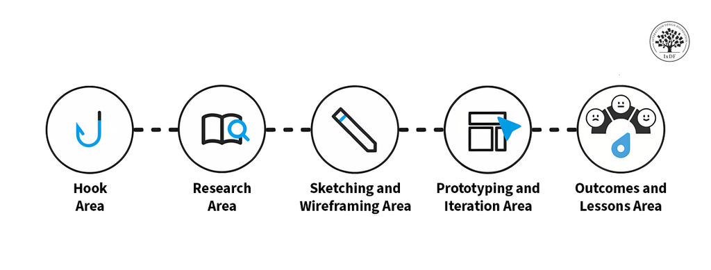
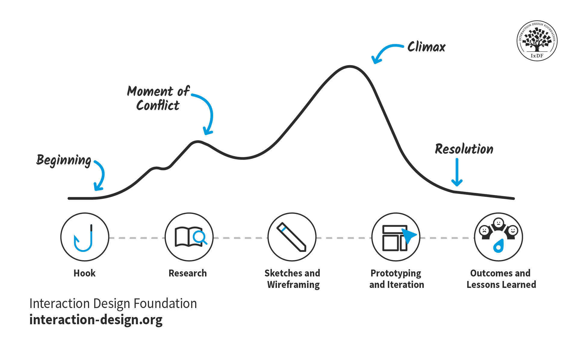
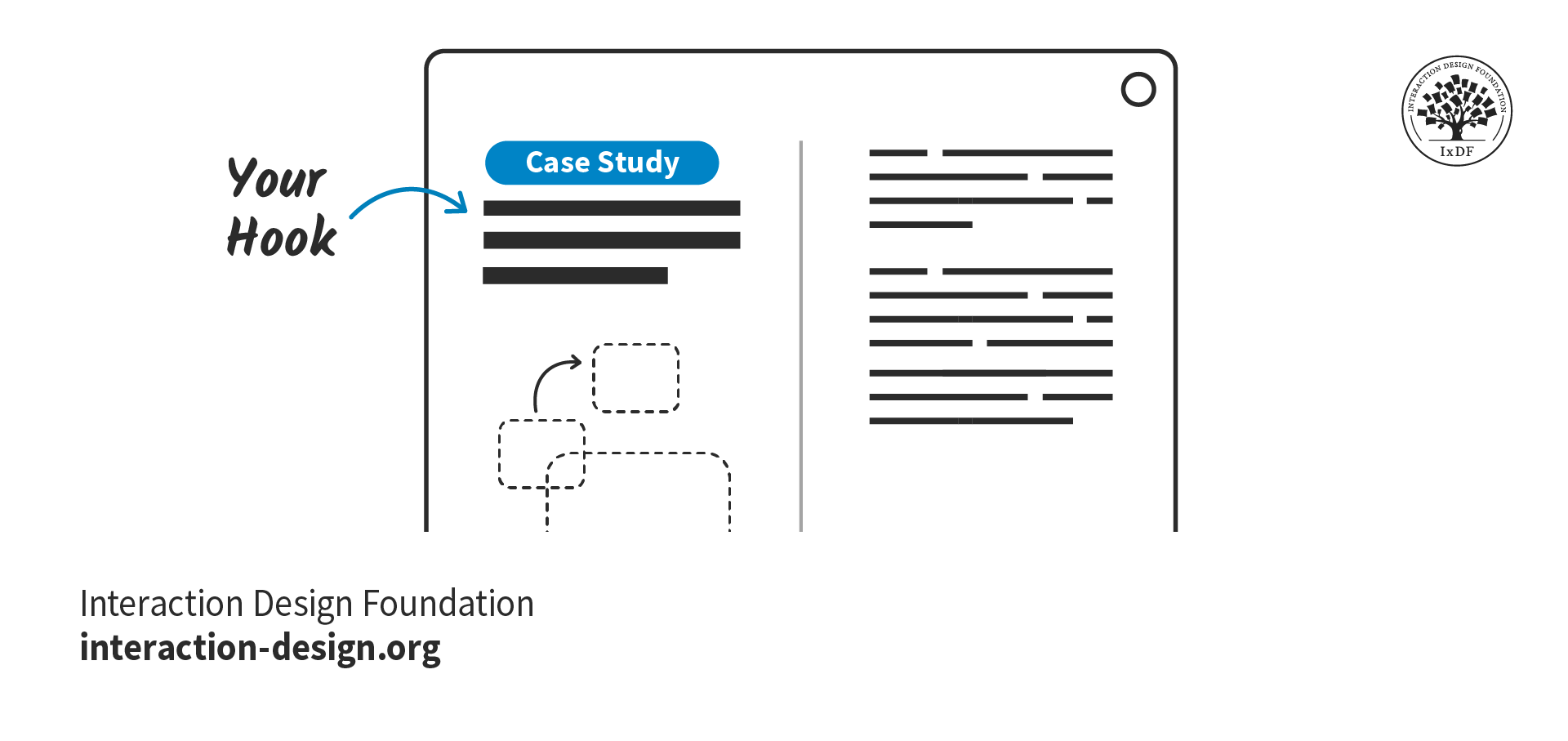
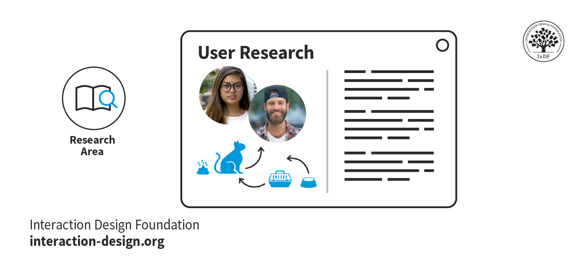
Case studies: Present detailed case studies that outline the project's goals, the KPIs targeted, the design process and the resulting impact on those KPIs—and it’s best to angle these in the form of a story arc.
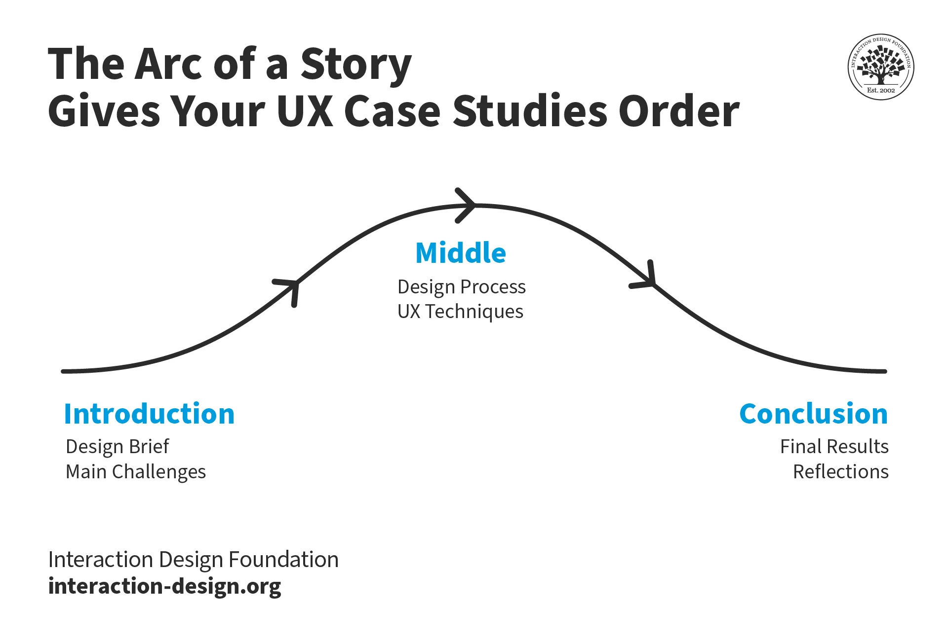
Designers can include KPIs in their portfolios to great effect, especially when these tie in with a story arc approach.
© Interaction Design Foundation, CC BY-SA 4.0
Collaboration highlights: A designer would do well to describe how they worked with other teams—like marketing and development—to align on KPIs and achieve shared goals.
UX Designer and Author of Build Better Products and UX for Lean Startups, Laura Klein explains essential points about cross-functional collaboration:
Lessons learned: It’s helpful to think from a storytelling angle again and discuss any challenges that came up while working with KPIs—and how the designer overcame them; something that can showcase adaptability and continuous learning.
Contextual explanation: Give context for the KPIs chosen—and explain why they’re relevant to the project plus how they aligned with the overall business objectives.
Morgane Peng explains additional valuable points about how to craft a strong portfolio:
What are Potential Pitfalls of Relying on KPIs Too Much?
Regarding pros and cons, there are so many benefits—and vital ones to consider, especially—that it’s easy to overlook some potential downsides that can come if designers, design teams and their brands over-rely on them. Here are some important concerns:
Oversimplification: Complex user experiences can't always boil down into simple metrics—to try to do so can result in missed nuanced insights.
Quantitative bias: To put too much emphasis on quantitative KPIs may overlook valuable qualitative feedback and insights—so get qualitative data, too.
One-size-fits-all approach: Standardized KPIs mightn’t be suitable for all products, services or user segments. For example, there’s the users’ culture to consider.
Author and Human-Computer Interaction Expert, Professor Alan Dix explains important points about how to design for culture:
Resource drain: To collect and analyze KPI data can be time-consuming and expensive—plus, it might even divert resources from actual UX improvements.
False sense of security: Good KPI numbers might invite complacency—supposedly healthy readings can mask a complex design and user landscape, and end up meaning missed opportunities for innovation and improvement.
Remember, UX KPIs function much like the vital signs of a digital solution and—by association—the brand behind it; so, use them wisely and take insights alongside each other for the best results.