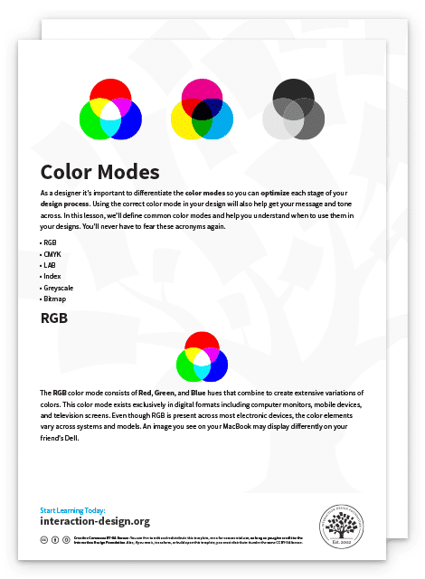
As a designer, it’s important to differentiate the color modes so you can optimize each stage of your design process. If you use the correct color mode in your design, you will also help get your message and tone across. In this lesson, we’ll define common color modes and help you understand when to use them in your designs. You’ll never have to fear these acronyms again.
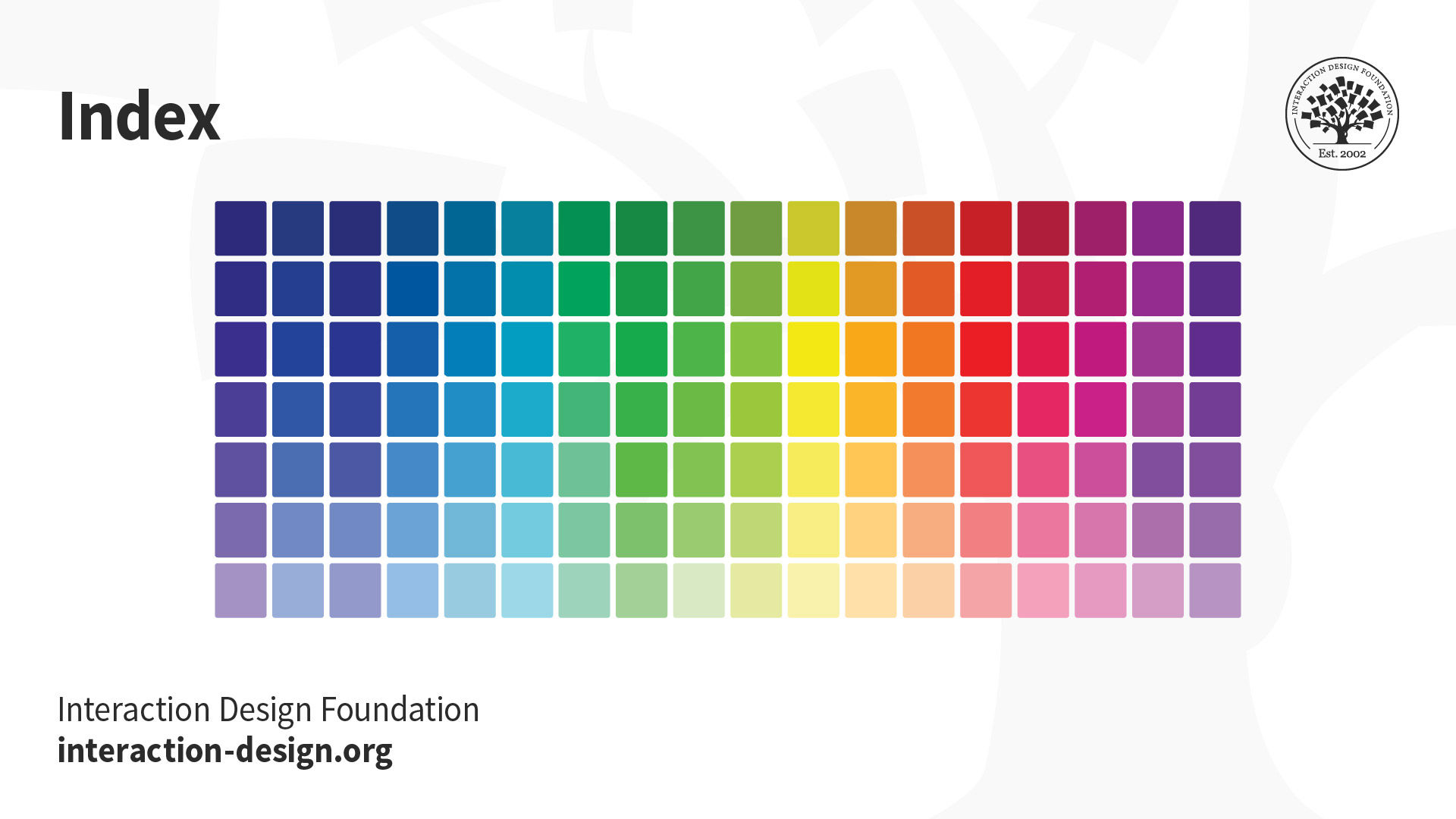
Let’s begin with a quality comparison between several common color modes. The below illustration depicts the difference between LAB, RGB, CMYK, Index, Greyscale and Bitmap color modes. You’ll notice how the quality from left (LAB) to right (Bitmap) decreases as the amount of color decreases.
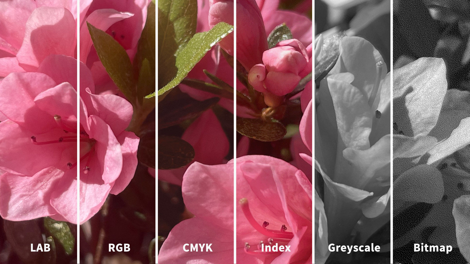
© Daniel Skrok and Interaction Design Foundation, CC BY-SA 3.0
You may be thinking, the quality is far superior in LAB and RGB, so shouldn't I always use this color mode? The short answer is no, as it really depends on the context of use for your users. While the RGB color mode contains millions of colors and is typically a higher quality, it may produce a large file size that is not optimized for the web. So, an optimized Index color mode may be a better solution to help increase your website load time and improve your users’ experience.
Color Modes:
LAB
RGB
CMYK
Index
Greyscale
Bitmap
LAB
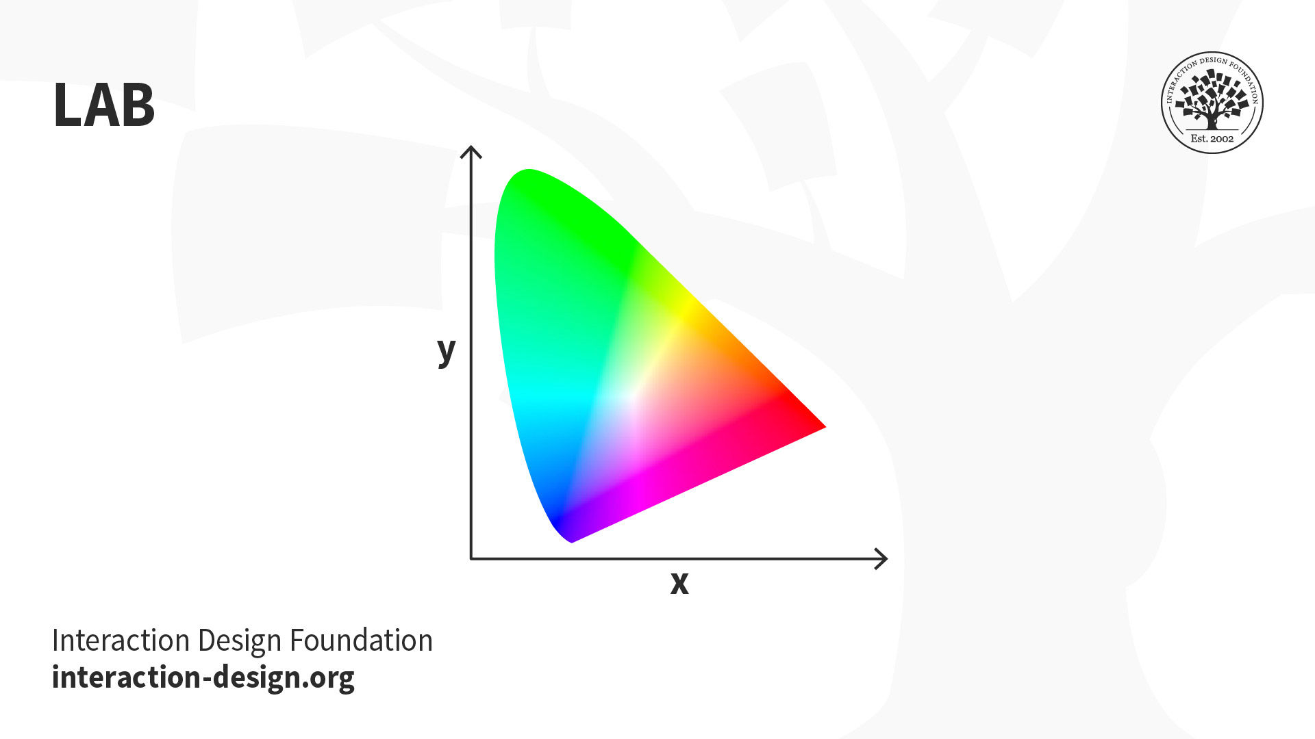
The LAB color mode, also known as CIELab (pronounced See-Lab), is based on the human perception of color. The color mode consists of one channel for Lightness (L) and two channels for Color (A and B). The Lightness channel (L) ranges from 0 to 100 and the Green-Red Axis channel (A) and Blue-Yellow Axis channel (B) range from +127 to -128.
© Daniel Skrok and Interaction Design Foundation, CC BY-SA 3.0
When Should I Use LAB?
Branded Products (e.g., t-shirts, coffee mugs, banners)
Color Reference
Photography
LAB color is considered device-independent, which means that it’s easier for you to achieve exactly the same color across different types of media. If your organization wants you to design a branded t-shirt, coffee mug or banner, it would be a good idea to use LAB color as it will ensure that the colors look exactly the same.
Color management systems use LAB as a color reference to predictably transform a color from one color space to another color space. You can also use LAB to make the colors in your images look more vibrant and natural.
RGB
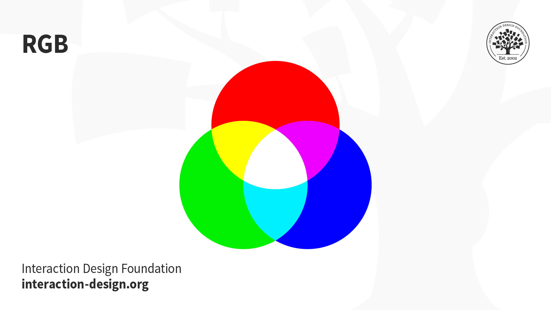
The RGB color mode consists of Red, Green and Blue hues that combine to create extensive variations of colors. This color mode exists exclusively in digital formats to include computer monitors, mobile devices and television screens. Even though RGB is present across most electronic devices, the color elements vary across systems and models. An image you see on your MacBook may display differently on your friend's Dell.
© Daniel Skrok and Interaction Design Foundation, CC BY-SA 3.0
Instead of using ink to produce hues, the RGB profile uses an additive process to produce color by blending light. This is the exact opposite of subtractive color processes, such as mixing ink or paint. The presence of all RGB colors at full intensity produces white, while the absence of color produces black. That is why when you turn your device screen off, you see the absence of RGB color, resulting in black. The color displays on your screen result from the presence of those RGB base hues.
When Should I Use RGB?
Web & App Design
Digital Design
Online Advertisements
You should reserve RGB for digital designs. Set your documents in RGB when you design for websites, apps, digital design, social media or online advertisements. Essentially, any image that you will design on-screen should be RGB. While you can design in CMYK for a digital design, you’ll reduce your color options due to CMYK’s limited gamut range.
CMYK
© Daniel Skrok and Interaction Design Foundation, CC BY-SA 3.0
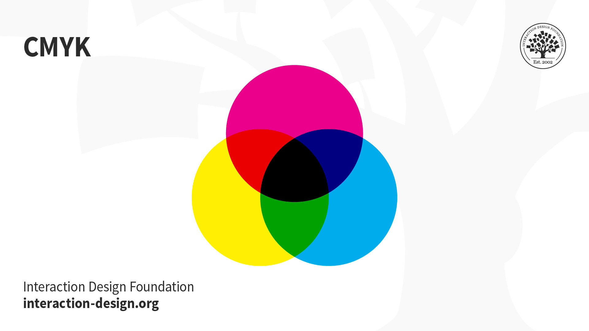
The CMYK color mode consists of Cyan, Magenta, Yellow and Key (Black) that combine to produce a range of hues. This four-color process works for most types of printers. Essentially, printed images are a series of layered four-color dots that create different hues and gradations to form an image. Dots per inch result from printing and involve the CMYK color profiles. Although CMYK is a standard color model, the exact range of colors represented can vary, depending on the press and printing conditions.
Fun Fact: The K in CMYK is known as the Key, because it's the key plate that prints all the detail in a printed image. In printing, Cyan, Magenta and Yellow plates are properly aligned with the Key plate.
In RGB color spaces, all primaries combine to produce white with additive color processing. CMYK modes combine with subtractive color processes, meaning all primaries mask to produce a blackish hue. This process is similar to when, as a child, you mixed every brightly-colored paint you could find and were surprised to end up with brown. You may notice if you layer inks or paints upon one another, they subtract from the white of the paper.
When Should I Use CMYK?
Stationery (e.g., business cards, letterhead, envelopes)
Advertising (e.g., posters, flyers, brochures, billboards)
Product Packaging
You should reserve CMYK for printed designs. Set your documents in CMYK when you design for business cards, letterheads, posters, brochures and packaging. Use the CMYK mode when you prepare an image to be printed with process colors, as image conversion from RGB to CMYK creates a color separation. If you start with an RGB image, it’s best to edit first in RGB and then convert to CMYK at the end of your edit process. Please do yourself and the printer a favor and double-check the documents color mode before you export for printing. This will prevent unbalanced colors that can result from the conversion of RGB colors into CMYK equivalents.
Index
The Index color mode produces 8‑bit image files with up to 256 colors. This color mode exists exclusively in digital formats to include computer monitors, mobile devices and television screens. According to Adobe, when you convert an image to index color, a color table is built which stores and indexes the colors in the image. If a color in the original image does not appear in the table, the software chooses the closest one or uses a dither effect to simulate the color.
Read Adobe’s “Image and Color Basics” to learn more about Color Modes:
https://helpx.adobe.com/photoshop/using/color-modes.html
© Daniel Skrok and Interaction Design Foundation, CC BY-SA 3.0
When Should I Use Index?
Websites
Digital Presentations
Mobile Applications
Although its palette of colors is limited, index color can reduce file size yet maintain the visual quality needed for digital presentations, websites and mobile applications. Therefore, Index color mode is ideal for image optimization. As limited editing is available in this mode, you should convert temporarily to RGB mode for extensive editing.
Greyscale
The Greyscale mode consists of different shades of grey within an image. This color mode may be used in both digital and print formats. In digital formats, every pixel within a greyscale image contains a value that ranges from 0 (black) to 255 (white). In print formats, the greyscale values are measured by the percentage of black ink that ranges from 0% (white) to 100% (black).
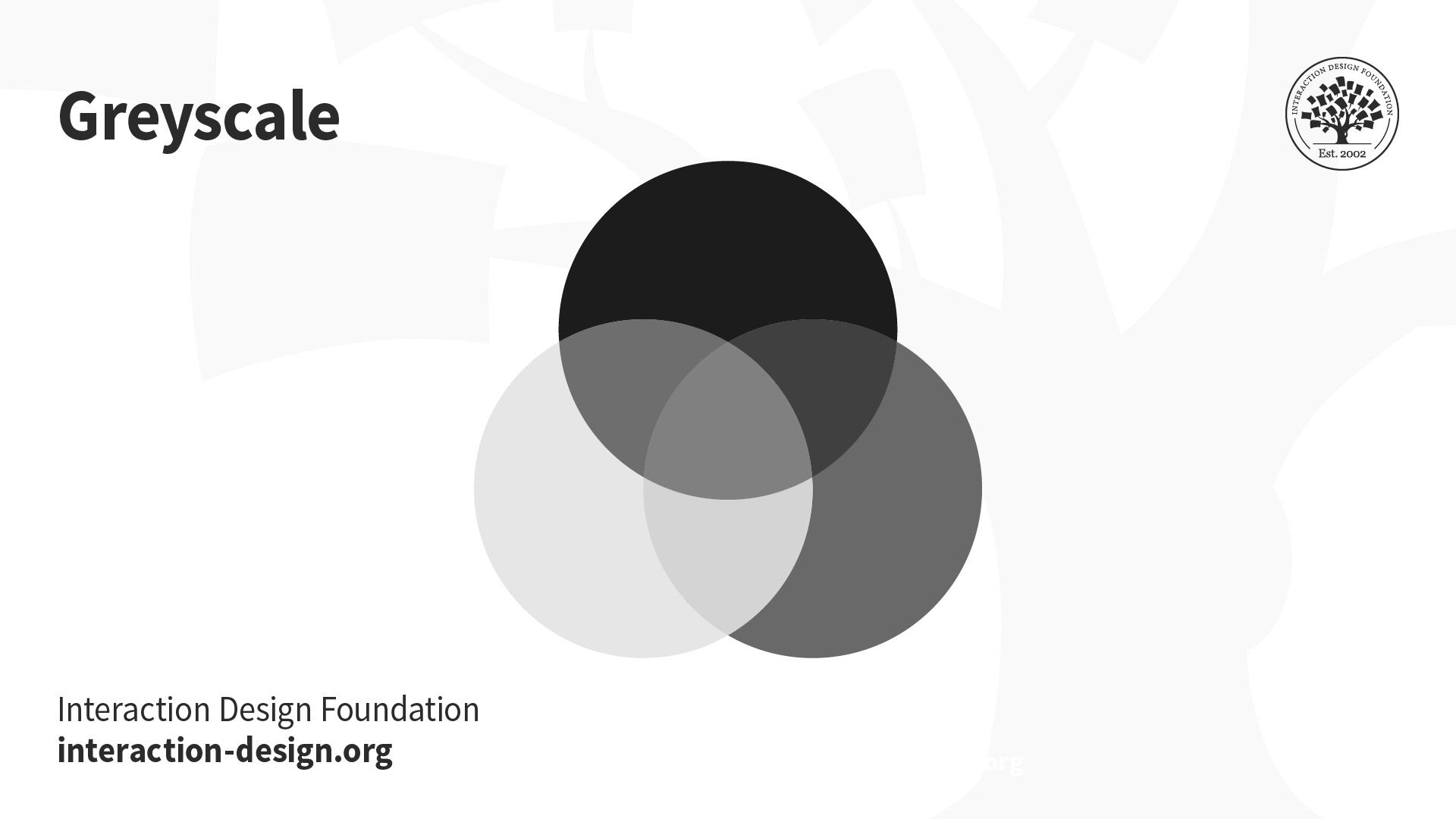
© Daniel Skrok and Interaction Design Foundation, CC BY-SA 3.0
When Should I Use Greyscale?
Reserve greyscale for both digital and print designs. In digital formats, use greyscale to capture a certain tone in your designs. In print formats, use greyscale to reduce costs and minimize the amount of ink usage.
Bitmap
The Bitmap mode, or line art, consists of black and white pixels. There are no colors or shades of grey in Bitmap images. This mode may be used in both digital and print formats. In digital formats, black and white values represent the pixels of an image. In print formats, black ink dots and the white of the paper represent the overall image.
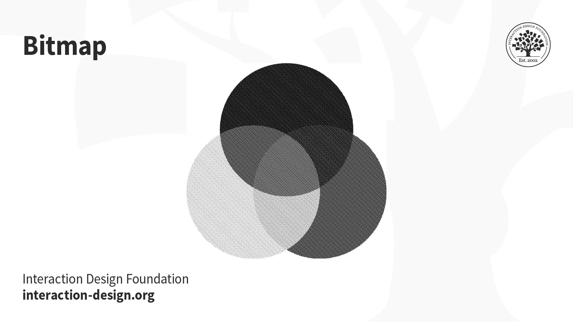
© Daniel Skrok and Interaction Design Foundation, CC BY-SA 3.0
When Should I Use Bitmap?
You should reserve Bitmap for both digital and print designs. In both formats, you may use bitmap to create the effect of a line drawing or hand-drawn sketch. You may also use it to mimic the feel of a vintage illustration. You may notice that bitmap images have jagged edges when viewed on-screen; however, they typically print very clean and smooth with a high enough print resolution.
The Take Away
As a designer, it’s important to understand common color modes so you can get your message and tone across. If you use the correct color mode, you can help optimize each stage of your design process. In this lesson, you learned about common color modes and when to use them in your designs. You’ll never have to fear the below acronyms again.
Color Modes:
RGB (Red, Green, Blue)
CMYK (Cyan, Magenta, Yellow, Black)
LAB (Lightness, Green-Red Axis, Blue-Yellow Axis)
Index
Greyscale
Bitmap
References and Where to Learn More
Read the insightful book “What Is Color? 50 Questions and Answers on the Science of Color” to learn more about Color Theory:
Arielle Eckstut and Joann Eckstut. What Is Color? 50 Questions and Answers on the Science of Color. 2020. (Link)
Image
© Daniel Skrok and Interaction Design Foundation, CC BY-SA 3.0