Bad design refers to design that fails to meet user needs effectively, lacks functionality, or creates unnecessary complexity, which leads to frustration, inefficiency and a poor user experience. It often results from overlooking essential principles of good design, such as usability, accessibility, aesthetics, and user-friendliness.
In this video, learn about the phenomenon of Norman Doors and how it relates to good and bad design:
What Makes a Bad Design “Bad”?
Bad design becomes "bad" primarily because it fails to effectively communicate or fulfill its intended function, which results in confusion, exasperation, or dissatisfaction among users. The characteristics that typically contribute to a design being considered flawed include:
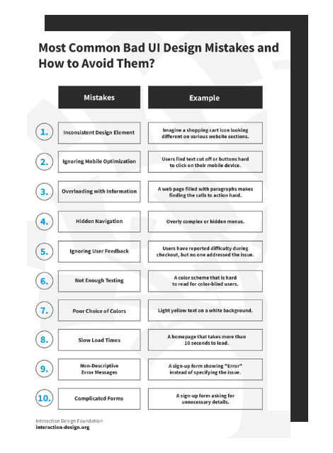
1. Lack of Clarity and Usability
Designs that confuse users, make navigation difficult, or obscure important information hinder usability. For instance, a website with a cluttered layout, confusing menus, or hidden call-to-action buttons can leave users feeling lost and frustrated.
Clippy, the Microsoft Office Assistant, was intended to make Office applications more user-friendly but became notorious for its intrusive and often unhelpful interruptions, especially for regular users. They found Clippy annoying rather than helpful, leading Microsoft to disable the feature by default in Office XP and eventually remove it altogether in future versions.
Chris Pratley, a former Microsoft employee, said that Clippy was “optimized for first use.” In his post-mortem report on Clippy, he said:
What has happened is that the usability test showed that people who have never seen a feature before have trouble with it in the first hour of using it. So the designer makes the feature hold your hand through the process. That improves the results in the test, but ruins the feature for people who know what they are doing.
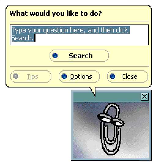
The original Microsoft Clippy from 1997.
© Microsoft, Fair Use
2. Poor Accessibility
Design that does not consider all users, including those with disabilities, is a hallmark of bad design. This could be a website that fails to provide alternative text for images (crucial for screen readers), uses color combinations with low contrast, or lacks keyboard navigation, making it inaccessible to users with visual impairments or other disabilities.
CAPTCHAs are designed to distinguish human users from bots and often present significant accessibility challenges, particularly for users with visual impairments. Traditional CAPTCHAs that require users to identify and type distorted text can be nearly impossible for screen reader software to interpret. Even audio CAPTCHAs or image-based CAPTCHAs can pose problems for users with hearing impairments or cognitive disabilities. This highlights the need for more accessible alternatives, such as checkbox CAPTCHAs ("I am not a robot") or more innovative solutions like behavioral analysis that doesn't require user interaction.
3. Ignores User Needs and Feedback
Designs created without understanding or considering the target audience's needs, preferences, and behaviors are likely to miss the mark. An example is a mobile app with a beautiful interface that fails to perform its core function efficiently or an app that overlooks user feedback regarding critical bugs or desired features.
The release of Windows 8 by Microsoft in 2012 is a notable example of a product criticized for ignoring user needs and feedback, primarily due to its drastic redesign that removed the familiar Start menu in favor of a new tile-based, touch-centric interface. This shift not only confused many users but also alienated those on non-touch devices, despite significant feedback during beta testing advocating for the retention of traditional elements. The backlash led Microsoft to reintroduce the Start button in Windows 8.1 and eventually restore the Start menu in Windows 10, acknowledging the misalignment with user preferences and the importance of listening to user feedback to maintain trust and satisfaction.
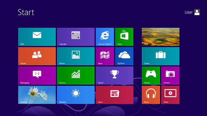
The new tile menu that was introduced in Microsoft Windows 8.
© Microsoft, Fair Use
4. Aesthetics at the Expense of Functionality
While aesthetics are important, designs that prioritize appearance over functionality can lead to a subpar user experience. An example would be a visually stunning website that loads slowly due to heavy use of high-resolution images and complex animations, thereby sacrificing performance and usability.
The launch of Apple's iOS 7 in 2013 exemplifies the tension between aesthetics and functionality. The operating system transitioned from skeuomorphism to a flat design that prioritized minimalism over clarity. This aesthetic overhaul led to usability issues, such as indistinct actionable elements, reduced contrast, and confusing navigation, due to the removal of visual affordances and the use of light colors and thin fonts. User feedback prompted Apple to iterate on iOS 7's design in subsequent updates, with the reintroduction of subtle visual cues to improve discoverability and readability. This situation highlights the critical importance of balancing visual appeal with functional usability in design, ensuring that aesthetic innovations do not compromise the user experience.
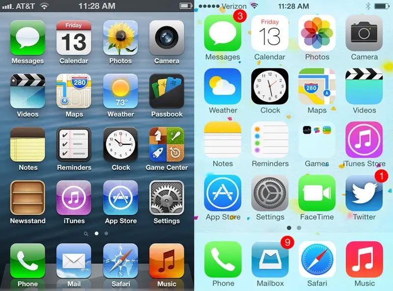
Apple’s previous operating systems, including iOS 6, had a skeuomorphic design. In 2013, however, Apple changed to a flat design with the release of the iOS 7. This caused widespread backlash, resulting in different iterations in updated versions of the system.
© Apple, Fair Use
5. Inconsistency
A lack of consistency in design elements such as typography, color schemes, and layout across a product can confuse users and degrade the user experience. Inconsistent application designs or branding materials can erode trust and professionalism.
In 2018, Snapchat's significant redesign merged content from friends, media, and celebrities into a single feed, which caused confusion and backlash among users. This overhaul disrupted the app's consistency in its navigation and how it presented content—a move away from the familiar user interface that users had come to know. The resulting petition, with over 1.2 million signatures calling for a rollback, emphasized the crucial need to maintain a coherent and user-friendly design to ensure user satisfaction and engagement.
6. Little or No Adaption to Changing Needs and Technologies
Designs that fail to evolve with user needs, technological advancements, or trends can quickly become outdated. For example, a website that is not optimized for mobile devices ignores the significant portion of users accessing the internet via smartphones.
BlackBerry was a leader in the smartphone industry but struggled to adapt to the shift towards touchscreens and expansive app ecosystems. It continued to prioritize physical keyboards and its own less versatile operating system. This Business Insider video discusses the Blackberry’s rise and fall:
How Bad UX and UI Design Impacts User Experience
Bad User Interface (UI) and User Experience (UX) Design can significantly detract from the overall user experience. A well-designed interface aims to facilitate ease of use, efficiency, and satisfaction in the interaction between the user and the product. Conversely, a poorly designed interface can lead to complete disengagement with a product. Here are several ways in which bad UI/UX design can negatively impact user experience:
Increased confusion and frustration: Poorly designed interfaces can leave users bewildered, struggling to complete basic tasks due to confusing, unclear, or counterintuitive layouts, as seen in the initial launch of Apple's Apple Music. The service faced criticism for its convoluted user interface, which mixed users' music libraries with streaming options in a way that was not intuitive to navigate.
Reduced efficiency and productivity: An interface that fails to optimize for ease of use can significantly slow down users, as exemplified by the complex and layered menus found in the early versions of Adobe's Creative Cloud apps. Users often had to navigate through multiple menus to find common tools and features which hindering workflow efficiency.
Higher learning curve: A steep learning curve can deter users, such as those new to Amazon's Alexa. Initially, users found it challenging to discover and remember the specific voice commands required to interact with the device effectively—this demonstrates the need for more intuitive interaction cues.
Decreased user satisfaction and loyalty: Negative interactions with an interface can lead to a drop in overall satisfaction. The redesign of LinkedIn's interface in 2017 received backlash for its over-simplified design that removed or hid many used features, frustrating long-time users and impacting their loyalty to the platform.
Loss of trust: Inconsistent design and unreliable products can erode trust. This is exemplified by the Volkswagen emissions scandal. Although not a direct UX example, the deliberate design choice to cheat emissions tests betrayed user trust on a massive scale and emphasized the broader implications of design ethics.
Accessibility issues: Failing to consider all users leads to exclusion, such as websites without mobile optimization, epitomized by older government websites that are difficult to navigate on smartphones. This means a significant portion of the population seeking information or services are excluded.
Increased error rates: Non-intuitive interfaces can lead to user errors. This was the case with early electronic voting machines that led to confusion over how to select candidates, resulting in misvotes or spoiled ballots. A clear, error-proof design is essential.
Designers should aim to reduce the instances of errors but some occasional errors are unavoidable. It helps to make these instances memorable or unique to enhance the user experience.
© Interaction Design Foundation, CC BY-SA 4.0
Negative impact on brand image: Users often associate their experience with a product's interface with the brand as a whole. The release of Google Buzz, which automatically shared users' email contacts publicly without clear consent, resulted in a privacy uproar that tarnished Google's image regarding user privacy.
Financial consequences: Design flaws can lead to direct and indirect financial losses, as seen with the costly recall of Samsung's Galaxy Note 7 due to design flaws in its battery—there were many instances of overheating and fires. In addition to financial losses, Samsung experienced long-term damage to its reputation.
A user-centered design approach that prioritizes clear, intuitive, and accessible design is vital to avoid these pitfalls. This approach ensures usability, enhances user satisfaction, and fosters trust, ultimately contributing to a product's success and a brand's reputation.
How Can Designers Avoid Bad Design?
Designers can steer clear of bad design and create positive, user-friendly experiences by adopting a series of best practices focused on user-centered design principles. Here are strategies to help avoid common pitfalls and ensure the creation of effective and engaging designs:
Understand Users
Designers should conduct user research to gain insights into users' needs, preferences, behaviors, and challenges. Create personas and user journey maps to guide design decisions from the perspective of the end-user.
This video explains what user research is and why it’s so important:
Prioritize Usability
Interfaces should be intuitive and easy-to-use interfaces. Designers must ensure that navigation is logical, content is easily accessible, and actions are straightforward to perform.
Implement Consistent Design
Maintain consistency in layout, color schemes, typography, and terminology across your product. Consistency helps users learn the interface faster and reduces confusion.
Iterate Based on User Feedback and Testing
Regularly test your designs with real users to identify usability issues and areas for improvement. Use feedback to iteratively refine and enhance the user experience.
Design for Accessibility
Ensure your designs are accessible to people with disabilities by following accessibility guidelines (such as WCAG). Consider color contrast, keyboard navigation, alternative text for images, and other accessibility best practices.
Beyond accessibility is inclusive design, learn the differences between them and universal design and their importance in UX design.
Optimize Performance
Balance aesthetic elements with performance considerations. Optimize images, leverage efficient coding practices, and minimize load times to ensure a smooth and responsive experience.
Embrace Minimalism
Avoid overwhelming users with unnecessary elements or information. Use white space effectively and keep interfaces clean and focused on the most important content or actions.
Adapt for Different Devices and Screen Sizes
Design responsively to ensure your product provides a seamless experience across various devices, from desktops to smartphones. Test on multiple devices to guarantee compatibility and usability.
This video explores adaptive design and how it enhances user experience:
Incorporate Visual Hierarchy
Use size, color, and placement to establish a clear visual hierarchy that guides users to the most important elements and actions on the page.
This video explains the concept of visual hierarchy and how to use it:
Collaborate
Designers must work closely with developers, content creators, and other stakeholders to ensure that design decisions are feasible and aligned with overall project goals. Collaboration can also bring new insights and ideas to the design process.


