The hierarchy of needs in UX (user experience) design is a layered pyramid model borrowing from Abraham Maslow’s psychological theory. It outlines five levels of user requirements: functionality, reliability, usability, convenience, and meaning or delight. Designers create products so that each level supports the one above it.
Watch as Author and Human-Computer Interaction (HCI) Expert, Professor Alan Dix explains important points about the hierarchy of needs in UX design:
How Maslow’s Hierarchy of Needs Inspires UX Designers
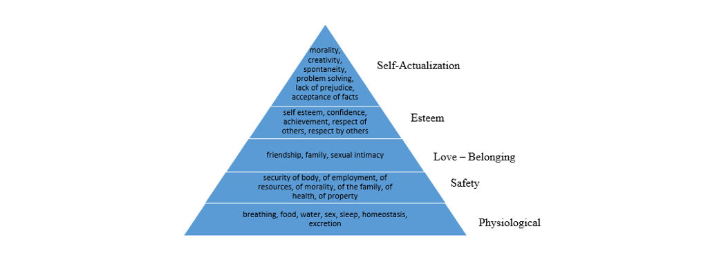
Abraham Maslow, an American psychologist, introduced the hierarchy in his paper “A Theory of Human Motivation” in 1943. Maslow proposed that human needs follow a predictable five-tier model, from basic survival at the lowest level up to personal fulfillment at the highest.
“It is quite true that man lives by bread alone — when there is no bread. But what happens to man’s desires when there is plenty of bread and when his belly is chronically filled?
At once other (and “higher”) needs emerge and these, rather than physiological hungers, dominate the organism.”
— Abraham Maslow, from “A Theory of Human Motivation”
The Five Levels of Maslow’s Hierarchy (from lowest to highest)
Physiological needs that include food, water, and shelter—essential for survival.
Safety needs that include security, stability, and protection from harm.
Love and belonging in the form of relationships, friendship, and community.
Esteem, which manifests as respect, recognition, and self-confidence.
Self-actualization, where people realize personal potential and creativity.
Maslow proposed that human needs take the form of a hierarchy, with more basic needs typically taking precedence. However, he acknowledged that this order is not rigid or fixed. Higher-level needs can emerge even when lower ones aren’t fully satisfied, and the sequence may vary between individuals and situations.
To illustrate how the hierarchy “works,” a person cannot focus on creative pursuits (self-actualization) if they’re struggling with basic-level problems like starvation. One can argue that a hungry, lonely, homeless artist who isn’t too sure of his abilities might still, for example, paint amazing pictures and succeed. However, most people will need their lower levels satisfied before they can “graduate” to activities where they can apply their creativity and skill to enjoy higher-level achievements.
Why Maslow’s Hierarchy Matters in UX Design
Maslow’s model helps UX designers understand user priorities. You can find parallels between Maslow’s human needs model and the needs hierarchy for users in UX design, namely in how:
It Prioritizes User Value
Just as humans need food before friendship, users need a product to work reliably before they can appreciate its aesthetics or feel emotional attachment to it. For instance, a “friendly” app that uploads all pictures on a user’s phone to their social media account by default is likely to embarrass and enrage users regardless of how impressive its features are.
It Aligns Teams Around Common Goals
This model gives everyone—from developers to executives—a shared language to evaluate product maturity. It clarifies where teams should put their resources, so they attend to the more basic levels first and then aim for the “wow” moments higher up.
It Supports Continuous Improvement
UX design isn’t a one-time effort. Products evolve, and so do user expectations. The hierarchy helps designers iterate strategically, whether they want to work on a new product or assess an existing one for potential tweaks. Once they’re sure the foundations are solid enough to address the users’ more basic needs, they examine how to delight them.
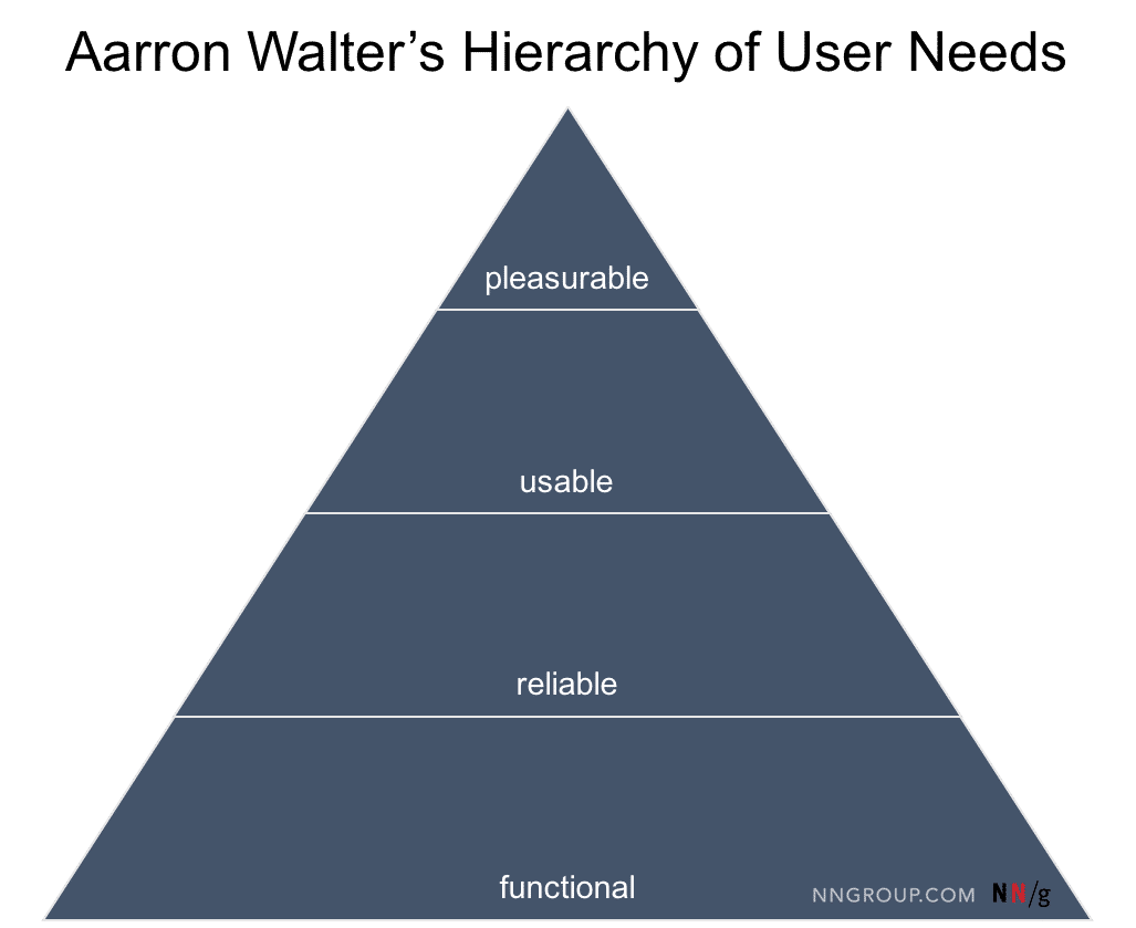
Author of Designing for Emotion Aarron Walter’s hierarchical pyramid mirrors Maslow’s model and translates human needs into user needs for designers to address.
© NN/g, Fair Use
The Five Levels of User Needs Every Design Should Address, Step by Step
This model offers a structured path from bare necessity to user delight, and it serves as a blueprint to help you build intuitive, trustworthy, and emotionally rewarding experiences.
1. Functional: Does It Work?
A product must function correctly before anything else matters. This level covers the core purpose of the product you want to design. For example, if it’s a map app, it must load maps. If it’s a messaging app, it must send and receive texts.
Users expect your product to do what it promises. If it fails here—if features are broken, load times lag, or navigation fails—users will abandon it instantly, no matter how attractive it looks. This mirrors Maslow’s physiological needs level in the sense of immediate survival. Users form first impressions within seconds. With the wide range of apps and other digital products they can choose from, they can discard one app and move to a competitor’s without thinking twice.
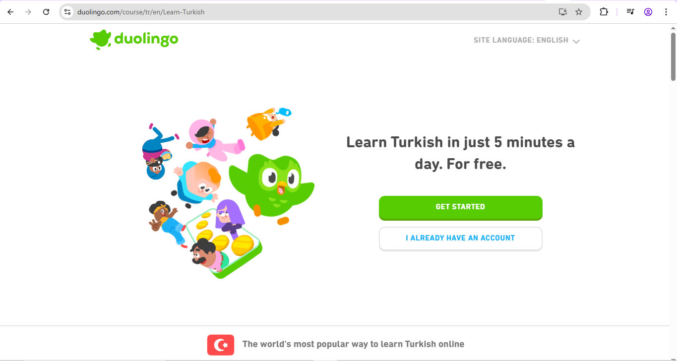
Duolingo is an app that scores well on all levels of the hierarchy. Users can rely on it to help them learn a language as painlessly as possible—and feel delighted along the way for their achievements.
© Duolingo, Fair Use
2. Reliable: Can I Trust It?
Once a product works, users need it to work every time. Reliability builds confidence. It includes uptime, performance under stress, and consistent behavior across different devices.
For example, a banking app that logs out users in the middle of a transfer won’t win trust. Neither will a health tracker that randomly loses data. Trustworthiness is the glue that keeps users coming back, and in an era when so many users “inhabit” the digital world and rely on it so much, a product needs to prove how reliable it is from the first use.
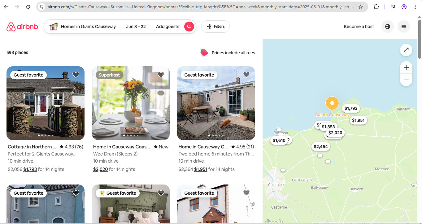
When users plan to travel and spend time (and money), they must feel confident about their destination. Airbnb, another brand that meets all the levels of needs, proves it understands this.
© Airbnb, Fair Use
3. Usable: Can I Use It Without Effort?
Usability determines whether users can achieve their goals without confusion or frustration. Even if your product works perfectly, poor usability leads to friction. “Works perfectly” may sound strange next to “poor usability,” but consider what users experience. Can they find what they need? Are buttons logically laid out? Is the language easy to understand? Does the interface reduce the cognitive load?
This level emphasizes clarity, intuitiveness, and feedback—vital parts of any digital solution. For example, imagine patient management software that functions well enough to the software developers who created it, but hospital staff can’t use it for crucial tasks. The consequences could be catastrophic.
Watch as Cory Lebson, Principal UX Researcher with 20+ years of experience and author of The UX Careers Handbook, explains usability.
4. Convenient: Does It Save Me Time?
At this level, the product goes above basic usability. It adds convenience, offering shortcuts, automation, and personalization. Users begin to feel that the product understands them, and their trust in it—and in the brand behind it—grows.
Convenience builds loyalty. Think of autofill forms, saved preferences, or intelligent suggestions. These features reduce friction and make repeated use more appealing. Best of all, they’re evidence that you respect one of the most precious resources of all: users’ time. When you help users feel that, you can congratulate yourself for having proved true empathy with them—and can build on it with the next step.
Empathy can make or break a design. Discover the difference between the design of two airports—one that was built with empathy, and one that wasn’t—in this video.
5. Meaningful or Delightful: Does It Connect With Me?
At the top of the hierarchy—or apex of the pyramid—sits emotional engagement. Once users trust and enjoy your product, they’re ready for experiences that delight, surprise, or inspire. This is where strong brand identity, aesthetics, storytelling, and values come into play.
Meaningful UX connects on a personal level. It acknowledges users’ emotions, aspirations, or values. Think of the sense of accomplishment a fitness app creates by celebrating milestones, or the pride users feel when a tool reflects their identity or mission.
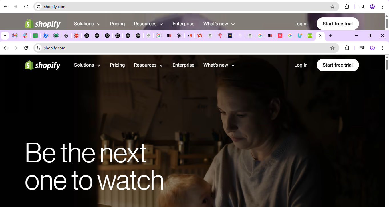
Shopify speaks to a high level of connection with users, empowering many to succeed in business—and so realize great potential in a way that reflects Maslow’s self-actualization needs.
© Shopify, Fair use
When you’ve designed a product that works well, works reliably, works easily, and works conveniently, the final challenge is to prove your brand cares about the people who use it. They’re real individuals with real desires. They use products and services in a variety of real-world contexts. To help you envision users and their needs, you’ll want to create personas—fictitious representations of real users.
Watch as User Experience Strategist and Founder of Syntagm Ltd, William Hudson explains why design without personas falls short:
How to Create Products That Meet The UX Hierarchy of Needs
Don’t tackle every level at once—instead, break things down with the hierarchy so you can focus on what matters right now. Keep a clear view of the needs hierarchy throughout your UX design process to pinpoint the right problem and best solutions.
A well-established design process that meshes perfectly with the hierarchy of needs is Design Thinking. Discover more in this video.
Before you begin, document needs per level. For example, break down features by functionality, usability, and potential to delight. Start with the basics. Then layer on higher-level needs after you have validated the foundation. Most importantly, don’t skip any levels. Remember, each layer of needs rests on the one beneath it, and the top one (delight) can point the way to even greater rewards if you approach it correctly.
Follow this practical process to apply the hierarchy during product development:
1. Deliver Functionality
Start with user research. Know what “functional” means for your users. It may differ across segments.
Watch as William Hudson explains the basics of user research, and how to approach it step by step:
Prioritize core features before you add extras.
Test early and often to catch bugs or performance issues. Do the core features work as promised?
Deliver a minimum viable product (MVP) that’s fully functional.
Watch as CEO of Experience Dynamics, Frank Spillers explains the key considerations for MVPs in UX design:
Use metrics like feature completion rate and crash reports to check functionality.
2. Confirm Reliability
Ensure data integrity, crash resistance, and platform stability. Run stress tests and evaluate uptime and bug reports.
Monitor performance and resolve issues proactively.
Maintain predictable behavior for interactions and outputs.
Use logs or user feedback to detect reliability gaps.
3. Improve Usability
Use familiar design patterns and consistent layouts.
Watch as Vitaly Friedman, Senior UX Consultant, European Parliament, and Creative Lead of Smashing Magazine, presents the difference between good and bad UI design patterns.
Minimize user input and offer smart defaults.
Provide instant feedback for user actions.
Conduct usability testing. Watch users navigate the product.
Address UI pain points and confusing workflows.
4. Make It Convenient for Users
Implement features like “recent activity,” “favorites,” or “recommendations.”
Allow customization to match user habits.
Use adaptive interfaces that respond to context (e.g., mobile versus desktop).
Analyze behavior data for repetitive tasks.
Identify ways to reduce clicks, streamline flows, or automate input.
Watch as Frank Spillers gives helpful insights on how to build connections with users in mobile UX design:
5. Make It Meaningful, and Design to Delight
Add delightful microinteractions and thoughtful animations.
Align visual design and messaging with your audience’s values.
Build narratives that encourage users to feel progress or purpose.
Use storytelling or gamification to enhance emotional impact.
Integrate positive surprises—small rewards, visual polish, or appropriate humor.
In this video, Ellen Lupton, Writer, Designer, Curator and Educator gives some top tips for storytelling.
Be sure to revisit the hierarchy as your product evolves. You can stay grounded in user needs while you aim for experiences that uplift and inspire.
How To Go Beyond the Pyramid and Design for Delight and Loyalty
At the top of the needs pyramid, delight looks like a single supreme goal. However, it can seem a complex element, too, like a “secret sauce” that only a handful of brands perfect. Delight often feels intangible and mysterious, but remember that delight rests on solid groundwork. User delight involves three types, and you can understand each one and how they play into the bigger picture of design success:
Surface delight is about the small details that surprise or charm—like animations or witty microcopy—that set your product (and brand) apart as valuable.
Behavioral delight refers to smart behaviors that anticipate needs—like one-click reordering—and qualities that keep the user coming back; so much so that they can tell friends about how good the product is.
Reflective delight is about deeper emotional satisfaction, such as contributing to a cause, or achieving personal growth. For example, imagine two brands’ products that delight one user at the surface and behavioral levels—but only one resonates with how the user feels about sustainable design. That product will be more “delightful” (and, by association, successful—if enough users buy it).
To craft lasting experiences, don’t treat delight as a “cherry on top.” Instead, see it as the outcome of mastering lower levels of the hierarchy. Celebrate the small wins as you “clear” each level and certify its strength to build on. Even micro-level conveniences can raise satisfaction levels significantly. However, also remember that a brilliant design solution is more than the sum of its parts. It should speak holistically to individuals in their user flows—to the extent that they enjoy a truly seamless experience and feel connected with the brand that has engaged them so meaningfully.
Watch as Professor Alan Dix explains the important part emotion plays in design:
A Case Study: A Fitness App Through the Hierarchy
You can see an example of how a fitness app might develop with this model.
Functional: The app tracks steps, workouts, and calorie intake.
Reliable: It syncs correctly across devices and updates instantly.
Usable: Users find features easily, with visual cues and progress bars.
Convenient: It auto-suggests workouts, recalls food entries, and adapts routines.
Delightful: It celebrates milestones with personalized badges, lets users share progress, and connects them with a community.
In the app, each level builds a stronger emotional bond. Users move from utility to habit, and—last, but not least—to advocacy. The app they use does what they expect it to, but it goes “above and beyond” by speaking to their higher needs and empowering them to adopt healthy habits and weave their achievements into a larger context with family, friends, and (perhaps) friendly competitors. The designer behind the app can be justly proud of having created more than “a fitness app.” Thanks to solid user research, thoughtful micro-level conveniences, and other elements to boost user satisfaction, their product has made a more profound connection. Their design is a trusted part of everyday life for the people who expect it—and the brand—to be there for them.
Overall, you can view the UX hierarchy of needs as a reliable blueprint to help you craft—and assess—experiences that don’t just work but resonate too. Whether your design is a simple app or a complex service, let the hierarchy guide you—from essential to exceptional. Design with purpose; build trust; create joy. That’s the path to products that truly matter and, more importantly, impact lives for the better.