Concept maps are visual representations of information that show the relationship between ideas or concepts. They are suitable for organizing and representing knowledge in an easy-to-understand manner using shapes and lines to represent relationships visually.
© Interaction Design Foundation, CC BY-SA 4.0
Benefits of Concept Maps
A concept map helps you see how different ideas fit together, making complex information easier to understand. It's like laying concepts before you to see how they connect.
Enhanced understanding: Concept maps make abstract ideas concrete for quick and enhanced comprehension.
Efficient learning and recall: Concept maps help you memorize information better and make recall during exams or meetings easier.
Creativity boost: The visual layout reveals the gaps and links between concepts to foster creative thinking.
Improved problem-solving: Identifying connections between elements helps you tackle issues in a structured way.
Effective communication: Sharing concept maps makes complex topics easy for a team or audience to discuss and understand.
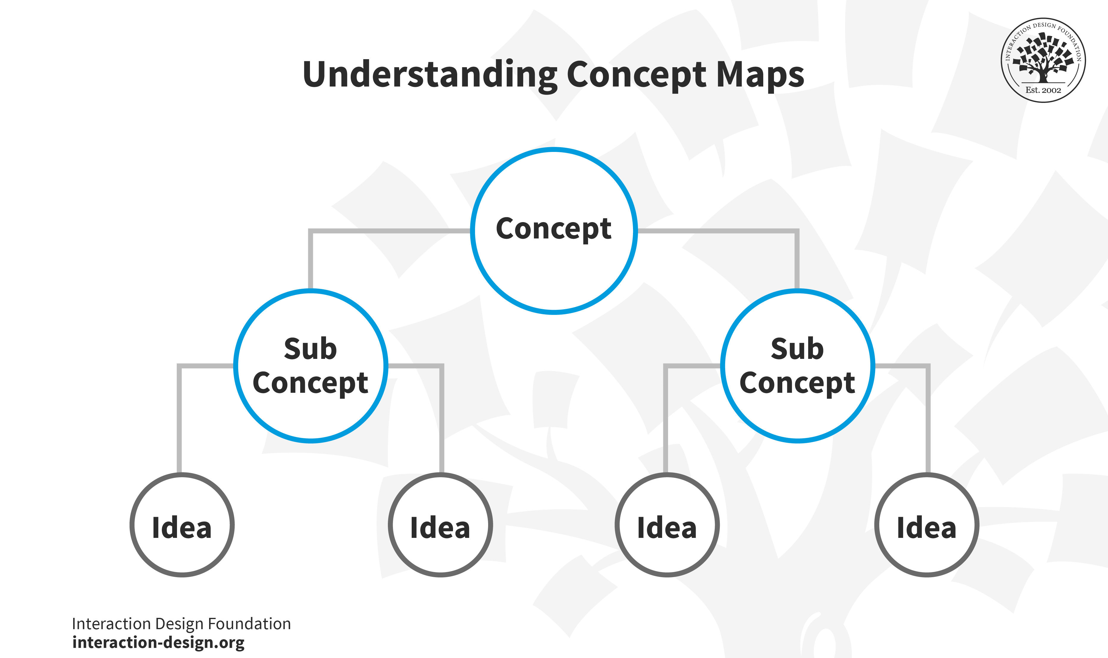
Key Components of Concept Maps
A concept map has three main components: nodes, links, and hierarchies.
Nodes: These are the fundamental building blocks of concept maps, represented as boxes or circles containing a concept or idea. Every node represents a distinct part of the knowledge domain under consideration.
Links: These lines connect the nodes, representing the relationships between different concepts. Each link is usually labeled with a verb or phrase describing the nature of the connection between the nodes it connects.
Hierarchies: Most concept maps have a top-down approach. They start with the most general concepts at the top of the map and branch out to more specific concepts as you move downward. This hierarchical arrangement allows for an overview at a glance and helps organize complex information effectively
Role of Concept Maps in Knowledge Representation and Cognitive Mapping
Knowledge representation converts complex concepts, facts, and information into a structured, easily understandable format. Concept maps visually represent knowledge in an organized way to help with comprehension and knowledge retention.
Cognitive mapping is the mental process that helps us acquire, code, store, recall, and decode information about our environment's relative attributes. It's how we form and recall mental "maps" of our world.
Concept maps bring knowledge representation and the cognitive mapping process together. They visually structure knowledge and thereby mirror how our brains naturally work. Our minds tend to create "maps" or networks of related information; concept maps essentially externalize this process. In doing so, they help us understand and absorb complex information more effectively.
Benefits and Applications of Concept Maps
Concept maps are remarkably versatile tools with applications in various domains, including design, education, business, and research. Let's explore some of the key benefits and applications of concept maps.
Benefits of Concept Maps Across Different Domains
Education: Concept maps are instrumental in fostering deep learning among students. They encourage learners to connect new information with existing knowledge, promoting better comprehension and retention. Teachers can also use concept maps to assess students' understanding of a topic and identify gaps in knowledge.
Business: In the corporate world, concept maps are frequently used for strategic planning, project management, and knowledge management. They facilitate communication of complex ideas, promote collaboration, and help identify potential risks or opportunities.
Research: Concept maps are invaluable in organizing and visualizing the complexities of research. Researchers can use them to map out theories, hypotheses, and experimental designs to see connections or gaps in their work.
Real-World Example of Concept Maps
Concept maps have been effectively used in diverse contexts. Here’s an example:
In his book, “Learning, Creating, and Using Knowledge,” Joseph D. Novak shares how a high school in Costa Rica started using concept maps in all classes to teach and test students. Because of this, in just four years, the percentage of students passing the national high school graduation exam went up from 65% to a perfect 100%.
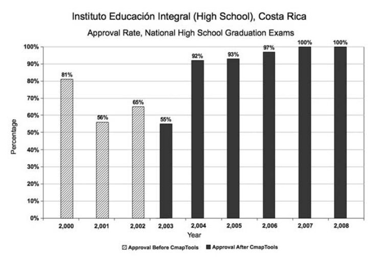
© Learning, Creating, and Using Knowledge, Fair Use
Applications of Concept Maps in Problem-Solving, Decision-Making, and Creativity Enhancement
Concept maps offer an effective way to understand and navigate the processes of problem-solving, decision-making, and creativity enhancement. This is thanks to their inherent flexibility and visual appeal.
Potential applications of concept maps in problem-solving:
Visualize the problem: Concept maps can help break down complex problems into smaller, manageable parts. They allow a clear understanding of the issue at hand.
Identify relationships: They enable users to identify relationships and connections between different aspects of the problem that they may have overlooked otherwise.
Highlight knowledge gaps: Concept maps can expose areas that need more information or exploration to guide the design thinking process in the right direction.
Watch this video to learn more about design thinking and its five phases.
Potential applications of concept maps in decision-making:
Compare options: Concept maps enable visual comparison and contrast of different options. They make the decision-making process more transparent and logical.
Analyze risks and benefits: Concept maps can highlight each option's potential risks and benefits.
Understand consequences: Concept maps can help visualize each decision's potential outcomes, promoting forward-thinking and strategic decision-making.
Potential applications of concept maps in creativity enhancement:
Promote divergent thinking: Concept maps encourage visual thinking and stimulate creativity.
Act as a brainstorming tool: You can use concept maps to be the focus of brainstorming sessions.
Nurture innovation: They can serve as a platform for integrating existing knowledge with innovative solutions and ideas.
How to Create Effective Concept Maps
Creating an effective concept map isn't difficult, but it does require some strategic thinking and a touch of creativity.
Here's how they work:
You start with a central concept. This could be anything you're thinking about. It may be a topic you're studying, a project you're planning, or even a big question you're trying to answer.
You then identify the major related ideas or subtopics that connect to this main concept. You draw lines from the central idea to these related ideas.
You might have more specific ideas or details for each subtopic. You draw more lines to show these connections.
You can write words or phrases on each line explaining how the ideas connect.
Here's a step-by-step guide to creating well-structured and visually appealing concept maps to give you a better idea.
Steps to Create Concept Maps
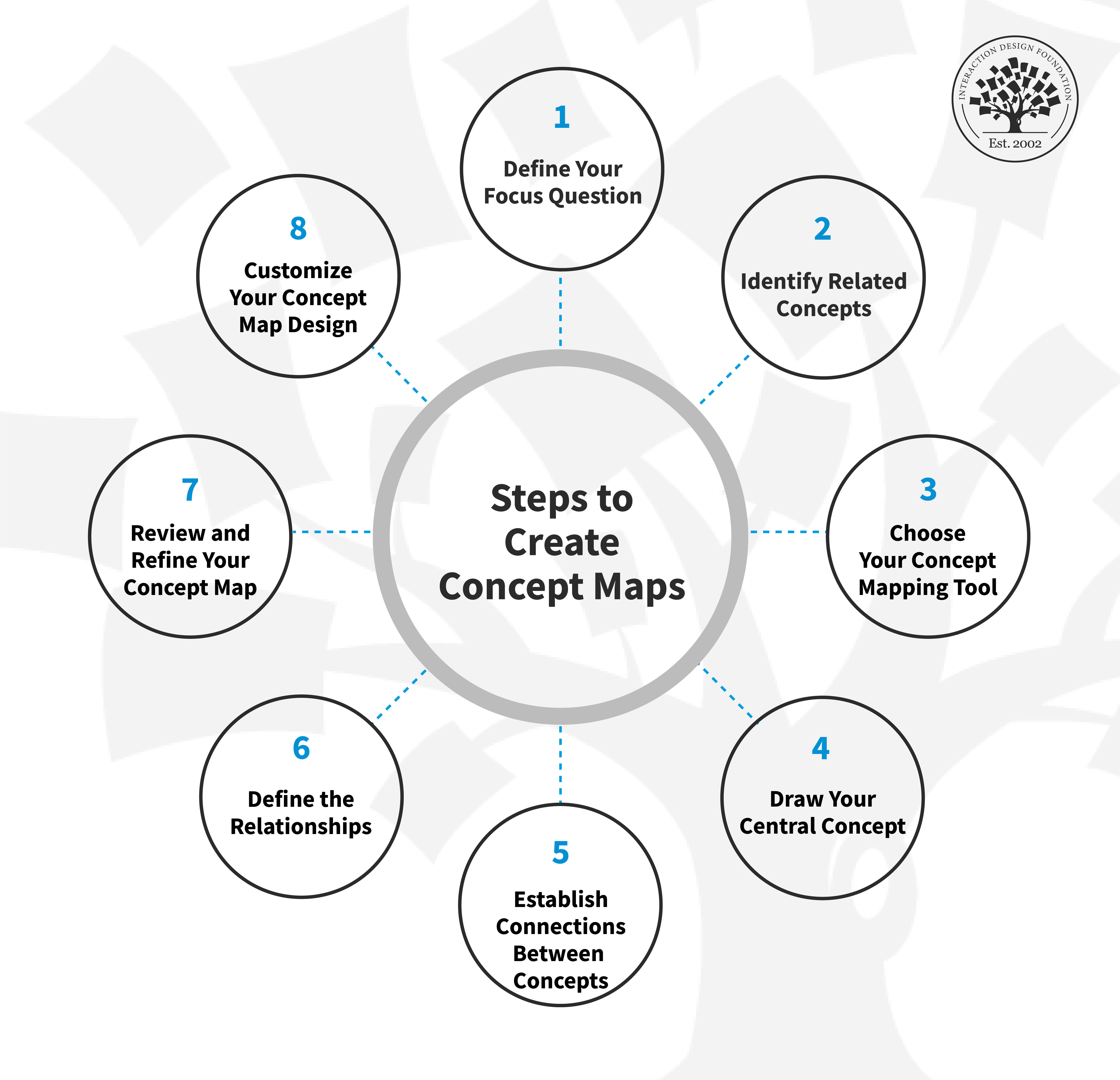
© Interaction Design Foundation, CC BY-SA 4.0
Step 1: Define Your Focus Question
Start by defining your focus question, whether it's a business problem, a research question, or a social issue. It's important to narrow it down to a core concept. This ensures that your map remains organized and easy to understand.
Step 2: Identify Related Concepts
Brainstorm and list all the concepts or ideas related to your focus questions. Having this 'parking lot' of ideas ready before you begin designing your map is beneficial. It saves you time and potential restructuring later on.
Step 3: Choose Your Concept Mapping Tool
You have two main options when it comes to creating your concept map: traditional tools (pen and paper cards, sticky notes, whiteboard) or a digital concept mapping application. Digital diagramming tools like Visme, LucidChart, Miro, and Mural offer advantages like easy collaboration, limitless space for complex maps, and the ability to customize templates and animations.
Step 4: Draw Your Central Concept
Whether you're drawing your concept map by hand or using a digital tool, always begin with your key concept at the top or center of your map. This allows for a clear hierarchical structure.
Step 5: Establish Connections Between Concepts
Now, it's time to connect your ideas. Begin with broader concepts, gradually moving to more specific ones. You can use arrows to indicate the direction of relationships between concepts to make it easier for viewers to understand the map's propositions.
Step 6: Define the Relationships
This step involves adding text to your lines or arrows to define the concepts' relationships clearly. Keep this text brief and straightforward to maintain a clean and clutter-free visualization.
Step 7: Review and Refine Your Concept Map
Now that your concept map has taken shape, review it carefully. Look for potential improvements, redundancies, or missed ideas. Feel free to rearrange nodes or add more cross-links if needed.
Step 8: Customize Your Concept Map Design
All that’s left is to save your work in a form that’s easily accessible for future reference. Take pictures if you’re working offline, and name and organize your files properly. Remember to add the date and any context that someone outside your group might need to understand the map fully.
If you plan to share or present your concept map to business stakeholders, you must polish it up. This can be as simple as adding a bold header or tweaking the colors and fonts to match your brand's visual identity. Businesses can consider adding their company logo to increase brand awareness. This can be particularly helpful if they want to share the concept map on social media or embed it on their website.
Step 9: Iterate
Concept maps are a valuable tool for organizing thoughts and explaining complex ideas. However, things may change depending on the subject of your concept map. Creating a concept map is an iterative process of understanding. It may require adjustments and revisions based on new research and insights.
Best Practices for Concept Mapping
Following the step-by-step guide above will enable you to construct a competent concept map for almost any situation. However, if you want to make your concept map truly exceptional, consider these tips and best practices:
1. Focus on One Idea
While having multiple key concepts in your concept map is possible, it's advisable not to use them. Your key concept originates from your focal question. It is the starting point from which all other ideas branch out in your hierarchical concept map.
Incorporating more than one key concept could lead to an overly complex and confusing diagram for your audience. Stick to one key concept and create separate concept maps for each if you have multiple key concepts.
2. Cluster Similar Concepts
If your general concepts branch out into too many specific ones, consider grouping related ideas under a sub-concept.
For instance, you can construct a concept map about "healthy living." You could have two main groups: "physical health" and "mental health." Within these, you could further categorize.
For physical health, you might have sub-groups like "exercise" and "diet."
For mental health, "stress management" and "emotional well-being" could be sub-groups.
Grouping similar ideas will make your concept map neater, less cluttered, and more digestible for readers.
3. Use Color-Coding
Colors can help differentiate the different domains in your concept map. This not only enhances readability but also aids in retaining information for longer periods by associating each domain with a distinct color. Be sure to use colors in a meaningful way rather than using them just for their sake.
For example, you can color-code renewable energy sources in various green shades while using red for non-renewable sources. Use these colors consistently to prevent confusion. But be sure to provide ways of identifying key components since color alone can cause accessibility and display problems. (Red on one screen could be magenta on another, plus red-green color blindness is fairly common.)
4. Incorporate Images and Icons
Consider enhancing the text with images or icons to make your concept map more engaging.
For instance, you can use outline icons to represent the concepts of "coffee beans" and "hot water." This method promotes faster learning and better recall, as the brain can form stronger associations with icons and words than with plain text.
5. Use Linking Words
We find linking words on the lines that connect different objects in a concept map. When you add linking words or phrases to clarify the relationships between different concepts, make sure they are logical. This will allow readers to form meaningful sentences from the linking words and the two concepts.
In some cases, you may not need to use any words. You can use symbols like + or - to indicate the addition or subtraction of ideas.
6. Make It Interactive
If you plan to share your concept map online, consider making it interactive to engage readers.
For instance, you can allow users to collapse and expand notes. You might also include links to your concept maps, leading readers to external web pages for detailed information.
Additionally, consider inserting additional resources and further reading at the bottom of your concept map or linking to various online sources used to gather information for your diagram.
5 Tips For Enhancing Readability And Clarity In Concept Maps
Creating a concept map is only the first step; ensuring it is easy to understand and digest is another crucial step to pay attention to. Clear concept maps with high readability will ensure effective communication. Here are some key points to consider:
1. Clear hierarchy
Organize your ideas in a clear and logical visual hierarchy. Your key concept should be the primary focus, with other ideas branching out according to their importance and relevance.
2. Appropriate spacing
Ensure adequate space between your ideas to avoid overcrowding. This will help readers distinguish between concepts and avoid confusion.
3. Consistent layout
Consistency in your layout, such as using shapes, colors, and fonts, will enhance readability. Make sure that similar concepts are visually unified.
4. Use of colors
Use different colors to distinguish between various levels or types of concepts. Striking a balance will bring about improved clarity.
5. Legible fonts
Ensure your fonts are easy to read. Avoid overly stylized fonts or small text sizes, which can detract from the readability of your concept map.
In this video, Mia Cinelli, Associate Professor of Art Studio and Digital Design, University of Kentucky, explains how Gestalt principles, such as figure–ground, similarity, proximity, and continuation, shape visual hierarchy and readability. These principles can help you create clear, well-structured concept maps.
Integrating into Workflows and Learning Environments
1. Daily planning
Use concept maps as a planning tool. Start with your main goal for the day in the center and branch out with tasks and subtasks.
2. Meeting summaries
After a meeting, create a concept map to summarize key points discussed, decisions made, and action items.
3. Learning and study
For students, concept maps can be invaluable in summarizing chapters, understanding complex topics, or revising for exams. They can turn dense textual information into a visual snapshot, making it easier to recall.
4. Project management
Concept maps can provide a visual overview of a project, showcasing the different phases, tasks, responsibilities, and timelines.
5. Collaborative brainstorming
In team environments, digital concept mapping tools allow real-time collaboration. This way, team members can contribute simultaneously, creating a comprehensive map with diverse perspectives.
6. Integration with digital tools
Ensure that your concept mapping tool integrates with other platforms you use, be it task management systems, cloud storage, or note-taking apps. This seamless integration ensures you can easily share and make the maps accessible.
Tools and Software for Concept Mapping
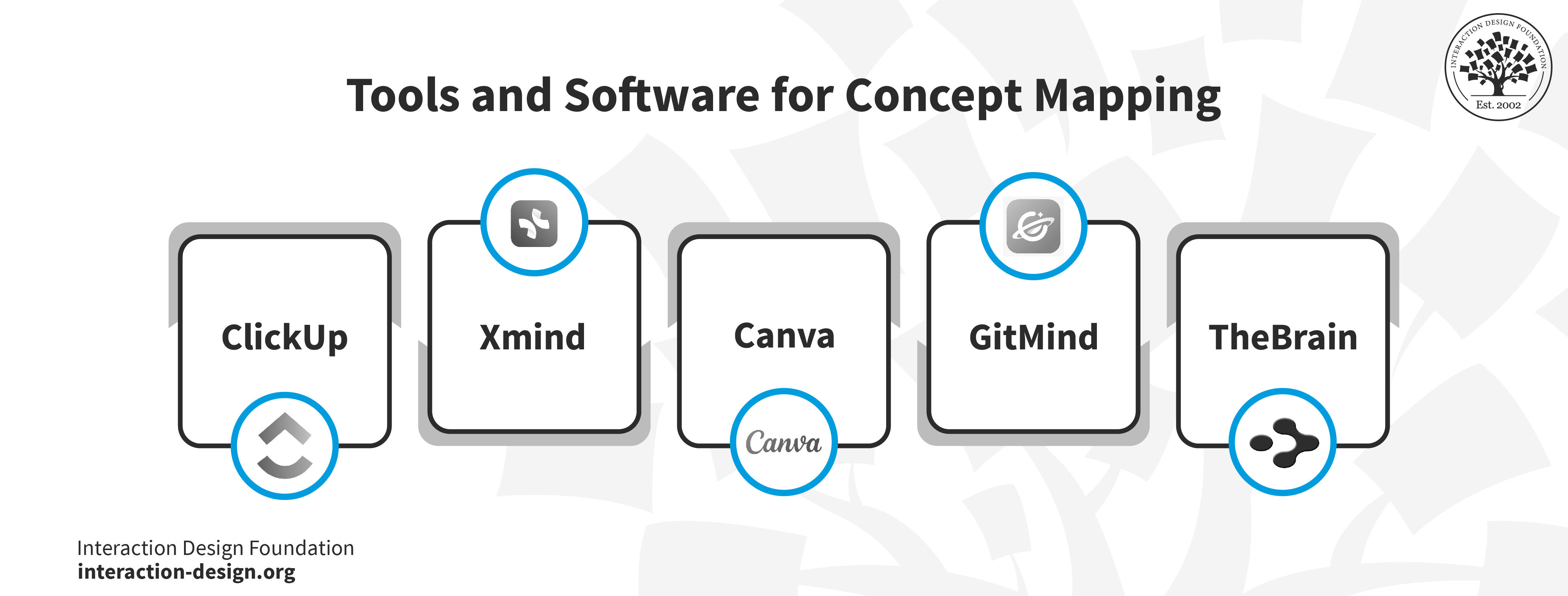
© Interaction Design Foundation, CC BY-SA 4.0
When it comes to translating your ideas, plans, or projects into a visual format, concept mapping tools and software offer a range of solutions. With the surge in remote work and online collaboration, these tools have become essential for organizations and individuals. Let's take a closer look at some of the top contenders in this space, including factors like key features, presentation mode, and collaboration features.
1. ClickUp
© Clickup, Fair Use
ClickUp is an all-in-one productivity platform with several views to visualize ideas and tasks. It offers some powerful collaboration tools, such as mind maps and whiteboards, to help keep cross-functional teams updated, whether they are working in real-time or asynchronously.
Features and functionalities of ClickUp include:
Over 1,000 integrations with other work tools
Detailed online help center, webinars, and support
A template library that expedites the creation process
Reporting and dashboards for an instant overview of your work
Multiple views for various project styles
50+ task automation to streamline workflows
Unique features of ClickUp:
Real-time collaboration with Docs
Customizable task statuses for project needs
Multiple assignees for tasks for transparency
Limitations:
The sheer number of features can make it challenging for new users
Not all views are available in the mobile app
2. Xmind
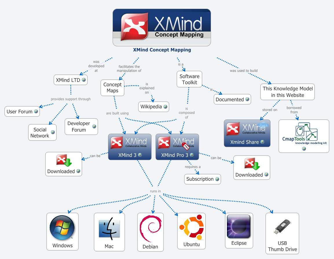
© Xmind, Fair Use
XMind is a concept mapping software that offers various map types and is compatible with Windows and Mac OS.
Features and functionalities of Xmind include:
Support for various formats, including PNG, PDF, SVG, and more
Map Shot to adjust the format for displaying and viewing
Tree Table for presenting topics with nested rectangles
Unique feature of Xmind:
Smart Color Theme for a consistent look and feel
Limitations:
It lacks project or task management features
3. GitMind
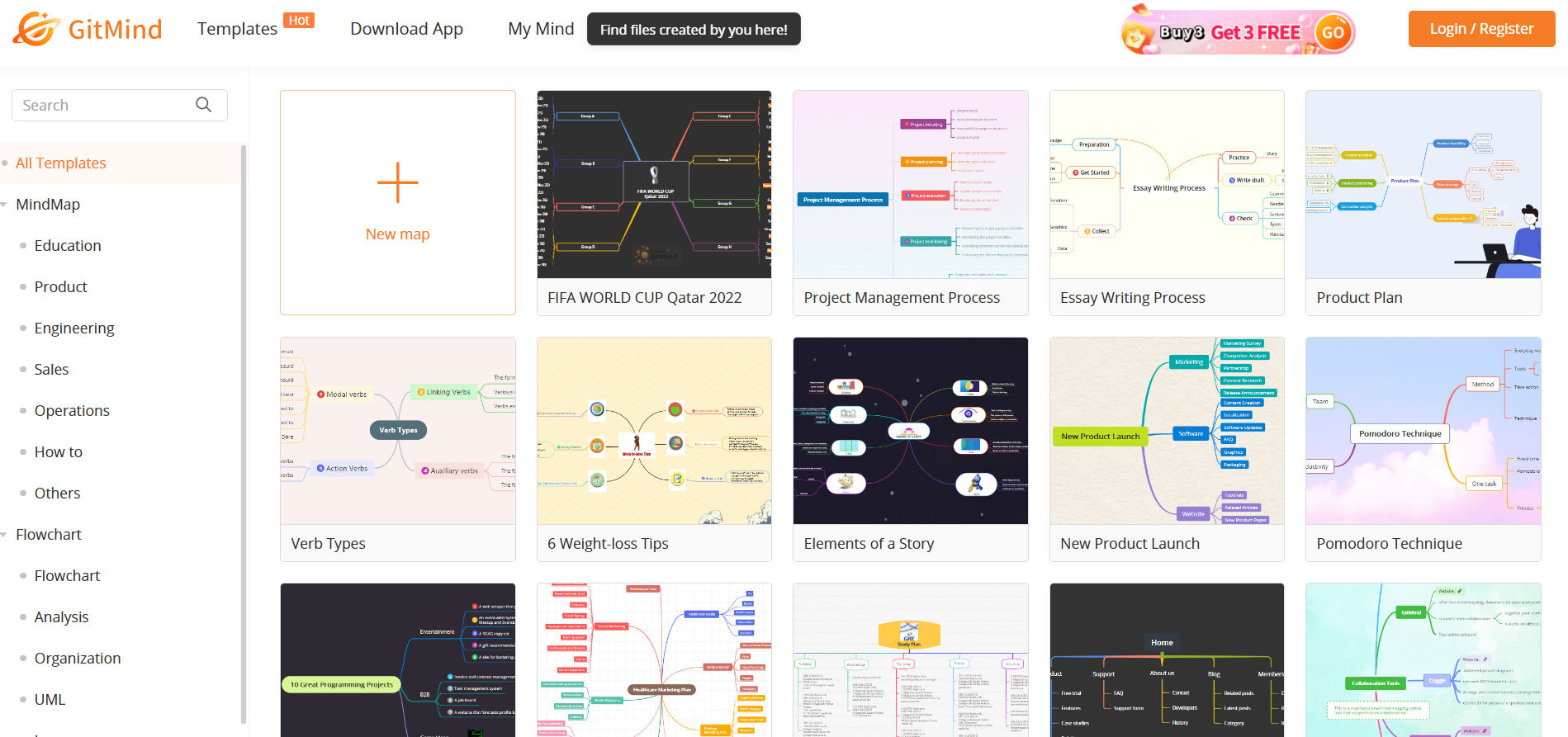
© GitMind, Fair Use
GitMind is an easy-to-use concept map maker software that offers advanced features like outlining, shape customization, shared editing, and exporting.
Features and functionalities of GitMind include:
Format painter to copy all formats of a first node to the second node
A global search to find concept maps or mind maps by keywords
Relationships to connect two nodes on a concept map
Unique feature of GitMind:
Concept map generator with an outline mode
Limitations:
Not equipped with project management tools
Limited scalability for larger teams
4. Canva
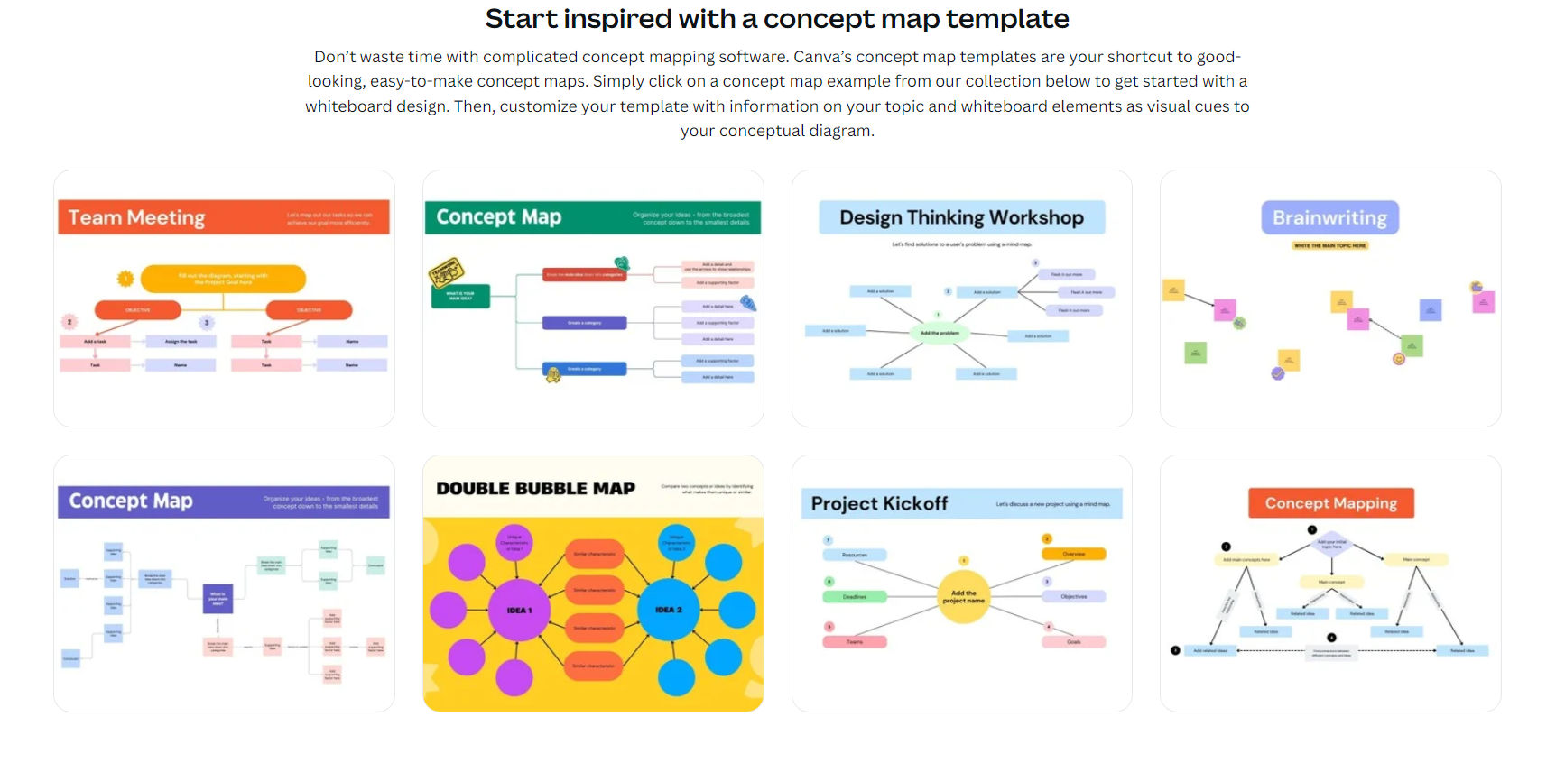
© Canva, Fair Use
Canva is an online graphic design software that allows anyone to create stunning visuals and designs, including concept maps.
Features and functionalities of Canva include:
Image enhancer to correct photos
Online video recorder to help explain complex concepts
Grid designs for photos and other design elements
Unique feature of Canva:
Dynamic messaging through text animations
Limitations:
Multiple file downloads are automatically compressed into a zip file
5. TheBrain
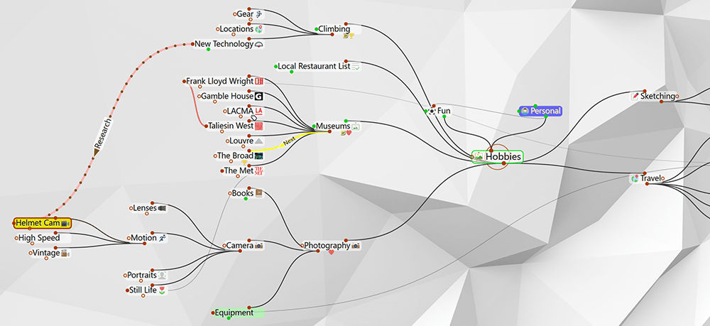
© TheBrain, Fair Use
TheBrain is a concept map maker package that helps users organize their thoughts and ideas in an interactive mind map format.
Features and functionalities of TheBrain include:
Desktop, mobile, and browser platform support
Connected topics to find related information
Document tags with priority indicators
Unique feature of TheBrain:
Events and reminder attachments
Limitations:
Not scalable to build powerful concept map templates
Lacks collaboration tools for teams
Consider your specific needs and each software program's unique features when choosing a concept mapping tool. Whether you have a small team or one with hundreds, there's a tool that can help you visualize information and connect ideas effectively.
Collaborative Concept Mapping
Collaborative concept mapping harnesses the collective intellect of a group, enabling participants to construct a shared understanding of a topic. Let's explore its benefits:
Benefits of collaborative concept mapping
1. Fostering Teamwork
Working together on a concept map requires mutual respect, understanding, and communication among team members. This process helps build trust and reinforces the spirit of collaboration.
2. Sharing Knowledge
Each participant brings a unique perspective and information. Integrating these diverse viewpoints into one map generates a richer, more comprehensive understanding of the topic.
3. Combating Cognitive Biases
When multiple individuals collaborate, it's easier to challenge and rectify individual cognitive biases, which leads to a more objective and balanced representation of information.
4. Enhancing Retention
The act of discussing, debating, and then representing ideas in a visual format can significantly improve memory retention.
Techniques and Tools for Collaborative Concept Mapping
You can employ certain tools and techniques to enhance collaboration in concept mapping:
1. Brainstorming Sessions
Before beginning the mapping process, have a brainstorming session. This allows all team members to voice their perspectives, ensuring inclusivity.
2. Real-time editing
Tools like Google Docs, ClickUp, and GitMind allow multiple users to edit concept maps in real time, ensuring that changes are immediately visible to all participants.
3. Feedback loops
Encourage team members to critique and review the map at various stages. Iterative feedback ensures the final product is well-rounded and comprehensive.
4. Use templates
Starting with a template can expedite the mapping process. Many digital tools offer customizable templates tailored for different purposes.
5. Integration with other tools
Some advanced mapping tools integrate with task management and communication platforms. This facilitates seamless sharing and discussion of the map content.
Example of Successful Collaborative Concept Mapping Project
Below, you will have the chance to take a peek into a fascinating study involving the real-life application and benefits of Concept Mapping. We’ve summarized it below in easy-to-grasp terms, just for you.
Study: Improving Medical Student Learning with Concept Maps
Background and Purpose
This study aimed to see if concept maps could help medical students in India learn better.
Methods
The study involved two groups of third-year medical students. The team conducted the study in two parts. In the first part, students took a test to see how much they knew about a topic. Then, they were taught about tuberculosis using a concept map. After this, another test took place. In the second part of the study, the students were asked how they felt about using the concept map. The team compared the scores from the two tests using a statistical method called the Wilcoxon test.
Results
The scores on the test after using the concept map were higher than before (an average score of 10 compared to 4, which is statistically significant at P < .0001). More than half of the students got a perfect score on the test after using the concept map, while none of them did on the first test. When asked about using the concept map, 82.09% of students liked it.
Conclusion
The study found that concept maps are a helpful tool for teaching and learning for medical students. They can be used to help students understand complex topics more easily. More use of concept maps could help improve student learning.
© National Center for Biotechnology Information, Fair Use
Advanced Concepts in Concept Mapping
Concept mapping has evolved considerably since its inception. Academic research, technological advancements, and the increasing complexity of subjects are at the forefront of this evolution.
As we look deeper into the emerging sophisticated techniques, we find innovations such as concept linking, concept evolution, and the development of ontologies. Additionally, the future of concept mapping holds exciting prospects as emerging trends reshape the process of creating concept maps.
Advanced Techniques and Concepts
1. Concept Linking
Concept linking is a way to connect related pieces of information by finding shared ideas within them. It's like seeing which things often appear together in a document. A concept is the main idea or thing that's important in that situation.
2. Concept Evolution
Advanced mapping tools now offer the capability to track the evolution of a concept over time. This dynamic visualization can show how an idea has changed, grown, or diminished. It is useful for projects spanning long durations or evolving subjects, like technology trends or scientific theories.
3. Ontologies
An ontology captures knowledge about entities and their relationships in a specific domain, while concept maps are visual tools. Both help in understanding complex topics. Ontology sets the groundwork, and concept maps visualize it.
Emerging Trends and Future Directions
© Interaction Design Foundation, CC BY-SA 4.0
1. Integration with Artificial Intelligence
As AI continues to progress, there's potential for it to analyze large volumes of data and automatically generate concept maps, uncovering relationships that the human eye might miss. Additionally, AI can offer real-time suggestions to enhance the quality and comprehensiveness of concept maps.
2. Augmented Reality (AR) and Virtual Reality (VR) in Concept Mapping
Imagine wearing VR glasses and walking through a 3D concept map, exploring ideas like physical objects in a room. AR and VR offer opportunities to make concept mapping a more immersive experience, thereby enhancing comprehension and retention.
3. Collaborative Real-time Mapping
With the rise of remote work and global teams, tools that allow multiple users to build and edit concept maps in real-time collaboratively will become even more critical. These platforms will enhance global teamwork and ensure you account for diverse perspectives.
4. Adaptive Concept Mapping
Future concept mapping tools may be able to adapt to individual users’ needs with user data and feedback. For example, if a user often struggles with a specific topic, the tool might offer more detailed nodes and links in that area.
5. Integration with Other Digital Tools
As our digital ecosystems become more interconnected, concept mapping tools that seamlessly integrate with other platforms—be it task management systems, learning platforms, or communication tools—will become invaluable. These could be task management systems, learning platforms, or communication tools.
6. Personalized Learning Paths
Advanced concept maps could guide learners through personalized paths based on their prior knowledge and learning pace in educational settings. Such maps would dynamically evolve, presenting new information when the learner is ready.
7. Semantic Analysis
Future concept maps may analyze the semantic relationships between concepts, offering more profound insights into the meaning and context of ideas. This could be particularly useful in linguistics, literature, and the social sciences.
As technology advances and our understanding of cognition and learning deepens, concept mapping will undoubtedly remain at the forefront of knowledge visualization and management. The future holds exciting possibilities as new techniques and tools emerge to make concept maps more dynamic, insightful, and valuable.
Tips for Effective Concept Map Usage
Like all tools, the effectiveness of concept maps hinges on how well they're used. Here are some strategies to maximize their potential, address common challenges, and seamlessly integrate them into various workflows and learning environments.
Practical Tips and Strategies
Start with a central idea: Always begin your map with a central concept or idea. This serves as the foundation for your map and ensures you stay focused on the topic.
Use hierarchies: Position the most general concepts at the top or center of the map and branch out to specific concepts. This provides a clear, top-down view of the information.
Limit node text: Keep the text within each node concise. If you need to add more detail, consider using keywords or phrases rather than complete sentences.
Differentiate links: Use different colors, line types, or arrows to represent different relationships between concepts.
Revise and update: Knowledge and understanding and your map evolve. Regularly update it to reflect new insights or information.
Common Challenges and Solutions
Challenge 1: Overwhelming Complexity: A common challenge is cramming too much information into a single map and cluttering it.
Solution: Break down complex topics into multiple, interconnected maps. Each map can focus on a particular sub-topic or aspect.
Challenge 2: Lack of Clarity: The relationships between nodes can sometimes be ambiguous.
Solution: Use linking phrases or words on the connecting lines to specify the nature of the relationship.
Challenge 3: Getting Started: Starting the map can be intimidating for some.
Solution: Begin with a brainstorming session and jot down all the ideas or concepts related to the topic without worrying about organization. Once you have a list, start identifying connections and building your map.