The Principles of Information Visualization for Basic Network Data

• 7 min read

688 Shares

Not all data has dependencies or a linear structure. In fact some data is related by either or a combination of two properties: connection and containment. These data sets are considered to be networks.

An easy example of a network is the London Underground Tube Network. Here the stations are either connected (via railway lines) or contained (either they are off the grid or not directly connected to each other). The classic London Underground tube map is a good example of information visualization for network data.

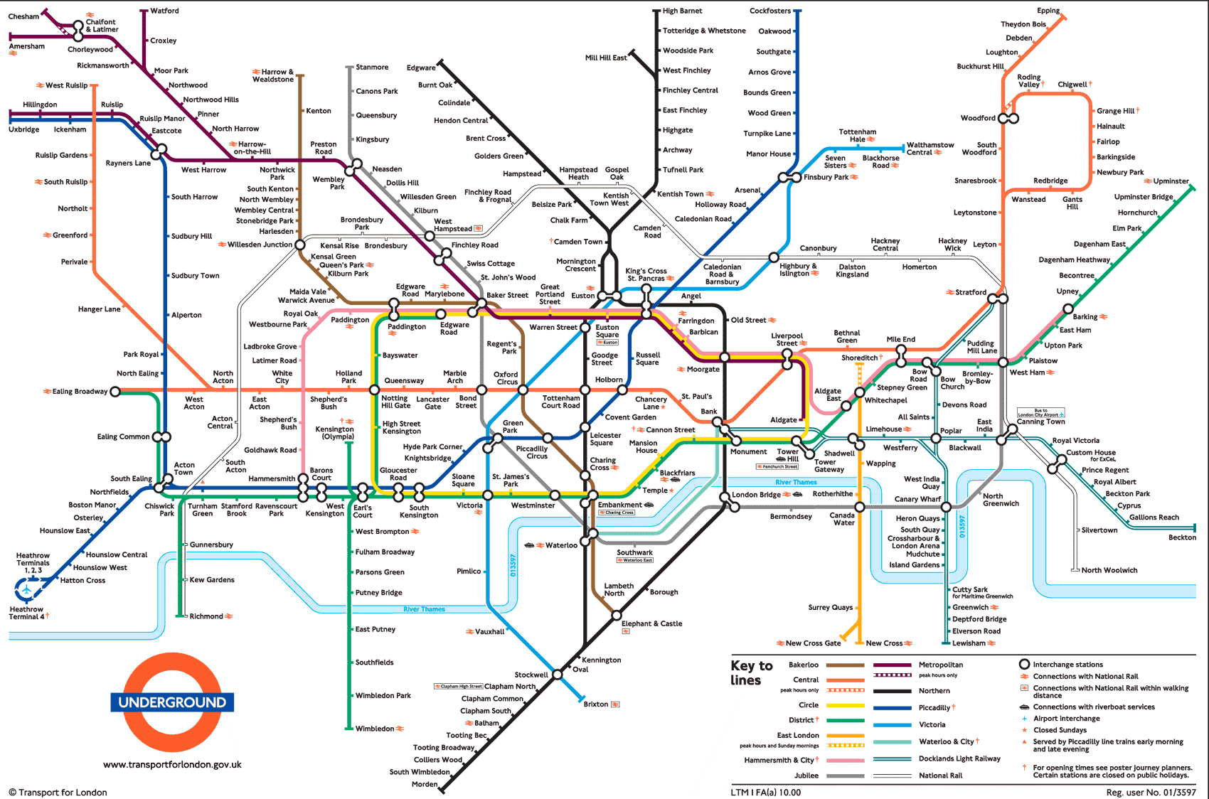
Author/Copyright holder: Michael Moore. Copyright terms and licence: CC BY-SA 2.0

The Principles of Information Visualization for Network Data

In his book, “Introduction to Information Visualization” Riccardo Mazza offers four simple principles to consider when designing a network data information visualization:

  • The positions of the nodes

  • The representations of the edges

  • The dimensions involved

  • The interaction elements

Positioning of Nodes

A node is an entity of the network. It may be a physical entity (such as a station on the tube map) or an abstract entity (such as piece of data within a computer network). It doesn’t matter whether a node is physical or abstract but it does matter that a choice is made on how the nodes will be laid out within the representation. The shape, color, dimensions, etc. of nodes can also be used to convey additional information about each node if so desired.

Representation of Edges

Any relationship documented between nodes has to have an edge (commonly shown as a line or an arrow on basic network representations). It is possible for an edge to be indirect or direct and to have direction or no direction. It is also possible to give weight to an edge through the use of numbers, thickness of lines, colours or other visual techniques.

Dimensions Involved

Networks may contain extremely large datasets (think books in the British Library or the US Library of Congress, for example) and these cannot always be represented in neat graphs with simple one-to-one relationships. Considering the numbers of dimensions involved can help the designer solve how these more complex relationships can be conveyed in the information visualization.

Interaction Elements

If you are using software to create the network diagram – you may also have the option to enable users to create their own views within your visualization. It’s best to decide what level of interaction you intend to provide to add the most value to your users before you get bogged down in designing the visualization.

Author/Copyright holder: Simon Pielow. Copyright terms and licence: CC BY-SA 2.0

2 Common Basic Network Diagrams

Let’s take a look at two fairly common basic network diagrams which use the first three principles well. Interaction elements tend to apply only to more complex information sets and as such aren’t a primary consideration here.

The Concept Map

Joseph Novak developed the concept map in the 1970s. They are simple representations showing relationships between concepts (nodes). They use labeled edges (known as propositions) which describe the connection between the two elements.

Concept maps enable the information visualization designer to take a simple concept and slowly extend it by adding further concepts and propositions. They can be very valuable in teaching and education because of this.

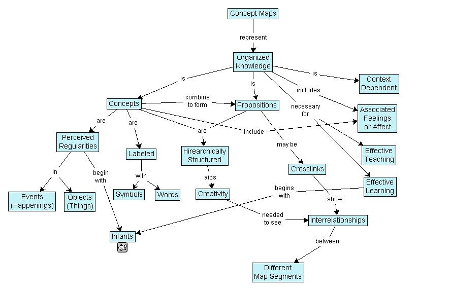
Author/Copyright holder: Vicwood40. Copyright terms and licence: CC BY-SA 3.0

The Mind Map

Tony Buzan, a researcher, developed the mind map concept. They serve a similar function to concept maps. The idea is to create concepts around a specific topic and then link them to each other with an edge describing the relationship.

Mind maps differ from concept maps in that they always work around a single central concept.

Tony Buzan offers many additional rules for developing mind maps in his book “The Mind Map Book”. These techniques are interesting and relate to the visual display of data within the mind map – they are not essential to understanding the mind map as a network diagram but are summarized in the image below.

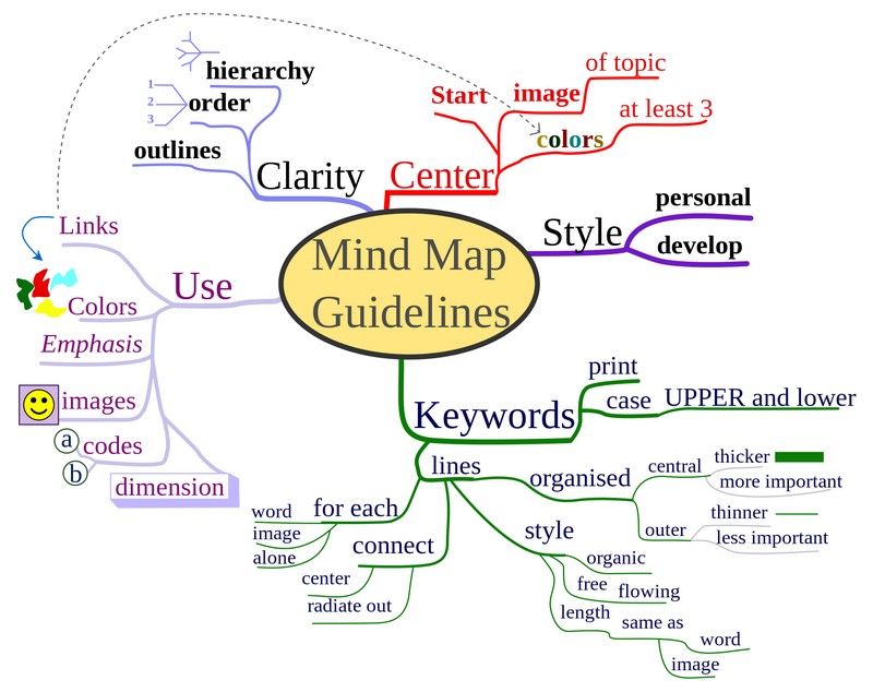
Author/Copyright holder: Nicoguaro. Copyright terms and licence: CC BY-SA 3.0

Tony says that using mind maps can help; “associate new and unique ideas with ‘old’ ideas that already exist to become exceptionally creative.”

The Take Away

It’s important to consider four factors before developing a basic network data visualization: The positions of nodes, the use of edges, the dimensions to be used and any interactions to be contained within the visualization.

Two common basic tools for representing networks are concept maps and mind maps.

References

Tony Buzan and Barry Buzan. The Mind Map Book. BBC Active, 2006.

Novak, J. D. (1990), Concept mapping: A useful tool for science education. J. Res. Sci. Teach., 27: 937–949. doi: 10.1002/tea.3660271003

More about Joseph Novak.

More about Tony Buzan.

Riccardo Mazza, Introduction to Information Visualization, Springer, ISBN 878-1-84800-219-7

Hero Image: Author/Copyright holder: Toby. Copyright terms and licence: CC BY-NC-ND 2.0

Learn More in This Course:

AI for Designers

12 days
13 % booked
View Course

What You Should Read Next

  • Read full article
    The Key Elements & Principles of Visual Design - Article hero image
    Interaction Design Foundation logo

    The Key Elements & Principles of Visual Design

    Visual design is about creating and making the general aesthetics of a product consistent. To create the aesthetic style of a website or app, we work with fundamental elements of visual design, arranging them according to principles of design. These elements and principles together form the building

    Social shares
    1.4k
    Published
    Read Article
  • Read full article
    The Principles of Service Design Thinking - Building Better Services - Article hero image
    Interaction Design Foundation logo

    The Principles of Service Design Thinking - Building Better Services

    Service design is all about taking a service and making it meet the user’s and customer’s needs for that service. It can be used to improve an existing service or to create a new service from scratch. In order to adapt to service design, a UX designer will need to understand the basic principles of

    Social shares
    1.4k
    Published
    Read Article
  • Read full article
    Principle of Consistency and Standards in User Interface Design - Article hero image
    Interaction Design Foundation logo

    Principle of Consistency and Standards in User Interface Design

    Learn to design with consistency and standards in mind and understand the reasons why they’re important to incorporate them into your work. Derived from Jakob Nielsen and Rolf Molich’s Ten User Interface (UI) Guidelines, ‘Consistency and Standards’ are evident in many of the widely-used produc

    Social shares
    1.3k
    Published
    Read Article
  • Read full article
    KISS (Keep it Simple, Stupid) - A Design Principle - Article hero image
    Interaction Design Foundation logo

    KISS (Keep it Simple, Stupid) - A Design Principle

    It was Albert Einstein who said; “If you can’t explain it, you don’t understand it well enough.” Though it is often mis-reported as being; “If you can’t explain it to a six year old, you don’t understand it well enough.” What Einstein was driving at was a particular application of “keep it simple, s

    Social shares
    1.3k
    Published
    Read Article
  • Read full article
    Hick’s Law: Making the choice easier for users - Article hero image
    Interaction Design Foundation logo

    Hick’s Law: Making the choice easier for users

    Now let’s see a topic about keeping our users’ lives easy. “Isn’t that the theme of most articles here?” you may ask. Well, this one is especially geared towards users. Understanding Hick’s law means you can design so that more users will visit and stay on your website.Delivering a good user experie

    Social shares
    1.3k
    Published
    Read Article
  • Read full article
    Visual Hierarchy: Organizing content to follow natural eye movement patterns - Article hero image
    Interaction Design Foundation logo

    Visual Hierarchy: Organizing content to follow natural eye movement patterns

    Let’s look at a topic that deals with, oddly enough, how we look at designs. Once you understand how the human eye processes these, you’ll find yourself better able to arrange your elements more effectively.Content in any digital page layout will follow a specific hierarchy. Headers appear above bod

    Social shares
    1.3k
    Published
    Read Article
  • Read full article
    Introduction to the Essential Ideation Techniques which are the Heart of Design Thinking - Article hero image
    Interaction Design Foundation logo

    Introduction to the Essential Ideation Techniques which are the Heart of Design Thinking

    Ideation is at the heart of the Design Thinking process. There are literally hundreds of ideation techniques, for example brainstorming, sketching, SCAMPER, and prototyping. Some techniques are merely renamed or slightly adapted versions of more foundational techniques. Here you’ll get an overview o

    Social shares
    1.2k
    Published
    Read Article
  • Read full article
    Information Overload, Why it Matters and How to Combat It - Article hero image
    Interaction Design Foundation logo

    Information Overload, Why it Matters and How to Combat It

    Designers often need to convey information to the users of their designs. Specialists in information visualization design in particular find themselves presenting data over and over again to their users. However, it’s important when developing your designs that you don’t create “information overload

    Social shares
    1.2k
    Published
    Read Article
  • Read full article
    Responsive Design: Best Practices - Article hero image
    Interaction Design Foundation logo

    Responsive Design: Best Practices

    Responsive Design allows people to access content across multiple device resolutions. As more people interact with websites through mobile devices, users now expect websites to be responsive. Here we’ll look at the main principles of responsive design and how it supports accessibility and device-swi

    Social shares
    1.1k
    Published
    Read Article
  • Read full article
    Symmetry vs. Asymmetry - Recalling basic design principles - Article hero image
    Interaction Design Foundation logo

    Symmetry vs. Asymmetry - Recalling basic design principles

    Now we’re going to look at two powerful design principles that may, at first glance, seem too simple and second nature to us to warrant too much thought. However, we would be wise not to underestimate their capabilities and the benefits of their effects. Always keeping a firm appreciation for symmet

    Social shares
    1.1k
    Published
    Read Article

Top Articles

Top Topic Definitions

Feel Stuck?
Want Better Job Options?

AI is replacing jobs everywhere, yet design jobs are booming with a projected 45% job growth. With design skills, you can create products and services people love. More love means more impact and greater salary potential.

At IxDF, we help you from your first course to your next job, all in one place.

See How Design Skills Turn Into Job Options
Privacy Settings
By using this site, you accept our Cookie Policy and Terms of Use.
Customize
Accept all

Be the One Who Inspires

People remember who shares great ideas.

Share on:

Academic Credibility — On Autopilot

Don't waste time googling citation formats. Just copy, paste and look legit in seconds.

Feel Stuck? Want Freedom?

Join 326,020+ designers who get one powerful email each week. Learn to design a life you love.

Next email in
1
day
16
hrs
6
mins
33
secs

Free forever. No spam. Unsubscribe anytime.