The Law of Common Fate

Your constantly-updated definition of the Law of Common Fate and collection of videos and articles.
Be a conversation starter: Share this page and inspire others!

98 Shares

What is the Law of Common Fate?

The law of common fate is a principle of Gestalt psychology. It states that when elements move together, humans see them as a group as human nature associates objects that share a common motion (e.g., a flock of birds). Designers apply common fate ​and leverage t​he power of motion—both real and implied—to create relationships between screen design elements.  

A​​​​uthor, Designer and Educator Mia Cinelli explains the importance of Gestalt principles in visual design and introduces a few of them, including continuity.  

Transcript
 

How the Law of Common Fate Determines the “Destiny” of Design Elements

The Gestalt law of common fate addresses motion and orientation in designs. According to this principle, when elements in a design show similar movement or behavior, viewers see them as connected. This phenomenon is natural to the human eye—and mind—because people’s brains tend to seek patterns automatically. Because of this, common fate is a staple in graphic design.  

“Gestalt” is the German word for “shape” or “form.” It is a psychological theory of visual perception. The Gestalt school consisted of psychologists Kurt Koffka, Wolfgang Köhler and Max Wertheimer, working in 1920s’ Germany. The central point of Gestalt theories is that human beings perceive objects in the world in patterns or whole forms. According to the Gestalt psychologists, people do not visually process their surroundings as a collection of separate parts. Instead, the mind organizes these elements into a cohesive whole.    

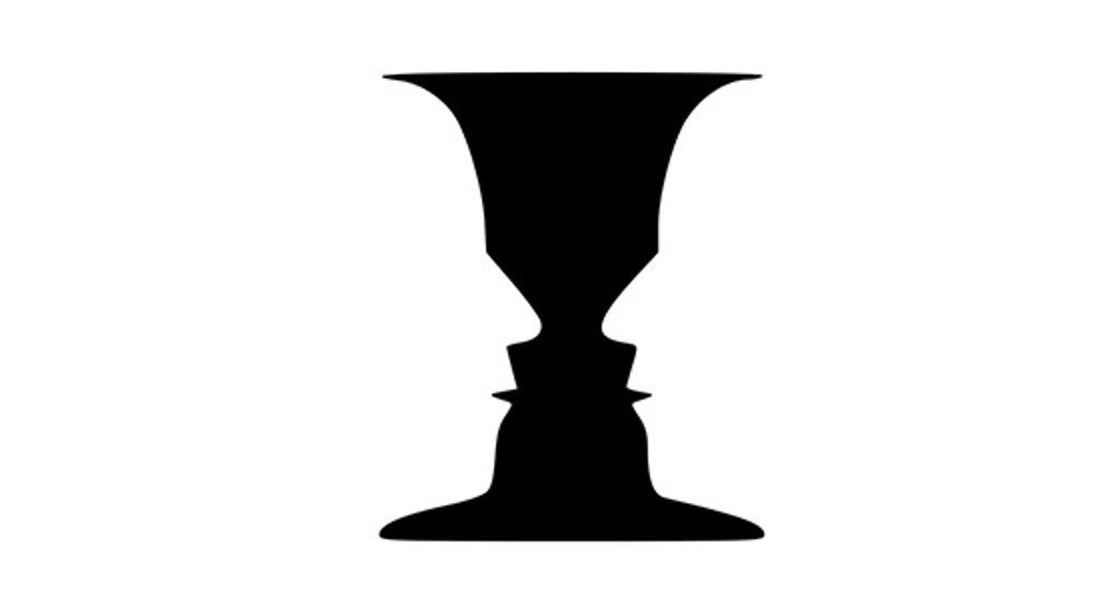
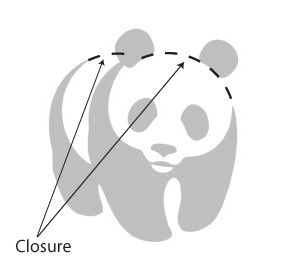
The Gestalt principles or laws address this tendency of the mind to simplify a complex image so the person sees it in a certain manner. The human inclination to process visual information accounts for how the elements of a seen image form visual relationships with each other. There are numerous Gestalt principles. Notable ones are the principles, or laws, of similarity, prägnanz, common region, figure ground, proximity, closure, and common fate. 

​​​How Does the Law of Common Fate Work in Digital Design?

The common fate principle provides a unique perspective on how users perceive and interact with digital products or services. Like other visual designers, UX designers who mindfully apply this principle can create works that are engaging—ones that help users in their tasks to achieve goals. They can create interfaces that are visually cohesive, intuitively navigable and intriguing, leading to richer user experiences.  

Designers can achieve this if ​​they provide strong visual cues that help users process and digest information fast. Digital products that feature common fate can be aesthetically pleasing. ​​What’s more, they can also serve to help users in busy environments or potentially stressful situations—as they direct attention efficiently. Designers apply the common fate law in: 

  • Web design: When website users perceive elements that move together as related, it helps to foster a sense of cohesion and continuity. In a menu, when users click an option, all elements move together to show they are related. Animations can make multiple elements move at the same time. That’s a factor that can help guide the user's attention to specific parts of the page. So, that way, the interaction becomes more engaging—while it helps users in problem solving—such as selecting an item to buy. Carousels are especially helpful for this. 

Image showing a carousel of car choices on Volkswagen's website.

Volkswagen utilizes carousels to showcase their new releases.

© Volkswagen, Fair Use

  • Mobile apps: Designers often apply the law of common fate when they use similar animations for user interface (UI) elements that have the same purpose. This creates a visual link between these elements, and makes them appear related. In a travel app, for example, the cards in “Past Trips” can slide together to show they are in the same category. Items that move or point together guide the viewer's eyes along a set path. That ensures a clear flow of information, an essential aid for smartphone users and others. 

  • ​​​Infographics: Infographics—with their integration of text and visuals—frequently show the law of common fate in good use. Elements that move or point together guide the ​​viewer's eyes and guarantee a good, clear flow of information. It also gives the readability a boost and makes the information more digestible. 

  •  Visual hierarchy: The law of common fate helps designers establish a visual hierarchy within their interfaces. When they group elements with shared movement or behavior, designers can usually communicate relationships and emphasize the importance of specific components.  

  • User guidance:​​​​ Common fate perception is something that lets designers guide users' attention and direct their focus towards important elements or interactive features. When they use this principle—and do it well—designers can make sure that users can easily navigate and interact with the interface in front of them. 

Image showing a menu of cars and options.

Common fate helps to clearly guide users around menu options.

© Priyanka Jeph, Fair Use

  • Coherence and consistency: If designers apply the law of common fate well, they’ll enhance the overall coherence and consistency at play in their designs. Elements that share a common fate appear visually connected—and they reinforce a good sense of unity and purpose. That makes for a user experience that has more harmony. 

Image showing a carousel of guitar footpedals for sale.

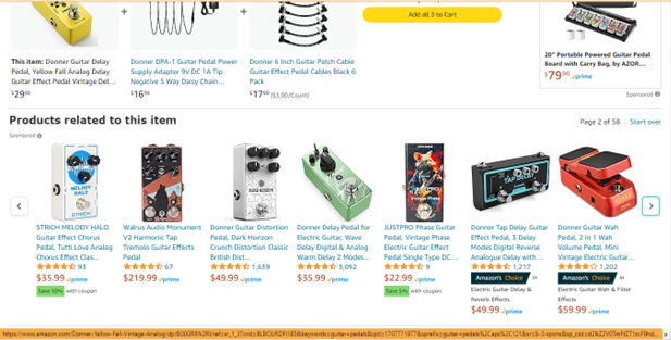
Users scroll through related items via a horizontal slider on Amazon.com. Users can appreciate the related products in the slider and can scroll through them for alternative items.

© Amazon, Fair Use

  • Efficient information processing: If ​designers​ group related elements based on their movement, they’ll make users' cognitive processing a good deal easier. Users can quickly and intuitively make sense of the relationships and functionalities of elements. That will lead to better efficiency and make things easier to use. 

Here are some of the main features where user experience (UX) and user interface (UI) designers apply common fate:  

  • Navigation menus: Dropdown menus or submenus that expand or collapse with a consistent motion create a visual connection between the main menu and its subcategories. Users can anticipate the behavior and understand how the designer has organized the navigation system. 

Image showing a screen with dropdown menus.

In dropdown menus, when a submenu appears to the right of the first menu, users expect the pattern to continue if they select another subcategory—i.e. it will appear to the right as well.

© Kathryncodonnell, Fair Use

  • Loading animations: ​​​These can employ coherent and synchronized movement. For example, they can be spinning circles or progressing bars. These can convey a sense of progress and continuity. Users perceive these animations as a group—since these indicate that the system is actively working. This lends great predictably to a user or customer experience, and it helps build trust as a design pattern.  

  • List animations​:​ When designers show lists or grids on an interface, they can animate the appearance or disappearance of items with a common movement pattern or direction. This helps users quickly understand the relationship at play between elements. For example, a cascading animation for a list of items carries the idea that these have a shared fate or relationship.  

  • Interactive feedback: Interactive elements—such as buttons or links—can feature visual cues like hover or click animations that show a shared movement pattern at play. This gives users immediate feedback; plus, it reinforces the idea that these elements are indeed related and that they do serve a common purpose.   

Animation showing Apple Airpods Pro headphones.

Apple’s product pages frequently feature animated product images. Users scroll, and pictures of the product and its components move together. This establishes an appealing visual narrative that speaks to the user.

© Apple, Fair Use

How to Apply the Law of Common Fate in Design

Here are some strategic ways that designers incorporate this principle in interfaces: 

  1. Guide user focus: Cont​​rol design elements to guide user focus towards key areas of the interface. This can be a button, a new feature—or anything else a designer wants to highlight and draw attention to. When designers group elements together and make them move in the same direction, it helps users understand an interface structure easily.

  2. Improve navigation: Designers use common fate to improve how easy it is to navigate in an interface. They can group related elements together and make them move in the same direction, to help users understand the interface’s structure more easily. That will promote a smoother navigation experience. 

  3. Enhance aesthetics: When designers integrate motion into their designs, it doesn’t just serve functional purposes—it adds a dynamic, visually appealing touch as well. Thoughtful animations, transitions and effects can make for an interface that’s more engaging and enjoyable for users.  

  4. Make consistent animations:​ Designers should make extra sure that elements with a shared fate or purpose exhibit consistent and synchronized animations. This consistency, after all, reinforces the users’ perception of a group—and that helps users to understand the interface and engage with it.

  5. Differentiate visual elements: W​​​​hile designers should visually connect elements with a common fate, it's also essential to differentiate them from unrelated elements. So, they should use effective contrast in color, shape or size to distinguish between groups and prevent users from associating unrelated elements.  

Gif image showing red and black dots moving to illustrate a point about the law of common fate.

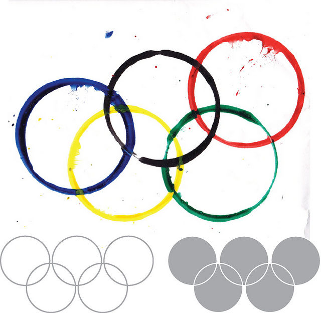
The law of common fate in grouping elements is stronger here compared to the law of similarity (another Gestalt principle). Regardless of color scheme, it is important to ensure synchronous movement so that the user can perceive this.

© Jon Hensley, Fair Use

  1. Give clear directional cues:​ ​Make sure that the movement or behavior of elements provides clear prompts as to direction. Users should be able to anticipate the trajectory or outcome based on the visual cues—something that facilitates their understanding of the interface. 

  2. Conduct user testing and iterate with the feedback:​​​​ Designers should validate the effectiveness of common fate perception in their designs—doable through user testing and feedback. It’s important to collect insights from users to understand how they interpret and perceive the relationships between elements; this will allow for iterative improvements. 

  3. Ensure contextual relevance: ​​​​Reflect on the specific context and purpose of a design that uses the principle of common fate. Designers should be sure that the shared movement or behavior does indeed fall into line with the overall user journey—and serve a meaningful purpose as it helps the users get to and get through their goals more easily. 

    Animated image showing Google Material Design's Ripple effect feature.

    Google’s Material Design​—​The ripple effect features when users click on a button; this is an effect that starts at the point of interaction and connects the action to the outcome visually.

    © Google, Fair Use

    The Risks of ​​the Gestalt Law of Common Fate in UX Design 

    While common fate is a powerful tool in UX design, it’s not without its limitations—and potential risks. So, it's essential to consider these; here are a few things to bear in mind:  

    1. Overuse or misuse: If a designer applies common fate excessively—or inappropriately—it can lead to visual clutter and confusion. So, it’s important to be sure that any use of this principle runs in line with the overall design goals and doesn’t overwhelm or distract users. For example, a digital solution should solve problems; so,​​ what problem does the target audience have—and how much of this Gestalt design is appropriate? Is there enough negative space or white space to help users notice the common fate elements easily?

    2. Cultural and contextual sensitivity: Different cultures and contexts may interpret common fate differently. Think about the target audience and their cultural background, to make sure that the design does effectively communicate the intended message. For example, patterns, symbolism and metaphors can hold different meanings for people from other cultures, as can color meanings and the reading direction for text (in Arabic, for example, it’s right to left). Research is—therefore—essential for any designer or design team looking to cast their brand’s message correctly across the world. UX researchers should apply careful insights that they collect from thorough studies and tools such as user personas, user journey maps and customer journey maps.  

    3. Accessibility considerations: Common fate effects that rely solely on visual cues may pose challenges for users with visual impairments or other accessibility needs. Designers should always strive to get information across in way that makes for an inclusive user experience. When designers well and truly understand ​their ​users’ needs, they can cater to all abilities. 

    4. User familiarity: Users' familiarity with common fate principles may vary. That’s why it’s important for designers to do solid usability testing so they can be sure that users interpret the intended relationships between elements in the right way. Testing is a vital part of any UX design process—and designers who investigate user interactions will get valuable insights out of it. From these, they’ll be able to improve various facets of their designs; that includes the information architecture and overall usability. 

      Illustration of blue fish on a white background.

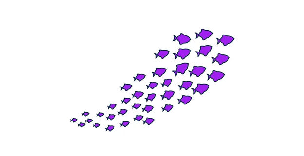
      These fish are “on board” in the same direction, moving naturally, as a school.

      © Saif Ali Khan, Fair Use

    The law of common fate is just one of the many tools in a designer’s toolkit. Given its popularity, such as in the form of carousels, it’s worth considering early on and in wireframing. It’s one of various Gestalt principles that can help craft user-friendly interfaces that are effective. Conduct user research and use it with discretion to help guide users around. One way to envision common fate is to see it as a well-signposted escalator to assist target users to the next level of engagement with the brand’s web page or app screen.  

Questions About Law of Common Fate?
We've Got Answers!

How does the Gestalt law of common fate affect visual hierarchy?

When they leverage this principle—and well—designers can bring a sense of unity and coherence into their designs. They can guide the viewer's attention to certain areas in a more effective way. 

For instance, in a website design, arrows that point in the same direction can suggest a sequence of actions for the user—like scrolling down or moving to the next page. Similarly, elements like icons or text that share a directional orientation can subtly indicate how to navigate through content. This is something that can improve usability and the user experience. 

When designers weave the law of common fate into their design work, they’ll find it can help establish a visual hierarchy. That’s since it emphasizes the relatedness of certain elements over others. This doesn’t just organize information in a way that's visually appealing but does it so it intuitively guides users through a design, too. That makes interactions smoother—and more predictable.  

Designers can apply this principle if they line up elements in a way that supports the main action they want users to take. For example, if they align call-to-action buttons along a common axis or use consistent directional cues across a website, it can reinforce the path users should follow, and make the design more effective and user-friendly, too.

What are the mistakes to avoid regarding common fate in UI design?

In UI design, if designers overlook the principle of common fate, it can lead to a disjointed user experience. Here are critical mistakes to avoid: 

  • Inconsistent animation speeds: Elements that users should perceive together should animate at the same speed. Variations can confuse users—and make it hard to understand which elements are actually related. 

  • Misaligned directional cues: Make sure that all elements intended for grouping together move or point in the same direction. Contradictory cues can disrupt the user's understanding of the interface's structure. 

  • Overuse of motion: While motion can guide attention, excessive or irrelevant movement can distract and annoy users, and undermine the sense of common fate. 

  • Ignorance of hierarchical structure: Common fate can also apply to the visual hierarchy. Elements related in function or importance should visually correspond to each other to reinforce their connection. 

To strengthen common fate in UI design, think about how elements can visually—and behaviorally—run in line to show what their relationship is to users. This alignment helps go towards a UI that’s cohesive and intuitive. 

Consider how a good design pattern can help establish a stronger connection with users. Watch as senior UX consultant Vitaly Friedman explains UI patterns: 

Transcript
 

How can designers test the effectiveness of common fate in their designs?

Designers can test the effectiveness of common fate in their designs through several user testing methodologies that ensure elements perceived as part of a group do function as intended: 

  • A/B testing: Implement A/B testing by creating two versions of a design—one that applies the common fate principle strongly and another that doesn’t. Analyze metrics such as user engagement, task completion time, and error rate to assess which design performs better in terms of user understanding and interaction. 

  • Eye tracking: Use eye-tracking technology to see how users visually navigate the design. Eye-tracking can reveal whether elements that users should perceive as being together ​​​​​​capture attention as a group—which indicates the effective application of common fate. 

  • Heatmaps: Apply heatmap tools to analyze where users click, touch, or hover most frequently. Heatmaps can show if users group elements together based on their movement or directional cues. This will provide insight into how well the common fate principle is at play. 

Take our​ ​Conducting Usability Testing course for in-depth insights into how to test the effectiveness of UI designs. Watch this video as CEO of Experience Dynamics, Frank Spillers explains: 

Transcript
  

How does the Gestalt law of common fate interact with other Gestalt principles?

The Gestalt law of common fate interacts closely with other Gestalt principles to enhance visual perception and design coherence.  

  • For example, it works hand in hand with the law of similarity—which suggests that users will perceive objects that look similar as part of the same group. When elements share both direction and appearance, this strengthens their perceived connection, and it makes it easier for users to understand and navigate design layouts. 

  • What’s more, the law of common fate complements the law of proximity—which states that users see objects that are close to each other as a unit. Together, these laws can guide viewers' attention toward or away from specific design elements. This can help to create focal points and organize information hierarchically. 

  • The interaction between the law of common fate and the law of closure—where users’ minds fill in missing information to see a complete object—is something that plays a crucial role, too. This can lead to dynamic interactions in design, where implied movement or alignment suggests a complete form or directs the viewer’s gaze through a narrative sequence within the design. 

  • What’s more, the law of common fate can enhance the principle of figure-ground. That involves users distinguishing between foreground and background elements. When they align movement or directional cues, designers can make certain elements stand out as the “figure” against a less dynamic “ground”—​​that can improve legibility and emphasis.

What considerations apply to the Gestalt law of common fate in mobile app design?

In mobile app design, designers need to carefully think about how they apply the Gestalt law of common fate so they can be sure of a cohesive and intuitive experience for their users. Key considerations include these: 

  • Screen size limitations: Thanks to the smaller screen sizes of mobile devices, it's crucial to manage the movement and direction of elements wisely. So, designers should make certain that animations and transitions guide users and don’t overwhelm the limited space. 

  • User interaction: Consider how touch interactions—such as when users swipe or scroll—can serve to reinforce the common fate principle. Elements that move together in response to user actions can enhance their perception of how related these are. 

  • Performance: Mobile apps have to remain responsive and fast—so, animations and movements that apply common fate shouldn’t compromise the app's performance in any way. It’s best to optimize animations and be sure that they’re smooth and don’t cause delays. 

  • Contextual relevance: Make sure when you apply the law of common fate, it falls into line with the app's purpose and the users’ tasks. Movement and grouping should always aim to simplify navigation and understanding—and not just serve as an aesthetic choice. 

  • Cultural considerations: Users from different cultures may interpret directional movements differently. Designers must consider these differences to make sure that the common fate principle effectively gets the intended relationships between elements across to all users.  

Watch this video as CEO of Experience Dynamics, Frank Spillers explains Mobile UI design patterns, and see how these can be helpful: 

Transcript
 

What tools and techniques enhance common fate in UI design?

To enhance the principle of common fate in UI design, designers use a variety of tools and techniques. Here are some effective strategies to keep in mind: 

  • Animation and motion: Utilize animation tools within design software like Adobe After Effects, Figma or Sketch—to create smooth transitions and movements that guide users' attention and group elements together visually. 

  • Consistent visual cues: Apply consistent visual cues—such as color, shape or size—to group elements and make sure that their synchronous motion or transformation reinforces the effect. This visual consistency helps users perceive them as being related or performing a similar function. 

  • Directional alignment: Make sure elements that users are supposed to associate move or point in the same direction. Do this through layout adjustments and motion design that guide the user's eye in a unified direction. 

  • Timing and easing: Use timing and easing functions within animation tools to synchronize the speed and flow of moving elements. This makes sure that all related elements do share the same dynamics—and reinforces the point that they’re connected. 

  • Prototyping tools: Use prototyping tools like Axure, InVision or Principle to test and refine how elements move together in real-time scenarios. Prototyping lets designers experiment with different approaches to common fate—and see how effective they are before the final implementation becomes a reality. 

Watch as author and human-computer interaction (HCI) expert Alan Dix explains the importance of prototyping: 

Transcript
 

How should designers balance common fate with the need for whitespace?
  • Prioritize clarity: Use common fate to group related elements, and make sure they move or align in a way that clearly indicates their relationship. However, don’t let this grouping clutter the interface. Whitespace around these groups can help maintain clarity and focus. 

  • Maintain hierarchy: Use whitespace to establish a visual hierarchy—to emphasize important elements or groups. This helps users navigate the interface more intuitively—they can understand which elements are related and which are most important at a glance. 

  • Enhance usability: Whitespace can improve readability and interaction comfort as it prevents information overload. Use it to separate groups of elements that common fate governs—and that will make the interface more approachable and easier to use. 

  • Optimize for different screens: Be mindful of how common fate and whitespace work together on various devices. A balanced design should adapt seamlessly across screen sizes, and maintain usability and aesthetic appeal.  
    Watch CEO of Experience Dynamics, Frank Spillers explain how responsive design achieves this: 

Transcript
 

  • Test and iterate: Do user testing to find the right balance between common fate and whitespace. Observe real users interacting with the design; it can provide valuable insights into how effectively the design communicates group relationships and prioritizes content. 

Take our Masterclass on usability testing, with Cory Lebson, Principal and owner – Lebsontech LLC

Does the Gestalt law of common fate improve UI accessibility?

Yes, the Gestalt law of common fate significantly improves UI accessibility. This principle can improve interfaces’ usability for a wide range of users—including users with disabilities. Here are some ways and reasons: 

  • Enhanced visual organization: When designers group related elements through motion or direction using common fate, it helps users with cognitive disabilities understand the interface's structure and functionality more easily. 

  • Reduced cognitive load: For users who are neurodiverse, interfaces that apply common fate can simplify information processing—that’s because they clearly indicate which elements are related and how they function together. 

  • Improved navigability: Users with motor impairments benefit from interfaces where related controls or information move together. It makes it easier to predict where to click, tap, or focus next. 

Watch our video to appreciate how important accessibility is as a consideration in UI and UX design: 

Transcript
 

What are some highly cited pieces of scientific research about the Gestalt law of common fate?

Dinh, K. (2022). Building mobile user interface by applying design principles (Bachelor’s thesis, LAB University of Applied Sciences). Supervisor: Aki Vainio, Lecturer, LAB UAS.  

Khanh Dinh's thesis—"Building Mobile User Interface by Applying Design Principles"—investigates the application of six design principles (visual hierarchy, similarity, proximity, common region, common fate and symmetry) to enhance mobile user interface design and user perception of quality. Utilizing a qualitative research method, deductive reasoning, and design science research, this study creates two mobile interfaces for a food application menu to test these principles. The findings reveal that incorporating design principles not only improves the aesthetic appeal and functionality of mobile interfaces but also aids users in efficiently completing tasks and enhances visual satisfaction. This research underscores the significance of design principles in the development of user-friendly mobile interfaces, contributing to the field of Business Information Technology. 

What are some highly regarded books about the Gestalt law of common fate?
  1. Malone, E. (2023). A Guide to Gestalt Principles for UX Designers: A mini visual design guide to help user experience designers leverage gestalt principles for better designs. 8 paw press. 

This book offers a concise exploration of Gestalt principles in UX design. Erin Malone provides a practical guide, applying these principles to digital interfaces with a focus on mobile and web examples. The book delves into visual hierarchy, animation, and microinteractions. It aims to help readers improve design skills. It also includes downloadable templates for design documentation. This makes it a hands-on resource for UX designers.  

  1. Johnson, J. (2020). Designing with the Mind in Mind: Simple Guide to Understanding User Interface Design Guidelines 3rd Edition. Morgan Kaufmann. 

Designing with the Mind in Mind by Jeff Johnson offers user interface (UI) designers a foundation in cognitive psychology—essential for understanding the rationale behind UI design guidelines. Initially grounded in cognitive psychology, early HCI principles strove to optimize problem-solving, memory and language in interfaces. However—as the field’s diversified—practitioners often come from varied backgrounds, and not all deeply versed in cognitive psychology. This book empowers designers with the science behind design rules—and facilitates educated choices amid project constraints and enhancing the ability to justify design decisions. It includes Gestalt laws. The updated edition expands on topics such as persuasion, cognitive economics, emotional design, trust, habit formation and speech interfaces—which makes it a vital resource for contemporary UI design. 

Earn a Gift Earn a Gift, Answer a Short Quiz!

1
2
3
4
1
2
3
4
Question 1
Question 2
Question 3
Get Your Gift
Interaction Design Foundation logo

Question 1

What is the Law of Common Fate in design?

1 point towards your gift

  • We see elements close together as a group.
  • We see the same colored elements as related.
  • We see elements that move together as part of the same group.
Interaction Design Foundation logo

Question 2

How do designers apply the Law of Common Fate in web design?

1 point towards your gift

  • They change the colors of unrelated elements.
  • They group static elements together.
  • They use animations to move related elements together.
Interaction Design Foundation logo

Question 3

What benefit does the Law of Common Fate provide in user interface design?

1 point towards your gift

  • It creates random motion effects.
  • It helps users quickly identify related elements through motion.
  • It increases the complexity of the design with interesting animations.

Learn More About the Law of Common Fate

Make learning as easy as watching Netflix: Learn more about Law of Common Fate by taking the online IxDF Course Gestalt Psychology and Web Design: The Ultimate Guide.

Why? Because design skills make you valuable. In any job. Any industry.

In This Course, You'll

  • Get excited when you discover how top brands use Gestalt psychology to make websites and apps intuitive, visually appealing, and user-friendly. Gestalt principles help you create clear layouts and a strong visual hierarchy, so your users never feel confused or overwhelmed. You already use some of these principles instinctively, for example, when you group similar tasks on your to-do list, so mastering Gestalt psychology for web design is easier than you think. You'll get methods to increase engagement and conversions by optimizing CTA placement. The result? More immediate impact: less confusion, more engagement, higher conversions, and happier customers. That leads to higher company profits, better career opportunities, and greater job satisfaction.

  • Make yourself invaluable when you organize visual elements to guide behavior and drive desired outcomes. Whether you're streamlining the layout of a patient portal or designing a retail website that converts, the science behind human perception dramatically improves outcomes across industries. When you apply Gestalt psychology in web design, you're not just creating something visually appealing, you're designing experiences that feel right, reduce overload, and build lasting brand loyalty. This pays off significantly, as studies show that, on average, every dollar invested in UX design brings 100 dollars in return. As AI accelerates how fast you can create and iterate, you stay in demand when you can direct it with deep understanding of human perception. These timeless human-centered design principles transform AI from a tool into your new superpower, helping you design for how people's minds actually work.

  • Gain confidence and credibility as you follow step-by-step guidance to apply real-world Gestalt techniques. It's easier than you think, regardless of your background! You'll get comfortable with Gestalt principles as we walk through case studies and practical examples you can immediately use. When you use principles like the law of proximity, similarity, and closure, you'll guide people's eyes, simplify complex ideas, and ensure your message is clear. With this psychology-driven framework, you'll confidently tackle complex design challenges and create experiences that people love, trust, and recommend.

Get an Industry-Recognized IxDF Course Certificate

Increase your credibility, salary potential and job opportunities by showing credible evidence of your skills.

IxDF Course Certificates set the industry gold standard. Add them to your LinkedIn profile, resumé, and job applications.

Course Certificate Example

Be in distinguished company, alongside industry leaders who train their teams with the IxDF and trust IxDF Course Certificates.

Our clients: IBM, HP, Adobe, GE, Accenture, Allianz, Phillips, Deezer, Capgemin, Mcafee, SAP, Telenor, Cigna, British Parliament, State of New York

All Free IxDF Articles on the Law of Common Fate

Read full article
The Laws of Figure/Ground, Prägnanz, Closure, and Common Fate - Gestalt Principles (Part 3) - Article hero image
Interaction Design Foundation logo

The Laws of Figure/Ground, Prägnanz, Closure, and Common Fate - Gestalt Principles (Part 3)

We’re now going to take a look at some more Gestalt principles, building on what we’ve learned in the first two articles. This third piece is particularly useful because having a good grasp of Figure/Ground, Prägnanz, Closure, and Common Fate will enhance your ability to design with more thoughtfuln

Social shares
1.1k
Published
Read Article

The Laws of Figure/Ground, Prägnanz, Closure, and Common Fate - Gestalt Principles (Part 3)

The Laws of Figure/Ground, Prägnanz, Closure, and Common Fate - Gestalt Principles (Part 3)

We’re now going to take a look at some more Gestalt principles, building on what we’ve learned in the first two articles. This third piece is particularly useful because having a good grasp of Figure/Ground, Prägnanz, Closure, and Common Fate will enhance your ability to design with more thoughtfulness, confident that you’re making the best use of some basic human tendencies to access your design and its impact.

“The eye tends to build a relationship between elements, it fills in the gaps, and identifies hidden motion in the design.” Figure/Ground, Prägnanz, Closure, and Common Fate are Gestalt Principles that help the eye build these relationships:

  • The Figure/Ground law examines how the eye can separate shapes in a design from the background of that design.

  • The Prägnanz law shows how our eyes can simplify complex shapes into simple shapes.

  • The law of Closure refers to our tendency to complete an incomplete shape in order to rationalize the whole.

  • The law of Common Fate observes that when objects point in the same direction, we see them as a related group.

This article is the third in the Gestalt series. Please refer to the previous two to learn about the Laws of Similarity, Proximity, Uniform Connectedness, and Continuation.

So, for example, text on a page makes use of this law. The figure is the text itself and the ground the paper on which the text sits. The law of Figure/Ground states that we can distinguish an object (the figure of the rule) from background (the ground). This rule shows that when we look at a design, we perceive the figure from the ground distinctly.

There are two main factors that affect the way we perceive the figure and the ground in any given design:

  • The size of the figure when compared to the background. For example, header text is normally published in a larger font than body text. In this instance, the header is the figure and the body the ground. The header stands out more to the eye than the main body of text.

  • The contrast between the figure and the ground. This is why most printed pages will use black ink on a white background. The figure (the text) is at maximum contrast with the ground (the page). Contrast provides a distinct barrier between the two. This is why the readability of content can be impaired when there is little contrast between the text and the page – it becomes more difficult for us to distinguish the figure from the ground. Have you ever wondered why you never find red text on a blue or gray screen? Contrast is the reason.

Author/Copyright holder: Klaus-Dieter Keller. Copyright terms and licence: Public Domain.

The relationships between figure and ground can be classified into three categories:

Stable – In the case of a stable figure, the figure will be clearly identifiable from the background, and one element clearly dominates the overall layout.

Reversible –In this case, the figure and background have near-equal density. This enables the eye to flip the figure with the background (hence “reversible”). This can be used to create visual illusions in both web design and art. However, at any point in time, a reversible design will have a clear figure and a clear ground.

A classic illustration of this is the image of a Rubin vase (have a look at the image above). This tends to be a black vase that is set centrally over a square white background. The symmetrical vase has a large, trumpet-funnel top that takes up nearly the full width of the background’s top and tapers down into a narrow middle. Down the middle, it has five contours and four projections before it flares out again to cover most of the width of the bottom.

You’ve probably seen such a vase and know what’s coming next. Yes, that’s right! The vase has “made” two white faces facing each other, not through it but set against what our eyes now perceive as being black space behind them. It’s a neat trick!

Ambiguous – In an ambiguous design, there is little distinction between the ground and the figure. At any point, a single element might be both figure and ground at the same time. You can make your design ambiguous by blurring the boundaries between your ground and figure.

It sounds difficult, but it’s a fascinating realm to explore, and there are many famous examples of ambiguous design. M.C. Escher – a Dutch graphic artist - was a master at this. His designs tapped ambiguity to the maximum and, thanks to that, we have wonderful pictures of people climbing steps in buildings: some are going up; some are going down, but at impossible angles. Escher used ambiguity to make waterfalls flow around more buildings in an impossible way – the water initially flows downward, falling in places, follows a seemingly logical course, and then, mysteriously, flows up again. Ambiguous designs are yours for the taking of your inspiration, whether you want to insert hidden writing, faces in profile that are also a single, different face, or faces made of fruity parts.

Designing with the Figure/Ground in Mind

In the image at the start of this article, the Digital Camera World website menu uses the Figure/Ground principle to differentiate between two menus (see the top sections of the image). The use of drop shadow and color creates the illusion of the (lower) blue menu being on a top layer, while the white menu remains part of the background.

You can also see figure/ground at work on the 500px.com website’s homepage (as shown above). The background is a large and dominant image – people in the hot air balloon rides enjoying the majestic sunset sky - but the content is clearly identifiable, thanks to the use of both space and contrast with the background. This stops the background from overwhelming the content and distracting or confusing a visitor, who is probably joining in with the people to take in the sunset view. Cleverly “bulls-eyed” in the sky and tapering up next to the hot air balloons is the text – the all-important message.

The Law of Prägnanz (or Simplicity)

Prägnanz is a German word that means “good figure” or “pithiness” (literally defined as, “brief, forceful and meaningful in expression”). The human eye likes to find simplicity and order in complex shapes – it prevents us from being overwhelmed by information overload.

Author/Copyright holder: Clint. Copyright terms and licence: CC BY 2.0

When we see convoluted shapes in a design, the eye simplifies these by transforming them into a single, unified shape (by removing extraneous detail from these shapes).

Designing with the Law of Prägnanz in Mind – We can use the law of Prägnanz to help when wireframing a website. Our eyes assemble the content blocks into a single page.

This law goes by the other name of “The Law of Good Gestalt”, and for good reason. We humans like to make quick sense of things that would otherwise be upsettingly disordered. We dislike flux and need to find meaning quickly. Luckily, we don’t even have to think about doing this – our eyes have already got there!

When redesigning a site, you can apply Prägnanz law to wireframe the new concept and place it alongside the current version of a page. The eye can swiftly pick out any variances, and the user can quickly provide feedback on changes made – without the need for content. That’s all there is to it.

The Law of Closure

The Gestalt principle or law of Closure explains how we perceive incomplete shapes (Palmer & Rock, 1994). When there is missing information in an image, the eye ignores the missing information and fills in the gaps with lines, color or patterns from the surrounding area to complete the image. In reality, there are no borders or lines between this area (the background) outside the image we’re completing and the bits of background that we have determined are now part of the image. The eye tells us otherwise.

Author/Copyright holder: Tangient LL. Copyright terms and licence: CC BY-SA 3.0

Designing with the Law of Closure in Mind – We can use the Law of Closure to achieve visual effects such as the use in the World Wildlife Fund logo (pictured at the top of this article). The panda is incomplete (there are no lines around the white areas), but our eyes perceive a whole panda despite this. It takes some effort to overcome and notice the otherwise random black shapes and spots that appear on every piece of white background we can eventually make ourselves see.

The Law of Common Fate

The law of Common Fate says that we perceive shapes as lines moving along the smoothest path. For example, we look at grouped elements and see them as moving in a similar direction.

Author/Copyright holder: Alastair Rae. Copyright terms and licence: CC BY-SA 2.0

Let’s see this in action. If you’ve got a piece of paper handy, draw seven or eight circles in a line beside each other. Above two of them, put a little arrowhead. Now, notice that these two circles are different from the others, but in the same way. The others are staying put, but the “arrowheaded” circles are going somewhere (the same direction); they share a common fate.

Note: The elements do not have to be moving (though they can be), but they must suggest motion for this law to work in your designs.

Designing with the Law of Common Fate in Mind - The law of Common Fate plays an important role in design, for example, with nested menus and content. Take the example of LinkedIn (as shown in the image up there at the start). LinkedIn have used the law of common fate to build a relationship between sub-menus. When you move over a menu item, the sub-menu item moves in the same direction as the last. This creates a link between sub-menus in the minds of the users.

The Take Away

The principles of perceptual organization defined by Gestalt Psychology provide us with valuable knowledge so we can design effective, efficient, and visually pleasing displays. Throughout three articles, we have reviewed the most relevant for you as a designer:

And, in this article, you have learned about the laws of Figure/Ground, Prägnanz, Closure, and Common Fate. As we have seen, we have many exciting ways to reach our users with designs. Are you ready to apply them?

Where to Learn More

We can’t help but to invite you, once again, to enroll in our Gestalt Psychology Course! Check its description here.

Besides learning about the Gestalt principles and how they relate to design, you will also take away some of the best resources currently available and a consolidated list of recommended reading materials, videos, and useful links to relieve you of the task of trawling the internet, searching for that vital piece of information.

In addition to this, we have a course on Visual Perception and Design
which is particularly relevant to this law.

Feel Stuck?
Want Better Job Options?

AI is replacing jobs everywhere, yet design jobs are booming with a projected 45% job growth. With design skills, you can create products and services people love. More love means more impact and greater salary potential.

At IxDF, we help you from your first course to your next job, all in one place.

See How Design Skills Turn Into Job Options
Privacy Settings
By using this site, you accept our Cookie Policy and Terms of Use.
Customize
Accept all

Be the One Who Inspires

People remember who shares great ideas.

Share on:

Academic Credibility — On Autopilot

Don't waste time googling citation formats. Just copy, paste and look legit in seconds.