The Law of Figure-Ground

Your constantly-updated definition of the Law of Figure-Ground and collection of videos and articles.
Be a conversation starter: Share this page and inspire others!

98 Shares

What is the Law of Figure-Ground?

The law of figure-ground is a visual perception law or Gestalt principle. It describes how humans perceive an image as they separate it into the figure—foreground—and ground—background. Designers use it to create a clear visual hierarchy between the front “figure” and surrounding “ground,” and so guide users’ attention to important design elements.  
 

Transcript
 

Why is the Law of Figure-Ground Important?

The Gestalt law or principle of figure-ground (sometimes called “figure/ground” or “figure and ground”) is an essential principle of cognitive psychology. It’s valuable for designers who work in user experience (UX)—and particularly user interface (UI) design. This law is also called figure/ground—or figure and ground—and it’s a long-used staple in graphic design. When designers have a clear division between the foreground and background, it helps them to offer users the guidance they need to help them in performing tasks and get to and through the goals they want to on a website or app.  

The Gestalt principles of perception describe how the human eye finds and the brain organizes visual elements into groups to find patterns. What is important to bear in mind is that this happens naturally for viewers—and users. Humans do it with very little information to cue from the individual elements we encounter. People see what they see because their minds automatically strive to find order and meaning in the world around them. For example, the Rubin vase—in the picture below—shows the figure-ground principle at work. A viewer sees either a black vase or two white faces looking at one another. They interpret one or the other—but not both images at the same time. 

Image of the Rubin vase.

The phenomenon of perspective: the famous Rubin vase compels viewers to see one thing or another.

© Nicholas Amendolare, Fair Use

To be more precise, the principles of Gestalt psychology—also called Gestalt laws—are psychological principles that describe how human minds perceive visual elements their eyes show them. They suggest how human brains perceive objects and visual information—and that includes lines or curves and focal points—in certain ways. These principles include how an image is more than the sum of its parts—and how human minds typically group items into meaningful patterns. Because of this simple fact—which some may call a universal truth—the Gestalt laws are vital parts of a designer’s toolkit in visual design. That’s especially the case when it comes to optimizing user interfaces in a way to welcome users and assure them that, indeed, they can enjoy a good experience. 

The roots of Gestalt theory are well-founded; they go back to Germany in the 1920s. The Gestalt school of psychology consisted of psychologists Max Wertheimer, Kurt Koffka, and Wolfgang Köhler. The Gestalt psychologists’ approach involved the development of some theories. These theories include: the law of Prägnanz—or good figure—common region, closed region, principle of similarity, principle of uniform connectedness, principle of proximity, principle of continuity, principle of closure, and figure-ground. 

The figure is the object that appears to be in the front. Meanwhile, the ground is the area that surrounds the figure. This remarkably simple phenomenon explains why the figure-ground relationship is one of the fundamental concepts in visual perception. Designers use it to create meaningful—and often very striking—compositions in art and design. The foreground and background are tools that create contrast and balance and deliver a great sense of organization. This fact makes it easier for users to understand the content—and navigate the interface. 

Image of the Gestalt principles arranged around the word 'Gestalt'.

Figure-ground is a fundamental Gestalt principle, among others.

© Cameron Chapman, Fair use

How to Apply the Figure-Ground Principle in UX Design 

Designers can apply the figure-ground principle—or law—in a variety of ways and with it make interfaces that are both visually appealing and functional. More specifically, designers can use the law of figure-ground in their designs to: 

  • Create contrast: When designers use contrasting colors, shapes and textures, they can make a clear distinction between the figure and the ground. This makes it much easier for users to spot the most important elements on the screen and navigate the interface. 

Screenshot of eBay.com homepage.

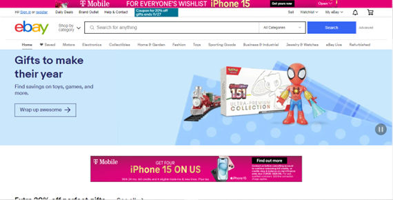
The contrast of eBay’s blue Search button on the white background is an example of figure-ground at work.

© eBay, Fair use

  • Balance elements: Use the figure-ground principle to balance the elements on the screen. Here, it’s especially important to make sure that the foreground and the background are visually appealing and in a state of harmony. This creates a sense of stability and order, something that makes the interface more user-friendly. 

    Screenshot of Seriously Unsweetened design.

    Seriously Unsweetened showcases tasteful, and tasty, balance using figure-ground.

    © Smashing Magazine, Fair use

  • Organize content: Use the figure-ground principle to organize content in a way that’s both logical and intuitive. When designers separate the foreground and background, they can create a really clear visual hierarchy. That will guide the users’ attention to the most important content showing on the screen. Sometimes, designers can do this directly over the background with text—but they can also include boxed content to show users even more noticeable content. 

    Screenshot of Ocean Health Index homepage.

    Ocean Health Index’s homepage exemplifies the use of figure-ground to organize content so users can easily see what they can do.

    © Ocean Health Index, Fair use

  • Enhance the user experience: Above all, it’s important to use the figure-ground principle to create a truly visually appealing and easy-to-use interface. This will make it easier for users to understand the content and navigate the interface, resulting in a more positive user experience. 

    Screenshot of Trellis homepage.

    Trellis’s homepage shows how figure-ground enhances the content, with well laid-out and contrasted “figure” elements—the text—set against an appealing and appropriately fertile-looking “ground.”

    © Trellis, Fair use

    Some tips to use the figure-ground principle include these: 

    • Use a limited number of colors to create contrast and focus the user’s attention on the most important elements. 

    • Use shapes and sizes to create a good visual hierarchy. It’s important to make sure that the foreground elements are larger than the background elements. 

    • Use shadows or outlines to separate foreground elements from background elements—this will create a sense of depth in the design. 

    • Make sure that the figure and ground have enough contrast so they’re easily distinguishable. However, don’t have so much contrast that it becomes too distracting for users. Too much contrast can be garish and strain their eyes. If there’s any doubt about contrast, use a contrast checker—such as WebAIM—to make sure there’s enough to make the work both accessible and effective. 

    • Take advantage of negative space—leave some areas blank or with minimal content in them. This helps keep the interface organized and clutter-free. What’s more, the calm, unbusy space will keep the background from competing with the foreground. It will also give users a fast track to interpret the message the designer’s presenting to them. 

    • Be careful not to make the design ambiguous. Remember, the Rubin vase is an example of ambiguity—and in that sense is a kind of optical illusion. However, in a design for an interface, it’s important to give users a clear understanding of what’s going on. Any hesitation from users—for instance, because they’re uncertain where the focal point is—will almost certainly work against the brand message. 

    • Remember the user’s culture. Users from some parts of the world may interpret figure-ground relationships entirely differently from—say—an American consumer context. So, it’s essential to be sure to accommodate these if designing for a global market. 

    More Examples of Good Figure-Ground Designs by Brands

    1. Apple is known for its minimalist design—and the figure-ground principle is a key element of its design philosophy. In the Apple Music app—for instance—the foreground and background are clearly separated. The album cover is the figure, and the background is a solid color. This creates a clear visual hierarchy, something that makes it easy for users to identify the most important elements on the screen. 

Screenshot of Apple Music app.

Apple Music offers clear selections by using a cleanly separated foreground and background.

© Apple Music, Fair use

  1. Naya’s homepage exemplifies a really effective use of figure-ground for its water products. The contrast of the logo over the outdoor picture is one such example. Also note the image. With the athletic woman in the foreground and the misty backdrop, viewers have connotations of healthy exercise and fresh, dew-soaked nature. 

    Screenshot of Naya.com

    Naya’s figure-ground use echoes the natural and health-oriented essence of the company.

    © Naya, Fair use

  2. Amazon’s iconic “Add to Cart” and “Buy Now” buttons show how to leverage figure-ground on a website. They’re virtually unmissable and entirely self-explanatory to users who want to buy desired items. 

    Screenshot of Amazon.com search result for a product.

    Amazon’s two buttons here are calls to action that stand out well against a background that includes white space.

    © Amazon, Fair use

    Remember to take full advantage of the Gestalt principle of figure-ground. It’s a fundamental concept in visual perception—and it plays a vital role in UI design, and for good reason. So, it’s vital for designers to use contrasting colors, balance elements, organize content—and enhance the user experience. That way, they can make interfaces that are visually appealing and functional—and ones that are easy to use and understand. And these can be ones that will be both visually appealing and user-friendly—digital interfaces that users will “get” and take to quickly. 

Questions About Law of Figure?
We've Got Answers!

What is an example of the law of figure-ground?

The figure-ground law is all about the human tendency to perceive objects or visual elements as either being in the foreground or the background. A real-world example that illustrates this principle is the perception of an image where the figure stands out prominently in the front—while the ground recedes into the back. For instance, in an image of a white apple sitting on a black background, observers focus on the white apple as the figure—while the black background stays as the ground. This is a determination that occurs quickly and subconsciously in most cases. It lets users discern what to focus on—and what to ignore—in design work and a brand’s product. The figure-ground principle is a fundamental concept in visual perception and design projects—and that includes product design and how you set out visual information in a user interface or web design. It plays a crucial role in various design disciplines—including user experience (UX) design and graphic design. 

How does the figure-ground principle affect visual perception in design?

The figure-ground principle has a great influence on visual perception in design. This principle asserts that people instinctively perceive objects as either being in the foreground—figure—or the background—ground. That perception’s critical in design because it affects how users discern and process information in a visual layout. 

In design, when you use the figure-ground principle well, it can direct the viewer's attention and improve readability and comprehension for them. For instance, a well-designed webpage uses contrasting colors, shapes and sizes to make sure that the main content—the figure—stands out against the background—the ground—which helps with quick information processing. Similarly, in UI design, buttons or interactive elements often appear as figures against a less prominent ground. That makes them easily identifiable and actionable for the user. 

One interesting fact about this principle is its roots in Gestalt psychology. Gestalt psychology emphasizes that the whole of anything is greater than its parts put together. Designers apply this principle to create a cohesive and harmonious visual experience that guides the viewer's eye naturally across the layout. 

For actionable insights, consider: 

  • Contrast: Use contrasting colors or shapes to make the figure stand out. 

  • Size and position: Place important elements—figures—in positions where they’re easy to notice. 

  • Simplicity: Avoid cluttered backgrounds that can make the figure less distinguishable. 

Can you give examples of the figure-ground principle in web design?

The figure-ground principle plays a crucial role in web design since it’s got an influence on how users perceive and interact with content. Here are some examples: 

  • Contrasting colors: Websites often use contrasting colors to distinguish text—figure—from its background—ground. For example, black text on a white background or vice versa. This contrast makes the content stand out and improves the readability factor greatly. 

  • Whitespace: A really effective use of whitespace can highlight key elements on a webpage—by setting them apart from the background. For instance, a call-to-action button with enough whitespace around it becomes more prominent and so attracts the user's attention. 

  • Layering and depth: When you create a sense of depth through shadows or layering, you can make certain elements appear to “pop out”—figure—against a flatter background—ground. This technique often features in card designs or modal windows. 

  • Images as background: Sometimes, a large, muted image serves as the background—ground—with text or other interactive elements overlaid as the figure. This approach can create a visually striking and engaging user interface. 

  • Navigation menus: In navigation menus, the currently active menu item often appears highlighted with a different color or style—something that makes it stand out against other menu items. This uses the figure-ground principle to indicate to users where they are in the website. 

  • Hover effects: When users hover over links or buttons, a change in color, size, or style can make these elements stand out—figure—against the rest of the content—ground—which is a good indicator of interactivity. 

These examples showcase how you can apply the figure-ground principle in web design to boost the user experience as you guide attention, improve usability and make a more visually appealing interface. 

What is the role of the figure-ground principle in UI design?

The figure-ground principle plays a critical role in UI (user interface) design. It’s got a profound influence on how users perceive and interact with an application or website. And it’s a foundational rule for you as a designer to create interfaces that are both aesthetically pleasing and functionally clear. Its role to assist you as a designer is that it can: 

  • Enhance usability: The figure-ground distinction helps users notice actionable items—like buttons and links—quickly. When these elements are clearly set as figures against a contrasting ground, it lessens cognitive load; plus, it makes navigation and interaction more intuitive. 

  • Guide user focus: Designers use the figure-ground principle to direct the user's attention to the most important elements. For instance, if you highlight a “Sign Up” button against a background that’s less prominent, you can make sure that it catches the user's eye. 

  • Organize information: In UI design, information hierarchy is an immensely key factor. When designers succeed in differentiating figures—primary information or actions—from the ground—background or less critical information—they can organize content in a way that naturally guides the user through the interface. 

  • Add aesthetic appeal: Beyond functionality, this principle contributes to the aesthetic value of the design. A well-executed figure-ground relationship adds depth and visual interest—which makes the UI more engaging and enjoyable to use. 

  • Create context: If they use backgrounds (the grounds) effectively, UI designers can make a context for the primary elements (the figures). This context helps get the right mood, theme or brand message across, and gives a boost to the overall user experience. 

  • Improve accessibility: A good and proper use of the figure-ground principle helps when it comes to accessibility. A high level of contrast between elements and their backgrounds can make the interface more usable for individuals with visual impairments. 

Overall, the figure-ground principle in UI design is an essential tool to help you create interfaces that aren’t just user-friendly and easy to navigate but visually compelling and accessible, too. It’s a fundamental part of ensuring that your interface communicates effectively with its users. 

What are the common mistakes when applying figure-ground in graphic design?

When you apply the figure-ground principle in graphic design, watch out for several common mistakes—ones that can detract from the effectiveness and appeal of your design. Here are key ones to keep in mind: 

  • Beware of insufficient contrast: One of the most frequent errors designers make is to fail to create enough contrast between the figure—the main element—and the ground—the background. Poor contrast can lead to elements blending into the background, which makes them difficult for users to distinguish and diminishes the design's impact. 

  • Don’t overcrowd elements: If you clutter a design with too many elements, it can confuse the figure-ground relationship. This overcrowding makes it challenging for viewers to pick out the main focus. That will lead to a loss of visual hierarchy and make the user’s interest fall. 

  • Beware of inconsistent focal points: A common mistake is having multiple elements competing for attention as the figure. This inconsistency can confuse viewers about where to focus—so, it can dilute the message or purpose of the design. 

  • Don’t neglect whitespace: Another mistake is to underestimate the power of whitespace—negative space. That space is a crucial part of a clear figure-ground distinction in your design work. So, help your designs breathe and keep the elements nice and uncramped. When you have the spacing right, your website or app can grab your users subtly in a seamless experience. 

  • Don’t misuse color and texture: Any inappropriate or excessive use of colors and textures can disrupt the figure-ground relationship. The result is that it can either overly complicate the background or cause the main elements to lose prominence. 

  • Don’t ignore contextual relevance: Sometimes, designers might choose a figure-ground relationship that doesn’t line up with the context or message of the design. This mismatch can lead to a confusing or misleading visual narrative—and work against the whole user experience. 

  • Beware of a lack of focal hierarchy: If you fail to establish a clear hierarchy of elements, it can lead to a disorganized and ineffective design. Each element should have a defined role and level of prominence relative to other ones. 

So, avoid these common mistakes; it’s crucial for you to effectively apply the figure-ground principle in graphic design. When you do that, you’ll help make sure clear communication is a reality, give a boost to the visual appeal and improve the effectiveness of the design all in all. 

How does color influence the figure-ground relationship in designs?

Color has a profound bearing on the figure-ground relationship in design—in that it affects how users distinguish between the main elements—figure—and the background—ground. In the realm of design—particularly when it comes to user interfaces and graphics—the figure-ground principle explains how humans separate visual elements according to contrast and color. 

  • Contrast and visibility: Strong color contrast between an element and its background makes the element stand out as the “figure,” easily catching the user's attention. For instance, a bright button on a dark background is immediately noticeable, and it guides the user’s interaction. 

  • Guiding user focus: Color can direct user focus to key elements. So, use colors to make critical elements like call-to-action buttons or navigation links stand out—so users interact with these elements intuitively. 

  • Emotional and psychological impact: Colors do evoke emotional responses—something that you can use to emphasize the figure-ground relationship. Warm colors—like red and yellow—can be signifiers of energy or alertness, while cool colors—like blue and green—can induce a sense of calmness. Use these psychological effects to reinforce the importance or functionality of specific elements. 

  • Creating depth and layering: Different color shades can create a sense of depth—and make some elements appear closer (figure) and others farther (ground). This depth perception helps in terms of layering information effectively, and giving the usability a boost. 

  • Harmony and balance: While color goes a long way to differentiating elements, it's crucial to keep harmony and not overwhelm users with too many high-contrast elements—something that can lead to confusion or fatigue. 

What are some highly cited academic papers about the Law of Figure-Ground?

Here are some highly cited pieces of research about the Law of Figure-Ground: 

  1. Wagemans, J., Elder, J. H., Kubovy, M., Palmer, S. E., Peterson, M. A., Singh, M., & von der Heydt, R. (2012). A century of Gestalt psychology in visual perception: I. Perceptual grouping and figure–ground organization. Psychological Bulletin, 138(6), 1172-1217.  

This extensive review traces the history and evidence for key Gestalt principles of perceptual grouping and figure-ground organization, evaluating modern computational models and neuroscience evidence. It provides a foundation for theory and research on the figure-ground principle.  

2. Peterson, M. A., & Gibson, B. S. (1994). Object recognition contributions to figure-ground organization: Operations on outlines and subjective contours. Perception & Psychophysics, 56(5), 551-564.  

This tests how familiar configuration affects emergence of subjective contours and figure-ground perception, relating principles to object recognition. Relevant to leveraging affordances in interface design.  

3. Driver, J., & Baylis, G. C. (1989). Movement and visual attention: The spotlight metaphor breaks down. Journal of Experimental Psychology: Human Perception and Performance, 15(3), 448-456.  

An influential publication on attention and figure-ground perception during motion, challenging spotlight metaphors. Relevant to animation and video interfaces. 

How does figure-ground theory apply to mobile app design?

Figure-ground theory plays a crucial role in mobile app design since it’s got a large bearing on how users perceive and interact with app elements. This Gestalt psychology principle states that people instinctively separate images into “figure”—the focal point—and “ground”—the background. In mobile app design, this translates to how users discern interactive elements—buttons, icons, text—from non-interactive backgrounds. 

When you apply it effectively, figure-ground theory ensures that users can easily identify important elements—something that enhances the user experience. For instance, a button with a contrasting color against a subtle background prominently stands out. It guides the user's focus and action. What’s more, this theory helps you create a visual hierarchy—one where the most important elements—like call-to-action buttons—are what users perceive as figures, which draw their immediate attention. 

You as a designer can use this theory when you play with colors, shapes and textures to make more depth and focus. When you clearly differentiate between the figure and ground, it helps to lighten the cognitive load for users—which makes the app more intuitive to use. What’s more, if you use whitespace effectively enough, you can amplify the figure-ground relationship. That will give a further boost to user engagement and the app’s usability. 

Even so, it's vital to strike a balance. If you overemphasize certain elements or overcrowd the design, it can lead to confusion and work against the user experience. If you thoughtfully apply figure-ground theory, you can make aesthetically pleasing and functionally superior mobile app designs. 

Earn a Gift Earn a Gift, Answer a Short Quiz!

1
2
3
4
1
2
3
4
Question 1
Question 2
Question 3
Get Your Gift
Interaction Design Foundation logo

Question 1

What does the Law of Figure-Ground describe?

1 point towards your gift

  • How people group similar elements together in front and back
  • How people perceive an image by separating it into foreground and background
  • How people perceive elements close to each other as a group
Interaction Design Foundation logo

Question 2

How can the Law of Figure-Ground improve user experience in UX design?

1 point towards your gift

  • It creates a clear distinction between important elements and the background.
  • It puts all important elements of the same size in the background of an image.
  • It uses many different colors and fonts for an interesting design.
Interaction Design Foundation logo

Question 3

What is an effective way to create contrast with the Law of Figure-Ground?

1 point towards your gift

  • Avoid the use of shapes in the foreground
  • Use contrasting colors for foreground and background elements
  • Use similar colors for all elements

Learn More About the Law of Figure-Ground

Make learning as easy as watching Netflix: Learn more about Law of Figure by taking the online IxDF Course Gestalt Psychology and Web Design: The Ultimate Guide.

Why? Because design skills make you valuable. In any job. Any industry.

In This Course, You'll

  • Get excited when you discover how top brands use Gestalt psychology to make websites and apps intuitive, visually appealing, and user-friendly. Gestalt principles help you create clear layouts and a strong visual hierarchy, so your users never feel confused or overwhelmed. You already use some of these principles instinctively, for example, when you group similar tasks on your to-do list, so mastering Gestalt psychology for web design is easier than you think. You'll get methods to increase engagement and conversions by optimizing CTA placement. The result? More immediate impact: less confusion, more engagement, higher conversions, and happier customers. That leads to higher company profits, better career opportunities, and greater job satisfaction.

  • Make yourself invaluable when you organize visual elements to guide behavior and drive desired outcomes. Whether you're streamlining the layout of a patient portal or designing a retail website that converts, the science behind human perception dramatically improves outcomes across industries. When you apply Gestalt psychology in web design, you're not just creating something visually appealing, you're designing experiences that feel right, reduce overload, and build lasting brand loyalty. This pays off significantly, as studies show that, on average, every dollar invested in UX design brings 100 dollars in return. As AI accelerates how fast you can create and iterate, you stay in demand when you can direct it with deep understanding of human perception. These timeless human-centered design principles transform AI from a tool into your new superpower, helping you design for how people's minds actually work.

  • Gain confidence and credibility as you follow step-by-step guidance to apply real-world Gestalt techniques. It's easier than you think, regardless of your background! You'll get comfortable with Gestalt principles as we walk through case studies and practical examples you can immediately use. When you use principles like the law of proximity, similarity, and closure, you'll guide people's eyes, simplify complex ideas, and ensure your message is clear. With this psychology-driven framework, you'll confidently tackle complex design challenges and create experiences that people love, trust, and recommend.

Get an Industry-Recognized IxDF Course Certificate

Increase your credibility, salary potential and job opportunities by showing credible evidence of your skills.

IxDF Course Certificates set the industry gold standard. Add them to your LinkedIn profile, resumé, and job applications.

Course Certificate Example

Be in distinguished company, alongside industry leaders who train their teams with the IxDF and trust IxDF Course Certificates.

Our clients: IBM, HP, Adobe, GE, Accenture, Allianz, Phillips, Deezer, Capgemin, Mcafee, SAP, Telenor, Cigna, British Parliament, State of New York

All Free IxDF Articles on the Law of Figure-Ground

Read full article
The Laws of Figure/Ground, Prägnanz, Closure, and Common Fate - Gestalt Principles (Part 3) - Article hero image
Interaction Design Foundation logo

The Laws of Figure/Ground, Prägnanz, Closure, and Common Fate - Gestalt Principles (Part 3)

We’re now going to take a look at some more Gestalt principles, building on what we’ve learned in the first two articles. This third piece is particularly useful because having a good grasp of Figure/Ground, Prägnanz, Closure, and Common Fate will enhance your ability to design with more thoughtfuln

Social shares
1.1k
Published
Read Article

The Laws of Figure/Ground, Prägnanz, Closure, and Common Fate - Gestalt Principles (Part 3)

The Laws of Figure/Ground, Prägnanz, Closure, and Common Fate - Gestalt Principles (Part 3)

We’re now going to take a look at some more Gestalt principles, building on what we’ve learned in the first two articles. This third piece is particularly useful because having a good grasp of Figure/Ground, Prägnanz, Closure, and Common Fate will enhance your ability to design with more thoughtfulness, confident that you’re making the best use of some basic human tendencies to access your design and its impact.

“The eye tends to build a relationship between elements, it fills in the gaps, and identifies hidden motion in the design.” Figure/Ground, Prägnanz, Closure, and Common Fate are Gestalt Principles that help the eye build these relationships:

  • The Figure/Ground law examines how the eye can separate shapes in a design from the background of that design.

  • The Prägnanz law shows how our eyes can simplify complex shapes into simple shapes.

  • The law of Closure refers to our tendency to complete an incomplete shape in order to rationalize the whole.

  • The law of Common Fate observes that when objects point in the same direction, we see them as a related group.

This article is the third in the Gestalt series. Please refer to the previous two to learn about the Laws of Similarity, Proximity, Uniform Connectedness, and Continuation.

So, for example, text on a page makes use of this law. The figure is the text itself and the ground the paper on which the text sits. The law of Figure/Ground states that we can distinguish an object (the figure of the rule) from background (the ground). This rule shows that when we look at a design, we perceive the figure from the ground distinctly.

There are two main factors that affect the way we perceive the figure and the ground in any given design:

  • The size of the figure when compared to the background. For example, header text is normally published in a larger font than body text. In this instance, the header is the figure and the body the ground. The header stands out more to the eye than the main body of text.

  • The contrast between the figure and the ground. This is why most printed pages will use black ink on a white background. The figure (the text) is at maximum contrast with the ground (the page). Contrast provides a distinct barrier between the two. This is why the readability of content can be impaired when there is little contrast between the text and the page – it becomes more difficult for us to distinguish the figure from the ground. Have you ever wondered why you never find red text on a blue or gray screen? Contrast is the reason.

Author/Copyright holder: Klaus-Dieter Keller. Copyright terms and licence: Public Domain.

The relationships between figure and ground can be classified into three categories:

Stable – In the case of a stable figure, the figure will be clearly identifiable from the background, and one element clearly dominates the overall layout.

Reversible –In this case, the figure and background have near-equal density. This enables the eye to flip the figure with the background (hence “reversible”). This can be used to create visual illusions in both web design and art. However, at any point in time, a reversible design will have a clear figure and a clear ground.

A classic illustration of this is the image of a Rubin vase (have a look at the image above). This tends to be a black vase that is set centrally over a square white background. The symmetrical vase has a large, trumpet-funnel top that takes up nearly the full width of the background’s top and tapers down into a narrow middle. Down the middle, it has five contours and four projections before it flares out again to cover most of the width of the bottom.

You’ve probably seen such a vase and know what’s coming next. Yes, that’s right! The vase has “made” two white faces facing each other, not through it but set against what our eyes now perceive as being black space behind them. It’s a neat trick!

Ambiguous – In an ambiguous design, there is little distinction between the ground and the figure. At any point, a single element might be both figure and ground at the same time. You can make your design ambiguous by blurring the boundaries between your ground and figure.

It sounds difficult, but it’s a fascinating realm to explore, and there are many famous examples of ambiguous design. M.C. Escher – a Dutch graphic artist - was a master at this. His designs tapped ambiguity to the maximum and, thanks to that, we have wonderful pictures of people climbing steps in buildings: some are going up; some are going down, but at impossible angles. Escher used ambiguity to make waterfalls flow around more buildings in an impossible way – the water initially flows downward, falling in places, follows a seemingly logical course, and then, mysteriously, flows up again. Ambiguous designs are yours for the taking of your inspiration, whether you want to insert hidden writing, faces in profile that are also a single, different face, or faces made of fruity parts.

Designing with the Figure/Ground in Mind

In the image at the start of this article, the Digital Camera World website menu uses the Figure/Ground principle to differentiate between two menus (see the top sections of the image). The use of drop shadow and color creates the illusion of the (lower) blue menu being on a top layer, while the white menu remains part of the background.

You can also see figure/ground at work on the 500px.com website’s homepage (as shown above). The background is a large and dominant image – people in the hot air balloon rides enjoying the majestic sunset sky - but the content is clearly identifiable, thanks to the use of both space and contrast with the background. This stops the background from overwhelming the content and distracting or confusing a visitor, who is probably joining in with the people to take in the sunset view. Cleverly “bulls-eyed” in the sky and tapering up next to the hot air balloons is the text – the all-important message.

The Law of Prägnanz (or Simplicity)

Prägnanz is a German word that means “good figure” or “pithiness” (literally defined as, “brief, forceful and meaningful in expression”). The human eye likes to find simplicity and order in complex shapes – it prevents us from being overwhelmed by information overload.

Author/Copyright holder: Clint. Copyright terms and licence: CC BY 2.0

When we see convoluted shapes in a design, the eye simplifies these by transforming them into a single, unified shape (by removing extraneous detail from these shapes).

Designing with the Law of Prägnanz in Mind – We can use the law of Prägnanz to help when wireframing a website. Our eyes assemble the content blocks into a single page.

This law goes by the other name of “The Law of Good Gestalt”, and for good reason. We humans like to make quick sense of things that would otherwise be upsettingly disordered. We dislike flux and need to find meaning quickly. Luckily, we don’t even have to think about doing this – our eyes have already got there!

When redesigning a site, you can apply Prägnanz law to wireframe the new concept and place it alongside the current version of a page. The eye can swiftly pick out any variances, and the user can quickly provide feedback on changes made – without the need for content. That’s all there is to it.

The Law of Closure

The Gestalt principle or law of Closure explains how we perceive incomplete shapes (Palmer & Rock, 1994). When there is missing information in an image, the eye ignores the missing information and fills in the gaps with lines, color or patterns from the surrounding area to complete the image. In reality, there are no borders or lines between this area (the background) outside the image we’re completing and the bits of background that we have determined are now part of the image. The eye tells us otherwise.

Author/Copyright holder: Tangient LL. Copyright terms and licence: CC BY-SA 3.0

Designing with the Law of Closure in Mind – We can use the Law of Closure to achieve visual effects such as the use in the World Wildlife Fund logo (pictured at the top of this article). The panda is incomplete (there are no lines around the white areas), but our eyes perceive a whole panda despite this. It takes some effort to overcome and notice the otherwise random black shapes and spots that appear on every piece of white background we can eventually make ourselves see.

The Law of Common Fate

The law of Common Fate says that we perceive shapes as lines moving along the smoothest path. For example, we look at grouped elements and see them as moving in a similar direction.

Author/Copyright holder: Alastair Rae. Copyright terms and licence: CC BY-SA 2.0

Let’s see this in action. If you’ve got a piece of paper handy, draw seven or eight circles in a line beside each other. Above two of them, put a little arrowhead. Now, notice that these two circles are different from the others, but in the same way. The others are staying put, but the “arrowheaded” circles are going somewhere (the same direction); they share a common fate.

Note: The elements do not have to be moving (though they can be), but they must suggest motion for this law to work in your designs.

Designing with the Law of Common Fate in Mind - The law of Common Fate plays an important role in design, for example, with nested menus and content. Take the example of LinkedIn (as shown in the image up there at the start). LinkedIn have used the law of common fate to build a relationship between sub-menus. When you move over a menu item, the sub-menu item moves in the same direction as the last. This creates a link between sub-menus in the minds of the users.

The Take Away

The principles of perceptual organization defined by Gestalt Psychology provide us with valuable knowledge so we can design effective, efficient, and visually pleasing displays. Throughout three articles, we have reviewed the most relevant for you as a designer:

And, in this article, you have learned about the laws of Figure/Ground, Prägnanz, Closure, and Common Fate. As we have seen, we have many exciting ways to reach our users with designs. Are you ready to apply them?

Where to Learn More

We can’t help but to invite you, once again, to enroll in our Gestalt Psychology Course! Check its description here.

Besides learning about the Gestalt principles and how they relate to design, you will also take away some of the best resources currently available and a consolidated list of recommended reading materials, videos, and useful links to relieve you of the task of trawling the internet, searching for that vital piece of information.

In addition to this, we have a course on Visual Perception and Design
which is particularly relevant to this law.

Feel Stuck?
Want Better Job Options?

AI is replacing jobs everywhere, yet design jobs are booming with a projected 45% job growth. With design skills, you can create products and services people love. More love means more impact and greater salary potential.

At IxDF, we help you from your first course to your next job, all in one place.

See How Design Skills Turn Into Job Options
Privacy Settings
By using this site, you accept our Cookie Policy and Terms of Use.
Customize
Accept all

Be the One Who Inspires

People remember who shares great ideas.

Share on:

Academic Credibility — On Autopilot

Don't waste time googling citation formats. Just copy, paste and look legit in seconds.