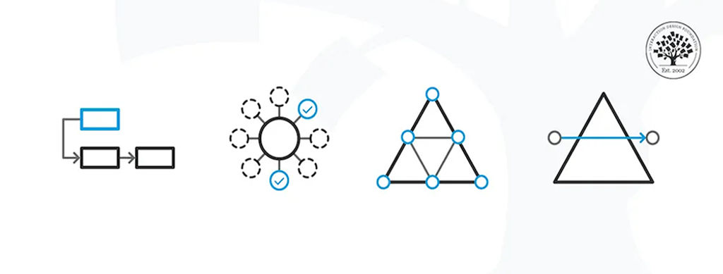
Hierarchical task analysis (HTA) is an approach designers use to organize user tasks into goals, subgoals, and steps, forming a clear task hierarchy. UX (user experience) designers use HTA to map user behavior, uncover bottlenecks, and streamline flows and so make interfaces intuitive and efficient from the ground up.
Explore how task analysis can help make great digital solutions in this video with Frank Spillers, CEO at Experience Dynamics.
Why Does Hierarchical Task Analysis Matter to UX Designers?
Hierarchical task analysis (HTA) breaks complex user activities into structured layers—namely, goals, subgoals, operations, and plans. It gives UX teams visibility into how users work step by step, and the clarity and perspective HTA can give empowers designers to identify precisely where friction or confusion occurs and remedy it in the next design iteration.
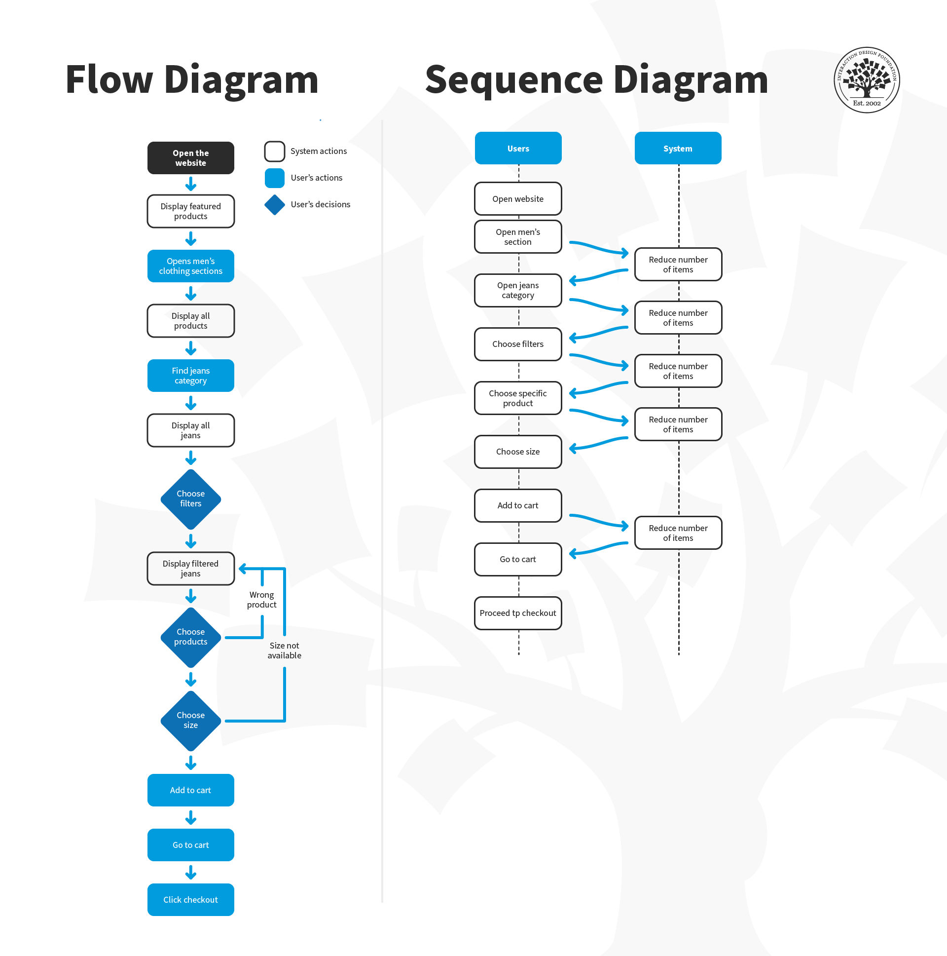
To understand how HTA can help designers help their target audience, imagine users who are trying to book flights on an airline website but keep abandoning their purchase at checkout—leading to lost revenue for the company and (possibly) a sour impression for the users of that company.
Here, a user researcher or designer could use HTA to break down the “Book a Flight” task into a basic yet detailed structure such as this:
Main Goal: Successfully purchase airline ticket
1. Search for Flights
1.1 Enter departure/destination cities.
1.2 Select dates.
1.3 Choose passenger count.
1.4 Apply filters (price, time, stops).
2. Select Flight Options
2.1 Compare outbound flights.
2.2 Compare return flights.
2.3 Review total itinerary.
3. Enter Passenger Details
3.1 Input names exactly as shown on ID.
3.2 Add contact information.
3.3 Select seats.
4. Complete Payment
4.1 Enter payment method.
4.2 Apply discounts/miles.
4.3 Review final charges.
4.4 Confirm purchase if content.
Our designer might notice that HTA reveals the abandonment happens at steps 4.2–4.3; it’s because users get confused by unexpected fees appearing or can’t figure out how to apply their frequent flyer miles. Some of them may even suspect the brand is trying to cheat them, so the designer needs to act fast. This HTA uncovers how, instead of redesigning the entire booking flow, they can focus on making pricing transparent earlier and simplifying the rewards redemption process at checkout.
HTA can “save the day” for this brand and improve how users feel and engage with it. It’s a handy form of analysis and has roots in safety and efficiency. It originated in human-factors engineering to optimize performance in complex environments such as (fittingly, for our example) aviation and manufacturing. Designers adapted it for digital interfaces in the early 2000s to ensure that threaded task flows match users’ actual steps in the real world.
The Benefits of Hierarchical Task Analysis for UX Designers
Hierarchical task analyses are particularly useful for design teams as they can help to:
1. Reveal Complex Task Structures
HTA helps designers break down user tasks into subtasks and goals, creating a structured, step-by-step view of how people actually complete a process. This technique reveals the underlying architecture of a task—not just what users do, but how and why they do it in a particular sequence.
When they use HTA to map out the layers, dependencies, and decision points within a task, designers can spot patterns like:
Where users take detours because the system doesn’t align with their natural workflow.
Where users repeat steps needlessly, signaling inefficiency or confusion.
Where subtasks depend on information or conditions that aren’t always available or existent.
This level of analysis helps uncover hidden complexity in tasks that may seem simple on the surface. It provides a clear foundation for simplifying workflows, too, and so designers can reduce cognitive load and design interfaces that really do support real-world behavior—not just idealized steps.
2. Pinpoint Pain Points and Redundancies
When teams use HTA to break tasks down step by step, they can clearly identify problems like unnecessary actions or areas where users tend to make errors. This helps highlight opportunities for automation, simplification, or improved UI feedback, reducing friction and streamlining the user experience. It also exposes moments where users may feel confused, frustrated, or delayed—critical insights for prioritizing design improvements.
Pain points can, true to their name, not only wreck what should be seamless user experiences but also hurt the brand’s image, especially for users who are having trouble in more profound or compounded ways. Think back to our plane ticket customers; what if some of them had to book plane tickets and were already distressed—perhaps worried about sick family members they had to suddenly fly to reach in time? This is why a streamlined, easy-to-use system needs to prove the brand has empathy for travelers in their many contexts.
Explore how empathy in design can translate to happier users and better products—even if those products happen to be buildings—in our video.
3. Compare Multiple Task Paths
Because people are different, they have unique idiosyncrasies and ways of understanding things and approaching concepts and tasks. Different users may complete the same task using different methods, depending on their experience level, mental model, or specific context—again, it’s a human world with much going on in users’ lives.
An HTA empowers designers to systematically map and compare these varying workflows, which can then reveal alternative strategies, shortcut behaviors, workarounds, and non-linear paths that users naturally take. This comparative view helps teams identify which variations are more efficient, which introduce risk or confusion, and where the design can better support flexibility, reduce complexity, or offer clearer guidance—especially for newer or less confident users.
For example, to return to the flight-booking website, consider User A and User B.
User A (Novice User)
Visits the homepage
Clicks “Flights”
Enters origin and destination
Selects travel dates from calendar
Clicks “Search”
Scrolls through results and compares times
Clicks flight details to compare amenities
Selects a flight and proceeds to checkout
User B (Experienced Traveler)
Uses the site’s quick-search bar on the homepage
Enters airport codes directly (e.g., JFK → LAX)
Selects flexible dates
Sorts by price immediately
Selects a preferred airline from filters
Books a flight in under 2 minutes
4. Guide Efficient Documentation
HTA diagrams act as clear, structured deliverables that visually break down user tasks into subtasks, flows, and dependencies. Since they’re straightforward and intuitive, developers, product managers, and other stakeholders can quickly grasp the user’s process without needing extensive explanation—it’s all right there in an easy-to-follow format, like an intuitive design in itself. This shared understanding improves communication, speeds up decision-making, and ensures everyone aligns on what users need and how the system should support them.
The Core Elements of A UX Hierarchical Task Analysis
To build a HTA well, designers must understand its components:
Goal: The overall user objective (e.g., “Submit expense report”).
Subgoals: Intermediate objectives in accomplishing the main goal.
Operations: Atomic actions users perform, exploded into small granularity (e.g., “Click Submit”).
Plans: Rules that articulate how subgoals and operations relate—whether they run in sequence or parallel, or depend on conditions to be satisfied.
Each level has a hierarchical number, with level 0 = goal, 1 = subgoal, and so on.
When to Use Hierarchical Task Analysis in the UX Design Process
Hierarchical task analyses are versatile in how they can help teams at several stages of their design process. It’s also important to know the difference between hierarchical task analysis and cognitive task analysis (CTA) in UX design—HTA excels at structural clarity, while CTA trawls deeper to yield further mental insight. While their purposes are similar—to optimize designs and make them easier for users to understand and flow through tasks in seamless experiences—HTAs are ideal to visualize task complexity, while CTAs offer an added helping hand to understand users’ thought processes in depth. You can use HTA:
1. During Early Project Discovery
Use HTA to explore task complexity before creating wireframes or prototypes. For example, HTAs can shed much light for teams who want to uncover workflow structure during the empathize/define phases of the design thinking process.
Discover fresh ground on which to build great digital solutions with design thinking, in this video.
2. When Optimizing or Updating Features
HTA isn’t just for designing new systems—it’s equally powerful for evaluating existing ones. Because an HTA breaks down current user workflows, it helps designers pinpoint inefficiencies, friction points, or redundant steps already embedded in the product. Team members can see where users take unexpected detours, loop back unnecessarily, or run into decision fatigue or even analysis paralysis. These insights reveal opportunities for streamlining, automation, or improving UI clarity—all without guessing where the problems are.
3. For Critical or Enterprise Systems
Systems with safety or compliance needs benefit from the granular clarity HTA provides in detecting error-prone steps. In keeping with its roots in human-factors engineering, this form of hierarchical analysis helps leave no stone unturned in a more high-stakes or intricate process, clearly exposing every point where indecision, unclear feedback, or other problems might get in the way.
4. In Training and Documentation
The structured outputs from hierarchical analysis of tasks don’t just aid design—they also serve as excellent training tools. The clear breakdown of tasks and subtasks makes it easy to create onboarding guides, help documentation, or internal training materials for end users, support staff, and new team members. HTA diagrams show not just what to do, but how and why, too, which makes processes far easier to teach, learn, and retain in the mind of the trainee.
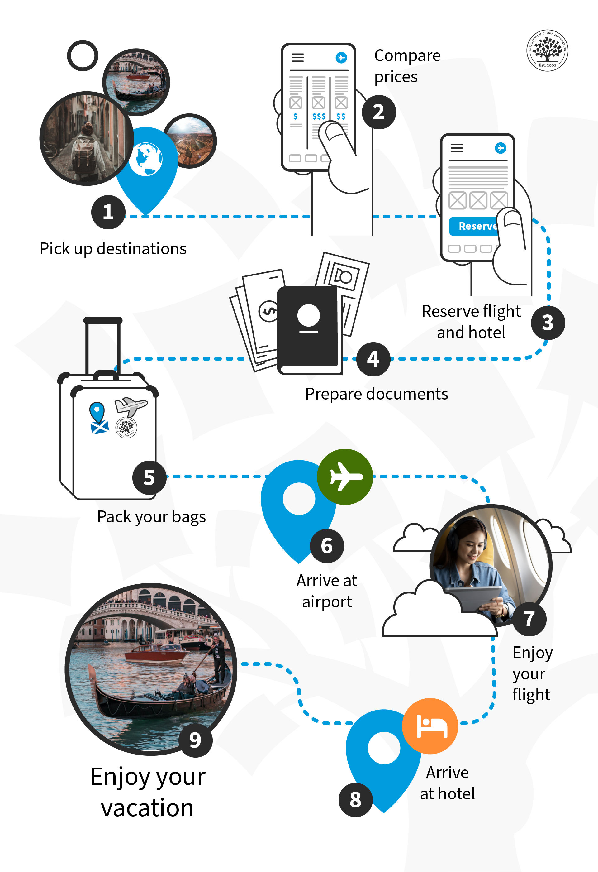
What goes into a great trip? Users already have a fair idea—a hierarchical task analysis can break this down into many micro-tasks so designers can address each smaller objective and make it a smooth ride every step of the way, or air mile of the journey.
© Interaction Design Foundation, CC BY-SA 4.0
How to Conduct Hierarchical Task Analysis, Step by Step
Step 1: Define Your Goal and Scope
To start, choose a clear, user-centered goal—something specific the user wants to accomplish, like “Book a flight,” “Submit a leave request,” or “Create a new document.” This goal becomes the top-level task in your analysis. Then, determine how deeply you'll break down the task, based on your research or design objectives. Are you identifying usability issues, streamlining a process, or designing from scratch? The level of detail should match your purpose—broader for strategic insights, deeper for implementation or redesign.
Speaking of detail, user research is crucial to understand the target users of a proposed solution, so you can understand why they need to do what they need or want to, among a variety of other factors. Fortunately, designers have a powerful ally they can leverage to help set strong foundations to build and iterate prototypes and design solutions—personas, fictitious representations of real users.
Discover how personas drive successful design and how designing without them falls short, in this video with William Hudson: User Experience Strategist and Founder of Syntagm Ltd.
Step 2: Gather Data
Watch real users perform the task in context, or ask them to walk you through how they typically do it—step by step. Use techniques like contextual inquiry, think-aloud protocols, or screen recordings to capture both actions and reasoning. Pay attention not just to what users do, but also why they do it that way, as this helps surface actual behaviors, workarounds, and decision points that tend to go unnoticed in assumptions or documentation. You want to collect authentic, detailed task data that will inform your HTA with real-world accuracy and relevance to real people. That’s why you need a careful approach to engaging users in interview-like settings for methods such as contextual inquiries.
Explore the benefits and drawbacks of user interviews in this video with Ann Blandford: Professor of Human-Computer Interaction at University College London.
Step 3: Break the Task Down
Start with level 0 (main goal) and then identify subgoals, operations, and define the plans that connect them. For example, you could break the “book a flight” task down into an ultra-fine level of granularity like this:
0. Book a flight
1. Search for Flights
Plan: Do 1.1–1.4 in any order, then proceed to 1.5.
1.1 Select type of trip (one-way, round-trip, multi-city).
1.2 Enter origin and destination airports.
1.3 Enter departure and return dates.
1.4 Specify number of passengers and travel class.
1.5 Submit search query.
2. Browse and Choose a Flight
Plan: Do 2.1–2.4 in order.
2.1 View search results.
2.2 Sort and filter results (e.g., by price, duration, airline, stops).
2.3 Compare flight options and schedules.
2.4 Select preferred outbound and return flights.
3. Review Flight Details
Plan: Do 3.1–3.3 in order.
3.1 Verify flight times, layovers, and total duration.
3.2 Confirm baggage allowance, seating, and in-flight services.
3.3 Continue to booking or go back to change selection.
4. Enter Passenger Information
Plan: Do 4.1–4.4 for each passenger.
4.1 Enter full name (as it appears on ID).
4.2 Add contact details (email and phone number).
4.3 Input travel document information (passport, visa, etc., if needed).
4.4 Add loyalty program or frequent flyer numbers (optional).
5. Select Optional Services
Plan: Complete any optional selections; then proceed.
5.1 Choose seat(s).
5.2 Add baggage (if not included).
5.3 Select travel insurance (optional).
5.4 Review or decline upgrade offers.
6. Provide Payment Information
Plan: Do 6.1–6.4 in order.
6.1 Enter payment method (credit card, PayPal, etc.).
6.2 Provide billing details.
6.3 Review total price and fare rules.
6.4 Submit payment.
7. Confirm Booking and Receive Documentation
Plan: Do 7.1–7.3 in order.
7.1 Display booking confirmation on screen.
7.2 Send confirmation email with ticket and itinerary.
7.3 Offer to save or print confirmation.
Step 4: Map Plans & Alternatives
Go beyond linear task flows—add conditional, optional, or parallel paths, as these reflect how real users interact with systems in varied contexts. For example: “If the user requires seat selection, display the seat map in parallel.” Consider exceptions, errors, or alternate user strategies, too.
When you capture these branching paths, it helps you anticipate edge cases, support user flexibility, and design more resilient, intuitive interfaces. Mapping alternatives exposes where users may skip steps, backtrack, or need additional guidance, too—critical insights for refining navigation and flow. Again, think about what their context is like: stressful? On a mobile and out and about? What might they need to help guard-rail them or conform with their way of thinking or mental model about a task like booking tickets?
Climb to a higher altitude so you can create designs that speak to users in their unique contexts, in this video with Alan Dix: Author of the bestselling book “Human-Computer Interaction” and Director of the Computational Foundry at Swansea University.
Step 5: Validate with Users or Stakeholders
Share your HTA with actual users, subject matter experts, or internal stakeholders (such as developers, product managers, or support staff). Walk through the steps together to make sure the task flow accurately reflects real-world behavior, not assumptions.
Validation is vital as it helps uncover missed steps, incorrect logic, or alternative paths you may have overlooked. It’s a great assumption-buster, too, as assumptions have a nasty habit of worming their way into design processes virtually undetected. Validation builds cross-functional alignment, too, as it ensures everyone shares a clear, accurate understanding of how users approach the task. That’s essential—everyone must be “on the same page” before you take ideas for creation or refinement further into design or development stages.
Step 6: Translate into Design
Now it’s time to “pour some concrete” and turn your HTA findings into actionable design decisions. Use the task structure to streamline user flows, eliminate unnecessary steps, and clarify UI (user interface) elements based on user goals and decision points. For example, was an icon or button in a part of the screen where users don’t typically expect to find it (such as a “Buy Now” button buried under the fold down at the bottom left of the screen)? Would better labelling make a button more noticeable? Or how about using a design pattern that’s more in step with your industry—such as UI design patterns that match what users would normally find on airline websites, with features such as date pickers?
In any case, pinpoint where guidance, feedback, or automation can support smoother interactions. Document edge cases—such as failed payments, missing info—as branches or subgoals to ensure they’re properly handled in the interface. Do form fields have prompts? Are they forgiving and automatically perform tasks like putting the spaces between the digits in phone and credit card numbers? When you ground your design in real cognitive workflows which real people understand and use, you can create experiences that aren’t only efficient but also intuitive, resilient, and user-centered.
Understand how the right choice of UI design patterns help make digital solutions more effective, trustworthy, and more, in our video.
Step 7: Iterate & Measure
The adage of “proof of the pudding is in the tasting” means it’s time to test what you’ve done. So, after applying your HTA insights to the design, evaluate the impact through usability testing. Find real users to test with. Measure key outcomes such as task completion time, error rates, and user satisfaction levels to see whether the design improvements truly enhance the experience.
Look for signs that the flow is smoother, clearer, and more intuitive. If users still struggle—be it due to unclear steps, missing guidance, unexpected detours, or a combination of factors—revisit your HTA to refine the task breakdown. Maybe a subgoal was “hiding” in the previous HTA? Can you split a task into finer granularity to spot what might be happening and where exactly? Iteration at this stage helps you ensure your final design has its foundations well rooted in real user behavior and is on course to improve to the best version possible to give users.
Special Considerations for Hierarchical Task Analysis
Here are some important points to bear in mind when conducting an HTA—beware of these common pitfalls in particular:
Too much granularity: Don’t break tasks into micro-steps that clutter and don’t contain any scope for problems themselves—stop when you gain clear insight.
Skipping validation: Always check your HTA with real users or subject experts; assumptions can creep in “unannounced.”
Ignoring edge cases: Document error conditions and optional flows, not just the ideal path—it’s vital to feel out the edges of the users’ ways of approaching and performing tasks.
Not linking to UX goals: Tie operations back to metrics like speed, error rate, or satisfaction—figures ground improvements in facts.
Overall, hierarchical task analysis offers clarity and convenience in design situations where users face complex workflows while handling tasks in their contexts—breaking goals into digestible, traceable steps. HTA may require upfront work, but it pays great dividends in task efficiency, user satisfaction, and well-structured products that support user needs.
When you need to understand how tasks unfold—whether it’s during early discovery or feature refinement—HTA can deliver reliable insights, informing design decisions, improving communication, and ensuring your product aligns with the actual way users think and act. When designers need to play the role of detective, HTA is a remarkably helpful tool to deduce what went wrong, how badly it went wrong, and—perhaps most importantly—why. If they’ve done their user research well, they’ll already know who uses their products and where they tend to use them. The additional information about the “what,” “how,” and “why” which an HTA can provide can help design teams fit together the last pieces of the puzzle. And, with those in place, their product’s users should never have to feel puzzled when they use it.