Brand guidelines in user experience design (UX design) are a set of standards that define how a brand should represent itself in digital products. Designers use them to ensure consistency in the use of brand elements such as colors, typography, logos and imagery. They help keep a cohesive brand identity across different digital touchpoints, to boost user recognition and trust and align designs with brand values and messaging.
© NN/g, Fair Use
Why Are Brand Guidelines Important in UX Design?
These guidelines are a vital way for brand designers to make a cohesive and impactful brand identity. They’re carefully crafted documents that don’t just dictate the visual aesthetics—like color palette and typography. They encompass the brand's tone of voice, core values and overall user experience, too. The main benefits for brands are that solid guidelines:
1. Assure Consistency and Recognition
These guidelines are crucial to keep things consistent across all user interfaces (UIs) and experiences. They help make sure that every element—from the typography and color palette to the layout and logo—is uniform. This consistency helps users recognize and become familiar with the brand—and it nurtures a solid sense of reliability and predictability in user interactions.
2. Build Trust and Credibility
When designers present a cohesive visual and communicative style to users, they build trust between their brands and their target audience. Users are far more likely to believe in the professionalism and reliability of a brand that consistently gets its message and values out across all platforms.
AI Designer, Ioana Teleanu explains important dimensions about trust and design in the age of artificial intelligence (AI):
3. Streamline Design Processes
Brand guidelines simplify the design process for UX/UI designers—and that’s because they provide clear directives on the aesthetic and functional aspects of brand elements. This doesn’t just speed up the design process. It reduces discrepancies and confusion among team members, too. What’s more, it makes sure that everyone is on the same page. As a result, the final product is a well-integrated user interface—and one that aligns perfectly with the brand’s identity.

Amazon’s highly recognizable brand is more than just the sum of the parts of—for example—the look and feel of buttons. Amazon’s guidelines help to keep this trust high and long-term customer loyalty in place.
© Amazon, Fair Use
4. Maintain Brand Integrity
Designers who stick to their brand’s guidelines help keep themselves safe from diluting their brand’s identity through inconsistent application—a hazard that can confuse users and diminish brand equity. Guidelines help guide designers so that their work clearly communicates their brand's core values and identity—and that they preserve these across all user touchpoints.

These are some simple examples of customer touchpoints—places of interaction with a brand rather than channels, which are planned points of interaction.
© Rosenfeld Media, Fair Use
What are Examples of Brand Guidelines in UX Design?
1. Logo Usage
The logo is a paramount symbol of identity. For instance, Medium's meticulous design of its logo, wordmark and symbol showcases how important consistency and recognition in branding are. Each element—carefully constructed for visual harmony—has to remain unaltered to preserve the brand's integrity. Similarly, the way whitespace and margins appear makes sure that the logo breathes freely—and it’s something that helps keep prominence and readability across various platforms.

© Medium, Fair Use
2. Color Palette
The color palette is a critical aspect of a brand's visual identity. It guides the design of all brand assets. It's not just about aesthetics; the right color combinations can evoke emotions and convey messages, too. For example, TikTok and Spotify have specific color schemes that align well with their brand values and really resonate with their target audiences. TikTok's guide emphasizes the general feel of the app. Meanwhile, Spotify's vibrant duotone colors are popular and appeal to users, which demonstrates how color can enhance user experience.

Spotify’s color use is part of its brand identity—and a vital way for users to know and trust they are, indeed, on Spotify.
© Spotify, Fair Use
3. Typography
Effective typography is essential for designers to make UIs that are readable and engaging. Designers have got to choose the right typefaces and organize them to optimize usability and get the brand's voice across accurately. For instance, the differentiation between serif and sans-serif fonts is something that has an impact on readability and mood—and it influences the user's perception of the brand. A well-defined typographic guideline makes sure that there’s consistency across all digital products. What’s more, it boosts the overall user experience.
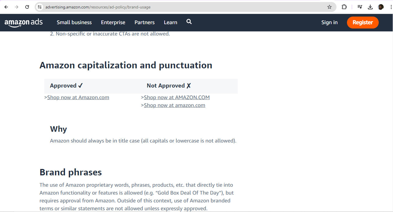
For example, typographical considerations also manifest in brand usage guidelines for third-party digital display ads.
© Amazon, Fair Use
4. Imagery and Visual Style
Imagery includes icons, illustrations, photographs and data visualizations—and it plays a massive role in carrying the brand’s identity and personality. It's not just about choosing appealing images, though. It’s about making sure that these are in line with the brand's storytelling and emotional connection with its audience, too. For example, when brands pick consistent characteristics for photographs and illustrations, they can create a really cohesive visual experience—and it’ll be one that reinforces each brand's message.
5. Tone of Voice (TOV)
The tone of voice in UX design extends far beyond the visual elements—and it really embodies how a brand communicates its personality through written and spoken words. Brands have got to find the right balance between being professional and personal, humorous and serious—depending on the context and the user's emotional state. For instance, a brand might take on a warm and reassuring tone to present itself genuinely and speak trust and professionalism to its target audience—like new parents looking for babysitters. This shows how a consistent and appropriate tone of voice can really establish trust and guide users through the product—and make the digital experience that much more engaging and memorable.
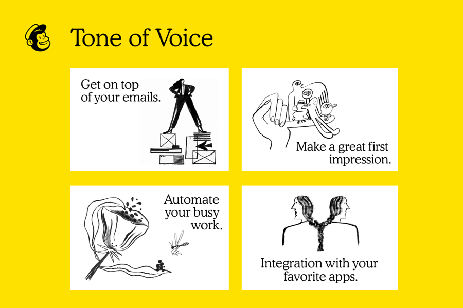
MailChimp’s brand guidelines cover how to bring offbeat humor and a conversational voice together in content.
© Arek Dvornechuck, Fair Use
What are Best Practices for Designers to Follow with Brand Guidelines?
Designers should stick to their brand’s established guidelines—ones that have proven to work well. Alternatively, they might be involved in a startup or consulted to create a brand’s style guide. Or they might have a voice in a rebranding process. There, they can have some influence on what those guidelines look like. In any case, designers should:
1. Maintain Consistency Across Platforms
Brand guidelines make sure there’s a uniform appearance across all digital and physical platforms—to reinforce brand recognition and trust. So, designers should help create—or follow—a comprehensive brand style guide that’s accessible to all team members. The guide should have specific rules for verbal, written and visual communication. And regular updates to the guide should keep the team well in line with the brand identity. This will make sure there are smooth transitions between platforms—for a seamless multi-channel experience.
2. Make Sure There’s Thorough Documentation
A detailed set of brand guidelines serves as a blueprint to represent the brand to the world—with key elements like logo usage, color palette, typography, imagery and tone of voice. And a brand style guide summarizes these guidelines. Brands should share it with clients and collaborators to keep confusion and inconsistency from happening. It’s got to include clear guidelines on how to adapt brand elements to meet platform-specific requirements and limitations. For example, there could be a section to address responsive design—or a variant for how the brand’s logo might appear:
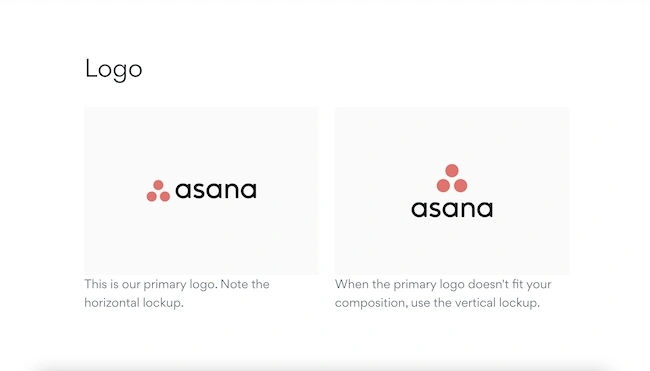
From Asana’s brand guidelines.
© Asana, Fair Use
It’s especially vital to make sure that the brand guidelines are easy to understand and implement. Clarity and simplicity can help all stakeholders—both internal and external—stick to the guidelines more effectively.
Watch as CEO of Experience Dynamics, Frank Spillers explains responsive design:
3. Collaborate with Stakeholders
Effective brand guidelines are the result of collaboration among all stakeholders who are involved in brand representation—and that includes internal teams, external partners, agencies and freelancers. If designers give everyone the same set of guidelines, they’ll help make sure that all materials that others produce for the company do actually reflect the brand identity—and consistently so. It's important to involve stakeholders in the creation of brand guidelines, as it will make sure that they’re practical and comprehensive. Regular communication and collaboration with stakeholders are essential things to keep the guidelines so relevant and effective.
Author, Speaker and Leadership Coach, Todd Zaki Warfel explains important points about dealing with clients:
4. Conduct Regular Updates and Reviews
Brand guidelines aren’t static; they’ve got to evolve with the brand. And regular reviews based on market trends, customer feedback and internal insights make sure that the guidelines do remain in line with business goals and brand values. It's important to get relevant stakeholders involved in the review process—and update guidelines as needed to reflect changes in branding strategies, messaging, visual identity and communication channels. This continuous process calls for monitoring, feedback and improvement to keep the brand fresh, relevant—and competitive, too.
It's essential to establish metrics—as well as feedback loops—to monitor just how effective the brand guidelines actually are. When brands and design teams get feedback in from both internal and external sources, they can work to improve the guidelines—and continuously so.
Design Director at Societe Generale CIB, Morgane Peng explains important aspects of how some stakeholders may view design-related topics:
Special Considerations and Potential Risks with Brand Guidelines
It’s important to also be aware of the following points regarding branding and guidelines:
1. Understand Flexibility vs. Rigidity
Brand guidelines have got to strike a delicate balance between consistency and adaptability. While strict adherence may make sure there’s a unified brand identity, too much rigidity can stifle creativity—and it can keep a brand back from being able to evolve with market trends. Brands have got to provide clear directives while they give some leeway or flexibility for creative interpretation. It’s best to make sure that guidelines are there as a supportive framework—and not as a restrictive set of rules.
2. Ensure Accessibility
Accessibility is an absolutely critical aspect of brand guidelines—and it’s one that brands mustn’t overlook. They’ve got to make sure that all communications are accessible to people with disabilities, and incorporate standards like WCAG 2.1 to guide how they make websites, mobile apps and other digital content. That includes the points that they’ve got to provide alternative text for images, make sure there’s sufficient color contrast and offer content in multiple formats to accommodate various disabilities.
Watch our video to understand why accessibility is a vital concern for brands and design:
3. Balance Creativity with Consistency
To maintain brand consistency and foster creativity at the same time is a challenging—but essential—task. Brand guidelines should define core elements like logos and color schemes. They should, however, allow room for innovation in secondary elements as well. This balance helps brands stay relevant and engaging—without losing their identity. Regular updates and assessments of brand guidelines are crucial things to adapt to changing consumer preferences and market conditions.
4. Adapt Guidelines for Global Markets
Global brands face the challenge of how to adapt their guidelines to fit diverse cultural, legal and linguistic contexts—and not compromise their core identity. This process is known as glocalization—and, to practice it, brands have got to understand local preferences and modify their brand elements accordingly. Plus, they’ve got to simultaneously keep their overall brand consistency. Brands must avoid cultural stereotypes and work closely with local experts to make sure that their messaging is, indeed, appropriate and resonant in each market.
Watch as Author and Human-Computer Interaction Expert, Professor Alan Dix explains the need to design with culture in mind:
As the best brand guideline examples show, UX brand guidelines are vital tools for designers to combine great-looking visual design elements in highly user-friendly interfaces and beyond. They can bring their brand’s personality to life in product designs that follow brand guideline color palettes and toe the line creatively with the brand guideline sheet. An active finger on the pulse of the industry and customer habits will also help to keep their brands relevant and capable of reliable support from marketing campaigns, too.
Overall, both brands, including marketing personnel, and designers, including graphic designers, must be aware that brand guidelines are significant far beyond aesthetic considerations. While the looks and sounds are indeed vital parts for users and customers to recognize, trust and have expectations about the brands they follow, designers need to expand the scope of how they represent their brands so that these companies and organizations appear in the best possible light at every touchpoint and across all channels. In this sense, web design plays a kind of customer service role in bolstering trust, for example. That’s key to forging a strong bond between customer and popular, successful brand.

Urban Outfitters’ brand guidelines help reflect the brand’s minimalist aesthetic, focusing on such areas as typography and calming color palette.
© Georgina Guthrie, Fair Use