Your constantly-updated definition of User Interface (UI) Design and collection of videos and articles. Be a conversation starter: Share this page and inspire others!
6,512 Shares
What is User Interface (UI) Design?
User interface (UI) design is the process designers use to build interfaces in software or computerized devices, focusing on looks or style. Designers aim to create interfaces that users find easy to use and pleasurable. UI design refers to graphical user interfaces and other forms—e.g., voice-controlled interfaces.
<
Watch this video to discover how UI design blends an understanding of user needs with visual choices like color and motion to create interfaces that feel intuitive.
Transcript
Transcript loading ...
How to Design User Interfaces for Users
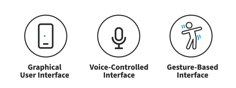
User interfaces are the access points where users interact with designs. They come in three formats:
Graphical user interfaces (GUIs): Users interact with visual representations on digital control panels. A computer’s desktop is a GUI.
Voice-controlled interfaces(VUIs): Users interact with these through their voices. Most smart assistants, E.g., Siri on iPhone and Alexa on Amazon devices—are VUIs.
Gesture-based interfaces: Users engage with 3D design spaces through bodily motions—e.g., in virtual reality (VR) games.
To design UIs best, you should consider:
Users judge designs quickly and care about usability and likeability.
In this video, Frank Spillers, Service Designer, and Founder and CEO of Experience Dynamics, explains how Google’s Material Design principles, such as clarity, contrast, and visual consistency, help designers create interfaces that are intuitive, accessible, and enjoyable for users to interact with.
Transcript
Transcript loading ...
They don’t care about your design, but about getting their tasks done easily and with minimum effort.
Your design should therefore be “invisible”: Users shouldn’t focus on it but on completing tasks: e.g., ordering pizza on Domino’s Zero Click app.
So, understand your users’ contexts and task flows (which you can find from, e.g., customer journey maps), to fine-tune the best, most intuitive UIs that deliver seamless experiences.
UIs should also be enjoyable (or at least satisfying and frustration-free).
When your design predicts users’ needs, they can enjoy more personalized and immersive experiences. Delight them, and they’ll keep returning.
Where appropriate, elements of gamification can make your design more fun.
UIs should communicate brand values and reinforce users’ trust.
Good design is emotional design. Users associate good feelings with brands that speak to them at all levels and keep the magic of pleasurable, seamless experiences alive.
Airbnb’s simple, inviting layout lets users satisfy their travel needs quickly, easily and enjoyably.
Often confused with UX design, UI design is more concerned with the surface and overall feel of a design. UI design is a craft where you the designer build an essential part of the user experience. UX design covers the entire spectrum of the user experience. One analogy is to picture UX design as a car with UI design as the driving console.
“Interfaces get in the way. I don’t want to focus my energies on an interface. I want to focus on the job.”
Watch this video to understand how UX and UI work together, with UX shaping the overall ease and satisfaction of an experience and UI delivering the colors, typography, layout, and interactions, plus the critical thinking needed to connect user needs with business goals.
Transcript
Transcript loading ...
How to make Great UIs
Transcript
Transcript loading ...
Learn the basic principles of UI Design.
To deliver impressive GUIs, remember—users are humans, with needs such as comfort and a limit on their mental capacities. You should follow these guidelines:
Make buttons and other common elementsperform predictably (including responses such as pinch-to-zoom) so users can unconsciously use them everywhere. Form should follow function.
Keep interfaces simple (with only elements that help serve users’ purposes) and create an “invisible” feel.
Respect the user’s eye and attention regarding layout. Focus on hierarchy and readability:
Use proper alignment. Typically choose edge (over center) alignment.
Draw attention to key features with:
Color, brightness and contrast. Avoid including colors or buttons excessively.
Text via font sizes, bold type/weighting, italics, capitals and distance between letters. Users should pick up meanings just by scanning.
Minimize the number of actions required to perform tasks but focus on one chief function per page. Guide users by indicating preferred actions. Ease complex tasks by using progressive disclosure.
Put controls near objects that users want to control. For example, a button to submit a form should be near the form.
Keep users informed regarding system responses/actions with feedback.
Use appropriate UI design patterns to help guide users and reduce burdens (e.g., pre-fill forms). Beware of using dark patterns, which include hard-to-see prefilled opt-in/opt-out checkboxes and sneaking items into users’ carts.
Maintain brand consistency.
Always provide next steps which users can deduce naturally, whatever their context.
Tailor your UI design to the platform or device on which it’s used. E.g., the UI of mobile UX will be different from that of the desktop experience.
Because the best interface is no interface, you should offer users the most direct, accessible, comfortable control (and best experience) where they’ll forget they’re using your design. Therefore, keep asking yourself “Can I make things simpler?”.
Questions About User Interface (UI) Design? We've Got Answers!
How much do UI designers make?
The industry highly values UI designers, and their salary reflects this demand. Glassdoor states that the average salary for a UI designer in the US in 2023 is approximately $75,057 annually. However, experience, location, and the company can significantly affect salaries, ranging from $90,000 to $128,000 per year in the United States. For more detailed information about UI & UX designer salaries in your region, check this article: UI & UX Designer Salaries: How Much Can I Earn in 2023.
How to become a UI designer?
To become a UI designer, develop visual design skills in color theory, typography and layout. You must also be well-versed with interaction design and interface design best practices and heuristics.
Create interface design projects, get feedback, and build a strong portfolio. Enhance your skills by enrolling in the Interaction Design Foundation (IxDF) courses offered in the UI Designer Learning Path.
What does a UI designer do?
A UI designer focuses on designing the user interface, which includes the layout, visuals, and interactive elements of an application or website. While most interfaces are graphical, UI designers may also work with:
Voice-controlled interfaces (VUIs): Users interact with these through their voices.
Gesture-based interfaces: Users engage with 3D design spaces through bodily motions.
UI designers ensure the interface is intuitive, easy to navigate, and aesthetically pleasing. Essential tasks include creating wireframes, mockups, prototypes and conducting user research.
As Frank Spillers highlights in his video, understanding the 'context of use' is crucial. It involves observing users in their environment and understanding their experiences and needs.
Transcript
Transcript loading ...
For a comprehensive understanding of Mobile UX Design, consider this course by the Interaction Design Foundation.
How to learn UI design?
To learn UI design, you must understand the basics of design principles, accessibility, color theory, and typography. Become familiar with design software such as Sketch, Adobe XD, or Figma. Create wireframes, mockups, and interactive prototypes as practice. Seek feedback from peers and online communities, and analyze well-designed applications to understand good practices. Lastly, consider taking online courses from the Interaction Design Foundation in the UI Designer Learning Path to strengthen your skills and knowledge. Continuous practice and learning are essential for proficiency in UI design.
How to be good at UI design?
To excel in UI design, you must understand the users' needs, develop a keen eye for aesthetics, and learn design principles. Practice regularly, seek feedback, and stay updated on the latest trends and tools.
What is UI/UX design?
UI/UX design involves two crucial elements: User Interface (UI) and User Experience (UX). UI encompasses all the elements a user interacts with, such as colors, typography, buttons, and icons. It focuses on the aesthetics and the overall look of a product. On the other hand, UX involves creating a holistic and pleasurable experience that meets the user's needs. It includes all aspects of the end user's interaction with the company, including its services and products. Ultimately, UI is about a product's appearance, while UX is about the overall product experience. Both elements are essential for designing successful solutions and experiences. Learn more about UI and UX design from this:
Transcript
Transcript loading ...
Does UI design require coding?
UI design does not necessarily require coding skills. A UI designer's primary focus is on the visual aspects of an application, such as color schemes, graphics, and typography. If you have some familiarity with coding languages such as HTML, CSS, and JavaScript, it can be helpful. It enables effective communication with developers and provides an understanding of the potential and limitations of the technology used.
Although it's not a requirement for a UI designer to be proficient in coding, possessing some coding skills can provide a competitive advantage in one's career. For a more in-depth discussion, see this article: Should Designers Learn to Code?.
Are graphic designers and UI designers the same?
Graphic designers and UI designers are not the same, but they do share similarities. Graphic design involves creating visual content for print, digital, and social media. It includes creating logos, brochures, posters, and more. UI design, on the other hand, focuses specifically on the elements of interfaces, such as apps or websites. UI designers may occasionally need to develop graphical elements such as logos and icons, however, their primary responsibility is to ensure that interfaces are usable and intuitive.
Transcript
Transcript loading ...
As mentioned in the video, UI design involves visualizing, grid typography, hierarchy, readability, and some basic aesthetics. While both graphic and UI designers work with visual elements, UI design requires a more specialized skill set focused on creating user-friendly digital interfaces. UI designers may also work with non-graphical interfaces such as voice-controlled interfaces (VUIs) and gesture-based interfaces.
Is UI design a good career?
Yes, UI design is an excellent career choice for individuals interested in the intersection of creativity, technology, and user experience. The demand for UI designers has surged with the proliferation of digital products, apps, and websites. However, it is a competitive field that necessitates continuous skill development and staying updated with the latest trends and tools. UI designers play a crucial role in shaping the user's interaction with a digital product, impacting its success and usability.
They work in various industries, including tech companies, design agencies, and freelancing. Overall, UI design is a rewarding and fulfilling career for those dedicated to enhancing user experiences and creating visually appealing interfaces.
What is Material UI?
Material UI is a popular open-source component library that helps designers and developers implement Google’s Material Design. It includes powerful predefined components and functionalities that are useful, culturally appropriate, safety compliant, and pleasant, ultimately addressing user needs and goals and fostering a deeper connection between the user and the app.
Transcript
Transcript loading ...
Material UI aligns with the principles discussed in the video, emphasizing the importance of understanding user needs, defining value propositions, and creating a differentiated UX strategy that provides users with functional and emotional value.
Earn a Gift! Answer a Short Quiz at the End of This Page
Earn a Gift, Answer a Short Quiz!
1
2
3
4
1
2
3
4
Question 1
Question 2
Question 3
Get Your Gift
2
3
4
2
3
4
Question 1
Question 2
Question 3
Get Your Gift
3
4
3
4
Question 1
Question 2
Question 3
Get Your Gift
4
4
Question 1
Question 2
Question 3
Get Your Gift
Try Again! IxDF Cheers for You!
0 out of 3 questions answered correctly
Remember, the more you learn about design, the more you make yourself valuable.
Why? Because design skills make you valuable. In any job. Any industry.
In This Course, You'll
Get excited as you discover the design patterns brands like Nike and Apple use to create interfaces users love. You know that feeling when you use a website that's so intuitive it feels almost like magic? Or the frustration when you can't find the items you just added to your cart? The difference lies in the User Interface (UI) design. Skills in UI Design equip you to create intuitive user experiences and amazing customer interactions. It's easy because you already have transferable skills like analytical thinking, creativity, clear communication, and problem-solving. In this course, you'll build on them to deliver exceptional customer interactions, even if interface design is new to you.
Make yourself invaluable with the in-demand design skills you need to create successful software. UI design patterns offer standardized ways to organize visual elements like hamburger menus and breadcrumbs. These repeatable design frameworks deliver predictable success. How? Your user-friendly software interfaces make your users' lives easier. Navigation, forms, data visualization, and feedback patterns reduce your users' cognitive load. Less cognitive load means happier customers. Happier customers mean greater loyalty, increased conversions, and higher earning potential. As AI speeds up production, you stay in demand by applying timeless human-centered design skills that keep simplicity, clarity, and usability front and center. This is how AI becomes a real advantage in your career, not just another tool.
Gain confidence and credibility with hands-on experience. No matter your background, you'll quickly master UI Design Patterns. With clear guidance and real-world examples, you'll apply your skills immediately. Master frameworks that simplify data entry, improve website usability, and engage your users. Fast-track your UI design portfolio and career with 20+ downloadable templates for sitemaps, user input forms, leaderboards, and more. If you'd like, you can also complete an optional portfolio project to showcase your new skills. This course gives you practical skills to delight your users, excel professionally, and confidently advance your career.
Get an Industry-Recognized IxDF Course Certificate
Increase your credibility, salary potential and job opportunities by showing credible evidence of your skills.
IxDF Course Certificates set the industry gold standard. Add them to your LinkedIn profile, resumé, and job applications.
Be in distinguished company, alongside industry leaders who train their teams with the IxDF and trust IxDF Course Certificates.
All Free IxDF Articles on User Interface (UI) Design
10 Free-to-Use Wireframing Tools for UX Designers in 2026
Wireframes help you quickly ideate and test your ideas. While paper wireframes are the fastest to create, digital wireframes look more polished and presentable. If you are looking for a pocket-friendly wireframing tool, look no further.Whether you prefer browser-based apps or offline desktop tools,
This is a question that, in slightly different forms, gets asked a lot by those considering a UX design career. The question is a simple one but the answer..? Well, that’s a bit more complicated. A lot depends on you and your approach to life and your career. So let’s take a look at the benefits of
10 Simple Ideas to Get Your Creative Juices Flowing
Writers deal with writer’s block and designer’s often find that they get stuck for ideas too. There’s no shame in it but learning to smash through the block is a necessary professional skill. Time waits for no-one and when there’s a deadline looming… you’ve got to pull something out of the bag.
The
We want to show you a tool so vital that it may amaze you as a designer. It’s as underrated as silence between musical notes. However, it’s powerful enough to mean keeping people on your page – survival, in other words.Many elements form the layout and structure of an interactive design. Often negle
As designers, we have a powerful ally in color. It can let us work towards a number of different goals. You can use it to reinforce or highlight an idea, to provoke an emotional response from the user or to draw attention to a specific part of your website. This is, of course, in addition to making
Recalling Color Theory Keywords: a way to refresh your memories!
Choosing the best combination of colors for an interactive design layout is not, as it may appear, a guessing game. Knowing which ones to use will save you time (and headaches). Getting it right will also keep your users connected.Since the early days of art and design, the use of color has followed
Social shares
1.1k
Published
Read Article
User Interface Design Guidelines: 10 Rules of Thumb
Learn to design with your user’s needs and expectations in mind by applying Jakob Nielsen and Rolf Molich’s Ten User Interface Guidelines. These heuristics have been reflected in many of the products designed by some of the most successful companies in the world such as Apple, Google, and Adobe. Further evidence of how their design teams incorporate these rules into their design process is reflected in the user interface guidelines published and shared by these companies. This article will teach you how to follow the ten rules of thumb in your design work so you can further improve the usability, utility, and desirability of your designs.
Nielsen and Molich's 10 User Interface Design Guidelines
Jakob Nielsen, a renowned web usability consultant and partner in the Nielsen Norman Group, and Rolf Molich, another prominent usability expert, established a list of ten user interface design guidelines in the 1990s. Note that there is considerable overlap between Nielsen and Molich's heuristics and Ben Shneiderman’s 'eight golden rules'. These 10 rules of thumb further iterate upon Shneiderman’s eight golden rules 4 years after Shneiderman’s initial publication.
Visibility of system status. Users should always be informed of system operations with easy to understand and highly visible status displayed on the screen within a reasonable amount of time.
Match between system and the real world. Designers should endeavor to mirror the language and concepts users would find in the real world based on who their target users are. Presenting information in logical order and piggybacking on user’s expectations derived from their real-world experiences will reduce cognitive strain and make systems easier to use.
User control and freedom. Offer users a digital space where backward steps are possible, including undoing and redoing previous actions.
Consistency and standards. Interface designers should ensure that both the graphic elements and terminology are maintained across similar platforms. For example, an icon that represents one category or concept should not represent a different concept when used on a different screen.
Error prevention. Whenever possible, design systems so that potential errors are kept to a minimum. Users do not like being called upon to detect and remedy problems, which may on occasion be beyond their level of expertise. Eliminating or flagging actions that may result in errors are two possible means of achieving error prevention.
Recognition rather than recall. Minimize cognitive load by maintaining task-relevant information within the display while users explore the interface. Human attention is limited and we are only capable of maintaining around five items in our short-term memory at one time. Due to the limitations of short-term memory, designers should ensure users can simply employ recognition instead of recalling information across parts of the dialogue. Recognizing something is always easier than recall because recognition involves perceiving cues that help us reach into our vast memory and allowing relevant information to surface. For example, we often find the format of multiple choice questions easier than short answer questions on a test because it only requires us to recognize the answer rather than recall it from our memory.
Flexibility and efficiency of use. With increased use comes the demand for less interactions that allow faster navigation. This can be achieved by using abbreviations, function keys, hidden commands and macro facilities. Users should be able to customize or tailor the interface to suit their needs so that frequent actions can be achieved through more convenient means.
Aesthetic and minimalist design. Keep clutter to a minimum. All unnecessary information competes for the user's limited attentional resources, which could inhibit user’s memory retrieval of relevant information. Therefore, the display must be reduced to only the necessary components for the current tasks, whilst providing clearly visible and unambiguous means of navigating to other content.
Help users recognize, diagnose and recover from errors. Designers should assume users are unable to understand technical terminology, therefore, error messages should almost always be expressed in plain language to ensure nothing gets lost in translation.
Help and documentation. Ideally, we want users to navigate the system without having to resort to documentation. However, depending on the type of solution, documentation may be necessary. When users require help, ensure it is easily located, specific to the task at hand and worded in a way that will guide them through the necessary steps towards a solution to the issue they are facing.
Google Inc., the multibillion-dollar technology company, certainly produces designs that reflect the above heuristics. Jon Wiley, the head designer of Google Search in 2012 once said:
“When I think of design and creating great user experiences, I generally think of it in terms of three things: usability, utility and desirability.”
Nielsen and Molich’s 10 user interface guidelines cover these three key components of user experience quite nicely, which means you can likely improve the user experience of your designs by following these guidelines!
Learn How Adobe Integrates Nielsen and Molich's Ten User Interface Design Guidelines
Adobe Systems Incorporated, the large North American computer software company, is a great example of how designs reflecting Nielsen and Molich’s ten user interface guidelines can lead to success for a company. One of their most popular products, Adobe Photoshop, which is a raster graphics editor exhibits the characteristics of a well designed user interface that reflects these guidelines.
We will take a closer look at how Adobe Photoshop reflects each of these guidelines in order to inspire you to improve the usability, utility, and desirability of your own designs by incorporating the 10 rules of thumb into your own work.
1. Visibility of System Status
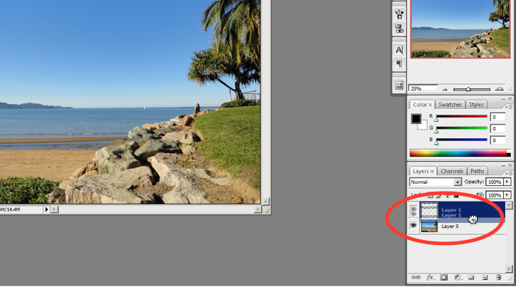
Photoshop does a great job of letting the user know what’s happening with the program by visually showing the user what their actions have led to whenever possible. For example, when users move layers around in the Layers palette, they can visually see the layer being represented as physically dragged within the space.
The cursor graphic goes from representing an open-hand to a gripped hand when the user drags a layer around within the Layers palette. This makes it easier to instantly understand the system status. Additionally, Adobe’s choice of using a ‘hand’ is a great example of the second guideline where the system matches the real world.
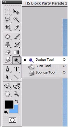
An example of Photoshop mimicking the real world in terms and representations that their target users would understand, is where they design the information structure and terminology to mirror the same wording we would use in the world of photography or print media. Familiar concepts and terms like RGB, Hue/Saturation/Brightness and CMYK are used to represent color, while various tools like the dodge tool and the burn tool mimics a traditional darkroom technique for photographs.
Photoshop’s Dodge Tool and Burn Tool mimics a traditional darkroom technique for photographs
Photoshop is very good at providing users with control every step of the way. As the user makes changes to an image or adds various artistic effects, they are able to quickly and easily take a step backwards if they make an error, for instance.
The users are in control as they can take a Step Backward or Step Forward under the Edit menu, or alternatively they can use Photoshop’s keyboard shortcuts like Alt+Ctrl+Z, for example.
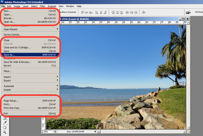
Photoshop maintains a standard layout and look and feel when it comes to the menu bar. They also utilize commonly known terminology such as “New…”, “Open…”, “Save As…”, etc.
The File menu in Photoshop displays a variety of highly familiar options.
To prevent users from making errors, Photoshop provides a brief description or label of the tools when a user hovers over it to help make sure users are using the proper tool for the task at hand.
The user hovers over the eraser icon and Photoshop displays the “Eraser Tool” label.
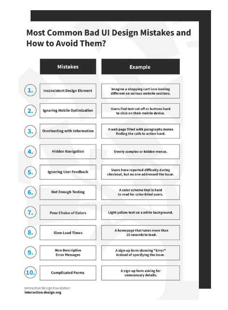
Advance Your Career With This Free Template
for “Bad UI Design Mistakes and How to Avoid Them”
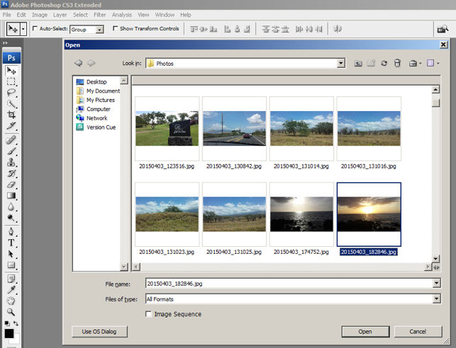
6. Recognition rather than Recall
Whether it be making a selection from the artistic filters menu, or opening a new image file, Photoshop provides a sample view for users to make the right choice. This allows for the user to visually recognize what they’re looking for instead of having to recall the name or typing it in to search for it. Perhaps you have encountered other photo editing programs which ask you to recall and type the name of the file you want to work on. This can indeed be really difficult to recall as it is often something to the effect of: 29412_09342.JPG.
The user is able to visually recognize the sunset image by its thumbnail and select it.
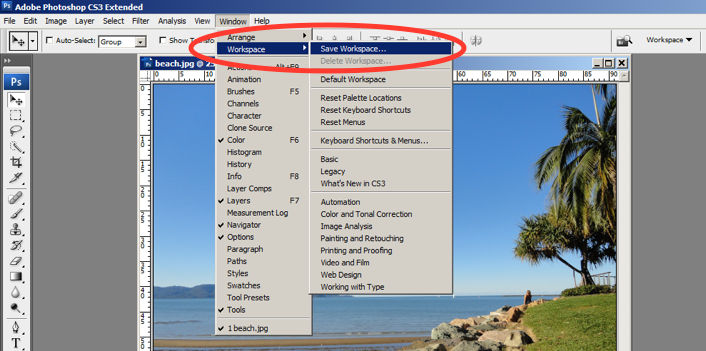
One of the many reasons for frequent users to love Photoshop is for its flexibility and efficiency. Users are able to utilize its flexibility by organizing and adding to their Workspace, as well as making things more efficient by saving it for future use.
Photoshop gives frequent users the ability to save their preferred workspace-setup.
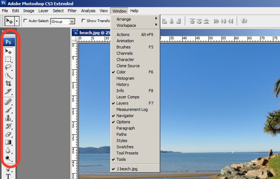
The toolbar in Photoshop only displays the icons and is neatly tucked to the side to help keep clutter to a minimum, and maintain a minimalist aesthetic.
The Photoshop toolbar is minimalist and avoids clutter by representing the tools with icons only.
9. Help Users Recognize, Diagnose and Recover from Errors
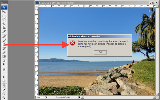
Whenever there is an error, Photoshop provides dialogue that lets the user know what went wrong and how to fix it.
In this error message for the user’s misuse of the clone stamp, Photoshop explains what went wrong, the reason why and how the user should proceed from there.
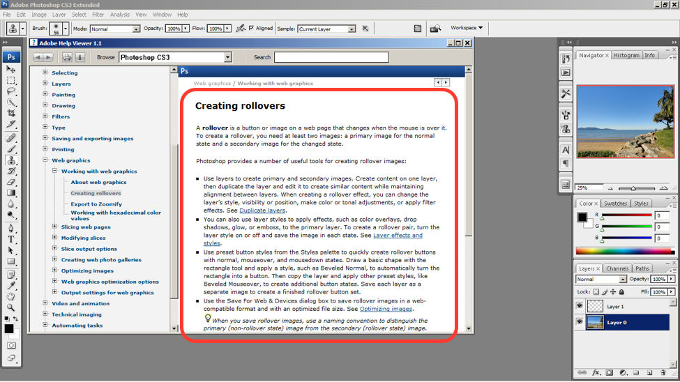
Help and documentation can be accessed easily via the main menu bar. From there, you can find a wide variety of help topics and tutorials on how to make full use of the program.
The window displays information on how to create rollovers in the context of web graphics. The user is also able to see a list of topics on the side menu.
10 Steps to Improve Usability, Utility, and Desirability by Implementing Nielsen and Molich’s User Interface Design Guidelines
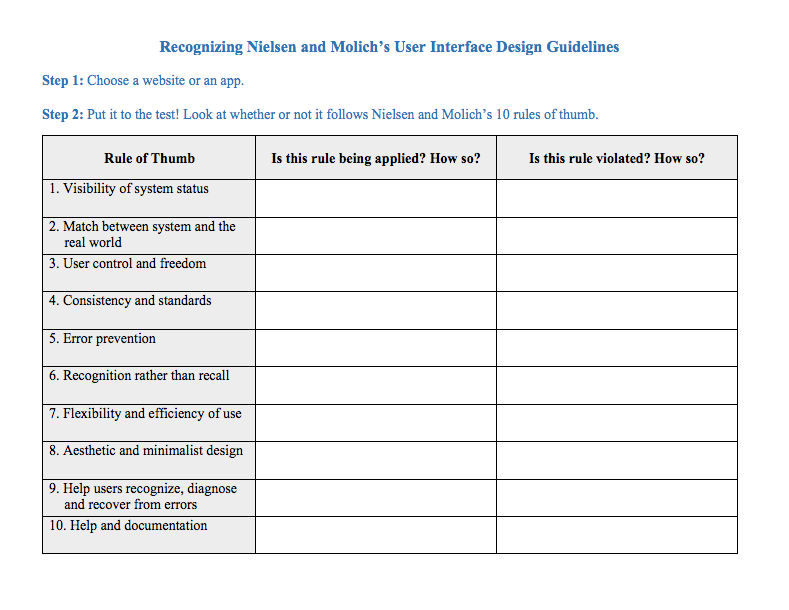
As a designer, you should have the ability to critique the designs of your own as well as the work of others with well supported reasoning. Applying Nielsen and Molich’s 10 rules of thumb in evaluating interface design will help you recognize any potential issues as well as guide you and your team in creating better experiences for your users. Here’s a worksheet for you to practice with as you learn the skill of recognizing whether or not these rules have been applied and when these rules have been violated. Finally, it’s time to improve the website or app by further implementing the 10 guidelines.
When you follow Nielsen and Molich’s 10 user interface guidelines you will design with usability, utility and desirability in mind. Just as the designers of successful companies like Apple, Google, and Adobe, you’ll be able to support your design decisions with well researched heuristics and be confident in creating designs that are both usable and beautiful. To practice recognizing these 10 rules of thumb, go ahead and work through the exercise outlined in the attached file from the above section.
References and Where to Learn More
To find more information on Jakob Nielsen’s ‘Enhancing the Explanatory Power of Usability Heuristics’ please see
AI is replacing jobs everywhere, yet design jobs are booming with a projected 45% job growth.
With design skills, you can create products and services people love. More love means more impact and greater salary potential.
At IxDF, we help you from your first course to your next job, all in one place.


