Your constantly-updated definition of Wireframes and collection of videos and articles. Be a conversation starter: Share this page and inspire others!
789 Shares
What are Wireframes?
Wireframes are basic visual representations of a user interface that outline the structure and layout of a webpage or app. They’re a key deliverable of UX (user experience) design. Wireframes serve as a blueprint that helps designers, developers, and other stakeholders understand the placement of elements like headers, buttons, navigation, and content blocks. They don’t focus on design details like colors, fonts, or imagery.
Transcript
Transcript loading ...
Wireframing is a process where designers draw overviews of interactive products to establish the structure and flow of possible design solutions. These outlines reflect user and business needs. Paper or software-rendered wireframes help teams and stakeholders ideate toward optimal, user-focused prototypes and products.
“Here is one of the few effective keys to the design problem — the ability of the designer to recognize as many of the constraints as possible — his willingness and enthusiasm for working within these constraints. Constraints of price, of size, of strength, of balance, of surface, of time and so forth.”
— Charles Eames, Pioneering designer, architect and filmmaker
Wireframes allow teams to:
Visualize ideas: Wireframing gives form to abstract concepts and ideas which enables designers to see how elements will work together on a screen.
Spot opportunities and constraints: Wireframes reveal usability challenges, technical limitations, and opportunities to improve the user experience.
Facilitate collaboration: Because wireframes are quick to create and easy to modify, they foster collaboration among design teams, developers, and stakeholders.
Save time and resources: When issues are identified and resolved in the wireframe stage, teams can avoid expensive changes later in the process, particularly during development.
Wireframes: The Foundation of Powerful Prototypes and Delightful Designs
Wireframes are basic visual guides in which designers propose elements for screens and webpages and show how experimental solutions would flow for target users. Wireframing is invaluable early in the interaction design process for design teams to explore how concepts accommodate user and business needs. Designer’s mark out a solution’s bare bones in more detail than a sketch, including navigation and other features of the design’s layout.
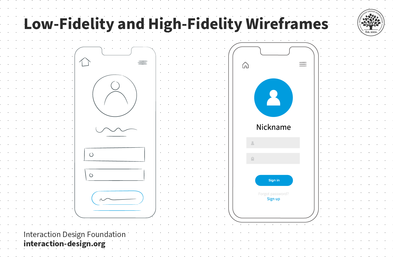
Good wireframing is the skill of creating realistic-looking, lean layouts so a team and stakeholders can quickly determine if concepts are worth developing. Wireframing is distinct from prototyping in the sense that prototyping deals more with testing interactivity and—when done at the highest level of fidelity—sophisticated versions that might closely resemble the released products. However, it’s similar in that wireframing can also be done by hand (e.g., using boxes and lines to represent pictures, text, etc.) or with software and make low- to high-fidelity versions. In low-fidelity wireframing, placeholders can be used to mark content and pictures in grayscale. In high-fidelity wireframing, more realism is introduced, including pictures and perhaps even some interactivity. These can be adapted into well-crafted wireframes far more easily into prototypes for usability testing.
Software choices vary in price (some are free), options (e.g., click-through interactivity) and suitability (e.g., for mobile). When wireframing is done well, it can safeguard a design, design team and a brand against pursuing flawed solutions. Good wireframing can also support agile development as team members needn’t wait for sophisticated deliverables.
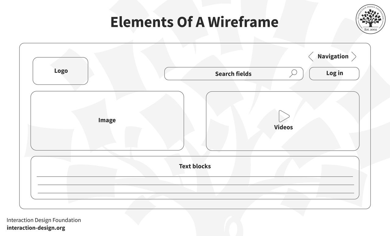
A well-designed wireframe typically includes the following elements:
Layout and structure: This outlines how content is arranged on the screen. It shows where key elements like headers, images, text blocks, and buttons will be placed.
Navigation: Wireframes indicate how users will move through the product, including the placement of menus, tabs, and other navigational elements.
Content hierarchy: Wireframes establish a clear visual hierarchy that prioritizes the most important content and guides the user’s attention.
Functionality: Wireframes show interactive elements like buttons, input fields, and forms, but without detailing how these will look.
Annotations: These are notes that explain the functionality, behavior, or rationale behind certain design decisions.
Low-Fidelity vs. High-Fidelity Wireframes: What’s the Difference?
Wireframes come in different levels of fidelity, depending on the project’s needs and the phase of the design process.
Low-fidelity wireframes are rough, simplified layouts that focus purely on the basic structure and layout of the page. They often use placeholders for images, text, and interactive elements and are usually created in black and white, or grayscale, to keep the focus on functionality and content hierarchy rather than aesthetics. Designers commonly use low-fidelity wireframes in the early stages of a project to quickly explore different layouts and ideas without investing much time in details.
Low-fidelity wireframes are useful for:
Brainstorming and ideation: Teams can rapidly create multiple wireframes to explore different design solutions.
User flow and navigation: These wireframes help map out the user’s journey through the product and determine if the navigation is logical and intuitive.
Collaboration: Low-fidelity wireframes are easy for team members and stakeholders to understand, making them effective tools for feedback and discussion.
High-Fidelity Wireframes
High-fidelity wireframes are more detailed and realistic representations of the final product. These wireframes may include accurate sizes for elements like buttons and fonts, as well as actual images and more specific content. In some cases, high-fidelity wireframes can also include limited interactivity, such as clickable elements that simulate basic user interactions.
High-fidelity wireframes are useful for:
Finalizing the design structure: When teams are close to deciding on the final layout and functionality, high-fidelity wireframes provide a more polished representation.
Developer handoff: Developers can use high-fidelity wireframes as a reference to ensure they are building the product as designed.
User testing: High-fidelity wireframes can serve as prototypes for testing usability with real users, providing valuable insights into how users will interact with the final product.
To make wireframing effective, focus on key elements users expect to see and how they will interact with them. Prioritize functionality, accessibility, layout, and navigation—the backbone of a well-structured design. Avoid unnecessary features or "nice-to-haves" at this stage.
Steps to Build Effective Wireframes
Prioritize content and hierarchy: List and organize the most important elements for each page early. Establish a clear information architecture, so users can navigate content intuitively.
Create large content blocks: Divide the screen into broad sections for content, then refine these blocks with details like links and placeholders.
Use a grid-based layout: A clean, grid-oriented structure ensures a balanced, user-friendly layout. This helps users focus and improves overall usability.
Annotate for clarity: Use annotations to explain functionality and design rationale, ensuring everyone—designers, developers, and stakeholders—can easily interpret the wireframes.
Start with mobile-first design: By designing for the smallest screen first, you create a more focused, scalable layout that translates well to larger devices.
Add detail in high-fidelity wireframes: For more advanced wireframes, include accurate sizes for fonts, icons, and other elements. Be specific but avoid overloading the design with unnecessary content at this stage.
Focus on Clarity and Collaboration
Keep your wireframes concise, focusing on core elements like functionality and user flow rather than visual aesthetics. Wireframes are tools for collaboration, not polished deliverables. Their purpose is to ensure alignment across teams, speed up iteration, and refine ideas before committing to high-fidelity designs.
Well-executed wireframes demonstrate your ability to strip a design down to its essentials, helping your team recognize constraints and identify the most effective user-centered solutions.
How to Successfully Showcase Wireframes in a Portfolio
Wireframes are an effective way to demonstrate a designer's problem-solving skills and how they structure user interfaces. Wireframes reveal the design process, focusing on functionality and user flow before visual refinement. To include them effectively, designers should:
Select: Choose wireframes that demonstrate key problem-solving moments and strong organizational skills.
Clarify: Redraw unclear wireframes to prioritize readability and ensure they effectively communicate structure and functionality.
Organize: Present wireframes in a sequence that shows the evolution from initial concepts to refined layouts, highlighting iteration.
Annotate: Add brief notes explaining design decisions and how challenges were addressed.
When UX designers present wireframes thoughtfully, they show their ability to prioritize functionality and user needs while refining solutions based on feedback. A well-organized wireframe display reflects a designer’s attention to detail, strategic mindset, and skill in creating user-centered products. This clear presentation positions them as strong candidates who balance both technical and creative aspects of design.
Questions About Wireframes? We've Got Answers!
Why are wireframes important in the design process?
Wireframes play a crucial role in the design process because they allow designers to plan the structure, functionality, and user flow of a digital product, all before investing time and resources into high-fidelity design. By visualizing layout and interactions early, teams can align on goals, spot usability issues, and get feedback fast.
Wireframes strip away visual details and focus on content placement, navigation, and user experience. This makes it easier to iterate quickly and keep the design user-centered.
To create effective wireframes, keep them simple, use consistent symbols for elements like buttons or menus, and always tie layouts back to user goals. Tools like Figma, Balsamiq, or Sketch can speed up wireframe creation and collaboration.
What are the differences between wireframes, mockups, and prototypes?
Wireframes, mockups, and prototypes serve different purposes in the design process, each offering unique value at various stages of product development.
Wireframes act as the blueprint. They show basic layouts, structure, and functionality without color, images, or detailed styling. Designers use them early to map out user flows and screen elements quickly.
Mockups bring visuals into play. They show how the final product will look, with colors, fonts, images, and branding. However, they remain static and don't support interaction.
Prototypes simulate interaction. They range from low-fidelity click-throughs to high-fidelity experiences that closely resemble the final product. Designers and teams use prototypes to test usability, validate ideas, and collect feedback from users or stakeholders.
It's wise to use wireframes for structure, mockups for visuals, and prototypes for experience testing.
Discover why prototyping is an essential design practice, as Alan Dix, Author of the bestselling book “Human-Computer Interaction” and Director of the Computational Foundry at Swansea University, explains:
Transcript
Transcript loading ...
What are the different types of wireframes?
Wireframes come in two main types—low-fidelity and high-fidelity—and each serves a specific purpose in the design workflow.
Low-fidelity wireframes focus on structure and functionality. They use simple shapes, grayscale colors, and placeholder text to outline layout and navigation. Designers use them early to brainstorm ideas, test user flows, and get stakeholder feedback quickly.
High-fidelity wireframes look more polished. They include specific content, UI elements, and often reflect brand styles. Although they're typically not interactive, high-fidelity wireframes offer a detailed visual guide for developers and are ideal for documenting design decisions.
Use low-fidelity wireframes when speed and collaboration matter most, and switch to high-fidelity when designs need more precision or buy-in. This stepwise approach can reduce revision cycles and raise alignment levels across teams.
A wireframe should be detailed enough to convey structure, layout, and functionality without slowing down iteration or locking in design decisions too early.
Early in the process, use low-fidelity wireframes with simple shapes and placeholders to outline page elements and user flows. This helps teams focus on usability and content hierarchy instead of visuals. As ideas solidify, you can add more detail, such as labels, button placements, or sample content, based on what stakeholders or developers need to understand.
Don't overload wireframes with colors, images, or fonts. That's the role of mockups. Rather, make wireframes clear, clickable if needed, and annotated with notes about behavior or interaction. This clarity saves time and prevents misunderstandings in development.
A well-balanced wireframe should answer the “what goes where” and “how does it work” questions and not pretend to be the final design.
Watch our video to get an overview of what wireframing involves:
Transcript
Transcript loading ...
How do wireframes fit into the overall design workflow?
Wireframes can play a fundamental role in the design workflow by bridging research and visual design. Designers typically create wireframes after collecting user needs, before starting to dive into detailed visuals or interactivity.
In early stages, wireframes translate user research into tangible layouts. They help teams map content, navigation, and functionality without getting distracted by colors or typography. This makes it easier to test ideas, align stakeholders, and make fast iterations.
As the project moves forward, wireframes evolve into mockups and prototypes. Developers use them to understand functionality, while product managers use them to visualize requirements.
Overall, wireframes guide the design process from idea to implementation. They create clarity, save time, and ensure the final product stays user-centered.
A good wireframe includes essential elements that define layout, structure, and user flow, without distracting details. It should communicate what content appears where, how users navigate, and what actions they can take.
Start with a grid to ensure alignment and consistency. Use placeholders for key content like headlines, text, images, and buttons. Navigation menus, search bars, and calls to action must be clearly marked. Include labels or annotations to explain functionality, especially for interactive elements like dropdowns or modals.
Keep the design simple and monochromatic to emphasize layout over visuals. Avoid decorative elements; instead, focus on user goals and logical hierarchy. A great wireframe guides design decisions and stakeholder feedback by showing structure, not style.
Test wireframes with users to validate flow and content placement before progressing to mockups or prototypes to enhance usability.
Trust in grid systems to help lay out information well and lay solid foundations for a design solution.
What are common mistakes to avoid when wireframing?
Common wireframing mistakes often lead to confusion, wasted time, and poor user experience down the line. One major pitfall is adding too much visual detail—colors, images, or branding—which shifts focus away from structure and function. Wireframes should stay neutral and simple.
Another mistake is skipping user flow. A wireframe isn't just a static screen; it should show how users move through the interface, too. Neglecting interactive elements like buttons or navigation cues can break the user journey later.
Designers can also hurt clarity by using inconsistent symbols or omitting labels. Stick to a clear visual language and annotate where needed.
Last, but not least, failing to test wireframes with users or stakeholders early can result in costly redesigns later.
Stay focused on layout, logic, and flow. Wireframes are tools for communication, not polished designs.
How do I prioritize content and features in a wireframe?
To prioritize content and features in a wireframe, focus on user goals and business objectives. Start by identifying your primary users and what they need to accomplish on each screen. Put the most critical content and actions where users naturally look—typically top-left or center.
Use visual hierarchy to signal importance. Larger elements, bold text, or higher placement signal priority. Break content into clear sections, and keep related items close together. Navigation should support easy access to key features, not distract from the main task.
Don't cram everything in. Prioritization means choosing what matters most and deferring or removing what doesn't. Refer to user flows, personas, and analytics to support your decisions. Consistent structure helps users scan faster and act more quickly.
Smart content prioritization keeps wireframes focused and products user-friendly.
Get an insightful overview of visual hierarchy in our video:
Transcript
Transcript loading ...
How many wireframes should I create for a single project or feature?
The number of wireframes you should create depends on the project's or feature's complexity. As a rule, design one wireframe for each unique screen or significant state, such as homepage, login, error state, and confirmation screens.
For simple features, you might need just two or three wireframes. However, for full applications or complex flows, expect to create dozens. Each wireframe should capture different user scenarios, including mobile and desktop views if needed.
Also, map out all stages in a user journey. For example, an e-commerce checkout flow may require five or more wireframes: cart, shipping, payment, review, and confirmation.
Planning multiple wireframes helps you visualize how users move through the product. It also gives stakeholders a clearer picture and allows developers to build accurately.
How do you present wireframes to clients or stakeholders?
Present wireframes to clients or stakeholders by focusing on clarity, purpose, and user flow, not visual design. Start by explaining the wireframe's goal: to show structure, content hierarchy, and functionality before styling.
Walk through the wireframe screen by screen. Describe how users will interact with the layout and why elements are in specific positions. Use annotations to clarify interactive parts like menus, buttons, or modals. Keep language simple and tie design choices to user needs or business goals.
Encourage feedback by asking open-ended questions like “Does this flow make sense to your users?” or “Are we meeting the key requirements here?” Avoid distractions; don't talk about colors or fonts unless they're relevant.
A clear, guided presentation builds trust, speeds up approvals, and aligns everyone on user experience and what the eventual solution needs to mirror: the users' needs.
This article provides a practical three-step framework for translating user research findings into effective wireframes. The authors emphasize that creating good wireframes requires combining research analysis with design intuition, and they guide readers through establishing optimized workflows by cataloging data points users interact with during task completion. The piece advocates for wireframes that are "detailed enough to prompt users and stakeholders to give feedback on functionality and user experience" while avoiding getting caught up in visual design details. Key recommendations include mapping entire user workflows before focusing on individual screens, grouping data points both sequentially and categorically, and accounting for supplementary content like help materials that users need to complete their tasks. The article positions wireframing as an iterative process that should be grounded in research data rather than assumptions, ultimately helping teams create interfaces that simplify users' goals.
This article positions wireframes as essential blueprints that guide the design journey by ensuring all elements fall into place properly. The piece emphasizes several key wireframing practices for 2024, including considering device support across desktops, tablets, and mobiles with a mobile-first design approach, and working with varying screen sizes. The authors advocate for designing in low fidelity using grayscale palettes, sparse fonts, and basic shapes to maintain simplicity and enable fast iterations. They stress the importance of setting clear expectations by communicating the role and detail level of wireframes to align stakeholder objectives, and recommend creating intuitive navigation patterns using familiar elements like tabs or hamburger menus. The article also highlights how wireframes should illustrate the hierarchy of information and functions, showing the prioritization of elements on each screen and emphasizing key actions. Throughout, the focus remains on wireframes as collaborative tools that enhance team efforts and ensure designs meet user needs effectively before moving into more detailed creative phases.
What are some popular and respected books about wireframing?
Wireframing for Everyone by Michael Angeles, Leon Barnard, and Billy Carlson offers a comprehensive guide to low-fidelity design techniques. Drawing from their extensive experience, the authors demonstrate how wireframes can be used to generate ideas, encourage feedback, and involve all team members in the design process. The book emphasizes the enduring relevance of wireframing in modern UX practices, providing frameworks for implementing UI design basics and techniques for developing concepts from idea to prototype. It's an essential read for those looking to demystify UI design and foster collaborative environments.
Matthew J. Hamm's Wireframing Essentials serves as a foundational text for those new to UX design. The book introduces readers to the core principles of user experience, emphasizing the importance of wireframes in the design process. Through real-world examples, Hamm illustrates how to craft effective design solutions, from initial research to task flow diagrams and wireframes. This guide is particularly beneficial for aspiring UX designers seeking to understand the industry's standard design processes and techniques.
Earn a Gift! Answer a Short Quiz at the End of This Page
Earn a Gift, Answer a Short Quiz!
1
2
3
4
1
2
3
4
Question 1
Question 2
Question 3
Get Your Gift
2
3
4
2
3
4
Question 1
Question 2
Question 3
Get Your Gift
3
4
3
4
Question 1
Question 2
Question 3
Get Your Gift
4
4
Question 1
Question 2
Question 3
Get Your Gift
Try Again! IxDF Cheers for You!
0 out of 3 questions answered correctly
Remember, the more you learn about design, the more you make yourself valuable.
Why? Because design skills make you valuable. In any job. Any industry.
In This Course, You'll
Get excited when you discover the secret to a portfolio that fast-tracks your way to job offers. Did you know most hiring managers decide on your application in just 7.4 seconds? In today's competitive job market, first impressions are everything.
Learn to build a career where you fulfill your potential and earn a salary that reflects your true value. Your design portfolio is your ultimate advocate. It speaks for you when you're not in the room. In this course, you'll get real-world insider insights from an expert who's reviewed thousands of portfolios. Take the course and build the career you're truly meant for.
Make yourself invaluable when you learn how to hook hiring managers with your problem-solving mindset, user-centered design approach, and business acumen. We know how frustrating it is to apply for job after job with no response. As AI makes it easier to generate generic portfolios and case studies, you stay in demand by clearly showing your timeless human-centered design skills: How you think, make decisions, and solve real problems. This User Experience/User Interface (UX/UI) portfolio course gives you the skills to finally stand out from the pack. Whether you're new to design or already experienced, you'll turn your past work experiences into portfolio gold and create a portfolio they love! No matter your background, it's easier than you think.
Gain confidence and credibility with our step-by-step blueprint for a portfolio that gets you hired faster into a role where you'll fulfill your purpose and increase your salary potential. Through hands-on projects and ready-to-use downloadable templates, you'll develop a winning portfolio strategy, write attention-grabbing hooks, present your portfolio with confidence, and master the first impression formula. You'll walk away with a pitch-ready UX/UI design portfolio you can use to land your dream job.
It's Easy to Fast-Track Your Career with the World's Best Experts
Master complex skills effortlessly with proven best practices and toolkits directly from the world's top design experts. Meet your expert for this course:
Morgane Peng: Designer, speaker, mentor, and writer who serves as Director and Head of Design at Societe Generale CIB.
Get an Industry-Recognized IxDF Course Certificate
Increase your credibility, salary potential and job opportunities by showing credible evidence of your skills.
IxDF Course Certificates set the industry gold standard. Add them to your LinkedIn profile, resumé, and job applications.
Be in distinguished company, alongside industry leaders who train their teams with the IxDF and trust IxDF Course Certificates.
10 Free-to-Use Wireframing Tools for UX Designers in 2026
Wireframes help you quickly ideate and test your ideas. While paper wireframes are the fastest to create, digital wireframes look more polished and presentable. If you are looking for a pocket-friendly wireframing tool, look no further.Whether you prefer browser-based apps or offline desktop tools,
Rapid Prototyping, Faking It Until You Make it in a UX Driven World
The idea of “faking it, until you make it” is not new but it has a unique UX twist. The ability to develop and test prototypes at rapid rates of iteration lets you “fake” new products, get user feedback and make improvements without ever “making the product” until you have things just right. This ca
Don’t Build It, Fake It First – Prototyping for Mobile Apps
The design phase for mobile applications should include a prototyping stage. It is at this point that users can “play” with your ideas and concepts and give you valuable feedback that shapes the final designs before you begin development. This can save time and money in development and create produc
A Review of UXPin – A Collaborative UX Design Tool
The design team behind the Interaction Design Foundation got a chance to review UXPin – a collaborative UX Design tool – and here is our review (spoiler: it’s awesome!)To fully appreciate a tool like UXPin, it’s important to understand the context in which it exists. With the digital revolution rapi
What UX Tools Do I Need to Create My Portfolio, and How Do I Learn Them?
“What UX tools should I learn so that I can build my portfolio?” “How do I learn UX tools?” We get these questions a lot here at the Interaction Design Foundation. If you’re starting out in UX, you might have these burning questions, too. So, here, we’ll go through everything you need to know about
Top UX and UI Design Tools for 2026: A Comprehensive Guide
UI/UX design tools, also called user interface and user experience design tools, are specialized software applications that help designers create, modify, and explore user interfaces and user experiences. But they’re more than just software: They’re like bridges in a sense, or a way for you, dear de
Social shares
1k
Published
Read Article
How to Create Wireframes: An Expert’s Guide
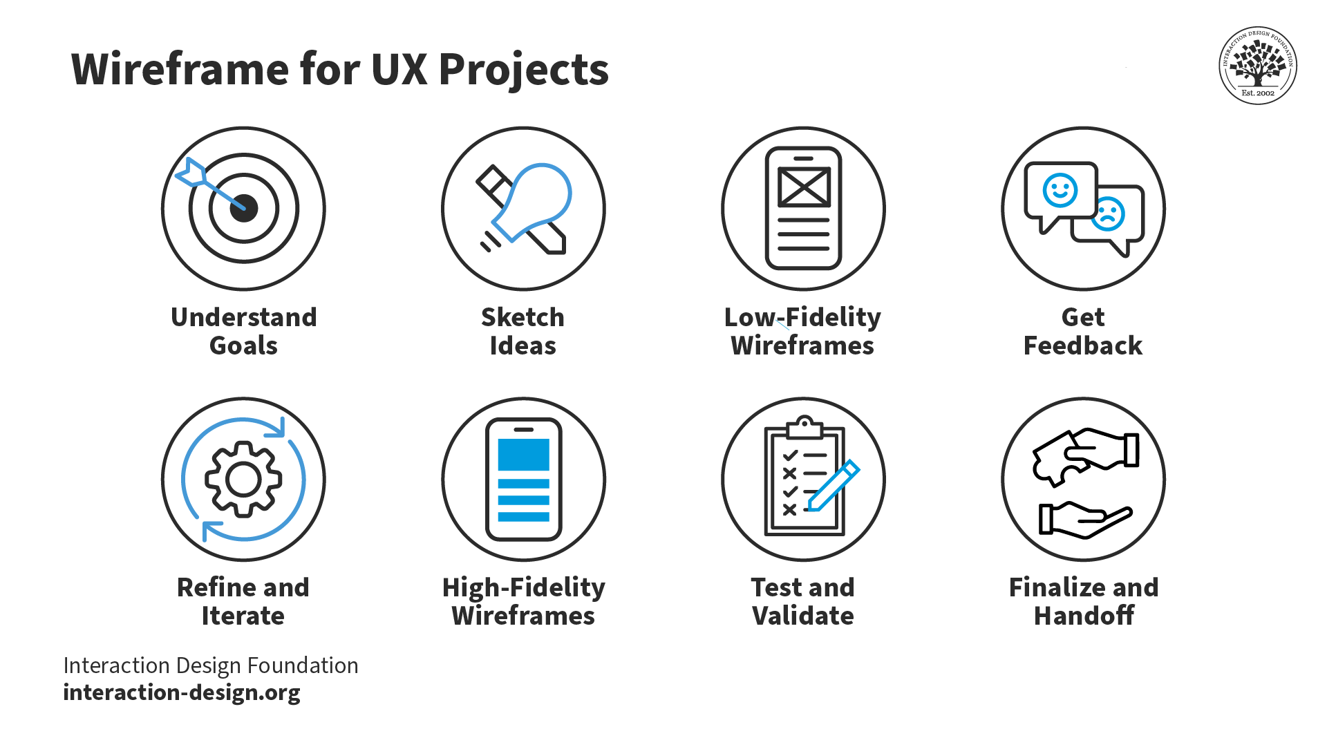
In user experience design (UX design), wireframing is one of the most fundamental steps UX designers take. Wireframes are like blueprints for houses—you’d find it tough to build without one—only the structures you build from them are digital projects. They’re sketches that set out things so you’ve got a visual guide for the layout of the website or app you’re going to create, and an effective wireframe shows where elements will go before you get into any detailed design work, hence why you’ll read all about wireframing here.
After you’ve done your user research, you’ll find wireframing to be one of the earliest stages for your UX design process, and the chief reason for that is how wireframes save you so much—and prevent headaches. Make an effective wireframe and you’ll save time, reduce errors, and make sure you’ve got a clear vision to head towards with your efforts. Not just you, dear designer, but others on your design team and developers and other stakeholders will get to enjoy a clear project view when they’ve got a wireframe in front of them.
Wireframes work like roadmaps for making an effective digital solution, and they’re a huge plus in syncing everyone’s expectations and getting team members on board for a user-friendly digital experience to emerge. They’re cost-efficient, they focus on functionality, and they’re neat and clear deliverables to start the ball rolling on really effective designs.
Transcript
Transcript loading ...
The Basics of Wireframing
In a wireframe, your goal is to make the best possible visual representation of the workflow of a website or mobile application, but—instead of making a high-fidelity prototype in high and fine detail—you want to illustrate the page’s structure, layout, and functionality so you help plan out the user experience without color, graphics, or content getting in the way and causing distractions. What’s key when you’re making a wireframe is to organize the content in a logical way—the layout should guide the user through the information so an intuitive and pleasant browsing experience happens when they view it without having to hesitate in confusion.
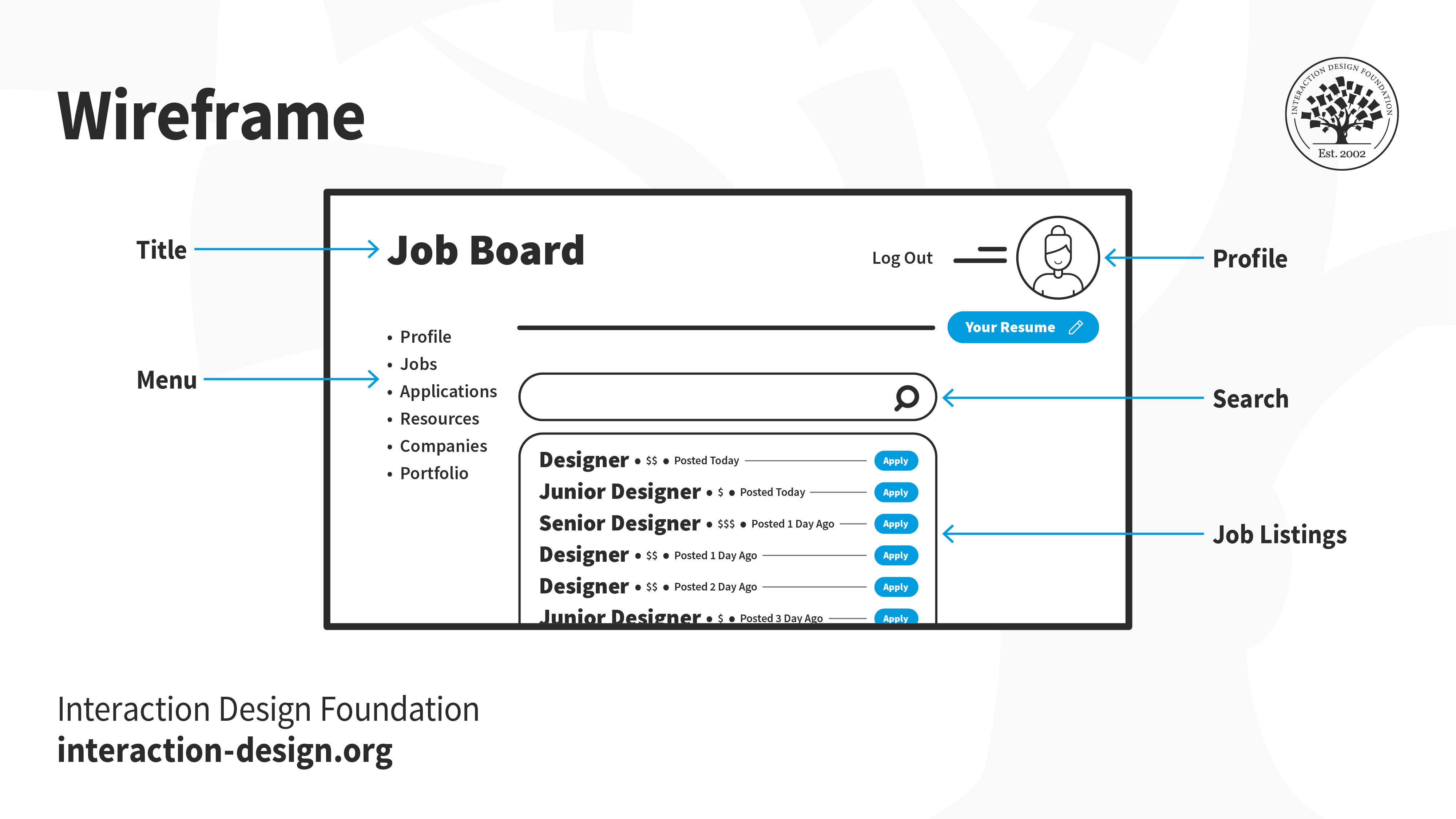
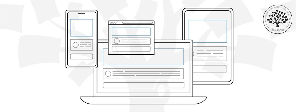
The overall content breaks down into the elements, and first up is the logo, which carries the brand identity and usually sits at the top corner of a page. It’s vital to anchor the brand’s presence and build trust with users. Next, navigation is what helps users explore different parts in the site or app—often appearing as a menu bar or sidebar—and it directs users to primary sections or features so they can get around the design you put before them. After that, search fields are what let users find specific content or features, by typing or speaking if they’ve got mic capabilities, and it’s great to have a search field if a content-heavy site is the plan.
Speaking of typing, text blocks in a wireframe are for content placement—namely, the textual content like headlines, paragraphs, or bullet points. Buttons are, of course, the prompts for users to take actions like “Submit,” “Read More,” or “Buy Now”—whatever the site or app calls for—and they’re vital for users to make calls to action.
Image placeholders are the areas where you’re going to put your visuals, and they help in understanding a page’s content-to-visual balance—and that’s another vital thing to get right for effective designs. And, while we’re in picture-oriented matters here, videos—or video placeholders—save the spot for where multimedia content, such as videos or animations, will go.
You’ve essentially got five principles of wireframing to bear in mind as you create these superb tools to help your UX design process along: simplicity, user-centricity, clarity, feedback loop, and consistency. For simplicity, you keep it straightforward and focus on structure and functionality, while user-centricity refers to how you prioritize your users’ needs and user journeys. Clarity in wireframing means every element should have a clear purpose—another vital thing to get right and what also takes a fair degree of thought—while feedback loop means you keep gathering feedback and iterating to shape the wireframe well. Last—but not least—is consistency, so you keep a uniform structure and design language going throughout.
Different Types of Wireframes
1. Low-fidelity Wireframes
Low-fidelity wireframes—or lo-fi wireframes—are the first ones you create, and they give the basic visuals of the design. Key here is “basic”—and you don’t want scale, grid, or pixel accuracy, because the aim is to have no distractions, but instead to help find simple images, block shapes, and placeholder text.
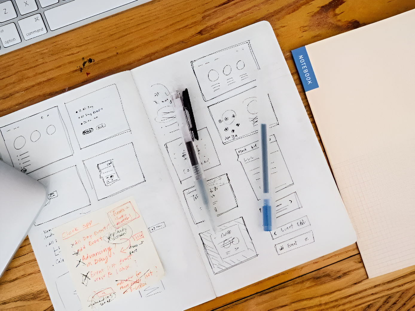
An example would be if you, dear designer, were in a room with stakeholders and clients, and wanted to sketch an app layout on paper, and these wireframes wouldn’t just ease discussions but help set navigation and outline users’ paths, too. You’d sketch ideas with a pen in this meeting, and with a great deal of product ideas coming to or at you, low-fi wireframes help you zero in on one; plus, they’d be helpful for initial tests at this level.
2. Mid-fidelity Wireframes
Mid-fidelity wireframes are—of the three kinds—the most prevalent. They’re not “crude” like most lo-fi ones, and they offer a clearer layout view but still leave out visuals like images or specific typography.
What’s key here, though, is that components have got more precision and features stand out, and you can use, for instance, varied text weights to help distinguish between titles and body text. Instead of colors, you use different shades of grey to indicate importance of elements. Mid-fi wireframing is suitable for early product stages, to be sure, but you use digital tools like Miro or Figma to craft these kinds of wireframes.
3. High-fidelity Wireframes
True to their name, high-fidelity wireframes—or hi-fi wireframes—are detailed and give pixel-specific layout views. Instead of placeholder text (“lorem ipsum”) and symbols which you’d more likely find in lo-fi versions, here is where you present actual images and relevant content. That level of intricate detail makes these wireframes good to explore and record complex ideas with.
To take detailed menu systems or dynamic maps as an example, this is where designers reserve hi-fi wireframes for the design cycle’s advanced stages—and it’s through these that they refine and finalize design concepts in sharp relief, so they save the “best” until last in that sense.
When to Use Wireframes?
Explore the initial idea: At the start of a project, wireframes help designers and design teams visualize rough ideas and bring abstract concepts to life.
Collect meaningful feedback: Before you get right down into the details of a design, wireframes can help you get in that vital initial feedback to see if you’re on the right track. Stakeholders, members of the design team, and potential users can provide valuable insights so you’ll be better placed—and more clued up—to revisit, tweak, or discard things before you move on to the next step.
Plan functionality: Wireframes map where you’re going to put functional elements—like buttons or interactive features—and it helps you understand how to create an interaction design for usability, and one that will work well.
Transcript
Transcript loading ...
Structure content: Wireframes help you plan where content will appear from early on—and so they make it easier, for instance, to position text, images, or multimedia so that you’re not left wondering about where to put these later on.
Customer journey mapping: Wireframes are effective tools to plot user journeys with, and they’re a great way to enable designers to envision how users are going to navigate a site or app and experience it in that way.
Usability testing: Before you move on and get anywhere near your final designs—or even high-fidelity prototypes (prototypes are more involved design deliverables where, say, while a wireframe shows there’s a button, a prototype shows what that button does as an action)—wireframes can work as wonderful test “subjects” for you to usability-test with so you can get an early edge to identify and rectify usability issues.
How to Choose the Right Wireframing Tools
Benefits of Digital Wireframing
The precision digital tools have offer accurate measurements, so you can be sure that elements align and match the intended design—so you’ve got an edge over just drawing them on paper.
Author and Human-Computer Interaction (HCI) Expert, Professor Alan Dix explains alignment in this video:
Transcript
Transcript loading ...
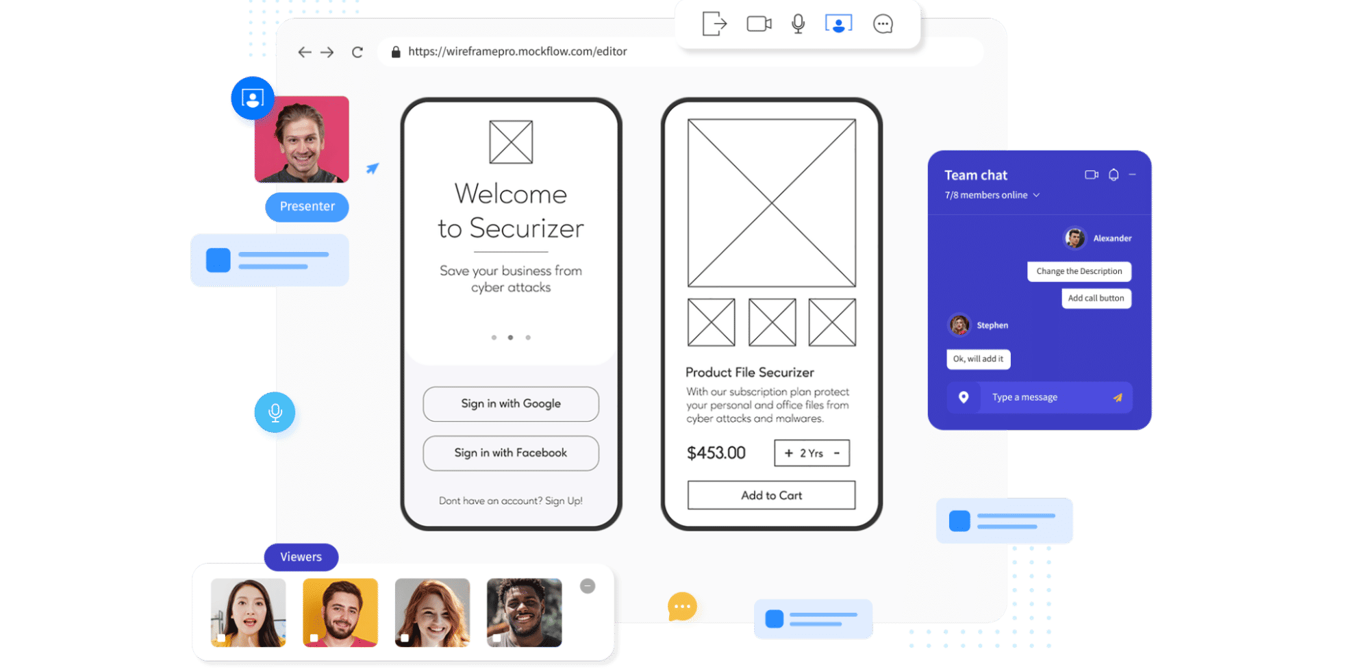
Another massive benefit of digital wireframing is the efficiency they provide you with, since you can speed up the wireframing process with digital and features like copy, paste, and templates, which save time as well as potential headaches from all the labor of hand-drawn efforts. On the subject of saving time, there’s the benefit of easy sharing in that you can share digital wireframes just with a link, and that makes the process of gathering feedback easier, too.
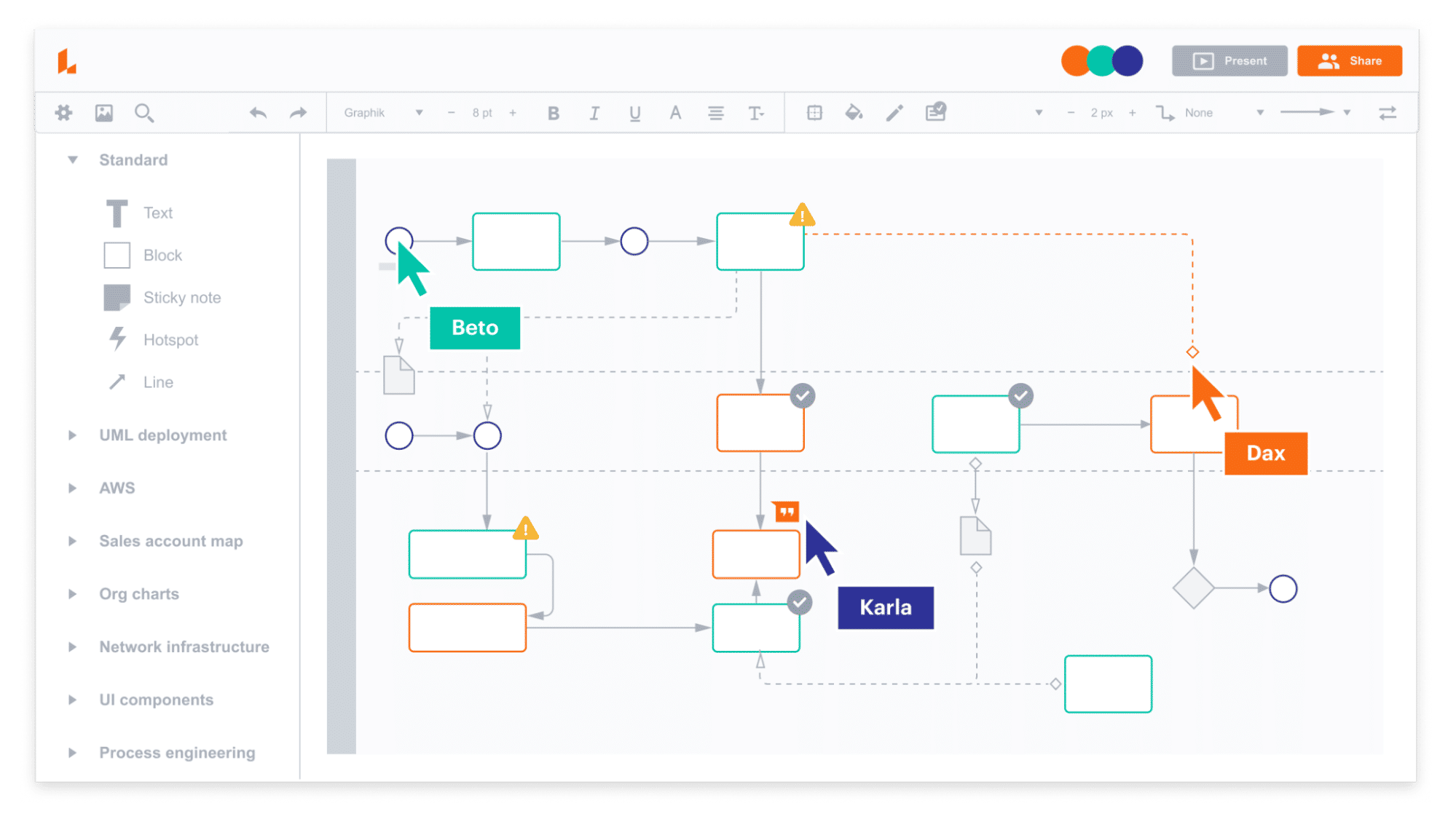
Another point to sharing is sharing in the work on the project, so better collaboration comes with digital wireframing—not least since many digital tools have got built-in collaboration features, and so teams can review, comment, and iterate together in real-time.
With all this efficient work going into a project, there’s always the chance that you and your team will want to check back on different versions of what you’ve done, and that’s where version control comes in, since digital wireframing can help you track changes—with most tools offering version history and allowing designers to compare versions or revert back to old ones.
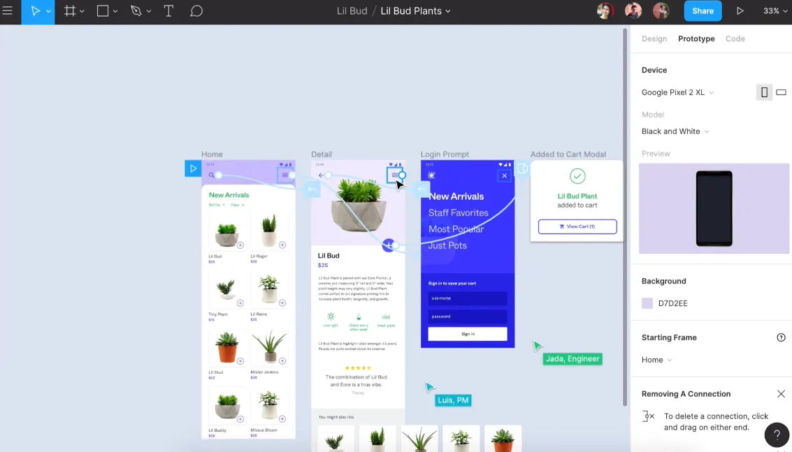
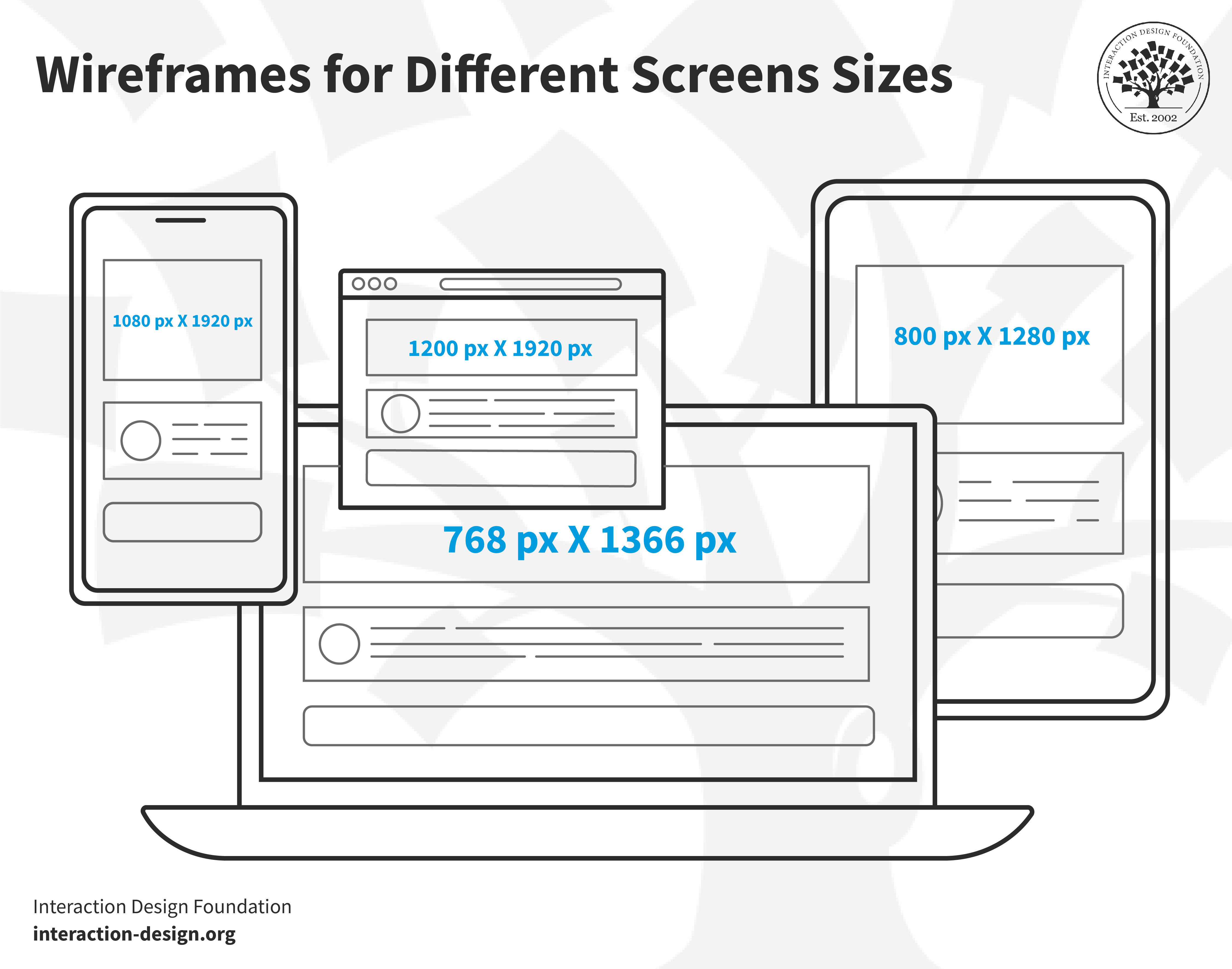
The difference between prototypes and wireframes came up earlier, but let’s revisit a feature there—of interactivity—and some tools enable clickable wireframes, and that handy feature simulates user interactions by offering them a dynamic preview. Scalability is another big benefit of going digital with wireframes, and it’s just a straightforward matter to adjust wireframe sizes for various devices—so you can also ensure designs are responsive.
Another juicy plus is the factor of integration—and many tools integrate with other design software, and so that streamlines the transition from wireframing to high-fidelity designs. Asset management is yet another benefit, and it’s easy to organize and store assets—not least since icons, components, and UI elements remain at your fingertips.
Last—but not least—there’s the boost of professional presentation, and as digital wireframes look polished, and if you present them to stakeholders or clients, it’ll give a professional impression.
Wireframing tools and software
Wireframing tools help you map the user experience, layout, and overall flow—and put you streets ahead of pen-and-paper sketching (although hand-drawn wireframes can come in very handy in brainstorming sessions and the like). Software for wireframing helps you streamline the design process and ensure everyone is on the same page, so we’ll talk about some of the top wireframing tools leading the industry. (Prices correct at the time of writing.)
Figma is a top-tier, cloud-based design tool, and it's a favorite among solo designers and teams alike. Even free users benefit from its comprehensive feature set. FigJam is an online whiteboard, and it integrates with Figma, so you can use it for brainstorming and user flow mapping.
You can transition to wireframing and prototyping within the same platform, and a juicy plus is that there’s no need for external design apps. What’s more, the platform excels at team collaboration with real-time edits and in-file discussions. Developers can extract CSS for smooth transitions to production.
Best Features
Generous free plan
Online whiteboard companion (FigJam)
Seamless team collaboration
Vector-based pen tool
Integrated team conversations
Pricing
Free (3 projects). Professional plan at $12/user/month (annual billing).
MockFlow is an online wireframe tool with real-time collaboration, and its clean, intuitive interface makes wireframing simple with a great many UI packages. The platform has design controls placed on the left—which maximizes the space for the design—and beginners find it easy to use due to the precise placement of its diverse elements.
The platform offers unique features—like organizational functionality—and it allows you to create separate spaces for each project, plus you can export in various formats, too, including Word and PowerPoint.
With native Slack and Microsoft Teams integrations, team communication stays streamlined with Mockflow, and bonus features like AI image and text generators are neat plusses that enhance its capabilities.
Lucidchart is a diagramming tool that’s accessible via web browsers, and it empowers users to draw, do revisions, and distribute charts and diagrams collaboratively. This platform is ideal for enhancing organizational structures, systems, and workflows, and a user-friendly interface makes it a top choice if you’re after visual collaboration tools.
The platform’s strength is how it promotes teamwork through real-time collaboration, in-app chats, and extensive integration capabilities. Lucidchart syncs with popular tools—including Microsoft Office and Google apps—and it connects with its virtual whiteboarding product, Lucidspark.
Best Features
Vast wireframe template library
Drag-and-drop functionality
Real-time collaboration
In-app chat
Automatic sync and save
Integration with Microsoft, Google, Atlassian, and more
Pricing
Freemium version. Paid plans start at $7.95/month.
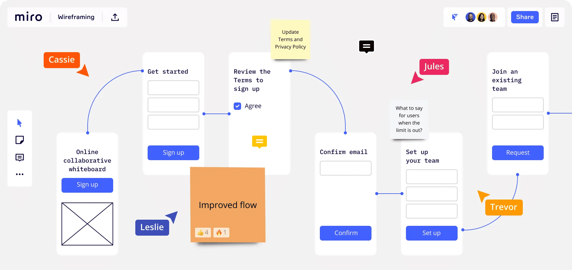
Miro is a popular and dynamic AI-powered virtual whiteboard platform, and it fosters real-time team collaboration with features like sticky notes, wireframe libraries, and mind-mapping tools.
With its diverse integrations and templates, what also makes Miro a nifty pick is how it provides a holistic solution for brainstorming and design. The free version is pretty generous—and additional perks come with the team plan.
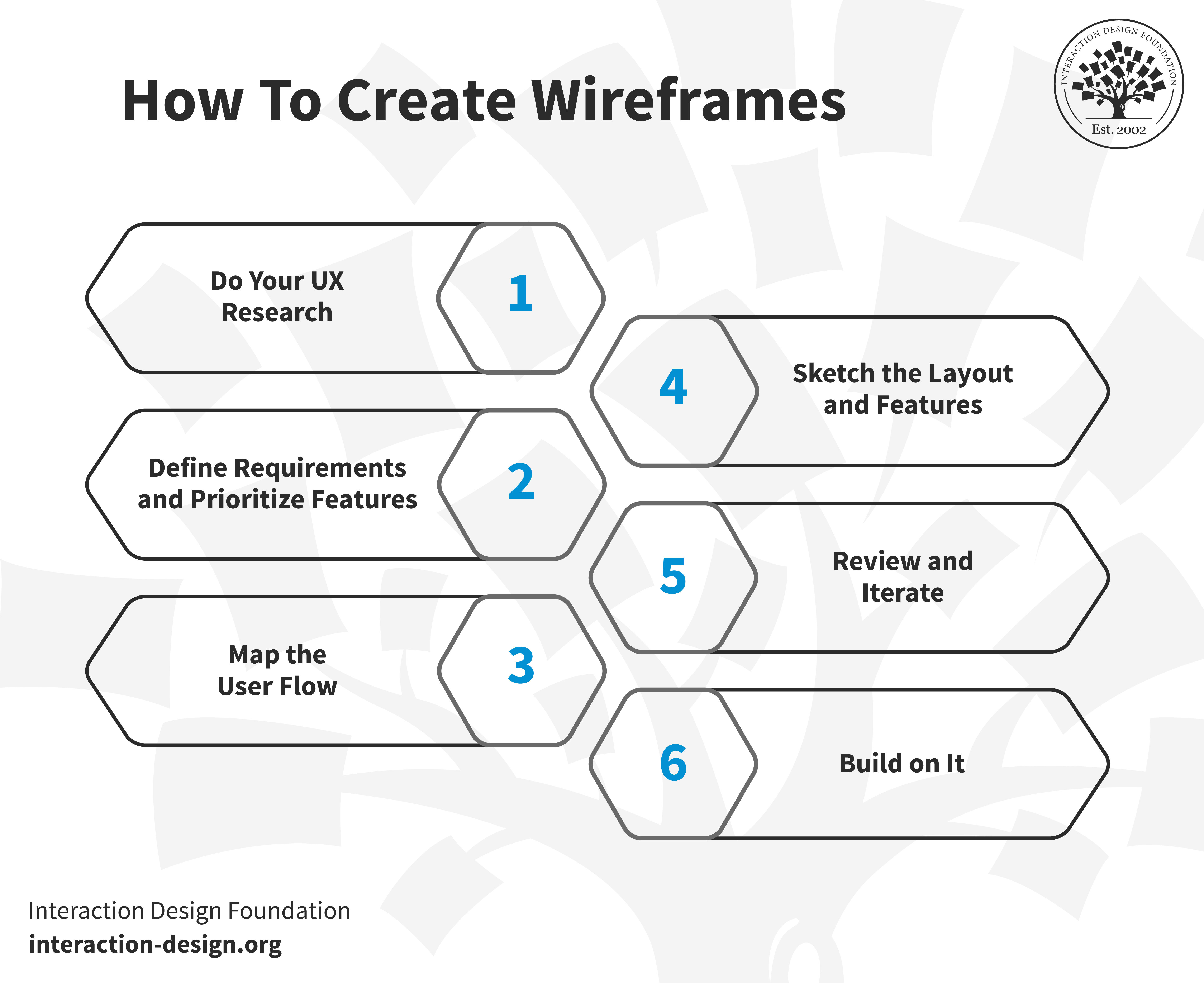
Before you get to sketching, you’ve got to understand your target audience and business well, so be sure to start your UX research from the perspective of your target audience and look at some questions and keep them well in mind about your users, like: What motivates them? What holds them back? Which products resonate with them? If you get tools like user personas or the jobs-to-be-done (JTBD) framework, you can find them invaluable aids here.
Transcript
Transcript loading ...
As you’re doing this, make yourself familiar with the business side—and understand what you offer, the goals you’ve set, and what your desired outcomes are. This may call for input from your clients or employer brand, but the main point is to balance user needs with business objectives in your wireframe.
Step 2: Define Requirements and Prioritize Features
After you’ve completed your UX research, the next step is to narrow down what to build and here’s where you will need to involve stakeholders or the product owner. They’ll help translate broad user needs into specific features.
For instance, if your brand wants to improve user engagement on its e-commerce site, you can learn from stakeholders about what features align with user needs and business goals if you’re to design a “Recommended Products” section.
You’ll find this step a crucial one for deciding what elements will make it to the wireframe, so do list prioritized features to help you focus on what’s most important for users and the brand—and it’ll help guide the design process.
Step 3: Map the User Flow
Now you’ll need to envision how a user’s journey on your platform will go, and a user flow is the blueprint for that. If it’s an e-commerce site, a user’s path might begin at the homepage, move to a product search, then select a product, make a payment, and—last, but not least—get an order confirmation. When you’ve got these steps clear in your mind, you’ll be better able to highlight necessary features and make good design decisions from there.
Step 4: Sketch the Layout and Features
Congratulations—you’ve got the user research and project requirements well in hand, so now it’s time to go ahead and sketch the wireframe, so pick a fitting canvas size and start to position elements. Think of it like piecing together a puzzle, and you can shift components until you’ve got a nice and intuitive, user-friendly design in front of you, and as you’re working on this, think about some things like information architecture, interactive elements, static elements, and your fidelity choice. For information architecture—IA, for short—focus on how to organize the content and prioritize information based on its significance. For interactive elements, highlight buttons, links, and other clickable items; while for static elements, don’t forget foundational parts like headers, footers, or menus. As to fidelity level, do you want low-, mid-, or high-fidelity (it’ll largely depend on how early on you are in your design process to work out the detail level of this)?
Step 5: Review and Iterate
Now, it’s time to share your wireframes and get that vital feedback in from stakeholders—and they can, and maybe should, include business professionals and developers. You could run “bona fide” usability tests on your wireframes, too, and see what users make of them. When you collect feedback and gather insights in from users, you can frame your questions so they include broad insights and specific details, and—to help things along in a big way—if you’ve got a variety of wireframe versions, let reviewers pick their favorites.
Here, collaboration is a vital thing—and you, dear UX designer, are a champion for the user’s voice and advocate for a user-centered design while brands have objectives and developers focus on the feasibility side of things. In any case, user testing wireframes is invaluable before you and your team get deep into design or development—wireframes work as a tangible product for users to interact with, early-stage testing that can spot potential usability issues, layout problems, or unclear navigation paths before things start costing.
Step 6: Build on It
Once you’re all agreed on the wireframe design, you can move on to make detailed mockups and interactive prototypes—and then kick things up a gear or three so you can transform them into minimum viable products (MVPs) so you refine the user experience towards a final product that’s both functional and user-centric.
Watch this video to learn about the minimum viable product and how to scope out the MVP:
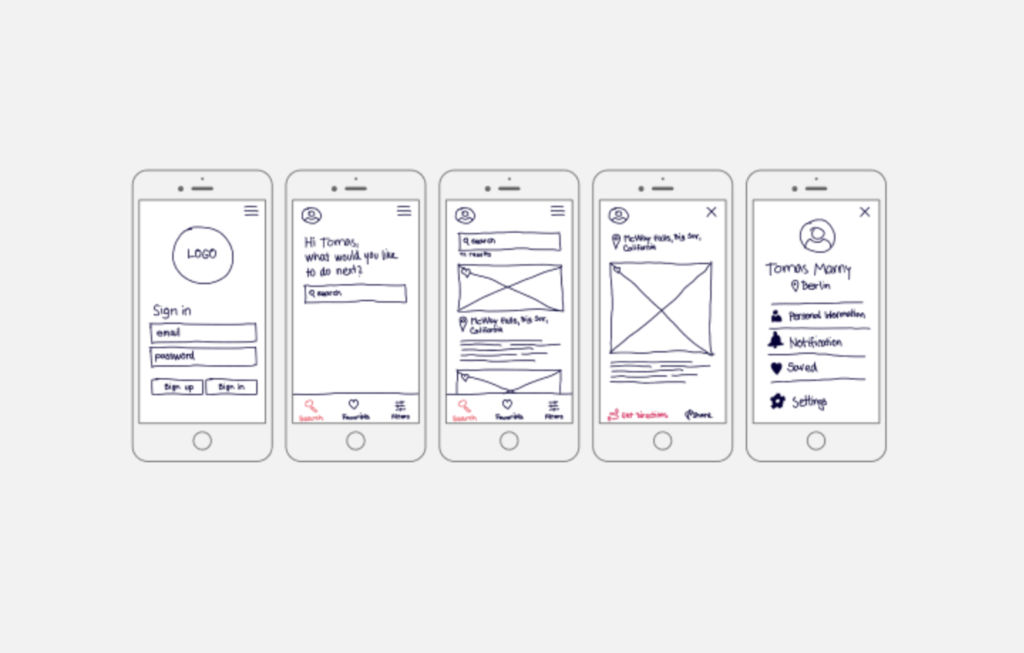
This is a hand-drawn app wireframe with detail, and—despite the point it’s got limited detailing, doesn’t capture specific UI nuances or interactions, and isn’t so suitable for complex app structures with multiple layers—it gives context for each step and uses grids for structure. It emphasizes the mobile-first approach, focusing on essential features, and it’s quick to draft and foster iterative design.
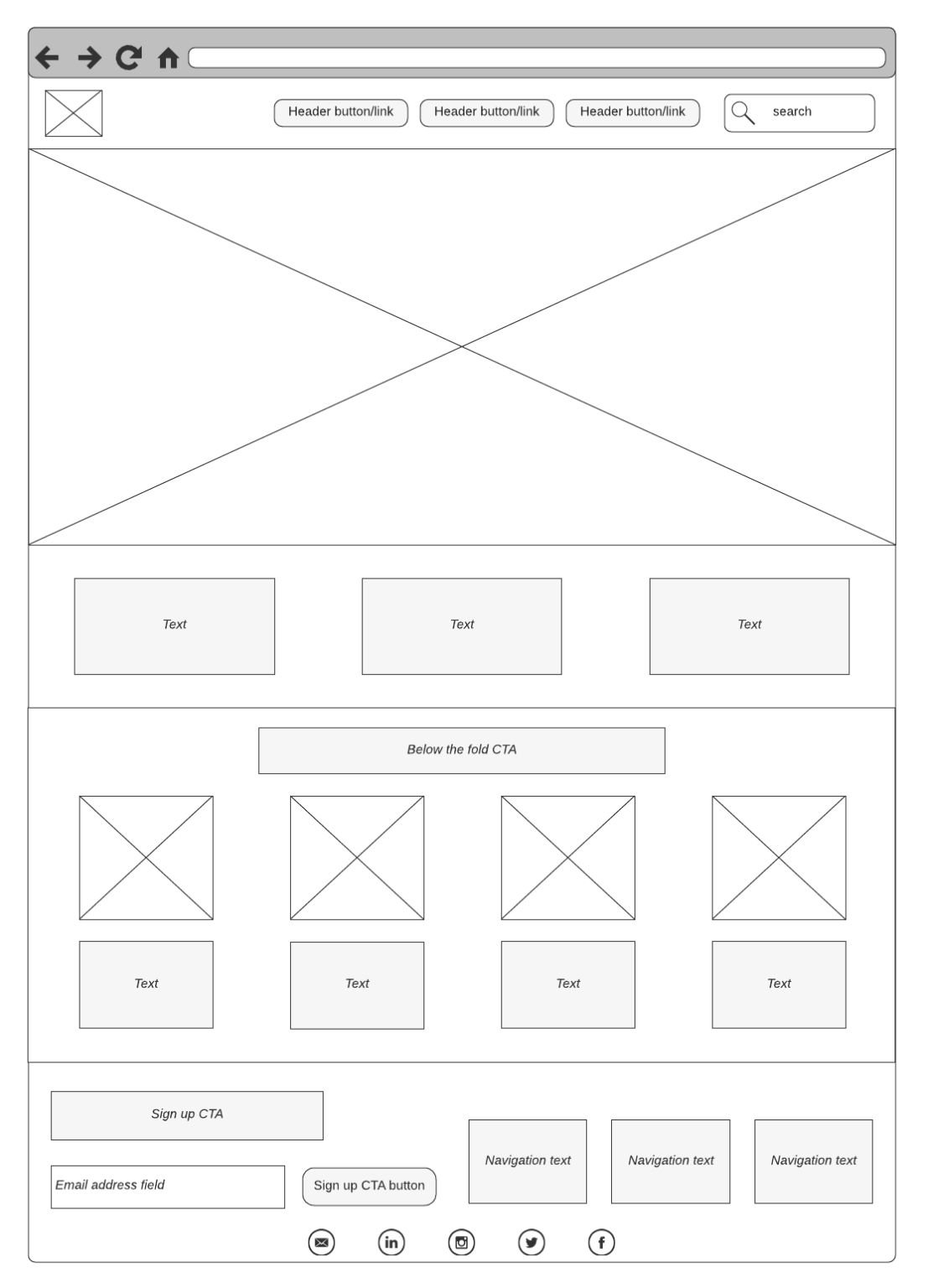
A straightforward digital wireframe example above, this one uses basic tags for description. Empty boxes in the wireframe with crossbars indicate image spots in the UI, and—with its distinct placeholders that indicate where images will be, a straightforward layout that supports content-focused designs like blogs and product listings, and a minimalistic design that helps prioritize content hierarchy—this wireframe is an ideal one for blogs and primary eCommerce sites.
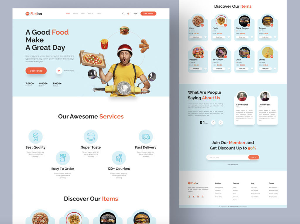
A complete wireframe showcasing text, buttons, colors, and images, this one provides a preview of the site’s final look before development. It’s fully detailed with copy, imagery, and design elements, it’s ready for stakeholder review, and it neatly embraces the brand's colors, imagery, and voice for an authentic feel. Last—but not least—a comprehensive representation provides a clear vision for developers. A detailed vision of high-fidelity wireframes reduces ambiguities during the development phase, and it leads to a smoother project flow.
The Take Away
A crucial preliminary step in UX design, wireframing helps in the visualization and planning of a product's structure, and you need a clear understanding of elements, types, and appropriate use cases to create better wireframes—and you've got wireframing tools like Figma, Mockflow, and Lucidchart to support your efforts to make wireframes that work as foundational deliverables for your design process.
You’ve got a step-by-step guide in the form of do your UX research, define requirements and prioritize features, map the user flow, sketch the layout and features, review and iterate, and—last, but not least—build on it.
Wireframe examples also help as stepping stones toward creating the best wireframes of each type for your purpose. In any case, the choice of wireframing—and prototyping—tools can have a great influence on how easy and efficient your design process turns out to be, so it’s vital to pick the right one when you know what your goals are. Effective wireframing can save you a great deal, serve you well, and go a long way towards creating digital solutions that resonate best in the marketplace.
Feel Stuck? Want Better Job Options?
AI is replacing jobs everywhere, yet design jobs are booming with a projected 45% job growth.
With design skills, you can create products and services people love. More love means more impact and greater salary potential.
At IxDF, we help you from your first course to your next job, all in one place.