Usability Reports

Your constantly-updated definition of Usability Reports and collection of videos and articles.
Be a conversation starter: Share this page and inspire others!

98 Shares

What are Usability Reports?

Usability reports are comprehensive documents that summarize the findings, observations and recommendations of usability testing. Researchers create them to provide valuable insights into how users interact with a product or service, identify usability issues and suggest potential solutions. Designers can then enhance a product’s or service’s usability and overall user experience. 

An illustration of a usability report.

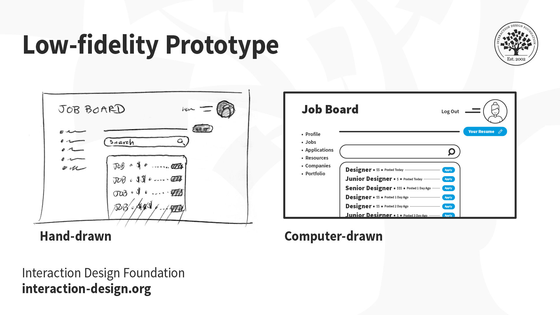
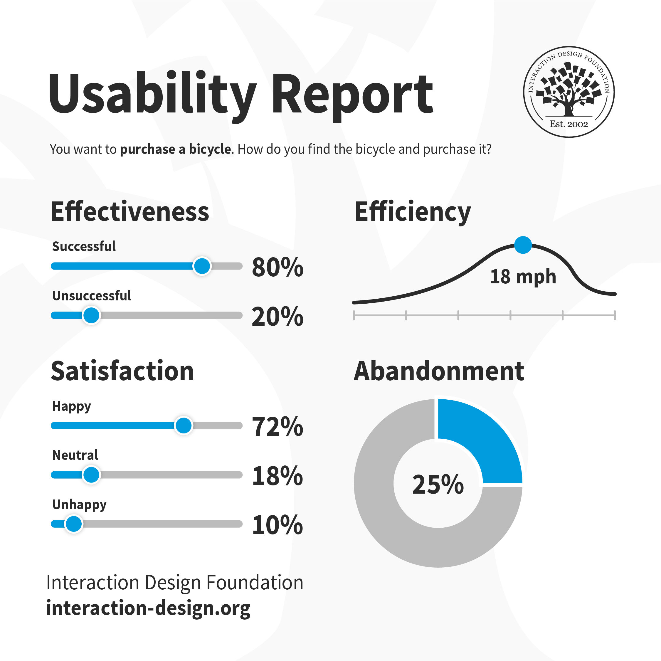
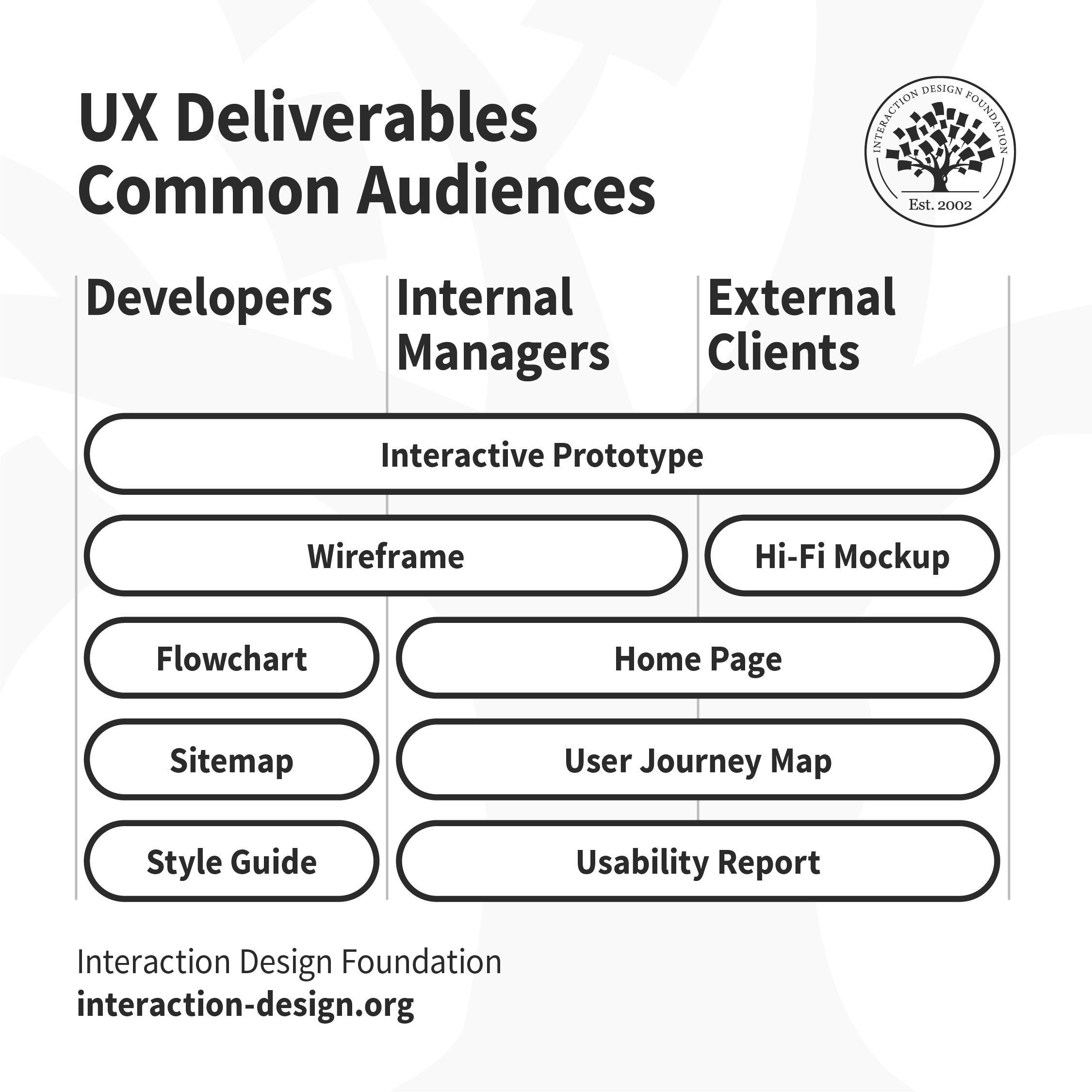
A simple representation of a usability report, to illustrate the value of such reports.

© Interaction Design Foundation, CC BY-SA 4.0

Why are Usability Reports Important in UX Design?

Usability reports play a role that’s crucial in user experience (UX) design. When researchers or designers create them—and do it properly—these provide valuable insights into how usable a digital product is for the target audience. So, these reports help designers and researchers spot usability issues and address them.   

Usability reports come from usability testing—that’s when users test a design solution or prototype. The reports present a comprehensive analysis regarding how users interacted with a digital product—like a website or an app.  They also highlight areas for improvement, and they suggest actionable solutions. These reports are an essential means to inform design decisions, validate user needs and ensure a positive user experience. Above all, reports on usability are an essential check to ensure the design team and product manager have a strong sense of empathy with users in the target audience. 

This video explains the importance of empathy for users in design: 

Transcript
 

What do Usability Reports Show?

A usability report typically includes sections like a background summary, methodology, test results, findings and recommendations. It may feature visual content like screenshots and video clips, too—to illustrate specific points. These reports present the data and insights in a way that’s structured and organized. So, they let stakeholders understand the user experience—and so make informed decisions for product design improvement. These reports are particularly valuable since they show: 

  1. Usability issues: Usability reports show up specific issues and problems that users encountered while they were interacting with a product or website. These problems can range from navigation difficulties, to confusing layouts or unclear instructions. 

  1. User behavior: Usability reports show how users navigate, interact and engage with a product—like an app or a website. This includes their pathways, actions and patterns of behavior that turned up during usability testing. 

  1. Success rates: These reports show the users’ success rates in completing specific tasks or scenarios. This metric indicates the effectiveness of the design—and how well it supports users as they make their way to achieving their goals. 

  1. Task time: Usability reports give insights into the time it takes for users to complete tasks or scenarios. This metric helps determine the efficiency of the design—and whether users can accomplish their goals quickly. 

  1. User satisfaction: Usability reports include user satisfaction ratings—ratings which researchers obtain through questionnaires or interviews. This feedback helps gauge user satisfaction levels and identify areas that need improvements, such as in terms of a product’s visual design

Benefits of Usability Reports

Some key benefits to UX designers, researchers and stakeholders are: 

Data-Driven Decision-Making

Usability reports provide objective data and insights that really inform design decisions. When designers base decisions on user feedback and observations, they can create more user-centered and effective solutions, and gear them around more accurate tools such as user personas

Image of a persona, including picture and details.

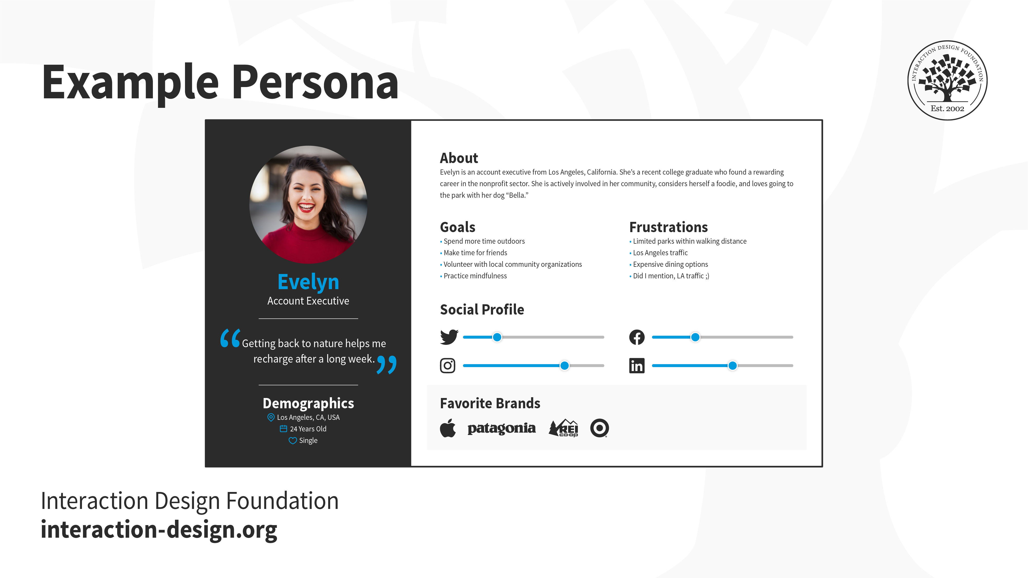
Good user personas help designers build around accurate visions of their target audience, which can translate to better results when they get to usability test their designs.

© Interaction Design Foundation, CC BY-SA 4.0

Improved User Experience

Usability reports help identify and address usability issues—and that leads to an improved user experience. If designers understand user needs and behavior—and thoroughly so—they can make informed changes that improve usability and satisfaction through a greater sense of empathy. 

Enhanced Product Quality

Usability reports both highlight areas of improvement and suggest actionable recommendations to follow. And when designers implement these recommendations, it improves the overall quality of their product. Another point is that it reduces user frustration and increases satisfaction, too. 

Cost and Time Savings

Since they identify usability issues early in the design process, usability reports help save a great deal of time and resources. To address usability issues during the design phase is something that’s more cost-effective than to make changes later in the development cycle.

Illustration of common deliverables in UX design.

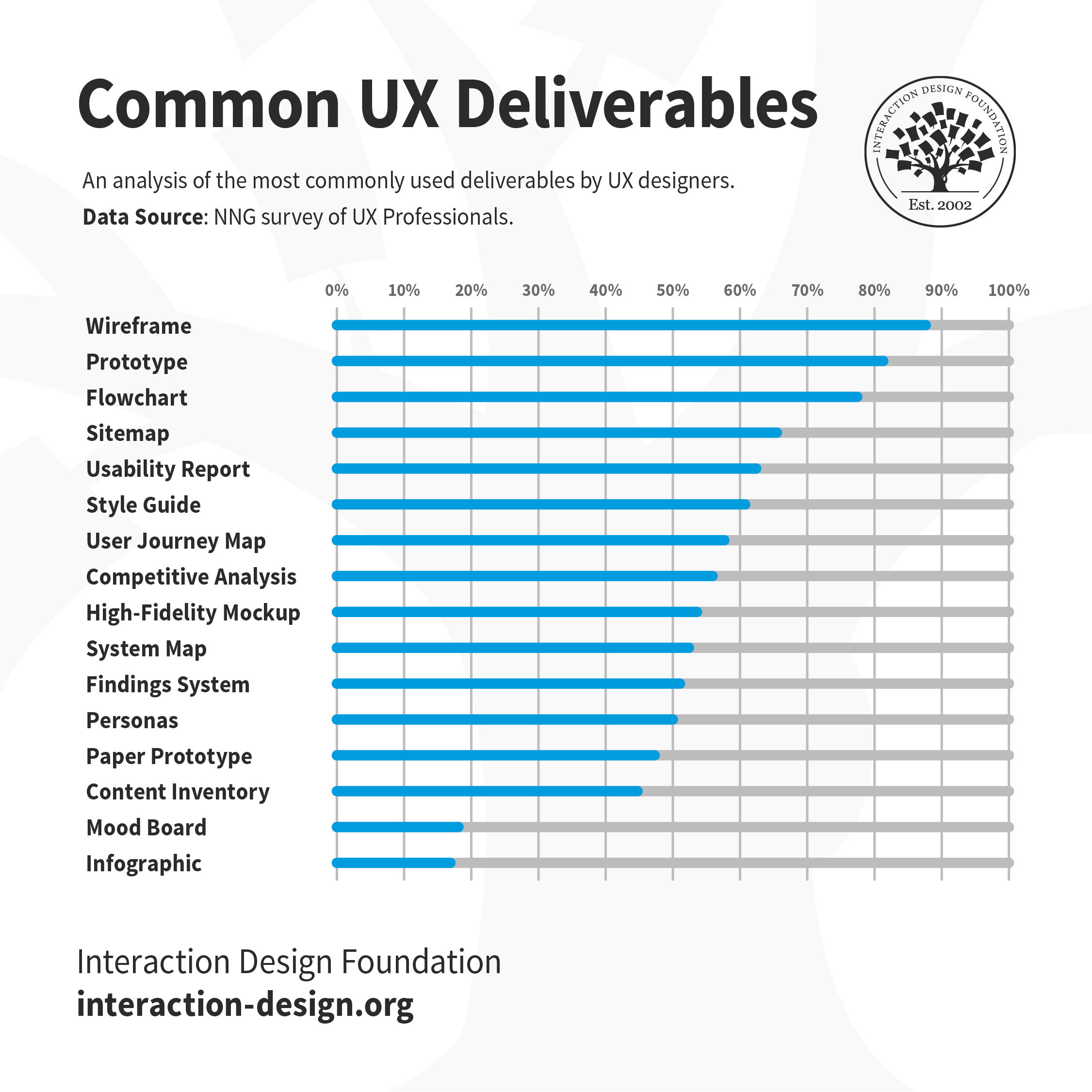
Usability reports are among common—and essential—UX deliverables, and are especially valuable aids to prevent unnecessary costs in product development.

© Interaction Design Foundation, CC BY-SA 4.0

What Challenges are involved with Usability Reports?

Potential challenges for researchers, designers and design teams include: 

  1. Interpretation of data: If a designer or a design team misinterprets the data that comes from usability testing, it can lead to incorrect conclusions and misguided design decisions. This data can be hard to analyze and interpret accurately—and it’s crucial to adopt a user research mindset and thoroughly analyze and understand the data, to avoid drawing conclusions that are erroneous. 

  1. Communication of findings: It can be hard to present the findings and recommendations clearly and concisely. It calls for effective communication skills to make sure that stakeholders understand the implications—and importance—of the usability issues that arise. 

  1. A balance of objectivity and subjectivity: Usability reports have a firm grounding in objective data. Even so, they call for subjective interpretation as well. And it’s essential to strike the right balance between objectivity and subjectivity—to provide accurate and actionable insights

  1. Overemphasis on usability testing: To rely just on usability reports may result in a narrow focus on usability issues. The risk is then that a design team might neglect other aspects of the user experience, such as how users feel in their emotional engagement with the design solution or its aesthetic appeal. It’s important to consider a holistic approach to UX design and the right types of usability tests for the project. 

Author and Human-Computer Interaction Expert, Professor Alan Dix explains the connection between emotion and usability: 

Transcript
 

  1. Resistance to change: Usability reports may reveal issues that challenge stakeholders' preconceived notions or that call for major changes to the design. It’s something that can lead to resistance to change and a reluctance to implement the improvements recommended. Notions of this sort come from real-world constraints—like budget, the inability to see what the design focuses on ideally, or an array of other matters. 

  1. Limited sample size: Usability reports typically have their basis resting on a small sample size of participants. While this does give valuable insights, it mightn’t capture the full range of users’ perspectives and behaviors. It’s important for designers to think about the limitations of the sample size when they interpret their findings. 

In Which Contexts do Usability Reports Work Best?

Usability reports are at their most effective in these contexts: 

Product Development

Usability reports play a crucial role here. For product teams, these reports bring insights that inform design decisions, guide improvements and validate the user experience. 

Iterative Design Process

Usability reports are particularly valuable here—as they help identify usability issues early on, which allows for iterative improvements and makes sure a user-centered design approach is a reality. 

User-Centered Design

Usability reports are vital in a user-centered design approach—and they provide evidence-based insights into user behavior, needs and preferences. This helps designers—including user interface (UI) designers—create products that really meet user expectations.

Cross-Functional Collaboration

Usability reports make cross-functional collaboration easier—and that’s because they provide a common language and understanding of the user experience. They help bridge the gap between designers, developers and stakeholders—and so nurture collaboration and goals that they share. 

UX Designer and Author of Build Better Products and UX for Lean Startups, Laura Klein explains the value of cross-functional teams in this video: 

Transcript
 

Examples of Good Usability Reports

Good usability reports provide clear and actionable insights—ones that drive improvements in the user experience. Here are a few examples of elements that make a usability report particularly effective: 

Clear Problem Statements

Good usability reports clearly define and articulate the problems that users really encounter. The problem statements are specific and concise, and stand on evidence from the usability testing. A problem statement is also called a Point of View (POV) and appears like the following: 

__(User)__ needs to __(user’s need)__ because __(insight)__. 

So, for example, a usability report could reveal that:  

“Mobile users need to have larger buttons because 23% of them accidentally pressed two at the same time.”  

Prioritized Recommendations

Usability reports prioritize recommendations based on the severity and impact of the identified issues. This helps stakeholders understand which problems need immediate attention and which ones design teams can address later. 

A list or chart showing recommendations.

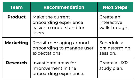
Recommendations clearly capture what to do, so team members can act.

© User Interviews, Fair Use

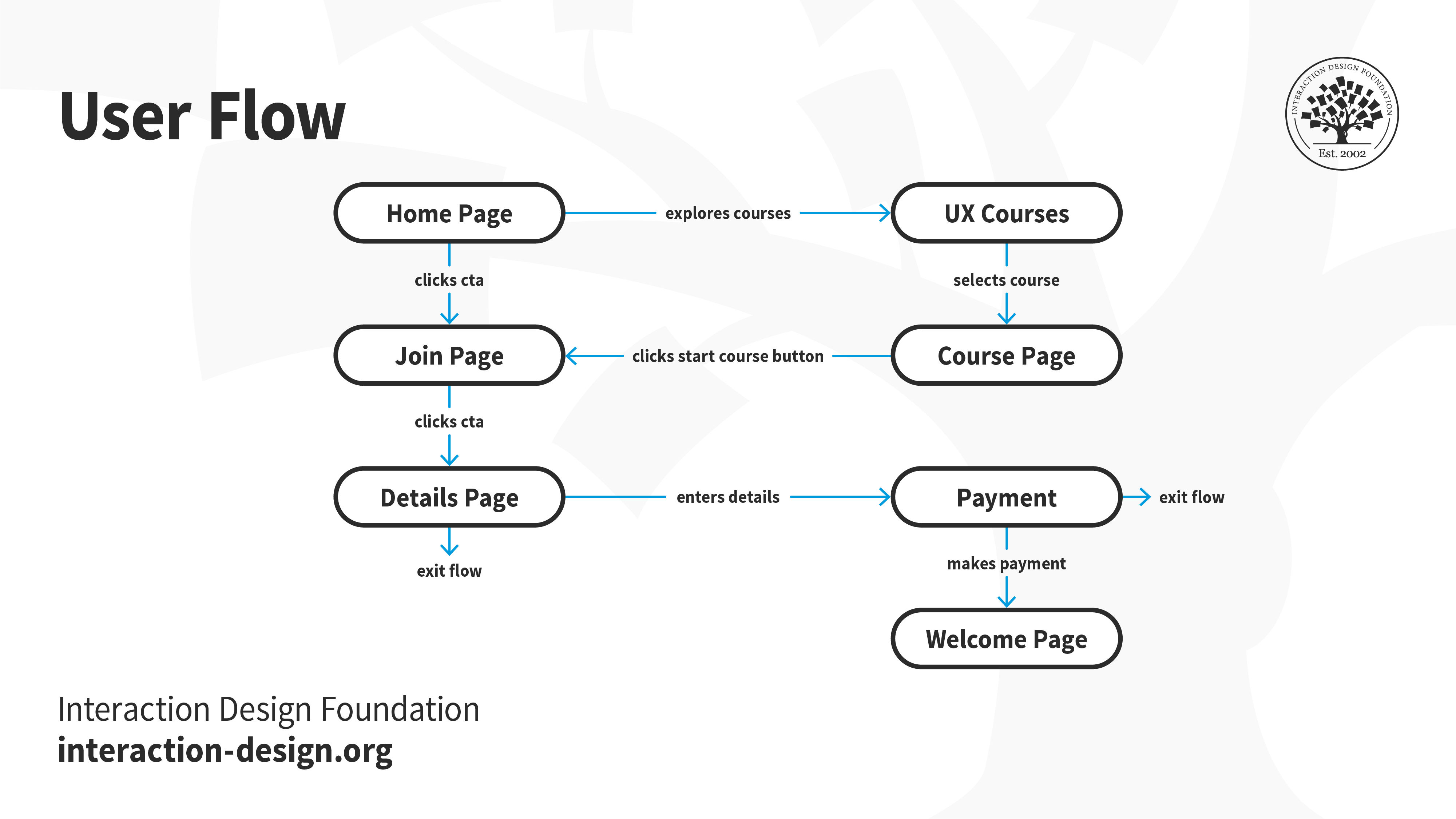
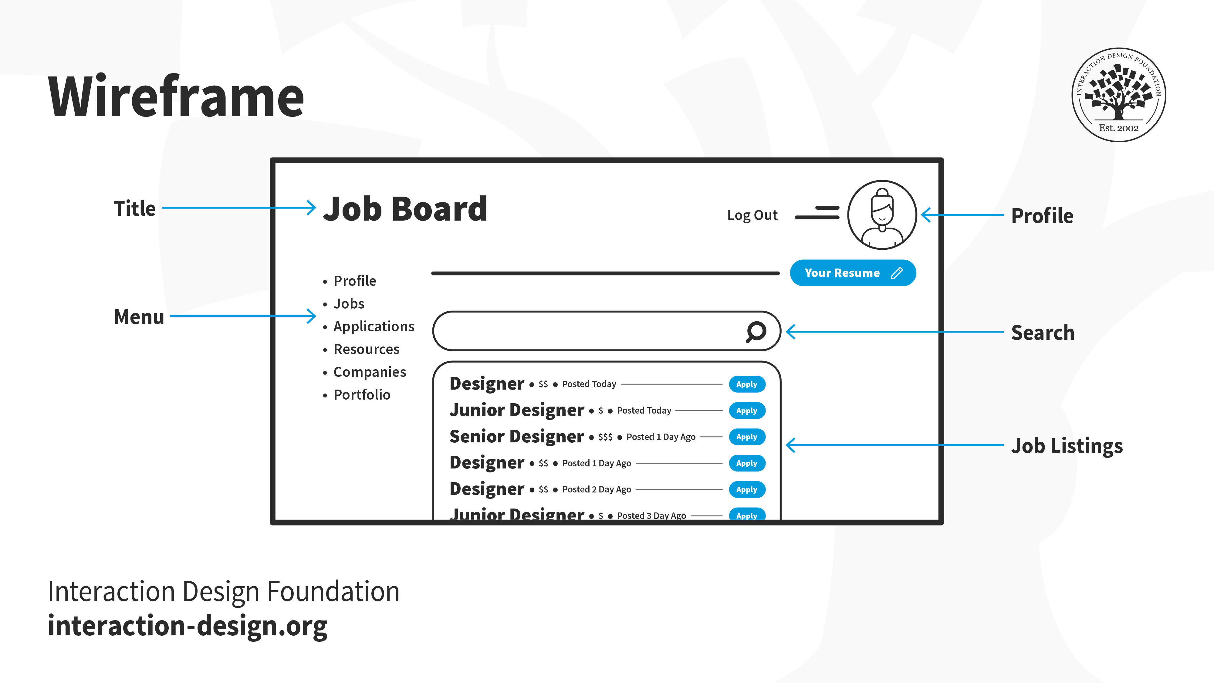
Visual Illustrations

Good usability reports include visuals such as screenshots or video clips to illustrate specific problem areas. These visuals make it easier for stakeholders to understand the issues and visualize potential solutions. 
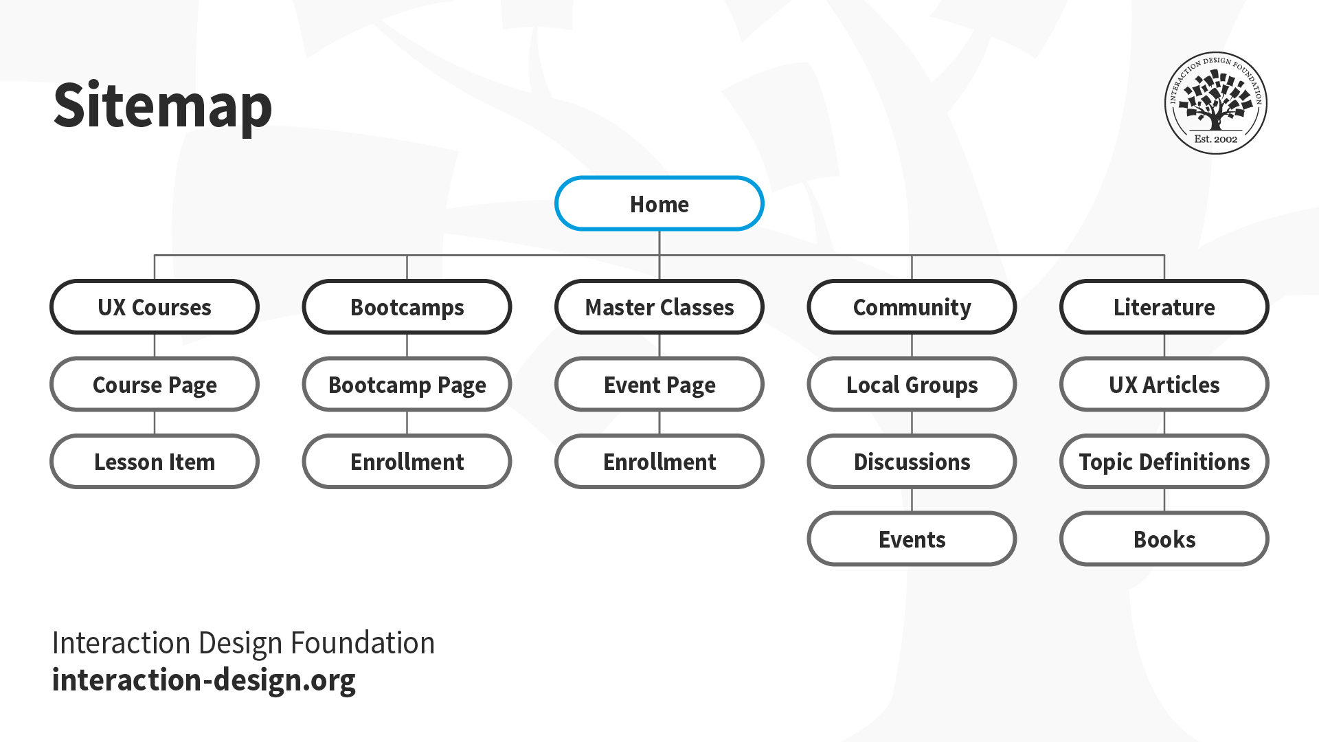
Structured Format

Usability reports follow a structured format, with sections that provide background information, methodology, test results, findings and recommendations. This format is something that makes the report easier to navigate and make sense of. 

An image showing an overview.

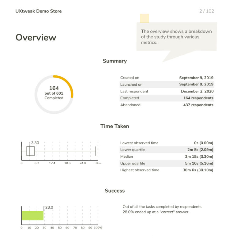
Usability reports call for a clear structure, so they can transmit important data quickly and easily—as this UXtweak overview shows.

© Daria Krasovskaya, Fair Use

It’s important to note that usability reports can sometimes call for improvements—and the earlier, the better. Ineffective reports often lack clarity. Or they fail to provide actionable insights, or they might show their information in an unstructured way. And if they do have vague problem descriptions, a lack of recommendations, unorganized data or a lack of visual support, their report writers should revisit them—and correct these flaws as soon as they can.   

How to Write a Usability Report

It takes careful planning and execution to make a report that’s well-structured and informative. Here’s a step-by-step process to the report-writing process: 

Step 1: Define the Scope and Objectives

Before usability testing begins, UX designers or researchers should clearly define the study’s scope and objectives. They need to determine the specific research questions they want to answer and the metrics they’ll use to measure usability. 

Step 2: Conduct Usability Testing

Now it’s time to test with representative users and use a combination of qualitative and quantitative research methods. It’s vital to collect data on success rates, task time, error rates and user satisfaction ratings. What’s more, it’s essential to record observations, problems and participants’ comments. 

Step 3: Analyze the Data

Designers or researchers now need to carefully analyze the data they collected during usability testing. They should look for patterns, trends and common issues. It’s important to categorize the problems by severity and consider their implications for the overall user experience. 

Professor of Human-Computer Interaction at University College London, Ann Blandford explains pitfalls to beware of in analysis. 

Transcript
 

Step 4: Structure the Usability Report

Next comes the structuring of the usability report—and doing it in a format that’s logical and easy to follow. Here, it’s vital to include sections such as background summary, methodology, test results, findings and recommendations. Tables, visuals and examples to present data and illustrate problem areas are invaluable tools for this activity.  

Step 5: Present Findings and Recommendations

Now it’s time to clearly communicate the findings and recommendations based on the data analysis. Researchers or designers should provide specific problem statements—and suggest actionable solutions. It’s important to think about the severity and wider impact of each problem—to prioritize recommendations. 

Step 6: Incorporate Visuals

Next comes the incorporation of visuals—like screenshots and video clips—to make the usability report even better. These visuals help stakeholders visualize specific areas of concern and understand the user experience more thoroughly. 

Step 7: Implement Recommendations and Retest

Last—but not least—it’s time to use the findings and recommendations from the usability report to make improvements to the product or website. It’s vital to prioritize the recommendations based on their severity and wide—or global—impact. Designers or researchers should remember to retest their design’s usability after they’ve implemented the changes—so they can validate the improvements. 

Image showing 3 mobile phones with text and screen color differences.

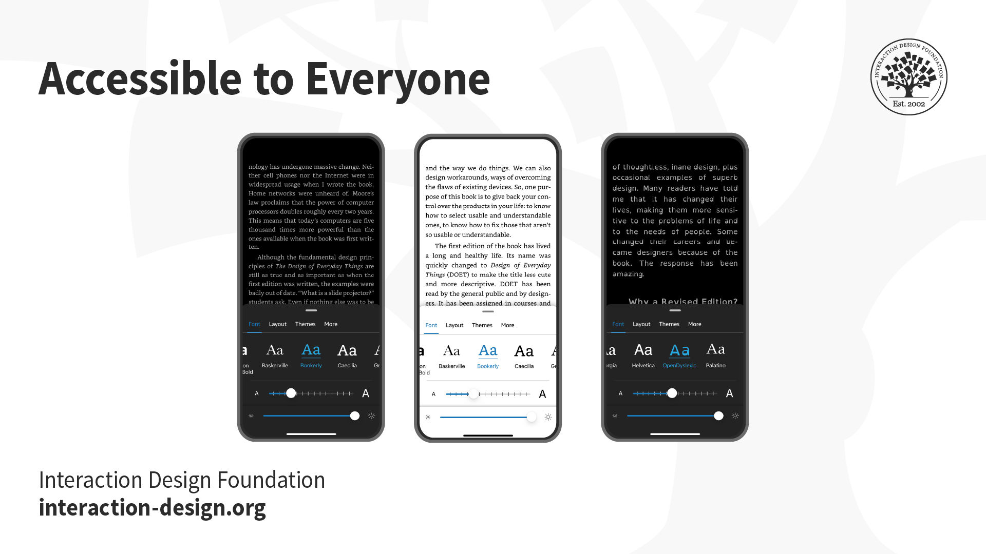
Issues about accessibility—an often-overlooked but essential part of design—can frequently crop up in usability reports. Design teams and stakeholders really need to make sure that their products are usable for everyone.

© Interaction Design Foundation, CC BY-SA 4.0

Tips to Create and Use Usability Reports in UX Design

Consider the following tips: 

Plan Ahead

Define the scope and objectives of the usability study before testing—it’s crucial. This makes sure that the usability report actually does address the specific research questions and provide valuable insights. 

Be Data-Driven

Base findings and recommendations on objective data that comes in during usability testing. It’s vital to keep personal biases and subjective opinions from getting in the way when analyzing the data.  

An image of a usability report.

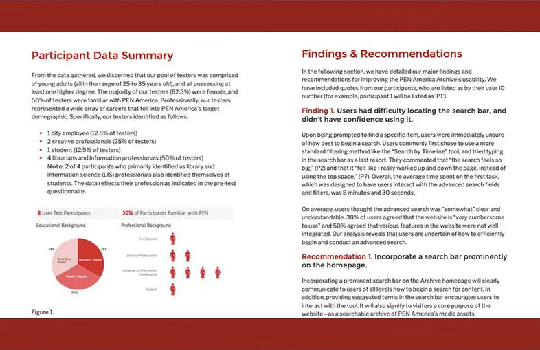
The Pratt Institute’s Usability Report on PEN America’s Freedom to Write—a fine example of a thorough, yet readable report.

© Pratt Institute, Fair Use

Prioritize Recommendations

It’s vital to prioritize these according to their severity and impact. So, researchers or designers—or report writers—should address those critical and serious usability issues first. Clear and actionable recommendations should be specific and feasible, and they must have a solid basis in data-driven insights. 

Communicate Effectively

Clear and concise language is critical—the only way to communicate findings and recommendations in the usability report. The report writer should incorporate visuals and examples to raise the levels of understanding and engagement. Stakeholders, design team members, members of the development team and anyone else involved in the design project need a clear point of reference to turn to in a report. It’s also important to tailor the report to the audience’s specific needs and knowledge level. 

Iterate and Improve

Design teams should use usability reports as a starting point for design improvements that are iterative—and it’s critical to implement recommendations, retest and continuously collect user feedback to refine the user experience. 

A diagram showing three circles that intersect in a common area.

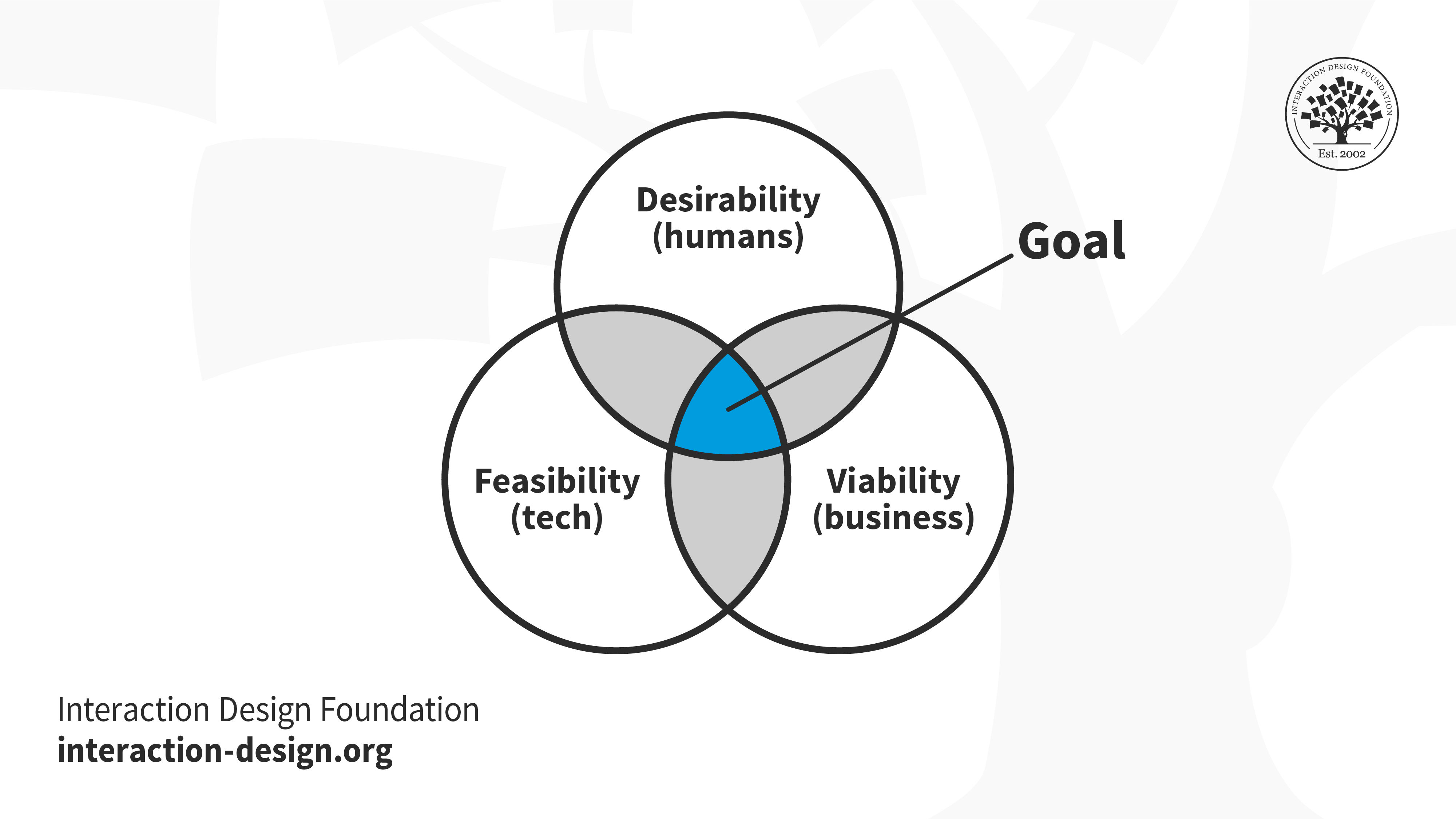
The area to aim for with design solutions, and the improvements design teams implement, should be in this spot.

© Interaction Design Foundation, CC BY-SA 4.0

Keep a User-Centered Approach

Usability reports should reflect a user-centered design approach. They should focus on the needs, preferences and behaviors of the target users. A report should prioritize user feedback and make sure that design decisions run in line with user expectations across all aspects—like a mobile app’s information architecture, for example. 

Reflect a Holistic Understanding of the User Experience

Usability reports should consider the holistic user experience. That includes emotional engagement, aesthetic appeal and overall satisfaction. A narrow focus solely on usability issues may overlook other important aspects of the user experience, such as the wider expanse of the user flow and the various touchpoints of a user journey. 

An illustration of a Bootcamp customer journey map.

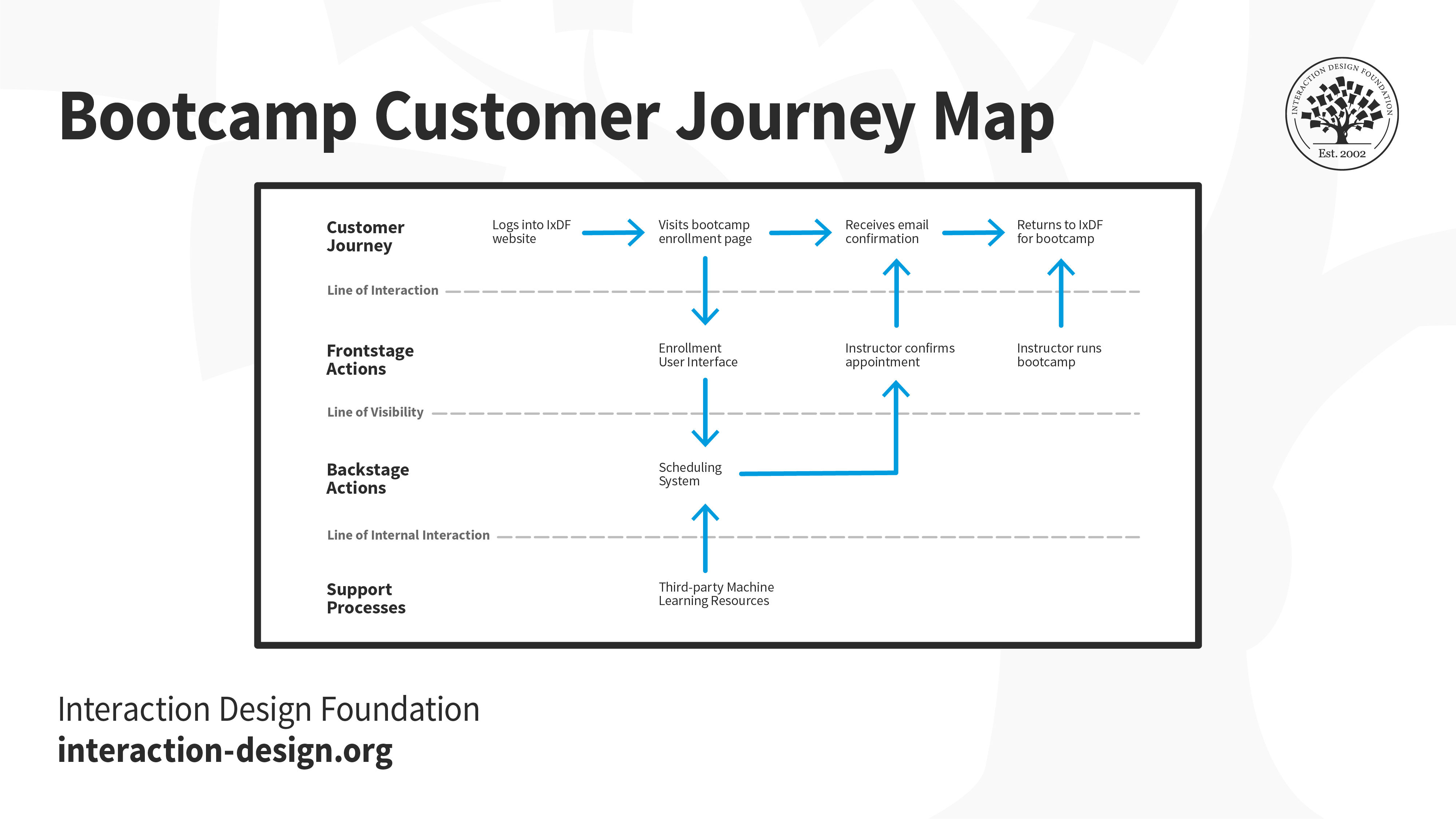
An example of a customer journey map reveals key areas to watch, to meet user expectations in a design.

© Interaction Design Foundation, CC BY-SA 4.0

Overall, usability reports can be challenging but are highly rewarding, essential parts of the design process. The more clearly they transmit accurate findings to everyone concerned in a design project, the better placed a design team will be to make the best iterations possible, and so ensure a digital product or service that will truly resonate with the target audience. 

An image showing three screens, two of which are mobile screens.

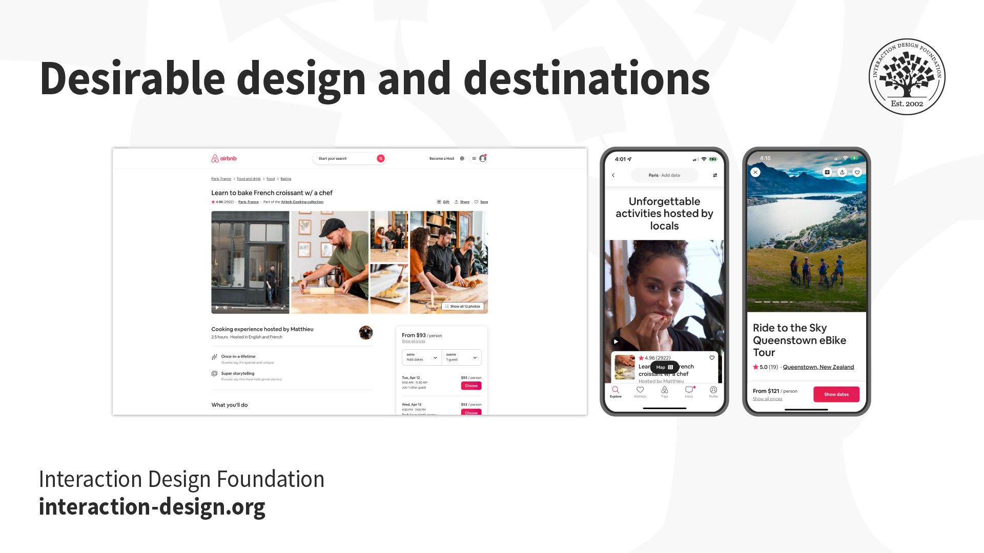
Usability is a core part of design, but it’s important to remember the desirability factor too.

© Interaction Design Foundation, CC BY-SA 4.0

Questions About Usability Reports?
We've Got Answers!

Who reads usability reports?

Project managers, UX designers, developers and business stakeholders commonly read usability reports. These professionals seek to understand user interactions with products so they can find areas for improvement.  

Marketing teams also benefit from usability reports, and they use these insights to tailor marketing strategies and raise the levels of customer engagement. The data from usability reports guide teams so they can make truly informed decisions about product design, development and marketing strategies. 

For designers and developers, usability reports serve as a roadmap for them to refine their products to meet user needs better. Business stakeholders use these insights for strategic planning—and so make sure that product development runs in line both with market demands and with user expectations. 

Take our Master Class How to Get Started with Usability Testing with Cory Lebson, Principal and Owner of Lebsontech LLC.

Can you automate the data collection for usability reports?

Yes, you can automate the data collection for usability reports. Automation tools and software track user interactions on websites and applications, capturing data on clicks, scrolls, navigation paths and time users spend on various elements. This technology allows teams to gather vast amounts of data without manually observing each user session. Tools like heatmaps, analytics platforms and session recorders automate the process—and show insights into user behavior patterns and potential usability issues. 

While automation helps to collect quantitative data, qualitative insights such as user feedback and interviews still call for a human touch to understand the context behind the behaviors. 

UX Strategist and Consultant, William Hudson explains the value of analytics in this video: 

Copyright
Transcript
 

How long should a usability report be?

The length of a usability report varies—it depends on the project’s complexity and how much data gets collected. Generally, aim for a report that’s concise yet comprehensive—typically between 5 and 20 pages. Be sure it includes an executive summary, key findings and actionable recommendations—and focus on clarity and brevity to make sure that stakeholders can quickly understand and act on the report's insights. To include visuals like graphs and heatmaps can also help convey information efficiently, and allow for a shorter, more impactful report. 

Take our Master Class How to Get Started with Usability Testing with Cory Lebson, Principal and Owner of Lebsontech LLC. 

What formats work best for sharing usability reports?

The best formats for sharing usability reports include PDFs, slide presentations and interactive dashboards. PDFs offer a universal format that’s easy to distribute and makes for consistent viewing whatever the device. They work well for comprehensive reports that detail findings, recommendations and visuals like graphs and heatmaps. 

Slide presentations—using tools like PowerPoint or Google Slides—allow for a more visual and succinct summary of key findings. They’re ideal for presenting to stakeholders in meetings, and they focus on high-impact insights and actionable recommendations. 

Interactive dashboards give a dynamic way to explore data—and tools like Tableau or Google Data Studio enable stakeholders to interact with the data, filter results and drill down into specific areas of interest. Dashboards are especially useful for ongoing projects where data regularly updates. They offer a real-time view of user behavior and usability metrics. 

Each format has its advantages, and the choice depends on the audience's needs, the report's complexity and the intended use of the findings. It can also be effective to combine formats, and ensure that the report reaches and engages a wider audience. 

Watch as CEO of Experience Dynamics, Frank Spillers explains the value of user research in our course promo for User Research: Methods and Best Practices: 

Transcript
 

What do you do if stakeholders ignore the usability report?

If stakeholders ignore the usability report, first ensure they understand its value. Schedule a meeting to discuss the findings and emphasize how these insights can improve the product, increase user satisfaction and potentially lead to higher revenue or reduced costs. Use language that’s clear and concise—and focus on the most critical issues, ones that directly impact business goals. 

Offer a summary or presentation that highlights key points if the report’s lengthy or technical. Visual aids—like graphs and videos—can also help convey the message more effectively. 

Think about asking for feedback on the report format and content. Stakeholders might need information presented in a different way to engage with it better. 

If the report indicates urgent issues, stress the potential consequences of inaction—like decreased user engagement or negative feedback. This can motivate stakeholders to take the findings seriously. 

Last—but not least—build relationships with stakeholders by involving them in the usability testing process. This inclusion is something that can increase their investment in the results and encourage them to pay more attention to the report. 

Take our Master Class How to Get Started with Usability Testing with Cory Lebson, Principal and Owner of Lebsontech LLC.

How do you measure the impact of changes that designers have made based on a usability report?

Follow these steps: 

  • Set clear goals: Before making changes, define what success looks like. Goals could include to increase user engagement, reduce error rates or improve task completion times. 

  • Use metrics: Identify key performance indicators (KPIs) that are related to your goals. If your goal is to improve navigation, metrics might include the number of pages users visit or the time they spend on each page. 

  • Conduct A/B testing: Implement changes in a controlled environment where some users see the original version (A) and others see the new version (B). This method lets you directly compare the performance of each version. 

  • Collect user feedback: Beyond quantitative data, qualitative feedback from users can give insights into the user experience. Surveys and interviews can show how changes affect users' perceptions—and how changes affect their satisfaction. 

  • Analyze data: Compare the metrics from before and after implementing changes—and look for trends and improvements in user behavior and feedback. 

  • Iterate: If the changes don’t achieve the desired impact, analyze the data to understand why. Use these insights to make further adjustments. 

When you set clear goals, use appropriate metrics and continuously iterate based on feedback, you can gauge the success of your efforts—and effectively so. 

Take our Master Class Design with Data: A Guide to A/B Testing with Zoltan Kollin, Design Principal at IBM. 

What are the essential elements of a usability report?

At its core, the report contains an executive summary, methodology section, findings and recommendations. 

The executive summary gives a concise overview of the report's purpose, key findings and suggested actions to take. It lets stakeholders quickly grasp the report's significance and not need to delve into the details. 

The methodology section details the procedures and tools that saw use in the usability testing, and it includes information on participants, testing scenarios and data collection methods. This section makes sure that the report is transparent and reproducible. 

Findings present the data and observations that arose during testing. They highlight usability issues—like navigation difficulties or unclear instructions. Visual aids like screenshots or graphs often support these insights, and make them easier to understand. 

Recommendations propose solutions to those problems identified. They prioritize issues based on their impact on user experience—and they suggest practical steps to address them. These recommendations guide designers and developers as they make informed decisions to improve the product. 

Take our Master Class How to Get Started with Usability Testing with Cory Lebson, Principal and Owner of Lebsontech LLC. 

What methods do researchers commonly use to gather data for usability reports?

Researchers use various methods to collect data for usability reports, and to make sure they capture how users interact with a product and identify areas for improvement.  

Usability testing participants complete tasks using the product while observers note any difficulties or barriers that these users encounter. This method directly assesses how well users can actually navigate and use the product. 

Surveys and questionnaires let researchers collect quantitative and qualitative feedback from users about their experiences. Users answer specific questions—and provide insights into their satisfaction and areas they find challenging. 

Interviews offer a more in-depth understanding of user experiences. Researchers conduct one-on-one sessions, and ask open-ended questions to explore users' thoughts and feelings about the product in question. 

Eye tracking technology tracks where and how long a user looks at different parts of a product interface. This data helps find out which areas attract the most attention and which ones go unnoticed. 

Heatmaps generate visual representations of where users click, touch or scroll on a digital interface. They highlight the most and least engaging elements. 

Together, these methods provide a comprehensive view of user interaction with the product. They form the basis of a detailed usability report. This report then guides designers and developers as they work to boost the product's user experience. 

Take our User Research – Methods and Best Practices course.

What are common mistakes in creating usability reports, and how can you avoid them?

Common mistakes in the creation of usability reports include to overlook the importance of clear, concise communication and to fail to prioritize findings based on their impact on the user experience. To avoid these, try to follow these guidelines:  

Avoid technical jargon: Use simple language that stakeholders from various backgrounds can understand.  

Be specific and actionable: Instead of vague statements, provide specific examples of usability issues and actionable recommendations for improvement. 

Prioritize findings: Rank the usability issues based on their severity and impact on the user experience.   

Include visuals: Use screenshots, videos and diagrams to illustrate usability issues.   

Summarize key points: Begin with an executive summary that highlights the most important findings and recommendations.  

If you follow these strategies, you can create a usability report that communicates effectively, focuses on actionable insights and guides teams as they work to improve the product's user experience. 

Take our Master Class How to Get Started with Usability Testing with Cory Lebson, Principal and Owner of Lebsontech LLC. 

What are some highly cited scientific articles about usability reports?
  1. Friess, E. (2011). Discourse Variations Between Usability Tests and Usability Reports. Journal of User Experience, 6(3), 102-116. Retrieved from:  

Erin Friess' publication on "Discourse Variations Between Usability Tests and Usability Reports" explores the language discrepancies between usability testing sessions and the subsequent reports generated by novice usability testers. This ethnographic case study delves into the linguistic differences between usability participants during testing sessions and how novice testers present their findings orally in reports. By conducting comparative discourse analyses, Friess investigates the consistency and integrity of usability data as it transitions from testing to reporting stages. The study highlights potential biases in reporting, challenges in data fidelity and the need for broader investigations to enhance the reliability of usability reports in user-based testing scenarios. 

  1. Gray, W. D., & Salzman, M. C. (2009). Damaged Merchandise? A Review of Experiments That Compare Usability Evaluation Methods. Human-Computer Interaction, 25(3), 203-261.   

The publication—by Gray and Salzman (2009)—titled "Damaged Merchandise? A Review of Experiments That Compare Usability Evaluation Methods" critically examines the design of experiments comparing usability evaluation methods (UEMs) in the field of human-computer interaction (HCI). The paper highlights the importance of understanding how small features in experimental design can significantly impact the results and conclusions drawn from usability evaluation studies. By reviewing five experiments comparing UEMs, the authors reveal flaws in experimental design that challenge the validity of conclusions drawn from these studies. This work emphasizes the necessity for researchers and practitioners to carefully consider experimental design to ensure reliable and valid guidance for usability evaluation methods in HCI—ultimately aiming to enhance the quality and integrity of evaluations in interface design. 

What are some highly regarded books about usability reports?

Nielsen, J. (1993). Usability Engineering. Morgan Kaufmann. 

Jakob Nielsen's book Usability Engineering published in 1993 has been highly influential in the field of usability reports. This book provides detailed insights into usability testing and heuristic evaluations. It emphasizes how important quantitative research and data are to support usability methods. Nielsen's work is renowned for its practical guidance on usability practices. This makes it a cornerstone resource for professionals who seek to enhance user experience through effective usability engineering techniques. By combining theoretical frameworks with practical applications, this book has significantly contributed to shaping the usability profession. It remains a valuable reference for individuals involved in designing user-friendly interfaces and systems. 

Earn a Gift Earn a Gift, Answer a Short Quiz!

1
2
3
4
1
2
3
4
Question 1
Question 2
Question 3
Get Your Gift
Interaction Design Foundation logo

Question 1

What is the purpose of a usability report?

1 point towards your gift

  • To find and evaluate participants for user research
  • To decrease production costs and the project timeline
  • To summarize usability testing findings and recommendations
Interaction Design Foundation logo

Question 2

How do usability reports benefit design teams?

1 point towards your gift

  • They provide subjective opinions.
  • They offer data-driven insights for design decisions.
  • They focus on reducing complex visual elements.
Interaction Design Foundation logo

Question 3

Which section is NOT typically found in a usability report?

1 point towards your gift

  • Background summary
  • Financial analysis
  • Methodology

Learn More About Usability Reports

Make learning as easy as watching Netflix: Learn more about Usability Reports by taking the online IxDF Course User Research – Methods and Best Practices.

Why? Because design skills make you valuable. In any job. Any industry.

In This Course, You'll

  • Get excited as you learn the business superpower: user research! Master it, and you'll solve meaningful problems, create better experiences, and drive success in any field. Why? User research empowers you to become a detective of human behavior. You'll discover what people truly need so that you can create products and services they love. You can use user research to reduce abandoned carts in online shopping, improve patient outcomes in healthcare, and solve challenges in any industry. It's easier than you think! With step-by-step guidance, you'll master User Research quickly—no matter your background. Studies show that user research can improve time to market by up to 330% and increase revenue by up to 320%. So get on board, do work you're proud of, and get paid what you're worth.

  • Make yourself invaluable with timeless human-centered skills. At the heart of great design is understanding people: What they need, what holds them back, and what keeps them coming back. As AI becomes part of how teams build and iterate, this deep understanding of people turns AI from a tool into your superpower. Effortlessly transform insights into Return on Investment (ROI) as you design solutions people love. You'll learn to make data-driven decisions that eliminate guesswork as you design products and services based on real user needs. That drives loyalty and outperforms competitors. You'll easily translate research into visuals that win over stakeholders, managers, and clients. Discover exactly what motivates people and build solutions that consistently deliver results.

  • Gain confidence and credibility with hands-on experience in usability testing, contextual inquiries, semi-structured qualitative interviews, and observational methods. Master how to ask the right questions and create actionable personas from your research. You'll plan, conduct, and analyze research in real-world scenarios, fast-tracking your success with 40+ ready-to-use templates like interview guides, affinity diagrams, and customer journey maps. If you want to leave assumptions behind and create with precision, purpose, and impact, this course is perfect for you. If you're interested, we'll even help you build your portfolio around an app, so your new superpowers shine clearly.

It's Easy to Fast-Track Your Career with the World's Best Experts

Master complex skills effortlessly with proven best practices and toolkits directly from the world's top design experts. Meet your experts for this course:

  • Frank Spillers: Service Designer and Founder and CEO of Experience Dynamics.

  • Ann Blandford: Professor of Human-Computer Interaction at University College London.

  • Alan Dix: Author of the bestselling book “Human-Computer Interaction” and Director of the Computational Foundry at Swansea University.

Get an Industry-Recognized IxDF Course Certificate

Increase your credibility, salary potential and job opportunities by showing credible evidence of your skills.

IxDF Course Certificates set the industry gold standard. Add them to your LinkedIn profile, resumé, and job applications.

Course Certificate Example

Be in distinguished company, alongside industry leaders who train their teams with the IxDF and trust IxDF Course Certificates.

Our clients: IBM, HP, Adobe, GE, Accenture, Allianz, Phillips, Deezer, Capgemin, Mcafee, SAP, Telenor, Cigna, British Parliament, State of New York

All Free IxDF Articles on Usability Reports

Read full article
14 UX Deliverables: What will I be making as a UX designer? - Article hero image
Interaction Design Foundation logo

14 UX Deliverables: What will I be making as a UX designer?

What does a UX designer actually produce? Here, we will explore the concept of UX deliverables, a term that describes the outputs of a UX design process during its various stages. The deliverables produced by UX designers vary according to their role in the design team and also depending on the meth

Social shares
1.2k
Published
Read Article

14 UX Deliverables: What will I be making as a UX designer?

14 UX Deliverables: What will I be making as a UX designer?

What does a UX designer actually produce? Here, we will explore the concept of UX deliverables, a term that describes the outputs of a UX design process during its various stages. The deliverables produced by UX designers vary according to their role in the design team and also depending on the methods and tools used by each role. We will provide an overview here of some of the most common types of deliverables.

When you join a UX team, you might find yourself on unfamiliar grounds. Every team has its preferred (or defined) tools, methods and processes. While there is no single, gold-standard UX design process, most teams’ process follows closely with Jesse James Garrett’s 5 elements of user experience. Building up from the most abstract, Strategy, to the most concrete, Surface, each element has a few associated activities. Let’s look at each of these closely, and a few common deliverables associated with them.

Jesse James Garrett's five elements of user experience design depicted as an iceberg, with all but the surface element submerged underwater.

Much like an iceberg, visual design is only the surface of user experience. Underneath, there is so much more including skeleton, structure, scope and strategy. These layers are by no means standalone, and influence each other. Decisions taken at one plane can cascade up or down the layers. There will likely be other considerations that emerge later, which might impact the experience. For example, if the team encounters technical challenges or budgetary constraints during development, they might have to revisit some design decisions.

© Interaction Design Foundation, CC BY-SA 3.0

Tip: Detach Yourself from Your Deliverables

As a UX designer, you will find yourself working on different types of projects, each demanding a unique approach. While you must familiarize yourself with as many tools and methods as possible, in practice, you will likely use only some of them regularly, and others for exceptional cases. No matter which design activity you conduct, remember to detach yourself from the deliverables.

Design is a fluid activity, and you must mentally prepare yourself to adapt to changes — internal, external, known and unknown. For example, you will often find yourself revising your designs after a usability test. This could be at the surface, skeleton or even strategy level. Sometimes your research might reveal new insights that prompt you to reconsider the product’s core value (strategy). Perhaps the technical team runs into a roadblock that makes it difficult to implement your solution (scope). In all these, and many other cases, you (and your team) will need to adapt your design decisions.

As designers — as humans — we tend to get attached to our work and find it hard to change course. The beauty of (and indeed the toughest challenge in) design is to be open to iteration. Always remember, iteration is a crucial part of a UX designer's work, and you will rarely ever create a “final” deliverable in the first attempt. 

User Needs and Product Objectives

“If I had an hour to solve a problem I'd spend 55 minutes thinking about the problem and five minutes thinking about solutions.”

— Albert Einstein

Albert Einstein's words are true for any new project that you begin, and especially so for UX design. When you join a UX team, you might work on a new product, building it from the ground up. Or, you might join at a time when the product is already built and launched and the team is looking to enhance it incrementally. No matter which stage or shape the product or service is in, you will need to dig in and understand the product objectives and user needs before you begin your work. By building (and reading) personas, storyboards and customer journey maps, you can get a better understanding about why you are designing, and for whom.

1. Personas

Illustration depicting a user persona.

© Interaction Design Foundation, CC BY-SA 3.0

A persona is a fictional character which the designers build as a sort of user stereotype. It represents the typical users, their goals, motivations, frustrations and skills. Other information such as demographics and education backgrounds complete the persona. Depending on the scope of the projects, designers will generate a number of different personas to capture as wide a part of the audience as possible. Generating personas helps designers empathize with the users and demonstrate a thorough understanding of who they are and what they want to achieve.

Example of a user persona. Demographics, skills, goals and frustrations are represented visually or in text.

© Interaction Design Foundation, CC BY-SA 3.0

2. Storyboards

Illustration depicting storyboards.

© Interaction Design Foundation, CC BY-SA 3.0

A storyboard is an idea borrowed from the movie industry. It essentially consists of a comic strip, outlining the user’s actions and circumstances under which these are performed. The power of this idea is that it doesn’t only demonstrate what the user does, but it also reveals the environment, which might be affecting how or why the user does something.

Sketchbook containing hand-drawn storyboards

A storyboard helps visualize the users’ actions and also the environment in which they take place. While mostly used for empathizing with the users, storyboards can also be used to help illustrate alternatives in interaction design.

© Interaction Design Foundation, CC BY-SA 3.0

3. Customer Journey Maps

Illustration depicting a customer journey map.

© Interaction Design Foundation, CC BY-SA 3.0

A customer journey map is a diagram that represents the steps (i.e., the process) taken by a user to meet a specific goal. By laying the process out along a timeline, designers can understand the changes in the user’s context, and their motivations, problems and needs along the way. By identifying the major stumbling blocks for users, the designers can better relate to their problems and begin to see where a product or service might fit along the way to help the user.

Birds-eye view of the IxDF Journey Mapping Course.

Customer journey map of a student's course experience.

© Interaction Design Foundation, CC BY-SA 3.0

Features and Content Requirements

As a new UX designer, you might be asked to design certain features or work around pre-defined requirements. As a more experienced designer, depending on the team you join, and your role, you might be involved in conversations about what those features and requirements might be. In each of these cases, you will likely participate in brainstorming sessions: to generate ideas for new features, or for implementing those features. 

4. Brainstorming

Illustration depicting brainstorming.

© Interaction Design Foundation, CC BY-SA 3.0

Brainstorming is a process whereby a team of designers generates ideas about how to address the issues and opportunities identified in the user research phase. The concept here hinges on the generation of as many ideas as possible (even if they are completely wild) so that the designers can later sift through these and reduce them to the ideas that seem most promising. A central point is that the team members are free to explore all angles and realms; indeed, the best solutions can sometimes sprout from the craziest-sounding notions.

Groups of sticky notes against a window pane

Sticky notes are incredibly useful in brainstorming sessions. Designers write down all of their ideas — one idea per sticky note. Sticky notes enable the team to move ideas around, grouping ideas into themes in real time while discussing them. Having all the ideas sorted and visually laid out in one space makes it much easier for the team to narrow down, and ultimately pick the best idea to develop further.

© Interaction Design Foundation, CC BY-SA 3.0

5. Content Strategy

Illustration depicting content strategy.

© Interaction Design Foundation, CC BY-SA 3.0

“Content strategy plans for the creation, publication, and governance of useful, usable content. Content strategy plans for valuable, findable, meaningful content.”

— Kristina Halvorson, author of Content Strategy for the Web

Content strategy is the practice and process of ensuring that content is written, published, edited, repurposed and archived at the right time, and for the appropriate audience.

Content strategy is extremely important if you’re working on a product that is content-heavy, such as an online magazine. It is also relevant for non-publication-oriented products. In a fiercely competitive market, digital marketers often rely on content to increase traffic (that’s marketing-speak for potential users). Your users will likely see marketing communication and content before interacting with your product, thus setting expectations. As a UX designer, you may not be directly involved in creating a content strategy, but you must work closely with the person (or team) who works on it, to ensure the communication matches your design.

Information Architecture and Interaction Design

The information architecture is analogous to the blueprint of a house. Larger UX teams might have specialist information architects and interaction designers, while in smaller teams, UX designers will likely perform these roles.

Designers often use different types of flowcharts to visualize the information and interactions, such as sitemaps and user flows.

6. Sitemaps

Illustration depicting a sitemap.

© Interaction Design Foundation, CC BY-SA 3.0

You might have come across sitemaps while browsing different sites. Like physical maps, they help you find your way through a website. UX designers often create similar sitemaps to show the hierarchy and navigation structure of a website or an application. Such maps are often produced for mobile apps as well. They show how the content will be organized into logical “screens” or sections, and how the user may transition from one section of your service to another.

An example sitemap which shows how content on a website is organized and how a user can navigate each section.

© Interaction Design Foundation, CC BY-SA 3.0

7. User Flows

Illustration depicting a user flow.

© Interaction Design Foundation, CC BY-SA 3.0

A user flow (also known as a task flow) diagram is a simple chart outlining the steps that a user has to take with your product or service in order to meet a goal. In contrast to the customer journey map, the user flow diagram considers only what happens with your product (that is to say, ignoring all external factors). These diagrams can help designers quickly evaluate the efficiency of the process needed to achieve a user goal and can help pinpoint the “how” (i.e., execution) of the great ideas identified through brainstorming.

An example user flow showing the user’s actions within an application.

© Interaction Design Foundation, CC BY-SA 3.0

Interface Design

8. Wireframes

Illustration depicting wireframes.

© Interaction Design Foundation, CC BY-SA 3.0

Just as a sculptor creates a wireframe before slapping on clay to craft a statue, an interface designer too creates a wireframe before adding in the details. Wireframes are the first interface-related deliverables in the UX design process and are just a step away from the surface layer and visual design. They are the first tangible elements of the proposed ideas or solutions.

An example wireframe which brings together structure, navigation, information architecture, layout details, and more. Designers rely on hand-drawn sketches, sitemaps and user flows to create a wireframe. They can be an intermediary step between sketches and prototypes.

© Interaction Design Foundation, CC BY-SA 3.0

Good wireframing is the skill of creating lean layouts so your team and stakeholders can quickly determine if concepts are worth developing. They are typically grayscale and do not include visual or branding elements. 

9. Prototypes

Illustration depicting a low-fidelity prototype.

© Interaction Design Foundation, CC BY-SA 3.0

A prototype is a simulation of the product or solution you want to build. It is an early version of a product or feature with which people can interact. Prototypes allow you to bring your idea closer to life before investing time and energy in building the real thing. You can test your idea with real people to identify friction points and iterate on your design — without having to write a single line of code. Common types of prototypes include low-fidelity and high-fidelity.

Low-fidelity prototypes

A low-fidelity prototype omits any visual design details and serves as a rough guide to allow designers to get a feel of how and where they should place content. Low-fidelity prototypes can start as hand-drawn sketches (which are great, because they are fast and cheap to produce, so you can easily throw them away if you change your mind) and later refined as computer-drawn wireframes, which are more faithful to the presentation of information on a real screen, but still lacking visual design details.

Examples of hand-drawn (left) and computer-drawn (right) low-fidelity prototypes.

© Interaction Design Foundation, CC BY-SA 3.0

High-fidelity prototypes

A high-fidelity prototype is a step up from a low-fidelity prototype. They are often called pixel-perfect prototypes because they try to show all the visual and typographic design details of a product, as it would be shown on a real screen. They take into consideration physical screen dimensions and are produced in a size that corresponds to the physical device’s size. Although these require a lot more time to produce compared with low-fidelity prototypes, they are often the type of illustration that you would want to show to a customer or stakeholder.

An example of a design and high-fidelity prototype for desktop.

© Interaction Design Foundation, CC BY-SA 3.0

Information Design

The information that you present on an interface plays a significant role in guiding the user and helping them accomplish their goals. Information can refer to text, as well as audio-visual elements, such as animated gifs, explainer videos and voice-overs.

10. UX Writing / Microcopy

Illustration depicting information design.

© Interaction Design Foundation, CC BY-SA 3.0

UX writing is the practice of choosing the words people see when they interact with software, an app, or a website. This specialized writing is about designing the conversation between a digital product and the person using it. From the heading text on each screen and button labels to the navigation menu items and error messages, all the text on the interface of an application falls under the term microcopy or UX writing.

Whenever you use an app or a website, you encounter microcopy. It may not have been done by a UX writer, but those word cues are important for a positive user experience. True to its name, when the microcopy is doing its job well, you don’t even notice it — just like good UX!

Rideshare apps Lyft (example A) and Uber (example B) allow users to choose their destination to book a ride. In this case, the user is greeted with a message — microcopy — on the primary page. Notice the difference between the messages on both applications. As a user, which one would you prefer?

© Lyft and Uber, Fair Use

In large software companies and digital agencies, you might have help from dedicated UX writers. UX writing is sometimes bundled into the work of content strategists. In most cases, however, UX writing is part of a UX designer’s role.

Visual Design

Illustration depicting visual design elements.

© Interaction Design Foundation, CC BY-SA 3.0

“Problems with visual design can turn users off so quickly that they never discover all the smart choices you made with navigation or interaction design.”

— Jesse James Garrett, UX Designer & Co-founder of Adaptive Path

Users form their first impressions typically in 50 milliseconds. The surface of the product (often the visual design) is one of the first elements that users of your product or service will see. It is, however, often the last detail added to a product. This is because the visuals (and sounds) depend on all the decisions taken beneath the surface. Any changes to the layout, navigation, copy, etc. have a cascading effect on the surface layer.

11. Mockups

Illustration depicting a mockup.

© Interaction Design Foundation, CC BY-SA 3.0

Even though mockups look like screenshots from a completed, real app, they are little more than images. Unfortunately, many clients seem to believe that at this stage, you must be really close to actually finishing the whole project, so be careful to make it abundantly clear that these are little more than good-looking visuals with no code behind them!

Mockups are fully polished visual designs sometimes rendered in realistic devices that include branding, colors, images and typography.

© Interaction Design Foundation, CC BY-SA 3.0

12. Design Systems

Illustration depicting a design system.

© Interaction Design Foundation, CC BY-SA 3.0

A design system is a library of reusable components and guidelines that people within a company can combine into interfaces and interactions. What goes into a design system and how it is implemented can vary quite a bit from company to company, depending on the size and maturity of the design practice and the needs of the product team.

At their core, design systems provide consistent styling and interaction guidelines for teams. A robust design system makes the process of assembling interfaces much faster, as designers do not need to create elements from scratch.

The IxDF Design System allows our team to build consistent, principle-based designs that solve our users’ needs. With a library of components and guidelines, the design system allows for closer and clearer collaboration between designers and developers.

© Interaction Design Foundation, CC BY-SA 3.0

Ideally, the different elements of a design system are actually pieces of code that developers can drop into interfaces in order to build a feature quicker or prototype faster. Other times, they’re simply design elements in a prototyping tool that designers can reuse.

Evaluation Deliverables

Being a UX designer doesn’t mean that you only work on new design-related deliverables! You must also evaluate your (and your peers’) work to ensure it meets the users’ and the organization’s objectives. Not only should you evaluate your work, but you also should look closely at what your competition is doing. This will help you learn and improve your designs.

13. Usability Reports

Illustration depicting a pie chart.

© Interaction Design Foundation, CC BY-SA 3.0

Once you have a design that is implemented (even if only as an interactive prototype), you can begin to run some evaluations of this design with real users. Evaluation can take many shapes and forms. You can have some users try out your design and then interview them, or work with them in a focus group: This is an example of qualitative evaluation. You could bring users into a lab and ask them to accomplish specific tasks with your prototype, while you measure things such as the number of errors, number of clicks, or time taken to complete the task. In the lab, you can use special equipment, such as eye-tracking cameras, to see where your users’ attention is spent while navigating a particular design. You could also ask them to perform the same task using prototypes that offer alternative design implementations, so you can compare them and see which design is better (known as A/B testing).

There are many ways to evaluate a design. No matter what you end up doing for evaluation, you will have to summarize your findings into a usability report. A complete usability report typically contains the following sections:

  • Background Summary: what you tested, where and when, the tools and equipment that you used and who was involved in the research

  • Methodology: how you went about the evaluation, what tasks you asked the users to perform, what data was collected, what scenarios were used, who the participants were and their demographics

  • Test Results: an analysis of all the data collected, including illustrations such as bar charts and textual descriptions of the findings, and user comments that might be particularly illustrative or enlightening. Depending on whom you are communicating the report to, this section may contain some more technical details, such as the type of statistical analyses used.

  • Findings and Recommendations: what do you recommend, based on the data that you collected and your findings? What worked well, what didn’t and why? State what should be done next to improve the design or move forward with the process.

Remember that a usability report might be directed towards a number of other roles in your project. Managers will probably just need an executive summary and a statement of how the findings impact the overall project timeline. Other designers will be more interested in how you carried out your evaluation and would like all the details. Developers are probably only interested in your findings and recommendations. Ensure that your report is structured and worded appropriately for its audience.

An example of a usability report compiled in summary form. The full details have been intentionally left out to focus on the outcomes. This type of infographic form is perfect for key stakeholders who don’t have time to review the full details of the report.

© Interaction Design Foundation, CC BY-SA 3.0

14. Analytics Report

Illustration depicting a bar graph.

© Interaction Design Foundation, CC BY-SA 3.0

When a designed product has been released and has been running for a while, your company might make some usage analytics data available to you. Looking into this data may offer great insights into how to improve usability, particularly if this data contains users’ transitions and behaviors in your product.

For example, you might find that many users in an e-commerce website are not registering to complete a purchase. Does it mean that the registration process is not easy enough? Does it mean that they don’t see there is such an option? An analytics report contains the insights from this data and highlights areas where the design might be improved. While it is tempting to just put in the nice visuals and charts produced automatically by products such as Google Analytics, the UX designer’s job is not just to lay down the facts but also to interpret them. So, your report must contain the data, but also plausible explanations and recommendations on what to do. It’s also a useful record so that you can see the impact that design changes might have had on your website, after you have identified issues and attempted to address them.

Screenshots of Google analytics dashboards.

An analytics report is more than just data and visuals. It should contain your own explanations for the observed emergent user behaviors and recommendations on where a design could be improved.

© Google, Fair Use

The Take Away

In a 2015 article for the Norman Nielsen Group, UX specialist Page Laubheimer analyzed the types of UX deliverables that UX designers most frequently reported as being asked to create as part of their role. Wireframes and prototypes were reported to be most commonly produced, followed by flowcharts, sitemaps, and usability/analytics reports.

An analysis of the most commonly produced UX deliverables, according to the Norman Nielsen Group. This shows the frequency with which UX professionals are asked to produce and share a specific deliverable. Deliverables with a lower frequency of demand are still produced, but are typically not shared as much with others.

© Interaction Design Foundation CC BY-NC-SA 3.0

These are what we consider to be “classic” UX deliverables, but one important point to keep in mind is that while these deliverables are produced and shared with others, many other types of deliverables will be produced but never shared (hence ranking lower in this study). In order to produce a wireframe, should a designer not have a complete understanding of the users and their needs? Often, management, clients and other team members are interested only in the type of deliverable that helps them advance their tasks, as well. Given this, the types of the deliverables you produce might need to be “tuned” to whom you are going to share them with, too.

Flowcharts, sitemaps and style guides are shared with developers. Home page, user journey maps and usability reports are shared with internal managers and external clients. Wireframes are shared with developers and internal managers. Hi-fi mockups are shared with external clients. Interactive prototypes are shared with all stakeholders.

This chart shows the types of deliverables most frequently shared with other members of the development team and external clients. The interactive prototype is the one deliverable that everyone wants to see!

© Interaction Design Foundation CC BY-NC-SA 3.0

In your role as a UX designer, you will produce a wide variety of deliverables for different stages of the UX design process. Which deliverable you produce depends upon your team, the project, timelines and stakeholders. At the beginning of your UX career, you must learn and practice as many tools and methodologies as possible, and become familiar with all the types of UX deliverables out there. As you gain experience and work on different types of projects, you will get better at choosing the appropriate tools and tailor your UX design process (and deliverables) to suit the project.

References and Where to Learn More

Learn more about brainstorming and other idea-generation methods in the course Design Thinking: The Ultimate Guide

Image

© Interaction Design Foundation, CC BY-SA 4.0

Feel Stuck?
Want Better Job Options?

AI is replacing jobs everywhere, yet design jobs are booming with a projected 45% job growth. With design skills, you can create products and services people love. More love means more impact and greater salary potential.

At IxDF, we help you from your first course to your next job, all in one place.

See How Design Skills Turn Into Job Options
Privacy Settings
By using this site, you accept our Cookie Policy and Terms of Use.
Customize
Accept all

Be the One Who Inspires

People remember who shares great ideas.

Share on:

Academic Credibility — On Autopilot

Don't waste time googling citation formats. Just copy, paste and look legit in seconds.