Task Load

Your constantly-updated definition of Task Load and collection of videos and articles.
Be a conversation starter: Share this page and inspire others!

197 Shares

What is Task Load?

Task load is how much information a person can process at once. It is crucial in user experience (UX) design as it helps identify what information to share with users and when.

Copyright
Transcript

Too much task load and a user may become overwhelmed, unable to perform tasks, and generally unhappy. NASA originally designed the task load index (TLX) to evaluate how to ensure jobs were not beyond human capabilities. The NASA TLX also includes physical strain as part of the index, which is usually irrelevant for desktop and mobile interfaces. However, with the rise of augmented reality (AR) and virtual reality (VR) interfaces, the TLX is more relevant than ever to UX and an invaluable user research tool.

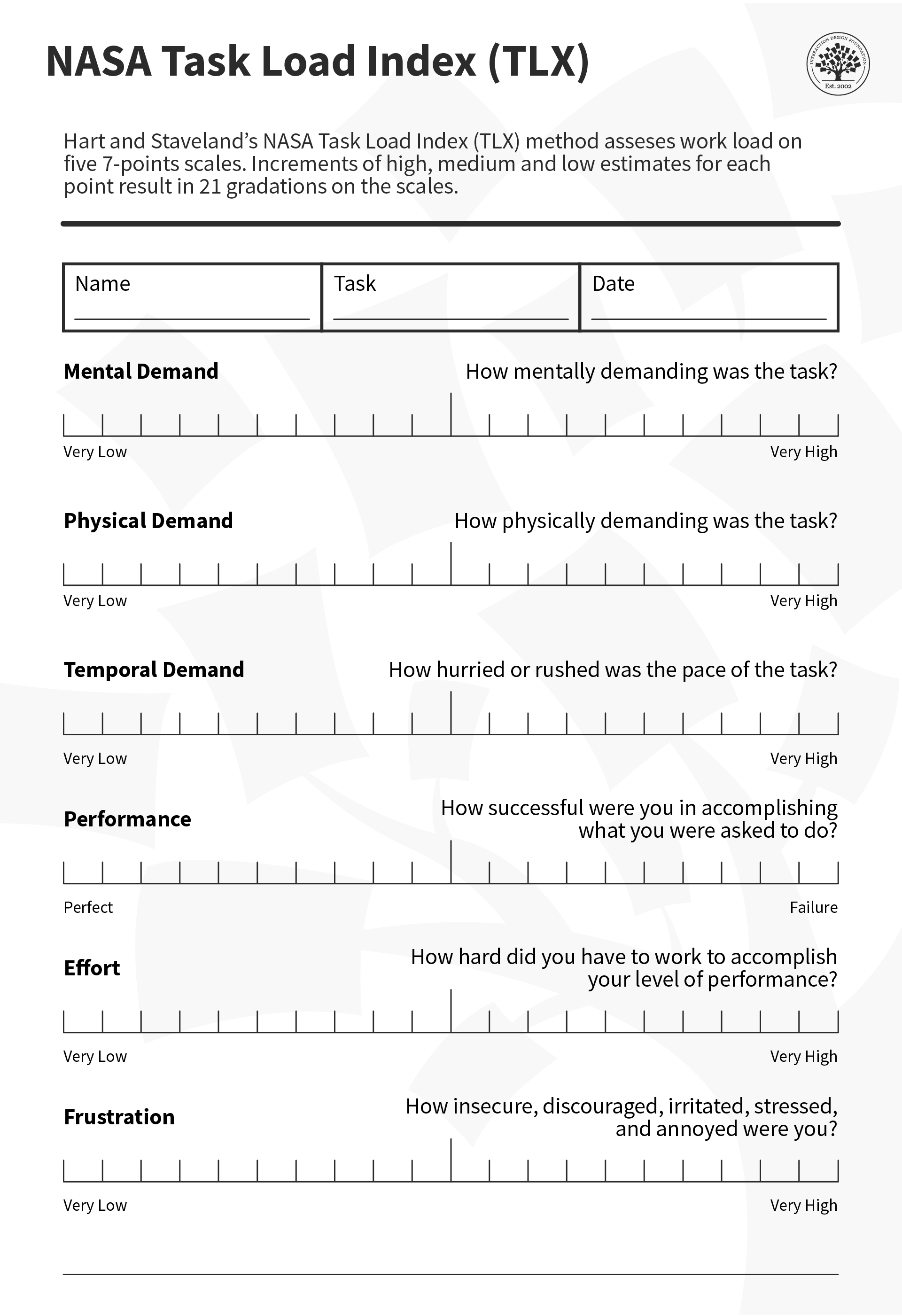
The TLX can help evaluate UX designs, especially AR ones.

© Interaction Design Foundation, CC BY-SA 4.0

Why Task Load is Crucial for UX

Task load is an important metric to remember for interface design. Information-heavy tasks like onboarding need to keep the task load in mind, as an overwhelmed user might close the app or ignore valuable information because it was too much at once.

Information architecture, or how to organize information for ideal user comprehension, is another element that should reduce cognitive task load and make a more enjoyable user experience. 

How to Design for Task Load

Here are some tips to help your designs account for task load:

  • Clean visual designs can be an excellent way to prevent the user from being overwhelmed.

  • User experience designers should ensure their product provides the most relevant information at the most suitable time. Simple tasks are put first, and more complex tasks are introduced when users have understood the basics. This is called progressive disclosure.

  • Task load is especially important for high-stress tasks or when a user might be distracted. It’s an excellent way to identify pain points and create a better overall user experience, even for less stressful tasks. Lower your task load threshold for these contexts to account for the extra stress.

  • Usability tests can help identify when users might be overwhelmed.

  • Drip-feed information instead of flooding the user with too many prompts. Break tasks into manageable steps, and don't ask too much from your user at one time.

  • People can only process up to five to seven task items. This limitation also applies to choices presented to users. For example, surveys only include up to five options to choose from.

  • Consider temporal demands or how long a task will take. Users might get distracted, interrupted, or give up if a task takes excessive time. It is good UX practice to shorten any task to as few manageable steps as possible.

Task load also applies to physical limitations as well. For most UI's, this is less relevant. For full-body interfaces like AR and VR, this becomes much more important.

  • The TLX can help you evaluate whether a task is too physically demanding for most users, and whether a less strenuous interaction might be better. 

  • Use simple physical interactions instead of complicated or strenuous ones. Use gaze, simple touch and proximity instead of complex or laborious body movements. Especially for repeated tasks, these will quickly tire your users and possibly injure them.

These tools and guidelines will allow users to enjoy your product or service more comfortably and use them more often with less effort.

Task Load vs Cognitive Load

While cognitive load is a common consideration in UX, it doesn’t account for physical demands. For interfaces like mobile and desktop, those might not be relevant. But, with the rise of AR and VR, which allow for full-body interactions, the TLX is a much more holistic approach.

This allows for a much more flexible perspective on user effort. Some VR apps might want a heavy physical but low mental effort for specific apps—for example, a VR exercise app.

How to Use the TLX

Let's consider the example of a VR exercise app. With the TLX, you can check each stage in the user's journey.

For the onboarding stage, try to keep mental demands as low as possible, but expect a higher mental demand as the user learns the app. You should consider a low temporal demand to keep onboarding short and a low physical demand.

Expect temporal and physical demands to skyrocket for an entire exercise routine and lower mental demands to compensate. A high physical demand is necessary at this stage, but be aware of overexertion. Workouts take time, but it might behoove you to be sensitive to the user's time limits and keep temporal demands in a specific range. Mental demands should be shallow, so ensure instructions are clear. Your users should not do algebra and jumping jacks at the same time (although that would be impressive).

After the workout, keep physical demands low so the user can rest, temporal demands low to move on with their day, and mental demands about average. The user might want to check or share their performance. Make it easy to understand and do without (metaphorically) jumping through hoops.

Beyond Digital

The TLX is a comprehensive rubric that isn't limited to only digital products. It was originally designed for physical processes and is still an invaluable tool for UX in the physical world.

Process engineers, teachers, and, of course, astronauts can use the TLX for a variety of tasks. For example, a product designer might use the TLX to test how the washing machine they are designing performs during usability tests. A fishing vessel might want to test the effort of operating its sonar system in case there is a storm.

The TLX has endless uses and a flexible approach to UX of all types, which makes it an invaluable tool for designers everywhere.

Questions About Task Load?
We've Got Answers!

How do you measure task load in a digital product or interface?

UX teams typically measure task load with structured tools like NASA‑TLX (Task Load Index). This validated method asks users to rate factors such as mental demand, effort, and frustration after completing a task, and produces a composite score that reflects perceived workload.

Designers also combine TLX with behavioral metrics: time‑on‑task, error frequency, number of clicks, and task completion rates. Heatmaps and eye‑tracking highlight where users struggle or hesitate. When users take longer or switch strategies frequently, it signals overload. In high‑stakes systems (aviation, healthcare), physiological measures like pupil dilation or heart rate variability provide further accuracy. Together, these qualitative and quantitative methods help teams identify friction points and redesign workflows to lighten the mental and operational burden for users.

Explore how quantitative and qualitative differ and how each works in user research, in this video with William Hudson: User Experience Strategist and Founder of Syntagm Ltd.

Transcript

What is the difference between task load and cognitive load?

Task load refers to the total effort a user feels while completing a task, covering time pressure, complexity, and frustration. Meanwhile, cognitive load, a concept from learning science, deals specifically with the mental processing demands placed on working memory.

Researchers divide cognitive load into intrinsic (complexity inherent to the task), extraneous (avoidable distractions or poorly designed interfaces), and germane (helpful effort that supports learning). While cognitive load focuses on mental processing limits, task load captures broader demands like physical effort or emotional stress. For UX (user experience) designers, understanding both matters: a cluttered dashboard can create unnecessary cognitive load, while long forms or repeated steps increase overall task load. Balancing these ensures users stay focused, efficient, and less prone to errors.

Discover more about cognitive load and how to design with it in mind.

How can UX designers identify when users feel overloaded?

Designers spot overload by observing behaviors during usability tests and field studies. Users who pause frequently, backtrack, or reread instructions often feel overwhelmed. Think‑aloud protocols expose moments of hesitation, with verbal cues like “I am confused” or “I cannot find it.”

High error rates, repeated attempts, and increased time‑on‑task signal excessive effort. Heatmaps may show erratic scanning patterns or ignored interface sections, while biometric tools—like eye‑tracking or heart rate monitors—can confirm strain. Surveys such as NASA‑TLX or the System Usability Scale quantify perceived workload.

By triangulating these signals, designers uncover hidden friction before it turns into user frustration or abandonment, and can make data‑driven redesigns that simplify interfaces and keep mental and operational demands manageable.

Take hold of triangulation to understand how it helps inform better designs, in this video with William Hudson.

Transcript

What common design mistakes increase task load for users?

Certain design mistakes consistently raise task load and frustrate users. Cluttered screens bombard users with too many elements at once, forcing them to scan and decipher unnecessarily. Poor labeling or inconsistent terminology makes navigation harder, requiring extra thought to match meaning to action. Overwhelming choice sets, like dropdowns with dozens of options, lead to “choice paralysis.”

Unnecessary steps, such as redundant logins or multi‑page forms, add friction. A lack of visual hierarchy forces users to guess what matters most. Inconsistent patterns—buttons that move, icons that change—demand constant relearning. Even small missteps compound quickly and make tasks feel heavy and confusing. Fixing these issues—through simplification, standardization, and better hierarchy—significantly reduces perceived effort and improves usability for every experience.

Explore how to leverage good visual hierarchy to make better designs.

What role do micro‑interactions play in managing task load?

Micro‑interactions, tiny, often overlooked interface moments, play a powerful role in reducing task load. These include animations that confirm an action, tooltips that clarify meaning, or progress indicators that signal completion. When done well, micro‑interactions reassure users that they are on the right path, preventing hesitation and rework. For instance, a subtle “saved” checkmark eliminates doubt about whether an update went through. Feedback loops like these shrink uncertainty, lowering cognitive effort.

Micro‑interactions also guide attention, highlight key steps, and even inject delight, making repetitive tasks feel lighter. However, they must stay subtle; too many flashy effects create noise and add friction. Thoughtfully designed micro‑interactions smooth workflows, keep users oriented, and help interfaces feel intuitive instead of burdensome.

Understand how to make better designs for users in the moment in our article The Role of Micro-interactions in Modern UX.

What strategies help reduce task load for expert vs. novice users?

Experts and novices need different design strategies to keep task load manageable. For beginners, progressive disclosure works best, where a design shows only essential controls first, then reveals complexity as confidence grows. Straightforward onboarding, contextual help, and guided walkthroughs build familiarity without overwhelming users.

However, experts benefit from shortcuts, advanced settings, and customizable dashboards that bypass repetitive steps. Adaptive interfaces—ones that adjust to user skill level—bridge both worlds seamlessly.

Providing layers of complexity prevents overload for novices while respecting expert efficiency, ensuring both groups complete tasks with the least effort and maximum satisfaction, regardless of their starting point.

Peer at how to use progressive disclosure to the advantage of your users.

Can gamification increase or decrease perceived task load?

Gamification influences task load in two ways: it can lighten or worsen it. Thoughtfully applied elements like progress bars, achievement badges, and small rewards break tasks into digestible milestones, making the experience more engaging and less daunting.

For example, Duolingo uses streaks and XP points to keep learning momentum high, making repetitive practice playful instead of tedious. However, for designs that implement excessive or poorly implemented gamification, such as constant pop‑ups or irrelevant rewards, it distracts from the task, creating cognitive clutter and frustration. The key lies in balance: use game elements to reinforce core goals, not to overshadow them. When gamification aligns with user needs, it reduces perceived effort; when misaligned, it becomes noise that inflates workload and drains focus.

Get a greater grasp of gamification to find how it might help make better digital solutions.

How does information hierarchy influence a task load for a user?

A strong information hierarchy reduces cognitive load by organizing information in a way that matches user mental models and supports their decision-making process. When content is structured with clear headings, logical grouping, and consistent visual weight, users can quickly scan and locate relevant information without having to process everything equally.

Good hierarchy works by leveraging visual principles like contrast, size, and spacing to create a clear path through content. Users can distinguish between primary, secondary, and supporting information at a glance, allowing them to focus cognitive resources only on what is relevant to their current task. This reduces the mental effort required for information processing and navigation.

Poor hierarchy increases task load because users must work harder to parse and prioritize information. Without clear visual cues about what is most important, users face higher cognitive burden as they try to determine relevance and relationships between content elements. This leads to slower task completion and higher error rates.

Techniques like progressive disclosure and layered information architecture help manage cognitive load by revealing information in digestible chunks aligned with user goals. For example, an e-commerce product listing might show key details (price, main image, rating) prominently, while detailed specifications remain accessible but secondary.

Pick up helpful points in our article Visual Hierarchy: Organizing content to follow natural eye movement patterns.

How do task load considerations change for mobile vs. desktop design?

Task load changes dramatically between mobile and desktop due to screen size, input methods, and user context. On mobile, users have limited space and often work one‑handed, so every tap matters. Designers must reduce steps, enlarge tap targets, and strip away clutter. Navigation should rely on familiar gestures and clear icons rather than deep menus.

On desktop, users can handle more simultaneous information, multiple windows, and detailed workflows without feeling overloaded. However, simply shrinking a desktop interface for mobile increases task load by forcing zooming, scrolling, and guessing. Smart mobile design prioritizes simplicity—progressive disclosure, concise labels, and linear flows—to keep the workload light while respecting the different mental and physical demands of on‑the‑go use.

Get a greater grasp of how to tailor better user experiences through a mobile-first lens.

What are some helpful resources about task load for UX designers?

UX Bulletin. (n.d.). Tools for measuring cognitive load in UX. UX Bulletin. https://www.ux-bulletin.com/tools-for-measuring-cognitive-load-in-ux/

This UX Bulletin article outlines current tools for assessing cognitive load—such as NASA‑TLX surveys, dual‑task studies, and biometric methods like eye‑tracking. It guides designers on selecting the right method for their study goals and interpreting results effectively. Designers can use these methods immediately to diagnose mental workload, spot usability bottlenecks, and inform redesigns that simplify interfaces and reduce unnecessary user effort.

Sauro, J., & Lewis, J. (2022, April 26). A guide to task‑based UX metrics. MeasuringU. https://measuringu.com/task-based-metrics/

This article explains how to capture task‑based UX metrics, including success rates, time‑on‑task, and user satisfaction. It stresses combining behavioral measures with perceived effort data (e.g., NASA‑TLX) to understand workload holistically. The authors provide practical steps for crafting task scenarios, gathering and interpreting data, and setting benchmarks that drive design decisions. Designers and researchers will find clear, field‑ready advice for integrating metrics into usability tests, improving interfaces based on evidence, and ensuring task demands stay manageable across different product experiences.

Number Analytics. (2025, June 17). Optimizing UX with cognitive load. Number Analytics Blog. https://www.numberanalytics.com/blog/optimizing-ux-cognitive-load

This Number Analytics blog post delivers actionable guidance for reducing cognitive and task load in digital products. It covers strategies like simplifying layouts, chunking steps, improving clarity in language, and providing better user feedback. The article includes checklists and relatable examples for dashboards, forms, and onboarding experiences. Written for product teams and UX designers, it focuses on practical applications rather than theory, helping teams cut friction and lower perceived workload so users can move through tasks more smoothly and efficiently.

Earn a Gift Earn a Gift, Answer a Short Quiz!

1
2
3
4
1
2
3
4
Question 1
Question 2
Question 3
Get Your Gift
Interaction Design Foundation logo

Question 1

What is task load?

1 point towards your gift

  • The amount of information a person can process at once.
  • The amount of physical space available on a user interface.
  • The number of users on a website.
Interaction Design Foundation logo

Question 2

How can excessive task load affect a user?

1 point towards your gift

  • It can increase user efficiency.
  • It can overwhelm the user.
  • It has no impact on user experience.
Interaction Design Foundation logo

Question 3

What is a recommended method to manage task load effectively in user interfaces?

1 point towards your gift

  • Avoid any form of design guidance
  • Present all information at once via infinite scrolling
  • Use progressive disclosure to introduce information gradually

Learn More About Task Load

Make learning as easy as watching Netflix: Learn more about Task Load by taking the online IxDF Course UX Design for Augmented Reality.

Why? Because design skills make you valuable. In any job. Any industry.

In This Course, You'll

  • Get excited about immersive experiences that effortlessly blend the digital and physical worlds! Feeling stuck in a 2D job? The UX Design for Augmented Reality (AR) course will help you fulfill your potential by creating 3D AR experiences people love with intuitive interfaces and a seamless real-world connection. Use AR overlays for real-time training in industrial settings to improve retention by 80% or to help people visualize a product in their home before purchasing. You'll merge reality with imagination to reshape how people interact with the world around them. More love, more impact, greater salary potential.

  • Make yourself invaluable with sought-after skills in spatial mapping, gesture-based input, object manipulation, and 3D interaction. Brands that use AR in campaigns see up to a 200% increase in engagement! From AR-assisted surgeries in healthcare to virtual try-ons with your favorite retailer, AR isn't limited to one industry, it's everywhere! And you can easily learn to master it, no matter your background. With clear guidance, hands-on templates, and real-world examples, you'll apply your skills immediately.

  • Gain confidence and credibility as you discover the AR design process step-by-step, from research to heuristic evaluation. You’ll develop timeless human-centered design skills to create natural, intuitive interfaces that blend digital and physical worlds with genuine empathy and insight. These skills become even more powerful as AI accelerates how fast we build and iterate. They let you turn AI into your superpower as you guide emerging tools toward meaningful and authentic outcomes that only your unique human insight can deliver. You’ll learn how to create customer journey maps, prototype your AR design, and gather usability feedback. With optional hands-on exercises and downloadable templates like the 3D Persona Template and the AR Heuristic Scorecard, you'll walk away with an impressive portfolio featuring your own AR project that accelerates your career success.

It's Easy to Fast-Track Your Career with the World's Best Experts

Master complex skills effortlessly with proven best practices and toolkits directly from the world's top design experts. Meet your expert for this course:

  • Frank Spillers: Service Designer and Founder and CEO of Experience Dynamics.

Get an Industry-Recognized IxDF Course Certificate

Increase your credibility, salary potential and job opportunities by showing credible evidence of your skills.

IxDF Course Certificates set the industry gold standard. Add them to your LinkedIn profile, resumé, and job applications.

Course Certificate Example

Be in distinguished company, alongside industry leaders who train their teams with the IxDF and trust IxDF Course Certificates.

Our clients: IBM, HP, Adobe, GE, Accenture, Allianz, Phillips, Deezer, Capgemin, Mcafee, SAP, Telenor, Cigna, British Parliament, State of New York

All Free IxDF Articles on Task Load

Read full article
How to Improve Your UX Designs with Task Analysis - Article hero image
Interaction Design Foundation logo

How to Improve Your UX Designs with Task Analysis

One of the most important steps in the design thinking or human-centered design (HCD) methodology is to define the users' problems. This means to clearly identify and articulate problems in the UX so that you can later begin the ideation process (i.e., generate great ideas on how to solve said probl

Social shares
1.2k
Published
Read Article
Read full article
How to Design for AR Experiences on the Go - Article hero image
Interaction Design Foundation logo

How to Design for AR Experiences on the Go

From a design perspective, UX for Augmented Reality (AR) is similar to mobile UX in that users are often on the move and use the interface in short bursts of activity. In contrast, the user experience of a virtual reality application is more similar to web or desktop UX, designed for immersive, cont

Social shares
493
Published
Read Article

How to Improve Your UX Designs with Task Analysis

How to Improve Your UX Designs with Task Analysis

One of the most important steps in the design thinking or human-centered design (HCD) methodology is to define the users' problems. This means to clearly identify and articulate problems in the UX so that you can later begin the ideation process (i.e., generate great ideas on how to solve said problems). Task analysis is a simple exercise that UX designers can undertake during the definition of a problem, which can help identify opportunities to improve and generate some preliminary ideas as to how you might approach these challenges. Let's find out how.

Transcript

Task analysis is a method that helps you understand how users accomplish their goals and the steps they take to get there. This establishes their mental models and is crucial for task-oriented design. The most common output of a task analysis is a diagram that outlines the user's actions and the system's responses.

Designers can use this diagram to identify areas where additional support may be needed or to eliminate unnecessary steps. For example, designers may automate certain actions that users currently perform manually.

You can approach a task analysis activity from two main viewpoints:

  1. Hierarchical Task Analysis: Consists of breaking down tasks into smaller sub-tasks.

  2. Cognitive Task Analysis: Focuses on tasks that require decision-making, problem-solving, memory, attention and judgment. 

How to Prepare for a Task Analysis

Usability experts agree that task analysis is an important activity where designers must understand the users and their environments, their goals and external factors that might influence the performance of the task. This means that you may have already engaged in user research, which provides you with outputs such as user personas, scenarios or storyboards. This data is essential for task analysis, as you will base your work on these outputs. 

To ensure an effective task analysis process, it's essential to gather focused data during user research. Cognitive scientist and UX consultant Larry Marine suggests collecting five types of data during this phase:

  • Trigger: What initiates the task for the user?

  • Desired Outcome: How will users know they have successfully completed the task?

  • Base Knowledge: What will the users be expected to know when starting the task?

  • Required Knowledge: What do users already know before starting the task?

  • Artifacts: What resources or tools will users require during the task?

How to Conduct a Task Analysis 

With your current information, you can sketch out how a user goes about their daily life by mapping out the sequence of activities required to achieve a goal. Before you start, it's important to have an overview of the process and its steps to prepare better.

Here is a step-by-step guide for conducting task analysis:

  1. Identify the Task You Need to Analyze: Pick a persona and scenario for your user research and repeat the task analysis process for each of them. What is that user's goal and motivation to achieve said goal?

  2. Break Down This Goal into Smaller Subtasks: A good rule of thumb is to aim for 4–8 subtasks – any more than this may indicate that the goal is too broad or abstract.

  3. Draw a Layered Task Diagram of Each Subtask: You can use any notation you like for the diagram since there is no real standard here. Larry Marine shares some constructive advice on his notation, which you will examine below.

  4. Write the Story: Ensure you accompany your diagram with a narrative that focuses on the whys.

  5. Validate Your Analysis: Review the analysis with someone who wasn’t involved in the breakdown but knows the tasks well enough to check for consistency. 

  6. Pro Tip: Conduct a parallel task analysis with more than one person to undertake the process simultaneously so that you can compare and merge outputs into a final deliverable. 

Larry Marine likes to annotate his task analysis diagrams using different colors in the various flows; for example, green represents users' actions, yellow is a step the system can do, purple represents tools or knowledge, and orange represents questions about the task.

Larry Marine suggests adding annotations to task analysis diagrams using a variety of colors that correspond to different flows. This technique helps him better visualize the user's journey and identify pain points or areas for improvement in the user experience.

© Interaction Design Foundation, CC BY-SA 4.0

A task analysis would probably have a greater proportion of "green" flows initially. A redesigned task would probably have fewer "green" and more "yellow" flows to show that you've really managed to off-load tasks from a user to a system, thus improving their overall experience to make their lives easier.

Download and share this guide on task analysis with your team to collaboratively visualize your user's journey and identify pain points.

Advance Your Career With This Free Template for “How to Improve Your Design with Task Analysis”
How to Improve Your Design with Task Analysis
We respect your privacy
Get 1 powerful email each week: Design a life you love!

The Take Away

Task analysis is a vital tool in a UX designer's skill set, as it helps designers understand how users complete tasks and identify areas for improvement. However, it's important to keep the user's perspective in mind and resist the temptation to generate your own interpretations of the problem or stick to design elements just for the sake of it.

To ensure that task analysis is effective, it should be backed by rigorous user research. Without data from user research, any efforts to proceed with task analysis will be blind and may not reflect actual user needs. Remember that task analysis is not a one-off process. Designers may need to repeat task analysis on their own designs later in the process. 

Finally, task analysis requires time, resources, people, and budget like any other UX design activity. Balance these requirements carefully and engage in the process only if you have sufficient amounts of these elements. 

References and Where to Learn More

Read these books about Task Analysis and other related concepts:
Task Analysis. Human-computer interaction: Development Process. Catherine Courage, Janice (Genny) Redish, and Dennis Wixon. 2009

Task Analysis: How to Develop an Understanding of Work (Users' Guides to Human Factors and Ergonomics Methods). Jack Stuster. 2019.

Check out this in-depth article about Hierarchical Task Analysis from UX Matters.

Follow Larry Marine’s excellent approach to Task Analysis.

Learn about Task Analysis and usability from the Usability.gov website.

Hero Image: © Interaction Design Foundation, CC BY-SA 4.0

Feel Stuck?
Want Better Job Options?

AI is replacing jobs everywhere, yet design jobs are booming with a projected 45% job growth. With design skills, you can create products and services people love. More love means more impact and greater salary potential.

At IxDF, we help you from your first course to your next job, all in one place.

See How Design Skills Turn Into Job Options
Privacy Settings
By using this site, you accept our Cookie Policy and Terms of Use.
Customize
Accept all

Be the One Who Inspires

People remember who shares great ideas.

Share on:

Academic Credibility — On Autopilot

Don't waste time googling citation formats. Just copy, paste and look legit in seconds.