Storytelling In Presentations

Your constantly-updated definition of Storytelling In Presentations and collection of videos and articles.
Be a conversation starter: Share this page and inspire others!

492 Shares

What is Storytelling In Presentations?

Storytelling in presentations is the strategic approach you can use to apply narrative techniques, such as characters, conflict, and resolution, to make your message engaging and memorable for the target audience. Rather than list facts, you guide your audience through a journey, helping them understand your points and needs, connect emotionally and feel inspired, and be more likely to support you.

Explore how you can use effective communication to get stakeholders on your side so they can support your ideas more readily, in this video with Morgane Peng, Managing Director, Global Head of Product Design and AI Transformation.     

Transcript
  

Envision How to Get the Happy Ending You Want

How did you absorb information as a child? What made it stick in your mind all these years later? Chances are, you can remember tales and fables from books more easily than you can recall exact facts and figures from that era. There’s a reason humans love a good story; it makes the information which the storyteller wants to get across relatable and memorable.

Fast-forward to the present and the future presentations you’ll give. Your biggest challenge isn’t just to deliver information but also to make people care enough to remember and act on it. When you use storytelling to structure information into a format your target audience can relate to, you transform dry data into meaning for them. You can turn your slides into experiences that sit in their minds instead of lectures that they’ll tune out of.

More specifically, when you use effective storytelling in your presentations and public speaking engagements, you can:

Keep Attention Locked In

Our brains are hard-wired for stories; it’s part of being human. A clear narrative keeps people engaged longer than bullet points ever can. Ancient people used storytelling around their campfires for good reason: to weave important information into a format that others could follow with intrigue and listen to attentively right through to the end.

Boost Retention

Facts tend to fade in people’s minds or become misremembered distortions, but stories can stick clearly. When you embed information in a narrative, it can reach people more deeply and they can recall it more easily. Humans have been impressing listeners from the earliest times, making money off fiction and films, and getting what they want from influential people through the craft of packaging information as meaningful stories they remember. From an early age, children’s minds are sponges that recall, for example, a hero or heroine, the challenges that individual had to overcome, and how they came to a solution that often either improved the original situation or rectified a dire scenario into a “happily ever after” conclusion.

Build Trust and Influence

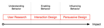
Stories humanize your ideas and bring the concepts in them out of the dry wastelands of data territory and “home” to the human experience. Through storytelling, you can leverage empathy, intention, and credibility, all vital ingredients to win buy-in from stakeholders.

For a prime example, explore what empathy can do in the craft of UX (user experience) design.

Transcript

Create Emotional Connection

Numbers appeal to logic, but stories reach feelings and strike a chord that’s distinctly human. Figures like “94%” may have the ability to impress or shock; however, you can secure that feeling from your audience through the telling of a tale around the cold, hard facts. That is how you persuade, motivate, and inspire action.

Position Yourself as a Leader

Storytelling demonstrates clarity and confidence, making you stand out as someone worth listening to. Audiences can appreciate that you thoroughly understand the situation you’re describing and why it’s important. You come across as more human and humane, showing a compassionate mindset who understands the dimensions and meaning that hit home with listeners. They acknowledge you as a competent professional and a caring person, two necessary “boxes to tick” in winning their trust.

Discover how to use trust frameworks to impress stakeholders and stand out as someone who deserves support, in this video with Morgane Peng.

Transcript

How to Use Storytelling in Your Presentations and Get What You Want

Before you follow this step-by-step approach, get into the mindset of storytelling as a tool for connection. Think of your presentation as less about “reporting” and more about connecting with and inspiring the people who have come to listen to you.

1. Anchor Your Message in a Clear Structure

A story without an effective structure is (at worst) senseless and (at best) just a loose pile of “this happened, X or Y did something, and then this happened.” In any case, the audience will lose interest in this noise or lifeless string of events. To spark and retain their interest, you want signals to come through, to take situations, actors, actions, and outcomes and weave an engaging piece around them. You’ve got two proven frameworks to help you craft compelling narratives:
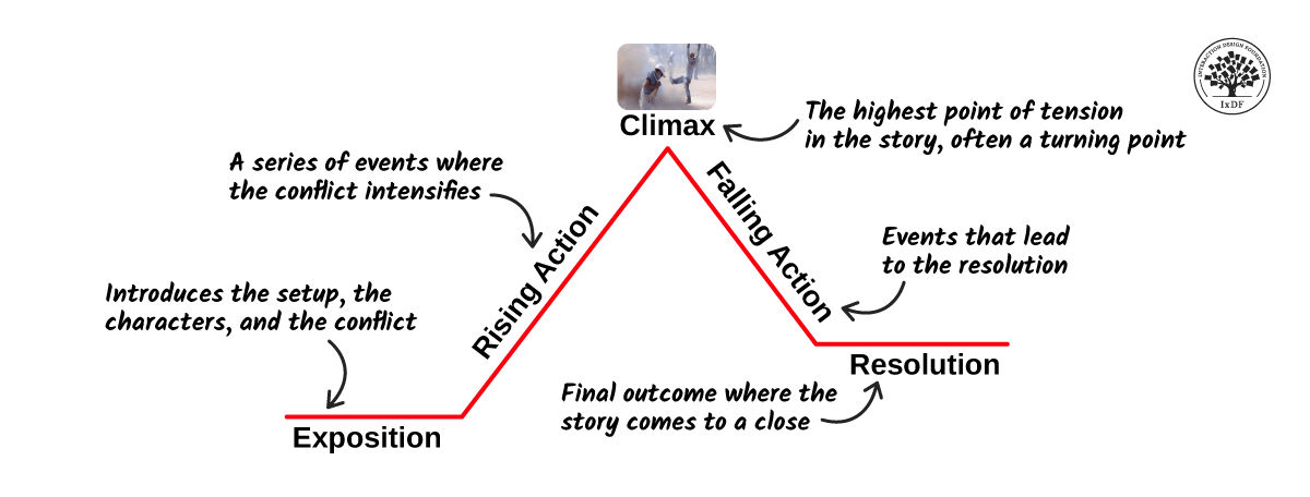
Freytag’s Pyramid

Start with the exposition (the context and characters in it), build rising action (the problem gets worse), reach the climax (the turning point), then show falling action (changes that occur), and end with resolution (the outcome). Use this structure when you want to take your audience on a journey, and it’s especially powerful in project case studies. However, be careful with business stakeholders who are on tight schedules, as your story will need to be extra concise.

Climb Freytag’s Pyramid in a UX Case Study Example

  1. Exposition (Context and Characters)

“Our team aimed to improve the onboarding flow for a mobile banking app aimed at Gen Z users. The app had strong features, but completion rates during signup were abysmally low: really astonishing. As the UX designer, I collaborated with product managers, developers, and customer support personnel to understand where the drop-offs were happening and why.”

  1. Rising Action (The Problem Intensifies)

“Through feedback sessions and analytics, we discovered that users grew frustrated at multiple points. They faced too many input fields, early requests for sensitive information, and a lack of feedback about their progress. The frustration wasn’t just causing delays; it was leading to abandoned accounts and negative reviews on app stores. Stakeholders were concerned, as this directly impacted new customer acquisition and the brand was starting to get a bad name, visibly.”

  1. Climax (Turning Point)

“At this point, we had a decision to make, a hard one: Should we patch the existing flow with small fixes or completely redesign it? After reviewing the data and competitor benchmarks, we opted for a bold approach: a full redesign of the onboarding journey. This was a risky but pivotal choice.”

  1. Falling Action (Changes that Occur)

“We simplified the form by cutting out unnecessary fields, moved sensitive requests to later steps, added progress indicators, and integrated a friendly chatbot to guide users. In follow-up usability tests, completion rates rose by 40%, and users described the new flow as ‘easy’ and ‘trustworthy.’”

  1. Resolution (The Outcome)

“After launch, account creation grew significantly. Support tickets about onboarding dropped by 50%, and app store ratings improved from 3.2 to 4.5 stars within three months. That improved user satisfaction, all right, and it also boosted the company’s conversion metrics. By being bold and not building good structures on shaky foundations, we proved that thoughtful UX design directly impacts business goals.”

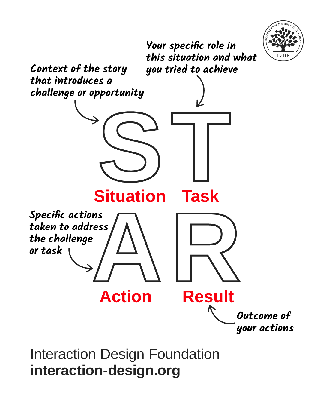
STAR Method (Situation, Task, Action, Result)

Use STAR for clear, concise business communication; it’s especially helpful with businesspeople who don’t have time to indulge the storyteller. With STAR, you define the situation (challenge or opportunity), explain your task (your role), detail the action (steps taken), and finish with the result (impact of what you did, lessons learned). This is perfect for interviews, status updates, and, indeed, senior stakeholder meetings where executive communication comes first.

Shine with STAR in the Case Study Example (Mobile Banking App Onboarding Redesign)

  1. Situation (Challenge or Opportunity)

“Our mobile banking app was seriously struggling with onboarding: only 55% of Gen Z users completed the signup flow. This led to abandoned accounts, poor app store ratings, and slowed customer acquisition.”

  1. Task (Your Role)

“As the lead UX designer, I was responsible for diagnosing the friction points and designing a solution to increase completion rates, improve user satisfaction, and raise public perception of our brand.”

  1. Action (Steps Taken)

“I analyzed analytics to identify drop-off points, ran user feedback sessions to uncover pain points, and benchmarked competitor apps. Based on the insights, I redesigned the flow: simplified the form, delayed sensitive requests, added progress indicators, and integrated a friendly chatbot to guide users.”

  1. Result (Impact + Lessons Learned)

“After launch, completion rates shot up by 40%, onboarding-related support tickets plummeted by half, and app store ratings improved from 3.2 to 4.5 stars. The project improved customer experience, directly supported business goals of acquisition and retention, and turned an ugly situation around for the brand’s image. I also confirmed the need to test copy and tone early, as user trust was as crucial as usability.”

Both frameworks keep you focused, make your message logical, and help your audience follow your thinking step by step. Freytag’s Pyramid is great for case studies, portfolios, and workshops where you want to take your audience on a journey. Meanwhile, the STAR structure gets to the point quickly; it strips away dramatic buildup and emphasizes challenge, role, concrete steps, and business outcomes, perfect for executive updates, interviews, or when time is short and the bottom line needs to show quickly.

A diagram showing the STAR approach.

© Interaction Design Foundation, CC BY-SA 4.0

2. Start with a Hook

First impressions matter; your opening sets the tone for everything that follows. A strong hook captures attention and frames your message, so your audience is engaged right from the start. Here are four effective ways to do it:

  • Share a short anecdote that illustrates the problem, like: “Last month, a student told me she gave up opening a bank account because the app asked for her passport photo before she even understood what benefits it offered. That’s one user story, but it reflects a bigger issue we uncovered.”

  • Ask a thought-provoking question, like: “How many of you have abandoned an app sign-up because it asked for too much information too soon? What if that same frustration is happening to our users every day in countless moments around the world?”

  • Present a striking statistic that surprises them, like: “Did you know that 45% of Gen Z users drop off during mobile app onboarding, before they even create an account? That means nearly half of our potential customers leave before we can show them any value.”

  • Paint a scenario they can see themselves in, like: “Imagine you’re 19, trying to open a bank account on your phone, and suddenly you freeze. You’ve just been asked to upload your driver’s license, confirm your address, and fill in 12 fields. That’s all before you can even explore the app. Based on the driver’s license upload alone, never mind all the work of filling in fields, would you stick with something that asked you to do that?”

Notice how these tactics can flip the perspective so stakeholders can get the distance to objectively consider what their brand is doing wrong. That’s essential to bring them out of the zone where they’re so close to the organization that they can’t appreciate what’s really going on “outside,” where results happen.

3. Make It Relatable with Characters

Stories need people to make things happen in ways that audiences follow and care about. After all, when was the last time you heard about a brick having a worthwhile adventure that did good in the world? Even children’s books that feature objects like cars typically endow them with human characteristics. In presentations, your “characters” can be:

  • Users: Share their frustrations, desires, or wins.

  • Stakeholders: Describe their challenges and how your solution helps.

  • You or your team: Show your journey of solving the problem through a storytelling framework.

Relatable characters help your audience empathize and see why the story matters to them.

4. Use Conflict and Resolution

Every compelling story has tension. If everything were all right all the time, nobody would have to do anything to change the situation, perhaps more like watching CCTV footage of a beach than an adventure movie. Still, in presentations, this doesn’t mean drama; instead, a problem-solution format means highlighting the challenge your audience cares about and showing your solution.

  • Conflict = the problem, obstacle, or pain point.

  • Resolution = how your work solves it and what impact it creates.

A diagram showing Freytag's Pyramid with its sequence of Exposition, Rising Action, Climax, Falling Action, and Resolution.

Remember Freytag’s Pyramid and take the audience on a journey where they’ll want to get to the end for the right reason.

© Interaction Design Foundation, CC BY-SA 4.0

5. Blend Data with Narrative

Numbers can be dramatic; still, on its own, data can feel cold. And stories alone can feel vague and disconnected from their bottom-line significance for the brand. When you combine both, you get credibility and memorability. So:

  • Present numbers as part of the journey: “User drop-off was at 55%; however, after our redesign, completion rates shot up by 45%.”

  • Use visuals: charts, before-and-after screenshots, or quotes that support your story. Keep your slides lean and trim so they support rather than replace your story.

  • Always tie data back to the human impact: “That’s 11,000 more users actually finishing their purchase.”

6. Adapt Storytelling to Context

Not every situation calls for a long narrative, and especially around business executives you’ll want to fine-tune for these time-poor individuals. Here’s how to adapt:

  • Short updates: Use micro-stories, brief examples that bring your point to life.

  • Workshops: Use stories to frame problems and spark discussion.

  • High-stakes pitches: Use full story arcs (Freytag or STAR) to show urgency and impact, but tailor the length to your audience.

  • Emails: Structure them like mini-stories: context → issue → action → result.

When you know your format and tailor your story, you can ensure relevance and efficiency, and one way to help you know what story to try is to use a stakeholder map before your presentation. That way, you’ll know if you’ve got the luxury of more time or need to impress ultra-quickly.

Get a firm idea of your target audience’s needs so you can deliver the most effective presentation and journey that resonates best, in this video with Morgane Peng.

Transcript

8 Tips to Make Your Story Delivery Great

Once you’ve built the core story, refine how you deliver it and cover all the bases.

1. Use Presenter Styles Strategically

Depending on your situation (and remembering those busy executive stakeholders in particular), you can switch between storytelling modes and presentation styles. You have several modes to pick from and adapt:

  • The Storyteller: Create a narrative arc (perfect for user journeys).

  • The Demonstrator: Show instead of telling, good for live demos or prototypes.

  • The Instructor: Break concepts down step by step, ideal for when you must teach audiences who are unfamiliar with your subject.

  • The Collaborator: Involve your audience, co-create the story together and reach that happy ending on a collaborative note.

When you mix styles and “flow” the story or information well to the people you need to impress, it makes you adaptable and engaging.

An image of the instructor with four people portraying roles at the corners: the Demonstrator, the Collaborator, the Storyteller, and the Instructor.

Everyone needs to say something; it’s how you do it that counts for how you’ll access your audience best.

© Interaction Design Foundation, CC BY-SA 4.0

2. Leverage Your Voice and Body Language

Your story isn’t just words; it’s how you deliver them. You can have the most captivating story ready to go, but it won’t get anywhere if you sound like you’re just reading it from a book. So, make it relevant and impactful:

  • Use pauses like “white space” to let key points land or insert just before them, like a prelude. The best stories need that breathing space and “drumroll” effect to punctuate what’s important within them.

  • Vary tone, pitch, and pace to avoid monotony. Nerves can get the better of any speaker and manifest in how you sound and how quickly you present. Stay calm and in control. Try some breathing exercises and practice until you’re confident you’ve got your material fully in step with your delivery of it.

  • Match body language to your story: lean in when emphasizing urgency and relax when closing. Think of how a captivating storyteller doesn’t sit or stand there just recounting what happened; they get into it.

These non-verbal communication cues help reinforce your narrative and keep people hooked.

3. Apply Emotional Intelligence and Audience Awareness

To tell a good story, you’ll want to “read the room” so it reaches everyone. Emotional intelligence helps you sense when to speed up, slow down, or shift tone so audience members stay on board and don’t tune out.

  • Notice faces and reactions (including online, and in the chat) and use active listening to stay in tune with how people are tuning in to you.

Discover key things to watch out for and help maximize your presentation potential when you listen actively, in this video with Morgane Peng.

Transcript

  • Use empathy to acknowledge feelings or challenges in your story. For example, did Robbie, the 19-year-old, need the banking app to help pay for his overdue rent? How many others like him might face hardship because of bad design? Translate their desperation to the room around you so people feel why things needed to change.

  • Balance confidence with humility. Share strong opinions but be open to feedback. This responsiveness keeps your story alive and collaborative, and it shows you’re conscientious and aware, not going through another rehearsal of your presentation.

An image of the instructor with the caption Have strong opinions weakly held.

You’re like a movie director or author of a gripping tale who is presenting to the audience; they’re there to get maximum value from what you show them and, remember, you want to get maximum value from how they respond.

© Interaction Design Foundation, CC BY-SA 4.0

4. Keep The Right Amount of Detail

How much is just right? You’ll know according to your audience. Design team members might want more background, but business executive stakeholders will typically just want the condensed version. In any case, too many plot points confuse your audience, so stick to what drives your message.

5. Stay On-Track

Keep your key point in view, and don’t let anecdotes overshadow it. If you’ve ever seen an extras section featuring bonus or deleted scenes from a movie, you’ll understand why this is important. Stories should serve the message, and every part of the story and presentation should contribute to move things forward. This plays alongside good time control, especially important for executive audience members, so keep the pace tight and interesting.

6. Bring It Home to Them

That means make and keep it relevant to the audience with specific stories they can relate to, not generic ones. To keep listening, your audience will need to resonate with what you’re telling them, so customize examples to their context and what they can care about.

7. Frame It with a Clear Structure

Plan and structure with STAR or Freytag to package and “sell” your points. The risk of going totally freestyle is that you might overlook your structure. Audiences can’t “buy” random sequences of events or even likeable characters who go off on tangents. Keep the “tension” going so everyone cares to find out what happens in the end.

8. Watch What Goes into Powerful Stories

Get inspired from a TED talk, a colleague’s powerful presentation, or any other successful storyteller delivering to a business or stakeholder audience. Note how they speak, move, and match their non-verbal communication to what they’re talking about and to the audience. Take these observations and help improve your own storytelling approach so you can make people relate to, and resonate with, the exact message you want them to understand and act upon.

Overall, storytelling is humanity’s oldest teaching tool and for good reason. Cognitive science shows that stories trigger more brain activity than raw facts can, as they activate areas linked to emotion, empathy, and memory. Humans thrive on tales; they always have and always will.

Best of all, you don’t need a stage to use storytelling. Every professional interaction, from status updates and emails to one-on-ones and interviews, is a chance to tell a story. When explaining what you did, don’t just list tasks; frame them as a challenge you solved and the result you achieved. When you’re sharing feedback, use a mini-story to describe the situation, action, and impact. When you’re advocating for users, tell their story to make their struggles visible to stakeholders.

Even the shiest introverts can influence and persuade with authentic voices that tell tales people listen to. Good storytelling helps bridge gaps between technical and non-technical people; it makes complex ideas accessible and raises storytelling far above the misconception that it’s a “soft skill.” It’s a strategic tool. When you master storytelling, your presentations stop being “reports” and start being catalysts to ignite responsive stakeholders to take positive steps. You don’t just inform; you inspire action. And that’s what fast-tracks both your projects and your career, a happy ending for each step of the way.

Questions About Storytelling In Presentations?
We've Got Answers!

Why should I use storytelling in a business presentation?

You should use storytelling in a business presentation because it makes your message stick. Stories capture attention in a way raw data can’t. When you share a real-life example or narrative, people remember it longer, connect emotionally, and feel more invested in your idea.

Storytelling builds trust, too; by showing the “why” behind your work, you make your points relatable. For instance, instead of just showing a sales chart, you might tell the story of one customer who struggled and then succeeded with your product. That human angle makes your case feel real, not abstract.

In fast-paced business settings, well-constructed stories cut through noise, simplify complex topics, and make your message persuasive. Good storytelling turns presentations from forgettable slideshows into conversations that inspire action.

Discover how to harness one of the most powerful forces in any industry, in our article Trust: Building the Bridge to Our Users.  

What are the key elements of storytelling in presentations?

The key elements of storytelling in presentations are context, characters, conflict, and resolution. First, set the context: give your audience a clear starting point so they understand the situation. Next, introduce characters (including your user, customer, or team member) so people can connect on a human level. Then, highlight the conflict or challenge to overcome. Every strong story needs tension; without it, the audience won’t feel urgency.

Lastly, resolve the story by showing the solution, outcome, or lesson learned. Add emotions, visuals, and pacing to make these elements more powerful. For example, you might present a customer journey where frustration builds, then explain how your solution solved the problem. These four elements help you create a story that feels natural, memorable, and easy for anyone to follow and want to stay until the ending.

Get deeper into storytelling for an even firmer foundation on how to use it well.

How do I start a presentation with a story?

Start a presentation with a story by hooking your audience right away. Begin with something short and relatable: an anecdote, a question, or a surprising fact. For example, you might open with: “Last month, a new user tried our app. By step three, she quit, more than a little frustrated. She wasn’t alone.” This creates curiosity and sets the stage for your topic.

Keep your introduction brief so you don’t lose momentum. A story works best when it ties directly to the main problem you’re solving. Don’t tell random stories that don’t connect back to your message or pieces that don’t move the message forward. The goal isn’t to entertain for its own sake; it’s to make your point more engaging and clear. A strong story-driven opening sets the tone and keeps people listening throughout your talk, eager to know what happened.

Enjoy our Master Class The Power of Storytelling in User Experience Design with Fernando Marcelo Hereñu, Product and Design Manager at The Walt Disney Company.  

How do I choose the right story for my presentation?

Choose the right story for your presentation by asking, “Does this story connect directly to my main point?” If it doesn’t, leave it out. Look for stories your audience can relate to: customer experiences, real project challenges, or even a personal anecdote that reflects the problem at hand.

Keep it authentic: people can tell when a story feels forced or exaggerated. Relevance matters most. For example, if you’re pitching a product redesign, share a story about a user who struggled with the old version, not about a random success from years ago. Consider your audience’s level of knowledge, too. Senior executives may prefer stories tied to impact and business results, “bottom-line stuff,” while peers might connect with process or team stories. Choose a story strategically and you’ll make your presentation more effective and memorable.

Discover how to cast better impressions in presentations, in our article Key Soft Skills to Succeed as a UX Designer.  

How do I connect my story to my main message?

To connect your story to your main message, frame it as evidence, not entertainment. Begin with a clear problem in your story, then lead directly to your solution or insight. For example, if your main message is “We must simplify onboarding,” tell a story of a frustrated user quitting halfway through signup.

Immediately afterwards, highlight how your solution fixes the exact pain point in that story. Always transition from story to message with a clear link, like: “And this is exactly why…” or “That experience shows us why this matters.” This way, the story isn’t a distraction but a bridge to your point. Without this connection, stories risk sounding irrelevant, but a strong tie-in makes your presentation feel cohesive, persuasive, and easy to remember.

Get more out of your presentations (and more from more interested attendees) with a wealth of helpful points to appreciate your value, in our article How to Communicate Clearly and Gain People’s Interest.  

Can I use customer stories in my presentations?

Yes, use customer stories mindfully in your presentations, as they make your message real and relatable. A customer story shows how your product or idea works in practice, not just in theory. For example, instead of saying, “Our solution reduces support tickets,” tell the story of a specific client who cut support requests in half after adopting your product.

Use real details but keep them clear and concise. Customer stories also build credibility and trust, especially when they include measurable outcomes. Just make sure you have permission to share the story, or anonymize sensitive details. When you tell them well, customer stories transform abstract claims into proof points your audience can believe and connect with emotionally. They’re one of the most persuasive storytelling tools you have.

Find helpful relevant points in UX case studies to bring to bear on how you tell customer stories in your presentations.

How do I keep stories short but powerful in a presentation?

To keep stories short but powerful, focus only on the essentials: setup, conflict, and resolution. Don’t overload your audience with every detail; highlight the moments that matter most instead. For example, instead of telling a five-minute backstory about a frustrated customer, jump straight into the key moment: “He tried three times to reset his password, and failed.” (You can use a moment’s pause before “and failed” for effect.)

Then quickly explain how you solved it and what changed. Use simple, clear language that paints a picture without dragging on. Practice trimming any words or details that don’t drive the message forward. Think of stories like seasoning for your presentation; enough to bring out flavor, but not so much they overpower the “dish.” Short, focused stories keep your presentation engaging while still making your point unforgettable in the minds of people who are more likely to care and act upon them.

Learn how to cast yourself well as a trustable presence in more effective presentations where people listen, in this video with Morgane Peng, Managing Director, Global Head of Product Design and AI Transformation.     

Transcript
  

Can storytelling help me explain complex topics?

Yes, storytelling can make complex topics easier to understand. Rather than drown your audience in jargon or technical details, frame your explanation as a relatable story. For example, instead of describing an algorithm step by step, you could say, “Imagine you’re sorting mail into boxes. Our system does the same thing, just millions of times faster.”

Stories simplify by turning abstract ideas into everyday scenarios people can picture. They create emotional hooks that make people care about otherwise dry topics, too. For business audiences, a well-chosen story can turn confusing data into a clear, compelling case for action they can get behind. Wrap complex topics in storytelling and you not only explain them better but also make sure people remember and act on what you said.

Get a solid grasp of how to come across better in UX presentations, design team meetings, and more, in our article What Soft Skills Does a UX Designer Need?.  

How do I structure a story to fit in a short presentation?

Structure a story for a short presentation by using a simple three-part format: problem, action, result. Start with a quick problem setup: one or two sentences that show what’s at stake. Then, explain the key action taken to address the problem, without getting bogged down in process details.

Lastly, highlight the result in clear, measurable terms. For example: “A customer abandoned our app during signup. We cut unnecessary steps, tested a new flow, and completion rates jumped by 45%.” That entire story you can tell in under a minute. Keeping the structure tight ensures you stay within time while still giving your audience a full arc they can follow. Short presentations demand clarity, and this format delivers it without wasting words.

Get behind the perspective many stakeholders will have by reading up on UX management.

How do I use visuals to support storytelling in presentations?

Use visuals to support storytelling by choosing images, icons, or diagrams that reinforce your message, not distract from it. A strong visual can make a story more memorable and help people grasp ideas faster.

For example, if you tell a story about onboarding drop-offs, show a simple chart with the exact point where users quit. Or if you describe a customer’s frustration, include a short quote or sketch of their journey.

Don’t have cluttered slides or stock photos that feel generic. Instead, keep visuals clean, relevant, and emotionally connected to the story. Think of your visuals as stage props for your narrative; to help people picture the story, not compete with your words. Visuals should make storytelling sharper, stronger, and more persuasive.

Explore how to make the best use of visual representation to support any presentation you give.   

What mistakes should I avoid when using storytelling in presentations?

Avoid these three common mistakes with storytelling in presentations:

  • Telling stories that don’t connect to your message.

  • Dragging them out too long.

  • Overloading with irrelevant details.

If a story doesn’t tie directly to your point, it feels like filler and loses the audience. Keep stories focused by trimming anything that doesn’t move the narrative forward. For example, if your presentation is about product adoption, don’t dive into unrelated side stories about office culture.

Another mistake is relying only on drama without facts; stories must support, not replace, evidence. Last, but not least, don’t forget your audience: stories that feel irrelevant or forced can break trust. A good rule is this: if the story doesn’t clarify, humanize, or prove your point, leave it out.

Watch out for these potential presentation pitfalls in this video with Morgane Peng, Managing Director, Global Head of Product Design and AI Transformation.    

Transcript

How do I balance storytelling with facts and evidence?

Balance storytelling with facts by weaving them together; stories provide context, while facts prove credibility. Begin with a story to grab attention, then back it up with clear data. For example: “One user abandoned our app after failing to reset her password three times. She wasn’t alone; our analytics showed 30% of users quit at the same step.” This approach makes the numbers meaningful by tying them to real experiences.

Always double-check your data and use it to anchor your story. On the flip side, don’t overwhelm your audience with endless charts or making claims without evidence. A good balance is story first, data second, then return to the story for resolution. This rhythm keeps people engaged emotionally and intellectually, while keeping your credibility good and strong.

Get an expanded view of storytelling from a different angle and with some fascinating insights in our article How to Use Narrative as a Design Tool.

What are some helpful resources about storytelling in presentations?

Heath, C., & Heath, D. (2007). Made to Stick: Why Some Ideas Survive and Others Die. Random House.

Chip and Dan Heath’s Made to Stick examines why some stories and ideas spread while others disappear. They introduce the SUCCESs model (Simple, Unexpected, Concrete, Credible, Emotional, Stories), which has become a go-to framework for communicators. The book highlights how stories, when made simple and emotional, create “stickiness” that makes messages memorable. Practical examples range from urban legends to business pitches, making the lessons accessible and relatable. This resource is valuable for presenters because it emphasizes clarity and relatability over complexity. In a world of information overload, the Heaths demonstrate that stories cut through noise and make people care. For anyone in design, business, or leadership, Made to Stick offers timeless, research-backed strategies to communicate persuasively and make ideas last.

Duarte, N. (2019). DataStory: Explain Data and Inspire Action Through Story. Ideapress Publishing.

Nancy Duarte’s DataStory focuses on a specific challenge: presenting data in a way that inspires decisions. Instead of dumping statistics into slides, Duarte teaches how to wrap numbers inside compelling stories. She explains how to move from raw data to clear insights, and from insights to actions. Case studies in the book show how companies turned metrics into motivating narratives that secured executive approval. DataStory is crucial because professionals often struggle to connect analytics with strategy. Duarte offers practical tools such as story frameworks, diagram templates, and phrasing techniques to make data-driven presentations persuasive. For analysts, designers, or leaders, this book is a step-by-step guide to transforming data-heavy talks into compelling stories that drive change.

Gallo, C. (2014). Talk Like TED: The 9 Public-Speaking Secrets of the World’s Top Minds. St. Martin’s Press.

Carmine Gallo studied hundreds of TED Talks and interviewed speakers to uncover what makes them compelling. In Talk Like TED, he identifies nine principles of great public speaking, with storytelling at the center. Gallo argues that stories trigger emotions, and emotions drive action. He shows how even technical speakers use personal anecdotes and emotional narratives to connect with audiences. Each chapter includes actionable tips, such as “unleash the master within” and “stick to the 18-minute rule.” This book matters because TED Talks are widely considered the gold standard of engaging presentations. Gallo distills their secrets into techniques anyone can apply in business, education, or leadership. For presenters aiming to inspire like the world’s best, this is a practical, evidence-backed guide.

Earn a Gift Earn a Gift, Answer a Short Quiz!

1
2
3
4
1
2
3
4
Question 1
Question 2
Question 3
Get Your Gift
Interaction Design Foundation logo

Question 1

Why do designers use storytelling when they present ideas?

1 point towards your gift

  • Storytelling makes presentations shorter and easier to finish quickly
  • Storytelling helps the audience connect emotionally and remember key points
  • Storytelling replaces the need for visuals or diagrams
Interaction Design Foundation logo

Question 2

What structure do designers often use to build a strong story in presentations?

1 point towards your gift

  • Problem, solution, benefit
  • Title, list, graph
  • Idea, test, publish
Interaction Design Foundation logo

Question 3

What can happen if designers use too much storytelling in presentations?

1 point towards your gift

  • The audience may forget the main message
  • The visuals will automatically improve
  • The presentation becomes shorter and clearer

Learn More About Storytelling In Presentations

Make learning as easy as watching Netflix: Learn more about Storytelling In Presentations by taking the online IxDF Course Present Like a Pro: Communication Skills to Fast-Track Your Career.

Why? Because design skills make you valuable. In any job. Any industry.

In This Course, You'll

  • Get excited to finally see your work get the recognition and results it deserves. Strong communication is the #1 skill employers seek, and research shows it's directly linked to faster promotions and higher salaries. Successful presentations aren't an innate talent, they're a skill you can master. With proven frameworks and practical techniques, you'll gain lifelong skills that turn every presentation into a career opportunity.

  • Make yourself invaluable when you master the art of delivery and craft messages that resonate. You'll inspire action and guide the conversation. You become the person people listen to, trust, and follow. Research shows that people trained in presentation skills are 12% more likely to move into leadership roles. This is the skill that gets your name on the next big project, a salary increase, and the shortlist for promotion. Deliver presentations where each word works for you and gets you the results you want. As AI speeds up how products, services, and experiences are created, clear communication becomes the skill that keeps you in demand. Strong presentation skills help you turn AI output into clear direction, aligned decisions, and real results.

  • Gain confidence and credibility as you learn how to overcome nervousness and impostor syndrome, use your voice and body language to engage any audience, and own every room you enter. Never again leave a meeting thinking, "I should have said that better." Master the overlooked skill of turning feedback into fuel: handle criticism with confidence, navigate difficult conversations, and make Q&A sessions your strongest moments. If you can't communicate your ideas, someone else will, and they'll get the credit.

  • Craft your personal portfolio with step-by-step guidance. Through hands-on activities, you'll create a professional presentation video, an impactful asset that showcases your skills and helps you stand out to employers, clients, and collaborators. It'll speak for you long after the course ends.

It's Easy to Fast-Track Your Career with the World's Best Experts

Master complex skills effortlessly with proven best practices and toolkits directly from the world's top design experts. Meet your expert for this course:

Morgane Peng: Head of Product Design & AI Transformation at Societe Generale CIB. Morgane is a design leader who climbed from trainee to Managing Director, and knows exactly how to use strategic communication and presentation skills to fast-track career growth and open doors to leadership.

Get an Industry-Recognized IxDF Course Certificate

Increase your credibility, salary potential and job opportunities by showing credible evidence of your skills.

IxDF Course Certificates set the industry gold standard. Add them to your LinkedIn profile, resumé, and job applications.

Course Certificate Example

Be in distinguished company, alongside industry leaders who train their teams with the IxDF and trust IxDF Course Certificates.

Our clients: IBM, HP, Adobe, GE, Accenture, Allianz, Phillips, Deezer, Capgemin, Mcafee, SAP, Telenor, Cigna, British Parliament, State of New York

All Free IxDF Articles on Storytelling In Presentations

Read full article
The Persuasion Triad — Aristotle Still Teaches - Article hero image
Interaction Design Foundation logo

The Persuasion Triad — Aristotle Still Teaches

The Greek philosopher Aristotle (384-322 b.c.e.) classified properties of items and concepts in the known universe. One of his most fundamental discoveries was the composition of persuasive speaking. Although Aristotle identified the “three appeals” that make it up 23 centuries ago, when the known u

Social shares
972
Published
Read Article
Read full article
The 5 Pixar Storytelling Principles That Will Redefine How You Present and Fast-Track Your Career - Article hero image
Interaction Design Foundation logo

The 5 Pixar Storytelling Principles That Will Redefine How You Present and Fast-Track Your Career

Ever sat through a presentation that felt like watching paint dry? You’re not alone. Most presentations miss one vital ingredient: Storytelling. And when it comes to telling stories that make people laugh, cry, or rethink their entire worldview… no one does it like Pixar. They’ve mastered the art of

Social shares
405
Published
Read Article
Read full article
How to Present Like Steve Jobs (Without the Turtleneck) - Article hero image
Interaction Design Foundation logo

How to Present Like Steve Jobs (Without the Turtleneck)

Steve Jobs treated every presentation like a user journey. He shaped the emotional pacing with the precision of a product designer. If you think presenting is about speaking, you’re missing the deeper craft: Guiding someone’s experience. He made people see the world through his eyes. The power of hi

Social shares
257
Published
Read Article
Read full article
Introverts Make Great Presenters: Here’s How You Turn Your Introversion into Your Superpower - Article hero image
Interaction Design Foundation logo

Introverts Make Great Presenters: Here’s How You Turn Your Introversion into Your Superpower

At some point, someone with a big personality took the stage, spoke confidently, made jokes, and walked away with applause. You watched from your seat and thought, “I could never do that.” Long before that, back in school, the same people always volunteered to speak: The ones who seemed to enjoy the

Social shares
195
Published
Read Article
Read full article
9 Top Tips to Present Like a TED Speaker - Article hero image
Interaction Design Foundation logo

9 Top Tips to Present Like a TED Speaker

You have 18 minutes to change someone's mind. Maybe less. That's all TED gives its speakers, whether you're Bill Gates or a complete unknown. No exceptions. And somehow, those 18-minute talks have generated over 1.5 million views per day and launched entire movements. There's a moment in every great

Social shares
263
Published
Read Article

The Persuasion Triad — Aristotle Still Teaches

The Persuasion Triad — Aristotle Still Teaches

The Greek philosopher Aristotle (384-322 b.c.e.) classified properties of items and concepts in the known universe. One of his most fundamental discoveries was the composition of persuasive speaking. Although Aristotle identified the “three appeals” that make it up 23 centuries ago, when the known universe was smaller, they are timeless. Persuaders of all types have been relying on them since, including we who appeal to users through UX design.

The Trinity of Persuasion

Looking at any act where a speaker tries convincing another person or group, we might first see someone arguing a point. From debating in school to selling merchandise on TV, persuaders state a case to win over an audience in order for the latter to do something. The persuader needs a) an objective, b) an audience, and c) to reach that audience with a message. Specifically, he/she has to persuade them, as opposed to an authority figure ordering them to do something. Aristotle identified that the art of persuasion consisted of three parts:

1) Logos — Appealing to Logic

2) Pathos — Appealing to Emotions

3) Ethos — Appealing to Ethics, Morals and Character

In the case of logos, a persuader uses facts, statistics, quotations from reputable sources/experts, as well as existing knowledge. This is the side of the argument that can prove how solid it is based on facts alone.

Author/Copyright holder: Unknown. Copyright terms and licence: Unknown.

Pathos involves delivering the argument in a way that appeals to the audience’s emotions. Logos alone has facts that are cold, flat and ‘dead’. For example, a scientist speaking at a world convention can talk about global warming and bring up facts and figures about how many tons of ice melt into the sea every year. There, she would be using logos. However, by arguing about the impact of global warming on living things, for instance, how many polar bears will die if the current trend continues, she’ll tap the emotions of the audience. Pathos is the emotional vehicle that carries the logos to the audience.

Ethos has to do with who the persuader is. His/her identity will have a great impact on how the audience takes the message. If our scientist had been running late, and a politician stumbled onto the stage and tried speaking for her, no one would take him seriously. He isn’t a specialist in the field. Not only that, his general knowledge (and political agendas: he may want to distort facts about the topic for his own gain!) about global warming would fail to convince them of his “expertise”. Fortunately, our expert on thermodynamics and environmental science shows up to give the talk. The audience listens to her because:

  • She is a specialist in her field and has practical intelligence.

She knows what she’s talking about, having been working in the discipline for thirty-five years.

  • She’s got a virtuous nature.

She is an honest, hardworking professional who has proven her dedication by writing articles, working at the South Pole, and is not in her vocation just to make money.

  • She has good intentions.

Her commitment to environmental conservation is evident in the articles she has written and, now, in the speech she is delivering. Keeping global warming at bay is her sole intention, and her life’s work reflects that.

Ethos comes first

So, we can take the heuristics, or rules of thumb, embodied in Aristotle’s three appeals to deliver persuasive designs. First, work on establishing trust, which is what Aristotle determined was the most important part of the honest process of persuasion. Winning users’ trust (in that split second on landing on your design, where they judge you as being, hopefully, credible) and reinforcing it (by establishing familiarity or at least reducing uncertainty in a good-looking, user-friendly design) are essential for them to start recognizing your organization’s ethos. You can reinforce your ethos with a strong social media presence. A well-Liked Facebook page will show that you’re likeable, fashionable, are just like your users and, therefore, know what they want.


Author/Copyright holder: Social Media Examiner. Copyright terms and licence: All rights reserved Img source


How do we organize our three appeals around a plot? Let’s imagine that we’re designing for a water purification company. There, our plot is:

“The Smiths, Joneses and Johnsons are concerned about the purity of their water supply; they want to fix that problem but don’t know where to start.”

As the designer, you could mention that your models catch 99% of pollutants, and that logos will look good. Or, how about a good emotional hook to get users a little desperate to find the facts? If you build towards mentioning the statistical efficacy of your water purifier, you might first point out to users that what they don’t know sure can hurt them, and then show how many thousands of households’ dirty water problems your company has solved. Also, you might want to include some humor… “In many cities, a glass of water will have been through six or seven people before it gets to you; let’s flush those other folks right now!” There are many emotions out there for you to tap (I’ll stop it with the water puns now) as pathos. Then, are you going to back up these facts and passionate delivery by showing your audience why you are wise and a specialist (more of your ethos)?

Let’s stop right there, step back, and think about our users again. Who are they?

All About Them — Directing your Persuasive Design

Oddly, even if you’re the best advocate in the world and have an airtight case with the argument you’re presenting (because it’s so scientifically grounded) and you’re making the best speech in your career, you can still lose!

How? It’s easy—your audience was the wrong one to attempt persuading. If you’ve ever heard about stand-up comedians “dying” behind the microphone because the crowd was hostile and didn’t get their jokes, that’s a similar concept.


Author/Copyright holder: Unknown. Copyright terms and licence: Unknown.


Fortunately, as UX designers, we know that we must at least try to figure out exactly who our users are well in advance of presenting our work to them. Say you had to present a design to show 7-year-olds why drinking filtered water was good for them, and then had to present to the heads of a school. You’d focus on a simplified version with an image-heavy, text-light entertaining design for the kids (who just have to drink the water). For the other group (50-something-year-olds who have to worry about costs and benefits), you’d have to concentrate on more text to show the stats, keep the images relevant as functioning representations (like diagrams), and make the whole affair far more serious.

The audience determines the composition of your design. You’ll need to identify your audience. Of course, you want to build beyond that trust and familiarity that you’ll establish with them. You want to win them over so much that they’ll follow through with a call to action. Winning their approval is key; you want to take them from landing on your design with a sense of “What’s this?” and warming that neutral (or even skeptical) feel they have into a feeling of agreement and, if you’re selling something, need. If your design is for water purifiers, you’ll appeal to a large section of the public.

However, what if your industry doesn’t have that potential draw? What if you’re designing for a funeral director’s business? There, you’ll be addressing a totally different usership—bereaved people and professionals from associated fields.

The power of culture

It’s easy to forget another important variable when we’re considering the characters in our targeted audience: culture. The Internet has shrunk the world; however, as internationalized as our sensibilities may have become, and as much as we can find out more about other cultures in our “global village”, one powerful feature remains: our culture largely determines our values. In some cultures, for instance, black is a funerary color, in others white is. The world is awash with a variety of cultures that see the world in very different ways. What appeals to one might offend another.

Therefore, it’s impossible to design to try and reach everyone. So, you might think that the best option is to at least try and appeal to everyone without offending anyone. The answer is a neutral approach? Hmm…well, the problem there is that you’ll be backing away from reaching anyone in a powerful way. This is like painting the walls of a rental property magnolia and putting in beige carpeting. You don’t know who the tenants will be; you can’t afford to gamble with taste: red might offend; yellow might make people sick. Most people will tacitly agree with neutral color choices, but they won’t be thanking you for wowing them. Congratulations on taking a safe, marginal approach that will be sure to keep casual renters from ever really being able to feel totally at home.

So, how do you aim high and keep your users from finding you as tasty as boiled lettuce? You need to elicit strong, positive feelings from them before they click away to find your competitor who does it for them. The art of aiming your persuasive design is the other side of the coin.

The Take Away

Aristotle determined that persuasion comprises a combination of three appeals: logos, pathos, and ethos. Anyone seeking to persuade an audience should craft his/her message with facts (logos), tapping an argument’s emotional aspect (pathos), and presenting his/her apparent moral standing (ethos). Ethos consists of three sub-qualities: the persuader’s professional intelligence, virtuous nature, and goodwill.

Creating persuasive designs is only one side of the coin. Unless we’re casting them to the right audience, taking on board cultural/lifestyle considerations, we will fail. Knowing who the users are is vital. Moreover, in UX design, we can only start persuading our users once we have their trust by presenting our ethos. From there, we can bring out the solid facts and get users interested with well-placed emotional hooks.

Where to Learn More

Toxboe, A. (2015). “Beyond Usability: Designing with Persuasive Patterns”. Smashing Magazine.

Gremillion, B. (2015). “Why UX Design Patterns Work and How to Use Them.” Creative Bloq.

Feel Stuck?
Want Better Job Options?

AI is replacing jobs everywhere, yet design jobs are booming with a projected 45% job growth. With design skills, you can create products and services people love. More love means more impact and greater salary potential.

At IxDF, we help you from your first course to your next job, all in one place.

See How Design Skills Turn Into Job Options
Privacy Settings
By using this site, you accept our Cookie Policy and Terms of Use.
Customize
Accept all

Be the One Who Inspires

People remember who shares great ideas.

Share on:

Academic Credibility — On Autopilot

Don't waste time googling citation formats. Just copy, paste and look legit in seconds.