Mental models are internal representations users form based on past experiences and understanding. These models shape how people expect systems and interfaces to behave. UX (user experience) designers analyze and accommodate these expectations to create intuitive, user-friendly digital experiences that minimize confusion and increase usability.
“Users spend most of their time on other sites. This means that users prefer your site to work the same way as all the other sites they already know.”
— Jakob’s Law (Jakob Nielsen, Usability Pioneer and Co-founder of the Nielsen-Norman Group)
Why People Need Mental Models
Humans rely on mental models to make sense of a complex world and have done so long before the advent of digital products. For example, a map simplifies a physical space, such as a country, into a visual representation for people who use it to understand where cities, towns, villages, forests, rivers, lakes, and other geographical features are—and how to get from A to B. As vital points of reference for decision-making, problem-solving, and learning, such models of the mind save people from having to learn from scratch every time they encounter an item, system, or concept. They’re also essential when individuals must communicate concepts to others, as a flexible and informal “knowledge base” for everyone to refer to.
In UX design, a mental model refers to what a user believes about how a system works. This belief system guides how users interact with a product, form expectations, and interpret feedback from the interface. These models often come from previous experiences with similar systems, cultural norms, and learned behaviors. Being human, users like to act on assumptions; it helps them push through uncertainty and do what they need or want to do more efficiently—if their assumptions and mental models are correct.
Google Maps taps into users’ mental models of physical maps but adds helpful details such as pictures and business hours. Interestingly, libraries were once the dominant mental model for information searches—for example, before one could “Google” (as a verb) a subject.
© Google, Fair use
The rise of home computing in the 1980s and the World Wide Web in the 1990s ushered in the Digital Age, or Information Age, which is maturing such that smartphones are currently the “dominant” means of interaction. To help users enjoy more seamless experiences, early designers leveraged skeuomorphism—a design style that features real-world elements. For example, most users understand that a magnifying glass icon symbolizes “search.” That association forms a mental model; users expect that clicking the icon will let them look for something. Similarly, they expect a trash can or recycling bin icon to indicate deleted content, and a shopping cart to represent items stored for purchase soon after those goods enter the cart.
Users don’t need to know how the underlying systems function technically. What matters is their ability to predict outcomes based on familiar cues.
Why Mental Models Matter in UX Design
1. They Shape User Behavior
A mental model is what the user believes about the system in question—including how it behaves, what they can do with it, and what will change in the system if they take certain actions. This belief influences every interaction a user may have. Whether those beliefs are accurate or not, designers must consider carefully how to accommodate and respond to them. When a product aligns with users’ expectations, it feels easy to use. When it doesn’t, users become confused or frustrated.
For example, most users understand that a shopping cart or basket icon signals “items I’ll buy later.” They also know a trashcan or a recycling bin is where their deleted items are held until they choose to empty the container. However, what about a magnifying glass? Arguably, users could identify microscopes, compasses, binoculars, telescopes, and even tracker dogs as good items to search with. While trash versus recycling bins might be a matter of ecological preference, the magnifying glass is the item from the “analogue” world that means “search” in the digital world. Even though a magnifying glass takes on a slightly different functionality in, for example, Adobe software where users use it to zoom in and out, it also functions in Acrobat for users to search for text with.
2. Mental Models Drive First Impressions
Users bring their mental models to a product from the first moment they see it. These impressions affect whether users stay, engage, and succeed, or quit and possibly go to a competitor’s website or application. Users’ first impressions form in milliseconds for digital solutions like websites and apps. A mismatch between user expectations and interface behavior leads to errors, abandoned sessions, or support requests.
For example, a new website might confuse users due to something as simple as a misunderstood “shopping bag” instead of a cart or basket. The brand might have an “eco-friendly” identity and prefers to offer its customers an icon of what appears to be a hemp net bag instead of a (potentially plastic or metal) cart or basket to put their intended purchases in. However, if they also label it as “Shopping bag,” most users will understand a bag to be what they take their shopping items away in after they’ve purchased them. That mismatch could cost the brand many potential customers.
I remember shopping on an e-commerce site for a hardware store that sold tools and garden equipment, and they called their shopping cart a “wheelbarrow.” Sure, that’s cute and all, but most web shoppers are familiar with the shopping cart metaphor. When they are finished shopping and are ready to check out, they will scan your site looking for the cart so they can complete their purchase, but if all they see is “wheelbarrow,” there’s always the chance that a few of them will get confused about what they are looking for. Hardware stores don’t give you a wheelbarrow to shop with, so why should we get creative with an online storefront anyway? If you want to detract from the usual name and go with something a little more quaint, I believe that “basket” is a close second choice to “shopping cart.”
— Jim McGaw, Beginning Django E-Commerce (Apress, 2009)
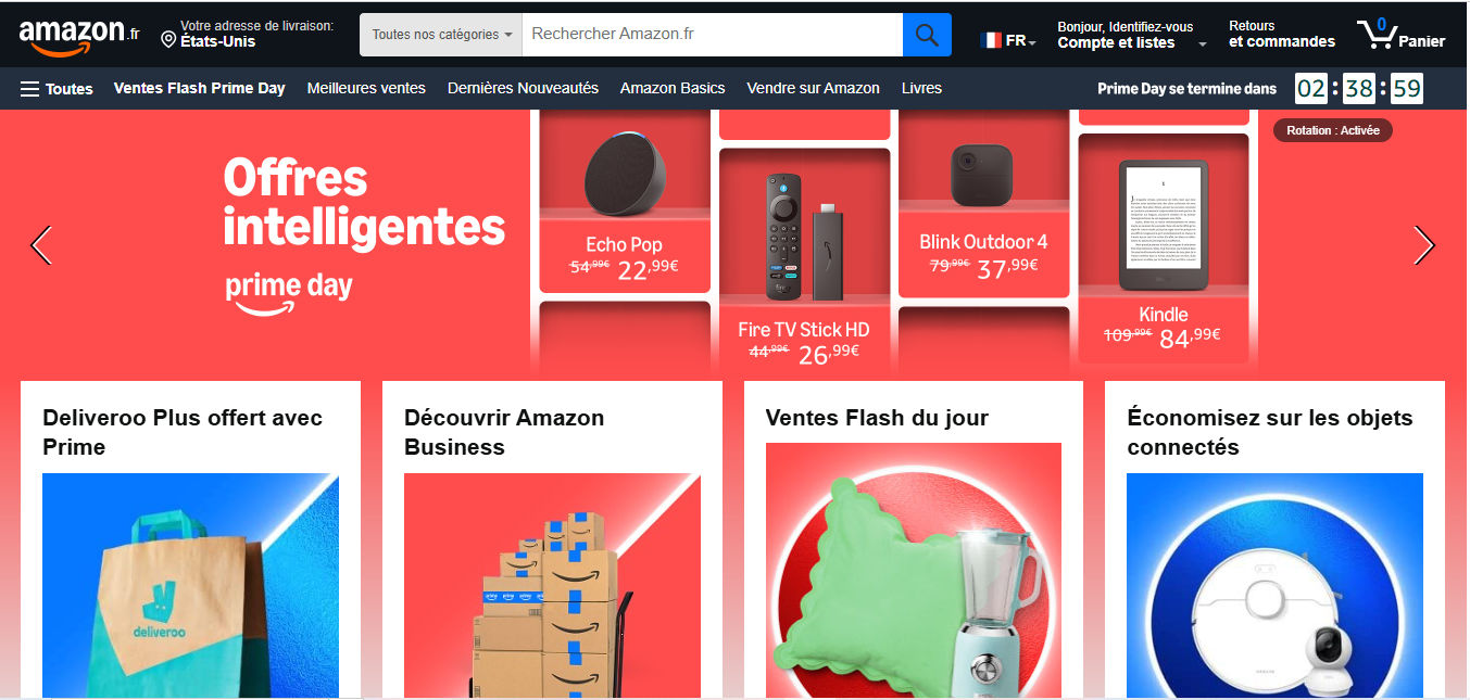
Users’ mental models apply internationally, too; for example, in France, Amazon buyers can add items to a cart icon labeled “Panier” (“Basket”), conforming to the users’ mental model of where their intended purchases are kept.
© Amazon.fr, Fair use
3. They Influence Learning
According to a significant academic paper on mental models—Kieras and Bovair’s 1984 research piece, The Role of a Mental Model in Learning to Operate a Device—users learn and operate devices more efficiently when they hold accurate mental models than if they learn about a device’s operation by memorizing instructions. When models are incomplete or incorrect, users struggle to understand cause and effect and make performance errors. This finding reinforces the value of aligning system design with user expectations—not just for usability, but also for learnability.
Users, like students, learn more meaningfully when the systems and features of systems they encounter conform to their mental models of how such things should operate. However, what about more complex systems that require intricate features for users to complete tasks with them?
For example, consider two claim management systems (CMS, or claims processing systems) that two designers might create for their respective client companies. In this case, it could be for workers at brands that offer insurance services. Both companies have just hired many new customer-service representatives who must handle customers’ car and building damage and injury claims and process these on the new systems. One CMS is more complex than the other and presents users with a massive group of dropdown menus, tabs, and more than one search field on a single page.
The other CMS, however, features a system design that has greater usability and learnability. For example, users can click over a map feature to locate repair shops, and the designer has applied progressive disclosure so they can easily find more specialized items—such as more complex insurance handling procedures—only if they need to access that screen due to the customer’s need.
Both that CMS and the more complex one offer the same (theoretical) level of functionality to their users. The difference will show in the error rate, confusion and frustration levels, and—if the first system is bad enough—how many workers complain or even quit.
Explore how progressive disclosure helps users enjoy more successful designs, in this video with William Hudson: User Experience Strategist and Founder of Syntagm Ltd.
How to Design for Mental Models, Step-by-Step
Step 1: Research User Expectations
Start by learning what users believe about systems like yours or the one you’re intending to design. Use approaches such as:
User interviews and contextual inquiries: Ask users how they expect things to work and why. For contextual inquiries, you observe users in their natural environment to understand their contexts and workflow—and examine what mental models they might have about a solution or potential solution to help them perform tasks and achieve goals.
Explore considerations and valuable tips about user interviews in this video with Ann Blandford: Professor of Human-Computer Interaction at University College London.
Card sorting: One of the most useful tools for mapping mental models, card sorting helps identify how users categorize concepts. This data informs navigation design and page grouping.
Discover important points about what sort of card sort content can help most, in this video with Donna Spencer, Author, Speaker and Design Consultant.
Tree testing: A tree test simulates a hierarchical navigation structure and helps designers align and structure websites and the like with how users think.
Try tree testing to find out important insights about users’ expectations, as this video with William Hudson discusses.
Step 2: Analyze for Patterns
Analyze what you gathered in your user research to uncover how users mentally model your product or system. This step involves identifying shared assumptions, expectations, and terminology, as well as pinpointing any disconnects between what users believe and how you intended your system to function.
Start by coding qualitative responses from interviews or open-ended survey questions. Look for recurring language, metaphors, or expectations. For example, do several users expect to find billing under “Settings”? Do they refer to “saving” when there’s no save function, as in Google Docs? These patterns reveal how people mentally structure your product.
For card sorting data, tree analysis done in the form of a dendrogram can be helpful.
Identify mismatches and flag areas where user expectations diverge from your system model. For example, users might expect a “back” button to take them to the previous content view, but your app returns them to a homepage. These discrepancies are red flags for usability friction.
Mismatches aren’t just usability issues or minor slips—they’re cognitive mismatches. They often cause problems or hesitation because users must pause to re-evaluate how things work, which increases cognitive load. They also break what could otherwise be a seamless experience with your product and brand.
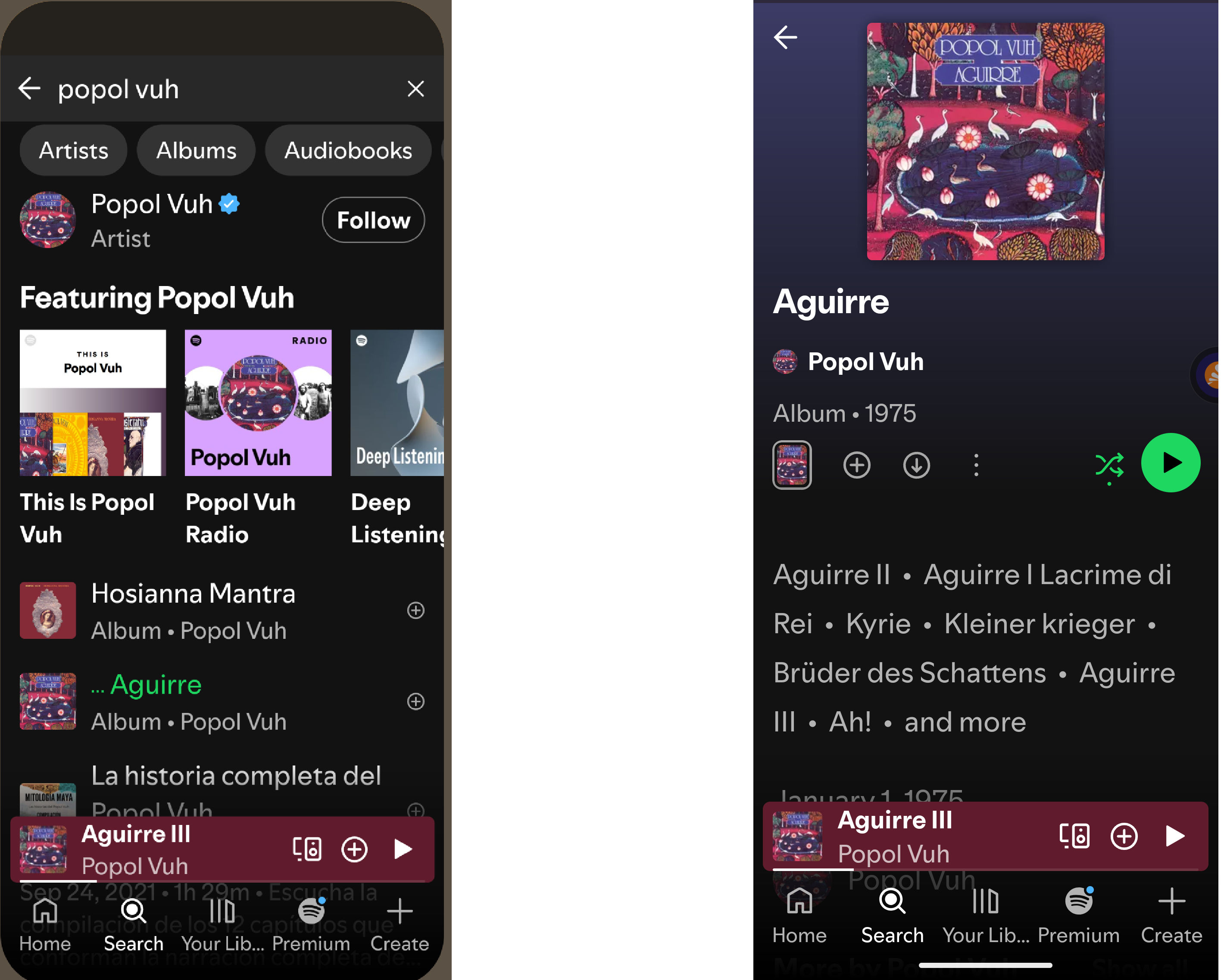
Mental models in this popular music app include how users can find album covers and song listings—as older users would recognize from the days of vinyl LPs—and play them using the universally understood Play button.
© Spotify, Fair use
Step 3: Design with Alignment in Mind
Create interfaces that reflect common expectations. Use metaphors, icons, and flows that users already understand. For example, if they can save their work, does “save” mean they expect to find a floppy disk icon? Use prototypes and test them with users. Prototyping offers an essential and cost-saving way to create early versions of proposed solutions and test assumptions.
Find out how prototyping helps fast-track more successful designs, in this video with Alan Dix: Author of the bestselling book “Human-Computer Interaction” and Director of the Computational Foundry at Swansea University.
It’s important to keep in line with users’ mental models about how they accomplish tasks—such as finding music, eating out, or buying a house. The music example (in the images above) is relatively simple.
Eating Out: A Mirror of Familiar Steps
Dining apps reflect the predictable flow of eating out: choose food, browse options, order, and then confirm. Uber Eats and OpenTable are examples of apps that follow this sequence with clear categories, intuitive filters, and visual menus. Features like availability indicators or delivery tracking simulate real-world cues, making the process seamless.
Buying a House: A Guide to a Complex Journey
Home-buying apps support a longer, multi-phase process: search, evaluate, plan finances, and act. Take an app like Zillow: using maps, photos, and calculators to match how buyers explore neighborhoods and assess affordability. Tools like saved searches and tour schedulers mirror real-world next steps, keep users oriented and progressing, and can be great sources of help during what can be a stressful, if exciting, time.
Step 4: Structure Your Information Architecture Accordingly
Mental models heavily influence information architecture (IA). If users expect “Billing” and “Payments” to be in the same menu, keep them together or users may become confused. Use your card sorting results and user feedback to create an IA that matches real-world logic—not just internal business logic.
Understand more about how to structure an effective information architecture from this video.
Fortunately, designers have a strong “ally” in the form of competitive analysis. You can select your problem domain, find the key players, and observe what they do to provide solutions and mark some important points to work with.
Step 5: Provide Support for Gaps
Familiarity is key as far as you can apply it to help users. However, when you must diverge from familiar patterns, help users adjust. Tooltips, onboarding flows, FAQs, and contextual help can close the gap between the system model and the user’s mental model.
Be proactive. Think of documentation not as an afterthought but as an essential layer of the user experience—particularly where your product breaks from convention. If what users find on the screen empowers them to intuitively interact with your brand for most tasks and purposes, it’s a healthy sign. It can mean that for instances where they must stretch beyond their comfort zone, at least they should trust your design enough to accommodate any adaptations they must make in their mental models.
Speaking of comfort, one vital consideration is that you understand the users’ contexts of use. Users will “arrive” on your digital product in a variety of situations. Remember the front-line insurance workers? Imagine their user contexts: often high-stress customer complaints, frequently high-value property damage, always the need to focus on precise actions. Users’ mental models don’t help them in a vacuum; they need empathic designers to help them apply those models in the moment.
Dig deeper into user contexts to learn why it’s vital to design for them, in this video with Alan Dix.
Best Practices – A Checklist to Help Stay One Step Ahead of Users
Respect familiarity: Unless innovation offers clear user benefits, default to common metaphors and conventions—such as the magnifying glass for searches.
Support learning: When diverging from norms, help users form accurate new models with guidance and repetition.
Test and iterate, continually: The only way to validate users’ mental models is to observe real users in action. Ask them to think out loud as they encounter and try to use prototypes, for example. Note what they do and say.
Design for change: Expect users to bring prior assumptions and allow your interface to gently reshape those over time. For example, the floppy disk is still around for “save,” but it may not be in the future.
Understand mental model inertia: Change is difficult. Users will naturally resist changing their internal expectations—even when those expectations are outdated or inaccurate. For example, people who learned to save documents by clicking a floppy disk icon may still expect that metaphor, even though physical disks are obsolete, and the number of users who did use those disks will dwindle as time ticks on. That’s mental model inertia in action.
Create reliable user personas: These fictitious representations of real users help designers fine-tune what they include in websites, apps, and other solutions according to the real-world needs and behaviors of the individuals who will use them. Personas can help inform design choices with vital considerations about many factors, including contexts and mental models.
Find out why personas are not only helpful but essential parts of design, too, in this video with William Hudson:
Design tooltips, onboarding, and FAQs to correct misconceptions.
Use clear visual cues and feedback to guide user behavior.
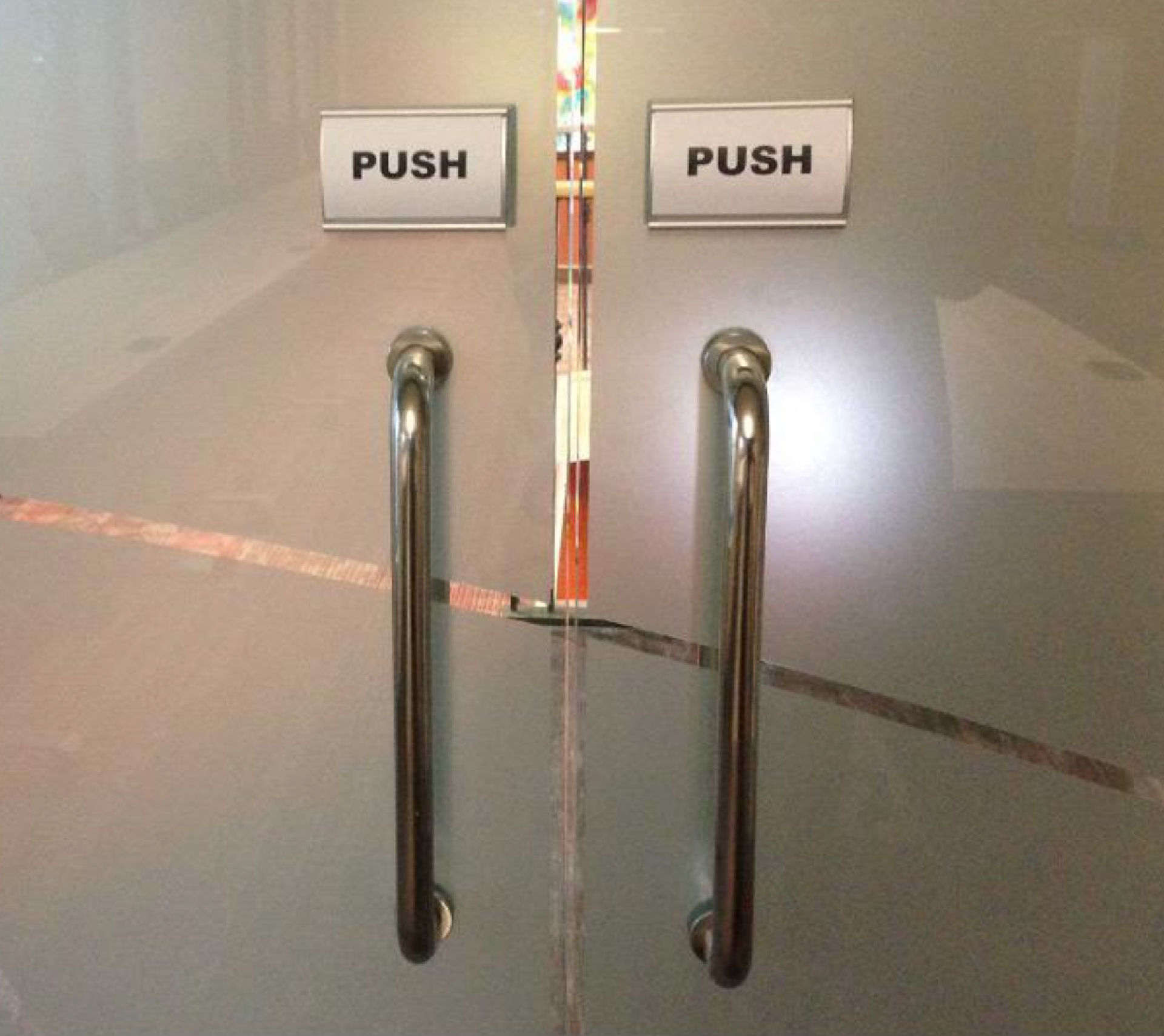
Support findability and discoverability: For example, the hamburger menu might align with users’ grasp of what to click to find more options, but it hides content they need there and then. Consider the users’ in-the-moment needs.
Anticipate misunderstandings before they happen. Where are users likely to make slips, errors, or mistakes? Simple errors may happen in an imperfect world, but mistakes that arise from disconnects between a user’s mental model and your design are serious red flags. Expert or heuristic evaluations can help catch these and other problems.
Explore how a heuristic evaluation can safety-ledge areas where your design might otherwise fall, in this video with William Hudson.
Conduct regular usability testing to keep up with evolving expectations. Test, test, and test again over time to determine how well it accommodates users’ mental models.
Not all mismatches carry the same weight. Focus your redesign efforts on gaps that affect core tasks or cause frequent user complaints. For example, if a small navigation label misleads users consistently, fixing it may yield greater usability gains than rethinking a rarely-used feature. However, a disconnect between how a user expects a delete function to work and the result that an item they decide to keep isn’t retrievable can be far more serious. Deleting something fully should take two “hits”; the first one should send it to the (holding) bin.
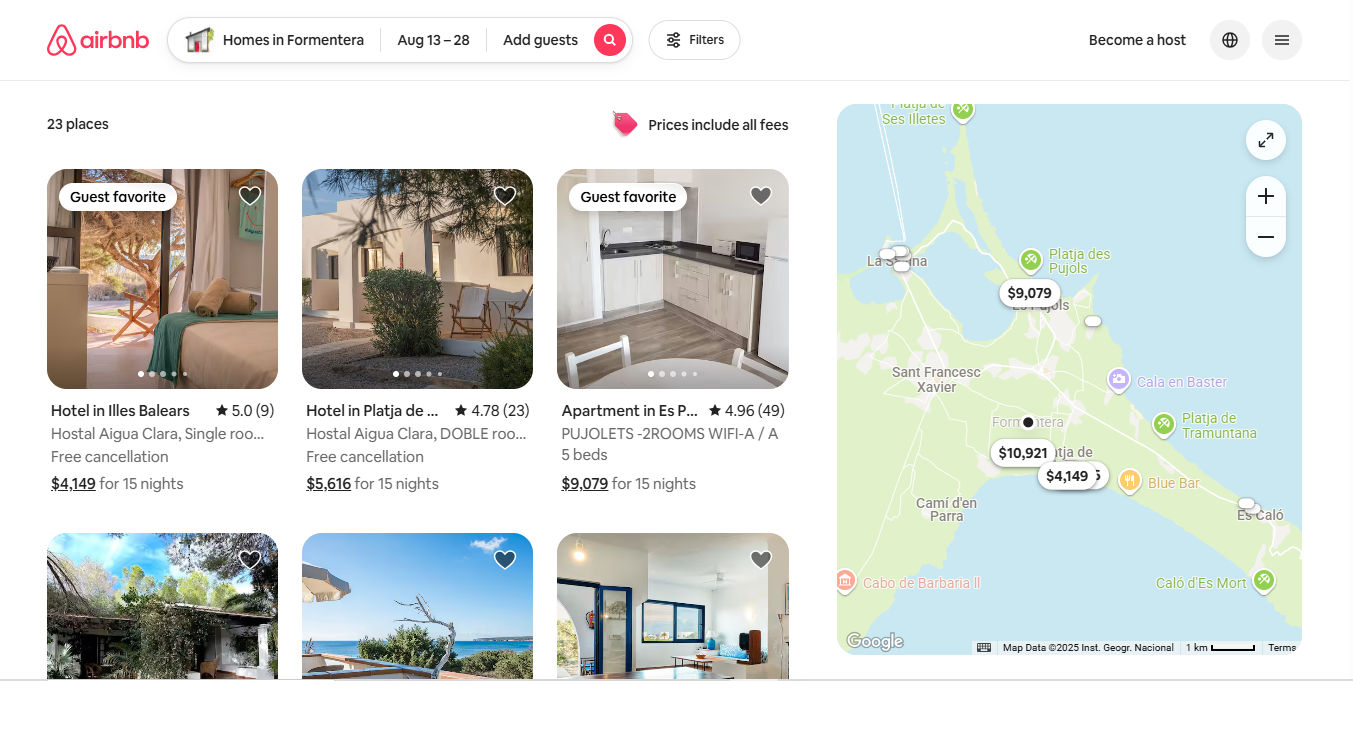
Users who remember what it was like to book vacations “back in the day” can relate to a host (no pun intended) of conveniences and effective tapping of mental models with Airbnb. There’s the hotel-like booking experience with destination input field, date-pickers, and number of guests. However, Airbnb elevates this to a new level with an informal “staying at a friend’s” vibe while building the same level of trust that, for example, 1970s’ holidaymakers would have expected from a reputable travel agent.
© Airbnb, Fair use
Overall, mental models shape how users think, behave, and learn in the face of an uncertain world. People create and use mental models involuntarily. However, the larger concern is inappropriate or inconsistent mental models; for example, people commonly associate some effect with the incorrect cause. If users develop the wrong mental model of your product, it will become harder to use, no matter how functional the backend is.
Designers who take the time to confirm their assumptions about their users’ assumptions and more can save their users much frustration and confusion. They can also help reduce their brands’ support costs and abandonment rates. Experiences that feel natural, trustworthy, and efficient revolve around screens and other designed items that align with how users understand things should work.
In our complex and subjective world, users bring diverse perspectives, cultural backgrounds, and individual quirks to every digital interaction. Whenever people encounter new platforms, apps, or brand experiences, they rely on their existing mental models to navigate unfamiliar territory. Designers can help by creating interfaces that align with these mental models, translating complex functionality into intuitive, seamless experiences that feel natural and effortless to use.